Introduction to JavaScript Graph
In JavaScript, graph is one of the technology method for generating charts and mainly its requires to some little techniques but it does not depend on the coding parts. When we use js charts in web applications it has user-friendly and a very simple easy task for the client user to understand the concepts meanwhile. It depends on the client-side scripting technique i.e. it is performed only by the user browsers there is no extra or additional plugins for related with the any type of modules etc is going to be required we can include only the script and prepare the data with any type of languages called xml, json, javascript arrays etc.
Syntax and Parameters:
When we use the graph in script mainly it depends on x-axis, y-axis and z-axis based on the user requirements.
<script>
function name()
{
var v1=new CanvasJS.chart(“”,{
-----some script logics ------
x-axis:
{
}
y-axis:
{
}
z-axis:
{
}
}
</script>
We can call the function with a different set of axis among these CanvasJS is one of the default class and it uses the method like Chart() while we passed the arguments as x, y and z-axis.
How is Graph done in JavaScript?
- The JavaScript graph charts can be used with the web based projects. When we use graphs in javascript it may be classified into different types Line chart, Area chart, Column & Bar charts, Pie & Funnel chart, Financial charts, Scatter & Bubble charts, Box & Whisker charts, Combination charts and Dynamic charts. When we use line charts it can be classifieds into different categories each line charts may have different functionalities some of the important charts are dashed line chart, multi series line charts, Line chart with Zoom and Pan etc. The Line chart is also known as Trend chart it mainly denoted as interconnecting all the data points in the data series using straight line segments.
- Also we have used data’s in normal visualisations with some amount of times and ranges. These type of charts it accepts numeric type of values and also date-time values are used as axis in the graph. It is used zooming, animations, panning technologies. If we used area charts its same as line charts but the shades of areas are fully covered with the colors. This also accepts some cumulative values with along period of time ranges. This charts also accepts animations, zooming, panning etc. It supports all type of browsers so it’s a browser compatibility. The Area charts are classified into different sets some of them are Multi series area chart, spline area chart, step area chart, Range area chart etc. The Column and bar chart are another type column charts are used to display the values in rectangular bar formats it compares the values with different categories and series.
- Mainly it display the vertical type of charts because column chart is shown in graph as vertical format and bar chart is display with bar horizontal format. These type of charts also supports the animations, zooming, panning etc. Some of the type of charts are column charts with multiple axes, multi series bar chart, Range Column chart and Staked Column charts. The Pie & Funnel charts pie chart is used to compare the share or proportion with various items it also compared and calculated the total sum of the column values. The Funnel Charts are used with the multiple stages like higher part is head or base, the lower part is referred as neck. Some of the charts are Pie with legends, funnel with custom neck. The Financial charts are also like Candlestick for column with vertical lines to represent with high, low and close values of data points.
- The Scatter chart represents the data as series of points with their axis co-ordinates determined with the x and y values of the data points. The Bubble chart is the 3 dimension axis like x, y and z axis. The values are marked with some bubble formats. The Box and Whisker charts are displayed the numerical datas with the box plots. The vertical lines are displayed with the box plots and horizontal lines are used in the Whisker plots. The Combination charts also known as Error charts is used with the uncertainty type of values. The Dynamic charts are live data charts it will change the scopes of datas.
Examples of JavaScript Graph
Given below are the examples of JavaScript Graph:
Example #1
Code:
<html>
<script type="text/javascript">
window.onload = function () {
var c = new CanvasJS.Chart("first", {
title:{
text: "Have a Nice Day"
},
data: [
{
type: "column",
dataPoints: [
{ label: "siva",  y: 9  },
{ label: "raman", y: 17  },
{ label: "arun", y: 26  },
{ label: "kumar",  y: 33 },
{ label: "gdgs",  y: 29  }
]
}
]
});
c.render();
}
</script>
<script type="text/javascript" src="https://canvasjs.com/assets/script/canvasjs.min.js"> </script>
<body>
<div id="first" style="height: 302px; width: 103%;"></div>
</body>
</html>
Output:

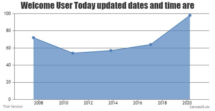
Example #2
Code:
<html>
<script type="text/javascript">
window.onload = function () {
var c = new CanvasJS.Chart("first",
{
zoomEnabled: true,
title:{
text: "Welcome User Today updated dates and time are"
},
data: [
{
type: "area",
xValueType: "dateTime",
dataPoints: [
{ x: 1185622200000, y :72},
{ x: 1285622200000, y : 54 },
{ x: 1383622200000, y:  57 },
{ x: 1485622200000, y : 64 },
{ x: 1585622200000, y : 98 },
]
}
]
});
c.render();
}
</script>
<script type="text/javascript" src="https://canvasjs.com/assets/script/canvasjs.min.js"></script>
<body>
<div id="first" style="height: 303px; width: 103%;">
</div>
</body>
</html>
Output:

Example #3
Code:
<html>
<script type="text/javascript">
window.onload = function () {
var chart = new CanvasJS.Chart("first",
{
zoomEnabled: true,
title:{
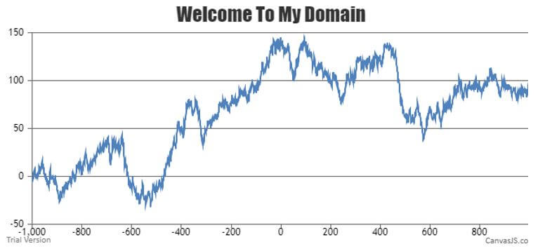
text: "Welcome To My Domain"
},
axisY:{
includeZero: false
},
data: data,
});
chart.render();
}
var l = 2000;
var y = 0;
var data = []; var ds = { type: "line" };
var dataPoints = [];
for (var i = 0; i < l; i += 1) {
y += (Math.random() * 10 - 5);
dataPoints.push({
x: i - l / 2,
y: y
});
}
ds.dataPoints = dataPoints;
data.push(ds);
</script>
<script type="text/javascript" src="https://canvasjs.com/assets/script/canvasjs.min.js"></script>
<body>
<div id="first" style="height: 302px; width: 103%;">
</div>
</body>
</html>
Output:

Conclusion
The charts are the way to understand the customer datas or any other useful scenarios in easy way. It is one of the user-friendly method with the browser interaction. It also supported all type of default browser in default Canvas JS file is added to the script.

