Introduction to Bootstrap Float
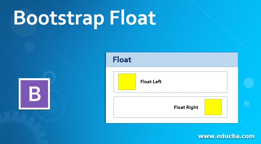
The float class in the bootstrap is used for the set position and format of contents. After floating content, wrap the remaining contents of the web application. The floating content into the container floats right, left, and none using a float-right, float-left, float-none class. It places images, quotes, and highlights content in a particular position. Therefore, it must be responsive according to the bootstrap float classes display screen.
Syntax
Here are the three main classes: left, right, and none.
| Bootstrap float class syntax | Details |
| class = “float-left” | The content or element is placed on the left side. |
| class = “float-right” | The content or element is placed on the right side. |
| class = “float-none” | The content or element is not to be placed to float. |
The responsive classes are below.
| Responsive bootstrap float classes syntax | Details |
| class= “float-sm-left” | The content is placed on the left side of the small screen size. |
| class= “float-sm-right” | The content is placed on the right side of the small screen size. |
| class= “float-md-left” | The content is placed on the left side of the medium screen size. |
| class= “float-md-right” | The content is placed on the right side of the medium screen size. |
| class= “float-lg-left” | The content is placed on the left side of the large screen size. |
| class= “float-lg-right” | The content is placed on the right side of the large screen size. |
| class= “float-xl-left” | The content is placed on the left side of the extra-large screen size. |
| class= “float-xl-right” | The content is placed on the right side of the extra-large screen size. |
| class = “float-sm-none” | The content does not float when the screen size is small. |
| class = “float-md-none” | The content does not float when the screen size is medium. |
| class = “float-lg-none” | The content does not float when the screen size is large. |
| class = “float-xl-none” | The content does not float when the screen size is extra large. |
Examples of Bootstrap Float
Different examples are mentioned below:
Example #1
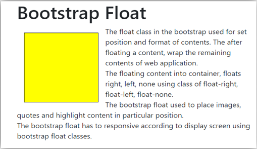
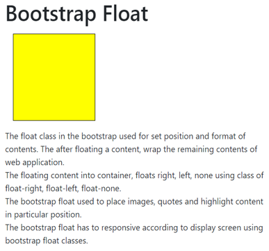
The yellow color cube is placed on the left side using a float-left class. Other contents are settled around float content.
The following example is left side bootstrap float example with output.
<!DOCTYPE html>
<html>
<head>
<title> bootstrap float </title>
<style>
.float-left{
height: 160px;
width: 160px;
border: 1px solid black;
background: yellow;
margin: 15px;
}
</style>
<link rel= "stylesheet"
href="https://stackpath.bootstrapcdn.com/bootstrap/4.2.1/css/bootstrap.min.css">
</head>
<body>
<div class = "container">
<h1> Bootstrap Float </h1>
<div class = "float-left">
</div>
<p>
The float class in the bootstrap used for set position and format of contents. The after floating a content, wrap the remaining contents of web application.<br>
The floating content into container, floats right, left, none using class of float-right, float-left, float-none.<br>
The bootstrap float used to place images, quotes and highlight content in particular position. <br>
The bootstrap float has to responsive according to display screen using bootstrap float classes.
</p>
</div>
<script src= "https://code.jquery.com/jquery-3.3.1.slim.min.js" >
</script>
<script src= "https://cdnjs.cloudflare.com/ajax/libs/popper.js/1.14.6/umd/popper.min.js" >
</script>
<script src= "https://stackpath.bootstrapcdn.com/bootstrap/4.2.1/js/bootstrap.min.js" >
</script>
</body>
</html>
Output:
Example #2
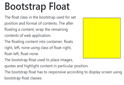
The yellow color cube is placed on the right side using a float-right class. Other contents are settled around float content.
The following example is the right-side bootstrap float example with output.
<!DOCTYPE html>
<html>
<head>
<title> bootstrap float </title>
<style>
.float-right{
height: 160px;
width: 160px;
border: 1px solid black;
background: yellow;
margin: 15px;
}
</style>
<link rel= "stylesheet"  href= "https://stackpath.bootstrapcdn.com/bootstrap/4.2.1/css/bootstrap.min.css">
</head>
<body>
<div class = "container">
<h1> Bootstrap Float </h1>
<div class = "float-right">
</div>
<p>
The float class in the bootstrap used for set position and format of contents. The after floating a content, wrap the remaining contents of web application.<br>
The floating content into container, floats right, left, none using class of float-right, float-left, float-none.<br>
The bootstrap float used to place images, quotes and highlight content in particular position. <br>
The bootstrap float has to responsive according to display screen using bootstrap float classes.
</p>
</div>
<script src= "https://code.jquery.com/jquery-3.3.1.slim.min.js" >
</script>
<script src= "https://cdnjs.cloudflare.com/ajax/libs/popper.js/1.14.6/umd/popper.min.js" >
</script>
<script src= "https://stackpath.bootstrapcdn.com/bootstrap/4.2.1/js/bootstrap.min.js" >
</script>
</body>
</html>
Output:
Example #3
the following example is a bootstrap float-none example with output.
Float-none is used to settle cub according to the web application container.
<!DOCTYPE html>
<html>
<head>
<title> bootstrap float </title>
<style>
.float-none{
height: 160px;
width: 160px;
border: 1px solid black;
background: yellow;
margin: 15px;
}
</style>
<link rel= "stylesheet"        href="https://stackpath.bootstrapcdn.com/bootstrap/4.2.1/css/bootstrap.min.css">
</head>
<body>
<div class = "container">
<h1> Bootstrap Float </h1>
<div class = "float-none">
</div>
<p>
The float class in the bootstrap used for set position and format of contents. The after floating a content, wrap the remaining contents of web application.<br>
The floating content into container, floats right, left, none using class of float-right, float-left, float-none.<br>
The bootstrap float used to place images, quotes and highlight content in particular position. <br>
The bootstrap float has to responsive according to display screen using bootstrap float classes.
</p>
</div>
Output:
Example #4
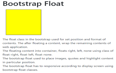
The float-md-left class is used for the left side floating on the medium screen.
On the medium screen, content is placed on the left side; otherwise, it is not to set float.
The following example is left side responsive bootstrap float example with output.
<!DOCTYPE html>
<html>
<head>
<title> bootstrap float </title>
<style>
.float-md-left{
height: 160px;
width: 160px;
border: 1px solid black;
background: yellow;
margin: 15px;
}
</style>
<link rel= "stylesheet"        href="https://stackpath.bootstrapcdn.com/bootstrap/4.2.1/css/bootstrap.min.css">
</head>
<body>
<div class = "container">
<h1> Bootstrap Float </h1>
<div class = "float-md-left">
</div>
<p>
The float class in the bootstrap used for set position and format of contents. The after floating a content, wrap the remaining contents of web application.<br>
The floating content into container, floats right, left, none using class of float-right, float-left, float-none.<br>
The bootstrap float used to place images, quotes and highlight content in particular position. <br>
The bootstrap float has to responsive according to display screen using bootstrap float classes.
</p>
</div>
<script src= "https://code.jquery.com/jquery-3.3.1.slim.min.js" >
</script>
<script src= "https://cdnjs.cloudflare.com/ajax/libs/popper.js/1.14.6/umd/popper.min.js" >
</script>
<script src= "https://stackpath.bootstrapcdn.com/bootstrap/4.2.1/js/bootstrap.min.js" >
</script>
</body>
</html>
Output:
Medium size screen

Small size screen
Conclusion
It is used for styling purposes. It helps to place images and important content in a particular position. However, it is mostly used for images, and their description is placed and elegantly adjusted to each other.

