Introduction to Bootstrap Screen Sizes
The web application is made in two ways. One is static, and another is responsive. The static web application works on one screen size, but responsive web applications modify according to screen size. The digital device has a different screen width. The web application set up their size according to screen width. In this topic, we are going to learn about Bootstrap Screen Sizes.
There are four screen sizes in bootstrap.
- Extra small screen: for phone devices.
- The Small screen: for tablet devices.
- The Medium screen: for small laptop devices.
- The Large screen: for laptop and desktop devices.
Syntax
There are four classes used for four screen sizes. The following syntaxes are screen size.
- The xs – extra small screen used for phone size devices.
- The sm – small screen used for tablet size devices.
- The md – medium screen is used for small laptop size devices.
- The lg – large screen used for laptop and desktop size devices.
Types of Bootstrap Screen Sizes
There are four types of screen sizes according to devices.
1. The extra small screen size
- The screen width is less than 768px for xs. Therefore, the xs always come up with a column (.col – xs).
- The container size is always horizontal for this screen size.
2. The small screen size
- The screen width is equal to or greater than 768px for sm. The sm always comes up with a column (.col – sm).
- The container size collapse above 768px for horizontal display.
3. The medium screen size
- The screen width is equal to or greater than 992px for md. The md always comes up with a column (.col – mg).
- The container size collapse above 992px for horizontal display.
4. The large screen size
- The screen width is equal to or greater than 1200px for lg. The lg always comes up with a column (.col – lg).
- The container size collapse above 1200px for horizontal display.
Examples of Bootstrap Screen Sizes
Different examples are mentioned below:
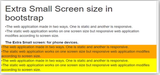
Example #1 – Extra small screen sizes
Code:
<!DOCTYPE html>
<html>
<head>
<title> Bootstrap Screen size Example </title>
<meta charset="utf-8">
<meta name= "viewport" content= "width=device-width, initial-scale=1">
<link rel= "stylesheet" href= "https://maxcdn.bootstrapcdn.com/bootstrap/3.4.1/css/bootstrap.min.css">
</head>
<body>
<div class= "container-fluid">
<h1> Extra Small Screen size in bootstrap </h1>
<p>The web application made in two ways. One is static and another is responsive. <br>
The static web application works on one screen size but responsive web application modifies according to screen size.
</p>
<b> The Extra Small screen: for phone devices. </b>
<div class="row">
<div class="col-xs" style="background-color:orange;">
The web application made in two ways. One is static and another is responsive. <br>
The static web application works on one screen size but responsive web application modifies according to screen size.
</div>
<div class="col-xs" style="background-color:yellow;">
The web application made in two ways. One is static and another is responsive. <br>
The static web application works on one screen size but responsive web application modifies according to screen size.
</div>
</div>
</div>
<script src= "https://ajax.googleapis.com/ajax/libs/jquery/3.4.1/jquery.min.js">
</script>
<script src= "https://maxcdn.bootstrapcdn.com/bootstrap/3.4.1/js/bootstrap.min.js">
</script>
</body>
</html>
Output:

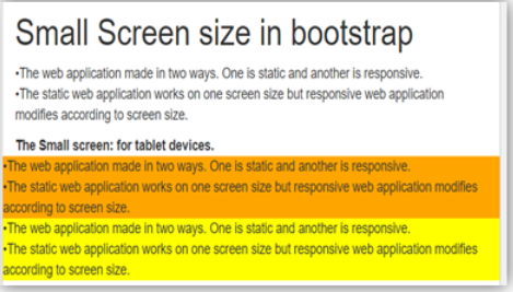
Example #2 – Small screen sizes
Code:
<!DOCTYPE html>
<html>
<head>
<title> Bootstrap Screen size Example </title>
<meta charset="utf-8">
<meta name= "viewport" content= "width=device-width, initial-scale=1">
<link rel= "stylesheet" href= "https://maxcdn.bootstrapcdn.com/bootstrap/3.4.1/css/bootstrap.min.css">
</head>
<body>
<div class="container-fluid">
<h1> Small Screen size in bootstrap </h1>
<p>The web application made in two ways. One is static and another is responsive. <br>
The static web application works on one screen size but responsive web application modifies according to screen size.
</p>
<b> The Small screen: for tablet devices. </b>
<div class="row">
<div class="col-sm" style="background-color:orange;">
The web application made in two ways. One is static and another is responsive. <br>
The static web application works on one screen size but responsive web application modifies according to screen size.
</div>
<div class="col-sm" style="background-color:yellow;">
The web application made in two ways. One is static and another is responsive. <br>
The static web application works on one screen size but responsive web application modifies according to screen size.
</div>
</div>
</div>
<script src= "https://ajax.googleapis.com/ajax/libs/jquery/3.4.1/jquery.min.js">
</script>
<script src= "https://maxcdn.bootstrapcdn.com/bootstrap/3.4.1/js/bootstrap.min.js">
</script>
</body>
</html>
Output:

Example #3 – Medium screen sizes
Code:
<!DOCTYPE html>
<html>
<head>
<title> Bootstrap Screen size Example </title>
<meta charset="utf-8">
<meta name= "viewport" content= "width=device-width, initial-scale=1">
<link rel= "stylesheet" href= "https://maxcdn.bootstrapcdn.com/bootstrap/3.4.1/css/bootstrap.min.css">
</head>
<body>
<div class="container-fluid">
<h1> The Medium Screen size in bootstrap </h1>
<p>The web application made in two ways. One is static and another is responsive. <br>
The static web application works on one screen size but responsive web application modifies according to screen size.
</p>
<b> The Extra Small screen: for small laptop devices. </b>
<div class="row">
<div class="col-md" style="background-color:orange;">
The web application made in two ways. One is static and another is responsive. <br>
The static web application works on one screen size but responsive web application modifies according to screen size.
</div>
<div class="col-md" style="background-color:yellow;">
The web application made in two ways. One is static and another is responsive. <br>
The static web application works on one screen size but responsive web application modifies according to screen size.
</div>
</div>
</div>
<script src= "https://ajax.googleapis.com/ajax/libs/jquery/3.4.1/jquery.min.js">
</script>
<script src= "https://maxcdn.bootstrapcdn.com/bootstrap/3.4.1/js/bootstrap.min.js">
</script>
</body>
</html>
Output:

Example #4 – Large screen sizes
Code:
<!DOCTYPE html>
<html>
<head>
<title> Bootstrap Screen size Example </title>
<meta charset="utf-8">
<meta name= "viewport" content= "width=device-width, initial-scale=1">
<link rel= "stylesheet" href= "https://maxcdn.bootstrapcdn.com/bootstrap/3.4.1/css/bootstrap.min.css">
</head>
<body>
<div class="container-fluid">
<h1> The Large Screen size in bootstrap </h1>
<p>The web application made in two ways. One is static and another is responsive. <br>
The static web application works on one screen size but responsive web application modifies according to screen size.
</p>
<b> The Extra Small screen: for laptop devices. </b>
<div class="row">
<div class="col-lg" style="background-color:orange;">
The web application made in two ways. One is static and another is responsive. <br>
The static web application works on one screen size but responsive web application modifies according to screen size.
</div>
<div class="col-lg" style="background-color:yellow;">
The web application made in two ways. One is static and another is responsive. <br>
The static web application works on one screen size but responsive web application modifies according to screen size.
</div>
</div>
</div>
<script src= "https://ajax.googleapis.com/ajax/libs/jquery/3.4.1/jquery.min.js">
</script>
<script src= "https://maxcdn.bootstrapcdn.com/bootstrap/3.4.1/js/bootstrap.min.js">
</script>
</body>
</html>
Output:

Conclusion
The bootstrap screen size is used for responsive web applications. The screen size helps to make an application in the standard format according to the device screen. In addition, it helps to make the application easy to use for users.

