Introduction to Bootstrap List Group
The bootstrap list-group is a flexible component to create an element list as per the required format. The list-group is modifying a list or group of content in the link or button style using classes. The list-group is a user-friendly component of bootstrap to make an unordered list into an elegant manner and ideal format. The list-group classes not only needed <ul> and <li> tags but also used many tags of HTML file to create a list.
Syntax
The list-group is a user-friendly component to make a sorted content list. This is a default unordered list with list items or contents.
The basic bootstrap list-group syntax is below.
<ul class= "list-group">
<li class= "list-group-item"> first list-group content
</li>
<li class= "list-group-item"> second list-group content
</li>
<li class= "list-group-item"> third list-group content
</li>
<li class= "list-group-item"> fourth list-group content
</li>
</ul>
Description: The <ul> tag is used to display an unordered list which is the default list-group. The class list-group is placed inside of <ul> tag to set list-group in bootstrap. The class list-group-item is placed inside of <li> tag to display list items in a series format.
How do List Group Classes work in Bootstrap?
Below are the steps to work:
Step #1
The support files include in the <head> section of HTML file. The bootstrap support files are below.
<link rel= "stylesheet" href= "https://maxcdn.bootstrapcdn.com/bootstrap/3.4.1/css/bootstrap.min.css">
<script src= "https://ajax.googleapis.com/ajax/libs/jquery/3.5.1/jquery.min.js">
</script>
<script src= "https://maxcdn.bootstrapcdn.com/bootstrap/3.4.1/js/bootstrap.min.js">
</script>
Step #2
The list-group syntax placed in the <body> section of HTML file. The basic syntax of the list-group is below.
<body>
<div class="container-fluid">
<ul class= "list-group">
<li class= "list-group-item"> first list-group content </li>
<li class= "list-group-item"> second list-group content </li>
<li class= "list-group-item"> third list-group content </li>
<li class= "list-group-item"> fourth list-group content </li>
</ul>
</div>
</body>- The list-group with hyperlink syntax is placed in the body section.
- The list-group with hyperlink syntax is below.
<div class= "list-group">
<a href= "google.com" class= "list-group-item"> Google link </a>
<a href= "facebook.com" class= "list-group-item"> Facebook Link </a>
<a href= "microsoft.com" class= "list-group-item"> Microsoft Link </a>
<a href= "youtube.com" class= "list-group-item"> Youtube Link </a>
</div>
Description:
- The list-group class placed in the <div> tag instead of <ul> tag.
- The href =”#” placed inside of <a> tag. This link used for the hyperlink.
- The list-group-item placed inside of <a> tag instead of <li> tag.
Step #3
The active class is placed with a list-group-list class. The active class is used for focused on the current group item of the list.
<div class= "list-group">
<a href= "google.com" class= "list-group-item active"> Google link </a>
<a href= "facebook.com" class= "list-group-item"> Facebook Link </a>
</div>
The above example Google link is currently used link because of active class.
Examples
Below are examples mentioned:
Example #1
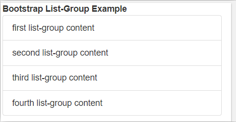
The basic bootstrap list-group example and output.
Code:
<!DOCTYPE html>
<html>
<head>
<title> Bootstrap list-group Tutorial </title>
<meta charset="utf-8">
<meta name="viewport" content="width=device-width, initial-scale=1">
<link rel="stylesheet" href="https://maxcdn.bootstrapcdn.com/bootstrap/3.4.1/css/bootstrap.min.css">
<script src="https://ajax.googleapis.com/ajax/libs/jquery/3.5.1/jquery.min.js"></script>
<script src="https://maxcdn.bootstrapcdn.com/bootstrap/3.4.1/js/bootstrap.min.js"></script>
</head>
<body>
<div class="container-fluid">
<b>Bootstrap List-Group Example </b>
<ul class= "list-group">
<li class= "list-group-item"> first list-group content
</li>
<li class= "list-group-item"> second list-group content
</li>
<li class= "list-group-item"> third list-group content
</li>
<li class= "list-group-item"> fourth list-group content </li>
</ul>
</div>
</body>
</html>
Output:
Description:
- The example and output show above to know the basic list-group.
- The <ul> and <li> tag used for unordered list and their items.
- The list-group and list-group-item classes used in the basic list-group.
Example #2
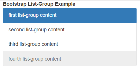
The list-group with active and disable class example and output.
Code:
<!DOCTYPE html>
<html>
<head>
<title> Bootstrap list-group Tutorial </title>
<meta charset="utf-8">
<meta name="viewport" content="width=device-width, initial-scale=1">
<link rel="stylesheet" href="https://maxcdn.bootstrapcdn.com/bootstrap/3.4.1/css/bootstrap.min.css">
<script src="https://ajax.googleapis.com/ajax/libs/jquery/3.5.1/jquery.min.js"></script>
<script src="https://maxcdn.bootstrapcdn.com/bootstrap/3.4.1/js/bootstrap.min.js"></script>
</head>
<body>
<div class="container-fluid">
<b>Bootstrap List-Group Example </b>
<ul class= "list-group">
<li class= "list-group-item active"> first list-group content
</li>
<li class= "list-group-item"> second list-group content
</li>
<li class= "list-group-item"> third list-group content
</li>
<li class= "list-group-item disabled"> fourth list-group content </li>
</ul>
</div>
</body>
</html>
Output:
Description:
- The active class placed with list-group-item in the first list-group content.
- The disabled class placed with list-group-item in the fourth list-group content.
- The example and output show above to know active and disabled class in the group item.
Example #3
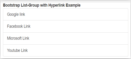
The list-group with Hyperlink example and output.
Code:
<!DOCTYPE html>
<html>
<head>
<title> Bootstrap list-group Tutorial </title>
<meta charset="utf-8">
<meta name="viewport" content="width=device-width, initial-scale=1">
<link rel="stylesheet" href="https://maxcdn.bootstrapcdn.com/bootstrap/3.4.1/css/bootstrap.min.css">
<script src="https://ajax.googleapis.com/ajax/libs/jquery/3.5.1/jquery.min.js"></script>
<script src="https://maxcdn.bootstrapcdn.com/bootstrap/3.4.1/js/bootstrap.min.js"></script>
</head>
<body>
<div class="container-fluid">
<b>Bootstrap List-Group with Hyperlink Example  </b>
<div class= "list-group">
<a href= "google.com" class= "list-group-item"> Google link </a>
<a href= "facebook.com" class= "list-group-item"> Facebook Link </a>
<a href= "microsoft.com" class= "list-group-item"> Microsoft Link </a>
<a href= "youtube.com" class= "list-group-item"> Youtube Link </a>
</div>
</div>
</body>
</html>
Output:
Example #4
The list-group with contextual class example and output.
Code:
<!DOCTYPE html>
<html>
<head>
<title> Bootstrap list-group Tutorial </title>
<meta charset="utf-8">
<meta name="viewport" content="width=device-width, initial-scale=1">
<link rel="stylesheet" href="https://maxcdn.bootstrapcdn.com/bootstrap/3.4.1/css/bootstrap.min.css">
<script src="https://ajax.googleapis.com/ajax/libs/jquery/3.5.1/jquery.min.js"></script>
<script src="https://maxcdn.bootstrapcdn.com/bootstrap/3.4.1/js/bootstrap.min.js"></script>
</head>
<body>
<div class="container-fluid">
<b>Bootstrap List-Group Example  </b>
<div class= "list-group">
<a href= "google.com" class= "list-group-item list-group-item-danger"> Google link </a>
<a href= "facebook.com" class= "list-group-item list-group-item-warning"> Facebook Link </a>
<a href= "microsoft.com" class= "list-group-item list-group-item-success"> Microsoft Link </a>
<a href= "youtube.com" class= "list-group-item list-group-item-info"> Youtube Link </a>
</div>
</div>
</body>
</html>
Output:
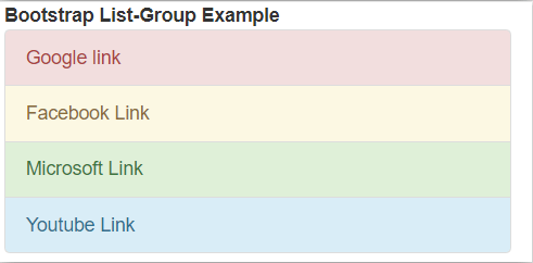
Description:
- The example and output show above to know the contextual classes in the list-group.
- The list-group-item-danger class placed with the list-group-item in the Google link.
- The list-group-item-warning class placed with list-group-item in the Facebook link.
- The list-group-item-success class placed with list-group-item in the Microsoft link.
- The list-group-item-info class placed with the list-group-item in the YouTube link.
Example #5
The list-group with customizing content example and output.
Code:
<!DOCTYPE html>
<html>
<head>
<title> Bootstrap list-group Tutorial </title>
<meta charset="utf-8">
<meta name="viewport" content="width=device-width, initial-scale=1">
<link rel="stylesheet" href="https://maxcdn.bootstrapcdn.com/bootstrap/3.4.1/css/bootstrap.min.css">
<script src="https://ajax.googleapis.com/ajax/libs/jquery/3.5.1/jquery.min.js"></script>
<script src="https://maxcdn.bootstrapcdn.com/bootstrap/3.4.1/js/bootstrap.min.js"></script>
</head>
<body>
<div class="container-fluid">
<b>Bootstrap List-Group Example </b>
<ul class="list-group">
<li class="list-group-item active">
<h3 class="list-group-item-heading"> HTML Tutorial </h3>
<p class="list-group-item-text"> This is basic website language with tags and attribute. </p>
</li>
<li class="list-group-item ">
<h3 class="list-group-item-heading"> CSS Tutorial </h3>
<p class="list-group-item-text"> This is used for Styling website. </p>
</li>
<li class="list-group-item ">
<h3 class="list-group-item-heading"> Javascript Tutorial </h3>
<p class="list-group-item-text"> This is used for validation and rules to website. </p>
</li>
<li class="list-group-item">
<h3 class="list-group-item-heading"> Bootstrap Tutorial </h3>
<p class="list-group-item-text"> This is advance language for website. </p>
</li>
</ul>
</div>
</body>
</html>
Output:
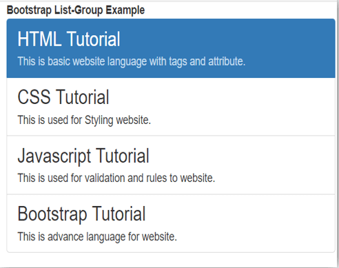
Description:
- The list-group-item-heading class is used for the heading of content. This class is placed inside <h3> tag.
- The list-group-item-text class is used for content information. This class is placed inside the <p> tag.
- The example and output show above to know to customize content classes in the list-group.
Conclusion
The bootstrap list-group is used to modify the content list according to the user’s requirements. The list-group helps to make different styles of content series using minimum coding. This is a user-friendly component and easy to understand for users.

