Definition of Bootstrap Padding
The bootstrap padding is one of the essential utilities to make space between content and container. This is a designing component to make space inside of the container or border using bootstrap class. This is an advance utility to modify the elements and their container using space and space size properties. It uses to make space in the content of the web application and its border.
Syntax:
- The bootstrap padding with all sides and size syntax is below.
{Property}-{Size}- <div class=”p-1″> bootstrap Padding with size 1 </div>
- The “p” class is used for bootstrap padding and p is the acronym of padding.
- The size 1 is used for 4px space when font size is 16px.
- The padding with a particular side and size syntax is below.
{Property}{Sides}-{Size}- <div class=”pt-3″> bootstrap top Padding with size3 </div>
- The “t” is used for top side of spacing in the container.
- The size 3 is used for 16px space when font size is 16px.
- The padding with a particular side, breakpoint, and size syntax are below.
{Property}{Sides}-{Breakpoint}-{Size}- <div class=”pb-sm-2″> responsive bootstrap top Padding with size2 </div>
- The breakpoint makes responsive padding in the web application.
- The “sm” breakpoint works for equals and greater than 576px screen size devices.
- The “b” works for the bottom side of spacing in the container.
- The size 2 is used for 8px space when font size is 16px.
How does Padding work in Bootstrap?
The bootstrap supportive files add in the head section of the HTML page.
Code:
<head>
<meta name = "viewport" content = "width=device-width, initial-scale=1">
<link rel = "stylesheet" href = "https://maxcdn.bootstrapcdn.com/bootstrap/4.5.2/css/bootstrap.min.css">
<script src = "https://ajax.googleapis.com/ajax/libs/jquery/3.5.1/jquery.min.js">
</script>
<script src = "https://cdnjs.cloudflare.com/ajax/libs/popper.js/1.16.0/umd/popper.min.js">
</script>
<script src = "https://maxcdn.bootstrapcdn.com/bootstrap/4.5.2/js/bootstrap.min.js">
</script>
</head>
The container and their elements placed in the HTML page using <div> tag.
Code:
<body>
<div class="container">
<div> responsive bootstrap top Padding with size2 </div>
</div>
</body>
The syntax placed in the <div> tag as per user’s requirement.
<div class="p-1"> bootstrap Padding with size 1 </div><div class="pb-sm-2"> responsive bootstrap top Padding with size2 </div>The working procedure is below.
Code:
<!DOCTYPE html>
<html>
<head>
<title>Bootstrap padding Example</title>
<meta charset="utf-8">
<meta name = "viewport" content = "width=device-width, initial-scale=1">
<link rel = "stylesheet" href = "https://maxcdn.bootstrapcdn.com/bootstrap/4.5.2/css/bootstrap.min.css">
<script src = "https://ajax.googleapis.com/ajax/libs/jquery/3.5.1/jquery.min.js">
</script>
<script src = "https://cdnjs.cloudflare.com/ajax/libs/popper.js/1.16.0/umd/popper.min.js">
</script>
<script src = "https://maxcdn.bootstrapcdn.com/bootstrap/4.5.2/js/bootstrap.min.js">
</script>
</head>
<body>
<div class="container">
<h2> Bootstrap Padding Example </h2>
<div class="p-3 bg-light"> bootstrap Padding with size 1 </div>
<div class="pt-2 bg-warning"> responsive bootstrap top Padding with size2 </div>
</div>
</body>
</html>
Examples
Below are the different examples:
Example #1: With Size
Code:
<!DOCTYPE html>
<html>
<head>
<title>Bootstrap padding Example</title>
<meta charset="utf-8">
<meta name = "viewport" content = "width=device-width, initial-scale=1">
<link rel = "stylesheet" href = "https://maxcdn.bootstrapcdn.com/bootstrap/4.5.2/css/bootstrap.min.css">
<script src = "https://ajax.googleapis.com/ajax/libs/jquery/3.5.1/jquery.min.js">
</script>
<script src = "https://cdnjs.cloudflare.com/ajax/libs/popper.js/1.16.0/umd/popper.min.js">
</script>
<script src = "https://maxcdn.bootstrapcdn.com/bootstrap/4.5.2/js/bootstrap.min.js">
</script>
</head>
<body>
<div class="container">
<h1> Bootstrap Padding Example with Size </h1>
<div class = "p-0 bg-info"> Bootstrap Padding with size 0 </div>
<div class = "p-1 bg-danger"> Bootstrap Padding with size 1 </div>
<div class = "p-2 bg-success"> Bootstrap Padding with size 2 </div>
<div class = "p-3 bg-primary"> Bootstrap Padding with size 3 </div>
<div class = "p-4 bg-secondary"> Bootstrap Padding with size 4 </div>
<div class = "p-5 bg-warning"> Bootstrap Padding with size 5 </div>
</div>
</body>
</html>
Output:

Description:
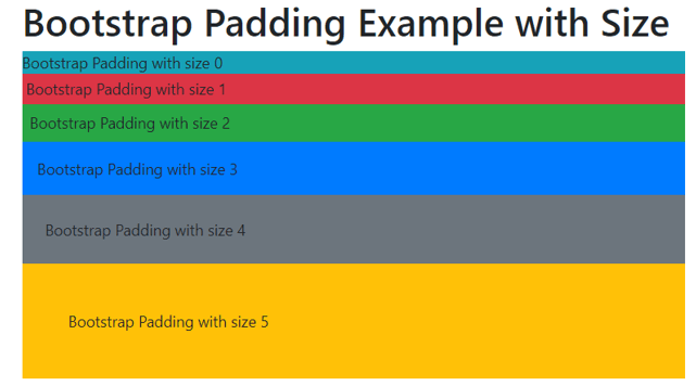
- The siz 4 is used for 24px space when font size is 16px.
- The size e5is used for 48px space when font size is 16px.
- The negative padding size does not apply.
Example #2: With Sides
Code:
<!DOCTYPE html>
<html>
<head>
<title>Bootstrap padding Example</title>
<meta charset = "utf-8">
<meta name = "viewport" content = "width=device-width, initial-scale=1">
<link rel = "stylesheet" href = "https://maxcdn.bootstrapcdn.com/bootstrap/4.5.2/css/bootstrap.min.css">
<script src = "https://ajax.googleapis.com/ajax/libs/jquery/3.5.1/jquery.min.js">
</script>
<script src = "https://cdnjs.cloudflare.com/ajax/libs/popper.js/1.16.0/umd/popper.min.js">
</script>
<script src = "https://maxcdn.bootstrapcdn.com/bootstrap/4.5.2/js/bootstrap.min.js">
</script>
</head>
<body>
<div class="container">
<h1> Bootstrap Padding Example with Sides </h1>
<div class = "pt-3 bg-warning"> Bootstrap Padding with top side </div>
<div class = "pb-3 bg-danger"> Bootstrap Padding with bottom side </div>
<div class = "pl-4 bg-warning"> Bootstrap Padding with left side </div>
<div class = "pr-4 bg-primary">Bootstrap Padding with right side </div>
<div class = "px-5 bg-secondary">Bootstrap Padding with horizontal side </div>
<div class = "py-3 bg-warning">Bootstrap Padding with vertical side </div>
</div>
</body>
</html>
Output:

Description:
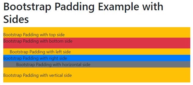
- The px is used for horizontal padding which is adjust left and right side.
- The py works for vertical padding which is adjust the top and bottom side.
Example #3: With Breakpoint
Code:
<!DOCTYPE html>
<html>
<head>
<title>Bootstrap padding Example</title>
<meta charset = "utf-8">
<meta name = "viewport" content = "width=device-width, initial-scale=1">
<link rel = "stylesheet" href = "https://maxcdn.bootstrapcdn.com/bootstrap/4.5.2/css/bootstrap.min.css">
<script src = "https://ajax.googleapis.com/ajax/libs/jquery/3.5.1/jquery.min.js">
</script>
<script src = "https://cdnjs.cloudflare.com/ajax/libs/popper.js/1.16.0/umd/popper.min.js">
</script>
<script src = "https://maxcdn.bootstrapcdn.com/bootstrap/4.5.2/js/bootstrap.min.js">
</script>
</head>
<body>
<div class="container">
<h1> Bootstrap Padding Example with Breakpoint </h1>
<div class = "pt-xs-3 bg-warning"> Bootstrap xs breakpoint Padding </div>
<div class = "pt-sm-3 bg-info"> Bootstrap sm breakpoint Padding </div>
<div class = "pt-md-3 bg-warning"> Bootstrap md breakpoint Padding </div>
<div class = "pt-lg-3 bg-danger"> Bootstrap lg breakpoint Padding </div>
<div class = "pt-xl-3 bg-warning"> Bootstrap xl breakpoint Padding </div>
<div class = "pt-3 bg-primary"> Bootstrap no breakpoint Padding </div></div>
</body>
</html>
Output:

Description:
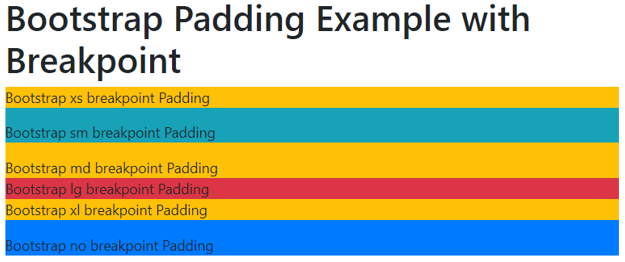
- The xs breakpoint is less than 576px device screen means there no needed any breakpoint.
- The sm, md, lg, xl has the main four breakpoints as per device screen size.
- The breakpoint makes responsive padding of the web application.
Example #4
Code:
<!DOCTYPE html>
<html>
<head>
<title>Bootstrap padding Example</title>
<meta charset="utf-8">
<meta name = "viewport" content = "width=device-width, initial-scale=1">
<link rel = "stylesheet" href = "https://maxcdn.bootstrapcdn.com/bootstrap/4.5.2/css/bootstrap.min.css">
<script src = "https://ajax.googleapis.com/ajax/libs/jquery/3.5.1/jquery.min.js">
</script>
<script src = "https://cdnjs.cloudflare.com/ajax/libs/popper.js/1.16.0/umd/popper.min.js">
</script>
<script src = "https://maxcdn.bootstrapcdn.com/bootstrap/4.5.2/js/bootstrap.min.js">
</script>
</head>
<body>
<div class="container">
<h1> Bootstrap Padding Example </h1>
<div class = "p-5 bg-warning"> Bootstrap Padding
<div class = "p-4 bg-info"> Bootstrap Padding
<div class = "p-2 bg-warning"> Bootstrap Padding
<div class = "p-3 bg-danger"> Bootstrap Padding
</div>
</div>
</div>
</div>
</div>
</body>
</html>
Output:

Conclusion
- This is a useful utility in the web application for designing and spacing purposes.
- It makes an attractive, user-friendly web application using a padding class.
- It is an essential component to make elements and their borders sorted and easy to understand.

