Introduction to Bootstrap Page Layout
The page layout is the design of the web application. It is designed and arranges header, footer, margin, content, etc. It is managed text, images, and so many objects on a web application using bootstrap. It has two types of the page layout. The first is the fixed layout and the second is the fluid layout. The fixed-layout has a particular width size but the fluid layout has 100% full width of application. The header, footer, sidebar, main content, and navigational bar mainly needed for page layout.
Syntax
The page layout syntaxes are below.
1. The fixed bootstrap layout
<div class ="container">
<!—-
The header, footer, sidebar, main content, and navigational bar mainly needed for page layout.
-->
</div>
2. The fluid bootstrap layout
<div class ="container-fluid">
<!—-
The header, footer, sidebar, main content, and navigational bar mainly needed for page layout.
-->
</div>
3. The responsive page layout using a breakpoint. Container-(breakpoint) class used for particular screen width devices.
<div class ="container-sm">
<!—-
The header, footer, sidebar, main content, and navigational bar mainly needed for page layout.
-->
</div>
How Does Bootstrap Page Layout Work?
The container class is used to understand the layout. The sidebar, navigation bar, grid system and footer used inside of the container. To know how the works page layout shows the below syntax with the demo.
<div class ="container">
<nav class ="navbar navbar-expand-sm bg-dark">
<ul class ="navbar-nav">
<li class ="nav-item">
<a class ="nav-link" href="#"> ITEM1 </a>
</li>
<li class ="nav-item">
<a class ="nav-link" href="#"> ITEM2 </a>
</li>
<li class ="nav-item">
<a class ="nav-link" href ="#"> ITEM3 </a>
</li>
</ul>
</nav>
<div class ="row">
<div class ="col-sm-4"> <div class ="sidenav">
<a href="#"> ITEM1 </a> <br>
<a href="#"> ITEM2 </a> <br>
<a href="#"> ITEM3 </a> <br>
<a href="#"> ITEM4 </a> <br>
<a href="#"> ITEM5 </a>
</div>
</div>
<div class ="col-sm-8">
<h2> page layout </h2>
<p> The page layout is the design of the web application. It is designed and arranges header, footer, margin, content, and etc.
The bootstrap has two types of the page layout. The first is the fixed layout and the second is the fluid layout.
The header, footer, sidebar, main content, and navigational bar mainly needed for page layout.</p>
</div>
</div>
<div class ="footer">
<p>Footer</p>
</div>
</div>
Examples of Bootstrap Page Layout
Here are the following examples mentioned below:
Example #1
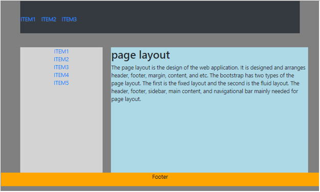
The fixed page layout example is below.
Code:
<!DOCTYPE html>
<html >
<head>
<title> Bootstrap page layout Example </title>
<meta charset ="utf-8">
<meta name ="viewport" content ="width=device-width, initial-scale=1">
<link rel ="stylesheet" href ="https://maxcdn.bootstrapcdn.com/bootstrap/4.4.1/css/bootstrap.min.css">
<script src= "https://ajax.googleapis.com/ajax/libs/jquery/3.4.1/jquery.min.js">
</script>
<script src= "https://cdnjs.cloudflare.com/ajax/libs/popper.js/1.16.0/umd/popper.min.js">
</script>
<script src= "https://maxcdn.bootstrapcdn.com/bootstrap/4.4.1/js/bootstrap.min.js">
</script>
<style>
body
{
background-color :grey;
}
.sidenav {
Background : lightgrey;
Height :230px;
margin-top :5px;
text-align :center;
}
.col-sm-8{
background-color :lightblue;
padding :1px;
margin-top :5px;
}
.footer {
position : fixed;
left : 0;
width : 100%;
background-color : orange;
color : black;
text-align : center;
}
</style>
</head>
<body>
<div class ="container">
<nav  class ="navbar navbar-expand-sm bg-dark">
<ul class= "navbar-nav">
<li class= "nav-item">
<a class= "nav-link" href="#"> ITEM1 </a>
</li>
<li class= "nav-item">
<a class= "nav-link" href="#"> ITEM2 </a>
</li>
<li class= "nav-item">
<a class= "nav-link" href="#"> ITEM3 </a>
</li>
</ul>
</nav>
<div class= "row">
<div class= "col-sm-4"> <div class="sidenav">
<a href="#"> ITEM1 </a> <br>
<a href="#"> ITEM2 </a> <br>
<a href="#"> ITEM3 </a> <br>
<a href="#"> ITEM4 </a> <br>
<a href="#"> ITEM5 </a>
</div>
</div>
<div class= "col-sm-8">
<h2> page layout </h2>
<p> The page layout is the design of the web application. It is designed and arranges header, footer, margin, content, and etc.
The bootstrap has two types of the page layout. The first is the fixed layout and the second is the fluid layout.
The header, footer, sidebar, main content, and navigational bar mainly needed for page layout.</p>
</div>
</div>
<div class= "footer">
<p>Footer</p>
</div>
</div>
</body>
</html>
Output:

Example #2
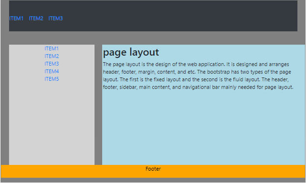
The below example is the fluid layout with output.
Code:
<!DOCTYPE html>
<html >
<head>
<title> Bootstrap page layout Example </title>
<meta charset ="utf-8">
<meta name ="viewport" content ="width=device-width, initial-scale=1">
<link rel ="stylesheet" href ="https://maxcdn.bootstrapcdn.com/bootstrap/4.4.1/css/bootstrap.min.css">
<script src= "https://ajax.googleapis.com/ajax/libs/jquery/3.4.1/jquery.min.js">
</script>
<script src= "https://cdnjs.cloudflare.com/ajax/libs/popper.js/1.16.0/umd/popper.min.js">
</script>
<script src= "https://maxcdn.bootstrapcdn.com/bootstrap/4.4.1/js/bootstrap.min.js">
</script>
<style>
body
{
background-color :grey;
}
.sidenav {
Background : lightgrey;
Height :230px;
margin-top :5px;
text-align :center;
}
.col-sm-8{
background-color :lightblue;
padding :1px;
margin-top :5px;
}
.footer {
position : fixed;
left : 0;
width : 100%;
background-color : orange;
color : black;
text-align : center;
}
</style>
</head>
<body>
<div class ="container-fluid">
<nav  class ="navbar navbar-expand-sm bg-dark">
<ul class= "navbar-nav">
<li class= "nav-item">
<a class= "nav-link" href="#"> ITEM1 </a>
</li>
<li class= "nav-item">
<a class= "nav-link" href="#"> ITEM2 </a>
</li>
<li class= "nav-item">
<a class= "nav-link" href="#"> ITEM3 </a>
</li>
</ul>
</nav>
<div class= "row">
<div class= "col-sm-4"> <div class="sidenav">
<a href="#"> ITEM1 </a> <br>
<a href="#"> ITEM2 </a> <br>
<a href="#"> ITEM3 </a> <br>
<a href="#"> ITEM4 </a> <br>
<a href="#"> ITEM5 </a>
</div>
</div>
<div class= "col-sm-8">
<h2> page layout </h2>
<p> The page layout is the design of the web application. It is designed and arranges header, footer, margin, content, and etc.
The bootstrap has two types of the page layout. The first is the fixed layout and the second is the fluid layout.
The header, footer, sidebar, main content, and navigational bar mainly needed for page layout.</p>
</div>
</div>
<div class= "footer">
<p>Footer</p>
</div>
</div>
</body>
</html>
Output:

Example #3
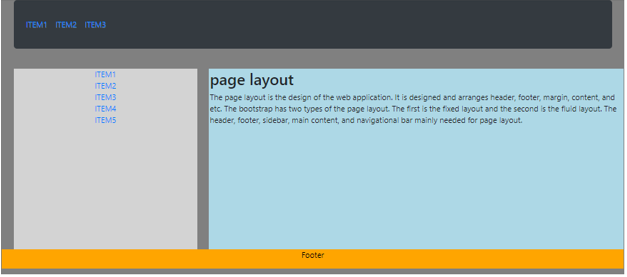
The below example is a fixed layout with a breakpoint.
Code:
<!DOCTYPE html>
<html >
<head>
<title> Bootstrap page layout Example </title>
<meta charset ="utf-8">
<meta name ="viewport" content ="width=device-width, initial-scale=1">
<link rel ="stylesheet" href ="https://maxcdn.bootstrapcdn.com/bootstrap/4.4.1/css/bootstrap.min.css">
<script src= "https://ajax.googleapis.com/ajax/libs/jquery/3.4.1/jquery.min.js">
</script>
<script src= "https://cdnjs.cloudflare.com/ajax/libs/popper.js/1.16.0/umd/popper.min.js">
</script>
<script src= "https://maxcdn.bootstrapcdn.com/bootstrap/4.4.1/js/bootstrap.min.js">
</script>
<style>
body
{
background-color :grey;
}
.sidenav {
Background : lightgrey;
Height :230px;
margin-top :5px;
text-align :center;
}
.col-sm-8{
background-color :lightblue;
padding :1px;
margin-top :5px;
}
.footer {
position : fixed;
left : 0;
width : 100%;
background-color : orange;
color : black;
text-align : center;
}
</style>
</head>
<body>
<div class ="container-lg">
<nav  class ="navbar navbar-expand-sm bg-dark">
<ul class= "navbar-nav">
<li class= "nav-item">
<a class= "nav-link" href="#"> ITEM1 </a>
</li>
<li class= "nav-item">
<a class= "nav-link" href="#"> ITEM2 </a>
</li>
<li class= "nav-item">
<a class= "nav-link" href="#"> ITEM3 </a>
</li>
</ul>
</nav>
<div class= "row">
<div class= "col-sm-4"> <div class="sidenav">
<a href="#"> ITEM1 </a> <br>
<a href="#"> ITEM2 </a> <br>
<a href="#"> ITEM3 </a> <br>
<a href="#"> ITEM4 </a> <br>
<a href="#"> ITEM5 </a>
</div>
</div>
<div class= "col-sm-8">
<h2> page layout </h2>
<p> The page layout is the design of the web application. It is designed and arranges header, footer, margin, content, and etc.
The bootstrap has two types of the page layout. The first is the fixed layout and the second is the fluid layout.
The header, footer, sidebar, main content, and navigational bar mainly needed for page layout.</p>
</div>
</div>
<div class= "footer">
<p>Footer</p>
</div>
</div>
</body>
</html>
Small screen Output:

Large screen output:

Conclusion
The page layout is an essential and necessary part of every web application. The layout in bootstrap makes web application more user friendly and understanding for every user.

