Introduction to Bootstrap Wells
The Bootstrap well is used for design and style purposes on the web page. The main purpose of it is to make a rounded border around the content of web applications. It also gives grey background and default padding to content with border. The element of web application looks sorted and effective because of it. For the developer, it is easy to use and reduce CSS style code along with HTML. The developer-only .well class required for border, background-colour, and padding.
Syntax:
- To make the rounded border with grey background colour and padding, we need only .well class.
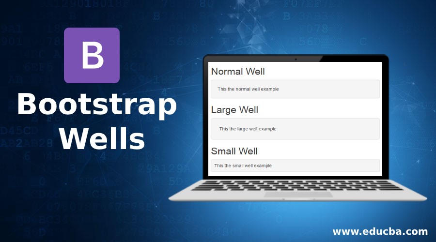
- It has three sizes; Normal, small, and large.
Normal Syntax:
<div class ="well"> NORMAL BOOTSTRAP WELL </div>- The .well class is required for normal. It gives a medium size of border and padding.
Large Syntax:
<div class ="well well-lg"> LARGE BOOTSTRAP WELL </div>- The .well-lg class is required for large wells. It gives a large size of border and padding.
Small Syntax:
<div class ="well well-sm"> SMALL BOOTSTRAP WELL </div>- The .well-sm class is required for small bootstrap wells. It gives a small size of border and padding.
How does Bootstrap Wells Work?
Given below are the examples with and without.well, class:
Example #1
With .well class in bootstrap, we can design border, padding and grey background-colour.
Code:
<!DOCTYPE>
<html>
<head>
<title> Bootstrap Wells </title>
<meta name ="viewport" content ="width=device-width, initial-scale=1">
<link rel ="stylesheet" href="https://maxcdn.bootstrapcdn.com/bootstrap/3.4.1/css/bootstrap.min.css">
<script src ="https://ajax.googleapis.com/ajax/libs/jquery/3.4.1/jquery.min.js">
</script>
<script src ="https://maxcdn.bootstrapcdn.com/bootstrap/3.4.1/js/bootstrap.min.js"></script>
</head>
<body>
<div class ="container">
<h2> Medium Wells </h2>
<div class ="well">
<p> The Bootstrap well is used for design and style purposes on the web page.
The main purpose of bootstrap well is to make a rounded border around the content of web applications.
The bootstrap well gives also grey background and default padding to content with border.
The element of web application looks sorted and effective because of bootstrap wells.<p>
</div>
</div>
</body>
</html>
Output:

Example #2
Without .well class in bootstrap, we can design border, padding and grey background-colour. We are using CSS style and .design class in HTML. In CSS, border, border-radius, background-colour, padding element has to use with sizes. The .well class in bootstrap removes all extra coding and looks more attractive web application.
Code:
<!DOCTYPE>
<html>
<head>
<title> Bootstrap Wells </title>
<style>
.design{
border:1px solid lightgrey;
background-color:#F5F5F5;
padding:12px;
border-radius: 10px;
}
</style>
</head>
<body>
<div class ="container">
<h2> Medium Wells </h2>
<div class ="design">
<p> The Bootstrap well is used for design and style purposes on the web page.
The main purpose of bootstrap well is to make a rounded border around the content of web applications.
The bootstrap well gives also grey background and default padding to content with border.
The element of web application looks sorted and effective because of bootstrap wells.<p>
</div>
</div>
</body>
</html>
Output:

Examples
Given below are the examples:
Example #1
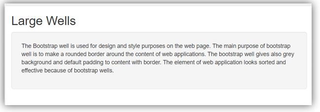
The following example is the large wells in bootstrap. The .well-lg class is needed for large wells. The padding size is large in between borders and content.
Code:
<!DOCTYPE>
<html>
<head>
<title> Bootstrap Wells </title>
<meta name ="viewport" content ="width=device-width, initial-scale=1">
<link rel ="stylesheet" href="https://maxcdn.bootstrapcdn.com/bootstrap/3.4.1/css/bootstrap.min.css">
<script src ="https://ajax.googleapis.com/ajax/libs/jquery/3.4.1/jquery.min.js">
</script>
<script src ="https://maxcdn.bootstrapcdn.com/bootstrap/3.4.1/js/bootstrap.min.js"></script>
</head>
<body>
<div class ="container">
<h2> Large Wells </h2>
<div class ="well well-lg">
<p> The Bootstrap well is used for design and style purposes on the web page.
The main purpose of bootstrap well is to make a rounded border around the content of web applications.
The bootstrap well gives also grey background and default padding to content with border.
The element of web application looks sorted and effective because of bootstrap wells.<p>
</div>
</div>
</body>
</html>
Output:

Example #2
The following example is the small wells in bootstrap. The .well-sm class is needed for small wells. The padding size is small in-between border and content.
Code:
<!DOCTYPE>
<html>
<head>
<title> Bootstrap Wells </title>
<meta name ="viewport" content ="width=device-width, initial-scale=1">
<link rel ="stylesheet" href="https://maxcdn.bootstrapcdn.com/bootstrap/3.4.1/css/bootstrap.min.css">
<script src ="https://ajax.googleapis.com/ajax/libs/jquery/3.4.1/jquery.min.js">
</script>
<script src ="https://maxcdn.bootstrapcdn.com/bootstrap/3.4.1/js/bootstrap.min.js"></script>
</head>
<body>
<div class ="container">
<h2> Small Wells </h2>
<div class ="well well-sm">
<p> The Bootstrap well is used for design and style purposes on the web page.
The main purpose of bootstrap well is to make a rounded border around the content of web applications.
The bootstrap well gives also grey background and default padding to content with border.
The element of web application looks sorted and effective because of bootstrap wells.<p>
</div>
</div>
</body>
</html>
Output:

Example #3
We can see wells with the table in bootstrap. How to work well in class with table class. The .well class manages the border and spacing between every row and column of the table.
Code:
<!DOCTYPE>
<html>
<head>
<title> Bootstrap Wells </title>
<meta name ="viewport" content="width=device-width, initial-scale=1">
<link rel ="stylesheet" href="https://maxcdn.bootstrapcdn.com/bootstrap/3.4.1/css/bootstrap.min.css">
<script src ="https://ajax.googleapis.com/ajax/libs/jquery/3.4.1/jquery.min.js"></script>
<script src ="https://maxcdn.bootstrapcdn.com/bootstrap/3.4.1/js/bootstrap.min.js"></script>
</head>
<body>
<div class ="container">
<h2> Basic Table with wells in bootstrap </h2>
<table class ="well table">
<thead>
<tr>
<th> Username </th>
<th> Email </th>
<th> City </th>
</tr>
</thead>
<tbody>
<tr>
<td> Manav </td>
<td> red1@gmail.com </td>
<td> Pune </td>
</tr>
<tr>
<td> Sadhan </td>
<td> techn@yahoo.com </td>
<td> Nashik </td>
</tr>
<tr>
<td> Merry </td>
<td> digit@rediff.com </td>
<td> Mumbai </td>
</tr>
</tbody>
</table>
</div>
</body>
</html>
Output:
Example #4
The following example is a combination of .well class and form in bootstrap. The .well class gives perfect spacing and border for the form element.
Code:
<!DOCTYPE>
<html>
<head>
<title> Bootstrap Wells </title>
<meta name="viewport" content="width=device-width, initial-scale=1">
<link rel="stylesheet" href="https://maxcdn.bootstrapcdn.com/bootstrap/3.4.1/css/bootstrap.min.css">
<script src="https://ajax.googleapis.com/ajax/libs/jquery/3.4.1/jquery.min.js"></script>
<script src="https://maxcdn.bootstrapcdn.com/bootstrap/3.4.1/js/bootstrap.min.js"></script>
</head>
<body>
<div class="container">
<h2> Default form </h2>
<form class="well well-lg" >
<div class="form-group">
<label> User Name: </label>
<input type="text" class="form-control" placeholder="Enter Username">
</div>
<div class="form-group">
<label> Email: </label>
<input type="email" class="form-control" placeholder="Enter EmailId">
</div>
<div class="form-group">
<label> Contact Number: </label>
<input type="text" class="form-control" placeholder="Enter contact number">
</div>
<button type="submit" class="btn btn-default">Submit</button>
</form>
</div>
</body>
</html>
Output:

Conclusion
These are used for the rounded border with specific padding between content and border. This gives a grey background-colour for content in web applications. The web application looks elegant, user-friendly and sophisticated because of it.


