Introduction to Bootstrap Collapse Navbar
Navigation bar (Navbar) is a header or index of the web application. It is always placed on top of the web page. The collapse in bootstrap is used for space-saving of large content. It is hidden and shows the content when the user wants. A collapse navigation bar in bootstrap is the combination of collapse in the Navbar. Navbar content can hide and show according to the requirement of the user using collapse Navbar. It becomes a responsive navigation bar for screen size.
Syntax
The following syntax is basic collapse navbar in bootstrap.
You can see the many navbars and collapsing classes used to make responsive Navbar.
<nav class ="navbar navbar-expand-xl navbar-dark bg-dark">
<a class ="navbar-brand" href ="#"> Website Name </a>
<button class ="navbar-toggler" type ="button" data-toggle ="collapse" data-target ="#colNav">
<span class ="navbar-toggler-icon"></span>
</button>
<div class ="collapse navbar-collapse" id ="colNav">
<ul class ="navbar-nav">
<li class ="nav-item">
<a class ="nav-link" href="#"> Services </a>
</li>
<li class ="nav-item">
<a class ="nav-link" href ="#"> About Us</a>
</li>
<li class ="nav-item">
<a class ="nav-link" href ="#"> Contact Us </a>
</li>
</ul>
</div>
</nav>
How to work it in Bootstrap?
The Navbar needed navbar-expand-size (xl /lg /sm /md) class to make responsive collapse navbar. You can choose the screen size according to the requirement of the user. The navbar-toggler class is used for navigation bar toggling or responsive navbar.
The data-toggler= “collapse” is used with navbar-toggler for the working button. This button helps to hide and show the items of the navbar. collapse navbar-collapse class is placed in the main div tag. This class is used for control and cover all the content Navbar with collapsing.
The button and content connect using id =”idname” and data-target =”#idName”.
Code:
<!DOCTYPE>
<html>
<head>
<title> Bootstrap Collapse Navbar </title>
<meta charset ="utf-8">
<meta name ="viewport" content ="width=device-width, initial-scale=1">
<link rel ="stylesheet" href="https://maxcdn.bootstrapcdn.com/bootstrap/3.4.1/css/bootstrap.min.css">
<script src ="https://ajax.googleapis.com/ajax/libs/jquery/3.4.1/jquery.min.js"> </script>
<script src ="https://maxcdn.bootstrapcdn.com/bootstrap/3.4.1/js/bootstrap.min.js"> </script>
</head>
<body>
<nav class ="navbar navbar-expand-xl navbar-dark bg-dark">
<a class ="navbar-brand" href ="#"> Website Name </a>
<button class ="navbar-toggler" type ="button" data-toggle ="collapse" data-target ="#colNav">
<span class ="navbar-toggler-icon"></span>
</button>
<div class ="collapse navbar-collapse" id ="colNav">
<ul class ="navbar-nav">
<li class ="nav-item">
<a class ="nav-link" href="#"> Services </a>
</li>
<li class ="nav-item">
<a class ="nav-link" href ="#"> About Us</a>
</li>
<li class ="nav-item">
<a class ="nav-link" href ="#"> Contact Us </a>
</li>
</ul>
</div>
</nav>
<div class ="container">
<h3> Collapsible Navbar in Bootstrap </h3>
Navigation bar (Navbar) is a header or index of the web application. It is always placed on top of the web page. <br>
The collapse in bootstrap is used for space-saving of large content. It is hidden and shows the content when the user wants.
</div>
</body>
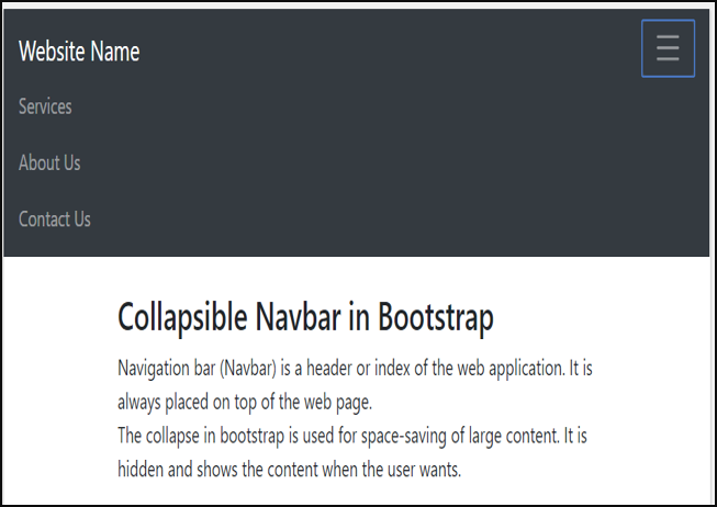
You can see the hiding Navbar content and showing Navbar content outputs below.
We can see the difference between hiding navbar content and displaying navbar content with these two output images.
Hiding Navbar Output:

Showing Navbar content Output:

Examples of Collapse Navbar
To more understanding about collapse Navbar in bootstrap follow the below examples.
Using different classes, tags and attributes developers can create more attractive Navbar.
Example #1
Code:
<!DOCTYPE html>
<html>
<head>
<title> Bootstrap Collapse Navbar </title>
<meta charset ="utf-8">
<meta name ="viewport" content ="width=device-width, initial-scale=1">
<link rel ="stylesheet" href="https://maxcdn.bootstrapcdn.com/bootstrap/3.4.1/css/bootstrap.min.css">
<script src ="https://ajax.googleapis.com/ajax/libs/jquery/3.4.1/jquery.min.js"> </script>
<script src ="https://maxcdn.bootstrapcdn.com/bootstrap/3.4.1/js/bootstrap.min.js"> </script>
</head>
<body>
<nav class ="navbar navbar-light bg-light">
<a class ="navbar-brand" href ="#"> Website Name </a>
<button class ="navbar-toggler" type ="button" data-toggle ="collapse" data-target ="#colNav">
<span class ="navbar-toggler-icon"></span>
</button>
<div class ="collapse navbar-collapse" id ="colNav">
<ul class ="navbar-nav">
<li class ="nav-item">
<a class ="nav-link" href="#"> Services </a>
</li>
<li class ="nav-item">
<a class ="nav-link" href ="#"> About Us</a>
</li>
<li class ="nav-item">
<a class ="nav-link" href ="#"> Contact Us </a>
</li>
</ul>
</div>
</nav>
<div class ="container">
<h3> Collapsible Navbar in Bootstrap </h3>
Navigation bar (Navbar) is a header or index of the web application. It is always placed on top of the web page. <br>
The collapse in bootstrap is used for space-saving of large content. It is hidden and shows the content when the user wants.
</div>
</body>
</html>
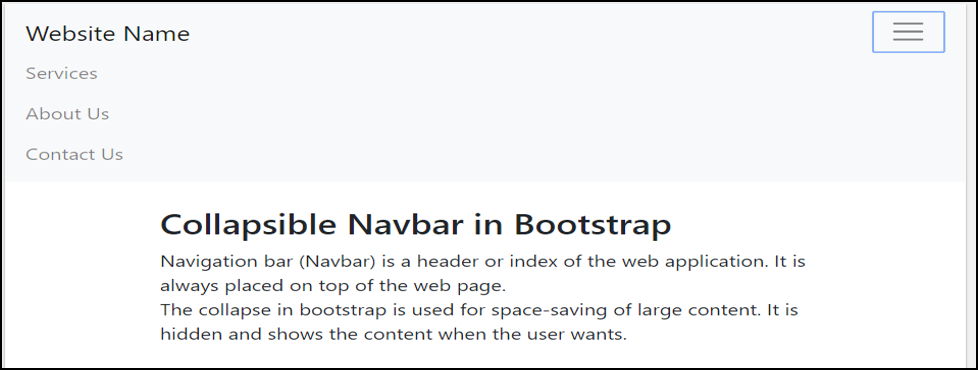
Output:

Description:
The navbar-light and bg-light classes are using to make Navbar light color. If collapse navigation bar used for large screen then navbar-expand-size (xl /lg /sm /md) class is not needed. Navbar content display vertically after clicking on the button.
Example #2
Code:
<html>
<head>
<title> Bootstrap Collapse Navbar </title>
<meta charset ="utf-8">
<meta name ="viewport" content ="width=device-width, initial-scale=1">
<link rel ="stylesheet" href="https://maxcdn.bootstrapcdn.com/bootstrap/3.4.1/css/bootstrap.min.css">
<script src ="https://ajax.googleapis.com/ajax/libs/jquery/3.4.1/jquery.min.js"> </script>
<script src ="https://maxcdn.bootstrapcdn.com/bootstrap/3.4.1/js/bootstrap.min.js"> </script>
</head>
<body>
<div class ="col">
<div class ="collapse" id="navbar1">
<div class ="bg-dark p-2">
<ul class ="nav navbar-nav navbar-right">
<class ="active"><a href="#">Home</a>
<a href ="#"> About Us </a>
<a href ="#"> Services </a>
<a href ="#"> Contact Us </a>
</ul>
</div>
</div>
<nav class ="navbar navbar-light bg-light">
<button class ="navbar-toggler" type="button" data-toggle="collapse" data-target="#navbar1">
<span class ="navbar-toggler-icon"></span>
</button>
</nav>
</div>
<div class ="container">
<h3> Collapsible Navbar in Bootstrap </h3>
Navigation bar (Navbar) is a header or index of the web application. It is always placed on top of the web page. <br>
The collapse in bootstrap is used for space-saving of large content. It is hidden and shows the content when the user wants.
</div>
</body>
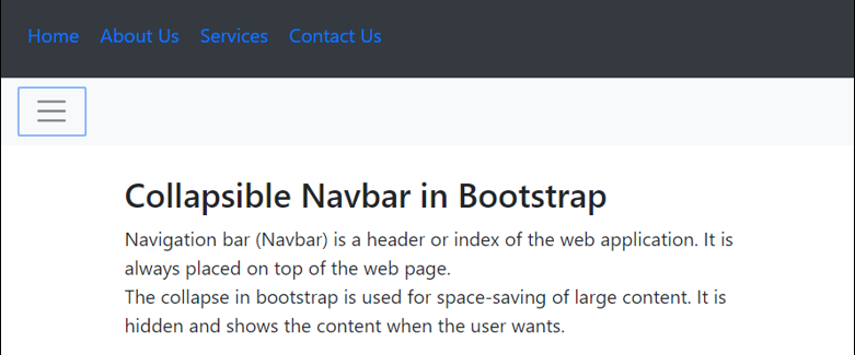
</html>Output:

If the navbar is placed below then button move and content are stable on top.
Example #3
Code:
<html>
<head>
<title> Bootstrap Collapse Navbar </title>
<meta charset ="utf-8">
<meta name ="viewport" content ="width=device-width, initial-scale=1">
<link rel ="stylesheet"
href="https://maxcdn.bootstrapcdn.com/bootstrap/3.4.1/css/bootstrap.min.css">
<script src ="https://ajax.googleapis.com/ajax/libs/jquery/3.4.1/jquery.min.js"> </script>
<script src ="https://maxcdn.bootstrapcdn.com/bootstrap/3.4.1/js/bootstrap.min.js"> </script>
</head>
<body>
<div class ="col">
<nav class ="navbar navbar-light bg-light">
<button class ="navbar-toggler" type="button" data-toggle="collapse" data-target="#navbar1">
<span class ="navbar-toggler-icon"></span>
</button>
</nav>
<div class ="collapse" id="navbar1">
<div class ="bg-dark p-2">
<ul class ="nav navbar-nav navbar-right">
<class ="active"><a href="#">Home</a>
<a href ="#"> About Us </a>
<a href ="#"> Services </a>
<a href ="#"> Contact Us </a>
</ul>
</div>
</div>
</div>
<div class ="container">
<h3> Collapsible Navbar in Bootstrap </h3>
Navigation bar (Navbar) is a header or index of the web application. It is always placed on top of the web page. <br>
The collapse in bootstrap is used for space-saving of large content. It is hidden and shows the content when the user wants.
</div>
</body>
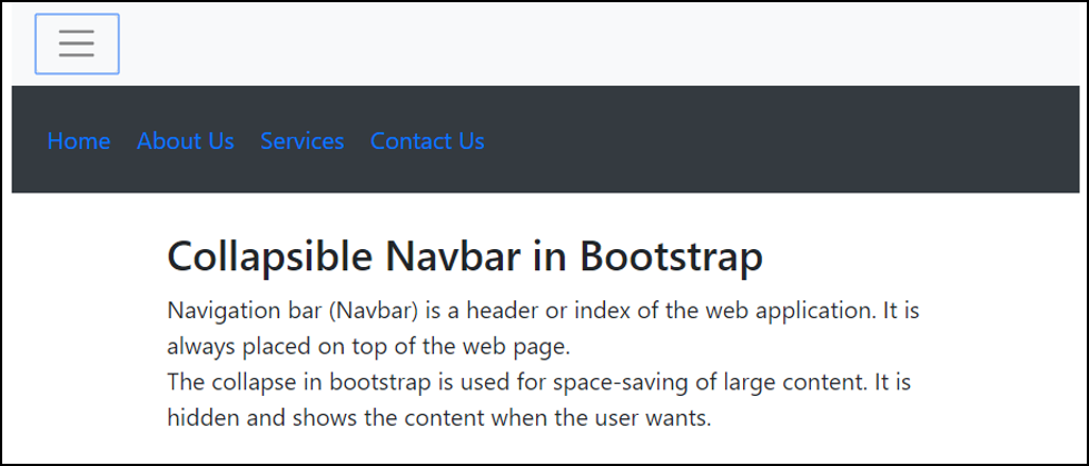
</html>Output:

Conclusion
Collapse navbar in bootstrap placed at the top of the web application with a small button. Because of the collapsed navbar, the header looks elegant and attractive. This is used for saving space for large content.

