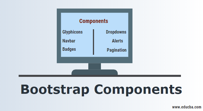
Introduction to Bootstrap Components
Originally called as the Twitter Blueprint, this was developed by Mark Otto and Jacob Thronton at Twitter. Bootstrap is a free CSS framework that imparts responsiveness to web pages. By responsiveness, it means that different DOM elements resize themselves accordingly with the change in the screen size without compromising the elegance of the web page as it would otherwise happen traditionally with pixel or percentage sizing CSS methods.
This is also called the ‘mobile-first CSS framework as it is designed to have a CSS Grid layout by defining the rows and columns. This framework also has JavaScript components along with CSS classes. In order to utilize this framework, you must mandatorily link jQuery and JavaScript Framework for Bootstrap along with the other Bootstrap CSS files. These CSS files are available for download as well as in the form of CDNs (Content Delivery Networks).
Different Bootstrap Components
Bootstrap is bundled with tons of components that can be reused to provide a good user experience and user interactions in a web page like navigation bars, pop-ups, dropdowns, icons, buttons, pre-designed forms and also sizing options for different DOM elements.
1. Glyphicons
These are the font formatted icons that are available in Bootstrap. They are about 200 in number. These glyphicons can be found at https://glyphicons.com.
How to use it?
There are glyphicons to denote almost all actions like zoom, edit, warning, file, delete, etc., and they are defined in an individual class. So, you need to use the base class and individual class, ideally in a span element and use these glyphicons.
Syntax:
<p><span class = "glyphicons glyphicon-pencil"></span></p>2. Dropdowns
These are the toggle-based menus that list a list of links. These are made more dynamic by the JS plugin and can be found at http://getbootstrap/javascript/#dropdowns
How to use it?
You need to use the .dropdown class as the element’s class have the list items under it with the class .dropdown-menu.
Syntax:
<div class= "dropdown"><!-- have your list in this with the class .dropdown-menu --></div>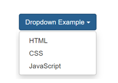
3. Button groups
With this Bootstrap component, you can group a set of buttons together in a series adjacent to each other.
How to use it?
Define division elements with .btn-group class and nest those elements with a button with .btn class.
<div class="btn-group"><button class= "btn">Correct</button></div>
<div class="btn-group"><button class= "btn">Wrong</button></div>
4. Button dropdowns
This component is used to employ a button element to trigger a dropdown.
Syntax:
<button class = “btn-default dropdown-toggle”><!—Write the dropdown component here --></button>
5. Input groups
This extends the form-control class and adds text or buttons at either side of an input field of an input element. You need to use a .input-group class with a .input-group-addon class in order to use these input groups.
Syntax:
<div class="input-group">
<span class="input-group-addon" id="basic-addon1">@</span>
<input type="text" class="form-control" placeholder="Username" aria-describedby="basic-addon1">
</div>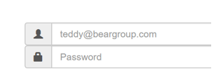
6. Navbar
These components serve as the navigation headers for your website. They are collapsed to be expanded vertically with a toggling hamburger menu in the devices of smaller screen sizes and become horizontal as the screen width increases.
Syntax:
<nav class = "navbar"><!—Code your navigation DOM elements --></nav>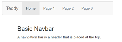
7. Jumbotron
This is a bootstrap component that can extend over the full screen (or viewport) to show some key content.
Syntax:
<div class = "jumbotron"><!—Write your content within DOM elements here --></div>
8. Alerts
This is a Bootstrap component with a jQuery plugin that provides contextual feedback messages depending upon the user action. This is basically used to display alert messages.
Syntax:
<div class="alert alert-success" role="alert">...</div>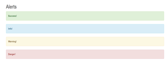
9. Progress bars
This component is used to provide the visuals on the feedback on the progress of work or action with a progress bar.
Synatx:
<div class="progress-bar" role="progressbar" aria-valuenow="60" aria-valuemin="0" aria-valuemax="100" style="width: 60%;">Example:
![]()
10. Badges
This is a component to highlight something like unread items by adding the class .badge to the DOM element, preferably a span.
Syntax:
<button class="btn btn-primary" type="button">
Messages <span class="badge">3</span>
</button>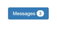
11. Pagination
This component gives your site multi-page pagination so that the content can

be split into multiple pages and navigated at ease. Usually, the DOM element for unordered lists is defined with this class .pagination.
Syntax:
<ul class = "pagination"><!—List elements goes here --></ul>How will this help in your career?
All businesses are now focusing on User Interaction and User Experience (UI/UX). Because the vast majority of the population is using handheld devices like tablets and smartphones, which widely vary in terms of their pixel resolution and screen size, this is why it is really important to have a front-end design that is responsive enough to adjust itself to any kind of screen without compromising the elegance of the webpage.
So, being skilled at Bootstrap would add up value to your technical career, and companies would look forward to hiring you with a handsome paycheck. And, because it is free & open-source, there is a lot of scopes for you to contribute as a developer and make it still better than what it is today.
Conclusion
Bootstrap framework is a very handy tool for bringing in responsiveness to web pages. The components explained in this blog are some of the very widely used ones that help you write less code for more functionality and add more elegance to the web page that you’re building.

