Introduction to Pull Right Bootstrap
The pull right is the utility class in bootstrap used to place the information right side of the display screen. The pull-right class is utilized to keep the content or element right side of the grid system in the bootstrap. The pull right utility class is used to float the element on the right side of the web application screen. The pull-right class is used up to bootstrap3, after bootstrap 4 it is replaced with float-right.
Syntax:
- The pull right syntax is below.
<div class ="pull-right">
This div placed to the right side of the screen device.
</div>- The pull-right class used in the <div> tag.
- The required information and content are placed inside of the <div> tag.
- The required content is displayed on the right side of the web application screen.
How does Bootstrap Pull Right work?
Below are the different steps for working of Pull Right:
Step 1:
- The HTML page has to create for the web application in the bootstrap.
Step 2:
- There have two ways to add the bootstrap framework file which is below.
- The bootstrap file downloads from the respective website and places the path and link in the head section.
- The online bootstrap support file is also added in the head section of the web page.
<link rel = "stylesheet" href = "https://maxcdn.bootstrapcdn.com/bootstrap/3.4.1/css/bootstrap.min.css">
<script src = "https://ajax.googleapis.com/ajax/libs/jquery/3.5.1/jquery.min.js">
</script>
<script src = "https://maxcdn.bootstrapcdn.com/bootstrap/3.4.1/js/bootstrap.min.js">
</script>
Step 3:
- The bootstrap is responsive for mobile, desktop, notepad devices. The framework has a mobile-first responsive priority.
- The below tag and attribute are added in the head section for a responsive web application.
<meta name = "viewport" content = "width = device-width, initial-scale =1">Step 4:
- The pull-right class is placed inside the body section of the HTML file.
<div class ="pull-right">
This div placed to the right side of screen device.
</div>- The union of pull-right working steps is below.
<!DOCTYPE html>
<html>
<head>
<title>  Bootstrap pull-right class Example  </title>
<meta charset = "utf-8">
<meta name = "viewport" content = "width = device-width, initial-scale=1">
<link rel = "stylesheet" href = "https://maxcdn.bootstrapcdn.com/bootstrap/3.4.1/css/bootstrap.min.css">
<script src = "https://ajax.googleapis.com/ajax/libs/jquery/3.5.1/jquery.min.js">    </script>
<script src = "https://maxcdn.bootstrapcdn.com/bootstrap/3.4.1/js/bootstrap.min.js">   </script>
</head>
<body>
<div class = "pull-right">
This div placed to the right side of screen device.
</div>
</body>
</html>- The basic pull-right class working procedure is above.
Examples
Below are the different examples of Pull Right:
Example #1
The basic pull-right class in the example and output are below.
<!DOCTYPE html>
<html>
<head>
<title> Bootstrap pull-right class Example </title>
<meta charset="utf-8">
<meta name = "viewport" content="width=device-width, initial-scale=1">
<link rel = "stylesheet" href = "https://maxcdn.bootstrapcdn.com/bootstrap/3.4.1/css/bootstrap.min.css">
<script src = "https://ajax.googleapis.com/ajax/libs/jquery/3.5.1/jquery.min.js">
</script>
<script src = "https://maxcdn.bootstrapcdn.com/bootstrap/3.4.1/js/bootstrap.min.js">   </script>
</head>
<body>
<h3> Bootstrap pull-right class </h3>
<div class = "container">
This div placed to the default position of screen device.
</div> <br>
<div class = "container pull-right">
<b> This div placed to the right side of screen device. </b>
</div> <br> <br>
<div class = "container">
This div placed to the default position of screen device.
</div>
</body>
</html>
Output:

Description:
- The container class is placed in the body section of the web page.
- The content of the container class shown on the default position of the display screen.
- The pull-right class added in the second <div> tag.
- The content of the container shows on the right side of the display screen.
Example #2
The responsive pull-right bootstrap example and output are below.
<!DOCTYPE html>
<html>
<head>
<title> Bootstrap pull-right class Example </title>
<meta name = "viewport" content = "width = device-width, initial-scale =1">
<link rel = "stylesheet" href = "https://maxcdn.bootstrapcdn.com/bootstrap/3.4.1/css/bootstrap.min.css">
<script src = "https://ajax.googleapis.com/ajax/libs/jquery/3.5.1/jquery.min.js">
</script>
<script src = "https://maxcdn.bootstrapcdn.com/bootstrap/3.4.1/js/bootstrap.min.js">   </script>
<style>
.container-fluid {
width: 200px;
height:100px;
background-color: yellow;
}
.container {
width: 200px;
height: 100px;
background-color: orange;
}
</style>
</head>
<body>
<center>
<h3> Bootstrap pull-right class </h3>
</center>
<div class = "container ">
<p>This div placed to the default position of screen device. </p>
</div> <br> <br>
<div class = "container-fluid pull-right">
<b> this div placed to the right side of screen device. </b>
</div>
</body>
</html>
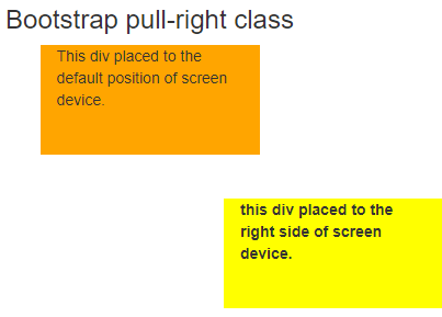
Output 1:
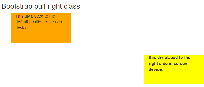
Output 2:
Description:
- The bootstrap container can place the right side on the display screen using a pull-right class.
- The container class is placed on the default position of the screen device.
- The container-fluid was placed on the right side due to pull-right classes used with the container-fluid class.
- The pull-right container is responsive for mobile, laptop, desktop device screens.
Example #3
The pull-right class with bootstrap table example and output is below.
<!DOCTYPE html>
<html>
<head>
<title> Bootstrap pull-right class Example </title>
<meta name = "viewport" content = "width = device-width, initial-scale=1">
<link rel = "stylesheet" href = "https://maxcdn.bootstrapcdn.com/bootstrap/3.4.1/css/bootstrap.min.css">
<script src = "https://ajax.googleapis.com/ajax/libs/jquery/3.5.1/jquery.min.js">
</script>
<script src = "https://maxcdn.bootstrapcdn.com/bootstrap/3.4.1/js/bootstrap.min.js">
</script>
<style>
.pull-right {
background-color: orange;
}
</style>
</head>
<body>
<div class = "container">
<h2> Bootstrap pull-right class with Table </h2>
<table class = "table table-bordered">
<thead>
<tr>
<th> Name </th>
<th> Mobile </th>
<th> city </th>
</tr>
</thead>
<tbody>
<tr>
<td> Aman </td>
<td class = "pull-right"> 7765757577 </td>
<td> man@gmail.com </td>
</tr>
<tr>
<td> Radha </td>
<td class = "pull-right"> 9567543212 </td>
<td > radham@yahoo.com </td>
</tr>
</tbody>
</table>
</div>
</body>
</html>
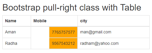
Output:
Description:
- The pull-right class is placed in the <td> tag of mobile.
- The content of the mobile column is placed on the right side and the rest of the content is placed on the left side of the column.
- The orange color column is using a pull-right class to float the mobile number on the right side.
Example #4
The basic pull-right class with button example and output is below.
<!DOCTYPE html>
<html>
<head>
<title>  Bootstrap pull-right class Example  </title>
<meta charset = "utf-8">
<meta name = "viewport" content = "width = device-width, initial-scale=1">
<link rel = "stylesheet" href = "https://maxcdn.bootstrapcdn.com/bootstrap/3.4.1/css/bootstrap.min.css">
<script src = "https://ajax.googleapis.com/ajax/libs/jquery/3.5.1/jquery.min.js">    </script>
<script src = "https://maxcdn.bootstrapcdn.com/bootstrap/3.4.1/js/bootstrap.min.js">   </script>
</head>
<body>
<h3> Bootstrap pull-right class </h3>
<button type= "button" class= "btn btn-success"> login </button>
<br>
<button type= "button" class= "btn btn-danger pull-right"> cancel </button>
<br>
<button type= "button" class= "btn btn-info"> register </button>
<br>
<button type= "button" class= "btn btn-warning pull-right"> submit </button>
<br>
</body>
</html>
Output:
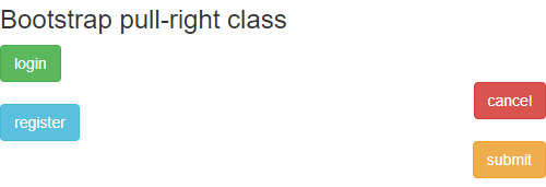
Description:
- The basic class is used in the bootstrap system to float the buttons on the right side.
- The cancel and submit button is placed on the right side using a pull-right class.
Conclusion
- The pull-right class is used for the design and style purpose of the web application content.
- The pull-right makes web application content attractive for users and highlights some important information.
- The bootstrap pull-right class is a utility component used for elegant and user-friendly design.