Introduction to Bootstrap Grid Table
The bootstrap grid table is a convenient way to make a responsive web application. A total of twelve columns were assigned for the web page. We can modify it as per the requirement of the user. We can group them and make the width of columns wide. The bootstrap grid table helps to make web applications according to screen size and it can be re-arranged as per need. It is a vital part of bootstrap to make applications or websites more animated and user-friendly. It helps to make layout shape in all screen sizes of devices.
Explain Different Type of Bootstrap Grid Table
This can be categorized in two ways.
- Based on the grouping of columns.
- Based on screen size with the grouping of columns.
Based on the grouping of columns.
- The container class or container-fluid class is required to contain the required element.
- The row class includes inside of the container class or container-fluid class. The row class helps to hold columns of the grid table.
- The class col used to make different grid tables as per the grouping column requirement.
- The twelve columns in the grid table.
<div class= "container">
<div class="row">
<div class="col-sm-1"> Col1 </div> <div class="col- sm-1"> Col2 </div>
<div class="col- sm-1"> Col3</div><div class="col- sm-1"> Col4</div>
<div class="col- sm-1"> Col5</div><div class="col- sm-1"> Col6</div>
<div class="col- sm-1"> Col7</div><div class="col- sm-1"> Col8</div>
<div class="col- sm-1"> Col9</div><div class="col- sm-1"> Col10</div>
<div class="col- sm-1"> Col11</div><div class="col- sm-1"> Col12</div>
</div>
</div>| Col1 | Col2 | Col3 | Col4 | Col5 | Col6 | Col7 | Col8 | Col9 | Col10 | Col11 | Col12 |
- The equal grouping columns in the grid table.
<div class= "container">
<div class="row">
<div class="col- sm-6"> Col1 </div>
<div class="col- sm-6"> Col2 </div>
</div>
</div>| Col1 | Col2 |
<div class= "container">
<div class="row">
<div class="col- sm-4"> Col1 </div>
<div class="col- sm-4"> Col2 </div>
<div class="col- sm-4"> Col3 </div>
</div>
</div>| Col1 | Col2 | Col3 |
- The unequal grouping column in the grid table.
<div class= "container">
<div class="row">
<div class="col- sm-2"> Col1 </div>
<div class="col- sm-4"> Col2 </div>
<div class="col- sm-6"> Col3 </div>
</div>
</div>| Col1 | Col2 | Col3 |
- The responsive grid table is used according to the screen size of devices.
The syntax is class=”col-*-*”.
The first star is used for screen size and a second star for column width.
1. The xs (extra small) screen size is used for the phone.
<div class= "container">
<div class="row">
<div class="col-xs-6"> Col1 </div>
<div class="col-xs-6"> Col2 </div>
</div>
</div>
2. The sm (small) screen size is used for tablets.
<div class= "container">
<div class="row">
<div class="col-sm-6"> Col1 </div>
<div class="col-sm-6"> Col2 </div>
</div>
</div>
3. The md (medium) screen size is used for small laptops.
<div class= "container">
<div class="row">
<div class="col-md-6"> Col1 </div>
<div class="col-md-6"> Col2 </div>
</div>
</div>
4. The lg (large) screen size is used for laptops and desktops.
<div class= "container">
<div class="row">
<div class="col-lg-6"> Col1 </div>
<div class="col-lg-6"> Col2 </div>
</div>
</div>- The output is the same for all screen sizes but the layout adjusts as per screen size or breakpoint.
| Col1 | Col2 |
Examples
Here are the following examples as mentioned below.
Example #1
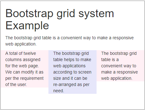
The basic grid table uses an extra small screen size.
Code:
<!DOCTYPE html>
<html>
<head>
<title>Bootstrap grid system Example</title>
<meta name= "viewport" content= "width=device-width, initial-scale=1">
<link rel= "stylesheet" href= "https://maxcdn.bootstrapcdn.com/bootstrap/3.4.1/css/bootstrap.min.css">
<script src="https://ajax.googleapis.com/ajax/libs/jquery/3.4.1/jquery.min.js">
</script>
<script  src= "https://maxcdn.bootstrapcdn.com/bootstrap/3.4.1/js/bootstrap.min.js">
</script>
</head>
<body>
<div class="container-fluid">
<h1> Bootstrap grid system Example </h1>
<p> The bootstrap grid table is a convenient way to make a responsive web application.
</p>
<div class="row">
<div class= "col-xs-4" style= "background-color:lavenderblush;"> A total of twelve columns assigned for the web page. We can modify it as per the requirement of the user. </div>
<div class= "col-xs-4" style= "background-color:lavender;"> The bootstrap grid table helps to make web applications according to screen size and it can be re-arranged as per need. </div>
<div class=
"col-xs-4" style= "background-color:lavenderblush;"> The bootstrap grid table is a convenient way to make a responsive web application. </div>
</div>
</div>
</body>
</html>
Output:

Example #2
Code:
<!DOCTYPE html>
<html>
<head>
<title>Bootstrap grid system Example</title>
<meta charset="utf-8">
<meta name="viewport" content="width=device-width, initial-scale=1">
<link rel="stylesheet" href="https://maxcdn.bootstrapcdn.com/bootstrap/3.4.1/css/bootstrap.min.css">
<script src="https://ajax.googleapis.com/ajax/libs/jquery/3.4.1/jquery.min.js"> </script>
<script src="https://maxcdn.bootstrapcdn.com/bootstrap/3.4.1/js/bootstrap.min.js"></script>
</head>
<body>
<div class="container-fluid">
<h1> Bootstrap grid system Example </h1>
<p> The bootstrap grid table is a convenient way to make a responsive web application.
</p>
<div class="row">
<div class="col-xs-4" style="background-color:lavenderblush;"> A total of twelve columns assigned for the web page. We can modify it as per the requirement of the user. </div>
<div class="col-xs-4" style="background-color:lavender;"> The bootstrap grid table helps to make web applications according to screen size and it can be re-arranged as per need. </div>
<div class="col-xs-4" style="background-color:lavenderblush;"> The bootstrap grid table is a convenient way to make a responsive web application. </div>
</div> <br>
<div class="row">
<div class="col-sm-4" style="background-color:lavenderblush;"> A total of twelve columns assigned for the web page. We can modify it as per the requirement of the user. </div>
<div class="col-sm-4" style="background-color:lavender;"> The bootstrap grid table helps to make web applications according to screen size and it can be re-arranged as per need. </div>
<div class="col-sm-4" style="background-color:lavenderblush;"> The bootstrap grid table is a convenient way to make a responsive web application. </div>
</div>
</div>
</body>
</html>
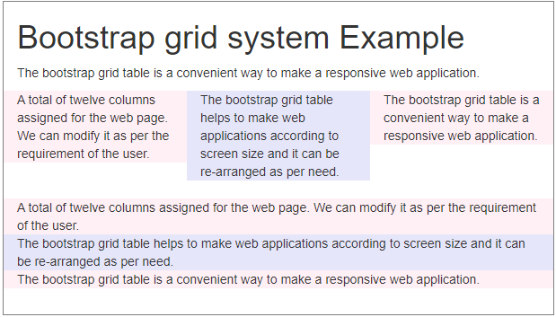
Output of Small Screen

Output of Large Screen

Example #3
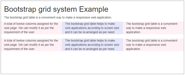
The grid table with large screen size.
Code:
<!DOCTYPE html>
<html>
<head>
<title> Bootstrap grid system Example </title>
<meta name="viewport" content="width=device-width, initial-scale=1">
<link rel="stylesheet" href="https://maxcdn.bootstrapcdn.com/bootstrap/3.4.1/css/bootstrap.min.css">
<script src ="https://ajax.googleapis.com/ajax/libs/jquery/3.4.1/jquery.min.js">
</script>
<script src ="https://maxcdn.bootstrapcdn.com/bootstrap/3.4.1/js/bootstrap.min.js">
</script>
</head>
<body>
<div class ="container-fluid">
<h1> Bootstrap grid system Example </h1>
<p> The bootstrap grid table is a convenient way to make a responsive web application.
</p>
<div class="row">
<div class ="col-lg-4" style ="background-color:yellow;"> A total of twelve columns assigned for the web page. We can modify it as per the requirement of the user. </div>
<div class ="col-lg-4" style ="background-color:orange;"> The bootstrap grid table helps to make web applications according to screen size and it can be re-arranged as per need. </div>
<div class ="col-lg-4" style ="background-color:yellow;"> The bootstrap grid table is a convenient way to make a responsive web application. </div>
</div>
<div class ="row">
<div class ="col-lg-4" style ="background-color:orange;"> A total of twelve columns assigned for the web page. We can modify it as per the requirement of the user. </div>
<div class ="col-lg-4" style ="background-color:yellow;"> The bootstrap grid table helps to make web applications according to screen size and it can be re-arranged as per need. </div>
<div class ="col-lg-4" style ="background-color:orange;"> The bootstrap grid table is a convenient way to make a responsive web application. </div>
</div>
</div>
</body>
</html>
Output:

Conclusion
The bootstrap grid table makes web applications responsive, sophisticated, and user-friendly. It helps the developer to reduce Coding and CSS tags for designing.