Introduction to Bootstrap 4 Cards
The bootstrap 4 cards are informative containers with many supportive components like header and footer. The bootstrap 4 cards is a content box that comes with a design and many display options. The 4 cards are container holds supportive content, background color, inbuilt padding, and images. The 4 card is a mini container of web application which reduces the space and size. The 4 cards are adjustable and stretchable boxes according to design and content size.
Syntax
1. The basic Bootstrap 4 card syntax needed two classes which are below.
- The card class used for making a 4 card container.
- The card-body class used for creating content inside of the container.
<div class = "card">
<div class = "card-body"> the content of the bootstrap 4 card. </div>
</div>
2. The 4 card header and footer syntax is below.
<div class = "card">
<div class = "card-header"> the header of the bootstrap 4 card. </div>
<div class = "card-body"> the content of the bootstrap 4 card. </div>
<div class = "card-footer"> the footer of the bootstrap 4 card. </div>
</div>- The card-header class creates the heading of the bootstrap 4 cards.
- The card-footer class creates the footer of the 4 cards.
3. The 4 card title and text syntax are below.
<div class = "card">
<div class = "card-body"> the content of the bootstrap 4 card.
<h1 class = "card-title"> Title </h1>
<p class = "card-text"> the information of the card body. </p>
</div>
</div>- The card-title and card-text classes placed inside of the card-body classes.
- The card-title class is the heading of the content body, and card-text is a description of the content body.
4. The bootstrap 4 card image syntax is below.
- The card-img-top or card-img-bottom class comes with <img> tag.
- The image class placed inside the card class with the top or bottom position.
<div class = "card"> the content of the bootstrap 4 card.
<img class="card-img-top" src="image_name.png">
<img class="card-img-bottom" src="image_name.png">
</div>
How Does Bootstrap 4 Cards Works?
Here are the following steps mention below
Step #1:
- Firstly the web page creates for the web applications in bootstrap 4.
Step #2:
- There have two ways to add the bootstrap supportive file, which is below.
- The bootstrap file downloads from the respective website and keeps the link in the head section.
- The bootstrap 4 support file also added in the head section of the web page. This support file is below.
<link rel = "stylesheet" href="https://maxcdn.bootstrapcdn.com/bootstrap/4.5.0/css/bootstrap.min.css">
<script src = "https://ajax.googleapis.com/ajax/libs/jquery/3.5.1/jquery.min.js">
</script>
<script src = "https://cdnjs.cloudflare.com/ajax/libs/popper.js/1.16.0/umd/popper.min.js">
</script>
<script src = "https://maxcdn.bootstrapcdn.com/bootstrap/4.5.0/js/bootstrap.min.js">
</script>
Step #3:
- Bootstrap 4 is responsive to many sizes of devices. The bootstrap 4 framework has a mobile-first responsive priority.
- The below tag added in the head section for a responsive web application.
<meta name = "viewport" content = "width = device-width, initial-scale =1">Step #4:
- The 4 card syntax placed inside the body section of the HTML file.
<div class = "card">
<div class = "card-body"> the content of the bootstrap 4 card. </div>
</div>- The combination of 4 card working steps is below.
<!DOCTYPE html>
<html>
<head>
<title> Bootstrap 4 card </title>
<meta name = "viewport" content = "width=device-width, initial-scale = 1">
<link rel = "stylesheet" href="https://maxcdn.bootstrapcdn.com/bootstrap/4.5.0/css/bootstrap.min.css">
<script src = "https://ajax.googleapis.com/ajax/libs/jquery/3.5.1/jquery.min.js"> </script>
<script src = "https://cdnjs.cloudflare.com/ajax/libs/popper.js/1.16.0/umd/popper.min.js"></script>
<script src = "https://maxcdn.bootstrapcdn.com/bootstrap/4.5.0/js/bootstrap.min.js"></script>
</head>
<body>
<div class = "container-fluid">
<h3>Basic bootstrap 4 card</h3>
<div class = "card">
<div class = "card-body"> the content of the bootstrap 4 card. </div>
</div>
</div>
</body>
</html>
Examples of Bootstrap 4 Cards
Given below are the examples of Bootstrap 4 Cards:
Example #1
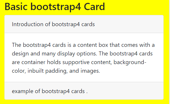
The 4 cards with header and footer example and output are below.
Code:
<!DOCTYPE html>
<html>
<head>
<title> Bootstrap 4 card </title>
<meta name = "viewport" content = "width=device-width, initial-scale = 1">
<link rel = "stylesheet" href="https://maxcdn.bootstrapcdn.com/bootstrap/4.5.0/css/bootstrap.min.css">
<script src = "https://ajax.googleapis.com/ajax/libs/jquery/3.5.1/jquery.min.js"></script>
<script src = "https://cdnjs.cloudflare.com/ajax/libs/popper.js/1.16.0/umd/popper.min.js"></script>
<script src = "https://maxcdn.bootstrapcdn.com/bootstrap/4.5.0/js/bootstrap.min.js"></script>
<style>
body{
background-color:yellow;
}
</style>
</head>
<body>
<div class = "container-fluid">
<h3>Basic bootstrap 4 card</h3>
<div class = "card">
<div class="card-header"> Introduction of bootstrap 4 cards </div>
<div class = "card-body"> The bootstrap 4 cards is a content box that comes with a design and many display options.
The bootstrap 4 cards are container holds supportive content, background-color, inbuilt padding, and images. </div>
<div class="card-footer"> example of bootstrap 4 cards .</div>
</div>
</div>
</body>
</html>
Output:

Example #2
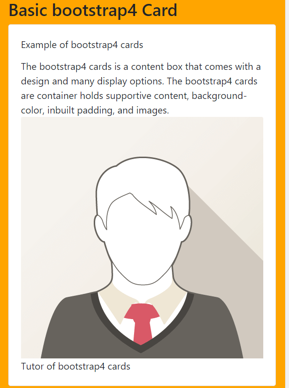
The 4 cards with image, title, and text example and output are below.
Code:
<!DOCTYPE html>
<html>
<head>
<title> Bootstrap 4 card </title>
<meta name = "viewport" content = "width=device-width, initial-scale = 1">
<link rel = "stylesheet" href="https://maxcdn.bootstrapcdn.com/bootstrap/4.5.0/css/bootstrap.min.css">
<script src = "https://ajax.googleapis.com/ajax/libs/jquery/3.5.1/jquery.min.js"></script>
<script src = "https://cdnjs.cloudflare.com/ajax/libs/popper.js/1.16.0/umd/popper.min.js"></script>
<script src = "https://maxcdn.bootstrapcdn.com/bootstrap/4.5.0/js/bootstrap.min.js"></script>
<style>
body{
background-color:orange;
}
</style>
</head>
<body>
<div class = "container-fluid">
<h3>Basic bootstrap 4 card</h3>
<div class = "card">
<div class = "card-body">
<div class="card-title"> Example of bootstrap 4 cards </div>
<div class="card-text">The bootstrap 4 cards is a content box that comes with a design and many display options.
The bootstrap 4 cards are container holds supportive content, background-color, inbuilt padding, and images. </div>
<img class="card-img-top" src="path/img-name.png" >
<div class="card-text"> Tutor of bootstrap 4 cards </div>
</div>
</div>
</div>
</body>
</html>
Output:

Example #3
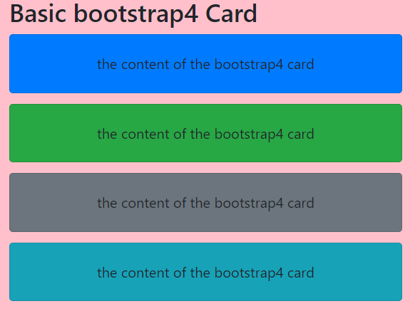
The 4 cards with contextual and card column examples and output are below.
Code:
<!DOCTYPE html>
<html>
<head>
<title> Bootstrap 4 card </title>
<meta name = "viewport" content = "width=device-width, initial-scale = 1">
<link rel = "stylesheet" href="https://maxcdn.bootstrapcdn.com/bootstrap/4.5.0/css/bootstrap.min.css">
<script src = "https://ajax.googleapis.com/ajax/libs/jquery/3.5.1/jquery.min.js"></script>
<script src = "https://cdnjs.cloudflare.com/ajax/libs/popper.js/1.16.0/umd/popper.min.js"></script>
<script src = "https://maxcdn.bootstrapcdn.com/bootstrap/4.5.0/js/bootstrap.min.js"></script>
<style>
body{
background-color:pink;
}
</style>
</head>
<body>
<div class = "container-fluid">
<h3>Basic bootstrap 4 card</h3>
<div class="card-columns">
<div class="card bg-primary">
<div class="card-body ">
<p class="card-text">the content of the bootstrap 4 card </p>
</div>
</div>
<div class="card bg-success">
<div class="card-body ">
<p class="card-text">the content of the bootstrap 4 card</p>
</div>
</div>
<div class="card bg-secondary">
<div class="card-body">
<p class="card-text">the content of the bootstrap 4 card</p>
</div>
</div>
<div class="card bg-info">
<div class="card-body text-center">
<p class="card-text">the content of the bootstrap 4 card</p>
</div>
</div>
</div>
</div>
</body>
</html>
Output:

Description:
- The card-columns class is used for making an equal amount of partition using a 4 grid system.
- The card class placed inside of the card-columns class with the required contextual class.
- The layout and margin automatically adjust according to the number and size of the column.
Example #4
The 4 cards with card group examples and output are below.
Code:
<!DOCTYPE html>
<html>
<head>
<title> Bootstrap 4 card </title>
<meta name = "viewport" content = "width=device-width, initial-scale = 1">
<link rel = "stylesheet" href="https://maxcdn.bootstrapcdn.com/bootstrap/4.5.0/css/bootstrap.min.css">
<script src = "https://ajax.googleapis.com/ajax/libs/jquery/3.5.1/jquery.min.js"></script>
<script src = "https://cdnjs.cloudflare.com/ajax/libs/popper.js/1.16.0/umd/popper.min.js"></script>
<script src = "https://maxcdn.bootstrapcdn.com/bootstrap/4.5.0/js/bootstrap.min.js"></script>
<style>
body{
background-color:aqua;
}
</style>
</head>
<body>
<div class = "container-fluid">
<h3>Basic bootstrap 4 card</h3>
<div class="card-group">
<div class="card bg-light">
<div class="card-body ">
<p class="card-text">the content of the bootstrap 4 card </p>
</div>
</div>
<div class="card bg-warning">
<div class="card-body">
<p class="card-text">the content of the bootstrap 4 card</p>
</div>
</div>
<div class="card bg-dark">
<div class="card-body">
<p class="card-text">the content of the bootstrap 4 card</p>
</div>
</div>
<div class="card bg-danger">
<div class="card-body">
<p class="card-text">the content of the bootstrap 4 card</p>
</div>
</div>
</div>
</div>
</body>
</html>
Output:

Description:
- The card-group class is used for making a group of more than two 4 cards.
- The card group creates equal width and height sizes of 4 cards.
- The card-group class removes the margin of 4 cards.
Conclusion
The bootstrap 4 cards make it easy for the developer to apply on the web application. The 4 cards are attractive, elegant, and space-saving components. In addition, the 4 card has an inbuilt CSS application for design purposes.