Introduction to Bootstrap Media Queries
The media queries in bootstrap are a way of making a responsive web application. It is used for different devices with different styles. It is used to create breakpoints for web application layout. The breakpoint helps to measure the viewport width of devices and apply them to the web application. It used in components, the layout of the application and the grid system.
Syntax
The media queries syntax is used for many purposes.
The below tag is the syntax of media queries in bootstrap.
@mediaAll syntaxes are below according to size or breakpoint.
1. Small Devices
The below syntax used for Phone devices or 576px and above screen width devices.
@media (min – width: 576px) {
Web design tag
}
2. Media Devices
The below syntax used for Tablet device or 768px and above screen width devices.
@media (min – width: 768px) {
Web design tag
}
3. Large Devices
The below syntax used for Laptop and Desktop devices and 992px and above screen width devices.
@media (min – width: 992px) {
Web design tag
}
4. Extra Large Devices
The below syntax used for Large Desktop devices and 1200px and above screen width devices.
@media (min – width: 1200px) {
Web design tag
}
How Bootstrap Media Queries Works?
The media queries used for the breakpoint to make a responsive web application. Either minimum width or maximum width needed for breakpoint setup in web application.
The media queries used inside of the style tag. All CSS tags write under the media queries according to requirements. The breakpoint media queries are working below.
<!DOCTYPE>
<html>
<head>
<style>
@media(min-width: 576px) {
p {
background-color: orange;
color: black;
}
}
@media (min-width: 1200px) {
p {
background-color: Yellow;
color: black;
}
}
</style>
</head>
<body>
<p>The bootstrap media queries used in components, the layout of the application and the grid system. <br></p>
</body>
</html>- The column in media queries used for the grid system.
<!DOCTYPE html>
<html>
<head>
<meta name="viewport" content="width=device-width, initial-scale=1.0">
<style>
.col-3 {width: 25%;}
.col-6 {width: 50%;}
.col-9 {width: 75%;}
@media only screen and (max-width: 768px) {
[class*="col-"] {
width: 90%;
}
}
</style>
</head>
<body>
<div class="row">
<div class="col-3 menu">
<ul>
<li> media queries break point </li>
<li> media queries column </li>
</ul>
</div>
<div class="col-6">
<p>The bootstrap media queries used for different devices with a different style.
</p>
</div>
</div>
</body>
</html>
Examples
Here are the following examples mention below
Example #1
This is used for the breakpoint to make responsive web applications.
The breakpoint can make using the standard width of the device or according to the requirement of the application.
Code:
<!DOCTYPE html>
<html>
<head>
<meta name ="viewport" content ="width=device-width, initial-scale=1.0">
<link rel="stylesheet" href= "https://maxcdn.bootstrapcdn.com/bootstrap/3.4.1/css/bootstrap.min.css">
<script src= "https://ajax.googleapis.com/ajax/libs/jquery/3.4.1/jquery.min.js">  </script>
<script  src="https://maxcdn.bootstrapcdn.com/bootstrap/3.4.1/js/bootstrap.min.js">
</script>
<style>
@media(min-width: 576px) {
p {
background-color: orange;
color: black;
}
}
@media (min-width: 1200px) {
p {
background-color: Yellow;
color: black;
}
}
</style>
</head>
<body>
<p>
The media queries in bootstrap are a way of making a responsive web application. <br>
The bootstrap media queries used for different devices with a different style. <br>
It is used to create breakpoints for web application layout. <br>
The breakpoint helps to measure the viewport width of devices and apply them to the web application. <br>
The bootstrap media queries used in components, the layout of the application and the grid system. <br>
</p>
</body>
</html>
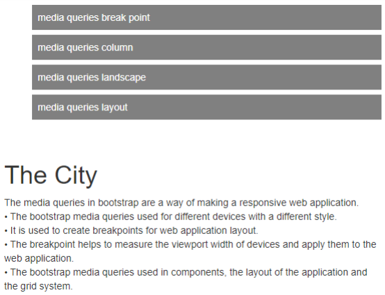
The output of the small screen

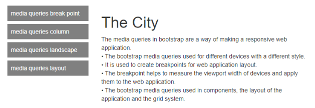
The output of the large screen

Example #2
The column media queries used for the grid system. The column of div tag can style with media queries.
Code:
<!DOCTYPE html>
<html>
<head>
<meta name="viewport" content="width=device-width, initial-scale=1.0">
<link rel = "stylesheet"     href=   "https://maxcdn.bootstrapcdn.com/bootstrap/3.4.1/css/bootstrap.min.css">
<script src= "https://ajax.googleapis.com/ajax/libs/jquery/3.4.1/jquery.min.js">  </script>
<script
src = "https://maxcdn.bootstrapcdn.com/bootstrap/3.4.1/js/bootstrap.min.js">
</script>
<style>
* {
box-sizing: border-box;
}
[class*="col-"] {
float: left;
padding: 15px;
}
.menu li {
padding: 8px;
margin-bottom: 7px;
background-color: grey;
color: white;
}
.col-3 {width: 25%;}
.col-6 {width: 50%;}
.col-9 {width: 75%;}
@media only screen and (max-width: 768px) {
[class*="col-"] {
width: 90%;
}
}
</style>
</head>
<body>
<div class="row">
<div class="col-3 menu">
<ul>
<li> media queries break point </li>
<li> media queries column </li>
<li> media queries landscape </li>
<li> media queries layout </li>
</ul>
</div>
<div class="col-6">
<h1>The City</h1>
<p> The media queries in bootstrap are a way of making a responsive web application. <br>
The bootstrap media queries used for different devices with a different style. <br>
It is used to create breakpoints for web application layout. <br>
The breakpoint helps to measure the viewport width of devices and apply them to the web application. <br>
The bootstrap media queries used in components, the layout of the application and the grid system. <br>
</p>
</div>
</body>
</html>
The output of the small screen

The output of the large screen

Example #3
The element hides using media queries.
If the minimum width of the screen is 576px then the respective element is hidden.
Code:
<!DOCTYPE html>
<html>
<head>
<meta name="viewport" content="width=device-width, initial-scale=1">
<link rel="stylesheet" href= "https://maxcdn.bootstrapcdn.com/bootstrap/3.4.1/css/bootstrap.min.css">
<script src= "https://ajax.googleapis.com/ajax/libs/jquery/3.4.1/jquery.min.js">  </script>
<script  src="https://maxcdn.bootstrapcdn.com/bootstrap/3.4.1/js/bootstrap.min.js">
</script>
<style>
div.quer  {
background-color: orange;
padding: 15px;
}
@media (max-width: 576px) {
div.quer {
display: none;
}
}
</style>
</head>
<body>
<h2> Hide elements Using media queries </h2>
<div class="quer"> Bootstrap Media Queries </div>
<p>
The media queries in bootstrap are a way of making a responsive web application. <br>
The bootstrap media queries used for different devices with a different style. <br>
It is used to create breakpoints for web application layout. <br>
The breakpoint helps to measure the viewport width of devices and apply them to the web application. <br>
The bootstrap media queries used in components, the layout of the application and the grid system. <br>
</p>
</body>
</html>
The Original Output

Media Queries Output

Conclusion
Bootstrap Media queries are an effective way to layout and responsive web applications. It is used for different style sheets for a different screen width of many devices. This help to make elegant or animated web applications.