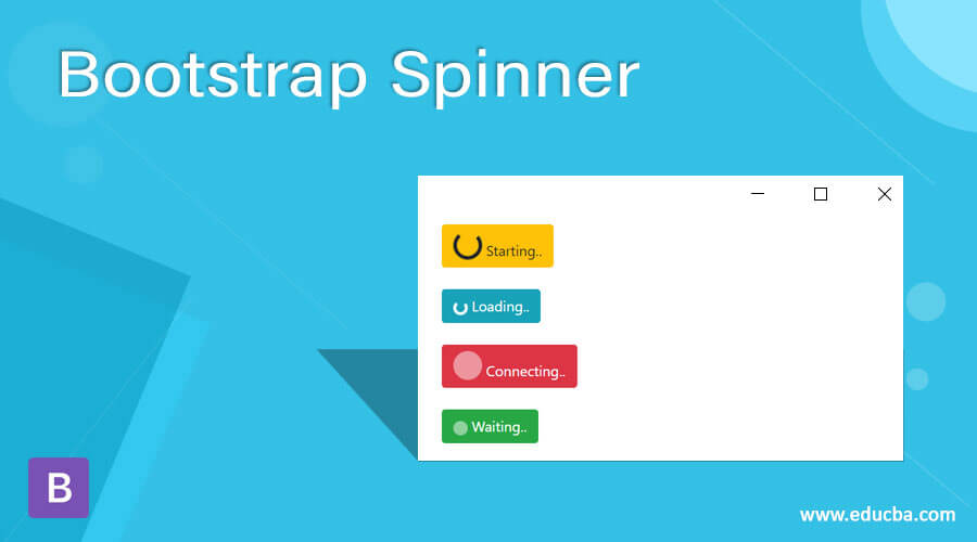
Definition of Bootstrap Spinner
The bootstrap spinner is one component to shows loading the web pages in the web application. It is a loader that is displayed when a web page or web server delays to display a web application display screen. It is an animated component to show the user when displaying the loading state of the web pages.
Syntax:
- The basic syntax needs a spinner-border class.
- The syntax is below.
<div class = "spinner-border"> </div>- The growing spinner syntax needs spinner-grow class.
- The growing spinner syntax is below.
<div class = "spinner-grow "> </div>- The colored spinner syntax needed contextual class with spinner class.
- The colored spinner syntax is below which is a warning contextual class.
<div class = "spinner-border text-warning"> </div>- The button syntax needs “btn btn-success” class with spinner class.
- The button syntax is below which is the success contextual button.
<button class = "btn btn-success">
<span class = "spinner-border"> </span>
</button>
How does Spinner work in Bootstrap?
- The responsive bootstrap spinner needs the below attributes.
<meta name = "viewport" content = "width = device-width, initial-scale = 1">- The bootstrap supporting file in the web page.
<link rel = "stylesheet" href = "https://maxcdn.bootstrapcdn.com/bootstrap/4.5.2/css/bootstrap.min.css">
<script src = "https://ajax.googleapis.com/ajax/libs/jquery/3.5.1/jquery.min.js">
</script>
<script src = "https://cdnjs.cloudflare.com/ajax/libs/popper.js/1.16.0/umd/popper.min.js">
</script>
<script src = "https://maxcdn.bootstrapcdn.com/bootstrap/4.5.2/js/bootstrap.min.js">
</script>- The syntax with the modified syntax used in the body section of the html page.
Syntax 1:
<div class = "spinner-border"> </div>Syntax 2:
<button class = "btn btn-success">
<span class = "spinner-border"> </span>
</button>- All steps are combined together to get a bootstrap spinner.
<!DOCTYPE html>
<html>
<head>
<title> Bootstrap Spinner Example </title>
<meta name = "viewport" content = "width = device-width, initial-scale = 1">
<link rel = "stylesheet" href = "https://maxcdn.bootstrapcdn.com/bootstrap/4.5.2/css/bootstrap.min.css">
<script src = "https://ajax.googleapis.com/ajax/libs/jquery/3.5.1/jquery.min.js">
</script>
<script src = "https://cdnjs.cloudflare.com/ajax/libs/popper.js/1.16.0/umd/popper.min.js">
</script>
<script src = "https://maxcdn.bootstrapcdn.com/bootstrap/4.5.2/js/bootstrap.min.js">
</script>
</head>
<body>
<div class = "container">
<h2> Bootstrap Spinner Example </h2>
<div class = "spinner-border"> </div> <br>
<button class = "btn btn-success">
<span class = "spinner-border"> </span>
</button>
</div>
</body>
</html>
Examples
Below we will discuss some examples with output.
Example #1
Code:
<!DOCTYPE html>
<html>
<head>
<title> Bootstrap Spinner Example </title>
<meta name = "viewport" content = "width = device-width, initial-scale = 1">
<link rel = "stylesheet" href = "https://maxcdn.bootstrapcdn.com/bootstrap/4.5.2/css/bootstrap.min.css">
<script src = "https://ajax.googleapis.com/ajax/libs/jquery/3.5.1/jquery.min.js">
</script>
<script src = "https://cdnjs.cloudflare.com/ajax/libs/popper.js/1.16.0/umd/popper.min.js">
</script>
<script src = "https://maxcdn.bootstrapcdn.com/bootstrap/4.5.2/js/bootstrap.min.js">
</script>
</head>
<body>
<div class = "container">
<h2> Bootstrap Spinner Example </h2>
<div class = "spinner-border"> </div> <br>
<div class = "spinner-grow"> </div> <br>
<button class = "btn btn-success">
<span class = "spinner-border"> </span>
</button>
</div>
</body>
</html>
Output:

Description:
The first spinner is a border spinner which is shown in the output. The second is a growing spinner which is also shown in the output. The third is a button spinner that is modified with a button tag.
Example #2 – Basic border spinner with Size
Code:
<!DOCTYPE html>
<html>
<head>
<title> Bootstrap Spinner Example </title>
<meta name = "viewport" content = "width = device-width, initial-scale = 1">
<link rel = "stylesheet" href = "https://maxcdn.bootstrapcdn.com/bootstrap/4.5.2/css/bootstrap.min.css">
<script src = "https://ajax.googleapis.com/ajax/libs/jquery/3.5.1/jquery.min.js">
</script>
<script src = "https://cdnjs.cloudflare.com/ajax/libs/popper.js/1.16.0/umd/popper.min.js">
</script>
<script src = "https://maxcdn.bootstrapcdn.com/bootstrap/4.5.2/js/bootstrap.min.js">
</script>
</head>
<body>
<div class = "container">
<h2> Bootstrap Border Spinner Example </h2>
<div class = "spinner-border"> </div>
<div class = "spinner-border spinner-border-sm"> </div> <br><br>
<button class = "btn btn-success">
<span class = "spinner-border"> </span>
</button>
<button class = "btn btn-success">
<span class = "spinner-border spinner-border-sm"> </span>
</button>
</div>
</body>
</html>
Output:
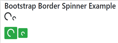
Description:
The spinner-border class is used for the border spinner which is displayed in the output. The spinner-border-sm class is used for the display smaller size of the spinner.
Example #3 – Growing spinner
Code:
<!DOCTYPE html>
<html>
<head>
<title> Bootstrap Spinner Example </title>
<meta name = "viewport" content = "width = device-width, initial-scale = 1">
<link rel = "stylesheet" href = "https://maxcdn.bootstrapcdn.com/bootstrap/4.5.2/css/bootstrap.min.css">
<script src = "https://ajax.googleapis.com/ajax/libs/jquery/3.5.1/jquery.min.js">
</script>
<script src = "https://cdnjs.cloudflare.com/ajax/libs/popper.js/1.16.0/umd/popper.min.js">
</script>
<script src = "https://maxcdn.bootstrapcdn.com/bootstrap/4.5.2/js/bootstrap.min.js">
</script>
</head>
<body>
<div class = "container">
<h2> Bootstrap growing Spinner Example </h2>
<div class = "spinner-grow"> </div>
<div class = "spinner-grow spinner-grow-sm"> </div><br><br>
<button class = "btn btn-info">
<span class = "spinner-grow"> </span>
</button>
<button class = "btn btn-info">
<span class = "spinner-grow spinner-grow-sm"> </span>
</button>
</div>
</body>
</html>
Output:
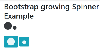
Description:
The spinner-grow class is used for bootstrap growing spinner which is display in the output. The spinner-grow-sm class is used for the display smaller size.
Example #4 – Colored spinner
Code:
<!DOCTYPE html>
<html>
<head>
<title> Bootstrap Spinner Example </title>
<meta name = "viewport" content = "width = device-width, initial-scale = 1">
<link rel = "stylesheet" href = "https://maxcdn.bootstrapcdn.com/bootstrap/4.5.2/css/bootstrap.min.css">
<script src = "https://ajax.googleapis.com/ajax/libs/jquery/3.5.1/jquery.min.js">
</script>
<script src = "https://cdnjs.cloudflare.com/ajax/libs/popper.js/1.16.0/umd/popper.min.js">
</script>
<script src = "https://maxcdn.bootstrapcdn.com/bootstrap/4.5.2/js/bootstrap.min.js">
</script>
</head>
<body>
<div class = "container">
<h2> Bootstrap colored Spinner Example </h2>
<button class = "btn btn-secondary">
<span class = "spinner-border"></span>
</button>
<div class = "spinner-grow text-warning"> </div>
<span class = "spinner-border text-primary"></span>
<br> <br>
<button class = "btn btn-info">
<span class = "spinner-border spinner-border-sm"></span>
</button>
<div class = "spinner-grow spinner-grow-sm text-danger"> </div>
<span class = "spinner-border spinner-grow-sm text-success">
</span>
</div>
</body>
</html>
Output:
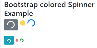
Description:
The text-primary class is used for blue color which is display in the output. The contextual classes are used for a bootstrap spinner for design and modification.
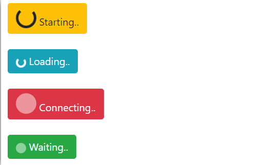
Example #5 – Button with text
Code:
<!DOCTYPE html>
<html>
<head>
<title> Bootstrap Spinner Example </title>
<meta name = "viewport" content = "width = device-width, initial-scale = 1">
<link rel = "stylesheet" href = "https://maxcdn.bootstrapcdn.com/bootstrap/4.5.2/css/bootstrap.min.css">
<script src = "https://ajax.googleapis.com/ajax/libs/jquery/3.5.1/jquery.min.js">
</script>
<script src = "https://cdnjs.cloudflare.com/ajax/libs/popper.js/1.16.0/umd/popper.min.js">
</script>
<script src = "https://maxcdn.bootstrapcdn.com/bootstrap/4.5.2/js/bootstrap.min.js">
</script
</head>
<body>
<div class = "container">
<h2> Bootstrap colored Spinner Example </h2>
<button class = "btn btn-warning">
<span class = "spinner-border"></span>
Starting..
</button>
<br> <br>
<button class = "btn btn-info">
<span class = "spinner-border spinner-border-sm">
</span>
Loading..
</button>
<br> <br>
<button class = "btn btn-danger">
<span class = "spinner-grow">
</span>
Connecting..
</button>
<br> <br>
<button class = "btn btn-success">
<span class = "spinner-grow spinner-grow-sm">
</span>
Waiting..
</button>
</div>
</body>
</html>
Output:
Conclusion
This component used indicates the web page loading state to the user. It is utilized for getting information to the user about web page loading conditions. It is an animated component to get information in the symbolic form.