Introduction to Bootstrap 4 Datepicker
Bootstrap 4 Datepicker is a plugin that adds a calendar interface to the input fields for selecting dates. It is built with the Bootstrap framework and is responsive, meaning it adjusts to the size of the device it is viewed on. It can be integrated into any web application or website and can be customised to match the design of the site. It also supports localization, enabling it to be used in different languages and regions. Overall, Bootstrap 4 Datepicker provides a user-friendly and visually consistent way for users to input dates.

Key Takeaways
- Bootstrap 4 Datepicker is a module that permits clients to choose a date from a schedule interface.
- It is built using the popular Bootstrap framework and is fully responsive.
- It can be easily integrated into any website or web application and can be customised to match the design of the site.
- It also supports localization, making it available in multiple languages and regions.
- It is a useful tool for allowing users to input dates in a user-friendly and visually consistent way.
How to Create Bootstrap 4 Datepicker?
Creating a Bootstrap 4 Datepicker requires a few steps.
Here is a general overview of how to do it:
1. Include the Bootstrap CSS and JavaScript files in the head of your HTML document. These can be downloaded from the Bootstrap website or linked to a CDN.
2. Include the Bootstrap Datepicker CSS and JavaScript files. These can also be downloaded from the Bootstrap website or linked to a CDN.
3. Create an input field in your HTML document where the datepicker will appear. For instance, you can make a text input field with the class “datepicker”.
<input type="text" class="form-control datepicker">4. Initialise the datepicker with JavaScript.
$('.datepicker').datepicker();5. Optionally, you can also customise the datepicker by passing in options to the initialization function. For example, you can set the format of the date, the start date, and the end date.
$('.datepicker').datepicker({
format: 'mm/dd/yyyy',
startDate: '01/01/2020',
endDate: '12/31/2022'
});
You can also include the datepicker library using npm package manager by installing bootstrap-datepicker package and including it in your project. That is all there is to it! You ought to now have a functioning Bootstrap 4 datepicker on your site or web application.
Bootstrap 4 Datepicker Setting
Setting options for Bootstrap 4 Datepicker is a relatively simple process.
Here is an overview of the steps:
First, you will need to initialise the datepicker, just add the following code to your JavaScript:
$('.datepicker').datepicker();Next, you can set options for the datepicker by passing in an options object to the initialization function.
Here are some examples of options you can set:
1. Format
You can set the format of the date that is displayed in the input field. This can be done using the “format” option. For example, you can set the format to be “mm/dd/yyyy”.
$('.datepicker').datepicker({
format: 'mm/dd/yyyy'
});
2. Start Date
You can set the earliest date that can be selected using the “startDate” option. For example, you can set the start date to be “01/01/2020”.
$('.datepicker').datepicker({
startDate: '01/01/2020'
});
3. End Date
You can set the latest date that can be selected using the “endDate” option. For example, you can set the end date to be “12/31/2022”.
$('.datepicker').datepicker({
endDate: '12/31/2022'
});
4. Language
You can set language to be used in the datepicker, just by including the language file and setting the “language” option.
<script src="https://cdnjs.cloudflare.com/ajax/libs/bootstrap-datepicker/1.9.0/locales/bootstrap-datepicker.fr.min.js"></script>
$('.datepicker').datepicker({
language: 'fr'
});
5. On Select
You can set an event to be triggered when a date is selected using the “onSelect” option.
$('.datepicker').datepicker({
onSelect: function(date) {
alert("Selected date: " + date);
}
});
Datepicker Function
$('.datepicker').datepicker({
format: 'mm/dd/yyyy',
startDate: '01/01/2020',
endDate: '12/31/2022',
language: 'fr',
onSelect: function(date) {
alert("Selected date: " + date);
}
});
Timepicker Function
- You can create an input field in your HTML document where the time picker will appear. For instance, we can create a text input field with the class “timepicker”.
- Then, you can initialise the time picker by calling the timepicker() function on the input element.
- You can also customise the time picker by passing in options to the initialization function, such as the format of the time, the start time, and the end time.
$('.timepicker').timepicker({
format: 'HH:mm',
startTime: '00:00',
endTime: '23:59'
});
Examples of Bootstrap 4 Datepicker
Here are some examples of how you can use the datepicker function in Bootstrap 4:
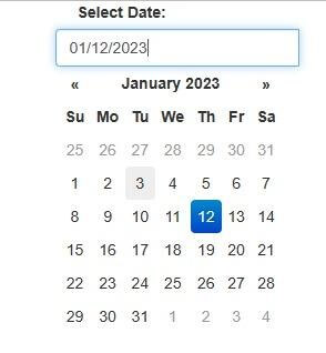
Example #1: Simple Date Picker
A simple date picker is a user interface element that allows users to select a date by providing a calendar interface. It typically consists of an input field that, when clicked, displays a calendar interface with the days of the month, allowing users to select a specific date. Simple date pickers are often used in forms to input dates of birth, event dates, and other types of data that require a date input. They are simple to use, easy to understand and can be integrated into a wide range of applications.
Code:
<div class="form-group">
<label for="datepicker">Select Date:</label>
<input type="text" class="form-control datepicker" id="datepicker">
</div>
<script>
$('.datepicker').datepicker();
</script>
Output:

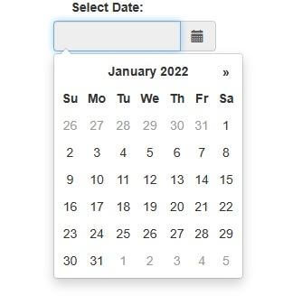
Example #2: Customised Date Picker
A customized date picker is a date picker that has been modified to meet specific requirements or preferences. This can include changes to the appearance, functionality, or localization of the date picker. For example, a customized date picker might have a different color scheme, format, or date range than a simple date picker. It can also be localized to show the date in specific format, language or regions. Customized date pickers are often used when the default options of a simple date picker do not meet the specific needs of an application or website. They allow developers to create a more tailored user experience by providing additional options and features.
Code:
<div class="form-group">
<label for="datepicker">Select Date:</label>
<input type="text" class="form-control datepicker" id="datepicker">
</div>
<script>
$('.datepicker').datepicker({
format: 'yyyy-mm-dd',
startDate: '01/01/2022',
endDate: '12/31/2022',
language: 'fr'
});
</script>
Output:

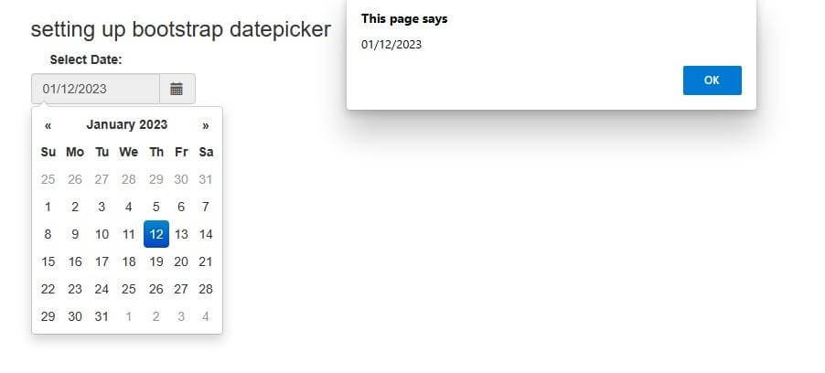
Example #3: Date Picker with an Event
A date picker with an event is a date picker that is configured to trigger an event or function when a date is selected. This event can be used to perform a specific action such as updating a database, displaying a message, or redirecting to another page. Events can be set on the date picker by passing an options object to the date picker initialization function and specifying the event. For example, you can use the “onSelect” option to trigger an event when the date is selected.
Html Code:
<div class="container">
<h3>Setting up Bootstrap Datepicker</h3>
<label>Select Date: </label>
<div id="datepicker" class="input-group date" data-date-format="mm-dd-yyyy">
<input class="form-control" type="text" id="datepicker1" readonly />
<span class="input-group-addon">
<i class="glyphicon glyphicon-calendar"></i>
</span>
</div>
</div>
Js Code:
<script>
$(function() {
$( "#datepicker1" ).datepicker({ dateFormat: "yy-mm-dd" });
$("#datepicker1").on("change",function(){
var selected = $(this).val();
alert(selected);
});
});
</script>
Output:

Conclusion
Bootstrap 4 Datepicker is a user-friendly and visually consistent tool that allows users to easily select dates and times in a web application or website. It is built on the Bootstrap framework and can be easily integrated and customised to match the design of the site. It can be regarded as a powerful tool that can improve the user experience and make date and time input more tangible and intuitive.