Introduction to Bootstrap Responsive
Developing responsive websites is mandatory to present user requirements. People can access websites from anywhere and accessed them from different devices like mobile, PC, Notepad, etc. Even Google has considered a point of emphasizing how these responsive websites play an important role in web design. Designing or developing responsive websites from scratch becomes very difficult for beginners. So, Web developers come up with different technologies HTML5, CSS 3, and bootstrap. Among these 3, bootstraps are more responsive because of capable of dealing with jQuery, JavaFX, and CSS in a single bundle by including libraries. However, the people who aren’t ready to deal with cutting edge layout techniques still, the Bootstrap grid is providing an excellent opportunity alternatively.
What does “Responsive Bootstrap Website” Means?
- The first and foremost thing coming to mind is what exactly the word “Responsive Design” is. Is responsive web design compatible with all different kinds of devices and different screen resolutions? The answer is Yes. For this, we can use bootstrap technology.
- Nowadays, responsive websites’ need is much more constant because of different devices and different screen sizes. It is very difficult to develop the same web page multiples times for multiple screen sizes. There we come across an idea of “Responsive Web Design”.
- We can include CSS3 and HTML5 in bootstrap. We can develop “Responsive Web pages” in fewer times because of pre-defined libraries.
Advantages of Bootstrap
- Multiple devices and multiple screen types can able to access the content.
- Better readability and beautiful User Interface by adding pre-defined libraries.
How can we get a Responsive Website in Bootstrap?
1. While designing responsive pages in bootstrap, “Setting the Viewport” is important.
Syntax:
<meta name="viewport" content="width=device-width, initial-scale=1.0">2. While designing responsive pages in bootstrap Media Queries, we can define different-different styles for different-different browser sizes.
Syntax:
@media screen and (min-width:value){
//CSS code
}
3. We have different HTML <picture> tag to allow different image sizes for different browsers.
Syntax:
<img class="img-responsive" src="imageName.jpg">4. Include the bootstrap feature in our application; we must specify some pre-defined libraries inside our application. They are
- Includes bootstrap view
<meta name="viewport" content="width=device-width, initial-scale=1">- Includes ajax and jQuery libraries
<script src="https://ajax.googleapis.com/ajax/libs/jquery/3.4.1/jquery.min.js"></script>- Includes bootstrap libraries
<link rel="stylesheet" href="https://maxcdn.bootstrapcdn.com/bootstrap/3.4.1/css/bootstrap.min.css">- Includes bootstrap libraries
<script src="https://maxcdn.bootstrapcdn.com/bootstrap/3.4.1/js/bootstrap.min.js"></script>Examples of Bootstrap Responsive
Given below are the examples of Bootstrap Responsive:
Example #1
Responsive content example
Bootstrap Code: ResponsiveContent.html
<!DOCTYPE html>
<html lang="en">
<head>
<title>Bootstrap Responsive</title>
<meta charset="utf-8">
<!-- makes responsive -->
<meta name="viewport" content="width=device-width, initial-scale=1">
<!-- including bootstrap css libraries -->
<link rel="stylesheet"
href="https://maxcdn.bootstrapcdn.com/bootstrap/4.1.3/css/bootstrap.min.css">
<!-- including bootstrap JavaScript libraries -->
<script
src="https://ajax.googleapis.com/ajax/libs/jquery/3.3.1/jquery.min.js"></script>
<!-- including bootstrap Popper libraries -->
<script
src="https://cdnjs.cloudflare.com/ajax/libs/popper.js/1.14.3/umd/popper.min.js"></script>
<!-- including bootstrap libraries -->
<script
src="https://maxcdn.bootstrapcdn.com/bootstrap/4.1.3/js/bootstrap.min.js"></script>
<!-- CSS styles -->
<style type="text/css">
h2
{
color:green;
}
h3
{
color:brown;
}
</style>
</head>
<body>
<div class="jumbotron text-center">
<!-- pre-defined class="jumbotron text-center gives text in the center -->
<h2>Bootstrap Responsive Demo</h2>
<h3>Even you can resize the page to see the text clearly.</h3>
</div>
<div class="container"> <!-- pre-defined class="container" gives proper text alignment at the sides -->
<div>
<span class="border">Executed and contributed to
full-stack web development projects, with an emphasis on front end
features, browser manipulation, and cross-browser compatibility.
Wrote templates and front-end code for ECM app to meet WebTop
application compatibility. Assisted in development of back end
features in Spring MVC with Hibernate. Developed importing models
and logic in Office Note app to store spreadsheet data and deployed
to host. </span><!-- pre-defined class="border" gives default border with black color -->
</div>
<br>
<div>
<span class="border border-success">Executed and contributed to
full-stack web development projects, with an emphasis on front end
features, browser manipulation, and cross-browser compatibility.
Wrote templates and front-end code for ECM app to meet WebTop
application compatibility. Assisted in development of back end
features in Spring MVC with Hibernate. Developed importing models
and logic in Office Note app to store spreadsheet data and deployed
to host. </span><!-- pre-defined class="border border-success" gives default border with green color -->
</div>
</div>
</body>
</html>
Output:
Screenshot #1
Screenshot #2
Screenshot #3
Explanation:
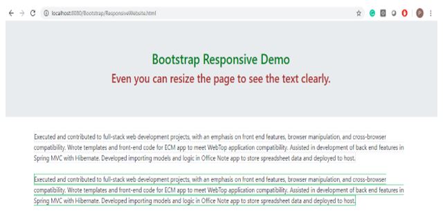
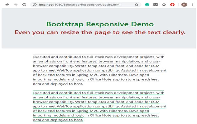
- You can see in the output screenshot #1 is not resized, and screenshot #2 is resized, then page content is also automatically resized.
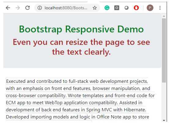
- Screenshot #3 further resized, then content further resized with the scroll bar.
- This way, we can achieve responsive features in bootstrap.
Example #2
Responsive navigation example.
Bootstrap Code: ResponsiveNavigation.html
<!DOCTYPE html>
<html>
<head>
<title>Bootstrap Responsive</title>
<meta charset="utf-8">
<!-- makes responsive -->
<meta name="viewport" content="width=device-width, initial-scale=1">
<!-- including bootstrap jQuery libraries -->
<script
src="https://ajax.googleapis.com/ajax/libs/jquery/3.4.1/jquery.min.js"></script>
<!-- including bootstrap libraries -->
<link rel="stylesheet"
href="https://maxcdn.bootstrapcdn.com/bootstrap/3.4.1/css/bootstrap.min.css">
<!-- including bootstrap libraries -->
<script
src="https://maxcdn.bootstrapcdn.com/bootstrap/3.4.1/js/bootstrap.min.js"></script>
<!-- CSS styles -->
<style type="text/css">
h2 {
color: green;
}
h3 {
color: brown;
}
</style>
</head>
</head>
<body>
<nav class="navbar navbar-default">
<!--navbar navbar-default gives you white background with block color text navigation bar -->
<div class="container-fluid">
<!--container-fluid Gives you a full width container -->
<div class="navbar-header">
<!--navbar-header Gives you a navigation header -->
<a class="navbar-brand" href="https://www.educba.com/">EDUCBA
HOME</a>
<!-- navbar-brand used to set logo -->
</div>
<ul class="nav navbar-nav">
<!--nav navbar-nav used to sets the navigation bar size( either increase or reduce) -->
<!-- data-toggle="dropdown" gives drop-down list -->
<li class="dropdownList"><a class="dropdown-toggle"
data-toggle="dropdown" href="https://www.educba.com/tutorials/">EDUCBA
Courses <span class="caret"></span> <!-- class="caret" used to open drop down list -->
</a>
<ul class="dropdown-menu">
<!-- class="dropdown-menu" display drop down list values -->
<li><a
href="https://www.educba.com/category/software-development/software-development-tutorials/java-tutorial/">Java</a></li>
<li><a
href="https://www.educba.com/category/software-development/software-development-tutorials/python-tutorial/">Python</a></li>
<li><a
href="https://www.educba.com/category/software-development/software-development-tutorials/angular-tutorial/">Angular</a></li>
</ul></li>
<li><a href="https://www.facebook.com/">Facebook</a></li>
<li><a href="https://www.twitter.com/">Twitter</a></li>
<li><a href="https://www.youtube.com/">YouTube</a></li>
</ul>
</div>
</nav>
<div class="jumbotron text-center">
<!-- pre-defined class="jumbotron text-center gives text in the center -->
<h2>Bootstrap Responsive Demo</h2>
<h3>Even you can resize the page to see the navigation clearly.</h3>
</div>
</body>
</html>
Output:
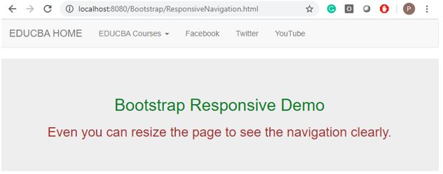
Screenshot #1

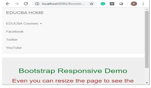
Screenshot #2
Screenshot #3
Explanation:
- You can see in the output screenshot #1 is not resized, and screenshot #2 is resized, then page content and the navigation bar is also automatically resized.
- Screenshot #3 further resized, then the content and navigation bar further resized with the scroll bar.
- This way, we can achieve responsive features in bootstrap.
Example #3
Responsive image example.
Bootstrap Code: ResponsiveImage.html
<!DOCTYPE html>
<html lang="en">
<head>
<title>Bootstrap Example</title>
<meta charset="utf-8">
<meta name="viewport" content="width=device-width, initial-scale=1">
<link rel="stylesheet"
href="https://maxcdn.bootstrapcdn.com/bootstrap/3.4.1/css/bootstrap.min.css">
<script
src="https://ajax.googleapis.com/ajax/libs/jquery/3.4.1/jquery.min.js"></script>
<script
src="https://maxcdn.bootstrapcdn.com/bootstrap/3.4.1/js/bootstrap.min.js"></script>
</head>
<body>
<div class="jumbotron text-center">
<!-- pre-defined class="jumbotron text-center gives text in the center -->
<h2>Bootstrap Responsive Demo</h2>
<h3>Even you can resize the page to see the images clearly.</h3>
</div>
<div class="row">
<!-- puts all images in single row -->
<div class="col-md-4">
<!-- gives images to equal column size -->
<div class="thumbnail">
<!-- class="thumbnail" Adds 4 pixels of the padding and the gray border -->
<a href="1.jpg" target="_blank"> <img src="1.jpg" alt="Lights"
style="width: 100%"> <!-- target="_blank" which tells the browser to open a new window when we clicked -->
<div class="caption">
<!-- class="caption" gives caption -->
<p>Image 1</p>
</div>
</a>
</div>
</div>
<div class="col-md-4">
<div class="thumbnail">
<a href="2.jpg" target="_blank"> <img src="2.jpg" alt="Lights"
style="width: 100%">
<div class="caption">
<p>Image 1</p>
</div>
</a>
</div>
</div>
<div class="col-md-4">
<div class="thumbnail">
<a href="3.jpg" target="_blank"> <img src="3.jpg" alt="Lights"
style="width: 100%">
<div class="caption">
<p>Image 1</p>
</div>
</a>
</div>
</div>
</div>
</body>
</html>
Output:
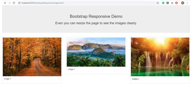
Screenshot #1
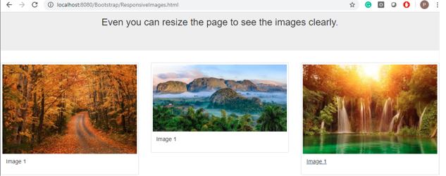
Screenshot #2
Screenshot #3
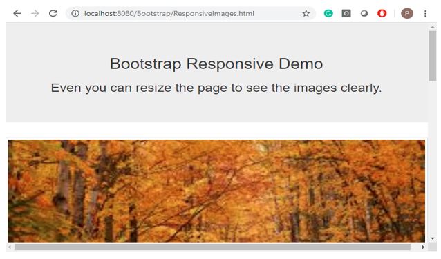
Explanation:
- You can see in the output screenshot #1 is not resized, and screenshot #2 is resized, then page content and images are also automatically resized.
- Screenshot #3 is further resized, and then the content and images are further resized with the scroll bar.
- This way, we can achieve responsive features in bootstrap.
Conclusion
Bootstrap is a very flexible web technology to develop responsive pages in less time with its all predefined classes and libraries.