Introduction to Checkbox in Bootstrap
Bootstrap used many buttons with one click, but sometimes we need to choose an option. Choosing an option has two ways one is a radio button, and another is a checkbox. The radio button has only one option to choose from others. In any condition, we need to choose more than one option that is the time checkbox working. Checkbox has multiple options to choose from the many options. The checkbox is used to choose options in multiple choices with a click on the checkbox. The use of checkbox buttons is multiple choice questions in the exam when the question has multiple answers to one question. Bootstrap has own class of checkbox button, you will see below.
Examples to Implement Checkbox in Bootstrap
Users can understand how to implement a checkbox and the working of these buttons. Below are the examples to implement checkbox in Boostrap:
- Vertical Checkbox
- Inline Checkbox
1. Vertical Checkbox
Example of Vertical Checkbox is given in the following.
Code:
<!DOCTYPE html>
<html>
<head>
<title>Bootstrap Example vertical checkbox</title>
<meta charset="utf-8">
<meta name="viewport" content="width=device-width, initial-scale=1">
<link rel="stylesheet" href="https://maxcdn.bootstrapcdn.com/bootstrap/3.3.6/css/bootstrap.min.css">
</head>
<body>
<div class="container">
<h2> Checkbox Example 1 </h2>
<form>
<div class="form-group">
<p> Which are seven wonders in following list?  </p>
</div>
<div class="checkbox">
<label><input type="checkbox" value=""> Taj Mahal </label>
</div>
<div class="checkbox">
<label><input type="checkbox" value=""> Egypt Pyramid </label>
</div>
<div class="checkbox">
<label><input type="checkbox" value=""> London Bridge </label>
</div>
<div class="checkbox">
<label><input type="checkbox" value=""> Eiffel Tower </label>
</div>
</form>
</div>
<script src="https://ajax.googleapis.com/ajax/libs/jquery/1.12.0/jquery.min.js"></script>
<script src="https://maxcdn.bootstrapcdn.com/bootstrap/3.3.6/js/bootstrap.min.js"></script>
</body>
</html>
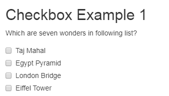
Output:

Description:
- You can see the above example of the vertical checkbox. This is a default checkbox and does not need any special class or entity.
- All form entity comes in vertically one by one.
- This is mostly used in multiple-choice question exams to know the options clearly and not confused with checkbox and label. Every < div > uses the class of checkbox with label. For question uses the paragraph entity < p >.
- You can click on the checkbox button, after clicking on the button checkmark become visible.
2. Inline Checkbox
Example of Inline Checkbox is given in the following.
Code:
<!DOCTYPE html>
<html >
<head>
<title>Bootstrap Example inline checkbox</title>
<meta charset="utf-8">
<meta name="viewport" content="width=device-width, initial-scale=1">
<link rel="stylesheet" href="https://maxcdn.bootstrapcdn.com/bootstrap/3.3.6/css/bootstrap.min.css">
</head>
<body>
<div class="container">
<h2> Checkbox Example 2</h2>
<form class="form-inline">
<label> hobbies: </label>
<label class="checkbox-inline">
<input type="checkbox" value=""> painting
</label>
<label class="checkbox-inline">
<input type="checkbox" value=""> dancing
</label>
<label class="checkbox-inline">
<input type="checkbox" value=""> reading
</label>
</form>
</div>
<script src="https://ajax.googleapis.com/ajax/libs/jquery/1.12.0/jquery.min.js"> </script>
<script src="https://maxcdn.bootstrapcdn.com/bootstrap/3.3.6/js/bootstrap.min.js"></script>
</body>
</html>
Output:

Description:
- The above example is an inline checkbox. We need to use the form-inline class to others form an entity which shows inline in form.
- For the inline checkbox, class checkbox-inline required with every label < label >.
- If you want to use the checkbox in any form with other inputs also that time an inline checkbox is useful.
- All the checkbox comes in one line.
- You can click on the checkbox button, after clicking on the button checkmark become visible.
Checkbox Using Buttons
Checkbox in bootstrap also worked out with the buttons with some classes to look more stylish and elegant in form. Class button-group-toggle, button class has to used in < div > and < label > respectively. With the button-group-toggle class, data-toggle=’buttons’ class also necessary in the form. In the < input >, the type must be a checkbox for working as the checkbox. Let’s see some examples to understand more about toggle in checkbox using bootstrap.
Code:
<!DOCTYPE html>
<html >
<head>
<title>Bootstrap Example checkbox</title>
<meta charset="utf-8">
<meta name="viewport" content="width=device-width, initial-scale=1">
<link rel="stylesheet" href="https://maxcdn.bootstrapcdn.com/bootstrap/3.4.0/css/bootstrap.min.css">
<script src="https://ajax.googleapis.com/ajax/libs/jquery/3.4.1/jquery.min.js"></script>
<script src="https://maxcdn.bootstrapcdn.com/bootstrap/3.4.0/js/bootstrap.min.js"></script>
</head>
<body>
<div class="container">
<form>
<label > Languages </label>
<div class="btn-group-toggle" data-toggle = "buttons">
<label class="btn btn-primary ">
<input type="checkbox" checked autocomplete = "off"> HTML
</label>
<label class="btn btn-primary">
<input type="checkbox" checked autocomplete = "off"> CSS
</label>
<label class="btn btn-primary">
<input type="checkbox" checked autocomplete = "off"> JavaScript
</label>
<label class="btn btn-primary">
<input type="checkbox" checked autocomplete = "off"> Bootstrap
</label>
</div>
</form>
</div>
</body>
</html>
Output:

Description:
- For this example, we used the primary button but any button can be used to checkout but ‘autocomplete’ must be off to not save extra data.
- If the user presses on the button then it is automatically chosen as an option and in the toggle button, the user can choose more options just clicking on buttons.
- Here we have four options to choose the languages, users can choose multiple languages.
- class=’btn-group-toggle’ is used for style the input of the form.
- Because this data-toggle, JavaScript allows Toggling to the buttons so Active and not active mode can be interpreted.
Using the Active Button of Checkbox in Bootstrap
If the user active class adds in button then this button automatically is checked and users have remaining options to choose. This button changes the color to get the activated sign.
Let’s see the following example:
Code:
<div class="container">
<form>
<label > Languages </label>
<div class="btn-group-toggle"data-toggle= "buttons">
<label class="btn btn-primary active ">
<input type="checkbox" checked autocomplete = "off"> HTML
</label>
<label class="btn btn-primary">
<input type="checkbox" checked autocomplete = "off"> CSS
</label>
<label class="btn btn-primary">
<input type="checkbox" checked autocomplete = "off"> JavaScript
</label>
<label class="btn btn-primary">
<input type="checkbox" checked autocomplete = "off"> Bootstrap
</label>
</div>
</form>
</div>
Output:

Description:
- This example can recognize the HTML button darker than others, which means this button is already active.
- On the < label> of HTML, add the active class with the primary button.
- This example also needs button-toggle = “buttons” instead of a button, because of the group of the button.
Conclusion
Checkbox is useful If the job has multiple options to choose for one condition. User can select more than one option which is required for the task. Checkbox Check means Yes or Not Checked means no. Minimum two mutual conditions can select using a checkbox.