Introduction to Navbar in Bootstrap
The navigation bar in bootstrap works as a header for a website or web applications. It is placed on top of the application. Navigation bar work as navigating the content with one click. It is helped to the user to find out the particular content place. Navbar is responsive, it modifies its size according to a device like a laptop, mobile, tab, etc. Navbar takes only one line for the large screen but a small screen takes much more space than a large screen.
Syntax
Two types of navbars are commonly used in bootstrap. One is default and another is inverse. You can see both the navbars syntax below.
1. For default navbar
<nav class ="navbar navbar-default">2. For inverse navbar
<nav class ="navbar navbar-inverse">Explanation: Class navbar we have to use with navbar-default or navbar-inverse in the main class. After this class navbar-header used for heading name or placed logo. The navbar header link placed with the navbar-nav class in the list attribute. The navbar-nav class used for the list attribute. List attributes are the index or heading of the content for the websites.
How does Navbar works in Bootstrap?
The Simple navbar works with the default header and links. There are no designs and styles.
1. The Default Navbar
Code:
<nav class="navbar navbar-default">
<div class="container">
<div class="navbar-header">
<a class="navbar-brand" href="#"> Logo/ website Heading </a>
</div>
<ul class="nav navbar-nav">
<li class="active"><a href="#"> Home </a></li>
<li><a href="#"> About </a></li>
<li><a href="#"> Services </a></li>
<li><a href="#"> Contacts </a></li>
</ul>
</div>
</nav>
<div class="container">
<h3> Welcome to Web Application </h3>
<p> Introduction of Navigation Bar in Bootstrap </p>
</div>
2. The Inverse Navbar
Explanation: The Inverse navbar is used when the user wanted a black background color and white font color. The user wanted a place the list on the right side of the header.
Code:
<nav class="navbar navbar-inverse">
<div class="container">
<div class="navbar-header">
<a class="navbar-brand" href="#"> Logo/ website Heading </a>
</div>
<ul class="nav navbar-nav navbar-right">
<li class="active"><a href="#"> Home </a></li>
<li><a href="#"> About </a></li>
<li><a href="#"> Services </a></li>
<li><a href="#"> Contacts </a></li>
</ul>
</div>
</nav>
<div class="container">
<h3> Welcome to Web Application </h3>
<p> Introduction of Navigation Bar in Bootstrap </p>
</div>
Explanation: The above two are basic navbars used in almost every website and web application. According to requirements and suitable style, The navbar can choose either default or inverse. We can see how navbar works on the large screen and short screen in the inverse navbar.
3. The Fixed Navbar
The navbar is placed in the header but some navbars are not fixed on top of the application. The navbar looks visible after using the scroll bar in the application. The navbar-fixed-top class using for fixed visible navbar in bootstrap.
Code:
<nav class ="navbar navbar-inverse navbar-fixed-top ">
<div class="container">
<div class="navbar-header">
<a class="navbar-brand" href="#"> Logo/ website Heading </a>
</div>
<ul class="nav navbar-nav navbar-right">
<li class="active"><a href="#"> Home </a></li>
<li><a href="#"> About </a></li>
<li><a href="#"> Services </a></li>
<li><a href="#"> Contacts </a></li>
</ul>
</div>
</nav>
Examples to Implement Navbar in Bootstrap
Below are examples to implement:
Example #1
The following example has an inverse navbar with the dropdown list. The dropdown list is used for space-saving content. The right side of the navbar placed Sine Up and log in using glyphicon.
Code:
<body>
<nav class="navbar navbar-inverse">
<div class="container">
<div class="navbar-header">
<a class="navbar-brand" href="#"> Logo/ website Heading </a>
</div>
<ul class="nav navbar-nav">
<li class="active"><a href="#"> Home </a></li>
<li><a href="#"> Blogs </a></li>
<li class="dropdown"><a class="dropdown-toggle" data-toggle="dropdown" href="#"> About us <span class="caret"></span></a>
<ul class="dropdown-menu">
<li><a href="#"> services </a></li>
<li><a href="#"> career </a></li>
<li><a href="#"> contact </a></li>
</ul>
</li>
</ul>
<ul class ="nav navbar-nav navbar-right">
<li> <a href="#"> <span class="glyphicon glyphicon-user"></span> Sign Up </a></li>
<li> <a href="#"> <span class="glyphicon glyphicon-log-in"></span> Login
</a></li>
</ul>
</div>
</nav>
<div class ="container">
<h3> Welcome to Web Application </h3>
<p> Introduction of Navigation Bar in Bootstrap </p>
</div>
</body>
Output:

Example #2
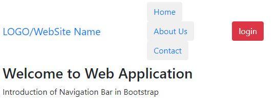
We can use a button in the navbar for convenience and look attractive. The navbar-btn class is used for placing buttons in the navbar. In the button class, we are using default and danger buttons using particular button classes.
Code:
<body>
<nav class= "navbar navbar-inverse">
<div class= "container">
<div class= "navbar-header">
<a class= "navbar-brand" href="#"> LOGO/WebSite Name </a>
</div>
<ul class= "nav navbar-nav ">
<li class=" active"> <button class="btn btn-default navbar-btn"> <a href="#"> Home </a> </button> </li>
<li><button class= "btn btn-default navbar-btn"><a href="#"> About Us </a> </button> </li>
<li><button class= "btn btn-default navbar-btn"><a href="#"> Contact </a> </button> </li>
</ul>
<button class= "btn btn-danger navbar-btn"> login </button>
</div>
</nav>
<div class= "container">
<h3> Welcome to Web Application </h3>
<p> Introduction of Navigation Bar in Bootstrap </p>
</div>
</body>
Output:

Example #3
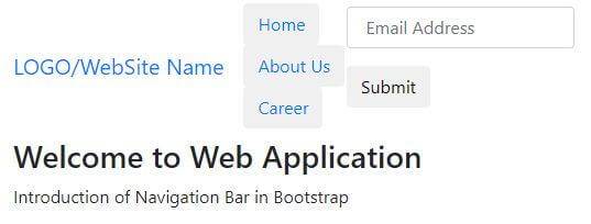
In this example, we are using buttons and forms for the user’s connection. This is an inverse navbar with a navbar-btn class used for the link. The navbar-form class is used in the navbar header list to show form content. In this form, we are using the input attribute for the email and submit button. The example is below.
Code:
<body>
<nav class="navbar navbar-inverse">
<div class="container">
<div class="navbar-header">
<a class="navbar-brand" href="#"> LOGO/WebSite Name </a>
</div>
<ul class="nav navbar-nav ">
<li class=" active"> <button class="btn btn-default navbar-btn"> <a href="#"> Home </a> </button> </li>
<li> <button class="btn btn-default navbar-btn"> <a href="#"> About Us </a> </button> </li>
<li> <button class="btn btn-default navbar-btn"> <a href="#"> Career </a> </button> </li>
</ul>
<form class ="navbar-form navbar-right" >
<div class ="form-group">
<input type ="text" class="form-control" placeholder =" Email Address ">
</div>
<button type ="submit" class ="btn btn-default"> Submit </button>
</form>
</div>
</nav>
<div class ="container">
<h3> Welcome to Web Application </h3>
<p> Introduction of Navigation Bar in Bootstrap </p>
</div>
</body>
Output:

Conclusion
The navigation bar is a heading list of all website content. This is always placed on top of the application. The size of the navigation bar can change according to device screen size. If you want to find contacts on the whole website then only click on the contact link or button. The contact page automatically shows on the screen. We can consider navbar as an index of the website. You get heading a list of websites all content in a single row.