Introduction to Bootstrap Collapse
HTML and CSS can make collapse but this technology needs big and complicated coding. In Bootstrap, collapse is easy for users and developers because of class and data toggle. Collapsible is used to hide a large amount of content and show this content when we want. Button and Anchor attributes are generated trigger for hiding and show content. It is using for memory and space management in the web pages.
Syntax
You can see the bootstrap syntax with the button and anchor tag below.
Syntax 1 using Button
<button type="button" class="btn btn-danger" data-toggle="collapse" data-target="#col"> Show more </button>
<div id ="col" class ="collapse">
HTML and CSS can make collapse but this technology needs big and complicated coding. <br>
In Bootstrap, collapse is easy for users and developers because of class and data toggle.
</div>
Syntax 2 using Anchor Attribute
<a href="#col" class ="btn btn-danger" data-toggle ="collapse"> Show more </button>
<div id ="col" class ="collapse">
HTML and CSS can make collapse but this technology needs big and complicated coding. <br>
In Bootstrap, collapse is easy for users and developers because of class and data toggle.
</div>
Syntax 3 for Default Content
<a href="#col" class="btn btn-danger" data-toggle="collapse"> Show more </button>
<div id="col" class="collapse in">
In Bootstrap, collapse is easy for users and developers because of class and data toggle.
</div>
How to work with Collapse in Bootstrap?
Following example are simple collapsible with Button tag.
Code:
<!DOCTYPE html>
<html>
<head>
<title> bootstrap collapse </title>
<meta name="viewport" content="width=device-width, initial-scale=1">
<link rel="stylesheet" href="https://maxcdn.bootstrapcdn.com/bootstrap/3.4.1/css/bootstrap.min.css">
<script src="https://ajax.googleapis.com/ajax/libs/jquery/3.4.1/jquery.min.js"> </script>
<script src="https://maxcdn.bootstrapcdn.com/bootstrap/3.4.1/js/bootstrap.min.js"> </script>
</head>
<body>
<div class="container">
<h1> syntax of bootstrap collapse </h1>
<button type="button" class="btn btn-danger" data-toggle="collapse" data-target="#col"> Show more </button>
<div id="col" class="collapse">
HTML and CSS can make collapse but this technology needs big and complicated coding. <br>
In Bootstrap, collapse is easy for users and developers because of class and data toggle.
</div>
</div>
</body>
</html>
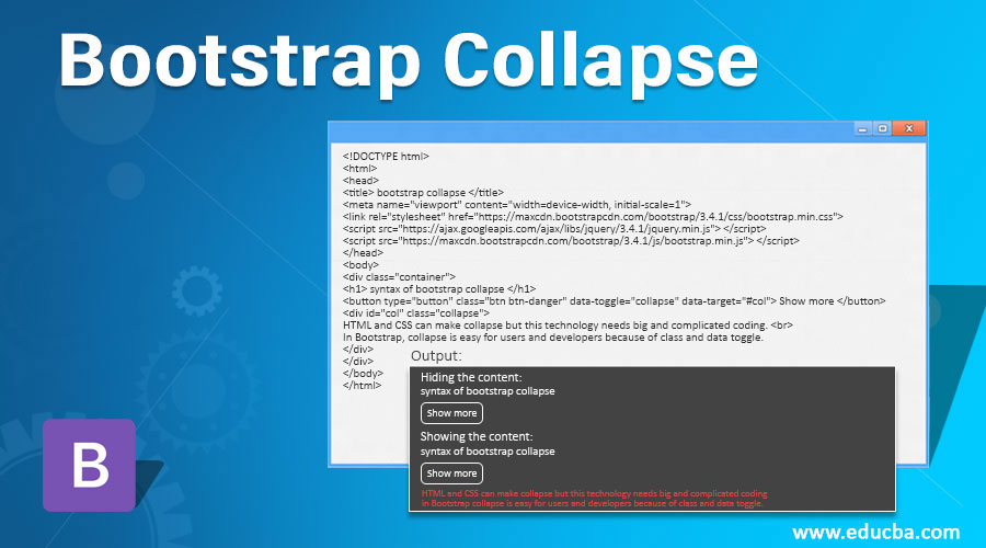
Output:
Hiding the content:

Showing the content:

Description:
After clicking the button, both outputs cover the content and show the contents.
- The class =” collapse” is used to show and hide the content with the button.
- The data-toggle =”collapse” is used for the control of collapse. This attribute used inside <a> or <button> tag.
- If <button> tag is used in collapsible then data-target =”#col” is used for connecting the data and button. For connection of data and button id =”col” also using with data-target.
- If <a> tag is used then href =”#col” attribute used instead of data-target.
- If content wants to show by default then class=” collapse in” is used.
Examples of Bootstrap Collapse
You can see the different ways of using a collapse in bootstrap. Show the following examples.
Example #1
A basic example of collapse using the button tag.
Code:
<!DOCTYPE html>
<html>
<head>
<title> bootstrap collapse </title>
<meta name ="viewport" content ="width=device-width, initial-scale =1">
<link rel="stylesheet" href="https://maxcdn.bootstrapcdn.com/bootstrap/3.4.1/css/bootstrap.min.css">
<script src="https://ajax.googleapis.com/ajax/libs/jquery/3.4.1/jquery.min.js"></script>
<script src="https://maxcdn.bootstrapcdn.com/bootstrap/3.4.1/js/bootstrap.min.js"></script>
</head>
<body>
<div class ="container">
<div class ="col-3" style= "border:1px solid black;" >
<h5> bootstrap collapse with button1 </h5>
<button type ="button" class ="btn btn-danger" data-toggle ="collapse" data-target="#col1"> Show more </button>
<div id="col1" class="collapse">
HTML and CSS can make collapse but this technology needs big and complicated coding. <br>
In Bootstrap, collapse is easy for users and developers because of class and data toggle.
</div>
</div>
<div class = "col-3" style = "border:1px solid black;">
<h5> bootstrap collapse with button2 </h5>
<button type ="button" class ="btn btn-danger" data-toggle ="collapse" data-target="#col2"> Show more </button>
<div id ="col2" class ="collapse">
HTML and CSS can make collapse but this technology needs big and complicated coding. <br>
In Bootstrap, collapse is easy for users and developers because of class and data toggle.
</div>
</div>
</div>
</body>
</html>
Output:


Description:
- In the above example, we can use a simple collapse with the grid system.
- We can divide into two sections and apply the collapse class on them.
- One side is hiding data and another side is showing data.
Example #2
Bootstrap collapse using the panel.
Code:
<!DOCTYPE html>
<html>
<head>
<title> bootstrap collapse </title>
<meta name="viewport" content="width=device-width, initial-scale=1">
<link rel="stylesheet" href="https://maxcdn.bootstrapcdn.com/bootstrap/3.4.1/css/bootstrap.min.css">
<script src="https://ajax.googleapis.com/ajax/libs/jquery/3.4.1/jquery.min.js"></script>
<script src="https://maxcdn.bootstrapcdn.com/bootstrap/3.4.1/js/bootstrap.min.js"></script>
</head>
<body>
<div class="container">
<h3> Bootstrap collapse using Panel </h3>
<div class ="panel-group">
<div class ="panel panel-default">
<div class ="panel-heading">
<div class="panel-title">
<a data-toggle="collapse" href="#col1"> panel of bootstrap collapse </a>
</div>
</div>
<div id="col" class ="panel-collapse collapse">
<div class ="panel-body">
HTML and CSS can make collapse but this technology needs big and complicated coding. <br>
In Bootstrap, collapse is easy for users and developers because of class and data toggle.
</div>
<div class ="panel-footer"> Footer content </div>
</div>
</div>
</div>
</div>
</body>
</html>
Output:
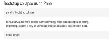
Hiding Panel Body:

Showing Panel Body:

Description:
- You can see the above example with output. The panel heading plate is only visible.
- After clicking on heading we can see the panel body and panel footer.
- The panel-heading class is used for by default visible header.
- The panel-body and panel-footer class are used for the main content and footer of content respectively.
Example #3
Bootstrap collapse with row.
Code:
<!DOCTYPE html>
<html>
<head>
<title> bootstrap collapse </title>
<meta name="viewport" content="width=device-width, initial-scale=1">
<link rel="stylesheet" href="https://maxcdn.bootstrapcdn.com/bootstrap/3.4.1/css/bootstrap.min.css">
<script src ="https://ajax.googleapis.com/ajax/libs/jquery/3.4.1/jquery.min.js"></script>
<script src="https://maxcdn.bootstrapcdn.com/bootstrap/3.4.1/js/bootstrap.min.js"></script>
</head>
<body>
<div class ="container">
<h3> Bootstrap collapse with row </h3>
<div class ="panel-group" id="row">
<div class ="panel panel-default">
<div class ="panel-heading">
<h4 class ="panel-title">
<a data-toggle ="collapse" data-parent="#row" href="#row1">
Collapse row 1</a>
</h4>
</div>
<div id ="row1" class="panel-collapse collapse">
<div class ="panel-body"> HTML and CSS can make collapse but this technology needs big and complicated coding. <br>
In Bootstrap, collapse is easy for users and developers because of class and data toggle. </div>
</div>
</div>
<div class ="panel-group" id="row3">
<div class ="panel panel-default">
<div class ="panel-heading">
<h3 class ="panel-title">
<a data-toggle ="collapse" data-parent="#row3" href="#row4">
Collapse row 2</a>
</h3>
</div>
<div id ="row4" class="panel-collapse collapse">
<div class ="panel-body"> HTML and CSS can make collapse but this technology needs big and complicated coding. <br>
In Bootstrap, collapse is easy for users and developers because of class and data toggle. </div>
</div>
</div>
</body>
</html>
Output:


Conclusion
This is used for saving space and managing a large amount of content on the web page. Hiding the content and showing again data is helpful for web pages to make website spacious. Because of the collapse in bootstrap, web design makes it more attractive and animated.