Introduction to Bootstrap Typography
Typography is one of the latest features of bootstrap. It’s especially used for styling and formatting text elements. Using the typography feature of bootstrap, someone can create headings, paragraphs, some other inline elements, and lists. Basically bootstrap uses 1rem (16px) as font size including line-height remains 5. By default, font families used by bootstrap are sans-serif, Arial; it sets how the contents should display on the body, background color on the body, uses font size and line height to create margins, paddings, etc.
Features of Bootstrap Typography
Below are the different features of typography:
1. Headings
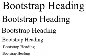
HTML headings are divided into <h1>to <h6>
<h1>Bootstrap Heading</h1> displayed in font-size
<h2>Bootstrap Heading</h2> displayed in font-size
<h3>Bootstrap Heading</h3> displayed in font-size
<h4>Bootstrap Heading</h4> displayed in font-size
<h5>Bootstrap Heading</h5> displayed in font-size
<h6>Bootstrap Heading</h6> displayed in font-size
Output:

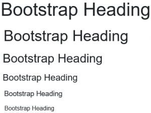
By using Bootstrap typography, it is styled & formatted using respective classes as shown below:
<h1 class="h1">Bootstrap Heading</h1> displayed in font-size
<h2 class="h2">Bootstrap Heading</h2> displayed in font-size
<h3 class="h3">Bootstrap Heading</h3> displayed in font-size
<h4 class="h4">Bootstrap Heading</h4> displayed in font-size
<h5 class="h5">Bootstrap Heading</h5> displayed in font-size
<h6 class="h6">Bootstrap Heading</h6> displayed in font-size
Output:

2. Responsive Headings
Responsive headings are one of the best things one can design using typography. These are the elements in which text gets adjusted automatically by using class responsive as per device size. So one can easily see the same text in an appropriate way on different devices.
Just add class responsive in your header tag as follows:
<h5 class="h5-responsive"> Responsive Header</h5>Output:
Responsive Header
You can check the same text on different devices and resize the browser; it will show changes.
3. <small>
This tag is used to create lighter, smaller, secondary text in your heading. By default, it sets to 85% of the size of the parent heading.
Example:
<h5>Example heading <small>secondary text</small></h5>Output:
h5 heading secondary text
4. <mark>
This tag is used to highlight text.
Example:
<h2>Bootstrap Typography</h2>
<p>This is used to <mark>highlight</mark> text.</p>
5. <abbr>
This tag is used to mark an abbreviation. Abbreviations have a default underline and gain a help cursor to provide additional context on hover and to users of assistive technologies.
Example:
<p>There are so many countries in the world.<abbr>India</abbr>is the best country</p>6. <del>
Indicates deleted text
Example:
<p>This tag is used to show <del>deleted text</del>.</p>This tag is used to show.
7. <blockquote>
The blockquote element is used to present content from another source.
Example:
<h1>Blockquotes</h1>
<p>The blockquote element is used to present content from another source:</p>
<blockquote>
<p>Very little is needed to make a happy life; it is all within yourself, in your way of thinking.Life is like playing a violin in public and learning the instrument as one goes on. </p> </blockquote>
Output:
Blockquotes
The blockquote element is used to present content from another source:
Very little is needed to make a happy life; it is all within yourself, in your way of thinking. Life is like playing the violin in public and learning the instrument as one goes on.
8. <dl>
This tag is used to display a description list.
Example:
<p>The dl element indicates a description list:</p>
<dl>
<dt>Bread</dt>
<dd>- White</dd>
<dd>- Brown</dd>
<dt>Cold Drinks</dt>
<dd>- Pepsi</dd>
</dl>
Output:
The dl element indicates a description list:
Bread
White
Brown
Cold Drinks
Pepsi.
9. <code>
The inline statement of code should be clubbed together in the code element.
Example:
<p>The following HTML elements: <code>span</code>, <code>section</code>, and <code>div</code> defines a section in a document.</p>Output:
The following HTML elements: span, section, and div defines a section in a document.
10. Contextual Colors
This is nothing but a different class that is used to convey meaning using different colors. It’s having different classes like .text-muted, .text-info, .text-primary, .text-success, .text-warning , .text-danger.
Example:
<p>Use the contextual classes to provide "meaning through colors":</p>
<p class="text-muted">This text is muted.</p>
<p class="text-primary">This text is important.</p>
<p class="text-success">This text indicates success.</p>
<p class="text-info">This text represents some information.</p>
<p class="text-warning">This text represents a warning.</p>
<p class="text-danger">This text represents danger.</p>
Output:
This text is muted.
This text is important.
This text indicates success.
This text represents some information.
This text represents a warning.
This text represents danger.
Where we can Use
Here we will see where it can be used.
- Most of web designers prefer to use bootstrap typography for a better look and feel of text format.
- It’s especially used while styling and formatting text content.
- Most of the time, there is an issue regarding text responsiveness. Text size gets varied as per different devices. So these issues get clarified by using the bootstrap typography feature.
- Bootstrap Typography is customized in a simple manner to present attractively to the end-user.
- Such text elements on a web page will always be rendered through the link to the Bootstrap 4 style sheet in the same way, except these elements are overridden by other style classes.
- The Bootstrap provides developers with convenient typography features to make it easy for them to create headings, paragraphs, lists and other inline elements that would be appealing to the readers.
Conclusion
As per all details given in the above content, the different typography features of Bootstrap for headings, blockquote, Lead Text, Marked Text, Abbreviations with suitable examples. Bootstrap’s robust and pretty features make it a very popular and unique front end development framework that many organizations widely use. The bootstrap comes with all the typography tags that we want styled for, everything from a <address> tag to <h1> and the whole heading hierarchy.