Introduction to Bootstrap Forms Validation
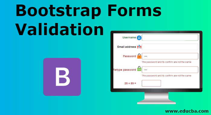
Validation is used to form acceptance with some rules and regulations. Bootstrap has many classes to build a form. But validation requires for control data about form. In this topic, we are going to learn about the types of Bootstrap Form Validation. For example, the form has a password. Password has many rules according to requirements.
Someone needs letters, many need numeric, otherwise, somebody required any special characters. The user knows the fulfillment of the requirement, validation is important. Sometimes the user does not get the exact requirement of form or how much required to fulfill, that time validation is helpful to submit data correctly. If you do not fulfill the specification then you get the feedback in the form automatically.
How to Validate Forms with Bootstrap?
- The bootstrap form makes validation overcome all complications of JavaScript coding and work easily with classes.
- Three bootstrap form validation comes with some glyphicon to get the message of error, warning, and success. Validation classes always placed in the parent class.
- Along with validation classes, it also requires the has-feedback class to get the icon in the proper place in the form input box along with the label. This class placed in the parent class.
Example:
Code:
<div class="form-group has-warning has-feedback"> </div>The form-control-feedback class was also necessary with the glyphicon icon to set icon in the box of the input form.
Example:
Code:
<span class="glyphicon glyphicon-ok form-control-feedback"> </span>Types of Bootstrap Forms Validation
There are 3 types of bootstrap form as mentioned below:
1. has-success
This class used to get the message of success. With this validation class, users need also “glyphicon glyphicon-ok” icon to show the icon of success. If the user enters the input in the form correctly then this validation worked.
The has-success class comes up with a parent class. To get the success message to use this validation used. The below example gives the horizontal form format. Output comes with the message in the green color.
Syntax:
<div class="form-group has-success has-feedback"> </div>.Example:
Code:
<form class="form-horizontal">
<div class="form-group has-success has-feedback">
<label class="col-sm-2 control-label" for="passSuccess">
Paasword</label>
<div class="col-sm-10">
<input type="text" class="form-control" id="passSuccess">
<span class="glyphicon glyphicon-ok form-control-feedback"></span>
</div>
</div>
</form>
Output:

2. has-warning
This class used for warning messages of form input. With this validation class, users need also a “glyphicon glyphicon- warning-sign” icon to show the icon of warning. If we enter the wrong input in the form, we have one more chance to enter input that time warning validation worked.
Warning validation class placed in parent class with a has-feedback class. If the user gets the warning of some kind of mistake then this class worked. The outcome comes with the message in yellow color.
Syntax:
<div class="form-group has-warning has-feedback"> </div>Example:
Code:
<form class="form-horizontal">
<div class="form-group has-warning has-feedback">
<label class="col-sm-2 control-label" for="passSuccess">
Paasword</label>
<div class="col-sm-10">
<input type="text" class="form-control" id="passSuccess">
<span class="glyphicon glyphicon-warning-sign form-control-feedback"></span>
</div>
</div>
</form>
Output:

3. has-error
This class used for error message of form input. With this validation class, users need also “glyphicon glyphicon-remove” icon to show the icon of error. If we enter the wrong input in the form, this validation worked.
Error validation class placed in parent class with a has-feedback class. If the user gets the error message of mistake then this class worked.
Syntax:
<div class="form-group has-error has-feedback">Example:
Code:
<form class="form-horizontal">
<div class="form-group has-error has-feedback">
<label class="col-sm-2 control-label" for="passSuccess">
Paasword</label>
<div class="col-sm-10">
<input type="text" class="form-control" id="passSuccess">
<span class="glyphicon glyphicon-remove form-control-feedback"></span>
</div>
</div>
</form>
Output:

Explanation:
- All form is a horizontal layout. The label has 2 columns and input has 10 columns. Validation class set with has-feedback into parent div. To see the icon user used glyphicon icons with form-control-feedback in the <span>
- Users work on the password. either password is correct then success validation work or password is wrong then error validation work. If the password has some mistake and we can able to recorrect then warning validation work.
Examples of Bootstrap Forms Validation
Below are the different examples of bootstrap forms validation:
Example #1
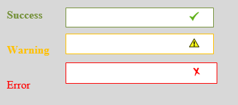
The following example is Validation with the horizontal form. Glyphicon sign is work on the inner input box in the form. Label and input in one horizontal line but all form-group class is vertically placed.
Code:
<form class="form-horizontal">
<div class="form-group has-success has-feedback">
<label class="col-sm-2 control-label" for="mySuccess">
Success</label>
<div class="col-sm-10">
<input type="text" class="form-control" id="mySuccess">
<span class="glyphicon glyphicon-ok form-control-feedback"></span>
</div>
</div>
<div class="form-group has-warning has-feedback">
<label class="col-sm-2 control-label" for="myWarning">
Warning</label>
<div class="col-sm-10">
<input type="text" class="form-control" id="myWarning">
<span class="glyphicon glyphicon-warning-sign form-control-feedback"></span>
</div>
</div>
<div class="form-group has-error has-feedback">
<label class="col-sm-2 control-label" for="myError">
Error</label>
<div class="col-sm-10">
<input type="text" class="form-control" id="myError">
<span class="glyphicon glyphicon-remove form-control-feedback"></span>
</div>
</div>
</form>
Output:

Example #2
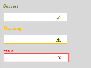
The following example is Validation with the vertical form. In the vertical form, all labels and inputs are vertical situated. Glyphicon can be situated in the line of the label at the end of the input box.
There is no class in the form. It is rarely used in form validation in bootstrap.
Code:
<form >
<div class="form-group has-success has-feedback">
<label class=" control-label" for="mySuccess">
Success</label>
<div>
<input type="text" class="form-control" id="mySuccess">
<span class="glyphicon glyphicon-ok form-control-feedback"></span>
</div>
</div>
<div class="form-group has-warning has-feedback">
<label class=" control-label" for="myWarning">
Warning</label>
<div>
<input type="text" class="form-control" id="myWarning">
<span class="glyphicon glyphicon-warning-sign form-control-feedback"></span>
</div>
</div>
<div class="form-group has-error has-feedback">
<label class=" control-label" for="myError">
Error</label>
<div >
<input type="text" class="form-control" id="myError">
<span class="glyphicon glyphicon-remove form-control-feedback"></span>
</div>
</div>
</form>
Output:

Example #3
The following example is Validation with the inline form. The inline form has all labels and input in one line including all form groups. This is a complicated but validation icon placed in the input box of the form.
If users need only small form and login form then with validations then the inline form can apply.
Code:
<form class="form-inline">
<div class="form-group has-success has-feedback">
<label class=" control-label" for="mySuccess">
Success</label>
<div>
<input type="text" class="form-control" id="mySuccess">
<span class="glyphicon glyphicon-ok form-control-feedback"></span>
</div>
</div>
<div class="form-group has-warning has-feedback">
<label class=" control-label" for="myWarning">
Warning</label>
<div>
<input type="text" class="form-control" id="myWarning">
<span class="glyphicon glyphicon-warning-sign form-control-feedback"></span>
</div>
</div>
<div class="form-group has-error has-feedback">
<label class=" control-label" for="myError">
Error</label>
<div >
<input type="text" class="form-control" id="myError">
<span class="glyphicon glyphicon-remove form-control-feedback"></span>
</div>
</div>
</form>
Output:

Above all example has all validation type with all layout and how it works. As per user requirement and easiness choose the format of form validation and layout.
Conclusion
Mostly form validation occurs on the server-side to control data of form in a database. For those purposes, we get many complicated coding and using the validation method using JavaScript language. Bootstrap did all things in one form page avoiding complications and lengthy coding and control the form data effortlessly.