Introduction to Bootstrap float right
The bootstrap float has mainly two classes. The float-right, float-left classes have in bootstrap. The element placed at left or right according to class requirement. The float right is used to place the element in the right side position. The other element place around the floating content. The float right is mostly used for place images and highlight elements on the right side. The default content set at the left side but using float- right we can place the content at the right side.
How Does float right work?
The float right using the float-right class for normal viewport at the web application. The responsive float right used as per device screen width and size. Here we used a small screen size for a phone device.
Example:
<!DOCTYPE html>
<html>
<head>
<title> Bootstrap Float Right Example </title>
<meta name= "viewport" content= "width=device-width, initial-scale=1">
<link rel= "stylesheet" href= "https://maxcdn.bootstrapcdn.com/bootstrap/4.1.0/css/bootstrap.min.css">
</head>
<body>
<div class="container">
<h2> Bootstrap Float Right Example </h2>
<div class="clear">
<div class="float-right"> Today’s Tutorial. </div>
The bootstrap float has mainly two classes. The float-right, float-left classes have in bootstrap. The element placed at left or right according to class requirement.
The bootstrap float right is used to place the element in the right side position. The other elements place around the floating content.
</div>
</div>
<script src= "https://ajax.googleapis.com/ajax/libs/jquery/3.3.1/jquery.min.js"></script>
<script src= "https://maxcdn.bootstrapcdn.com/bootstrap/4.1.0/js/bootstrap.min.js"></script>
</body>
</html>
Syntax
- The main syntax of bootstrap float right is below.
<div class = "float- right" >- The responsive float right is below.
| Bootstrap float right syntax | Details of syntax |
| class= “float-sm-right” | The data set at the right side of the small screen. |
| class= “float-md-right” | The data set at the right side of the medium screen. |
| class= “float-lg-right” | The data set at the right side of the large screen. |
| class= “float-xl-right” | The data set at the right side of the extra-large screen. |
Examples of Bootstrap float right
Below are the diferent examples:
Example #1
The heading and details of contents using float right. The basic class, class=”float-right” used for example.
Code:
<!DOCTYPE html>
<html>
<head>
<title> Bootstrap Float Right Example </title>
<meta name= "viewport" content= "width=device-width, initial-scale=1">
<link rel= "stylesheet" href= "https://maxcdn.bootstrapcdn.com/bootstrap/4.1.0/css/bootstrap.min.css">
<style>
.float-right{
width: 100px;
height: 100px;
border: 1px solid black;
padding: 5px;
background-color: orange;
}
</style>
</head>
<body>
<div class= "container">
<h2> Bootstrap Float Right Example </h2>
<div class= "clear">
<div class= "float-right"> Today’s Tutorial. </div>
The bootstrap float has mainly two classes. The float-right, float-left classes have in bootstrap. The element placed at left or right according to class requirement.
The bootstrap float right is used to place the element in the right side position. The other elements place around the floating content.
</div>
</div>
<script src= "https://ajax.googleapis.com/ajax/libs/jquery/3.3.1/jquery.min.js"></script>
<script src= "https://maxcdn.bootstrapcdn.com/bootstrap/4.1.0/js/bootstrap.min.js"></script>
</body>
</html>
Output

Description:
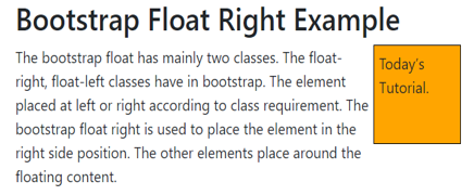
- The above output shows an orange box on the right side.
- The rest of the elements automatically set around the box.
Example #2
The responsive float-right example is below.
The “float-sm-left” class is used for small screen size devices.
Code:
<!DOCTYPE html>
<html>
<head>
<title> Bootstrap Float Right Example </title>
<meta name = "viewport" content = "width=device-width, initial-scale=1">
<link rel = "stylesheet" href= "https://maxcdn.bootstrapcdn.com/bootstrap/4.1.0/css/bootstrap.min.css">
<style>
.float-md-right{
width: 100px;
height: 100px;
border: 1px solid black;
padding: 5px;
background-color: orange;
}
</style>
</head>
<body>
<div class= "container">
<h2> Bootstrap Float Right Example </h2>
<div class= "clear">
<div class= "float-md-right"> Today’s Tutorial. </div>
The bootstrap float has mainly two classes. The float-right, float-left classes have in bootstrap. The element placed at left or right according to class requirement.
The bootstrap float right is used to place the element in the right side position. The other elements place around the floating content.
</div>
</div>
<script src = "https://ajax.googleapis.com/ajax/libs/jquery/3.3.1/jquery.min.js">
</script>
<script src = "https://maxcdn.bootstrapcdn.com/bootstrap/4.1.0/js/bootstrap.min.js">
</script>
</body>
</html>
Output for medium size screen

Output for the small size screen

Description:
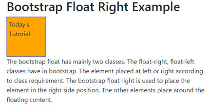
- The above output has according to small and medium screen sizes.
- The medium size float-right class used in the example.
- The content placed right side when the device screen size is medium or above.
- The small size screen devices show simply as other web application content works.
Example #3
The below example is responsive float right for all screen size.
Code:
<!DOCTYPE html>
<html>
<head>
<title> Bootstrap float right Example </title>
<meta name ="viewport" content ="width=device-width, initial-scale=1">
<link rel ="stylesheet" href= "https://maxcdn.bootstrapcdn.com/bootstrap/4.4.1/css/bootstrap.min.css">
<script src= "https://ajax.googleapis.com/ajax/libs/jquery/3.4.1/jquery.min.js">
</script>
<script src= "https://cdnjs.cloudflare.com/ajax/libs/popper.js/1.16.0/umd/popper.min.js">
</script>
<script src= "https://maxcdn.bootstrapcdn.com/bootstrap/4.4.1/js/bootstrap.min.js">
</script>
<style>
.float-md-right{
width: 140px;
height: 100px;
border: 1px solid black;
padding: 5px;
background-color: orange;
}
.float-sm-right{
width: 140px;
height: 100px;
border: 1px solid black;
padding: 5px;
background-color: yellow;
}
.float-lg-right{
width: 140px;
height: 100px;
border: 1px solid black;
padding: 5px;
background-color: lightgrey;
}
.float-xl-right{
width: 140px;
height: 100px;
border: 1px solid black;
padding: 5px;
background-color: lightblue;
}
</style>
</head>
<body>
<div class= "container">
<h2> Responsive bootstrap Floats right </h2>
<p> The bootstrap float has mainly two classes. The float-right, float-left classes have in bootstrap. The element placed at left or right according to class requirement.
The bootstrap float right is used to place the element in the right side position. The other elements place around the floating content.
</p>
<div class= "clear">
<div class= "float-sm-right"> The data set at the right side of the small screen.       </div> <br>
<div class= "float-md-right"> The data set at the right side of the medium screen.       </div> <br>
<div class= "float-lg-right"> The data set at the right side of the large screen.       </div> <br>
<div class= "float-xl-right"> The data set at the right side of the extra-large screen. </div> <br>
</div>
</div>
</body>
</html>
Output for Small Screen Size

Output for Medium Screen Size

Output for Large Screen Size

Description:
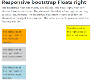
- The above outputs are small, medium, and large screen size float right.
- All bootstrap float content sets the right side when the screen size is large.
- The float-sm-right, float-md-right class used for small and medium screen size devices.
Conclusion
The float right makes web applications in the standard format. It looks user friendly and easy to point important elements in the application. The web applications look elegant, attractive, and formatted using float right.