Introduction to Bootstrap Panels
The content of data must be showing clean, neat and suitable. Having space in contents, colorful header and footer, and border for content looks attractive. Attractive content is easy for reading and understanding. Bootstrap panel work exactly similar for content. It is used for border-box for content with specific padding. It works for content, header, footer and also in a different color. Basic bootstrap panel work using ” .panel ” class in a div element, with this class ” .panel-default ” class also required.
Example:
<div class="panel panel-default">
<div class="panel-body"> THIS IS A DEFAULT PANEL </div>
</div>
Output:
![]()
Types of Bootstrap Panels
Panels are categorized with different classifications and goals which is the following. Content has a heading, body, and footer part. To make elegant content and style with purpose, the panel comes up with these categories:
1. Panel with the Heading
In panel heading, border-box surrounded with content heading and content body with format padding. Heading panel add class = “panel-heading” and content body add class = “panel-body”.
Code:
<div class="panel panel-default">
<div class="panel-heading"> Content Heading </div>
<div class="panel-body"> Content Body </div>
</div>
Output:

You can add the class = “panel-title” to modify the heading of content separately. This class is used rarely because the panel heading class modify all styles by themselves.
2. Panel with Footer
In panel footer, border-box surrounded with content footer and content body with format padding. Footer panel add class = “panel-footer” and content body add class = “panel-body”.
Code:
<div class="panel panel-default">
<div class="panel-body"> Content Body </div>
<div class="panel-footer"> Content Footer </div>
</div>
Output:

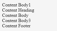
3. Panel Group
This panel is used for binding the many panels at a time. It removes the margin of the lower panel and makes a group of panels.
Code:
<div class="panel-group">
<div class="panel panel-default">
<div class="panel-body">Content Body1</div>
</div>
<div class="panel panel-default">
<div class="panel-heading"> Content Heading </div>
<div class="panel-body"> Content Body </div>
</div>
<div class="panel panel-default">
<div class="panel-body"> Content Body3 </div>
<div class="panel-footer"> Content Footer </div></div>
</div>
Output:

4. Panels with Contextual Classes
To get a more meaningful context bootstrap panel design different classes for context. Every contextual class heading has a different color to show the impact of context. These panel classes are below with their examples and outputs,
- .panel-default: This is the default panel used for context.
Code:
<div class="panel panel-default">
<div class="panel-heading"> Content Heading </div>
<div class="panel-body"> Content Body </div>
</div>
Output:

- .panel-primary: This class used for primary context means main contexts.
Code:
<div class="panel panel-primary">
<div class="panel-heading"> Content Heading with panel-primary class /div>
<div class="panel-body"> Content Body2 </div>
</div>
Output:

- .panel-success: This class is used when some context has the meaning of success.
Code:
<div class="panel panel-success">
<div class="panel-heading"> Content Heading with panel-success class </div>
<div class="panel-body"> Content Body3 </div>
</div>
Output:

- .panel-info: This class is used when some context has informative.
Code:
<div class="panel panel-info">
<div class="panel-heading"> Content Heading with panel-info class </div>
<div class="panel-body"> Content Body4</div>
</div>
Output:

- .panel-warning: This class is used when some context has the meaning of a warning sign.
Code:
<div class="panel panel-warning">
<div class="panel-heading"> Content Heading with panel-warning class </div>
<div class="panel-body"> Content Body5</div>
</div>
Output:

- .panel-danger: This class is used when some context has the meaning of danger and wants to indicate.
Code:
<div class="panel panel-danger">
<div class="panel-heading"> Content Heading with panel-danger class </div>
<div class="panel-body"> Content Body6</div>
</div>
Output:

Examples of Bootstrap Panels
Following are the examples explained in detail,
Example #1: Simple Bootstrap Panel
This is a simple bootstrap default panel example where placed panel heading, panel footer, and description body.
Code:
<div class="container">
<div class="panel panel-default">
<div class="panel-heading"> Content Heading </div>
<div class="panel-body"> Content Body <br/> Panel body for context </div>
<div class="panel-footer"> Content Footer </div>
</div>
</div>
Output:

Example #2: Bootstrap Panel with Table
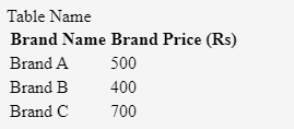
- In this example get the output of the table using bootstrap panel. The table can be modified to look elegant. The following example and output is the table using the bootstrap panel.
- This example needs a table class to make a table. It makes primary and panel heading class keeps a table name.
- The table class comes up with a panel body class. In this table, table header and table data are placed.
Code:
<div class="container">
<div class = "panel panel-primary">
<div class = "panel-heading">Table Name</div>
<table class = "panel-body table ">
<tr>
<th> Brand Name </th>
<th> Brand Price (Rs) </th>
</tr>
<tr>
<td> Brand A </td>
<td> 500 </td>
</tr>
<tr>
<td> Brand B </td>
<td> 400 </td>
</tr>
<tr>
<td> Brand C </td>
<td> 700 </td>
</tr>
Output:

Example #3: Bootstrap Panel with List
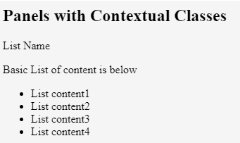
- This example is similar to the table but the only change is that the list is working instead of the table. panel-info class is used in this example.
- Panel heading is used for the name of the list.
- This example comes up with the unordered list in panel body class with a small description.
Code:
<div class="container">
<h2>Panels with Contextual Classes</h2>
<div class = "panel panel-info">
<div class ="panel-heading">List Name</div>
<div class = "panel-body">
<p> Basic List of content is below</p>
<ul class = "list-group">
<li class = "list-group-item"> List content1 </li>
<li class = "list-group-item"> List content2 </li>
<li class = "list-group-item"> List content3 </li>
<li class = "list-group-item"> List content4 </li>
</ul>
</div>
</div>
</div>
Output:

Conclusion
Sometimes Web application context looks clumsy and uneasy to read. It works to border and style with padding. Every content gets formatted padding with a meaningful context. For meaningful context used much class of bootstrap panel. This makes context readable, attractive and more effective.