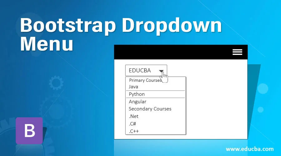
Introduction to Bootstrap Dropdown Menu
Bootstrap dropdown menu is defined as it allows a user to select any value from predefined values from the list. Dropdown menu is allowed to put numbers, strings, special characters, etc. A Dropdown menu is available in a third-party library called js. Make a dropdown menu to work in bootstrap and must include bootstrap.bundle.min.js/ bootstrap.bundle.js. Inside the dropdown menu, we can also include buttons, links, headers, etc. Inside dropdown, elements can also make it non-editable.
Real-time Scenario: While we want to select states, countries, villages, product items, etc. It can be done by drop-down menu.
Why Bootstrap over HTML?
- In HTML, developers must write each and every class, ids, links, buttons, cascading styles etc.
- Whereas in Bootstrap most of the predefined classes, links, and buttons, etc. are done with their own cascading styles to reduce code complexity.
How does Dropdown Menu Work in Bootstrap?
In bootstrap navigation bar feature works based on data-toggle=”dropdown”
Syntax:
<button type="button" data-toggle="dropdown">Dropdown Menu</button>type=”button”: Gives button type.
data-toggle=”dropdown”: Makes button to drop-down list
Different styles to drop-down list:
- class=”btn btn dropdown-toggle”: Drop-down list with light brown color.
- class=”btn btn-default dropdown-toggle”: Drop-down list with white color.
- class=”btn btn-primary dropdown-toggle”: Drop-down list with blue color.
- class=”btn btn-success dropdown-toggle”: Drop-down list with green color.
- class=”btn btn-info dropdown-toggle”: Drop-down list with light blue color.
- class=”btn btn-warning dropdown-toggle”: Drop-down list with light yellow color.
- class=”btn btn-danger dropdown-toggle”: Drop-down list with light red color.
Includes bootstrap feature in our application, we must specify some pre-defined libraries inside our application. They are as follows:
1. Includes bootstrap view
<meta name="viewport" content="width=device-width, initial-scale=1">2. Includes ajax and jQuery libraries
<script src="https://ajax.googleapis.com/ajax/libs/jquery/3.4.1/jquery.min.js"></script>3. Includes bootstrap libraries
<link rel="stylesheet" href="https://maxcdn.bootstrapcdn.com/bootstrap/3.4.1/css/bootstrap.min.css">4. Includes bootstrap libraries
<script src="https://maxcdn.bootstrapcdn.com/bootstrap/3.4.1/js/bootstrap.min.js"></script>Examples of Bootstrap Dropdown Menu
Given below are the examples of Bootstrap Dropdown Menu:
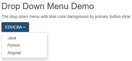
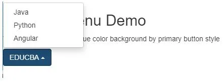
Example #1
Dropdown menu example.
Code:
<!DOCTYPE html>
<html>
<head>
<meta charset="ISO-8859-1">
<title>Drop Down Menu</title>
<meta name="viewport" content="width=device-width, initial-scale=1">
<script
src="https://ajax.googleapis.com/ajax/libs/jquery/3.4.1/jquery.min.js"></script>
<link rel="stylesheet"
href="https://maxcdn.bootstrapcdn.com/bootstrap/3.4.1/css/bootstrap.min.css">
<script
src="https://maxcdn.bootstrapcdn.com/bootstrap/3.4.1/js/bootstrap.min.js"></script>
</head>
<body>
<div class=" main">
<h2>Drop Down Menu Demo</h2>
<p>The drop down menu with blue color background by primary
button style</p>
<div class="dropdown">
<button class="btn btn-primary dropdown-toggle" type="button"
data-toggle="dropdown">
EDUCBA <span class="caret"></span>
<!-- class="caret" used to open drop down list -->
</button>
<ul class="dropdown-menu">
<!-- class="dropdown-menu" display drop down list values -->
<li><a
href="https://www.educba.com/category/software-development/software-development-tutorials/java-tutorial/">Java</a></li>
<li><a
href="https://www.educba.com/category/software-development/software-development-tutorials/python-tutorial/">Python</a></li>
<li><a
href="https://www.educba.com/category/software-development/software-development-tutorials/angular-tutorial/">Angular</a></li>
</ul>
</div>
</div>
</body>
</html>
Output:
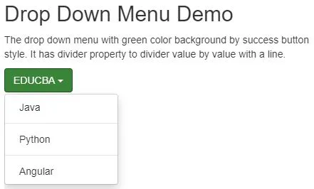
Example #2
Dropdown menu with divider example: class=”divider” is used to divide the drop-down list values.
Code:
<!DOCTYPE html>
<html>
<head>
<meta charset="ISO-8859-1">
<title>Drop Down Menu</title>
<meta name="viewport" content="width=device-width, initial-scale=1">
<script
src="https://ajax.googleapis.com/ajax/libs/jquery/3.4.1/jquery.min.js"></script>
<link rel="stylesheet"
href="https://maxcdn.bootstrapcdn.com/bootstrap/3.4.1/css/bootstrap.min.css">
<script
src="https://maxcdn.bootstrapcdn.com/bootstrap/3.4.1/js/bootstrap.min.js"></script>
</head>
<body>
<div class=" main ">
<h2>Drop Down Menu Demo</h2>
<p>The drop down menu with green color background by success
button style. It has divider property to divider value by value with a line.</p>
<div class="dropdown">
<button class="btn btn-success dropdown-toggle" type="button"
data-toggle="dropdown">
EDUCBA <span class="caret"></span>
<!-- class="caret" used to open drop down list -->
</button>
<ul class="dropdown-menu">
<!-- class="dropdown-menu" display drop down list values -->
<li><a
href="https://www.educba.com/category/software-development/software-development-tutorials/java-tutorial/">Java</a></li>
<li class="divider"></li> <!-- divider property to divide value by value with a line -->
<li><a
href="https://www.educba.com/category/software-development/software-development-tutorials/python-tutorial/">Python</a></li>
<li class="divider"></li>
<li><a
href="https://www.educba.com/category/software-development/software-development-tutorials/angular-tutorial/">Angular</a></li>
</ul>
</div>
</div>
</body>
</html>
Output:
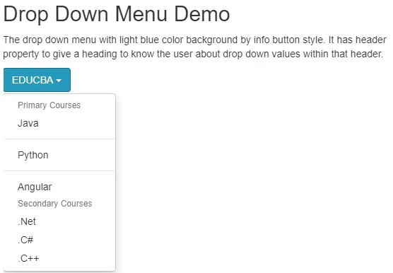
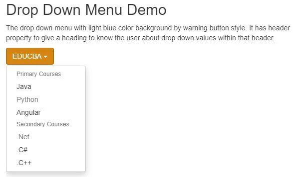
Example #3
Dropdown menu with header example: class=”dropdown-header” is used to separate the drop-down list values with different headings to make the user to aware of that values.
Code:
<!DOCTYPE html>
<html>
<head>
<meta charset="ISO-8859-1">
<title>Drop Down Menu</title>
<meta name="viewport" content="width=device-width, initial-scale=1">
<script
src="https://ajax.googleapis.com/ajax/libs/jquery/3.4.1/jquery.min.js"></script>
<link rel="stylesheet"
href="https://maxcdn.bootstrapcdn.com/bootstrap/3.4.1/css/bootstrap.min.css">
<script
src="https://maxcdn.bootstrapcdn.com/bootstrap/3.4.1/js/bootstrap.min.js"></script>
</head>
<body>
<div class=" main ">
<h2>Drop Down Menu Demo</h2>
<p>The drop down menu with light blue color background by info
button style. It has header property to give a heading to know the user about drop down values within that header.</p>
<div class="dropdown">
<button class="btn btn-info dropdown-toggle" type="button"
data-toggle="dropdown">
EDUCBA <span class="caret"></span>
<!-- class="caret" used to open drop down list -->
</button>
<ul class="dropdown-menu">
<!-- class="dropdown-menu" display drop down list values -->
<li class="dropdown-header">Primary Courses</li> <!-- header to show different drop down values within a header -->
<li><a
href="https://www.educba.com/category/software-development/software-development-tutorials/java-tutorial/">Java</a></li>
<li class="divider"></li>
<li><a
href="https://www.educba.com/category/software-development/software-development-tutorials/python-tutorial/">Python</a></li>
<li class="divider"></li>
<li><a
href="https://www.educba.com/category/software-development/software-development-tutorials/angular-tutorial/">Angular</a></li>
<li class="dropdown-header">Secondary Courses</li>
<li><a href="#">.Net</a></li>
<li><a href="#">.C#</a></li>
<li><a href="#">.C++</a></li>
</ul>
</div>
</div>
</body>
</html>
Output:
Example #4
Dropdown menu with disable values example: class=”disabled” is used to disable required values from the drop-down list.
Code:
<!DOCTYPE html>
<html>
<head>
<meta charset="ISO-8859-1">
<title>Drop Down Menu</title>
<meta name="viewport" content="width=device-width, initial-scale=1">
<script
src="https://ajax.googleapis.com/ajax/libs/jquery/3.4.1/jquery.min.js"></script>
<link rel="stylesheet"
href="https://maxcdn.bootstrapcdn.com/bootstrap/3.4.1/css/bootstrap.min.css">
<script
src="https://maxcdn.bootstrapcdn.com/bootstrap/3.4.1/js/bootstrap.min.js"></script>
</head>
<body>
<div class=" main ">
<h2>Drop Down Menu Demo</h2>
<p>The drop down menu with light blue color background by warning
button style. It has header property to give a heading to know the user about drop down values within that header.</p>
<div class="dropdown">
<button class="btn btn-warning dropdown-toggle" type="button"
data-toggle="dropdown">
EDUCBA <span class="caret"></span>
<!-- class="caret" used to open drop down list -->
</button>
<ul class="dropdown-menu">
<!-- class="dropdown-menu" display drop down list values -->
<li class="dropdown-header">Primary Courses</li> <!-- header to show different drop down values within a header -->
<li><a
href="https://www.educba.com/category/software-development/software-development-tutorials/java-tutorial/">Java</a></li>
<li class="disabled"><a
href="https://www.educba.com/category/software-development/software-development-tutorials/python-tutorial/">Python</a></li>
<li><a
href="https://www.educba.com/category/software-development/software-development-tutorials/angular-tutorial/">Angular</a></li>
<li class="dropdown-header">Secondary Courses</li>
<li class="disabled"><a href="#" >.Net</a></li><!-- class="disabled" is used for disabled the value -->
<li><a href="#">.C#</a></li>
<li><a href="#">.C++</a></li>
</ul>
</div>
</div>
</body>
</html>
Output:
Example #5
DropUp Menu Example: class=”dropup” gives you a drop up feature in bootstrap.
Code:
<!DOCTYPE html>
<html>
<head>
<meta charset="ISO-8859-1">
<title>Drop Up Menu</title>
<meta name="viewport" content="width=device-width, initial-scale=1">
<script
src="https://ajax.googleapis.com/ajax/libs/jquery/3.4.1/jquery.min.js"></script>
<link rel="stylesheet"
href="https://maxcdn.bootstrapcdn.com/bootstrap/3.4.1/css/bootstrap.min.css">
<script
src="https://maxcdn.bootstrapcdn.com/bootstrap/3.4.1/js/bootstrap.min.js"></script>
</head>
<body>
<div class="main">
<h2>Drop Up Menu Demo</h2>
<p>The drop up menu with blue color background by primary
button style</p>
<div class="dropup"> <!-- class="dropup" gives drop up feature -->
<button class="btn btn-primary dropdown-toggle" type="button"
data-toggle="dropdown">
EDUCBA <span class="caret"></span>
<!-- class="caret" used to open drop down list -->
</button>
<ul class="dropdown-menu">
<!-- class="dropdown-menu" display drop down list values -->
<li><a
href="https://www.educba.com/category/software-development/software-development-tutorials/java-tutorial/">Java</a></li>
<li><a
href="https://www.educba.com/category/software-development/software-development-tutorials/python-tutorial/">Python</a></li>
<li><a
href="https://www.educba.com/category/software-development/software-development-tutorials/angular-tutorial/">Angular</a></li>
</ul>
</div>
</div>
</body>
</html>
Output:
Conclusion
The drop-down menu is used to select a single value from the list at a time. The Dropdown menu can also be used with the header, divider, disable, etc. properties with the list values.