Power BI Tutorial - Power BI Charts Tutorial
Posted by Superadmin on August 20 2020 05:03:08
Power BI Tutorial - Power BI Charts Tutorial
Within the Power BI desktop visualization tab, you can see the small icons each represents one chart. Simply clicking that image will create a chart, or dragging appropriate measures or dimensions will also create a basic chart.
The following are the list of charts that are available to work. This section of Power BI tutorial covers the definition and the configuration of each and every chart.
- Area Chart , Format Area Chart
- Bar Chart, Format Bar Chart
- Card, Formatting Card
- Clustered Bar Chart, Format Clustered Bar Chart
- Clustered Column Chart, Format Cluster Column Chart
- Column Chart, Formatting Column Chart
- Donut Chart, Format Donut Chart
- Funnel Chart, Format Funnel Chart
- Heat Map
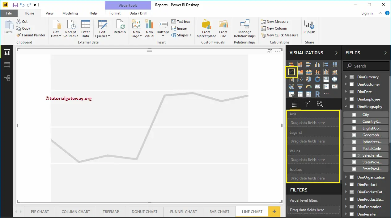
- Line Chart, Formatting Line Chart
- Clustered Column and Line Chart, Format Line & Clustered Column
- Line and Stacked Column Chart, Format Line & Stacked Column
- Matrix, Formatting Matrix
- Multi-Row Card, Format Multi-Row Card
- Pie Chart, Format Pie Chart
- Ribbon Chart, Formatting Ribbon Chart
- Stacked Area Chart, Format Stacked Area Chart
- Scatter Chart, Formatting Scatter Chart
- Stacked Bar Chart, Format Stacked Bar Chart
- Stacked Column Chart, Format Stacked Column Chart
- Table, Formatting Table
- Tree Map, Format Tree Map
- Waterfall Chart, Formatting Waterfall Chart
- 100% Stacked Bar Chart
- 100% Stacked Column Chart
- R Script
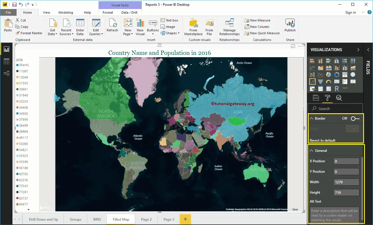
- Map, Format Map
- Filled Map, Format Filled Map
Area Chart in Power BI
Power BI Area Chart is the same as Line Chart, where the Area between the X-Axis and lines filled with a color. Let me show you how to Create an Area Chart in Power BI with an example.
For this Power BI Area chart demonstration, we are going to use the SQL Data Source that we created in our previous article.
Please refer to Connect Power BI to SQL Server article to understand the Data Source in Power BI. And also refer Line Chart article.
How to Create Area Chart in Power BI
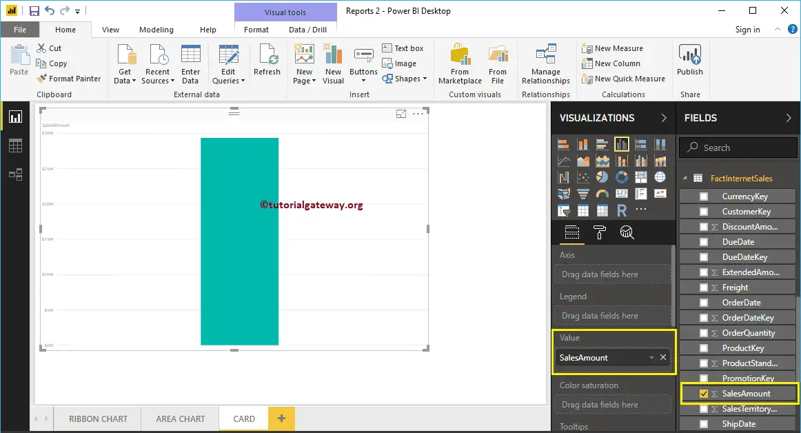
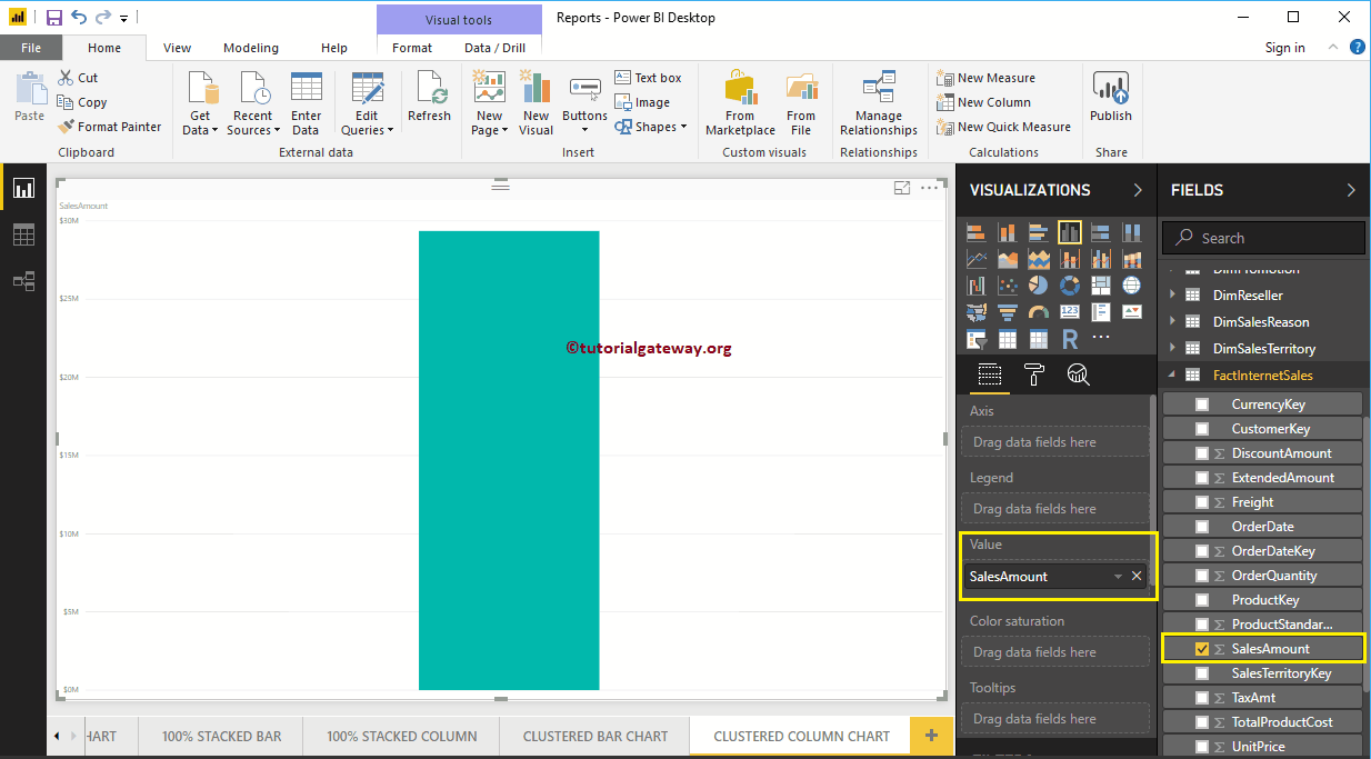
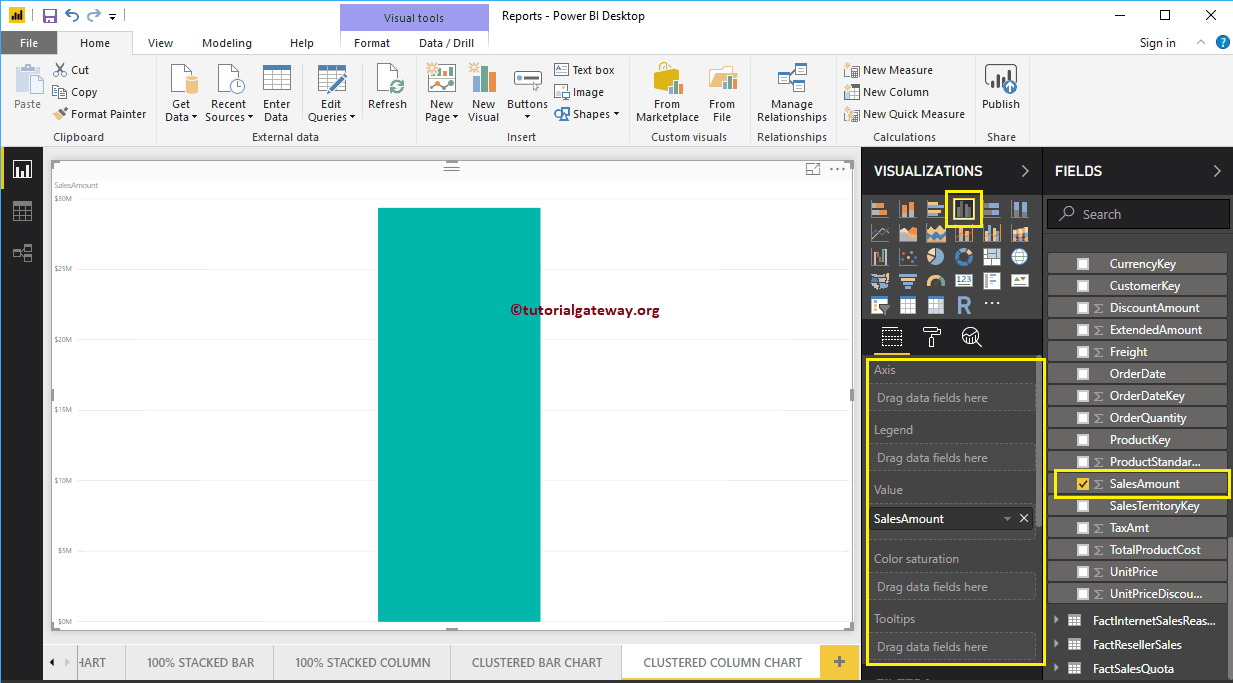
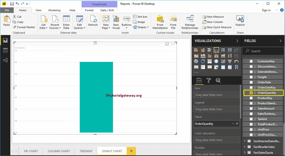
To create an Area Chart in Power BI, first Drag and Drop the Sales Amount from Fields section to Canvas region. It automatically creates a Column Chart, as we have shown in the below screenshot.
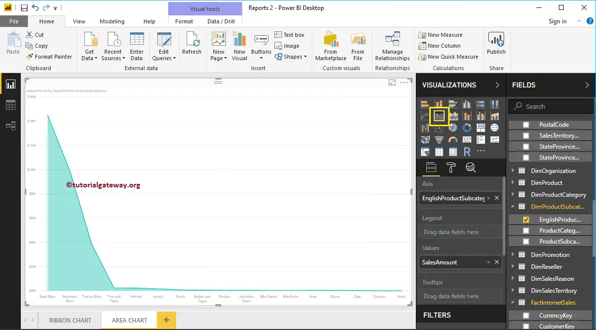
Next, let me add English Product Subcategory Name to the Axis section.
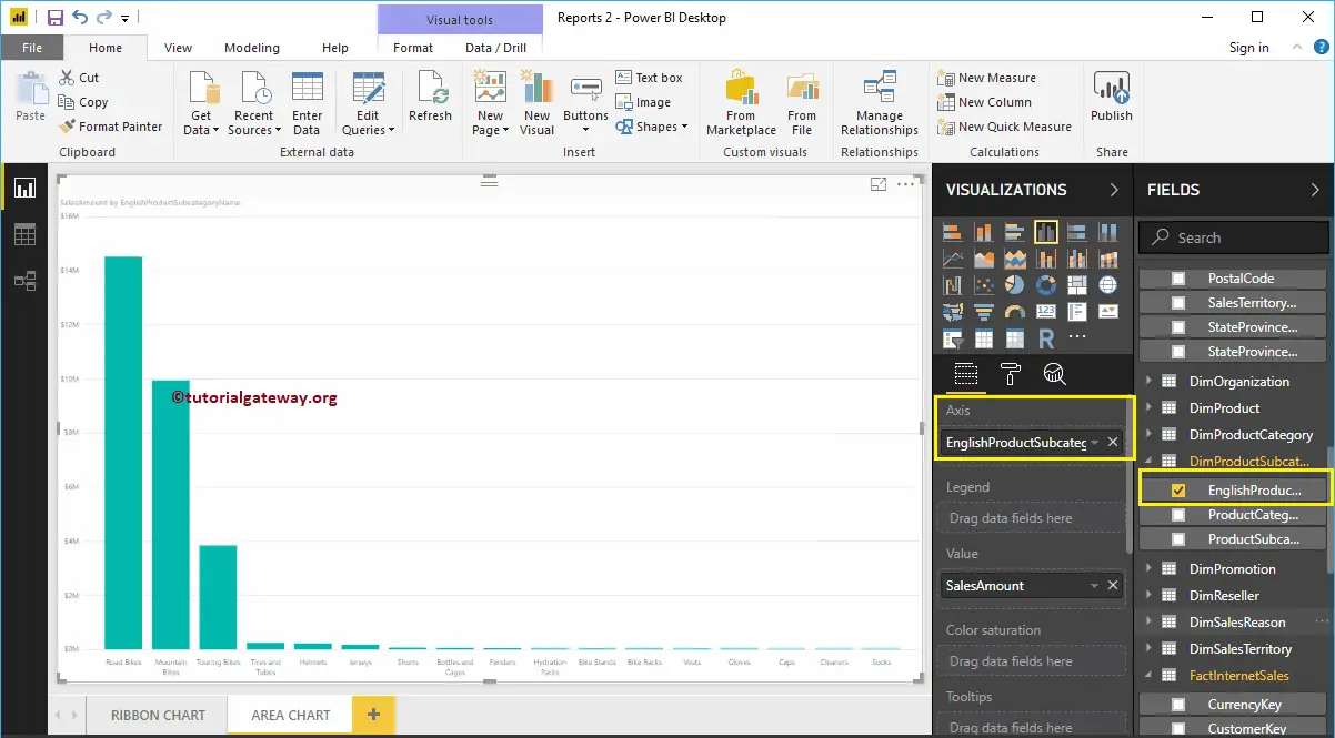
Please click on the Area Chart under the Visualization section. It will convert the Column Chart into an Area Chart. From the screenshot below, you can see the Area Chart that shows the Sales by Product Subcategory.
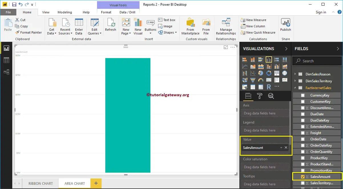
Create an Area Chart in Power BI Approach 2
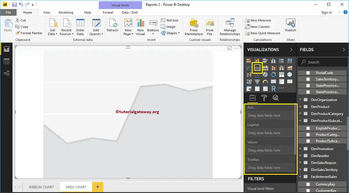
First, click on the Area Chart under the Visualization section. It will create an Area Chart with dummy data, as shown in the below screenshot.
In order to add data to the Power BI Area Chart, we have to add the required fields:
- Axis: Please specify the Column Name that represents the Area.
- Values: Any Numeric value such as sales amount, Total Sales etc.
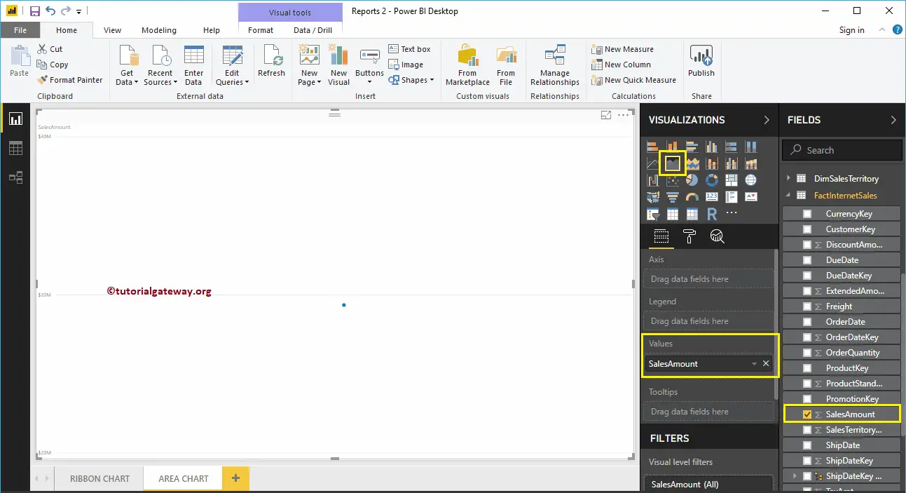
Let me drag the Sales Amount from the Fields section to the Values field.
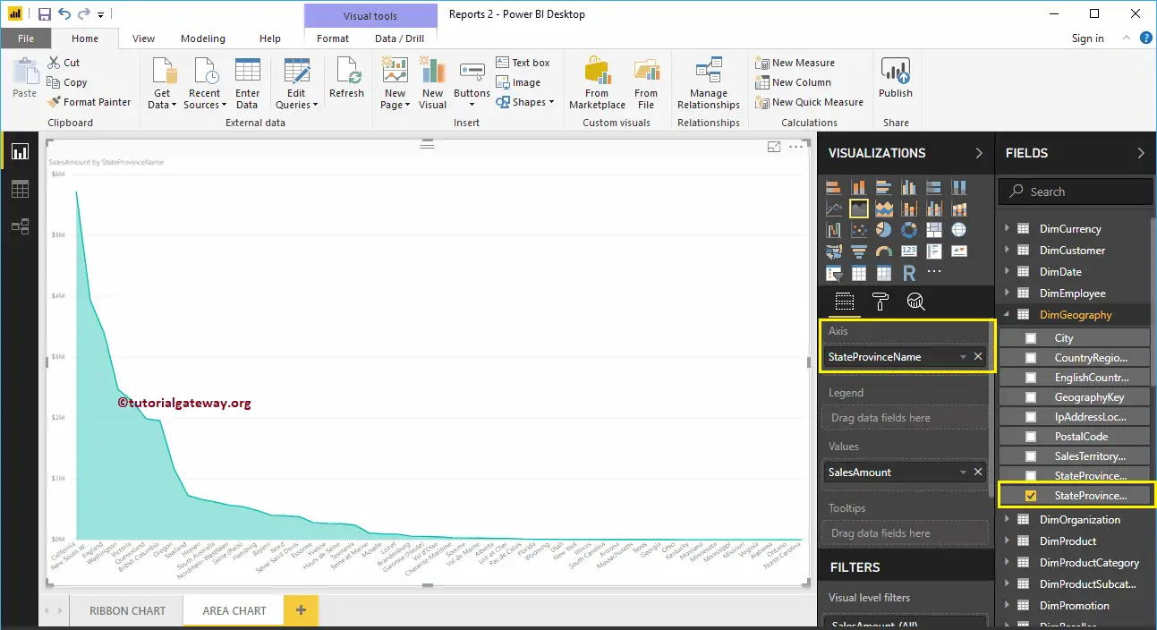
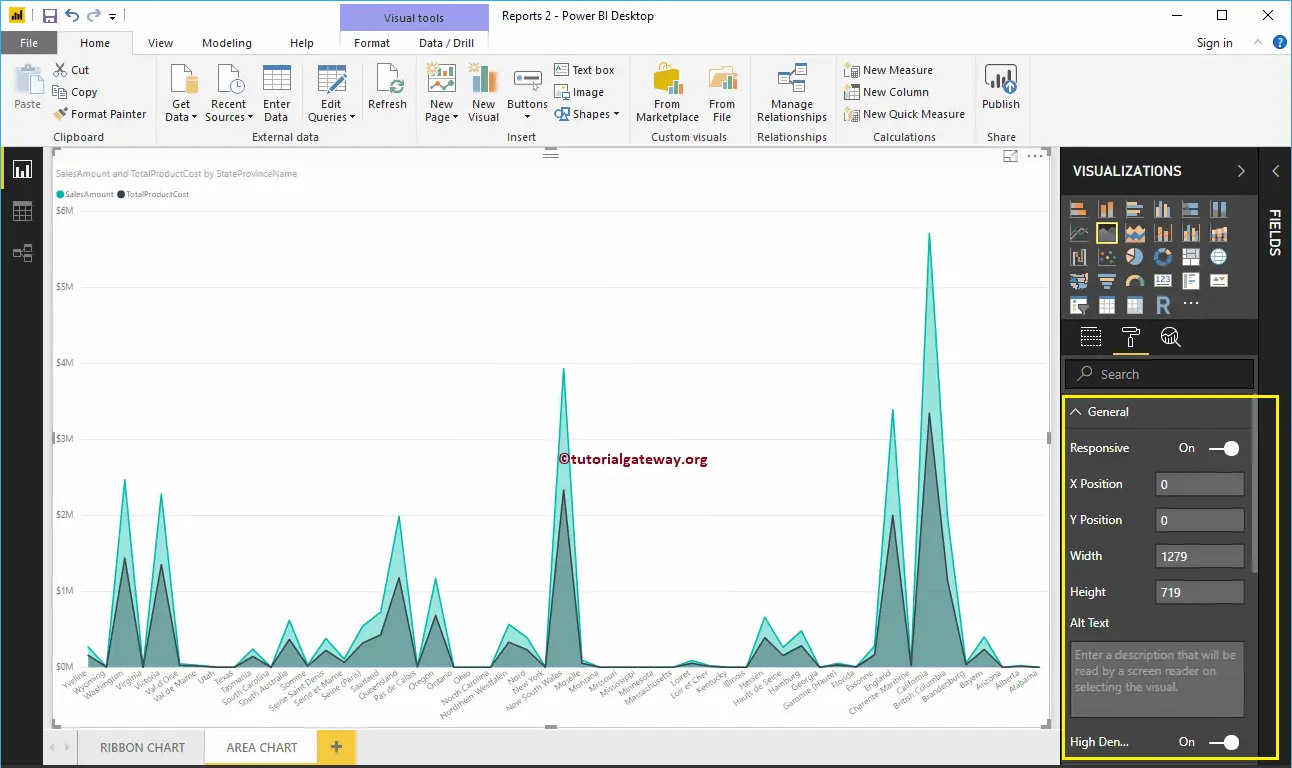
Next, let me add State Province Name to the Axis section. You can do this by dragging State Province to Axis section, or simply checkmark the State Province column.
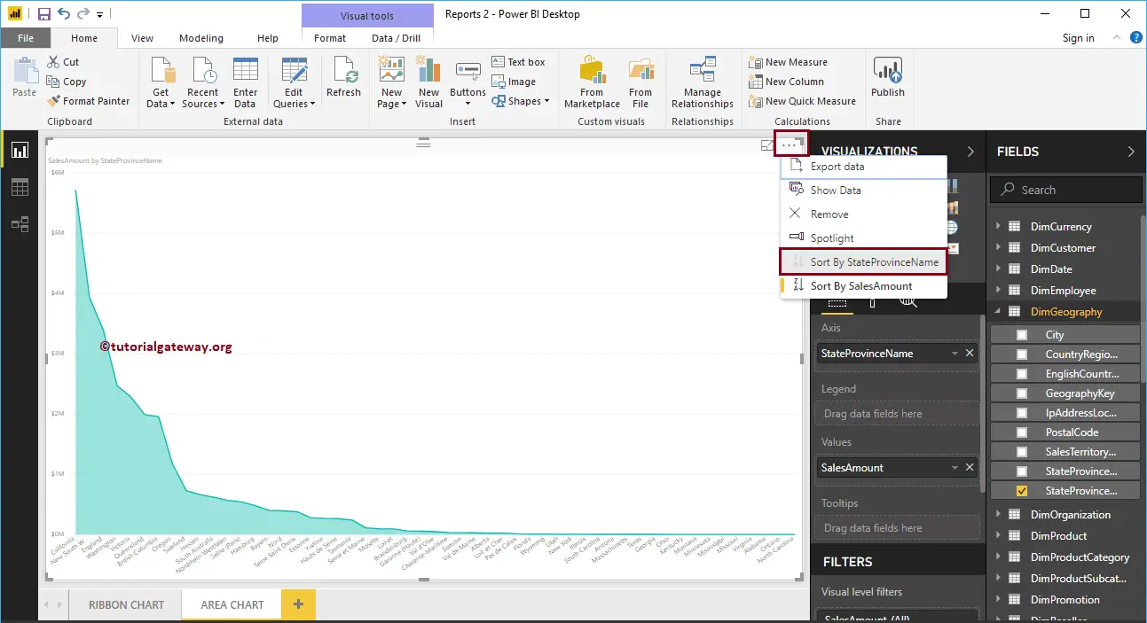
Let me sort the data by State Province Name (By default, it sorted by Sales Amount). To do this, click on the … (3 dots) on the top right corner, and select the Sort By StateProvinceName option as we showed below.
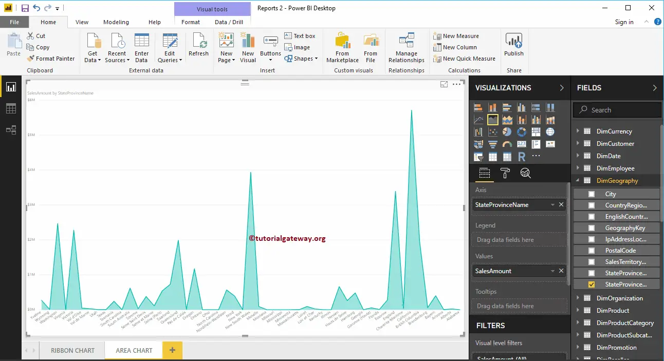
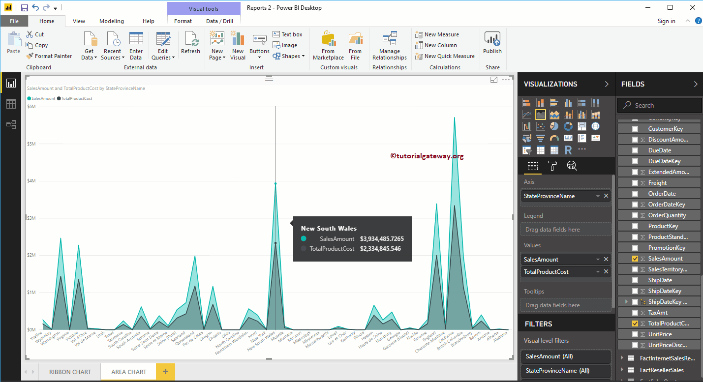
Now you can see a more meaningful area chart
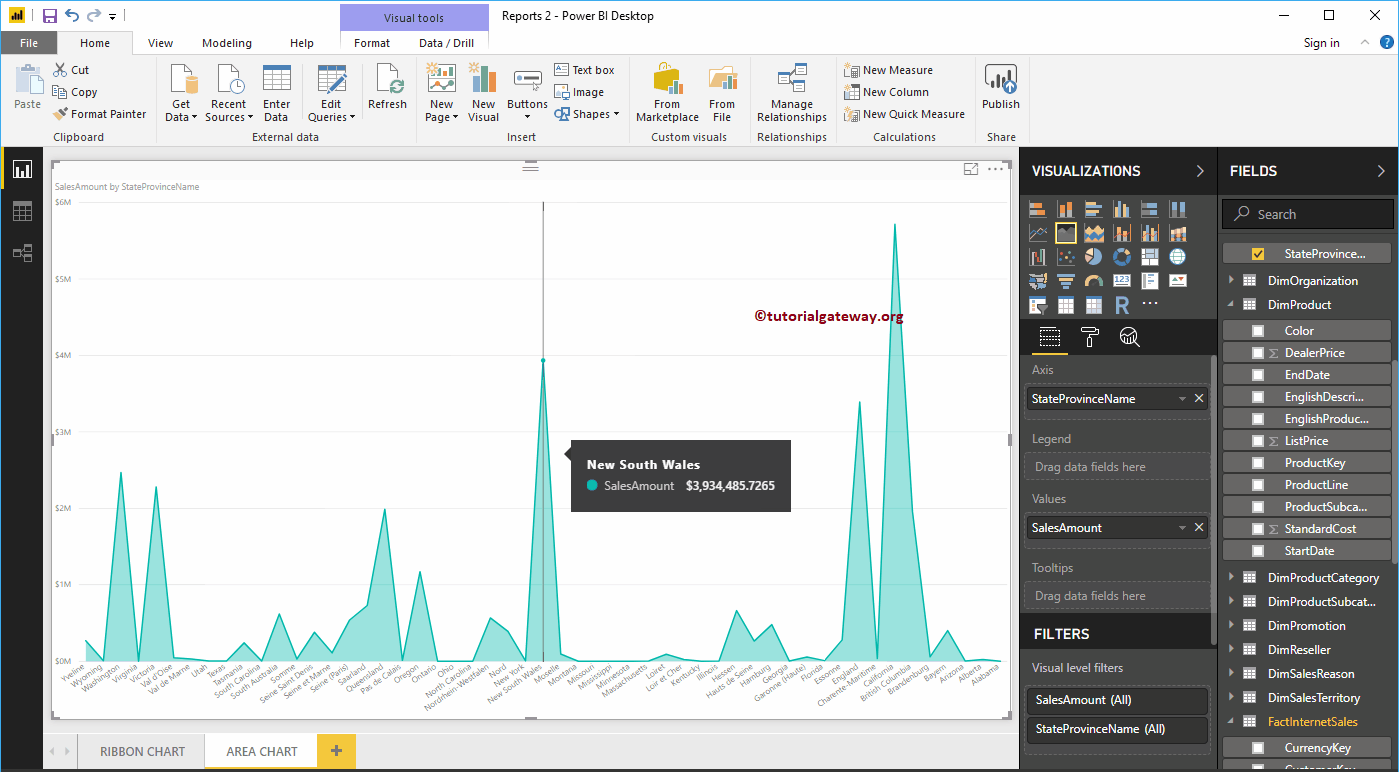
Hover over any position shows the Tool-tip of Sales Amount, and State Province Name
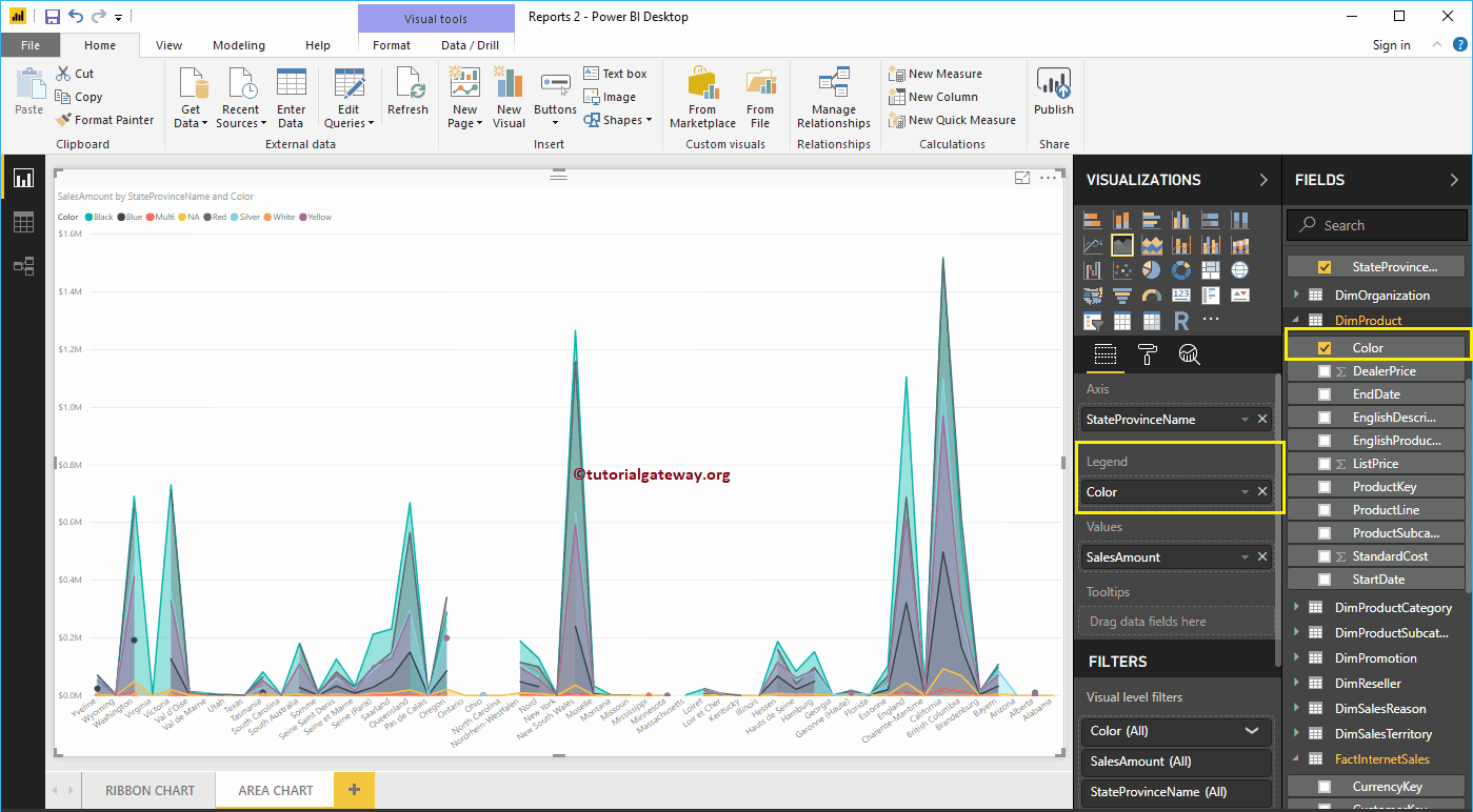
By adding Product Color to the Legend section, it will convert the Power BI Area chart into the Stacked Area chart.
Let me remove the Color field from the Legend section and add one more field, i.e., Total Product Cost to Values section. It compares the Area of Sales Amount against the Total Product Cost.
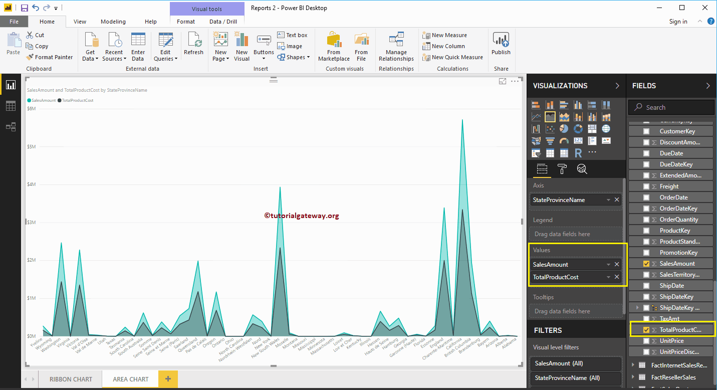
Hover over any position shows the Tool-tip of Sales Amount and Total Product Cost
Let me do some quick formatting to this Power BI Area Chart
NOTE: I suggest you refer to the Format Area Chart article to understand the steps involved in formatting the Area chart title, plot area, line color, etc.
Format Power BI Area Chart
How to Format Power BI Area Chart with an example?. Formatting Power BI Area Chart includes changing the Area Colors, Chart Title text, Title position, X-Axis Details, Y-Axis details, Data labels, and Background Images, etc.
To demonstrate these Power BI Area Chart formatting options, we are going to use the Area Chart that we created earlier. Please refer Area Chart in Power BI article.
How to Format Power BI Area Chart
Please click on the Format button to see the list of formatting options that are available for this Area Chart.
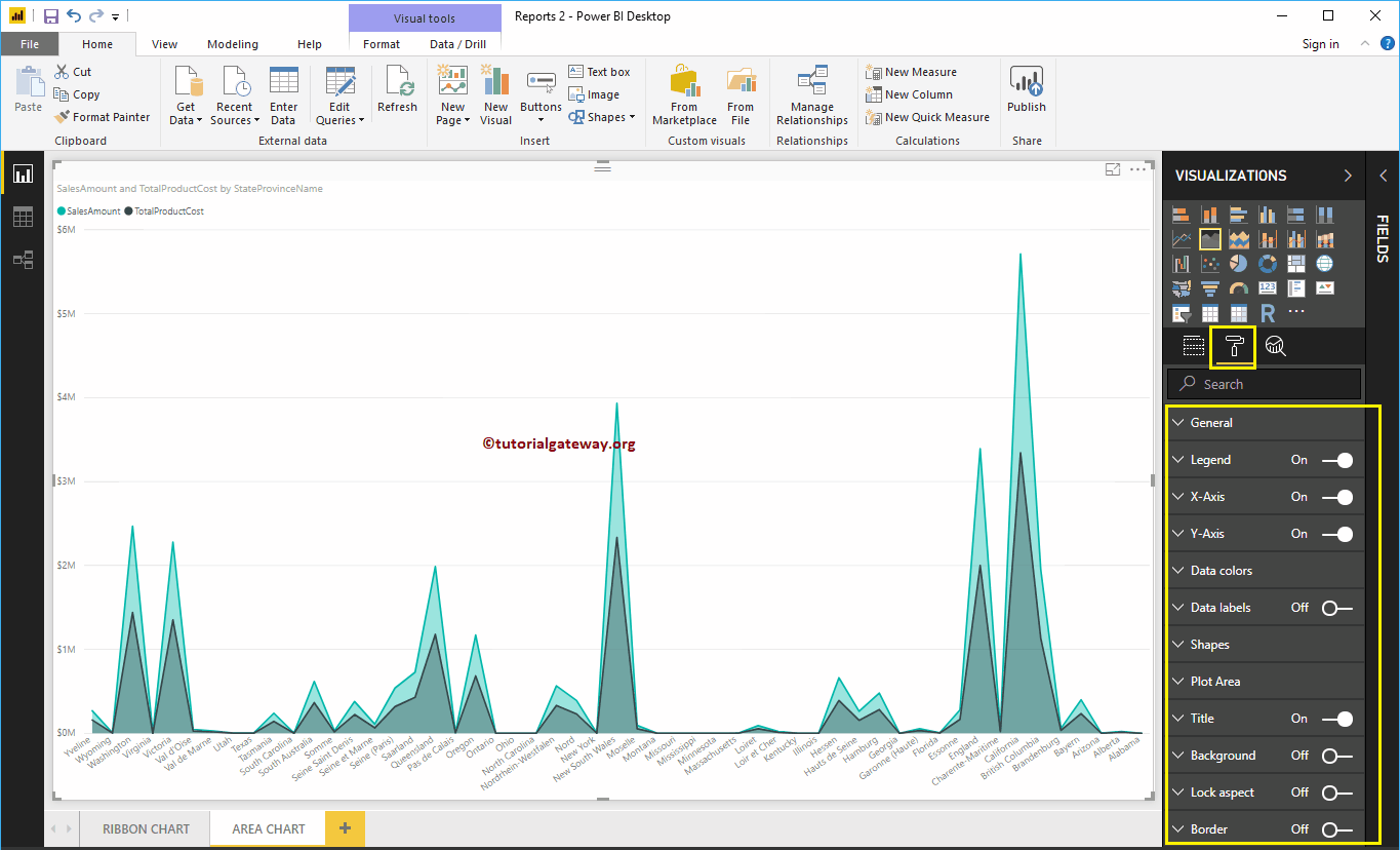
Format Area Chart General Settings
Use this General Section to Change the X, Y position, Width, and height of an Area Chart
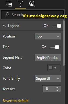
Format Legend of an Area Chart in Power BI
Please select the Power BI Legend region and toggle the option from Off to On to enable Legend.
As you can see from the screenshot below, we used the Position drop-down box to change the legend position to Top Center. And we also added the Legend Title as Money, Color to Brick Red, Font family to Candara, and text size to 15.

Format X-Axis of an Area Chart in Power BI
The following are the list of options that are available for you to format the Area Chart Horizontal axis or X-Axis. Here, we change the Color to Brown and Text Size to 12.
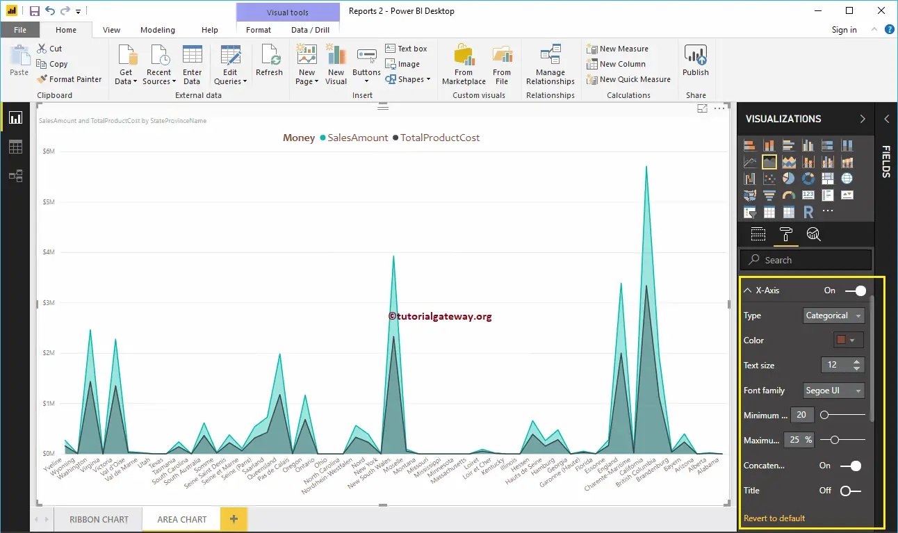
By default, the X-Axis title set to Off for the Area Chart, but you can enable it by toggling Title to On. Let me change the Title Color to Green, Font style to Cambria, and Font Size to 25.
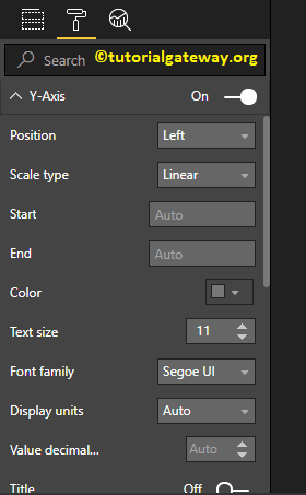
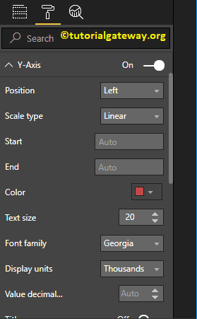
Format Y-Axis of a Power BI Area Chart
As you can see, we changed the Y-Axis labels Color to Brown, Text Size to 15, and display units to thousands.
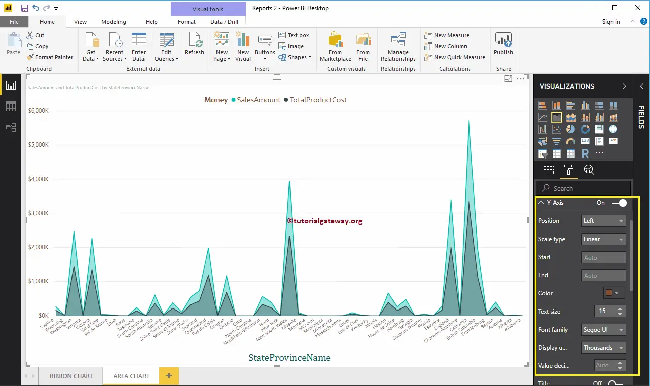
Let me change the Scale type to Log. From the below screenshot, you can see that it is displaying the Log scale.
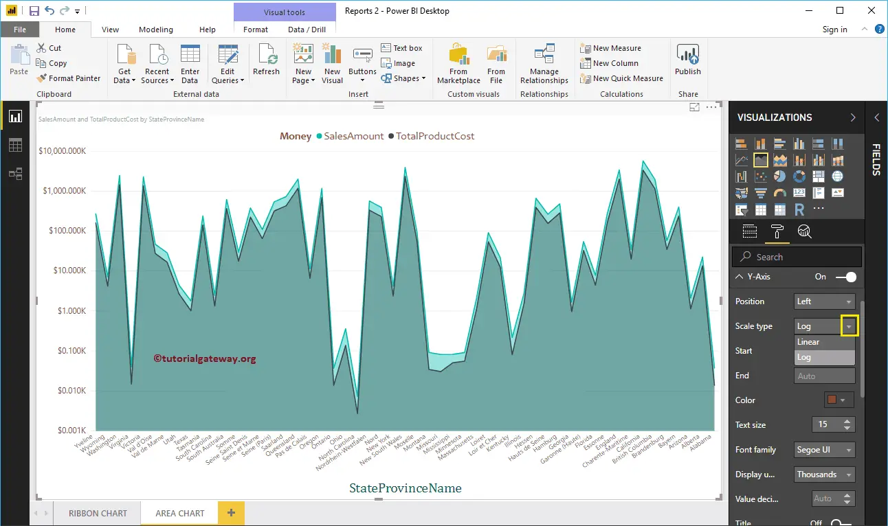
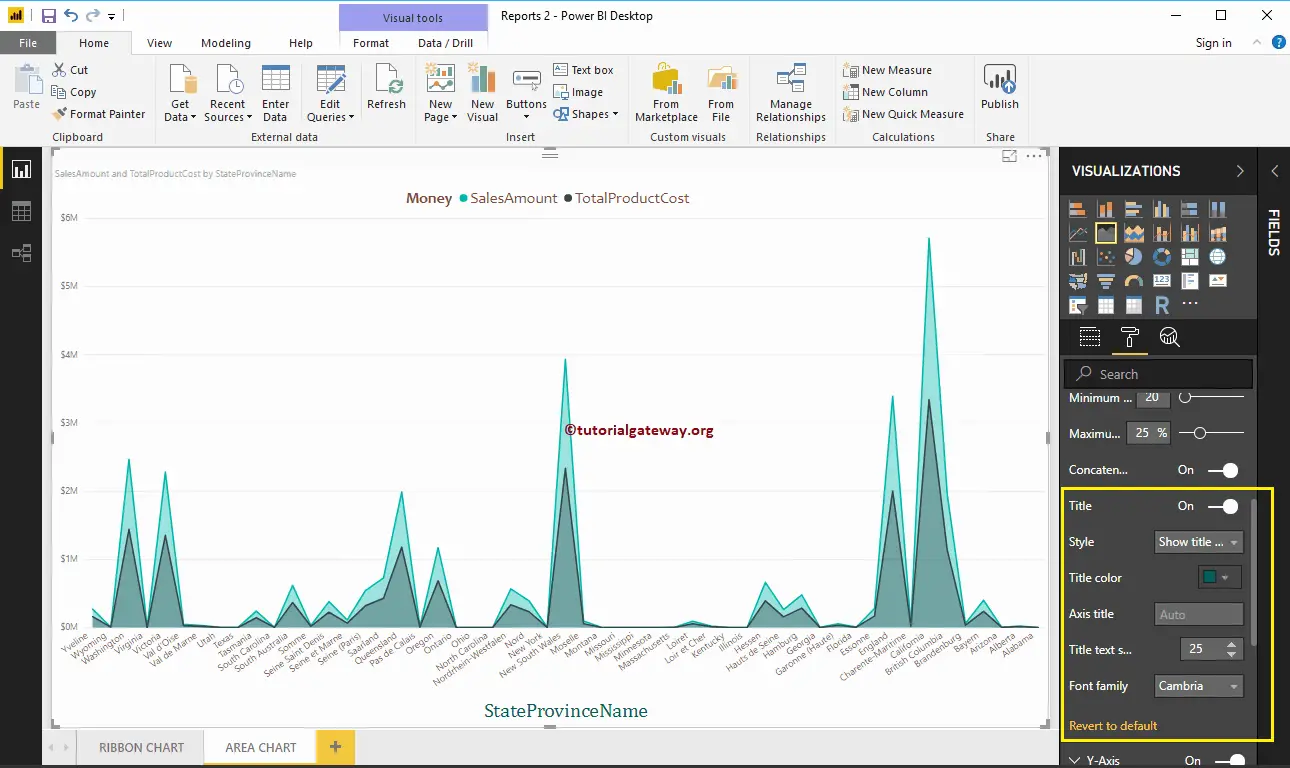
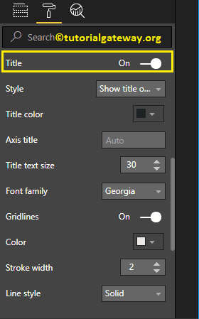
By default, Area Chart Y-Axis title set to Off. But, you can enable it by toggling Title under the Y-Axis section to On. Let me change the Title Color to Green, Text Size to 25, and Font family Cambria.
By toggling the Area Chart Gridlines option from On to Off, you can disable the Gridlines.
- Color: You can change the Gridlines color.
- Stroke Width: Use this to change the Gridlines width.
- Line Style: Choose the line style such as Solid, dotted, and dashed.

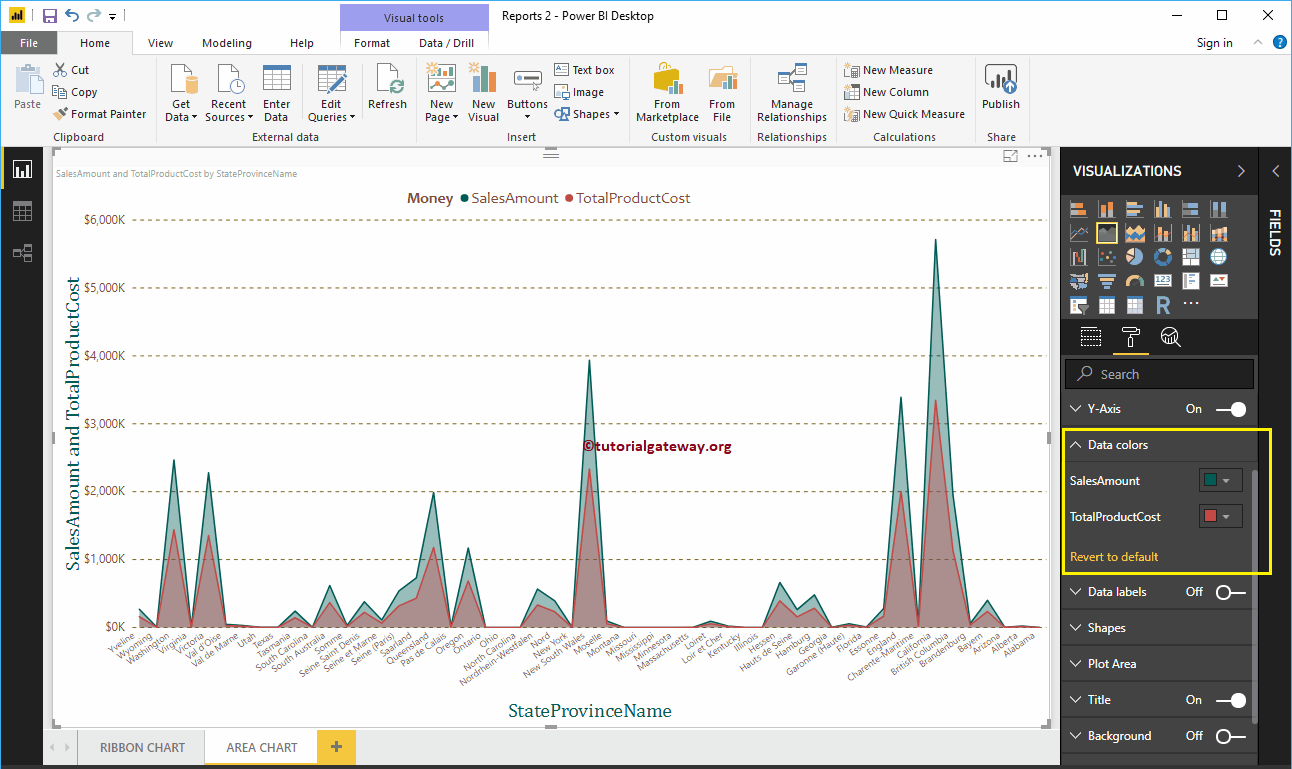
Format Power BI Area Chart Data Colors
By default, the area chart fills the space between axis and line with default colors. Let me change the Sales Amount Line color to Green and Total Product Cost color to Red.
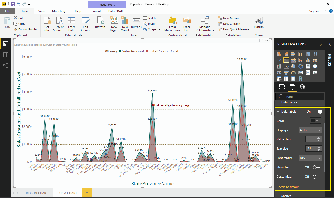
Format Data Labels of an Area Chart
Data Labels display the Values (Sales Amount and Total Product Cost at each point). As you can see from the below screenshot, we enabled data labels and changed the color to black.
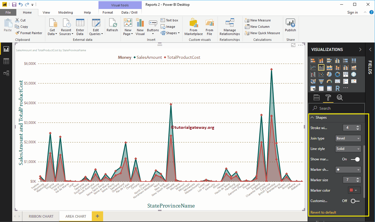
Format Area Chart in Power BI Shapes
Use this section to change the Line Strokes, or marking shapes.
As you can see from the below screenshot, we changed the Stroke Width (Line width) to 4, marker Shape (joining Point Shape ) as Diamond, Marker size as 7, and marker color as cherry red.
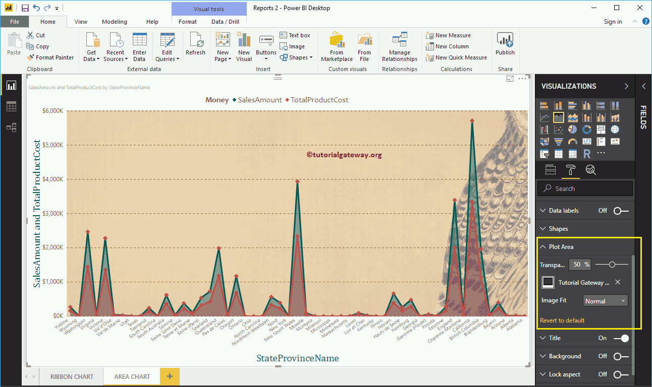
Format Area Chart Plot Area
Using this Plot Area property, you can add custom Images as the Background of the Area Chart. For the demonstration purpose, we added one image as the Plot Area Background.
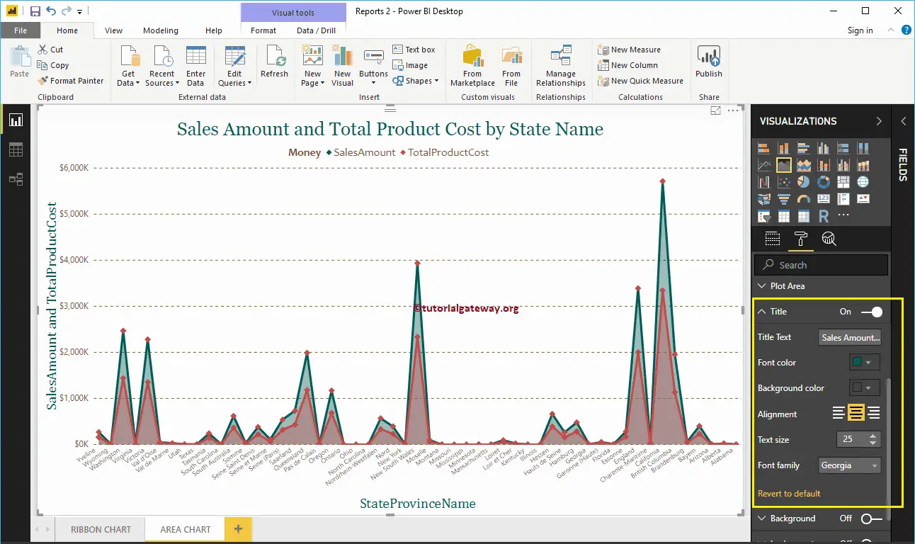
Format Power BI Area Chart Title
By toggling the Title option from On to Off, you can disable the Area Chart title.
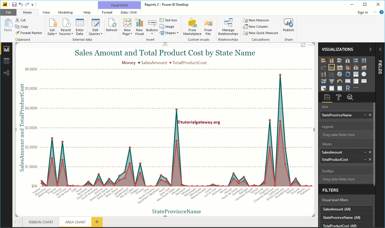
From the below screenshot, you can see, we change the Title Text to Sale Amount and Total Product Cost by State Name. We also changed the Font Color to Green, Font Family to Georgia, Text Size to 25, and Title Alignment to center. If you want, you can add the background Color to the title as well.
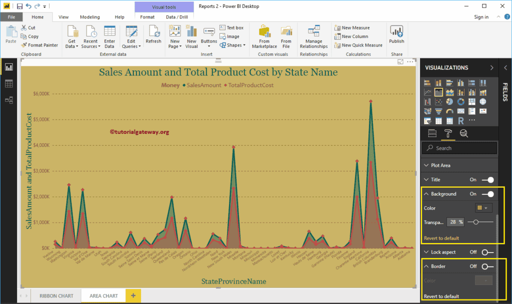
Format Power BI Area Chart Background Color, and Borders
You can add the Background color to an Area Chart by toggling Background option to On. For the demonstration purpose, we added yellow color with 28% transparency.
Similarly, you can add Borders to an Area Chart by toggling the Border option from Off to On.
Power BI Bar Chart
Power BI Bar Chart or Horizontal Bar Chart is useful for the data comparison. For example, you can compare Sales by Color, Region, or Product Group, etc. Let me show you how to create a Bar Chart in Power BI with example.
For this Power BI Bar Chart demonstration, we use the SQL Data Source that we created in our previous article. So, Please refer to Connect Power BI to SQL Server article to understand the Power BI Data Source.
How to Create a Bar Chart in Power BI
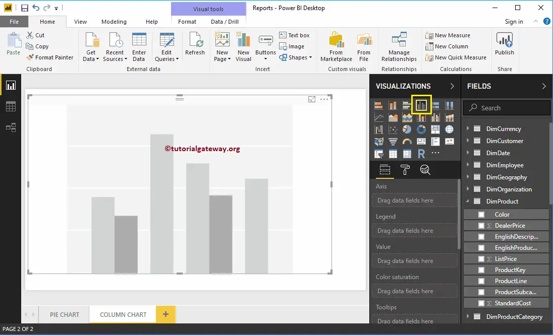
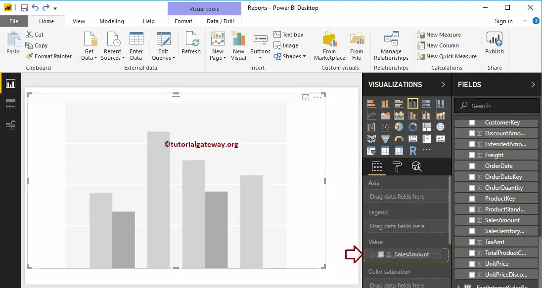
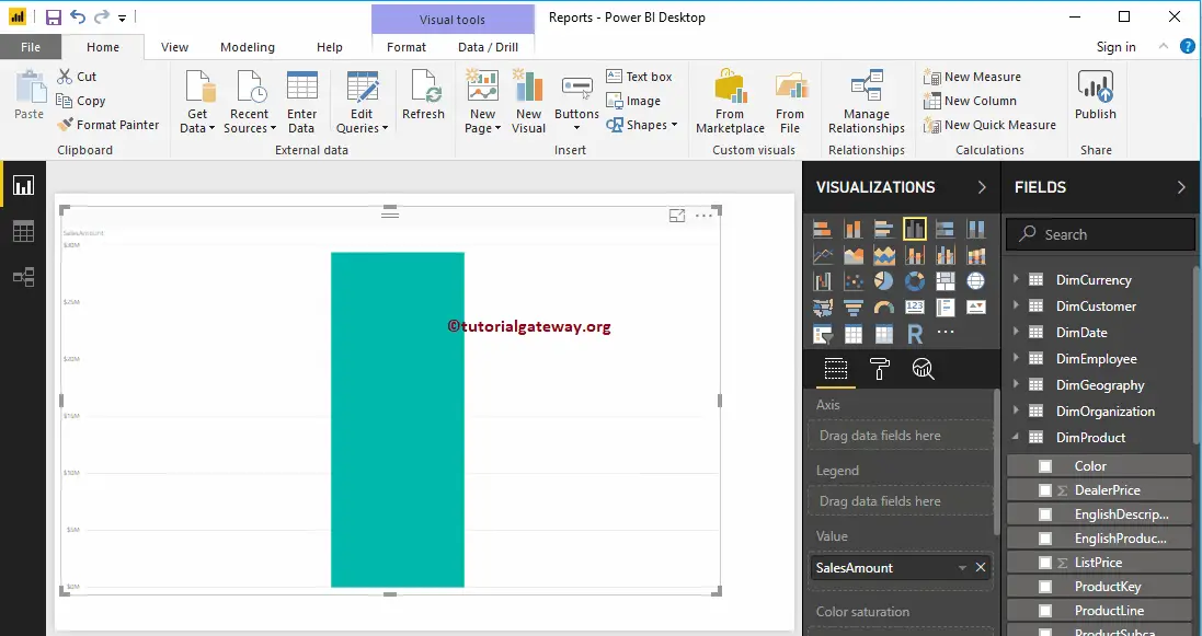
To create a Bar Chart, first Drag and Drop the Sales Amount from the Fields section to the Canvas region. It automatically creates a Column Chart.
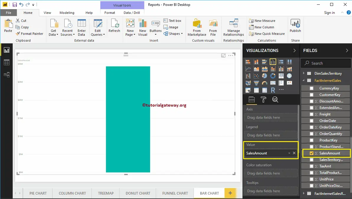
Next, let me add State Province Name to Axis section to create a column chart that shows Sales Amount by State Province.
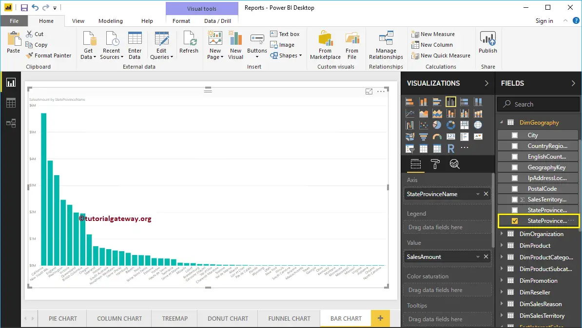
By clicking the Bar Chart under the Visualization section, it will convert the Column Chart into Bar Chart
Create a Bar Chart in Power BI – Approach 2
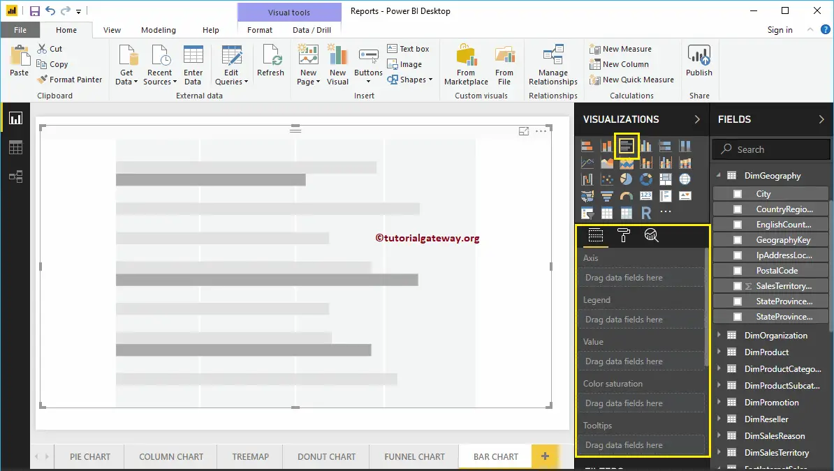
First, click on the Clustered Bar Chart under the Visualization section. It automatically creates a Bar Chart with dummy data.
In order to add data to the Power BI Bar Chart, we have to add the required fields:
- Axis: Please specify the Column that represents the Horizontal Bars.
- Values: Any Numeric value such as sales amount, Total Sales, etc.
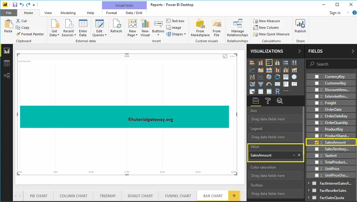
Let me drag the Sales Amount from the Fields section to the Values field.
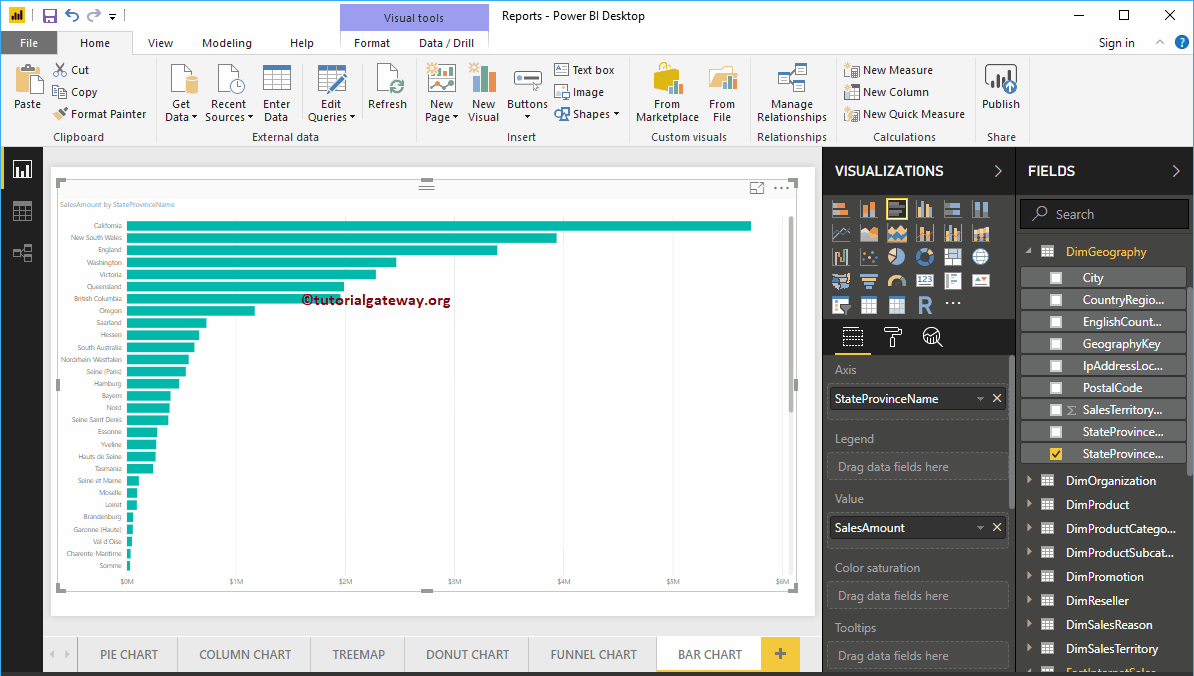
Next, add State Province Name from the DimGeography table to the Axis section. You can do this by dragging State Province to Axis section, or simply checkmark the State Province column
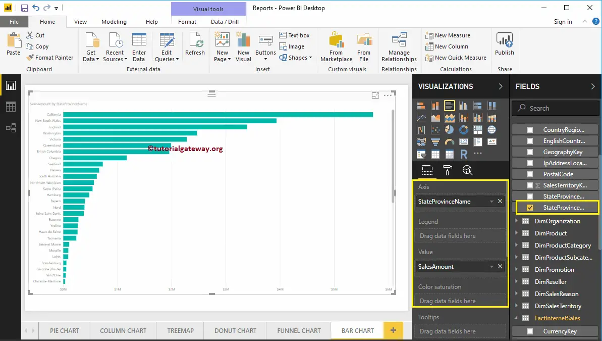
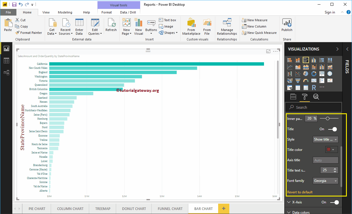
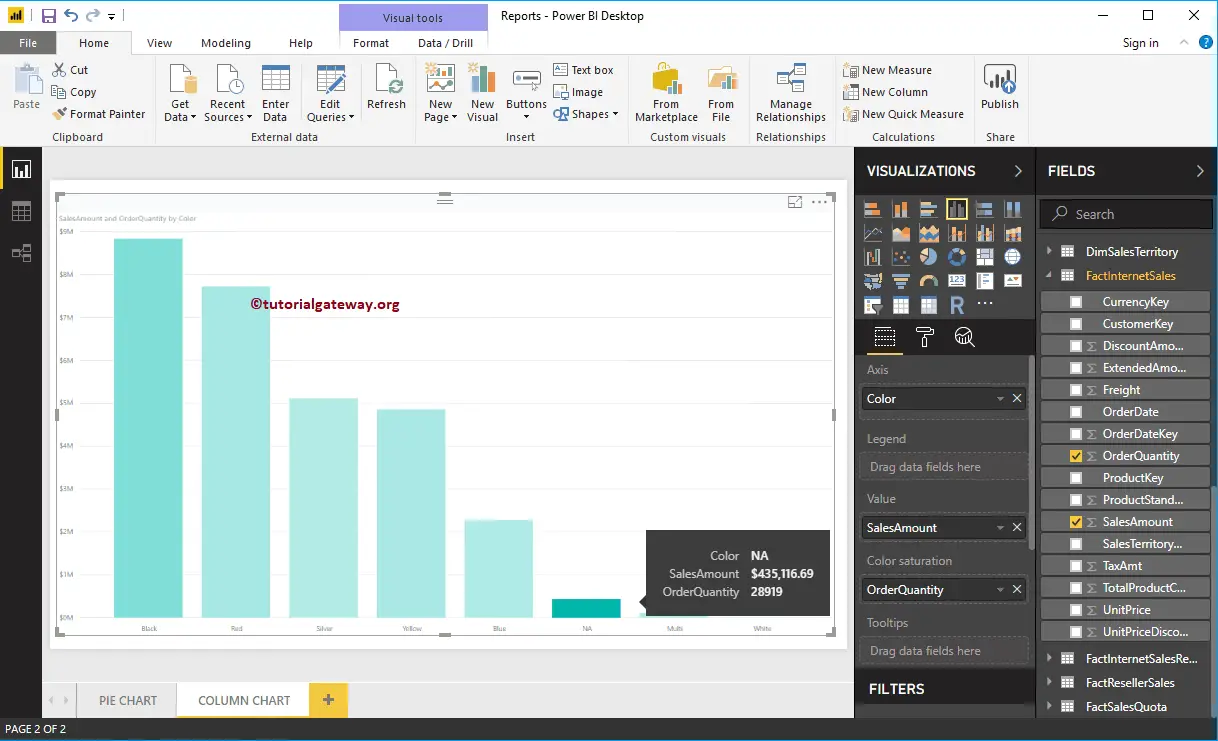
Now you can see a Bar Chart that represents Sales by State Province. Hover over any bar shows the Tool-tip of State Province Name and its Sales Amount
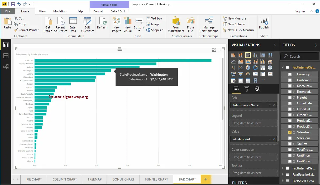
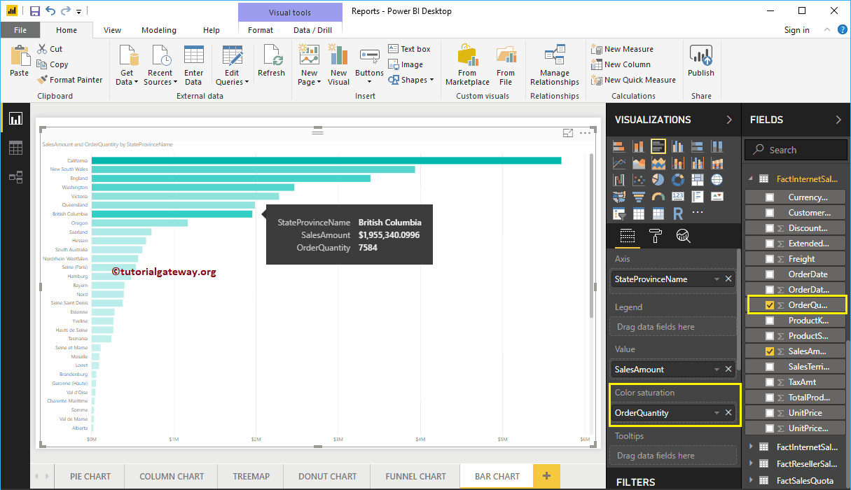
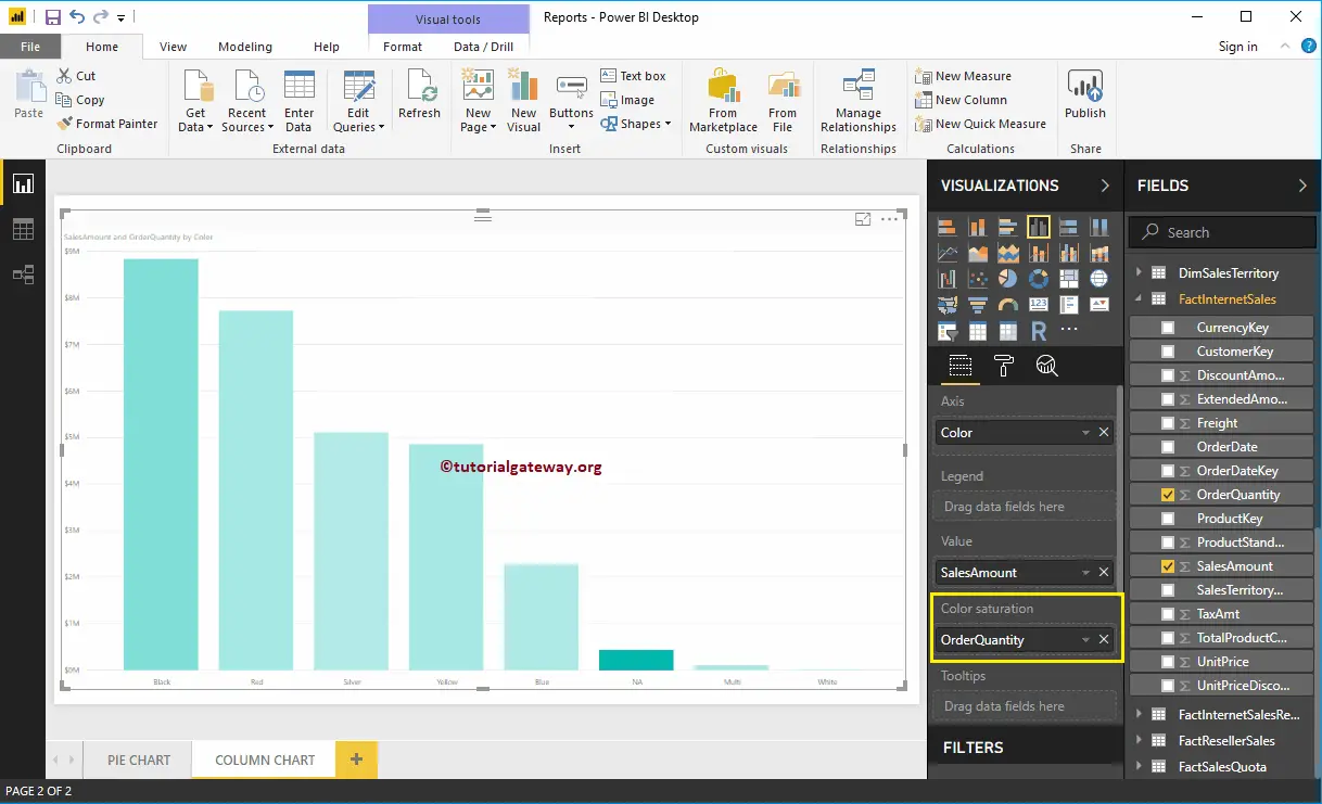
Power BI Bar chart has one more property called Color Saturation. It adds colors to individual bars based on the Color Saturation Field value. Let me add Order Quantity to saturate the Color from Light to dark.
From the screenshot below, you can see that the Colors of the Bars have changed based on their order quantity.
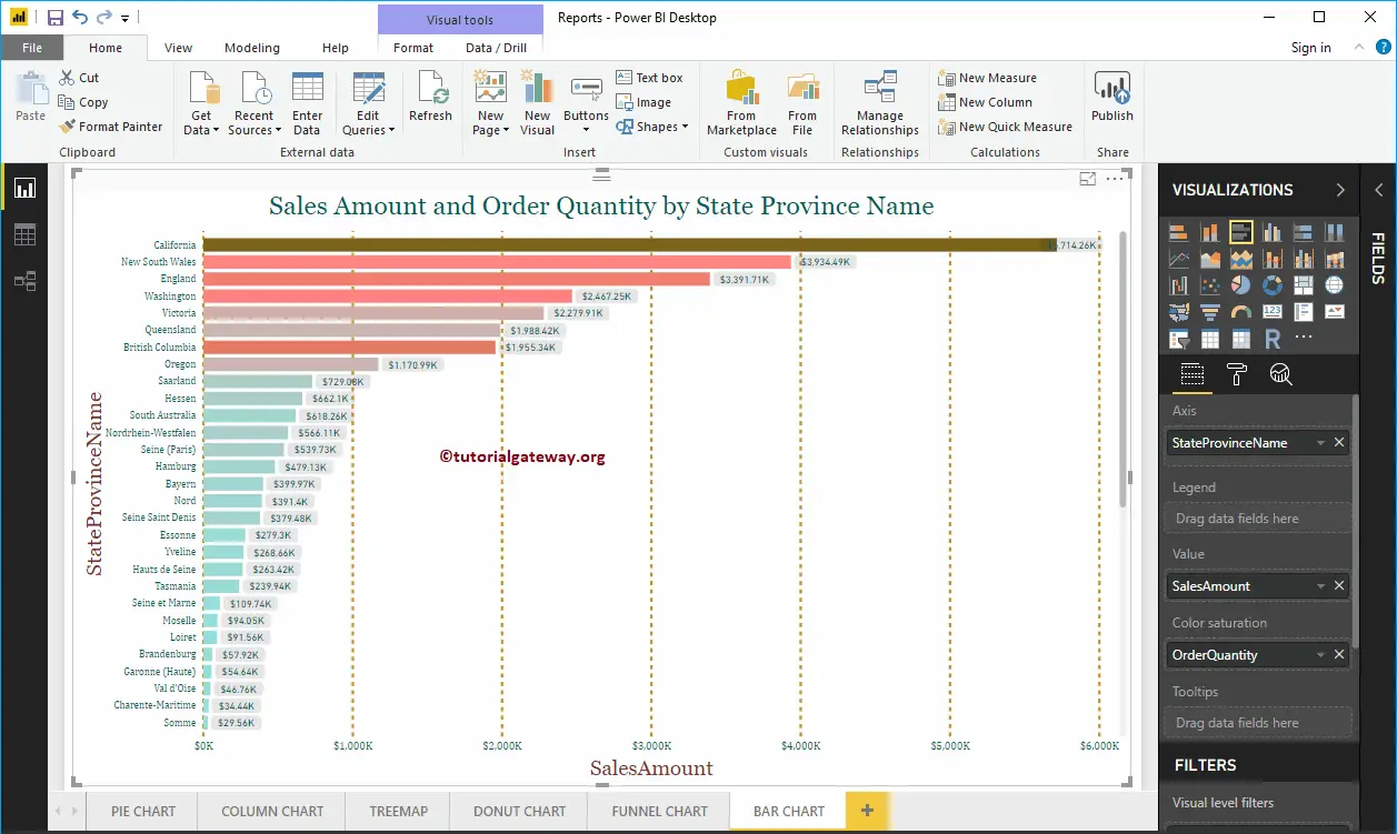
Let me do some quick formatting to this Bar Chart
NOTE: I suggest you refer to Format Bar Chart article to understand the steps involved in formatting the Bar Chart Title, Bar Colors, Data Color, background Color, Axis fonts, and colors.
Format Bar Chart in Power BI
How to Format Bar Chart in Power BI with an example?. Formatting Power BI Bar Chart includes changing the Horizontal Bar Colors, Title text, Title position, Data labels, Axis Details, and background Colors, etc.
To demonstrate these Power BI Bar Chart formatting options, we are going to use the Bar Chart that we created earlier. Please refer to the Power BI Bar Chart article to understand the steps involved in creating a Power BI Bar chart.
How to Format Bar Chart in Power BI
Please click on the Format button to see the list of formatting options that are available for this Bar Chart.
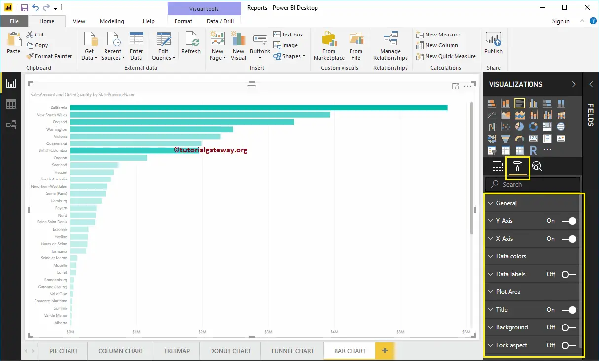
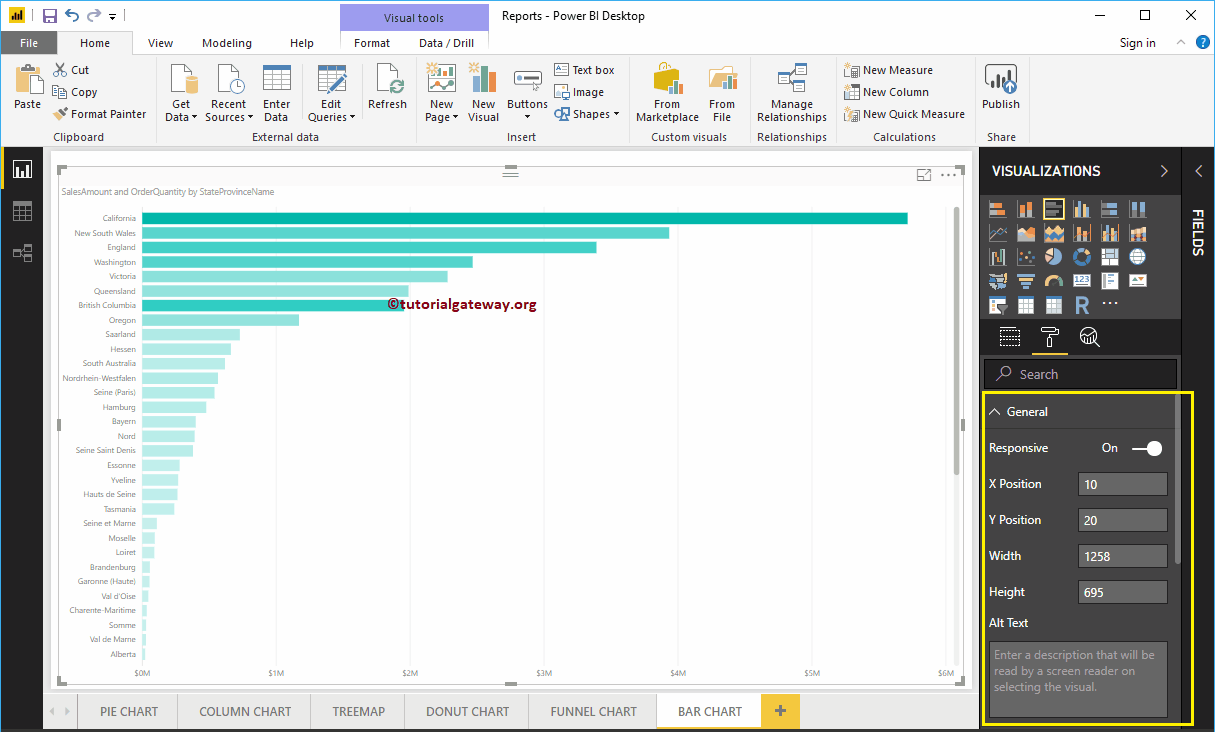
Format Bar Chart in Power BI General Section
Use this General Section to Change the X, Y position, Width, and height of a Bar Chart
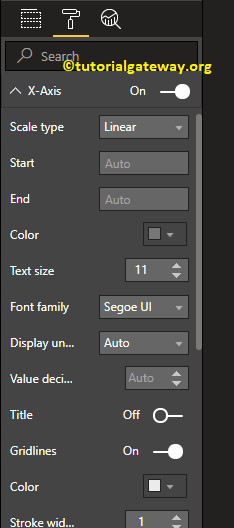
Format Y-Axis of a Power BI Bar Chart
The following are the list of options that are available for you to format the Vertical axis or Y-Axis.
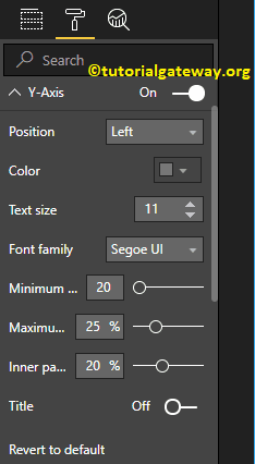
You can see from the screenshot below, we change the Y-Axis labels Color to Green, Text Size to 12, Font style to Cambria. You can use the Minimum category width, Maximum Size, and Inner Padding options to change the horizontal bar widths.
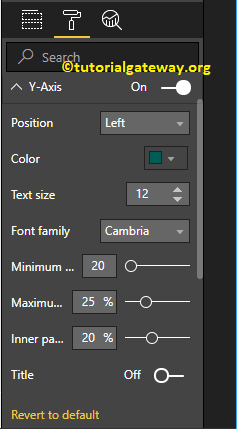
By default, the Y-Axis title set to Off, but you can enable it by toggling Title under the Y-Axis section to On. Let me change the Title Color to Brick Red, Title Text Size to 25, and Font style to Georgia.
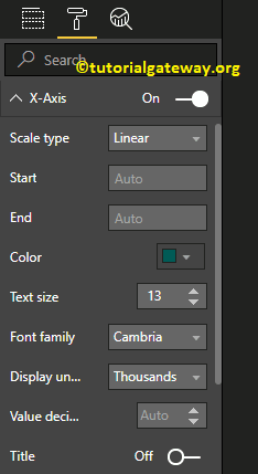
Format X-Axis of a Bar Chart in Power BI
Following are the list of options that are available for you to format the Horizontal axis or X-Axis
As you can see from the below screenshot, we change the Color to Green, Font style to Cambria, Text Size to 13, Display Units to Thousands (default is Auto).
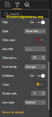
By default, the X-Axis title set to Off, but you can enable it by toggling Title to On. Let me change the Title Color to Brick Red, Font style to Georgia, and Font Size to 25.
By toggling the Bar chart Gridlines option from On to Off, you can disable the Grid lines.
- Color: You can change the Gridlines color.
- Stroke Width: Use this to change the Gridlines width. Here, we changed the width from default 1 to 2 strokes.
- Line Style: Choose the line style such as Solid, dotted, and dashed.
From the below screenshot, you can see the changes that we made to X-Axis.
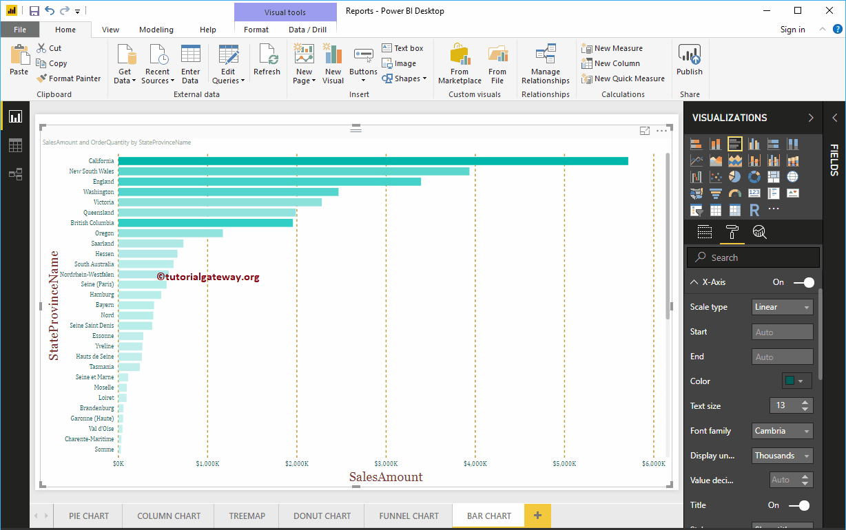
Format data Colors of a Bar Chart in Power BI
If you add any valid column to the Color Saturation field, then you can use this Diverging option to add colors to the Bar Chart. By default, it set to Off, but you can enable those Diverging options by toggling Off to On
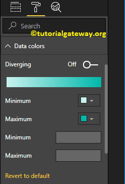
If you haven’t added any Filed under the Color Saturation section, then Diverging option under the Data Colors section replaced with the Default Color option like below
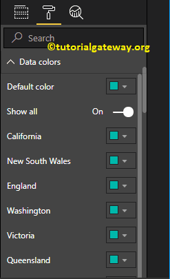
Let me add Minimum, Center, and Maximum color. Remember, you have an option to add the Minimum, Center, and Maximum values as well.
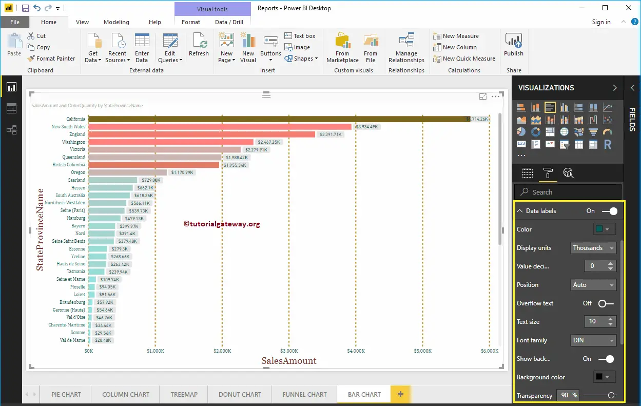
Enable Data Labels for Power BI Bar Chart
Bar Chart Data Labels display information about each individual horizontal bar. In this case, it displays the Sales Amount of each bar. To enable or format Power BI bar chart data labels, please toggle Data labels option to On.
Let me change the Color to Green, Display Units from Auto to Thousands, Font family to DIN, Text Size to 10, and Background color to Black with 90% transparency
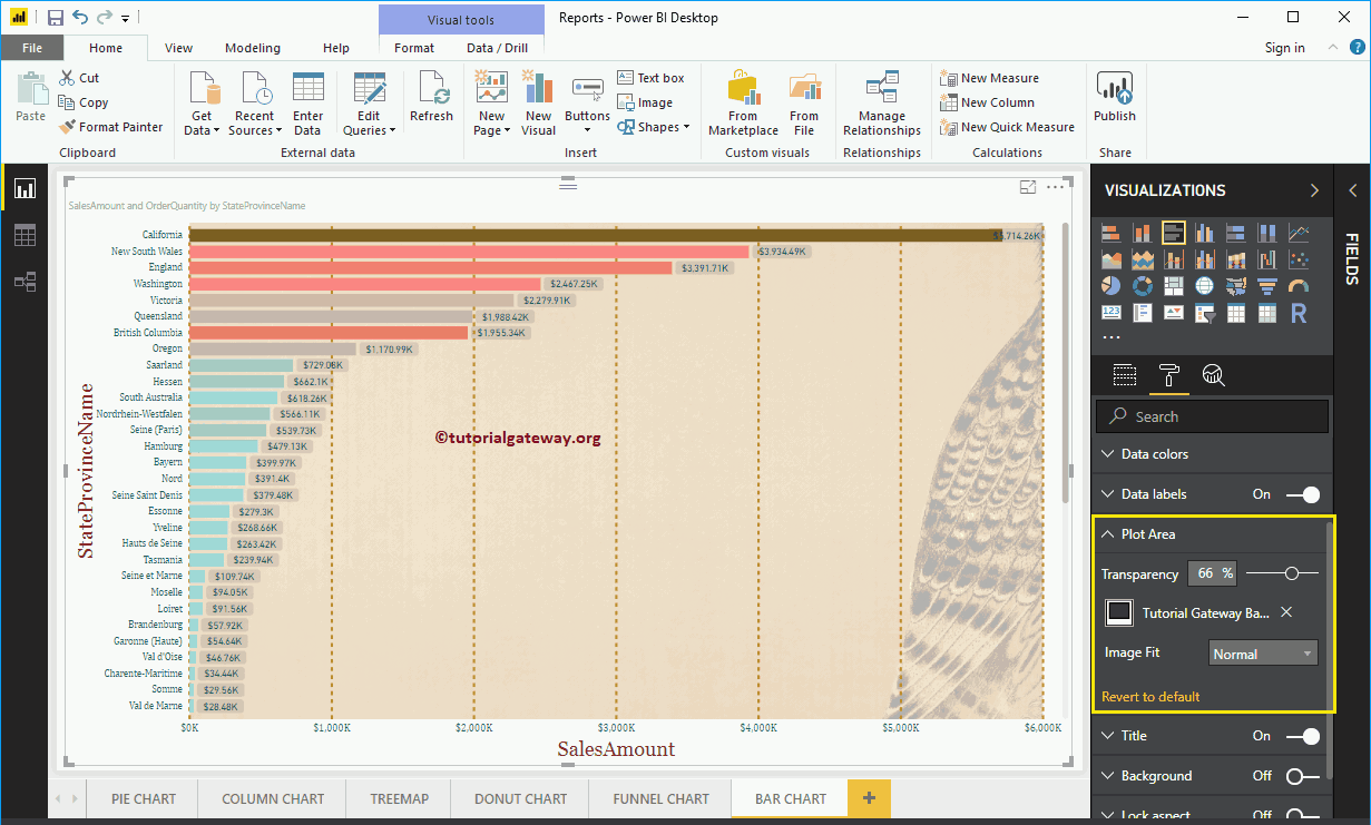
Format Bar Chart in Power BI Plot Area
You can add Images as the Background of a Bar Chart using this Plot Area section. For the demonstration purpose, we added one image as the Plot Area Background.
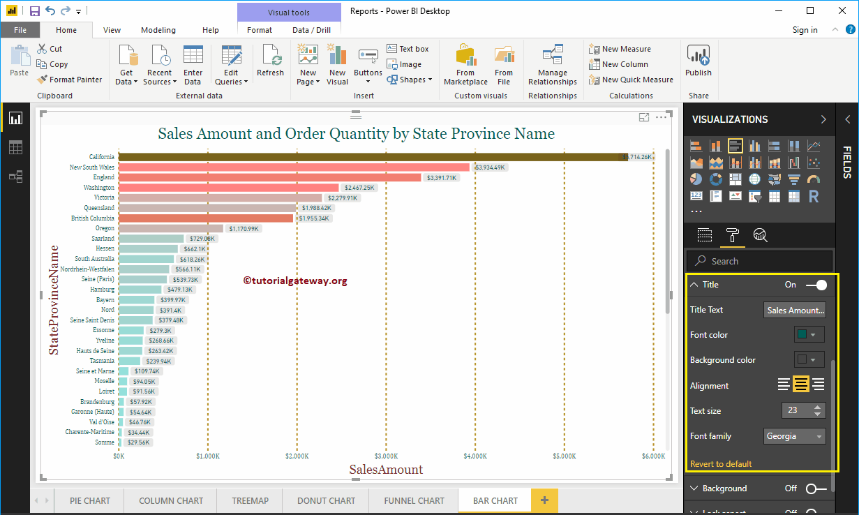
Format Bar Chart in Power BI Title
By toggling the Title option from On to Off, you can disable the Bar Chart title.
As you can see from the screenshot below, we change the Title Text to Sale Amount and Order Quantity by State province Name. We also changed the Font Color to Green, Font Family to Georgia, Font Size to 23, and Title Alignment to center. If you want, you can add the background color to the title as well.
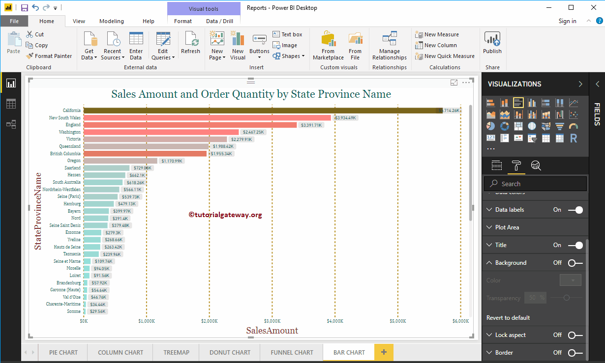
Format Background Color, and Border of a Bar Chart in Power BI
You can add the Background color to a Bar Chart by toggling Background option to On. And, you can add Borders to a Bar Chart by toggling the Border option from Off to On.
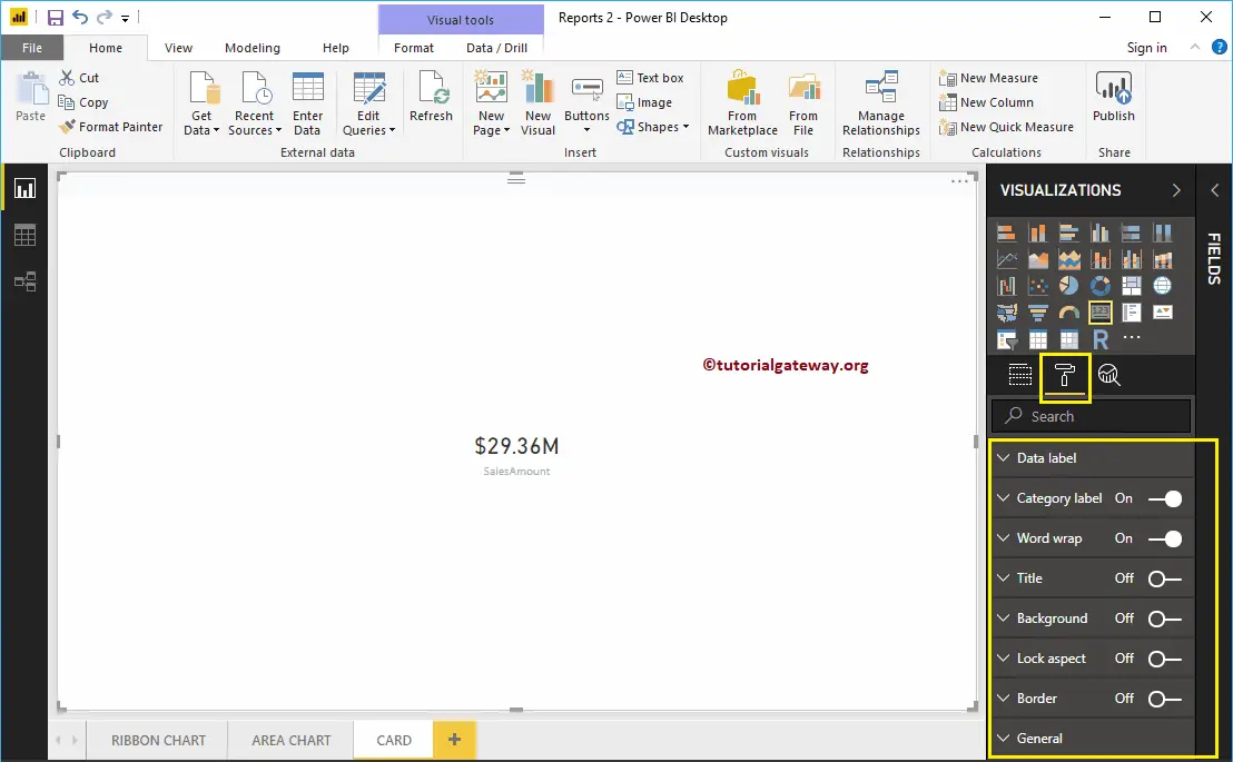
Create a Card in Power BI
Let me show you how to Create a Card in Power BI with an example. Power BI Card is useful to display a single number (or metric value). For example, If we want to track the total orders, total sales value, or total quotations we sent, then we can use this Power BI Card visualization.
For this Power BI Card demo, we are going to use the SQL Data Source that we created in our previous article. So, Please refer to Connect Power BI to SQL Server article to understand the Power BI Data Source.
How to Create a Card in Power BI
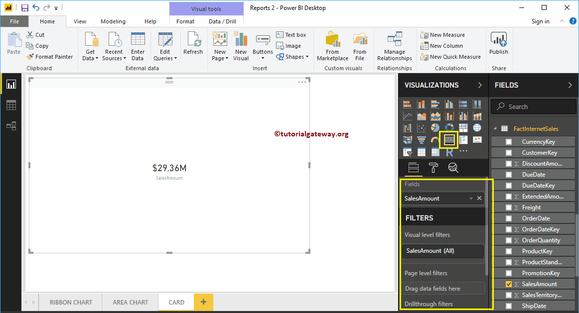
Drag and Drop the Sales Amount from Fields section to Canvas automatically create a Column Chart, as shown in the below screenshot.
Click on the Card under the Visualization section. It automatically converts the Column Chart into a Card. From the screenshot below, you can see the Card that shows the Total Sales Amount.
Create a Card in Power BI Approach 2
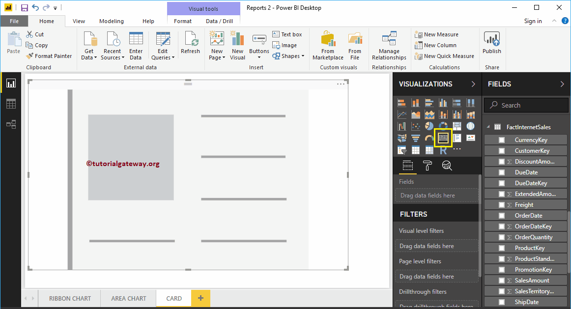
In order to create a Power BI card, first, click on the Card present in the Visualization section. It will create a Card with dummy data, as we have shown in the below screenshot.
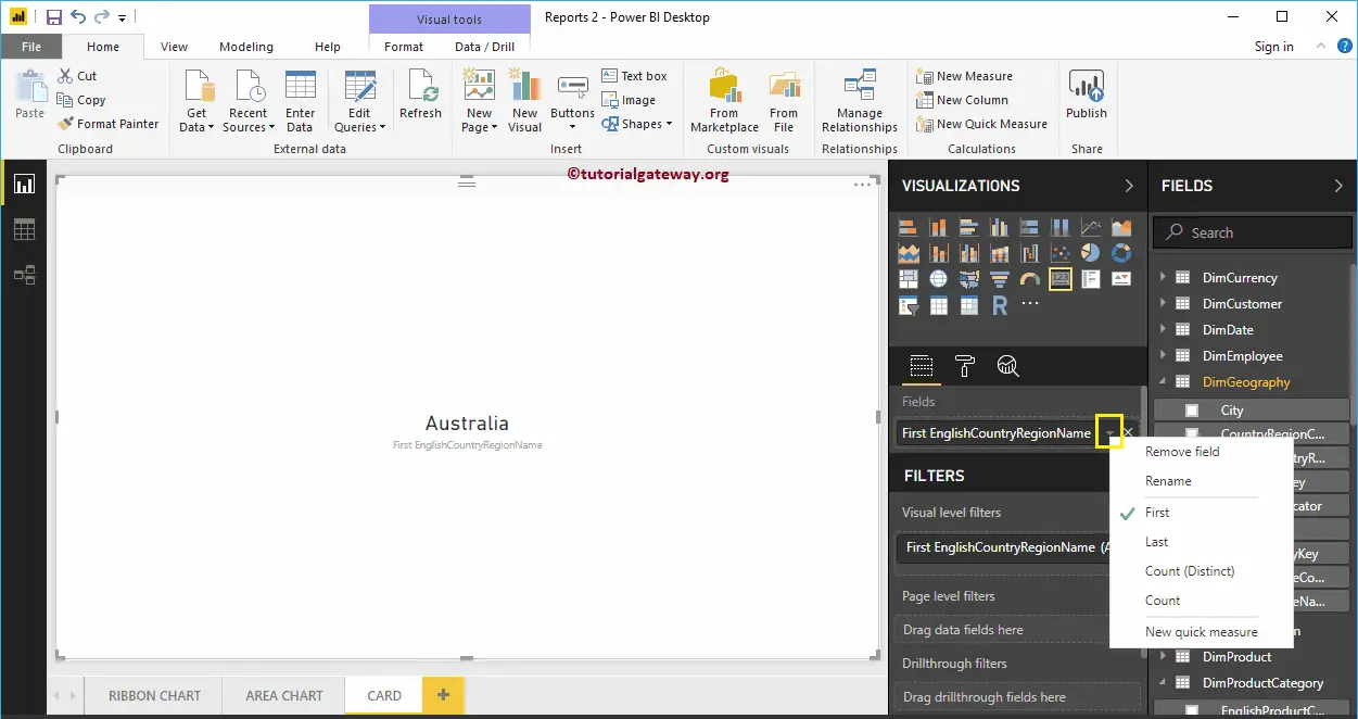
Let me drag the English Country Region Name (Dimension data) into the Fields section. As you can see, it shows the First Country Name as the Card value.
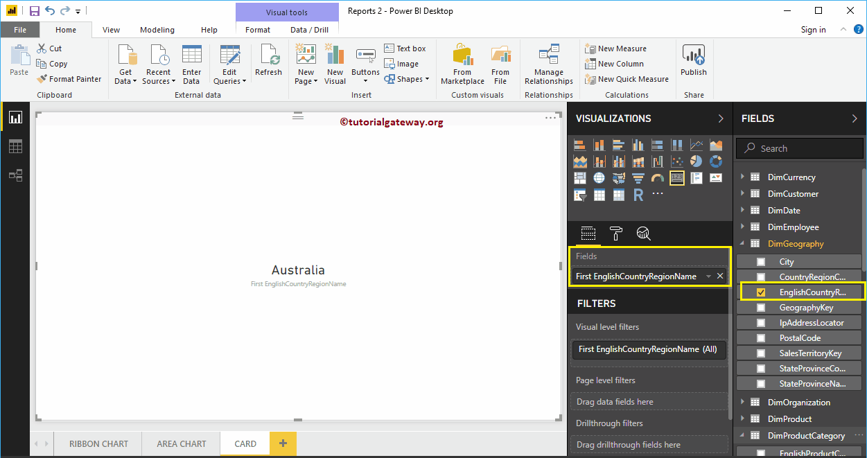
You can change the First function to any other Power BI supporting function.
Next, let me remove the Country Name and add Sales Amount to the Fields section.
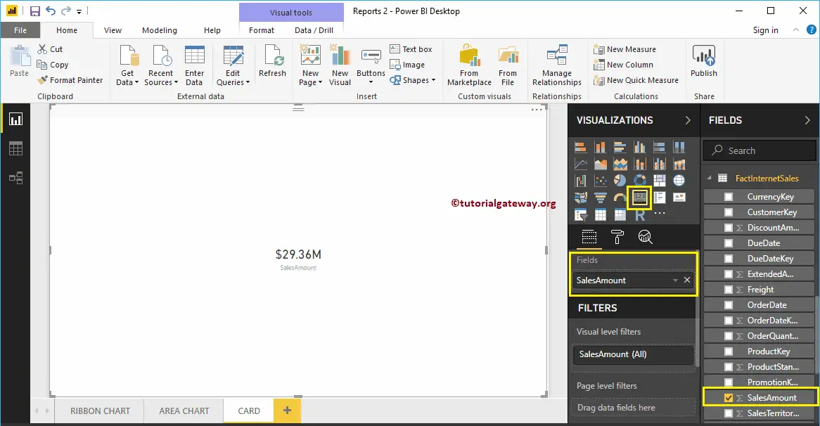
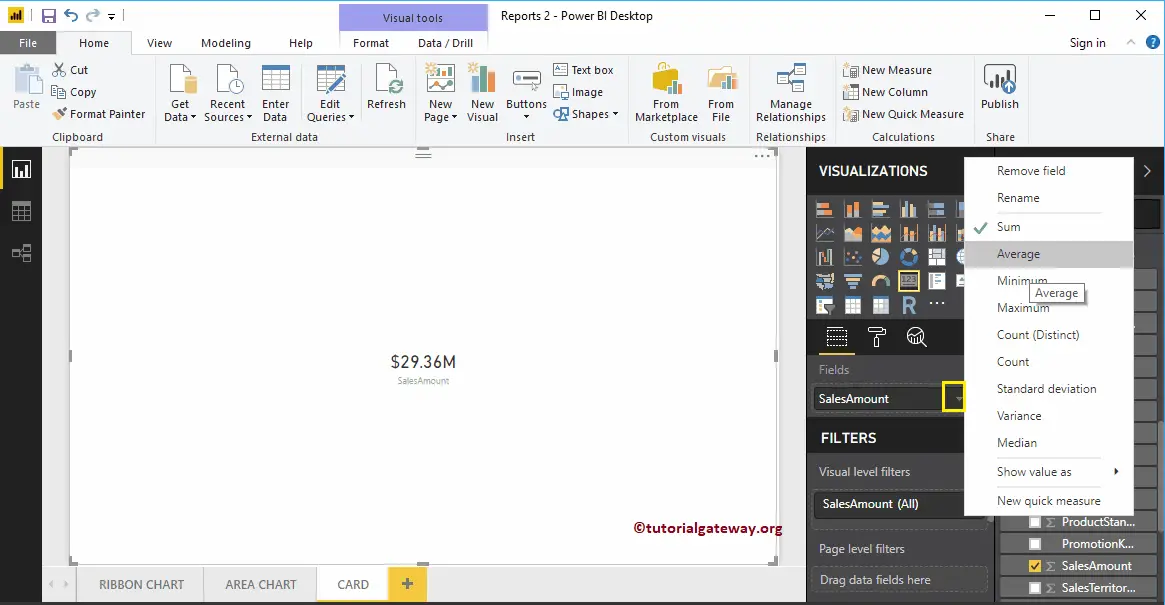
By default, it uses the default aggregated function called SUM. But, you can change this aggregate function as per your company requirement.
Let me do some quick formatting to this Card.
NOTE: I suggest you refer to Format Card article to understand the available formatting options.
Format Power BI Card
How to Format Power BI Card with an example?. Formatting Power BI Card includes changing the category Label Colors, enabling Card Title, background colors, etc.
To demonstrate the Card formatting options, we are going to use the Card that we created earlier. Please refer to Card in Power BI article to understand the steps involved in creating a Power BI Card.
How to Format Power BI Card
Please click on the Format button to see the list of formatting options that are available for this Card.
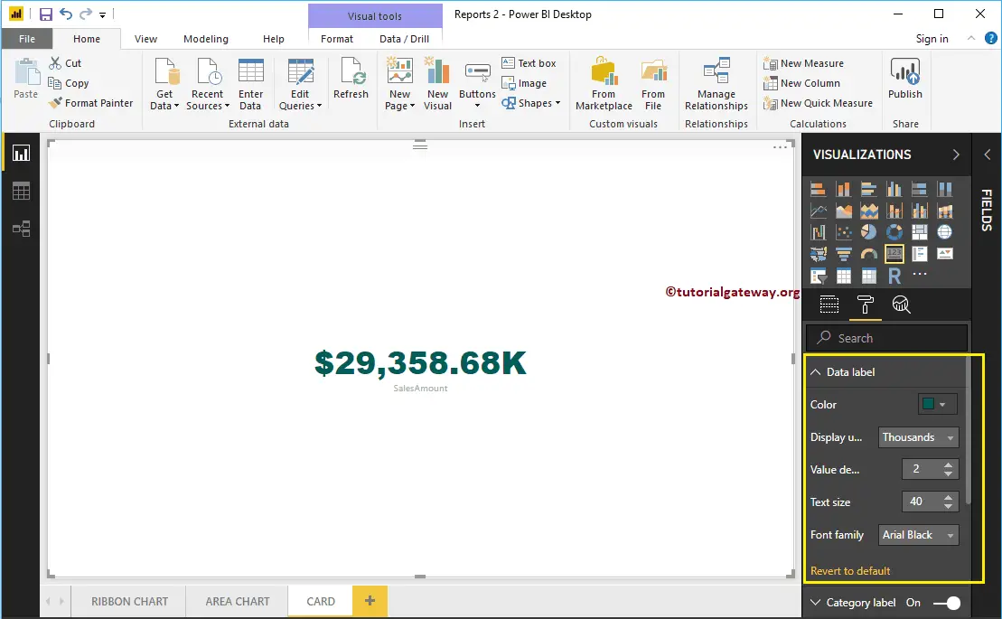
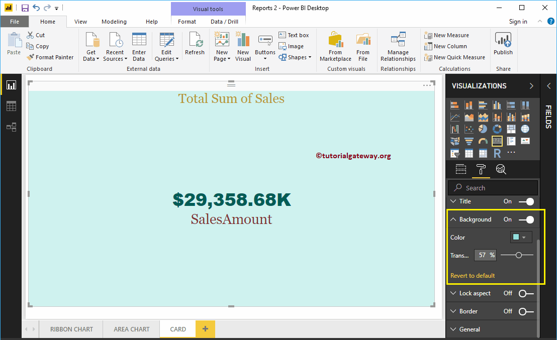
Format Data Label of a Card in Power BI
Data Label is the numeric value (Sales Amount, Total Product Cost, etc.) that is displayed by the card. As you can see from the below screenshot, we changed the Color to Green, Display Units to Thousands, text Size to 40, and Font Family to Arial Black.
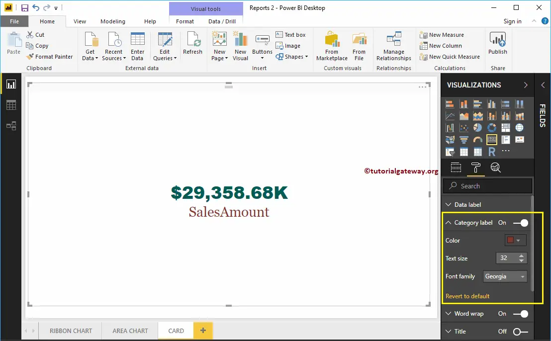
Format Category Label of a Card
Category Label means Columns Name that we used in the Card. From the screenshot below, you can see, we change the Color to Brick Red, Font Family to Georgia, and Text Size to 35.
Format Power BI Card Title
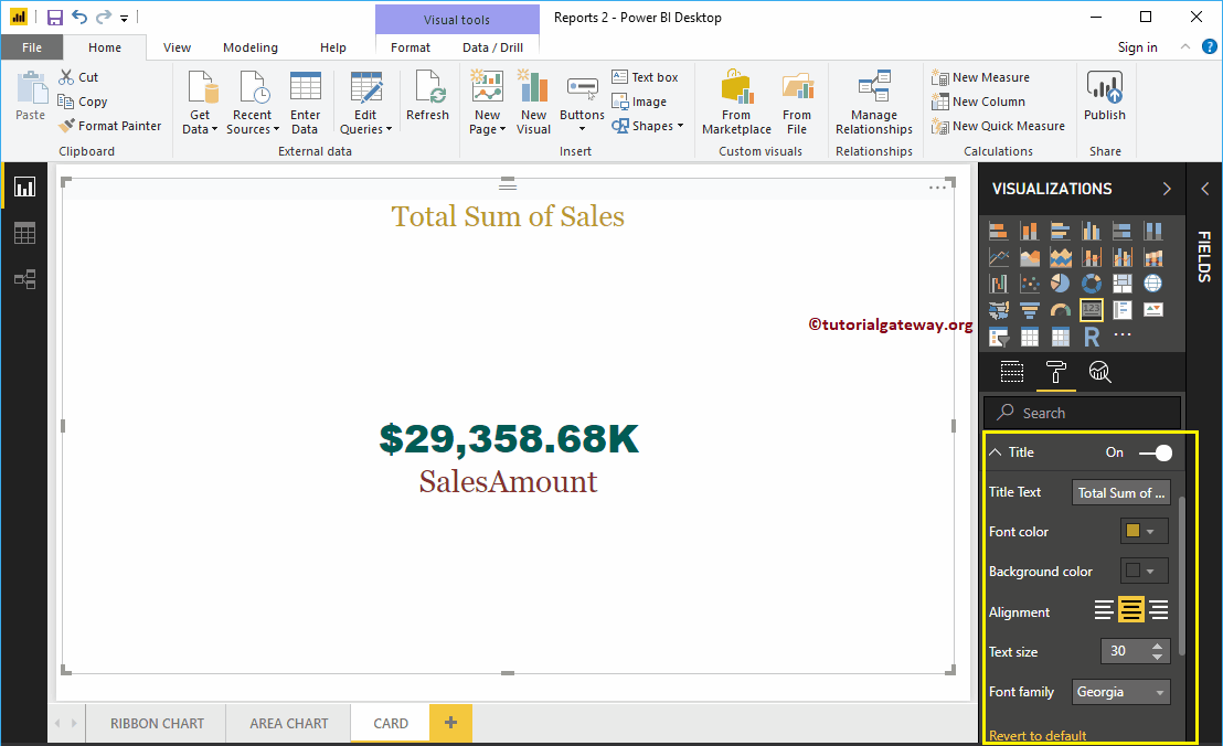
By toggling the Title option from Off to On, you can enable the title of a Card.
From the screenshot below, you can see, we change the Title Text to Total Sum of Sales. We have also changed the Font Color to Golden, Title Alignment to center, Font Family to Georgia, and Text Size to 30.
Format Power BI Card Background Color
You can add the Background color to a Card by toggling Background option to On. For the Card demonstration purpose, we added some random color with 57% transparency.
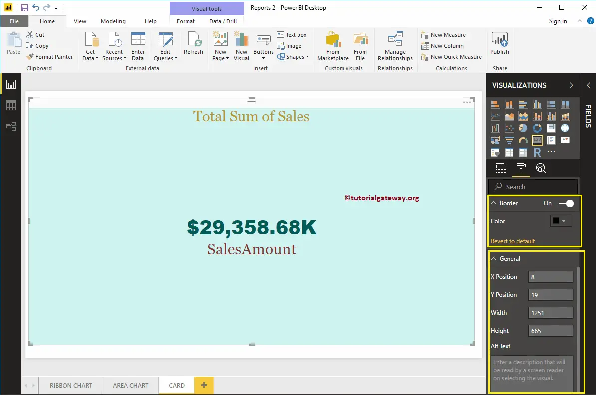
Format Card Borders and General Settings
You can add Borders to a Card by toggling the Border option from Off to On.
Use the General Section to Change the X, Y position, Width, and height of a Card
Clustered Bar Chart in Power BI
Power BI Clustered Bar Chart is used to display horizontal bars of multiple data regions (Measures) against a single Metric. Let me show you how to Create Clustered Bar Chart in Power BI with example.
For this Power BI Clustered Bar Chart demonstration, we use the SQL Data Source that we created in our previous article. So, Please refer to Connect Power BI to SQL Server article to understand the Data Source in Power BI.
How to Create a Clustered Bar Chart in Power BI
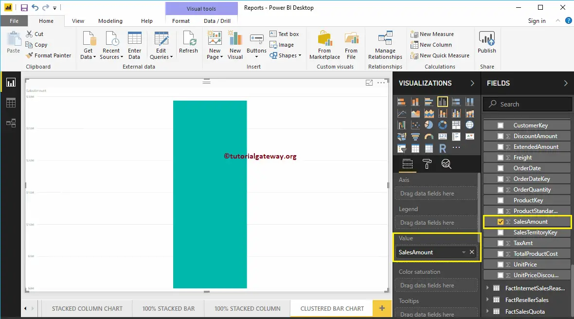
First, click on the Clustered Bar Chart under the Visualization section. It automatically creates a Clustered Bar Chart with dummy data.
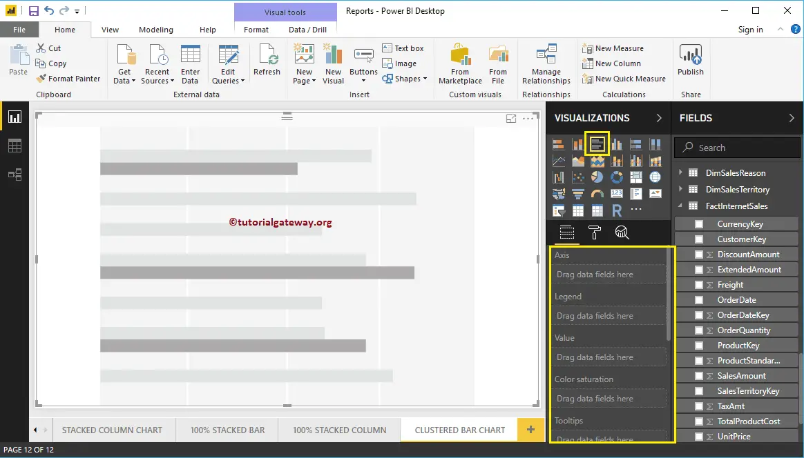
To add data to the Clustered Bar Chart, we have to add the required fields:
- Axis: Please specify the Main Column that represents the Horizontal Axis.
- Legend: Specify the second Column that represents Horizontal Bars.
- Values: Any Numeric value such as sales amount, Sales, Orders, etc.
Let me drag the Sales Amount from Fields section to Values field
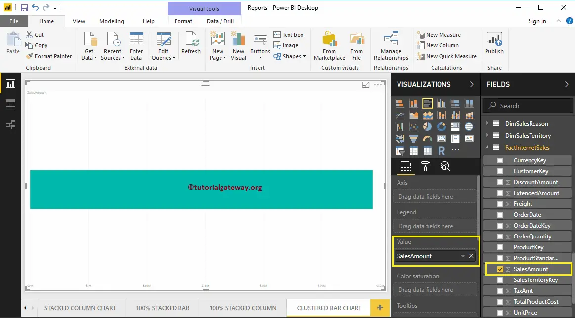
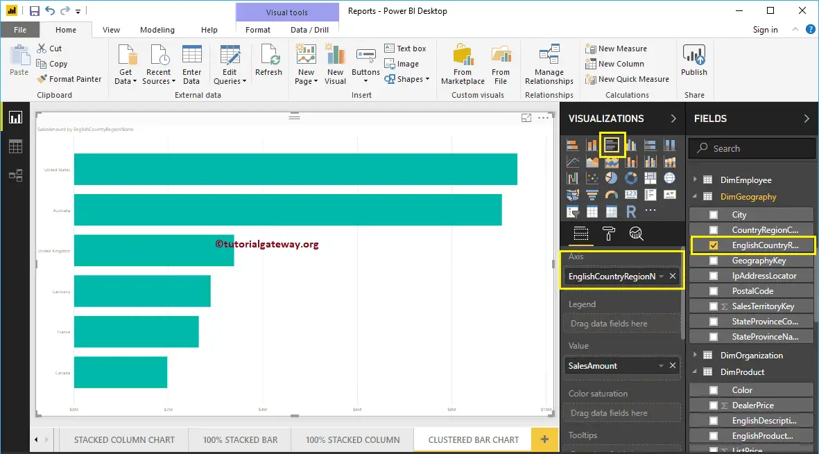
Next, let me add the English Country Region Name to Axis section to create a Bar chart. This Chart shows the Sales Amount by English Country Region Name.
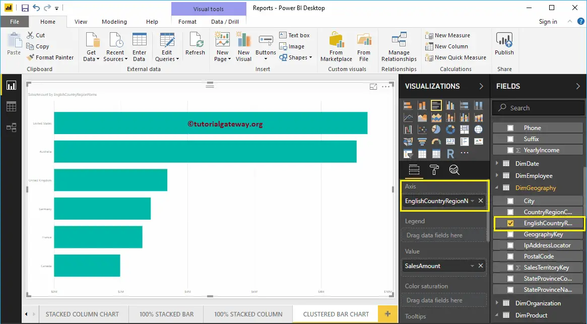
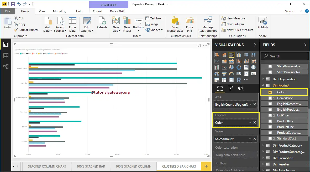
Next, add Color from DimProduct table to the Legend section.
Create a Clustered Bar Chart Approach 2
To create a Clustered Bar Chart in Power BI, first Drag and Drop the Sales Amount from Fields section to Canvas region. It automatically creates a Column Chart.
Next, let me add the English Country Region Name to the Axis section. Next, click on the Clustered Bar Chart under the Visualization section will convert the Column Chart into Clustered Bar Chart
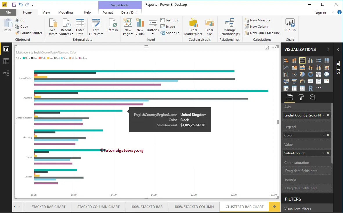
Let me add Color to Legend section to create a Clustered Bar chart that shows Sales Amount by Country Name and Color.
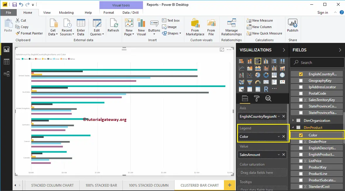
Hover over any horizontal bar shows the Tool-tip of Country Name, Product Color, and its Sales Amount
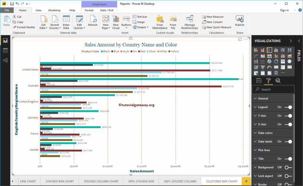
Let me do some quick formatting to this Power BI Clustered Bar Chart
NOTE: Formatting options for both Bar charts and Clustered Bar charts are the same. So, I suggest you refer to the Format Bar Chart article to understand the steps involved in formatting the Clustered Bars.
Format Bar Chart in Power BI
How to Format Bar Chart in Power BI with an example?. Formatting Power BI Bar Chart includes changing the Horizontal Bar Colors, Title text, Title position, Data labels, Axis Details, and background Colors, etc.
To demonstrate these Power BI Bar Chart formatting options, we are going to use the Bar Chart that we created earlier. Please refer to the Power BI Bar Chart article to understand the steps involved in creating a Power BI Bar chart.
How to Format Bar Chart in Power BI
Please click on the Format button to see the list of formatting options that are available for this Bar Chart.
Format Bar Chart in Power BI General Section
Use this General Section to Change the X, Y position, Width, and height of a Bar Chart
Format Y-Axis of a Power BI Bar Chart
The following are the list of options that are available for you to format the Vertical axis or Y-Axis.
You can see from the screenshot below, we change the Y-Axis labels Color to Green, Text Size to 12, Font style to Cambria. You can use the Minimum category width, Maximum Size, and Inner Padding options to change the horizontal bar widths.
By default, the Y-Axis title set to Off, but you can enable it by toggling Title under the Y-Axis section to On. Let me change the Title Color to Brick Red, Title Text Size to 25, and Font style to Georgia.
Format X-Axis of a Bar Chart in Power BI
Following are the list of options that are available for you to format the Horizontal axis or X-Axis
As you can see from the below screenshot, we change the Color to Green, Font style to Cambria, Text Size to 13, Display Units to Thousands (default is Auto).
By default, the X-Axis title set to Off, but you can enable it by toggling Title to On. Let me change the Title Color to Brick Red, Font style to Georgia, and Font Size to 25.
By toggling the Bar chart Gridlines option from On to Off, you can disable the Grid lines.
- Color: You can change the Gridlines color.
- Stroke Width: Use this to change the Gridlines width. Here, we changed the width from default 1 to 2 strokes.
- Line Style: Choose the line style such as Solid, dotted, and dashed.
From the below screenshot, you can see the changes that we made to X-Axis.
Format data Colors of a Bar Chart in Power BI
If you add any valid column to the Color Saturation field, then you can use this Diverging option to add colors to the Bar Chart. By default, it set to Off, but you can enable those Diverging options by toggling Off to On
If you haven’t added any Filed under the Color Saturation section, then Diverging option under the Data Colors section replaced with the Default Color option like below
Let me add Minimum, Center, and Maximum color. Remember, you have an option to add the Minimum, Center, and Maximum values as well.
Enable Data Labels for Power BI Bar Chart
Bar Chart Data Labels display information about each individual horizontal bar. In this case, it displays the Sales Amount of each bar. To enable or format Power BI bar chart data labels, please toggle Data labels option to On.
Let me change the Color to Green, Display Units from Auto to Thousands, Font family to DIN, Text Size to 10, and Background color to Black with 90% transparency
Format Bar Chart in Power BI Plot Area
You can add Images as the Background of a Bar Chart using this Plot Area section. For the demonstration purpose, we added one image as the Plot Area Background.
Format Bar Chart in Power BI Title
By toggling the Title option from On to Off, you can disable the Bar Chart title.
As you can see from the screenshot below, we change the Title Text to Sale Amount and Order Quantity by State province Name. We also changed the Font Color to Green, Font Family to Georgia, Font Size to 23, and Title Alignment to center. If you want, you can add the background color to the title as well.
Format Background Color, and Border of a Bar Chart in Power BI
You can add the Background color to a Bar Chart by toggling Background option to On. And, you can add Borders to a Bar Chart by toggling the Border option from Off to On.
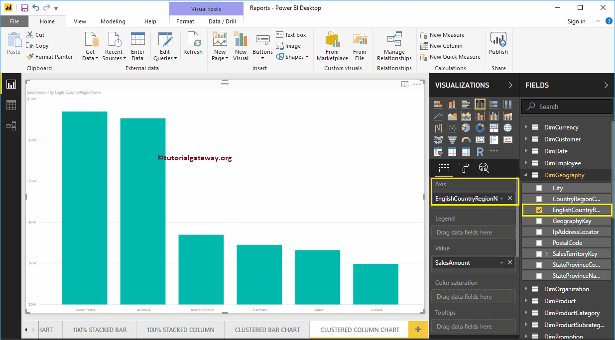
Clustered Column Chart in Power BI
Power BI Clustered Column Chart is used to display vertical bars of multiple data regions (Measures) against a single Metric. Let me show you how to Create a Clustered Column Chart in Power BI with example.
For this Power BI Clustered Column Chart demo, we are going to use the SQL Data Source that we created in our previous article. So, Please refer to Connect Power BI to SQL Server article to understand the Data Source in Power BI.
How to Create a Clustered Column Chart in Power BI
First, click on the Clustered Column Chart under the Visualization section. It will automatically create a Clustered Column Chart with dummy data, as shown in the below screenshot.
To add data to the Power BI Clustered Column Chart, we have to add the required fields:
- Axis: Please specify the Main Column that represents the Vertical Axis.
- Legend: Specify the second Column that represents Vertical Bars (or bar colors).
- Values: Any Numeric value such as sales amount, Total Sales, etc.
Let me drag the Sales Amount from Fields section to Values field
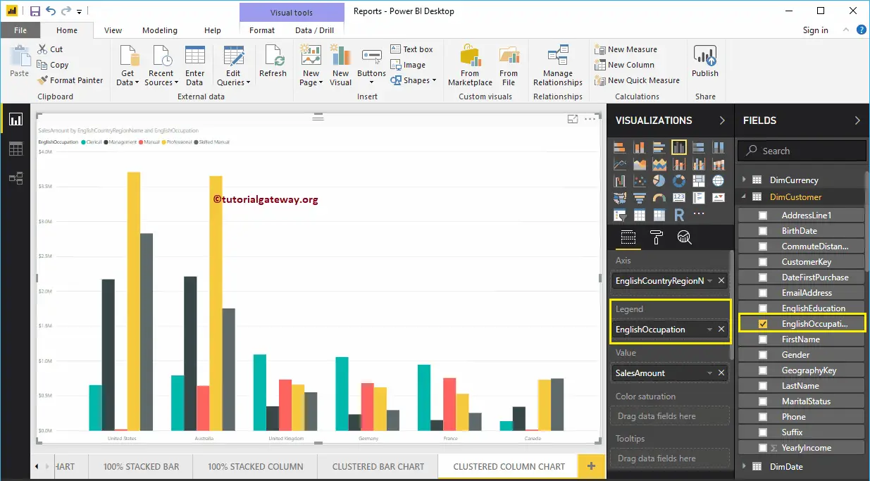
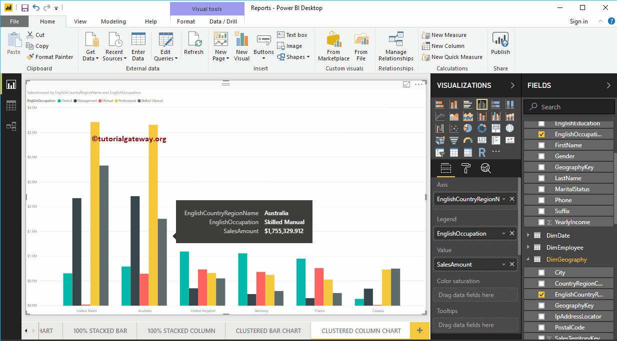
Next, let me add the English Country Region Name to Axis section to create a Column Chart. This Chart shows the Sales Amount by English Country Region Name.
Next, add English Occupation from the DimCustomer table to the Legend section.
Create a Clustered Column Chart Approach 2
To create a Clustered Column Chart, first Drag and Drop the Sales Amount from Fields section to the Canvas region. It will create a Column Chart, as we have shown below.
Next, let me add English Country Region Name to Axis section and English Occupation to the Legend section. It automatically creates a Clustered Column Chart using Country and Occupation columns for you.
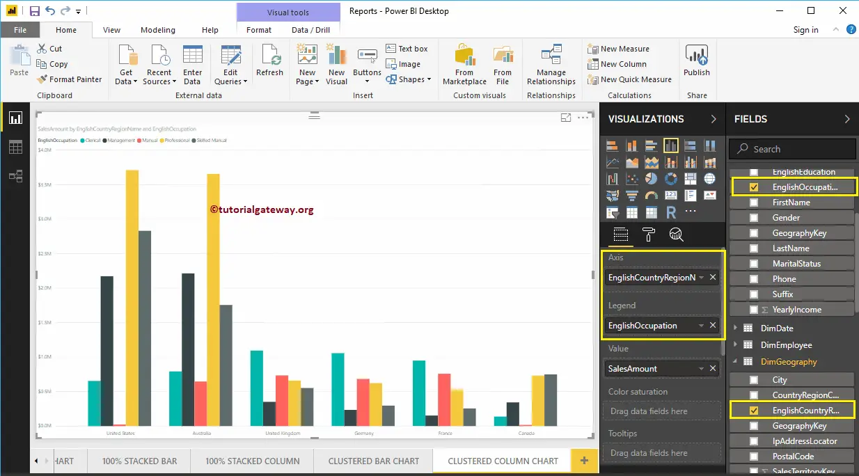
Hover over any vertical bar will show you the Tool-tip of Country Name, Customer Occupation, and Sales Amount
Let me do some quick formatting to this Power BI Clustered Column Chart.
NOTE: Formatting options for both Column Chart and Clustered Column Chart are the same. So, I suggest you refer to the Format Column Chart article to understand the steps involved in formatting the Clustered Columns.
Format Power BI Column Chart
How to Format Power BI Column Chart with example?. Formatting Power BI Column Chart includes changing the Bar Color, Title position, background Colors, and adding Data labels, etc.
To demonstrate these Column chart formatting options, we are going to use the Column Chart that we created earlier. Please refer Column Chart in Power BI article to understand the steps involved in creating a Power BI column chart.
How to Format Power BI Column Chart
Please click on the Format button to see the list of available formatting options for this Column Chart.
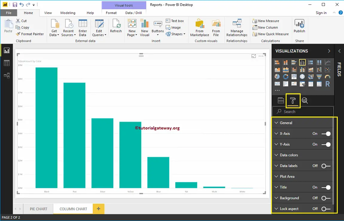
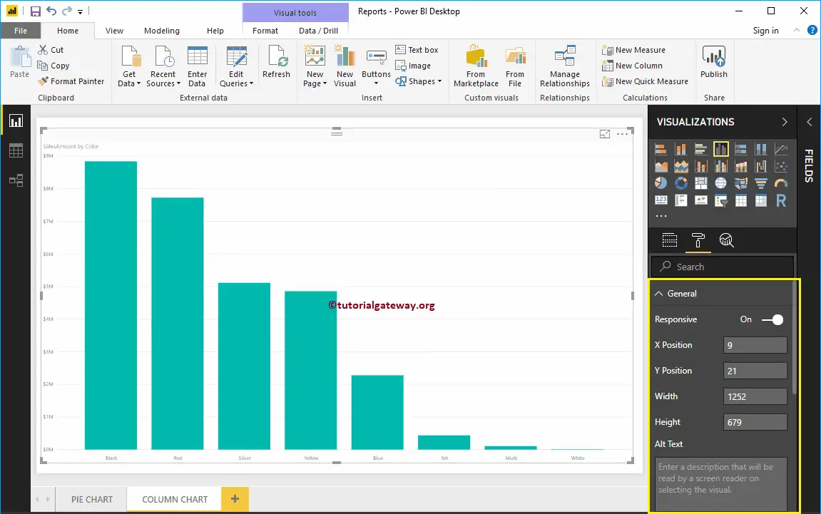
Use the General Section to Change the X, Y position, Width and height of a Column Chart
Format X-Axis of a Power BI Column Chart
Toggle the X-Axis option from Off to On to format the X-Axis labels. Following are the list of options that are available for you to format the Horizontal axis
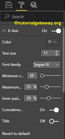
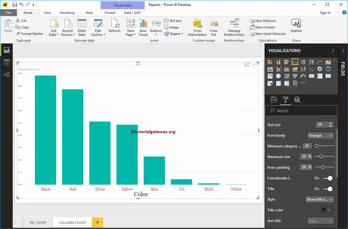
As you can see from the below screenshot, we change the Color to Brick red, Font style to Georgia, and Text Size to 20. Minimum category, Maximum Size, and Inner Padding options are to changed the bar widths
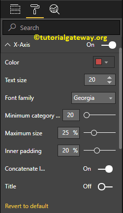
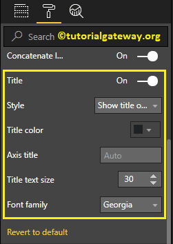
By default, the X-Axis title set to Off. But you can enable it by toggling Title to On. Let me change the Title Color to Dark Grey, Font style to Georgia, and Title Text Size to 30
From the below screenshot, you can see the changes that we made to X-Axis.
Format Power BI Column Chart Y-Axis
By toggling the Y-Axis option from Off to On, you can format the Y-Axis labels. The following are the list of options that are available for you to format the Vertical axis or Y-Axis.
From the screenshot below, you can see that we change the Y-Axis labels Color to Brick red, Text Size to 20, Font style to Georgia, and Display Units to Thousands.
By default, the Y-Axis title set to Off. But you can enable it by toggling Title under the Y-Axis section to On. Let me change the Title Color to Dark Grey, Font style to Georgia, and Title Text Size to 30.
By toggling the Gridlines option from On to Off, you can disable the Gridlines.
- Color: You can change the Gridlines color.
- Stroke Width: Use this to change the Gridlines width. Here, we changed the width from default 1 to 2 strokes.
- Line Style: Choose the line style such as Solid, dotted, etc.
From the below screenshot, you can see all the changes that we made so far to the Y-Axis.
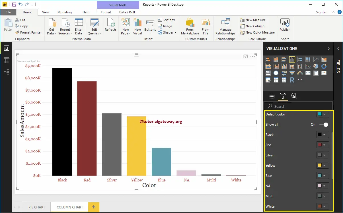
Format Power BI Column Chart Data Colors
By default, all the Bars in Column chart display in a single default color. This Data Colors section used to change the Bar Colors.
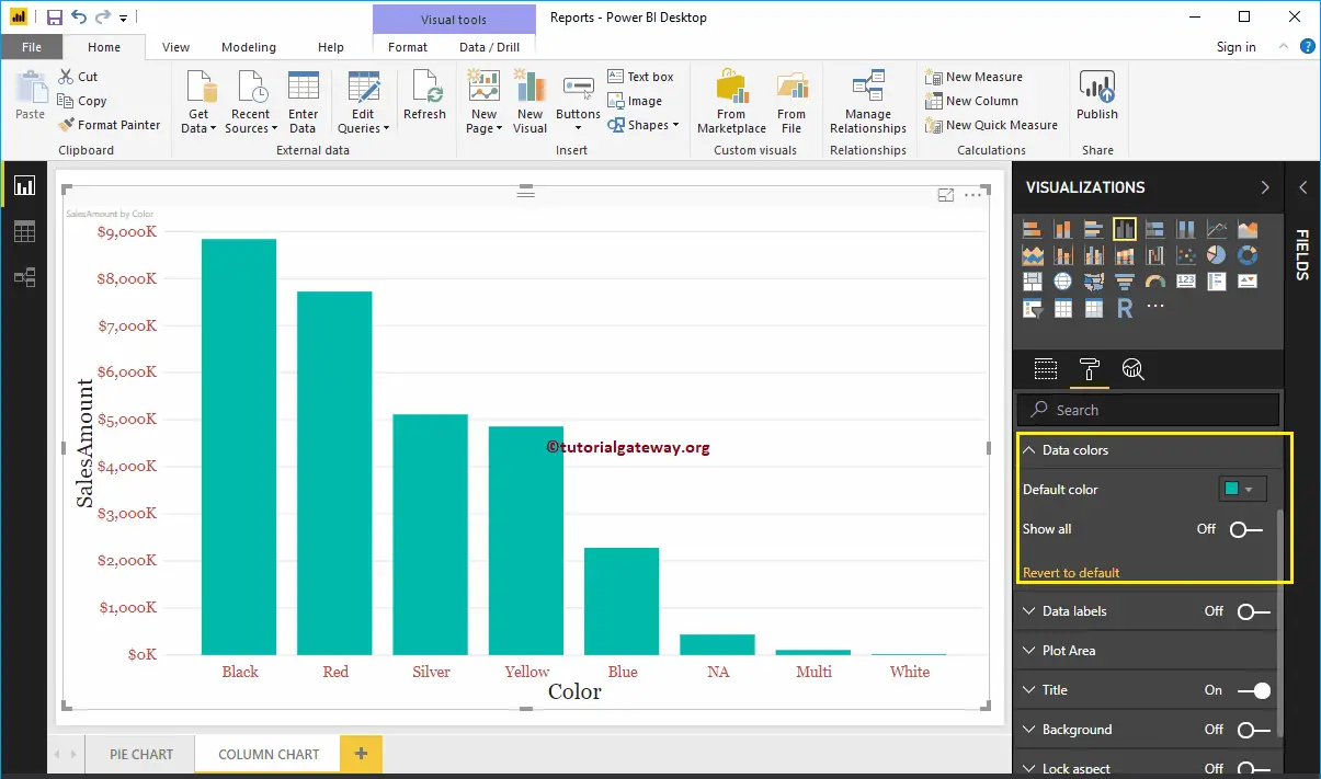
First, toggle Show all options from Off to On. It allows you to pick the individual color for each bar.
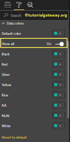
For the demonstration purpose, we changed the Colors of all the existing bars.
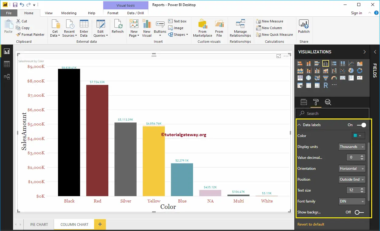
Enable Data Labels for Power BI Column Chart
Data Labels display information about the bar. In this case, it displays the Sales Amount of each bar. To enable data labels, please toggle Data labels option to On.
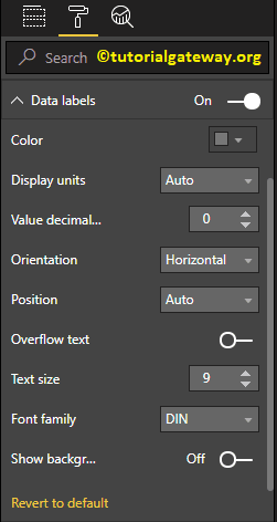
Let me change the Color to Green, Display Units from Auto to Thousands, Position to Outside End (Top of the Bar), Text Size to 12, and Font family to DIN. You can also add a Background color to the Data labels as well by enabling Show Background
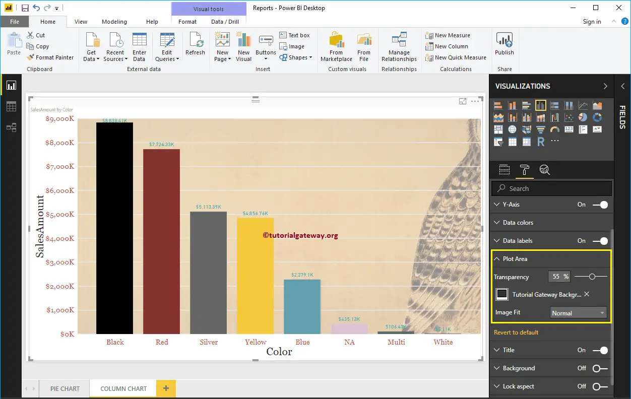
Format Power BI Column Chart Plot Area
You can add Images as the Background by using the Plot Area section. For the demonstration purpose, we added one image as the Plot Area Background.
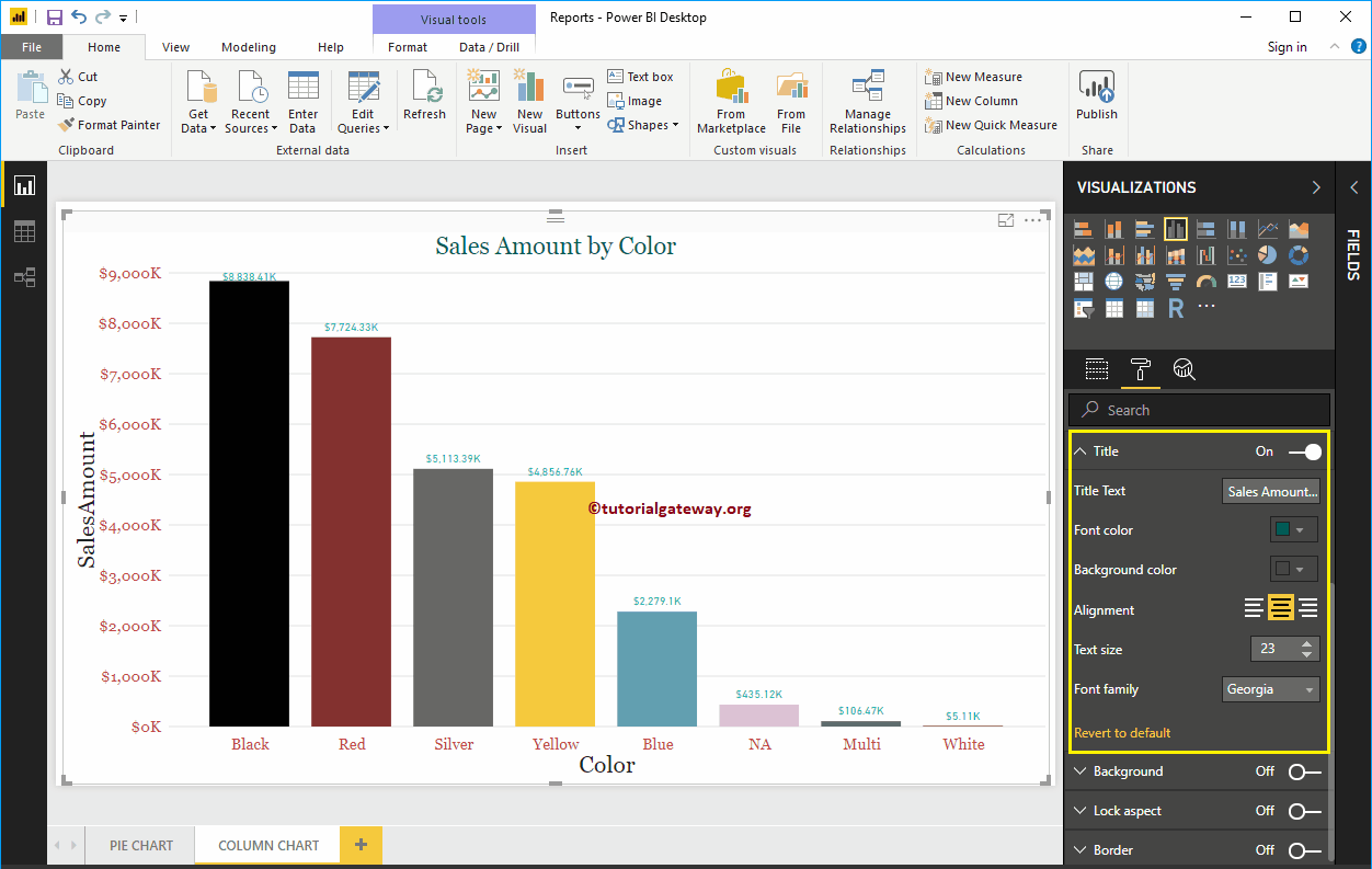
Format Power BI Column Chart Title
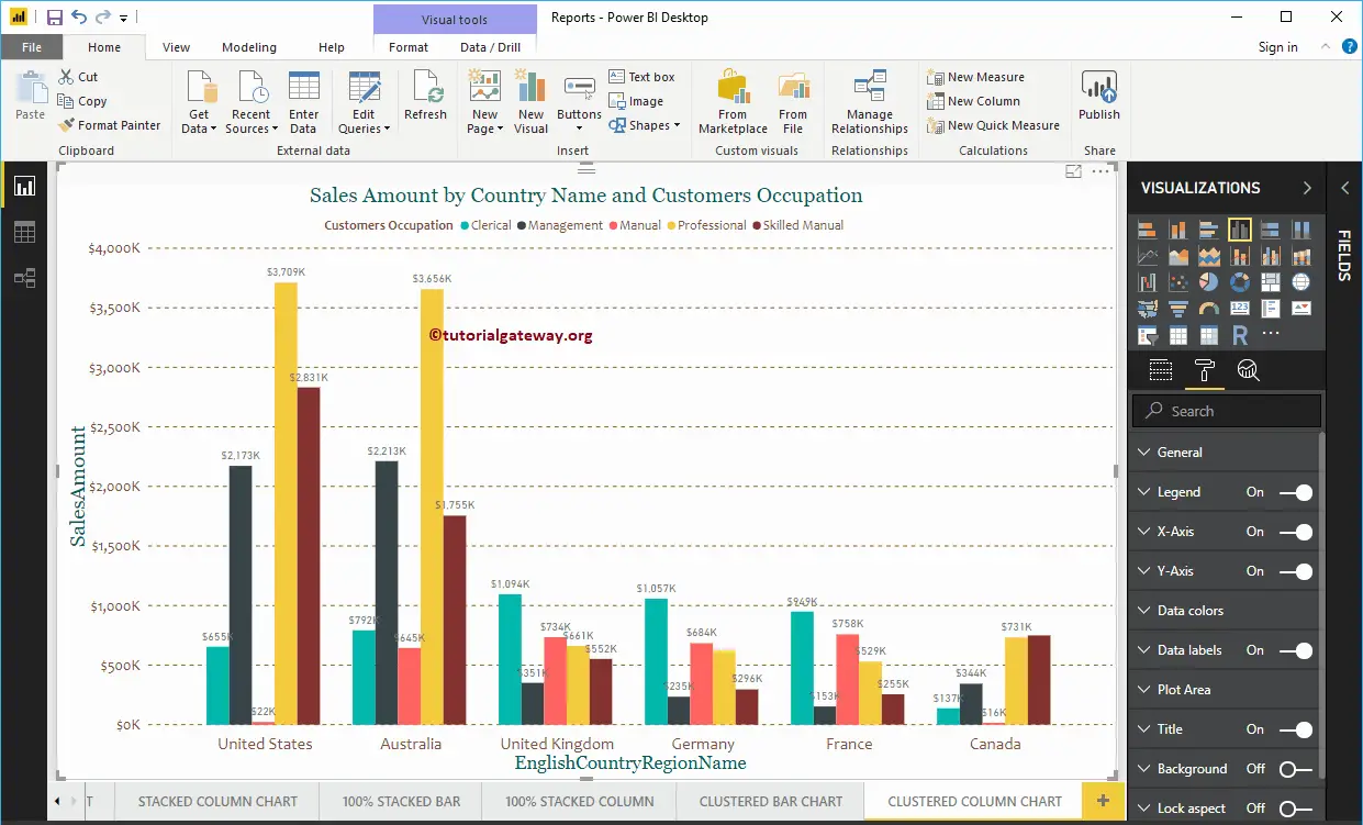
Please select the Title, and change the option from Off to On to display the Column Chart title. As you can see from the below screenshot, we change the Title Text to Sale Amount by Color. Next, Font Color to Green, Font style to Georgia, Font Size to 23, and Title Alignment to center. If you want, you can add the background color to the title as well.
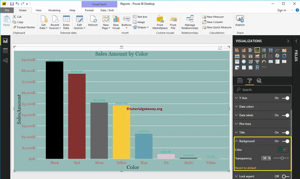
Add Background Color to Column Chart in Power BI
You can add Background color to the Column Chart by toggling Background option to On. For the demonstration purpose, we are adding a background color. Here, you can change the Transparency percentage as well.
It doesn’t look very good. Let me remove the background color by clicking the Revert to the default option
Enable Border to Column Chart in Power BI
You can add Borders to Column Chart by toggling the Border option from Off to On. For the demonstration purpose, we enabled Borders and added Dark Grey color as the Border color.
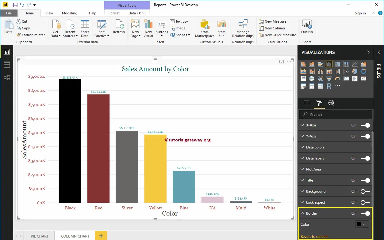
The below screenshot shows the Column Chart after formatting
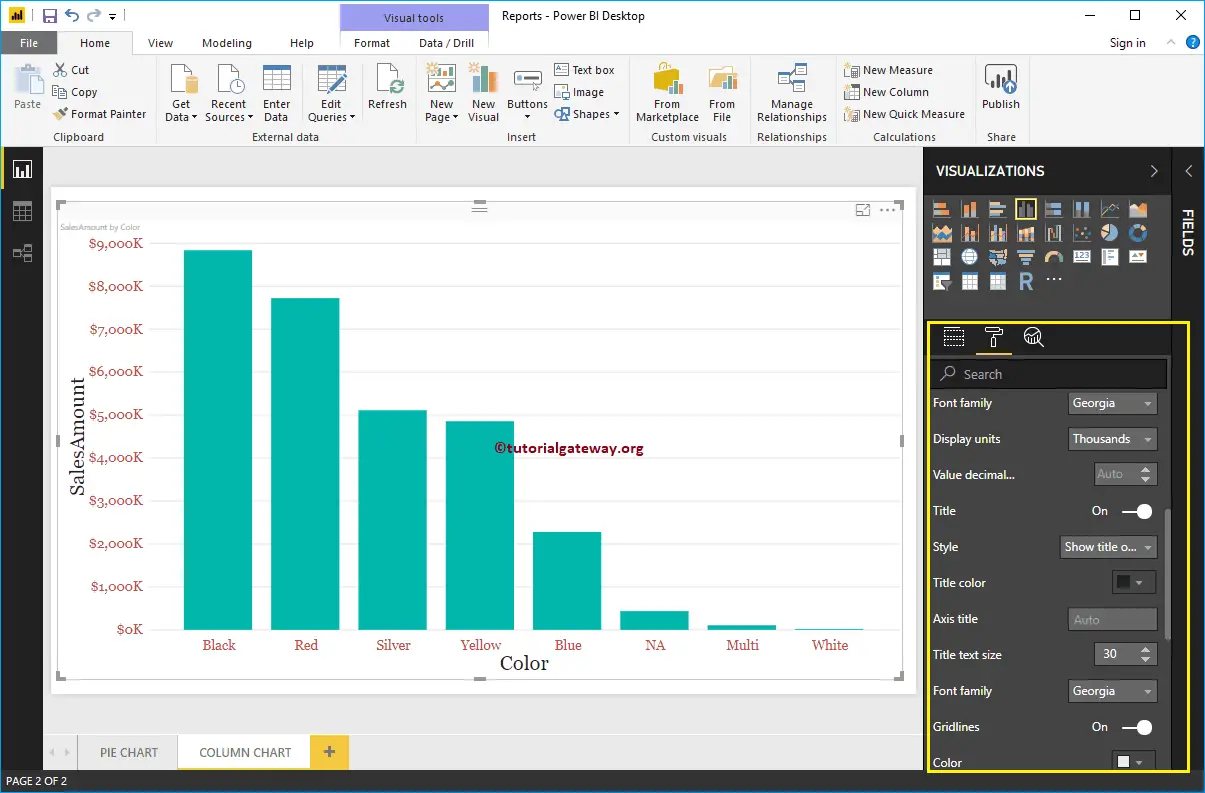
Column Chart in Power BI
Power BI Column Chart is very useful to compare the categorical data visually. For example, If we want to compare Sales by Product Group, or Color, then we can use this Power BI column chart.
For this Power BI Column Chart demonstration, we are going to use the SQL Data Source that we created in our previous article.
Please refer to Connect Power BI to SQL Server article to understand the Power BI Data Source.
How to Create a Column Chart in Power BI
Drag and Drop the Sales Amount from Fields section to Canvas automatically create a Column Chart, as have shown in the below screenshot.
Next, let me add Color field to Axis to create a column chart that shows Sales Amount by the product Color.
Create a Column Chart in Power BI – Approach 2
When you click on the Column Chart under the Visualization section, it automatically creates a Column Chart, as shown in the below screenshot.
To add data to the Power BI Column Chart, we have to add the required fields:
- Axis: Please specify the Column that divides the Bars.
- Values: Any Numeric value, such as sales amount, Total Sales, Customer count, etc.
Let me drag the Sales Amount from the Fields section to the Values field.
And you can see, it has created a column chart for you
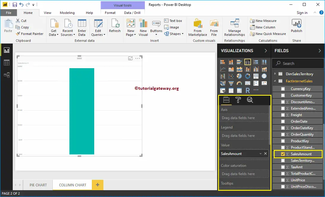
Next, add Product Color to the Axis field. You can do this by dragging Color to Axis section, or Checkmark the Color column
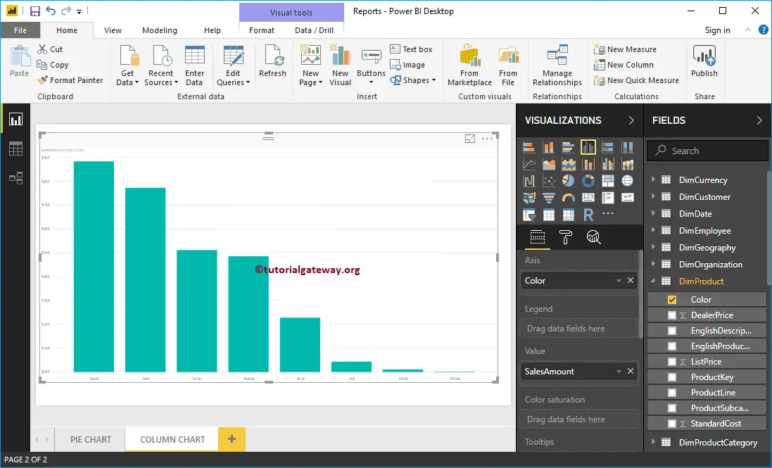
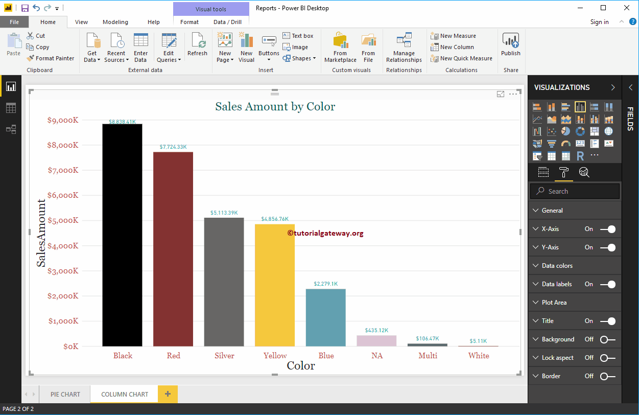
Power BI Column chart has one more property called Color Saturation. Let me add Order Quantity to saturate the Color from Light to dark. From the below screenshot you can see, all Product Colors apart from NA are light
It’s because the Order Quantity is high for NA color products, but the sale amount is very less. Whereas the Sales Amount of Black color products is High, but the number of orders is very less.
Let me do some quick formatting to this Column Chart
NOTE: I suggest you refer to the Format Column Chart article to understand the steps involved in formatting Bar Colors, Data Color, Background Color, Title, Axis fonts, and colors.
Format Power BI Column Chart
How to Format Power BI Column Chart with example?. Formatting Power BI Column Chart includes changing the Bar Color, Title position, background Colors, and adding Data labels, etc.
To demonstrate these Column chart formatting options, we are going to use the Column Chart that we created earlier. Please refer Column Chart in Power BI article to understand the steps involved in creating a Power BI column chart.
How to Format Power BI Column Chart
Please click on the Format button to see the list of available formatting options for this Column Chart.
Use the General Section to Change the X, Y position, Width and height of a Column Chart
Format X-Axis of a Power BI Column Chart
Toggle the X-Axis option from Off to On to format the X-Axis labels. Following are the list of options that are available for you to format the Horizontal axis
As you can see from the below screenshot, we change the Color to Brick red, Font style to Georgia, and Text Size to 20. Minimum category, Maximum Size, and Inner Padding options are to changed the bar widths
By default, the X-Axis title set to Off. But you can enable it by toggling Title to On. Let me change the Title Color to Dark Grey, Font style to Georgia, and Title Text Size to 30
From the below screenshot, you can see the changes that we made to X-Axis.
Format Power BI Column Chart Y-Axis
By toggling the Y-Axis option from Off to On, you can format the Y-Axis labels. The following are the list of options that are available for you to format the Vertical axis or Y-Axis.
From the screenshot below, you can see that we change the Y-Axis labels Color to Brick red, Text Size to 20, Font style to Georgia, and Display Units to Thousands.
By default, the Y-Axis title set to Off. But you can enable it by toggling Title under the Y-Axis section to On. Let me change the Title Color to Dark Grey, Font style to Georgia, and Title Text Size to 30.
By toggling the Gridlines option from On to Off, you can disable the Gridlines.
- Color: You can change the Gridlines color.
- Stroke Width: Use this to change the Gridlines width. Here, we changed the width from default 1 to 2 strokes.
- Line Style: Choose the line style such as Solid, dotted, etc.
From the below screenshot, you can see all the changes that we made so far to the Y-Axis.
Format Power BI Column Chart Data Colors
By default, all the Bars in Column chart display in a single default color. This Data Colors section used to change the Bar Colors.
First, toggle Show all options from Off to On. It allows you to pick the individual color for each bar.
For the demonstration purpose, we changed the Colors of all the existing bars.
Enable Data Labels for Power BI Column Chart
Data Labels display information about the bar. In this case, it displays the Sales Amount of each bar. To enable data labels, please toggle Data labels option to On.
Let me change the Color to Green, Display Units from Auto to Thousands, Position to Outside End (Top of the Bar), Text Size to 12, and Font family to DIN. You can also add a Background color to the Data labels as well by enabling Show Background
Format Power BI Column Chart Plot Area
You can add Images as the Background by using the Plot Area section. For the demonstration purpose, we added one image as the Plot Area Background.
Format Power BI Column Chart Title
Please select the Title, and change the option from Off to On to display the Column Chart title. As you can see from the below screenshot, we change the Title Text to Sale Amount by Color. Next, Font Color to Green, Font style to Georgia, Font Size to 23, and Title Alignment to center. If you want, you can add the background color to the title as well.
Add Background Color to Column Chart in Power BI
You can add Background color to the Column Chart by toggling Background option to On. For the demonstration purpose, we are adding a background color. Here, you can change the Transparency percentage as well.
It doesn’t look very good. Let me remove the background color by clicking the Revert to the default option
Enable Border to Column Chart in Power BI
You can add Borders to Column Chart by toggling the Border option from Off to On. For the demonstration purpose, we enabled Borders and added Dark Grey color as the Border color.
The below screenshot shows the Column Chart after formatting
Power BI Donut Chart
Power BI Donut Chart is similar to Pie Chart, which is useful to visualize the higher-level data. In this article, we show you how to Create a Donut Chart in Power BI with example.
For this Donut Chart in Power BI demonstration, we are going to use the SQL Data Source that we created in our previous article.
Please refer to Connect Power BI to SQL Server article to understand the Power BI Data Source.
How to Create a Donut Chart in Power BI
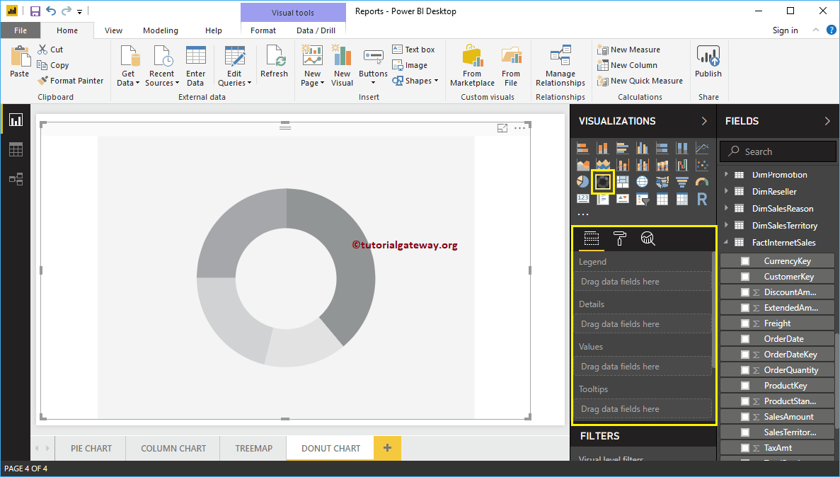
When you click on the Donut Chart under the Visualization section, it automatically creates a Donut Chart with dummy data.
To add data to the Power BI Donut Chart, we have to add the required fields:
- Legend: Drag and drop the column that you want to display as the legend.
- Details: Drag and drop the Column on which you want to partition your Donut Chart.
- Values: Any Numeric value such as orders, sales amount, Total Sales, Customer count, etc.
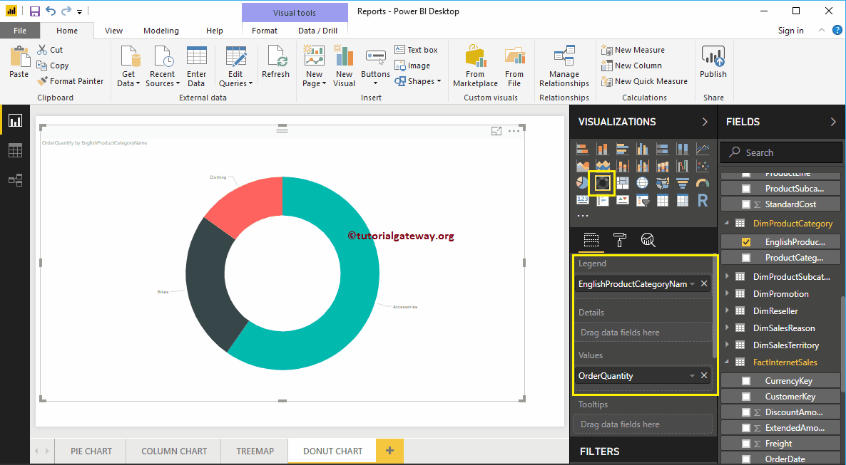
Let me drag and drop the Order Quantity from Fields section to Values field.
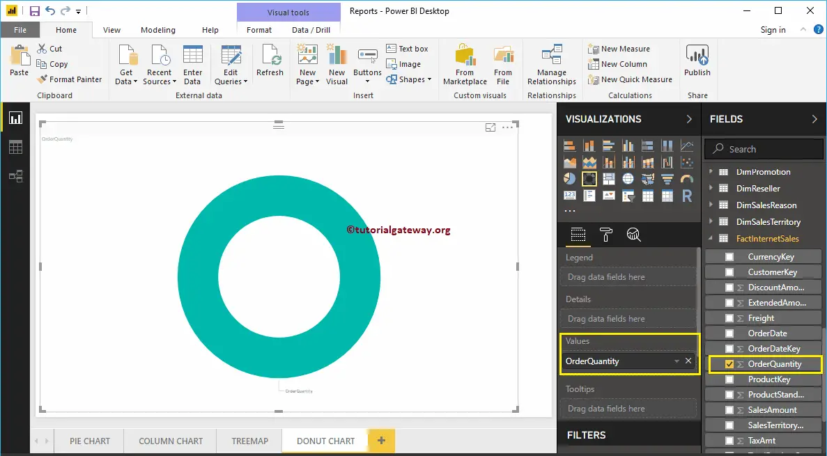
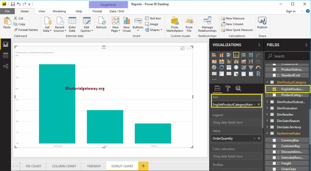
Next, let me add the English Product Category Name from DimProductCategory Table to the Axis section. You can do this by dragging Category to Axis, or checkmark the category column.
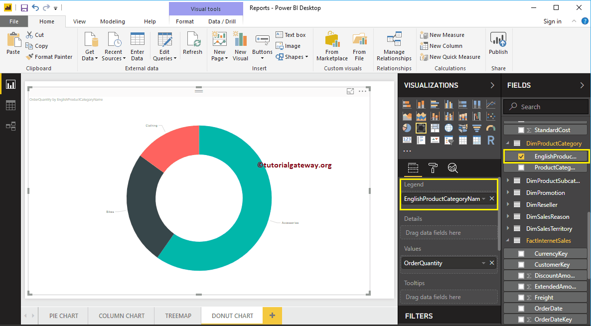
From the above screenshot, you can see the Donut Chart of Order Quantity that is Sliced by Product Category.
Create a Donut Chart in Power BI – Approach 2
First, Drag and Drop the Order Quantity from Fields section to Canvas. It automatically creates a Power BI Column Chart.
Next, let me add the English Product Category Name from DimProductCategory Table to the Axis section. For this, drag and drop Category to Axis, or checkmark the category column.
By clicking the Donut Chart under the Visualization section automatically convert the Column Chart into Donut Chart
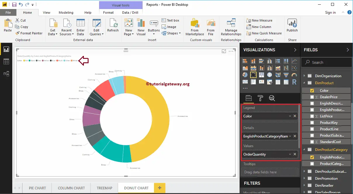
By adding another field to Details section further divide the Power BI Donut Chart.
Let me do some quick formatting to the Donut Chart
NOTE: I suggest you to refer to the Format Donut Chart article to understand the steps involved in formatting the Title font, Title alignment, Data labels, Legend titles, Slice color, and background colors.
Format Donut Chart in Power BI
How to Format Donut Chart in Power BI with example?. Formatting Donut Chart includes enabling Legend, positioning Legend, Title position, Slice colors, and background colors, etc.
To demonstrate these formatting options, we are going to use the Donut Chart that we created earlier. Please refer to the Power BI Donut Chart article to understand the steps involved in creating a Power BI Donut Chart.
How to Format Donut Chart in Power BI
Please click on the Format button to see the list of available formatting options for this Donut Chart.
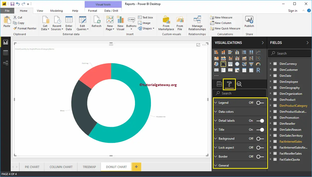
Format Legend of a Donut Chart in Power BI
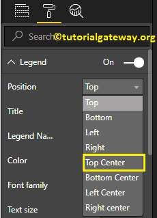
To display or enable the Legend, Please select the Legend region and toggle the option from Off to On. From the below screenshot, you can see the list of properties available for the legend
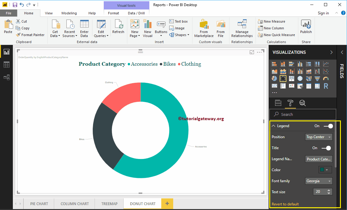
Position: Use the drop-down box to change the Donut Chart legend position as per your requirements. For now, we are selecting the Top Center.
As you can see from the below screenshot, we changed the Legend Title to product category, Color to Green, Font family to Georgia, and text size to 20.
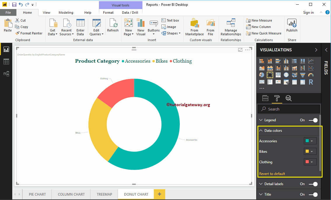
Format Data Colors of a Donut Chart in Power BI
Data Colors are useful to change the Slice Colors. Use this section to change the default slice colors to the required ones.
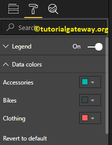
For the demonstration purpose, we changed the Bikes color to yellow.
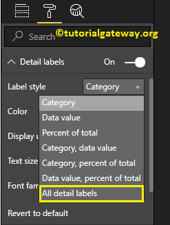
Format Detail labels of a Power BI Donut Chart
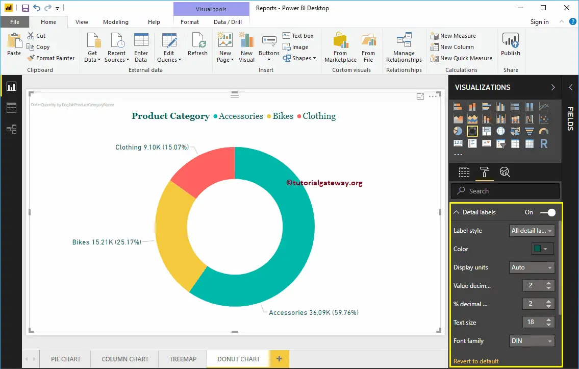
Detail labels display the information about each slice. By default, it displays the Category Name as the label. Let me change the Label style to All details. It means each slice shows the information about the Category Name, Order Quantity, and the Percentage of Total.
As you can see from the below screenshot, we also changed the Color of a Label to Green, and font size to 18. You can also change the Display Units from Auto to Millions or Trillions.
Format Donut Chart in Power BI Title
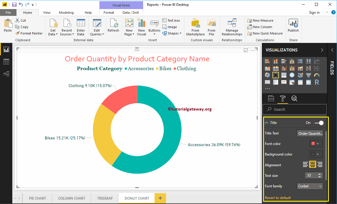
To display the Pie Chart Title, Please select the Title, and change the option from Off to On. The following are the list of options that are available to format the Donut Chart title.
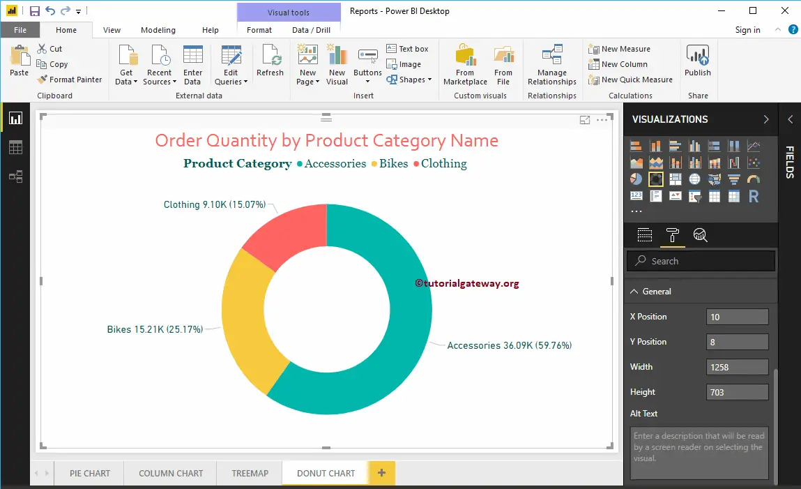
As you can see from the screenshot below, we change the Title Text to Order Quantity by Product Category Name. Next, Font Color to brick red, Font style to Corbel, Font Size to 32, and Title Alignment to center.
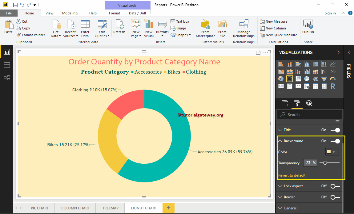
Add Background Color to Donut Chart in Power BI
You can add a Background color to Donut Chart by toggling the Background option from Off to On. For the demonstration purpose, we are adding a background color. Here, you can change the Transparency percentage as well.
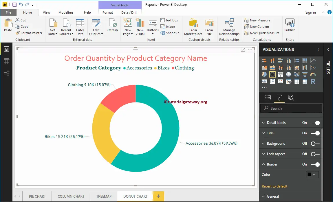
Add Border Colors to Donut Chart in Power BI
Toggling Border option from Off to On allows you to add Borders to Donut Chart. For the demonstration purpose, we are enabling it and adding Black color as the Border color.
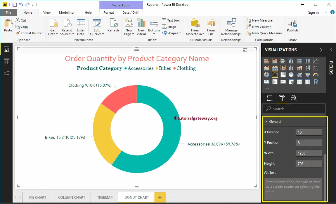
You can use this General Section to Change the X, Y position, Width and height of a Donut Chart
Power BI Funnel Chart
Power BI Funnel Chart is very useful to display the data in stages. For example, we can use this Power BI Funnel Chart to visualize the Cost of a Product at each stage in-detail.
For this Power BI Funnel Chart demonstration, we are going to use the SQL Data Source that we created in our previous article. So, Please refer to Connect Power BI to SQL Server article to understand the Power BI Data Source.
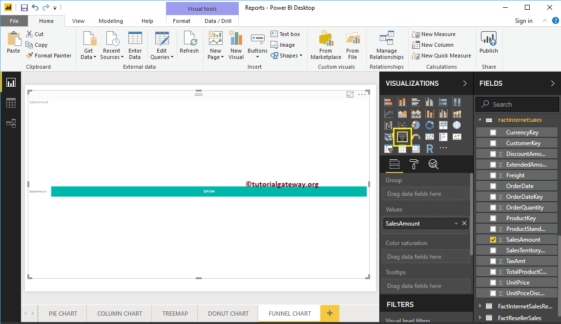
How to Create a Funnel Chart in Power BI
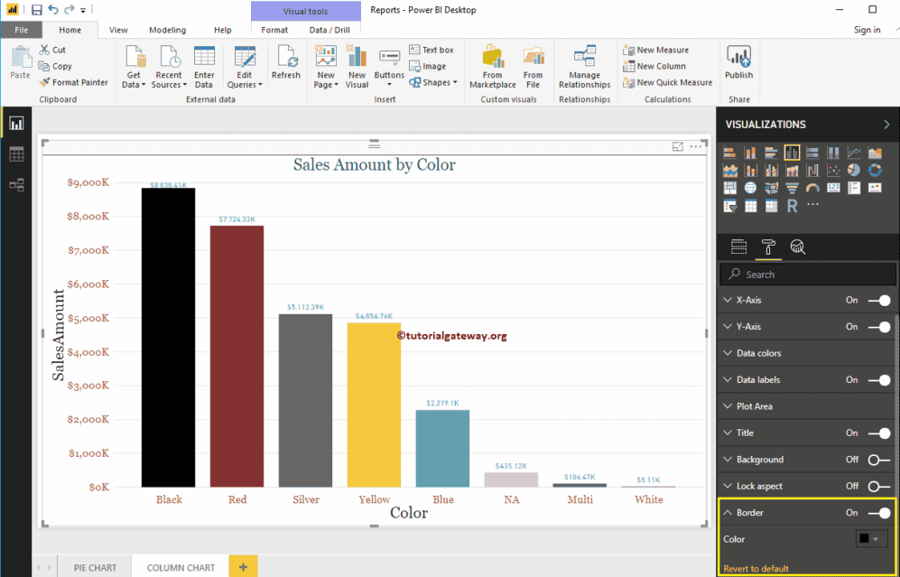
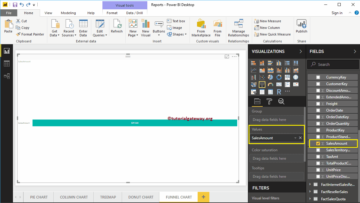
First, click on the Funnel Chart under the Visualization section. It automatically creates a Funnel Chart with dummy data, as shown in the screenshot below.
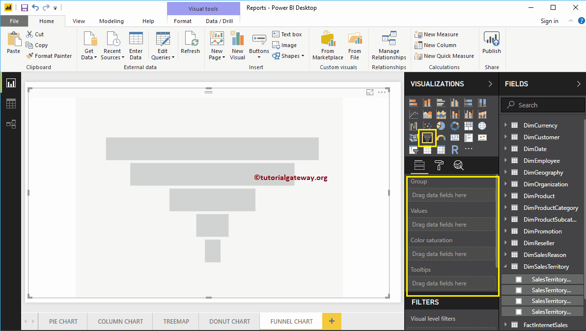
To add data to the Funnel Chart in Power BI, we have to add the required fields:
- Group: Please specify the Column that displays the stages.
- Values: Any Numeric value, such as sales amount, Total Sales, Customer count, etc.
Let me drag and drop the Sales Amount from the Fields section to the Values field.
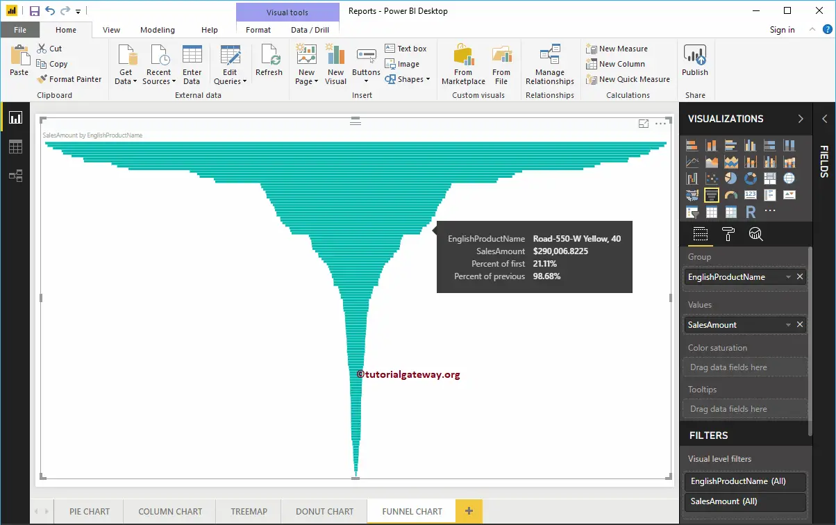
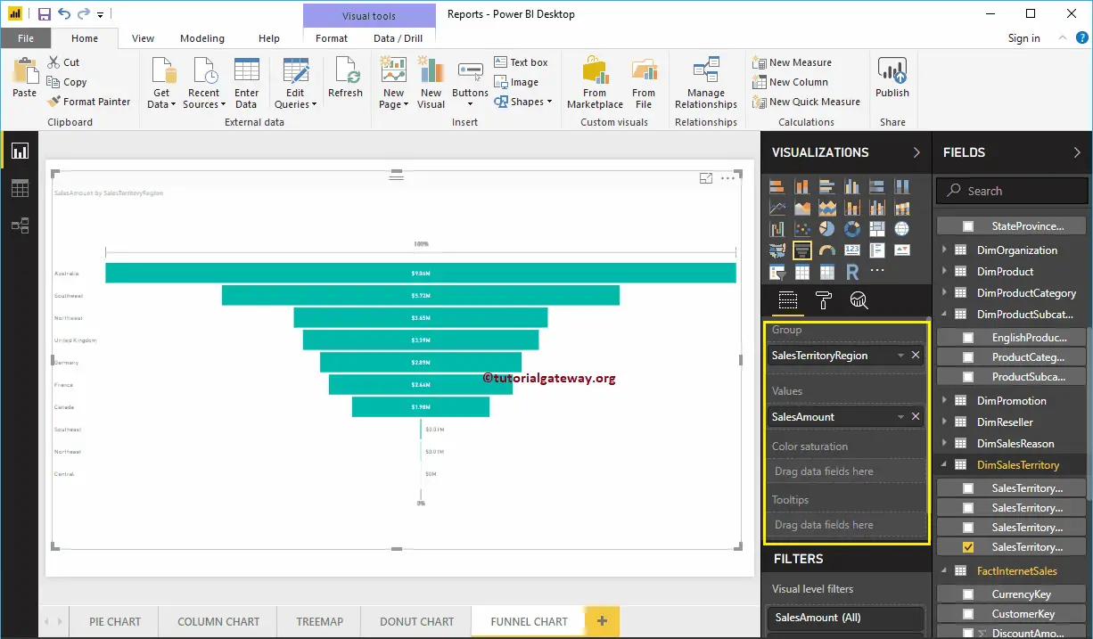
Next, add English Product Name from the DimProduct table to the group section. You can do this by dragging Product Name to Group section, or simply checkmark the Product Name column
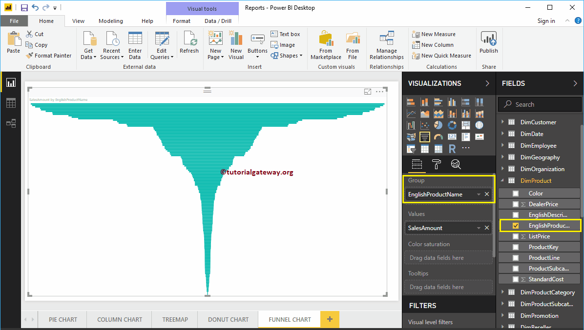
Now you can see the Funnel Chart for Sales Amount of each product. Hover over any box shows you the Tool-tip of Product Name and its Sales Amount
Create a Funnel Chart in Power BI Approach 2
First, Drag and Drop the Sales Amount from the Fields section to Canvas. It automatically creates a Column Chart, as we showed in the screenshot below.
By clicking the Funnel Chart under the Visualization section automatically convert the Column Chart into Funnel Chart
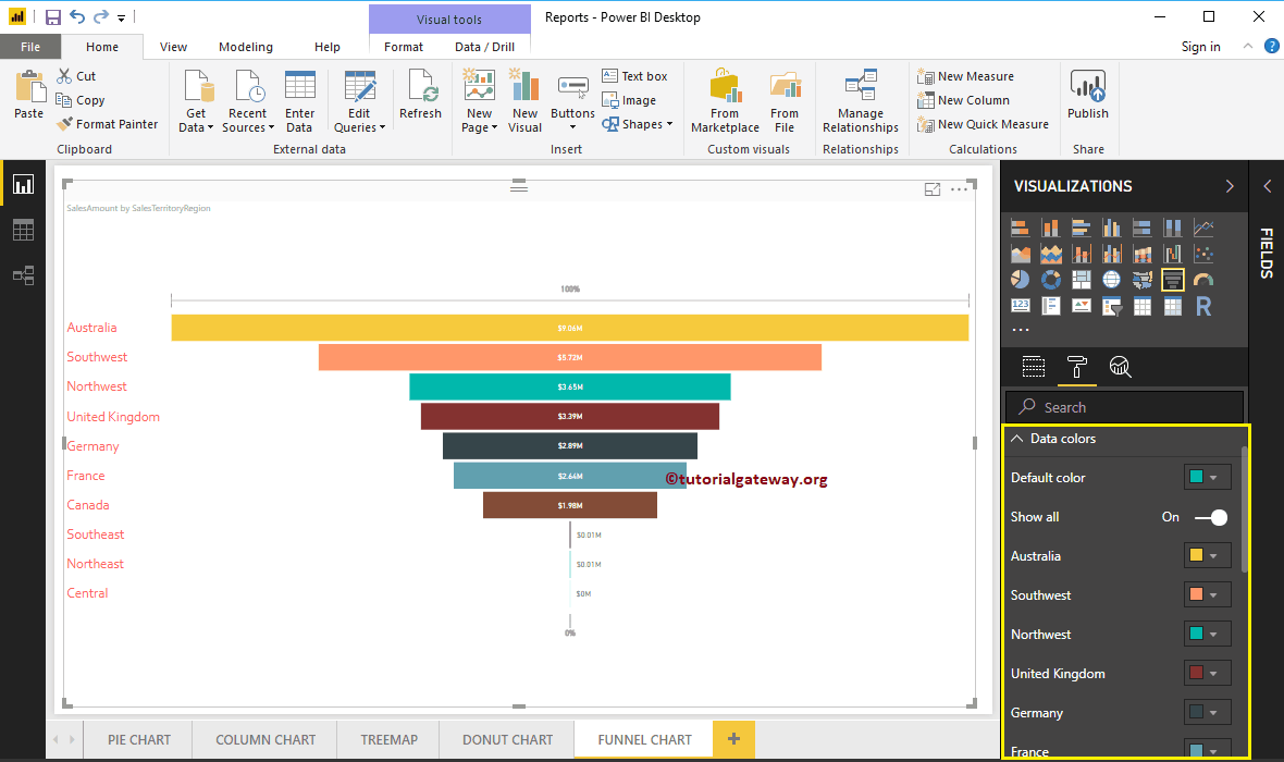
Next, let me add the Sales Territory Region from DimSalesTerritory to Group section. It means each box represents one region
Let me do some quick formatting to the Funnel Chart
NOTE: I suggest you to refer Format Funnel Chart article to understand the steps involved in formatting the Title font, Title alignment, Box colors, Data labels, and colors.

Format Funnel Chart in Power BI
How to Format Funnel Chart in Power BI with an example?. Formatting Funnel Chart in Power BI includes changing the Funnel Chart Title, Box Colors, Title position, data labels, and background Colors, etc.
To demonstrate these Power BI Funnel Chart formatting options, we are going to use the Funnel Chart that we created earlier. Please refer to the Power BI Funnel Chart article to understand the steps involved in creating Power BI Funnel Chart.
How to Format Funnel Chart in Power BI
Please click on the Format button to see the list of formatting options that are available for this Funnel Chart.
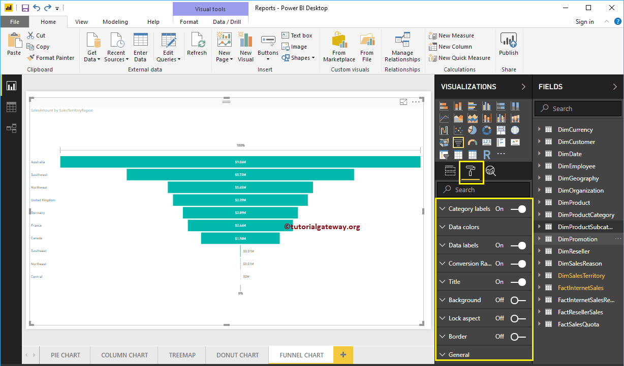
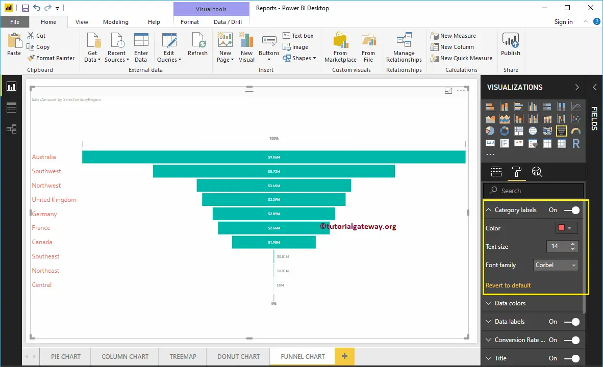
Format Category labels of a Funnel Chart in Power BI
Category labels display the information about each box (Here, Sales Territory Region Names). You can use this section to format those labels. From the screenshot below, you can see, we changed the color of the label to Brick red, Text Size to 14, and Font family to Corbel.
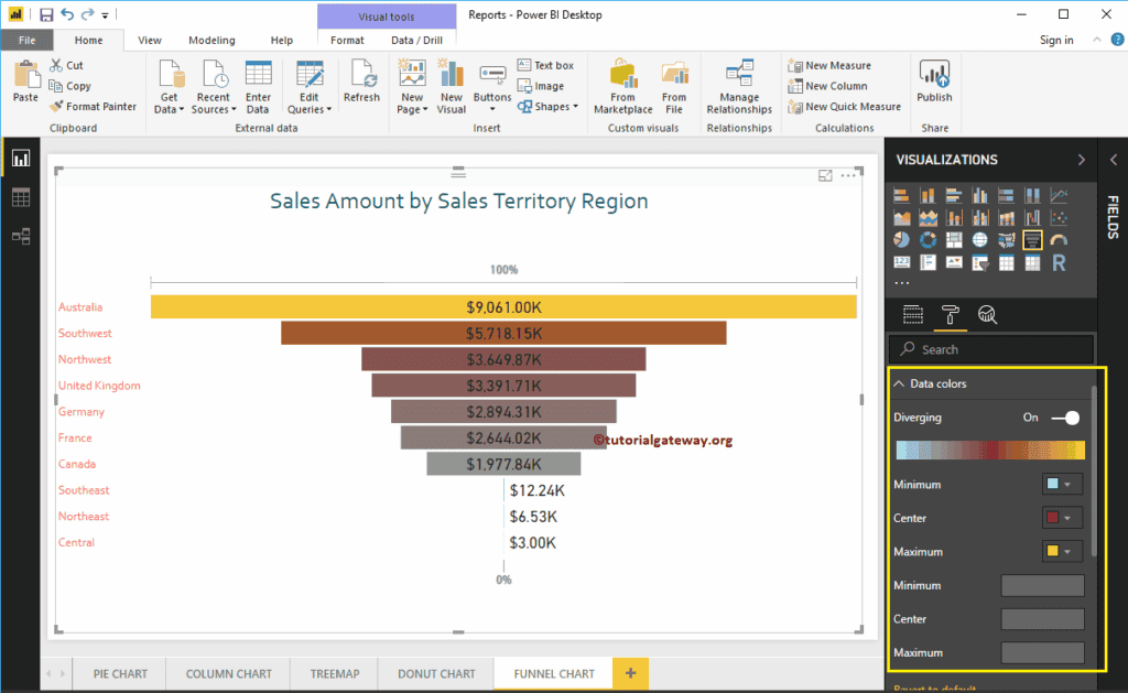
Format Power BI Funnel Chart Data Colors
By default, all the Funnel Chart Boxes display in a single default color. You can use this Data Colors section to change the Box Colors.
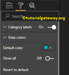
First, toggle Show all options from Off to On. It allows you to pick the specific color for each box.
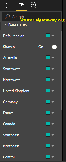
For the demonstration purpose, we changed the Colors of all the existing boxes.
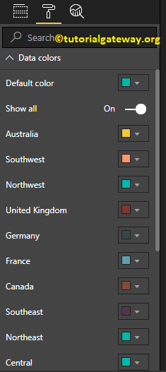
And you can see the result
Format Data Labels of a Funnel Chart in Power BI
Data Labels display the Metric information (Sales Amount of each bar) about the bar.
As you can see from the screenshot below, we changed the Data labels Color to Dark Gray, Display Units from Auto to Thousands. We also changed the Label Position to Inside Center, Text Size to 20, and Font family to DIN.
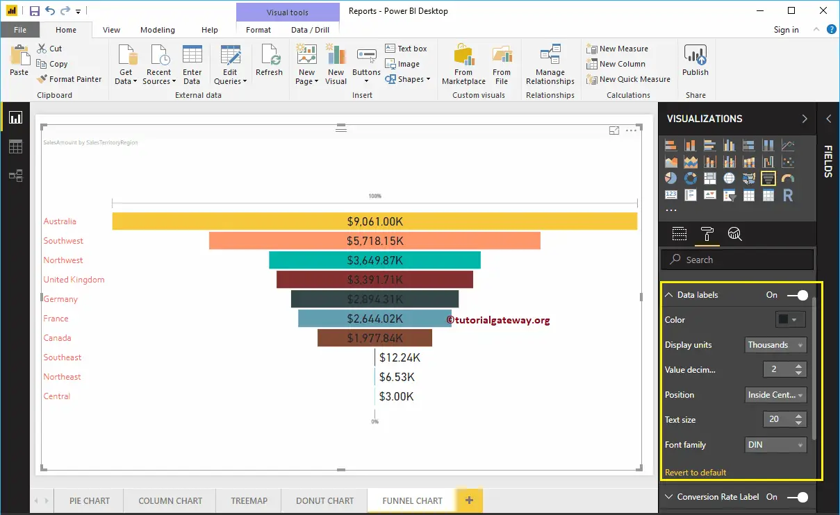
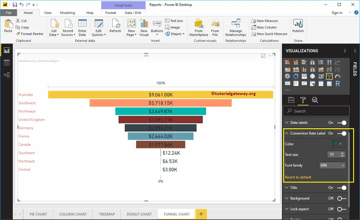
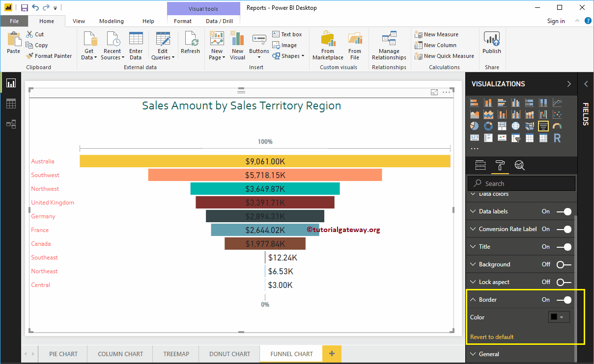
Format Power BI Funnel Chart Conversion Rate Labels
Please select the Conversion rate Label, and toggle the option from Off to On. It displays the 100% on Top, and 0% at the bottom of the Funnel Chart.
As you can see from the below screenshot, we change the Color to Green, Font style to DIN, and Font Size to 15. In general, you can just disable this feature.
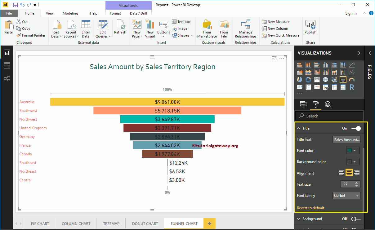
Format Power BI Funnel Chart Title
By toggling the Title option from On to Off, you can disable the title of a Funnel Chart.
As you can see from the screenshot below, we change the Title Text to Sale Amount by Sales Territory Region. And we also changed the Font Color to Green, Font style to Corbel, Font Size to 27, and Title Alignment to center. If you want, you can add the background color to the title as well.
Add Background Color to Funnel Chart in Power BI
You can add the Background color to Funnel Chart by toggling Background option to On. For the demonstration purpose, we are enabling this feature and adding a background color. Here, you can change the Transparency percentage as well.
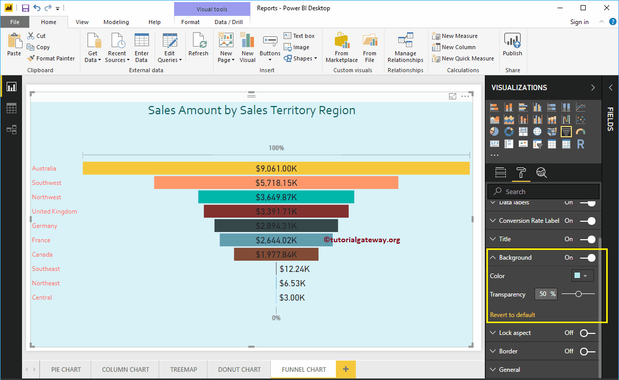
Let me remove the background color by clicking the Revert to default option
Add Border to Funnel Chart in Power BI
You can add Borders to Funnel Chart by toggling the Border option from Off to On. For the demonstration purpose, we enabled Borders and added Black color as the Border color.
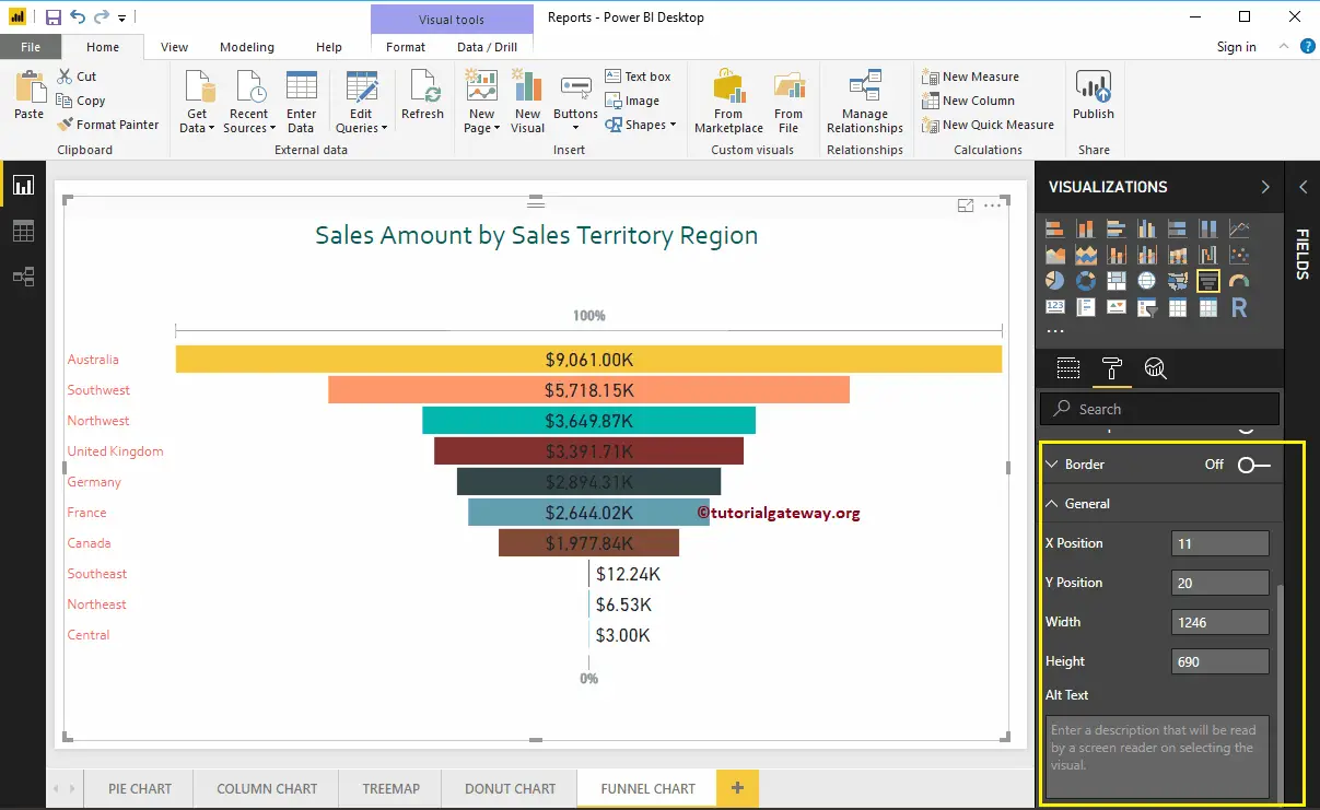
Use the General Section to Change the X, Y position, Width and height of a Funnel Chart
Diverging option in Power BI Funnel Chart
If you add any valid column to the Color Saturation field, then you can use this Diverging option to add colors to the Funnel Chart Boxes. To demonstrate the same, we are adding the Sales Amount to Color Saturation
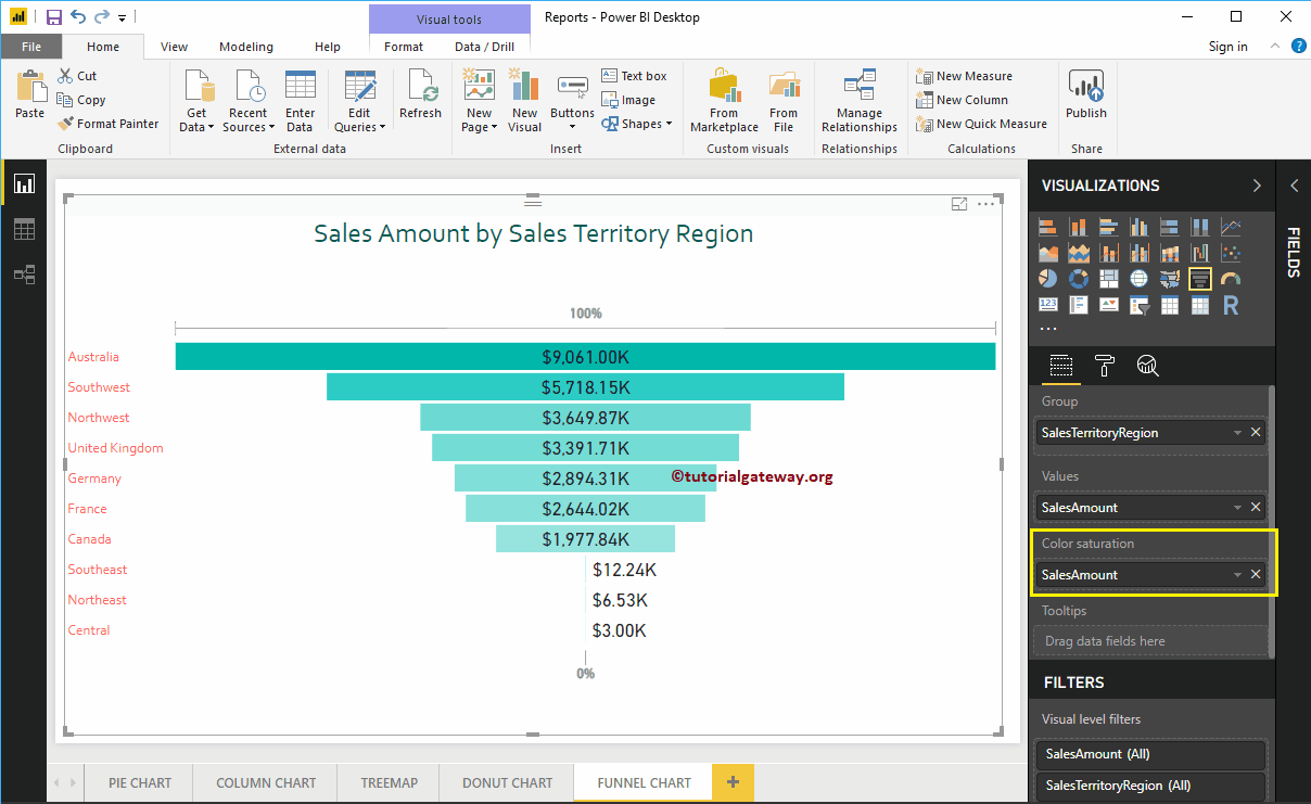
Now, you can see that the Default Color option under the Data Colors section replaced with the Diverging option. Let me add Minimum, Center, and Maximum color. Remember, you have an option to add the Minimum, Center, and Maximum values as well.
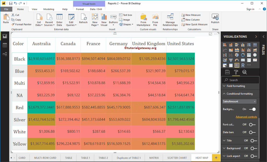
Heat Map in Power BI
Power BI Heat Map is useful to display the data along with the colors. By seeing the color, one can understand the profits easily. Let me show you how to create a Heat Map in Power BI with an example.
For this Power BI Heatmap demonstration, we are going to use the SQL Data Source that we created in our previous article. So, Please refer to Connect Power BI to SQL Server article to understand the Power BI Data Source.
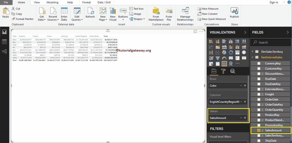
How to Create a Heat Map in Power BI
To create a Power BI heatmap, first, click on the Matrix under the Visualization section. It automatically creates a Matrix with dummy data.

Next, drag and drop the English Country Region Name to the Column Group, and product Color to the Row Group. Now, you can see a Matrix without values.

Next, let me drag the Sales Amount to the Values section. It automatically enables the Row totals and grand totals
Please click on the Format button to convert this Matrix into a Heatmap in Power BI. I suggest you refer to Format a Matrix article to understand the formatting options.
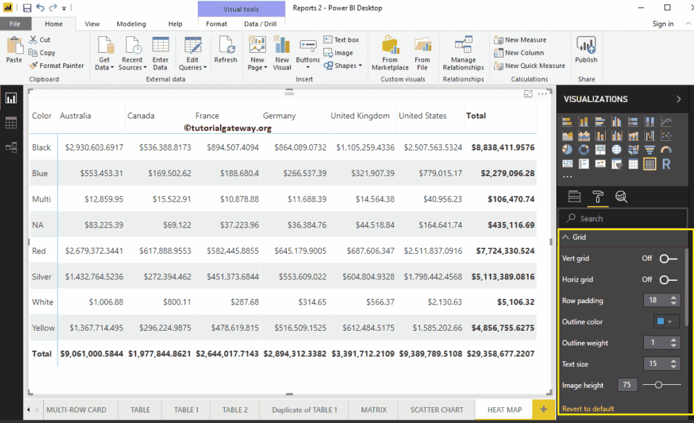
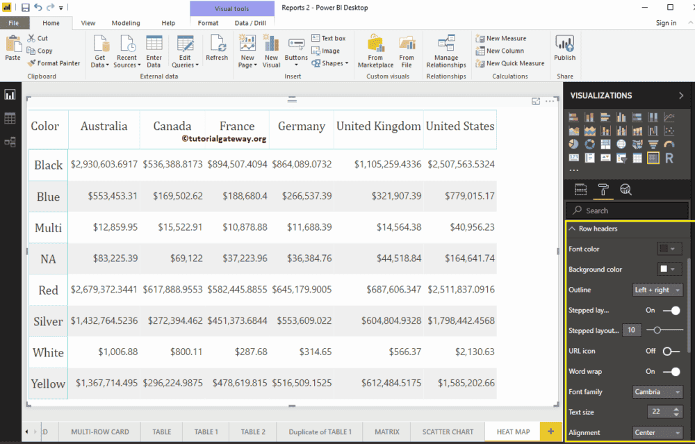
First, go to the Grid Section. As you can see from the below screenshot, we changed the row padding to 18 and text size to 15

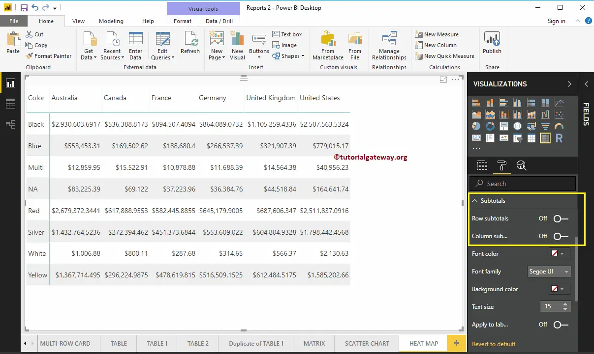
By toggling Row subtotals, column subtotals under the Subtotals section to Off, you can remove the Totals completely. So, let me remove them
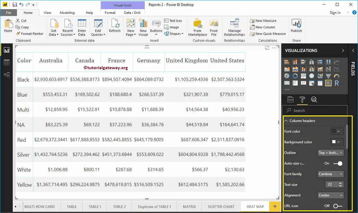
Column Header section of Power BI Heatmap helps us to alter the Headers. As you can see from the screenshot below, we changed the Font Family to Cambria. Next, Outline to Top + Bottom (Outline added to the top and bottom of a Header), Text Size to 22, and Header text alignment to center.
The row Header section of Power BI Heatmap helps us to format the Row Headers section. Here, we changed the Outline to Left + Right (Outline added to the Left and Right of Header Column, i.e., Color). Next, Font Family to Cambria, Text Size to 22, and text alignment to center.
Power BI Heatmap Example
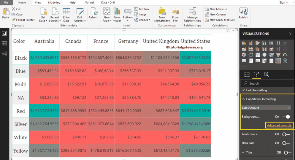
To connect that matrix to Power BI heatmap, go to the Conditional Formatting section to add colors to the Matrix Numeric column.
As you can see from the screenshot below, we selected the Sales Amount as the field and toggled the background color scale property to On. It adds a default color to the matrix. I mean, default color to Power BI Heatmap.
Change Power BI Heatmap Color
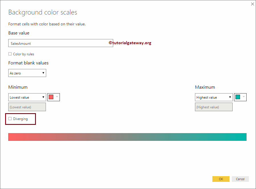
To change the Power BI heat map color, click on the Advanced option. It will open the following window. If you are interested in two colors, then select the Minimum color and maximum color.
We check-marked the Diverging option. Next, we selected some random colors as the minimum, Center, and Maximum values.
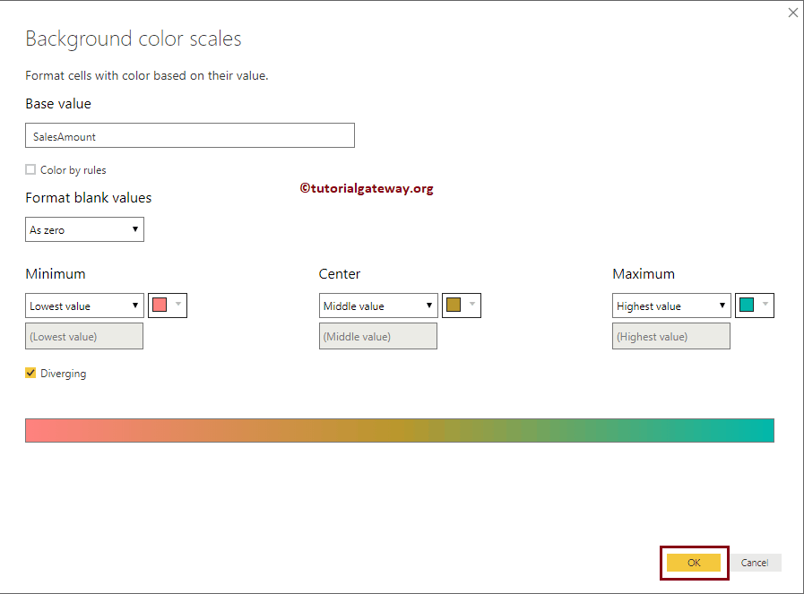
Now you see the Power BI Heat map with the selected colors.
Create a Power BI Line Chart
Power BI Line Chart is useful to visualize the Trends. For example, you can use this to create a Sales trend, Temperate Trend, etc. Let me show you how to create a Line Chart in Power BI with example.
For this Power BI Line Chart demonstration, we are going to use the SQL Data Source that we created in our previous article. So, Please refer to Connect Power BI to SQL Server article to understand the Power BI Data Source.
How to Create a Line Chart in Power BI
To create a Line Chart, first Drag and Drop the Sales Amount from the Fields section to the Canvas region. It automatically creates a Column Chart.
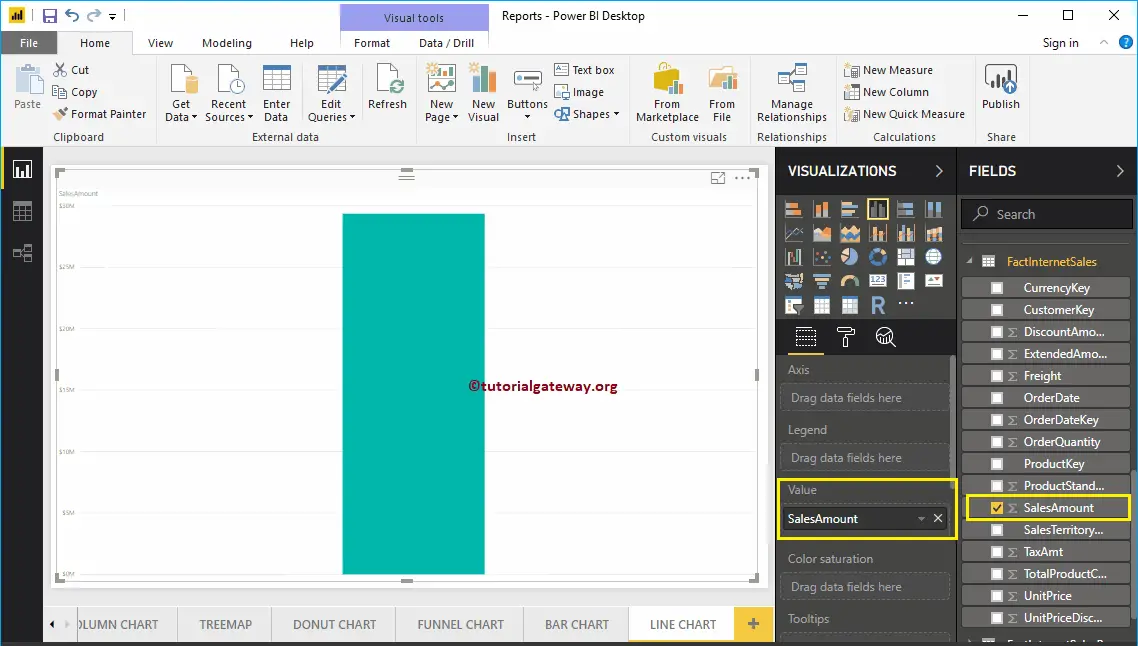
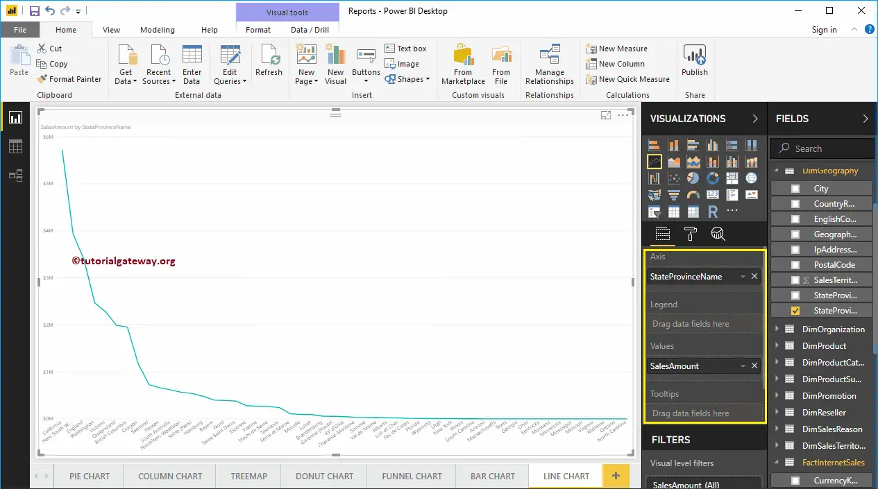
Next, let me add State Province Name to the Axis section. You can do this by dragging State Province to Axis section, or simply checkmark the State Province column.
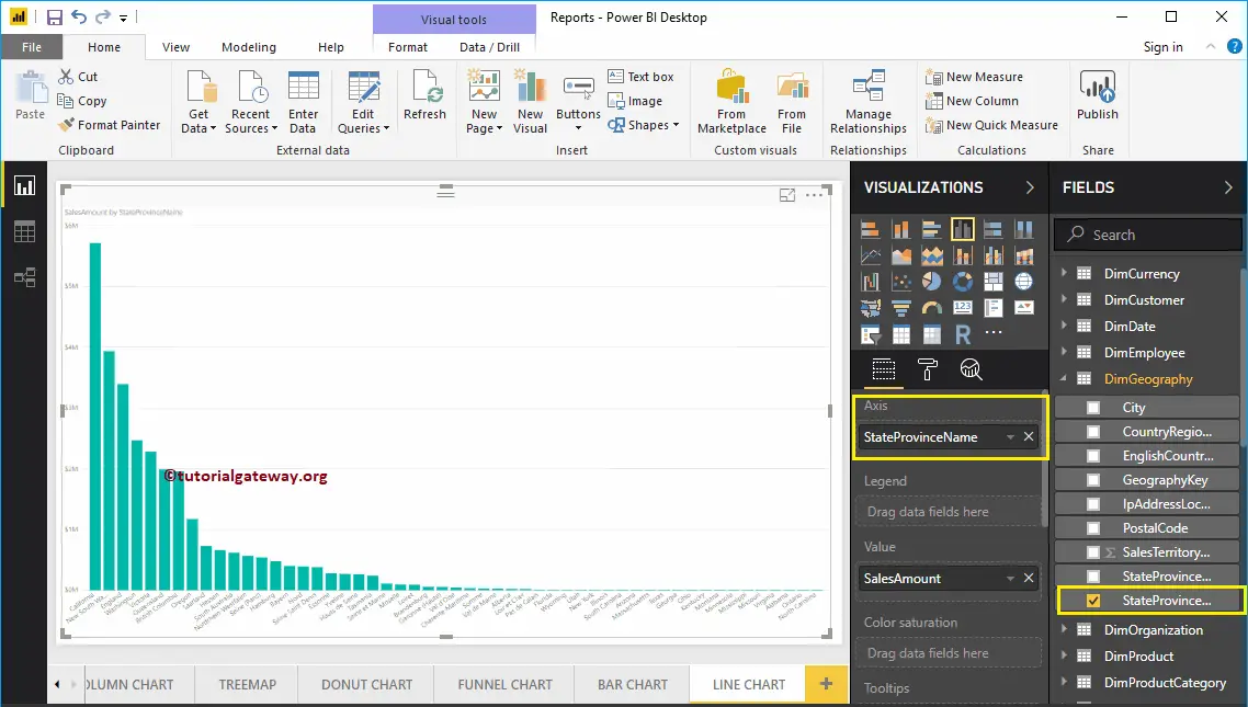
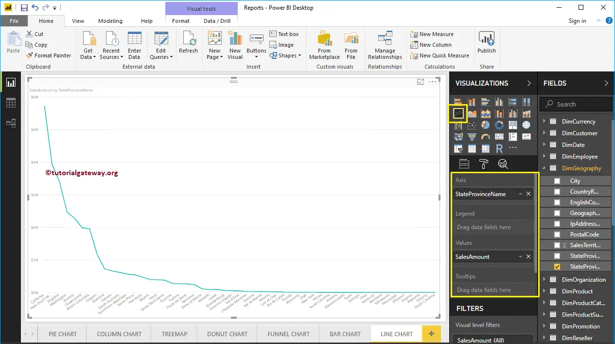
By clicking the Line Chart under the Visualization section, it automatically converts the Column Chart into Line Chart.
From the below screenshot, you can see the Line Chart that shows the Sales Trend by State Province Name.
Create a Line Chart in Power BI Approach 2
First, click on the Line Chart under the Visualization section. It will automatically create a Line Chart with dummy data.
In order to add data to the Power BI Line Chart, we have to add the required fields:
- Axis: Please specify the Column Name that represents the Trend.
- Values: Any Numeric value such as sales amount, Total Sales etc.
Let me drag the Sales Amount from the Fields section to the Values field, and State Province Name to the Axis section.
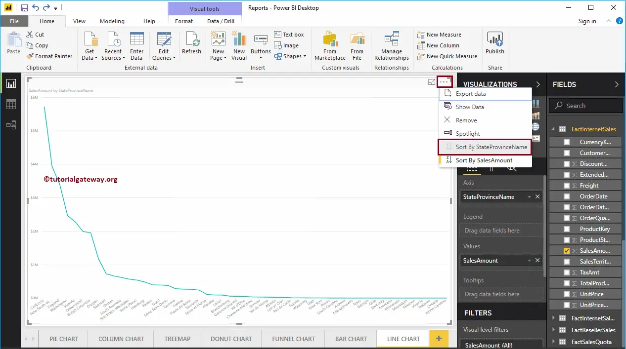
Let me sort the data by State Province Name (By default, it is sorted by Sales Amount). To do this, click on the … (3 dots) on the top right corner and select the Sort By StateProvinceName option.
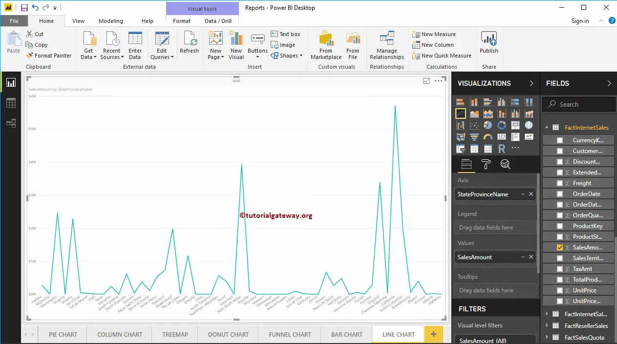
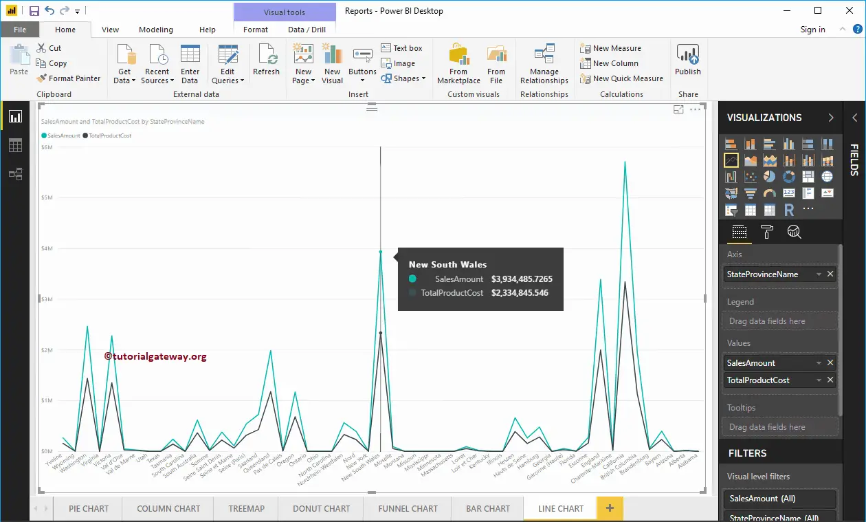
Now you can see the proper Trend
Let me add one more field, i.e., Total Product Cost to Values section. It will compare the trend of the Sales Amount against the Total Product Cost.
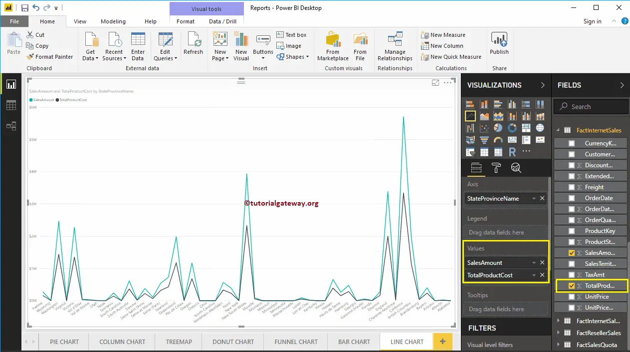
Hover over any position shows the Tool-tip of Sales Amount and Total Product Cost
Let me do some quick formatting to this Power BI Line Chart
NOTE: I suggest you to refer Format Line Chart article to understand the steps involved in formatting these Lines.
Format Line Chart in Power BI
How to Format Line Chart in Power BI with an example?. Formatting Power BI Line Chart includes changing the Line Colors, Title text, Title position, Axis Details, Data labels, and background Images, etc.
To demonstrate these Power BI Line Chart formatting options, we use the Line Chart that we created earlier. Please refer to the Power BI Line Chart article.
How to Format Line Chart in Power BI
Please click on the Format button to see the list of formatting options that are available for this Line Chart.
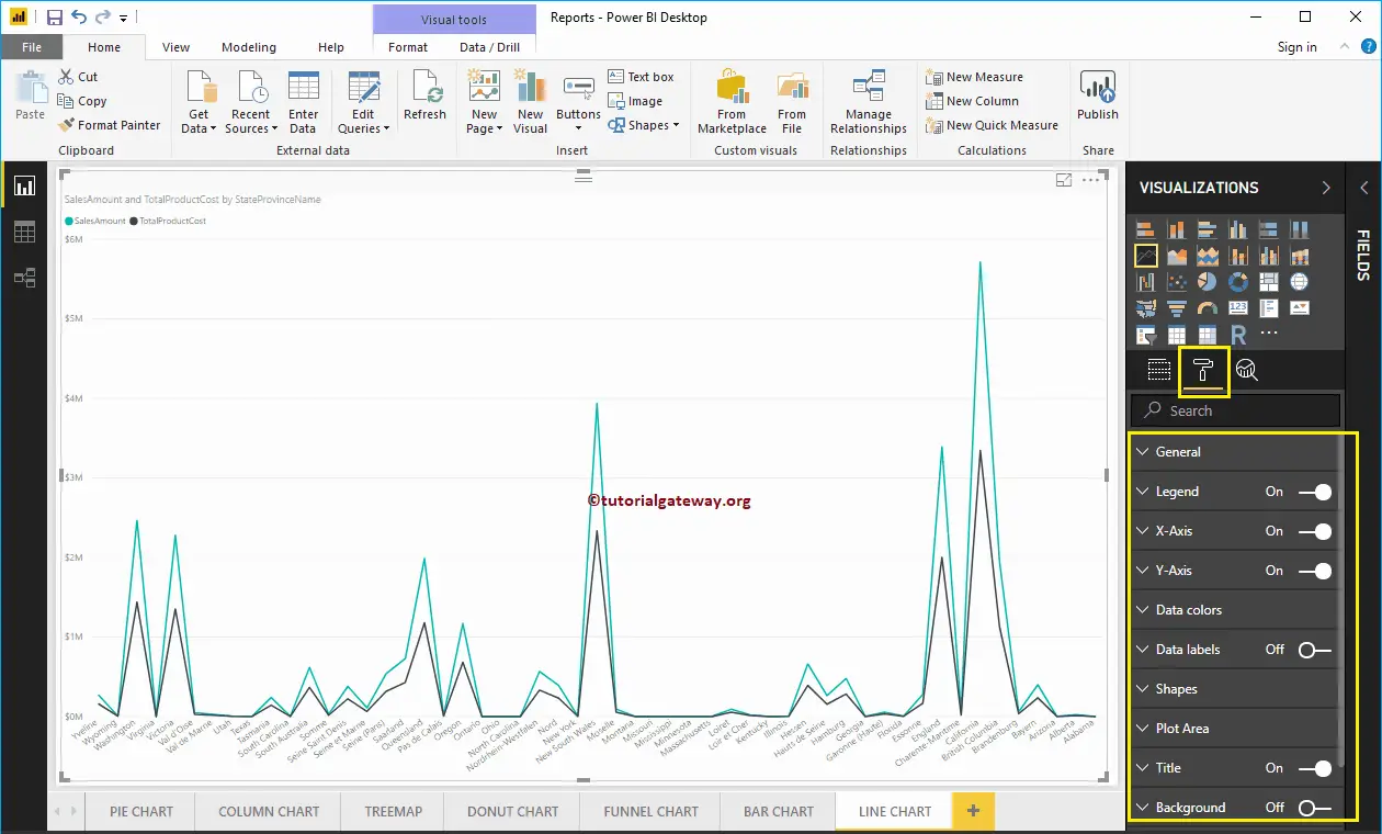
Format Line Chart General Settings
Use this General Section to Change the X, Y position, Width, and height of a Line Chart

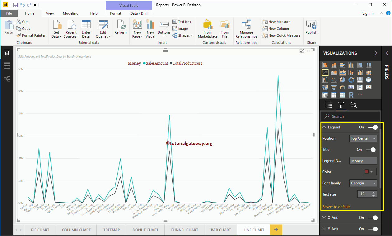
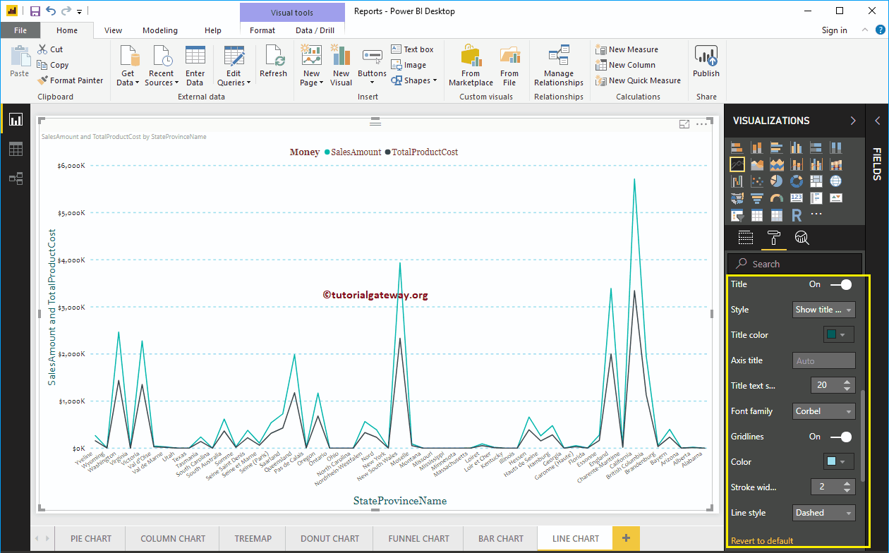
Format Legend of a Line Chart in Power BI
To display or enable the Legend, Please select the Power BI Legend region and toggle the option from Off to On. Use the Position drop down box to change the legend position.
As you can see, we added the Legend Title as Money, Legend Position as Top Center. And we also changed the Color to Brick Red, Font family to Georgia, and text size to 20.
Format X-Axis of a Line Chart in Power BI
The following are the list of options that are available for you to format the Horizontal axis or X-Axis. As you can see from the screenshot below, we change the Color to Dark Grey, Font style to Candara, Text Size to 12.
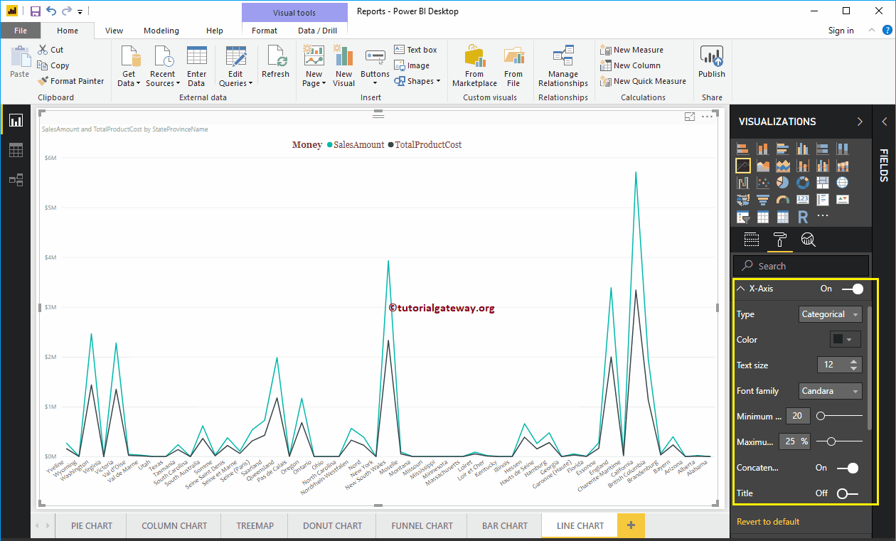
By default, the X-Axis title set to Off, but you can enable it by toggling Title to On. Let me change the Title Color to Green, Font style to Georgia, and Font Size to 20.

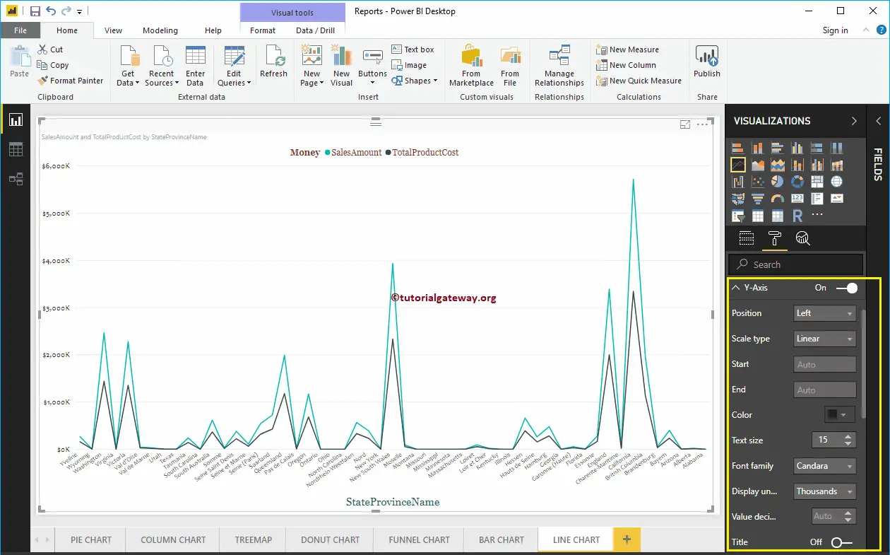
Format Y-Axis of a Power BI Line Chart
The following are the list of options that are available for you to format the Vertical axis or Y-Axis. From the screenshot below, you can see we change the Y-Axis labels Color to Dark Grey, Text Size to 15, Font style to Candara.
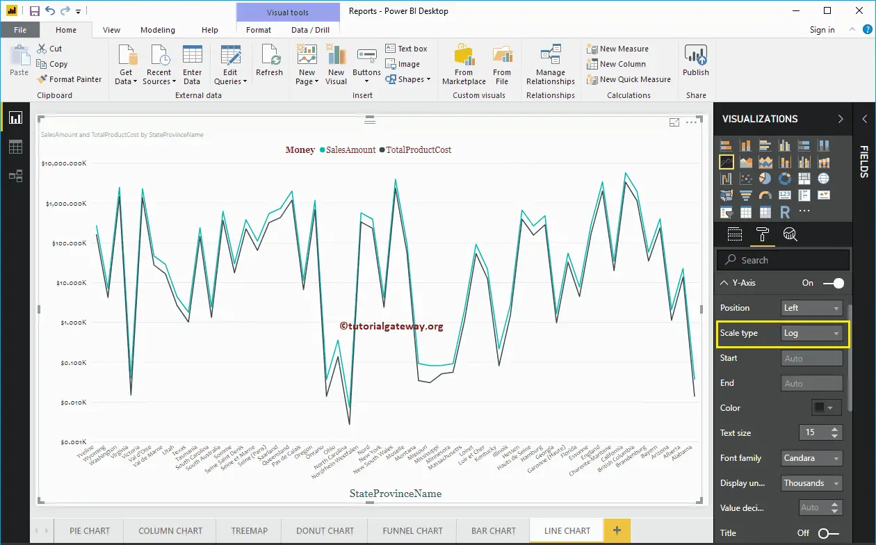
Let me change the Scale type to Log. From the below screenshot, you can see that it is displaying the Log scale.
By default, the Y-Axis title set to Off, but you can enable it by toggling Title under the Y-Axis section to On. Let me change the Title Color to Green, Title Text Size to 20, and Font family corbel.
By toggling the Gridlines option from On to Off, you can disable the Line Chart Gridlines.
- Color: You can change the Gridlines color.
- Stroke Width: Use this to change the Gridlines width. Here, we changed the width from default 1 to 2 strokes.
- Line Style: Choose the line style such as Solid, dotted, and dashed.
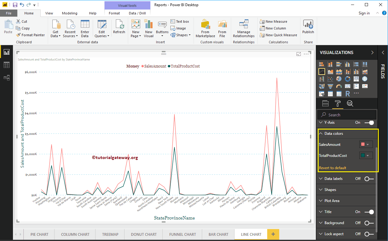
Format Power BI Line Chart Data Colors
By default, Line chart will display with default colors. Let me change the Sales Amount Line color to Brick Red, and Total Product Cost color to Green.
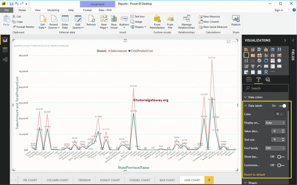
Format Data Labels of a Line Chart in Power BI
Data Labels display the Metric or Value information (Sales Amount at each point) about the Line. I don’t think you require Data Labels for the Trends, but you have an option.
As you can see from the below screenshot, we enabled it to display the properties.
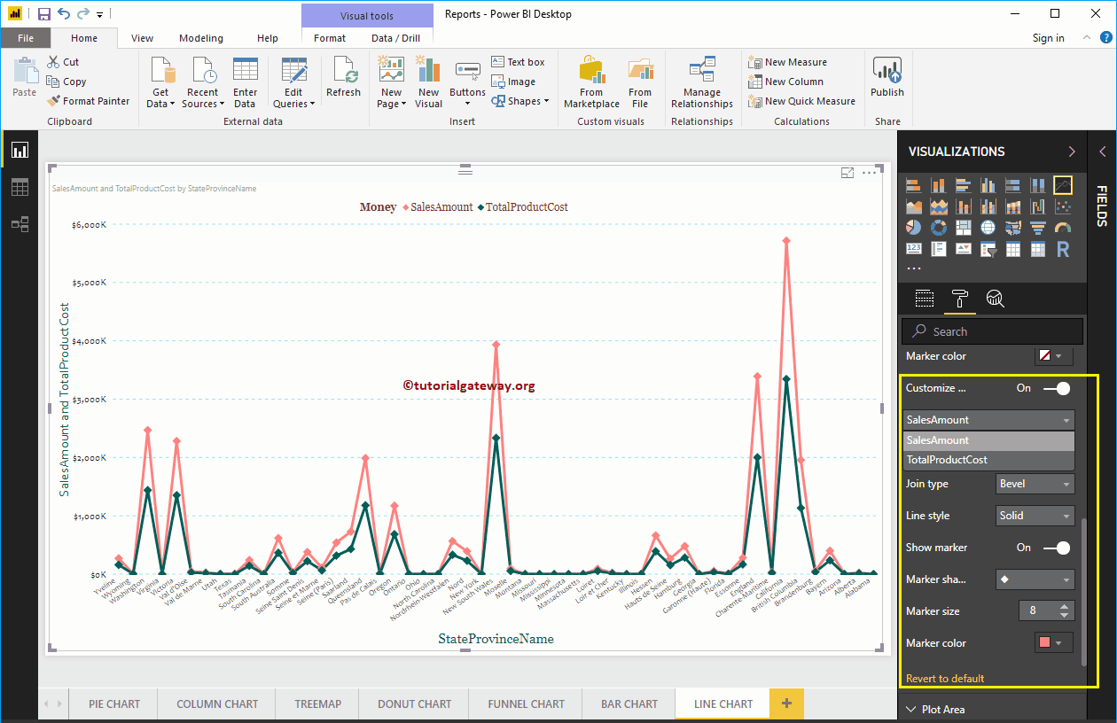
Format Line Chart in Power BI Shapes
Use this section to change the Line Strokes, or joining.
As you see from the below, we changed the Stroke Width (Line width) to 4, marker Shape (Shape at the joining Point) as Diamond, and Marker size as 8.
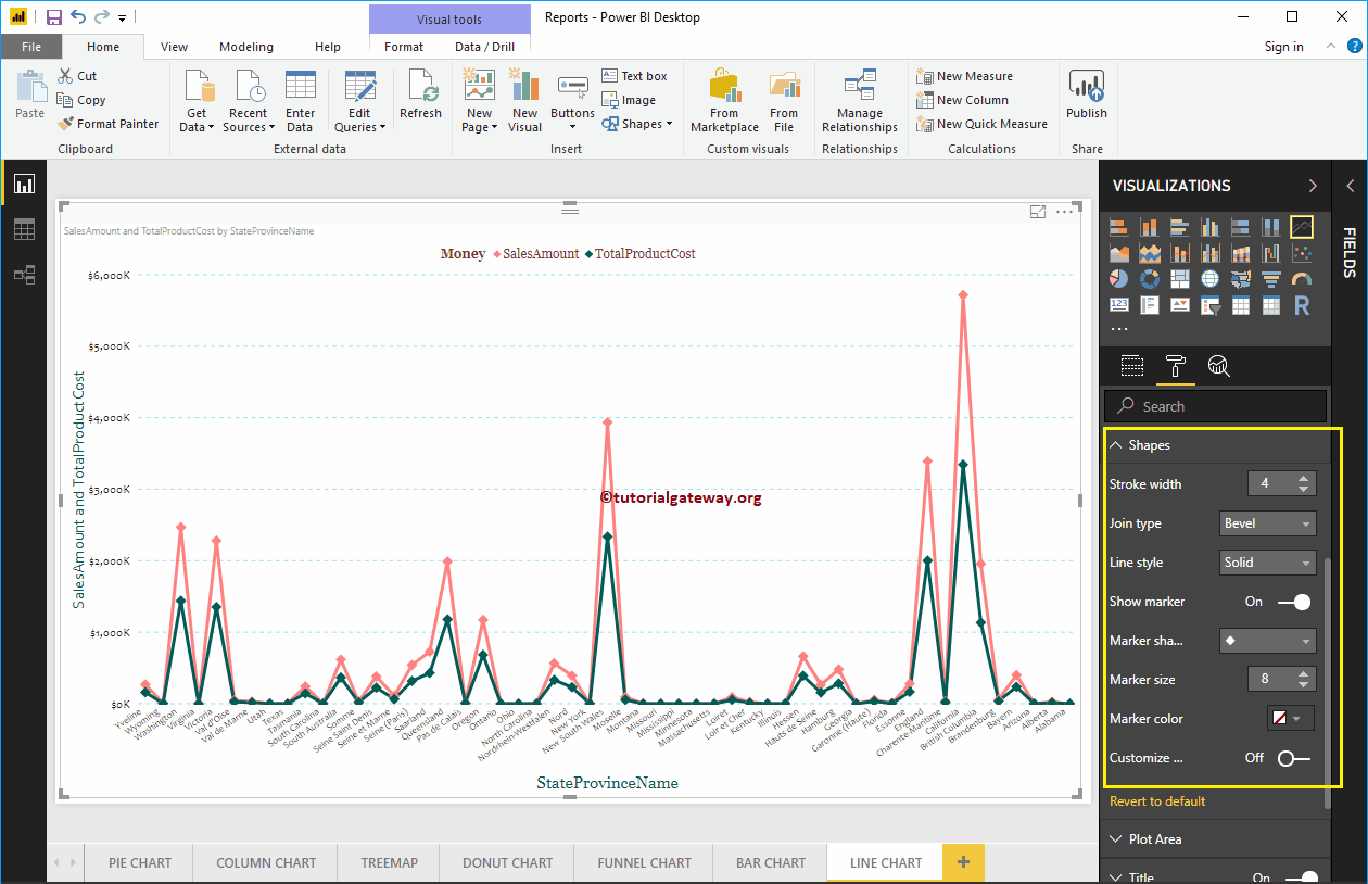
Whatever the changes you make in the above step reflect on both the Lines. But, you have an option called Customize Series, and if you enable this option, you can customize individual Line.
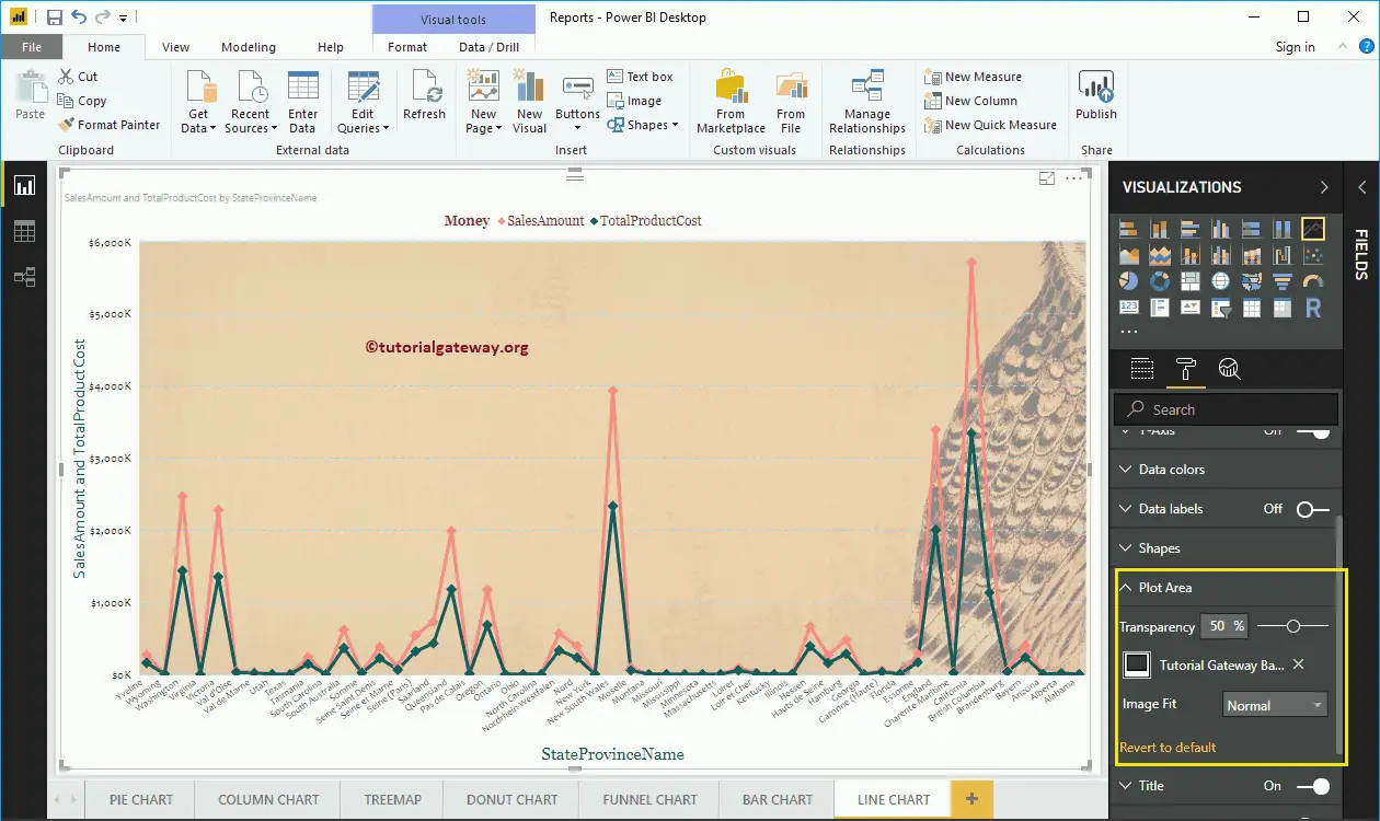
Format Line Chart Plot Area
You can add Images as the Background of a Line Chart using this Plot Area section. For the demonstration purpose, we added one image as the Plot Area Background.
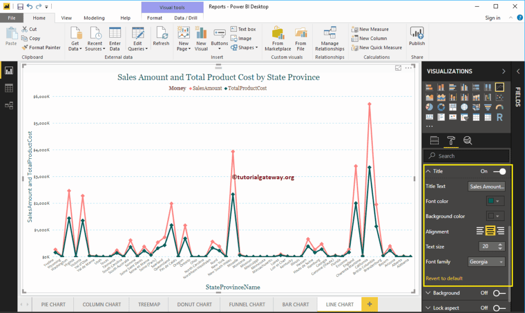
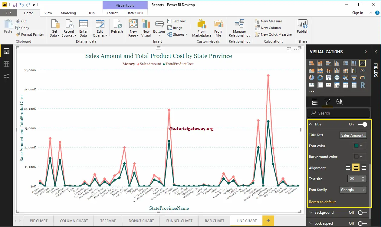
Format Power BI Line Chart Title
By toggling the Title option from On to Off, you can disable the title of a Line Chart.
As you can see from the below screenshot, we change the Title Text to Sale Amount and Total Product Cost by State Province Name. Next, we also changed the Font Color to Green, Font Family to Georgia, Font Size to 20, and Title Alignment to center. If you want, you can add the background Color to the title as well.
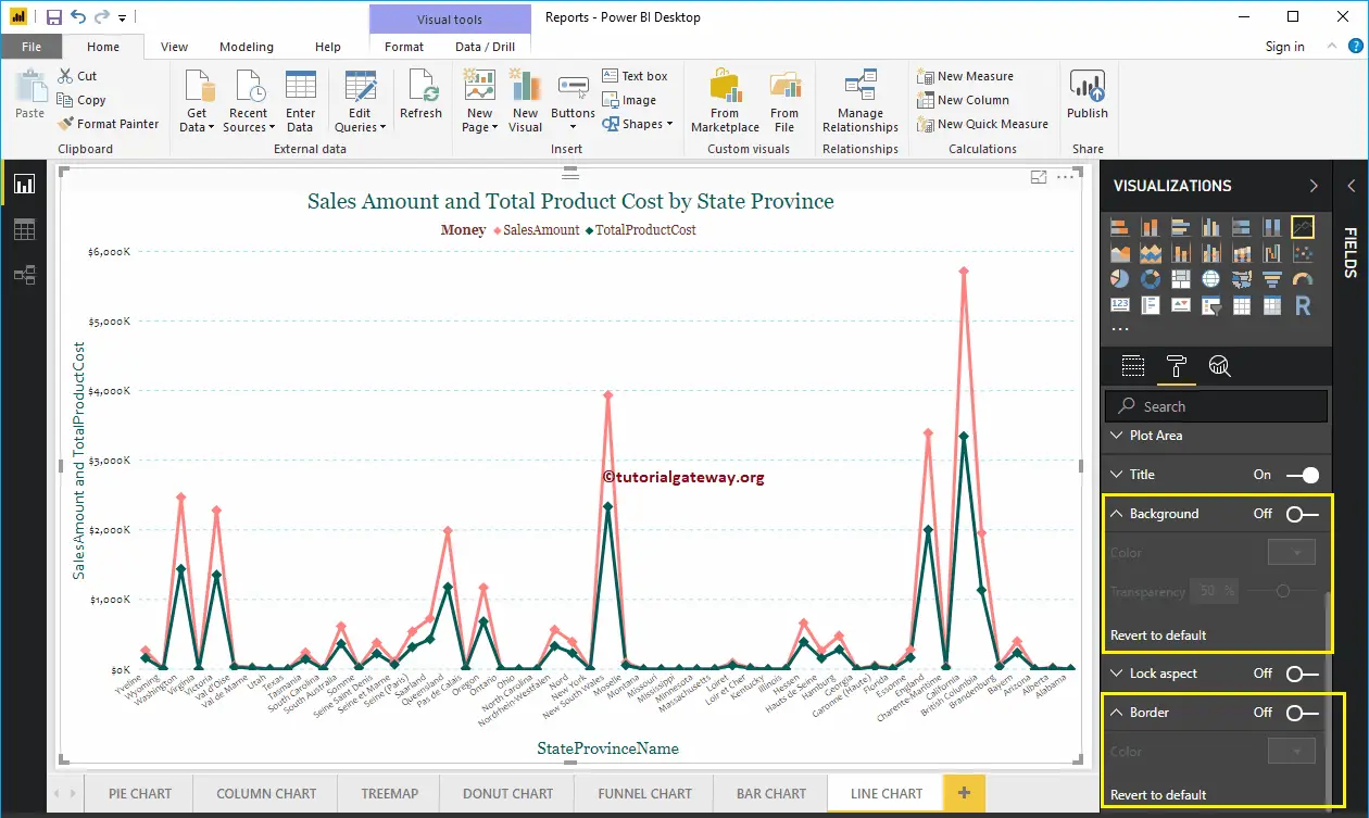
Format Background Color, and Border of a Line Chart
You can add the Background color to a Line Chart by toggling Background option to On. And, you can add Borders to a Line Chart by toggling the Border option from Off to On.
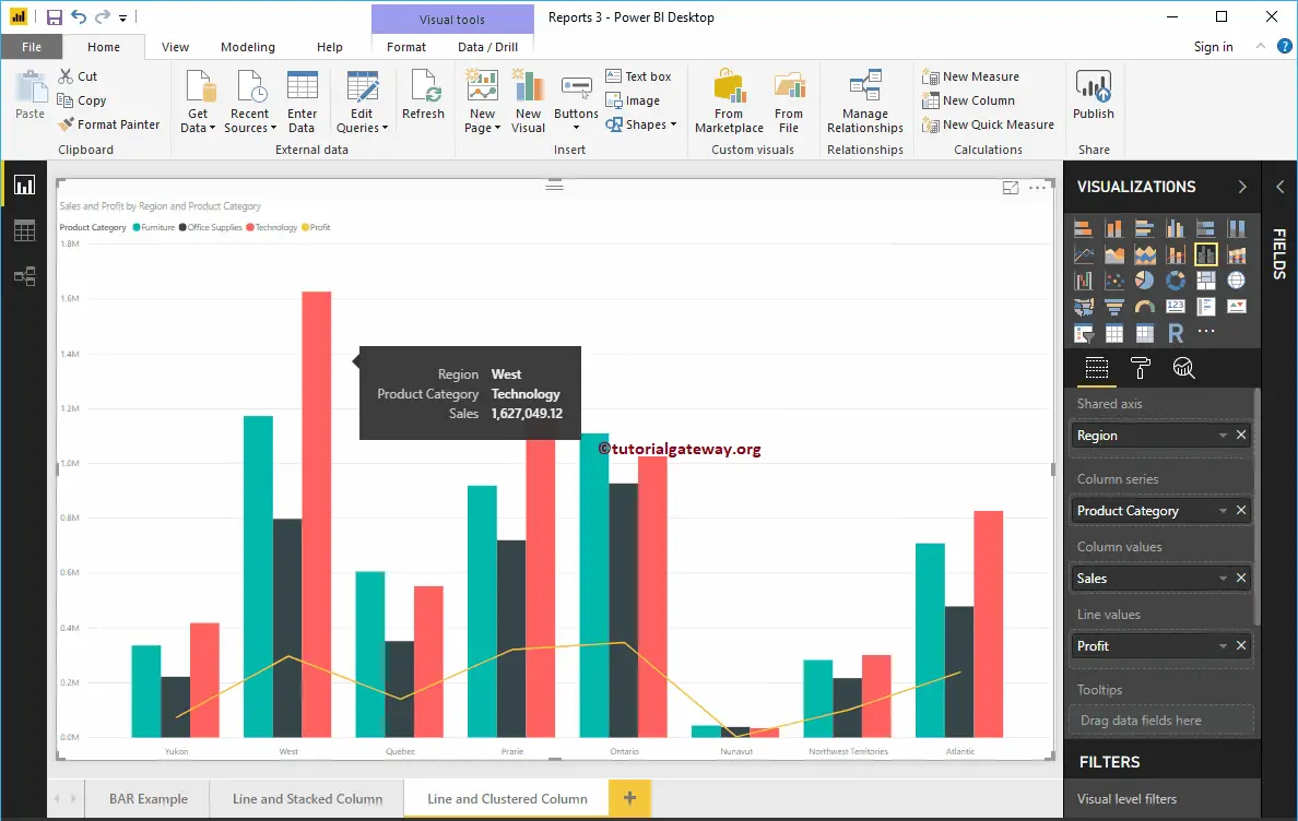
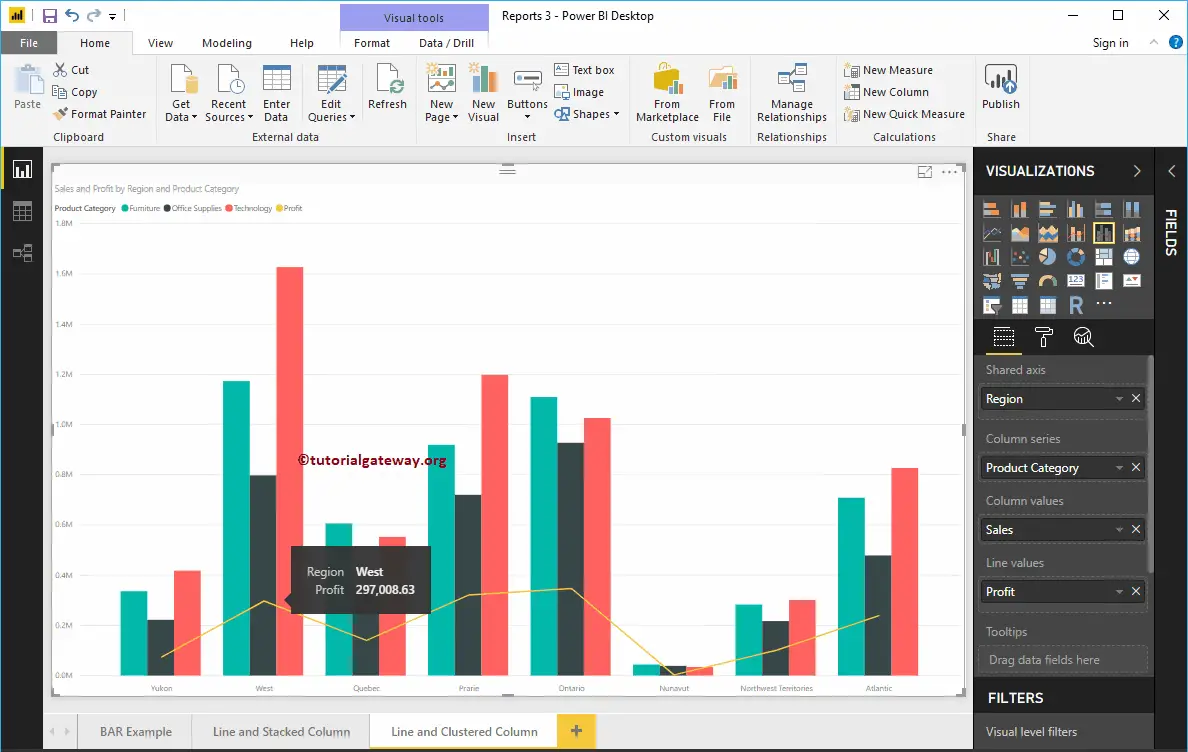
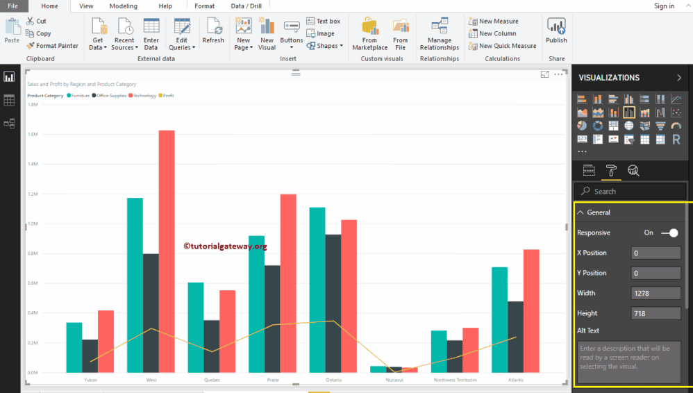
Line and Clustered Column Chart in Power BI
Power BI Line and Clustered Column Chart is useful to visualize multiple dimensions and measures. Let me show you how to Create a Line and Clustered Column Chart in Power BI with example.
For this Power BI Line and Clustered Column Chart demonstration, we are going to use the Excel Data Source that we created in our previous article.
Please refer to Connect Power BI to Excel Multiple Excel Sheets article to understand the Power BI Data Source.
How to Create a Line and Clustered Column Chart in Power BI
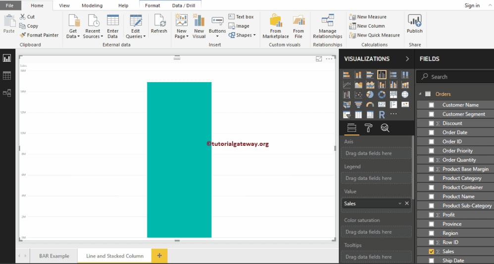
To create a Line and Clustered Column Chart, first Drag and Drop the Sales from Fields section to Canvas region. It automatically creates a Column Chart, as we have shown below.
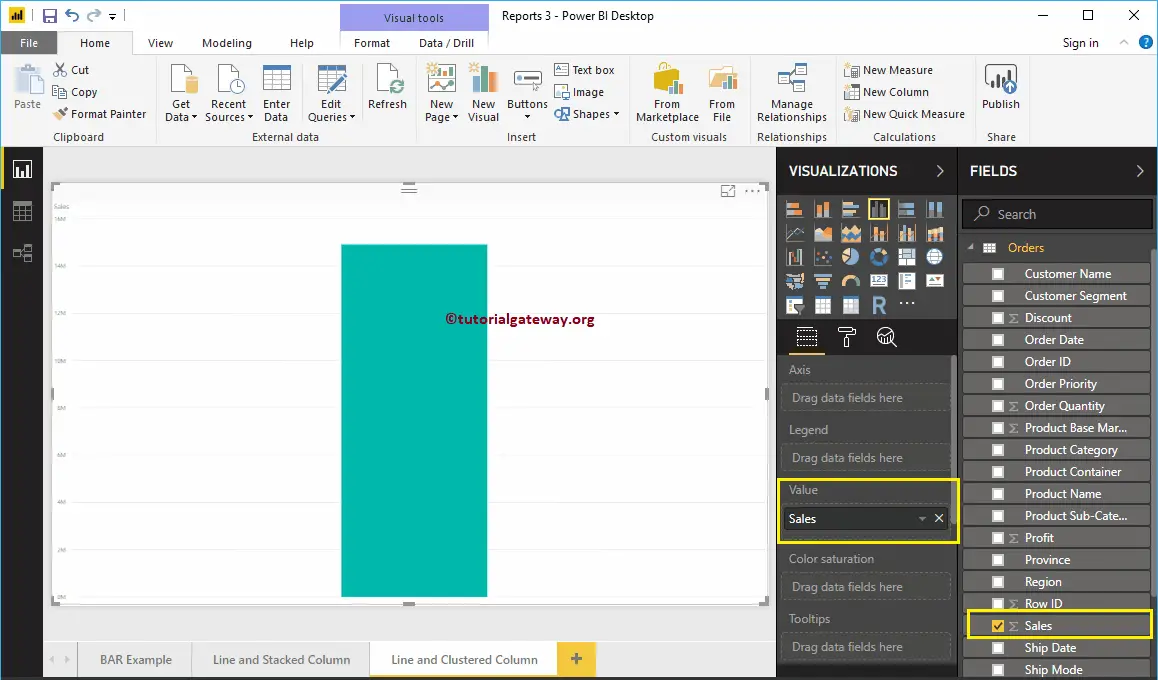
Click on the Line and Clustered Column Chart under theVisualizationsection. It automatically converts a Column Chart into a Line and Clustered Column Chart. Currently, you don’t see the change, because you have to add a few more fields.
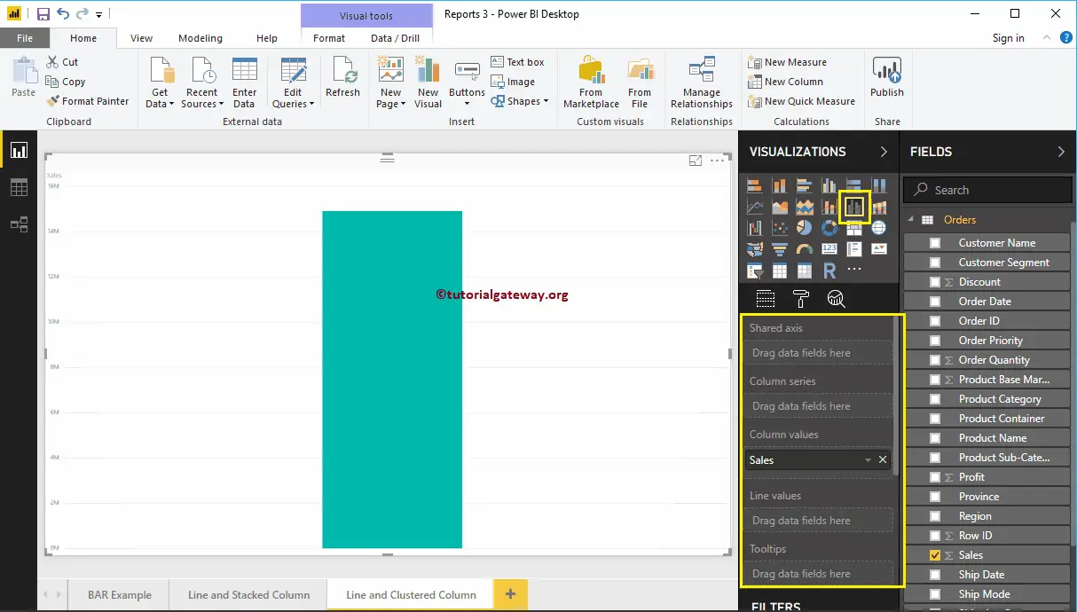
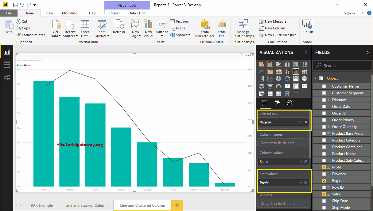
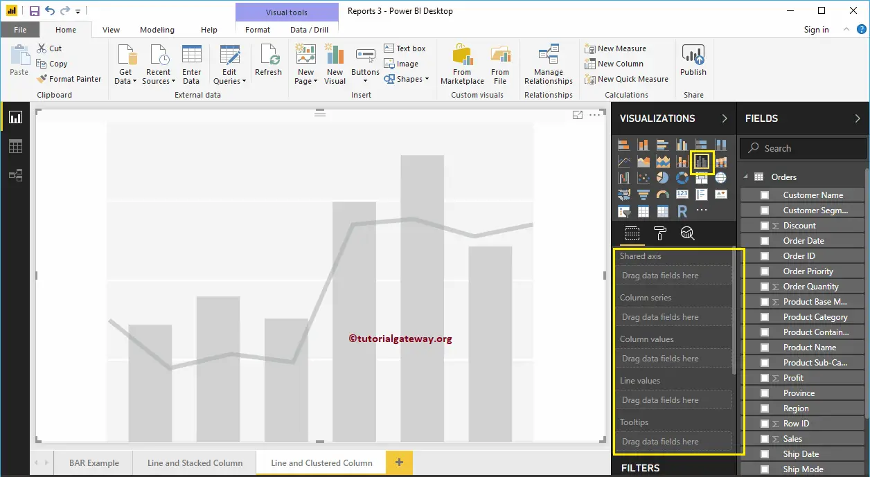
Let me add Region to Shared Axis section, and Profit to Line Values section to convert it into the Line and Clustered Column Chart.
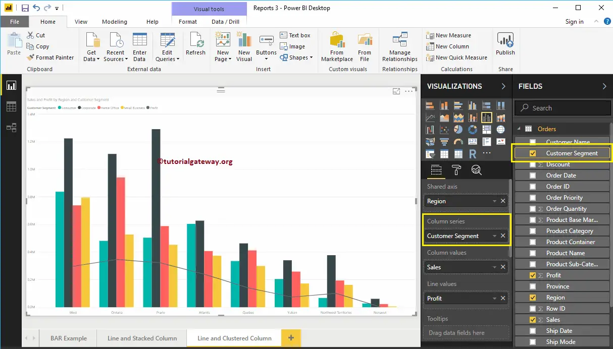
Next, we are adding Customer Segment to the Column Series section to convert it into the Clustered Column Chart.
Create a Line and Clustered Column Chart in Power BI Approach 2
First, click on the Line and Clustered Column Chart under the Visualization section. It will create a Line and Clustered Column Chart with dummy data, as shown in the screenshot below.
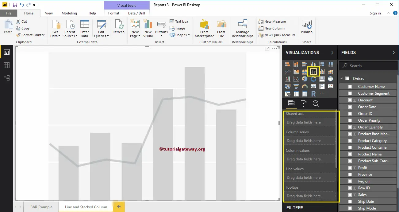
To add data to the Power BI Line and Clustered Column Chart, we have to add the required fields:
- Shared Axis: Please specify the Column that represents the Vertical Axis.
- Column Series: Specify the Column that represents the Clustered column Bars.
- Column Values: Any Numeric value such as sales, profit, etc., that represent the Vertical bars.
- Line Values: Any Numeric value that represents the Line.
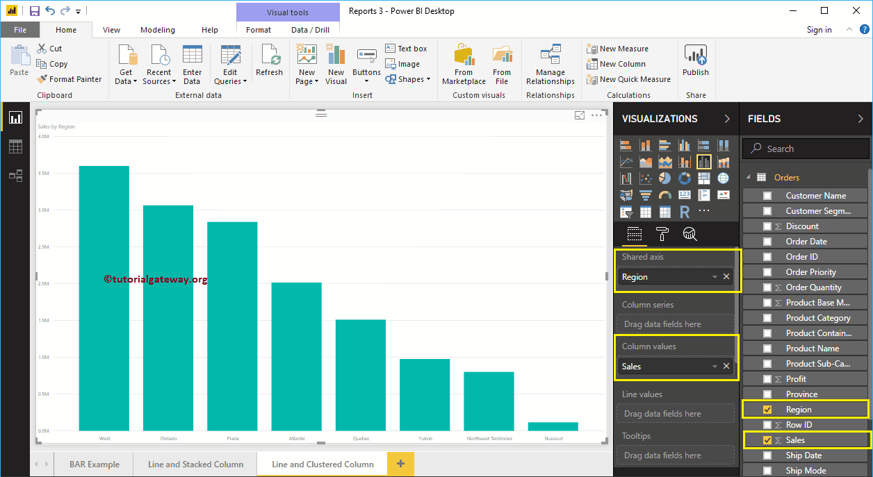
Let me drag the Sales from Fields section to Column Values field and Region to Shared Axis Section.
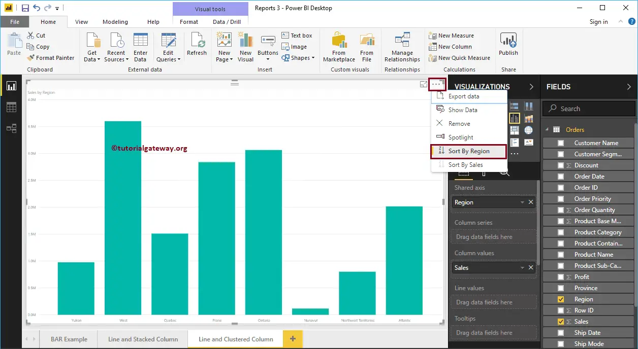
Let me sort the data by Region. To do this, click on the … (3 dots) on the top right corner, and select the Sort By Region option as we showed below.
Next, add the Product Category to the Column Series section
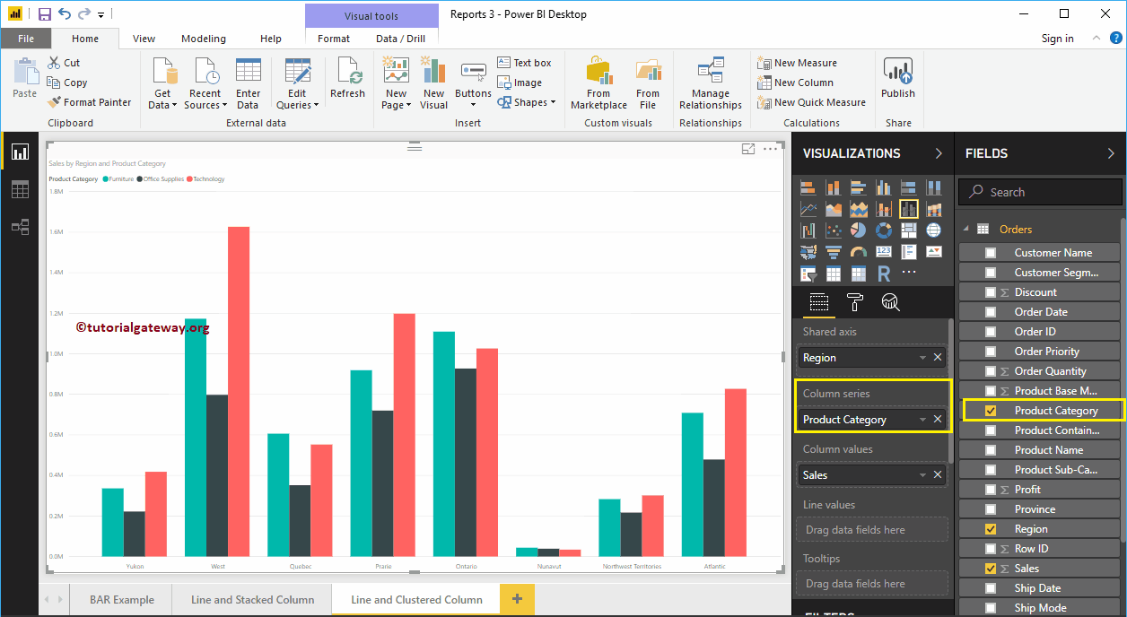
Drag and Drop the Profit field into the Line Values section. That’s it; we got our Line and Clustered Column Chart.
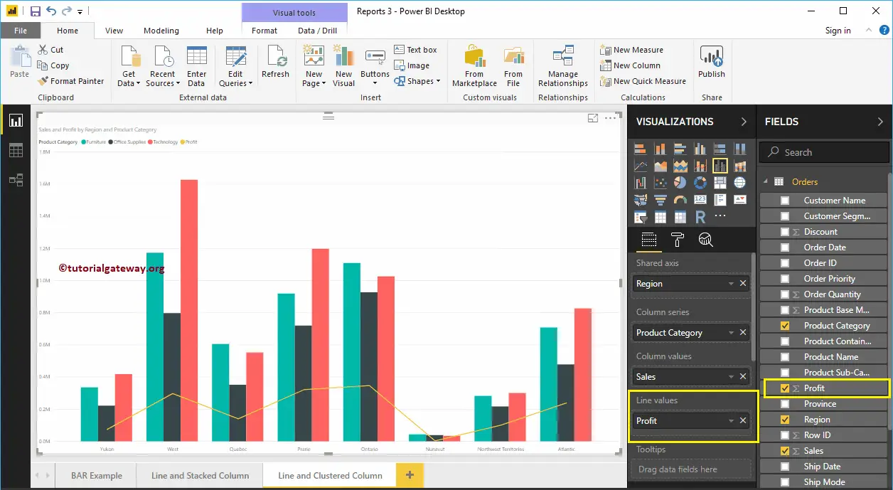
Hover over any vertical bar shows you the Tool-tip of Region, Product Category, and Sales Amount.
Hover over any portion of a Line will show the Tool-tip of Region, and Profit.
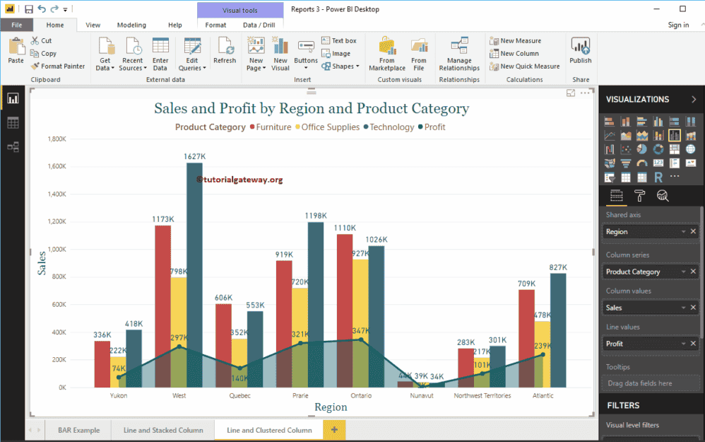
Let me do some quick formatting to this Line and Clustered Column Chart
NOTE: I suggest you refer to Format Line and Clustered Column Chart article to understand the steps involved in formatting the Clustered columns, Lines, Title, etc.
Format Power BI Line and Clustered Column Chart
How to Format Power BI Line and Clustered Column Chart with an example?. Formatting Power BI Line and Clustered Column Chart includes changing the Clustered Column colors, Line Strokes, Title position, Axis Details, etc.
To demonstrate the Line and Clustered Column Chart formatting options, we are going to use the Line and Clustered Column Chart that we created earlier. Please refer to Line and Clustered Column Chart in Power BI article in Power BI to understand the steps involved in creating it.
How to Format Power BI Line and Clustered Column Chart
Please click on the Format button to see the list of available formatting options in Line and Clustered Column Chart.
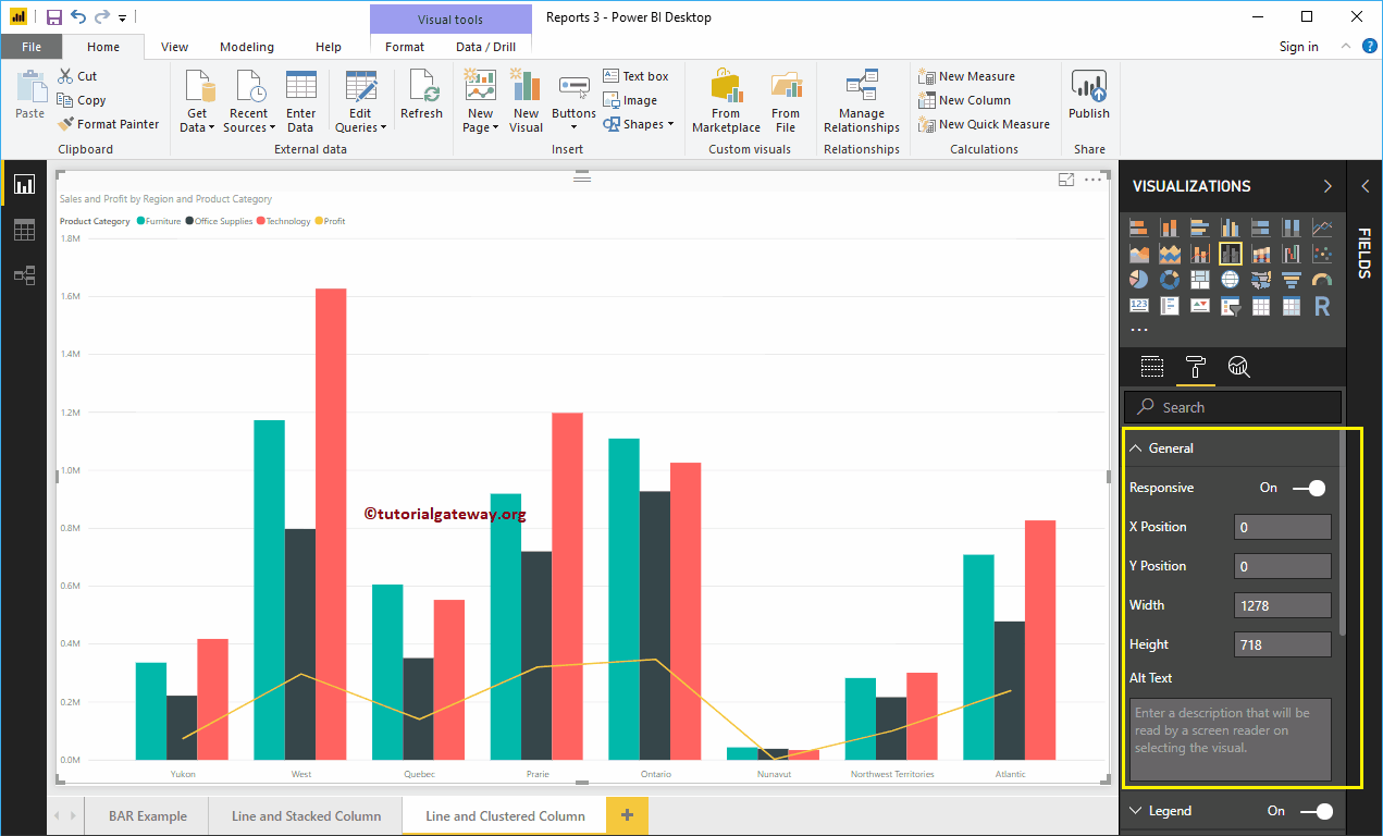
Format Line and Clustered Column Chart General Settings
Use this General Section to Change the X, Y position, Width and height of a Line and Clustered Column Chart
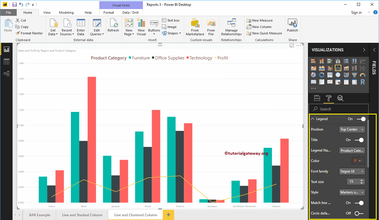
Format Legend of a Line and Clustered Column Chart in Power BI
First, we used the Position drop-down to change the legend position to Top Center. Next, we changed the Color to Brown and text size to 15.
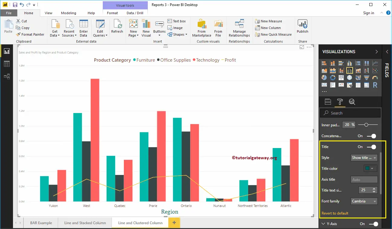
Format X-Axis of a Line and Clustered Column Chart in Power BI
The following are the list of options that are available for you to format X-Axis. Here, we changed the Color to Brown, and Text Size to 14.

As you see from the above screenshot, by default, the X-Axis title set to Off for the Line and Clustered Column Chart. But you can enable it by toggling Title to On. Let me change the Title Color to Green, Font style to Cambria, and Font Size to 25.
Format Y-Axis of a Line and Clustered Column Chart
As you can see, we changed the Y-Axis labels Color to Brown, Text Size to 14, and display units to thousands.
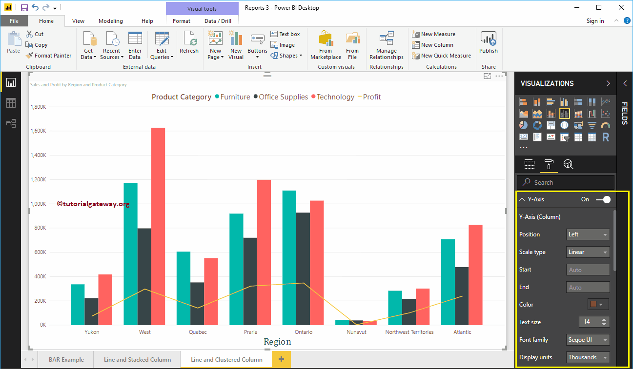
By default, Line and Clustered Column Chart Y-Axis title set to Off, but you can toggling Title to On. Let me change the Title Color to Green, Text Size to 25, and Font family Cambria.
By toggling the Line and Clustered Chart Gridlines option from On to Off, you can disable the Gridlines.
- Color: You can change the Gridlines color.
- Stroke Width: Use this to change the Gridlines width.
- Line Style: Choose the line style such as Solid, dotted, and dashed.
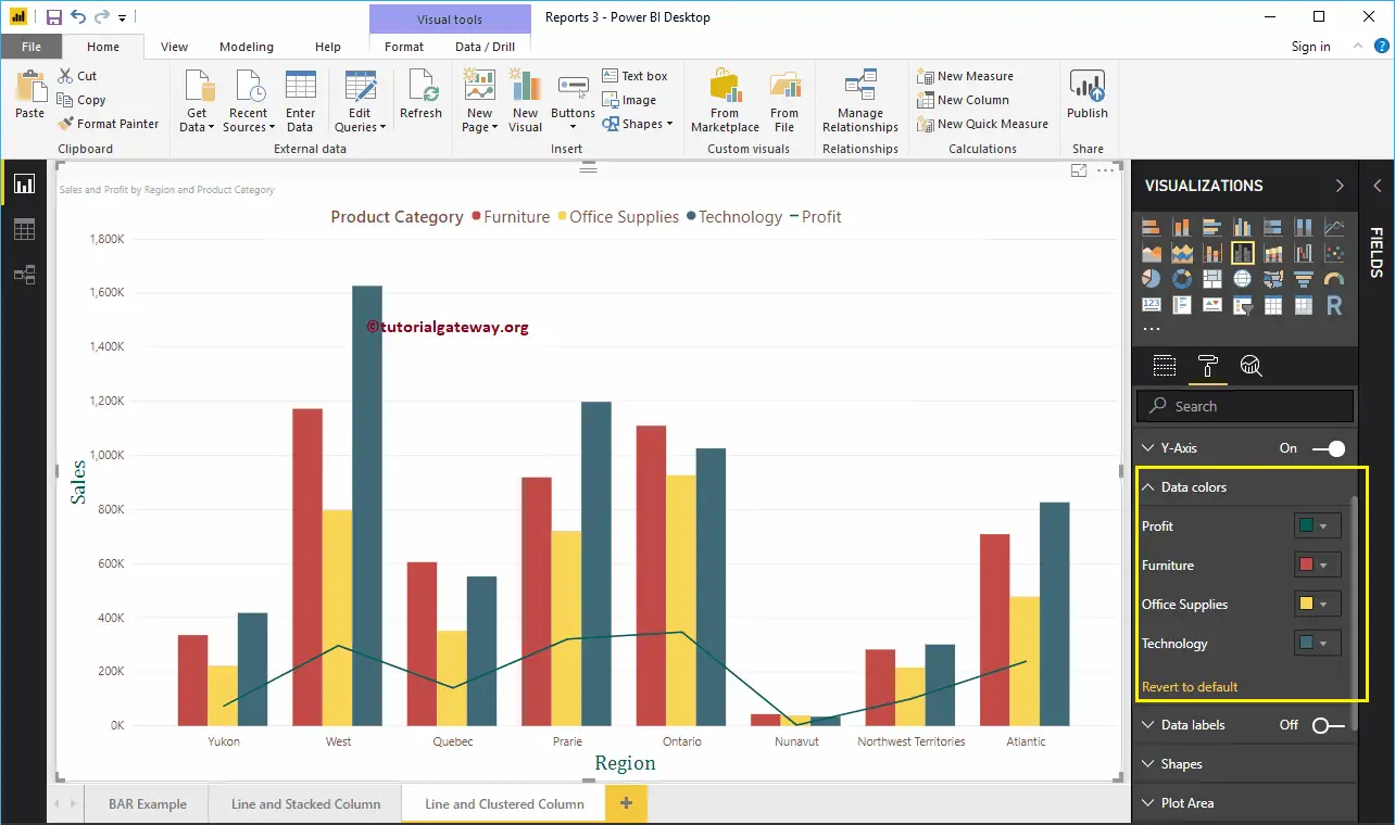
Format Power BI Line and Clustered Column Chart Data Colors
By default, Line and Clustered Column Chart will use the default colors to fill the Clustered columns and lines. Let me change them for the demonstration purpose.
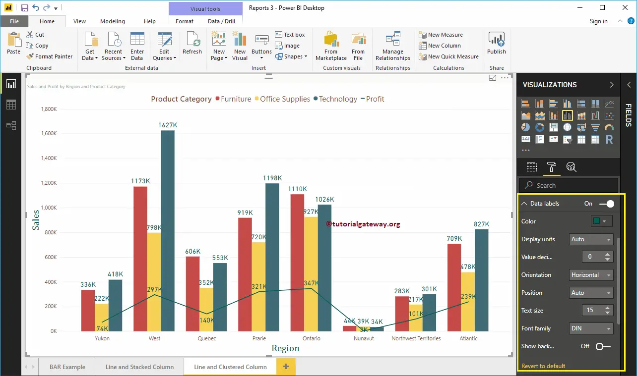
Format Power BI Line and Clustered Column Chart Data Labels
Data Labels display the Metric Values (Sales and Profit at each point). As you can see from the below screenshot, we enabled data labels and changes the color to Green, and Text size to 15.
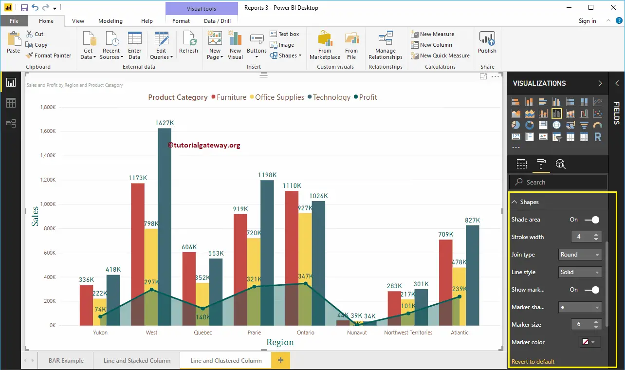
Format Line and Clustered Column Chart in Power BI Shapes
You can use this section to change the Line Strokes, or marking shapes. By enabling the Shade Area property, you can share the area between the x-axis and the line. Next, we changed the Stroke Width (Line width) to 4, join type to round, and line style to solid.
By enabling Show Markers property, you can display the markers at each point. Here, we changed the Marker size as 6.
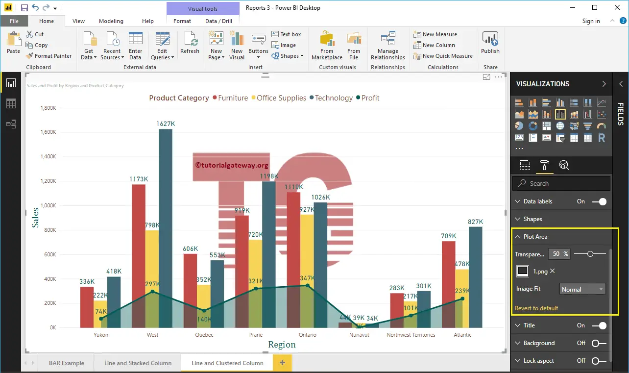
Format Line and Clustered Column Chart Plot Area
Using this Plot Area property, you can add custom Images as the Background of the Line and Clustered Column Chart. For the demonstration purpose, we added one image as the Plot Area Background.
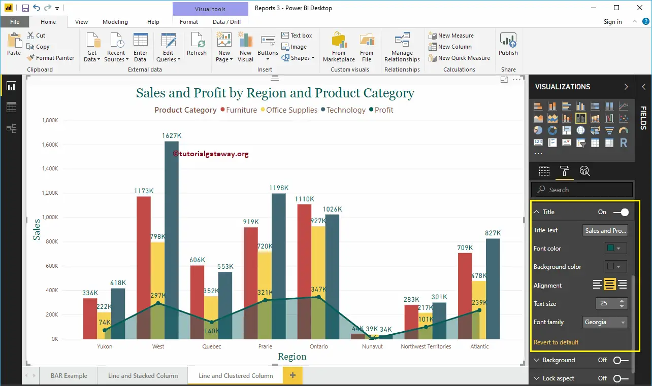
Format Line and Clustered Column Chart Title
As you see, we changed the Font Color to Green, Font Family to Georgia, Text Size to 25, and Title Alignment to center. If you want, you can add the background Color to the title as well.
Format Power BI Line and Clustered Column Chart Background Color, and Borders
You can add the Background color to a Line and Clustered Column Chart by toggling Background option to On. For the demonstration purpose, we added pale yellow with 25% transparency.
Similarly, you can add Borders to a Line and Clustered Column Chart by toggling the Border option from Off to On.
Line and Stacked Column Chart in Power BI
Power BI Line and Stacked Column Chart help you visualize multiple dimensions and measures. Let me show you how to Create a Line and Stacked Column Chart in Power BI with example.
For this Power BI Line and Stacked Column Chart demonstration, we are going to use the Excel Data Source that we created in our previous article.
Please refer to Connect Power BI to Excel Multiple Excel Sheets article to understand the Power BI Data Source.
How to Create a Line and Stacked Column Chart in Power BI
To create a Line and Stacked Column Chart in Power BI, first Drag and Drop the Sales from Fields section to Canvas region. It automatically creates a Column Chart, as we shown below.
Next, let me add the Product Subcategory Name to Axis section.
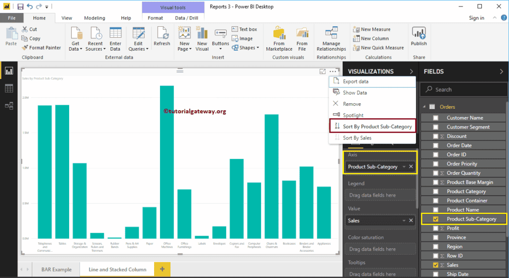
Let me sort the data by English Product Sub-category Name (By default, it sorted by Sales Amount). To do this, click on the … (3 dots) on the top right corner and select the Sort By Product Sub-category Name option, as we showed below.
Click on the Line and Stacked Column Chart under the Visualization section. It converts the Column Chart into a Line and Stacked Column Chart. From the screenshot below, currently, you don’t see the change, because you have to add a few more fields.
Next, we are adding a Customer Segment to the Column Series section to convert it into the Stacked Column Chart.
Next, we are adding Profit to Line Values section to convert it into the Line and Stacked Column Chart.
Create a Line and Stacked Column Chart in Power BI Approach 2
First, click on the Line and Stacked Column Chart under the Visualization section. It will create a Line and Stacked Column Chart with dummy data, as shown in the below screenshot.
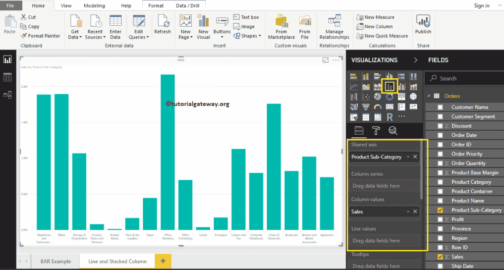
To add data to Line and Stacked Column Chart in Power BI, we have to add required fields:
- Shared Axis: Please specify the Column that represents the Vertical Axis.
- Column Series: Specify the Column to divide the Vertical Bars.
- Column Values: Any Numeric value such as sales amount, Total Sales, etc., that represent the Vertical bars.
- Line Values: Any Numeric value that represents the Line.
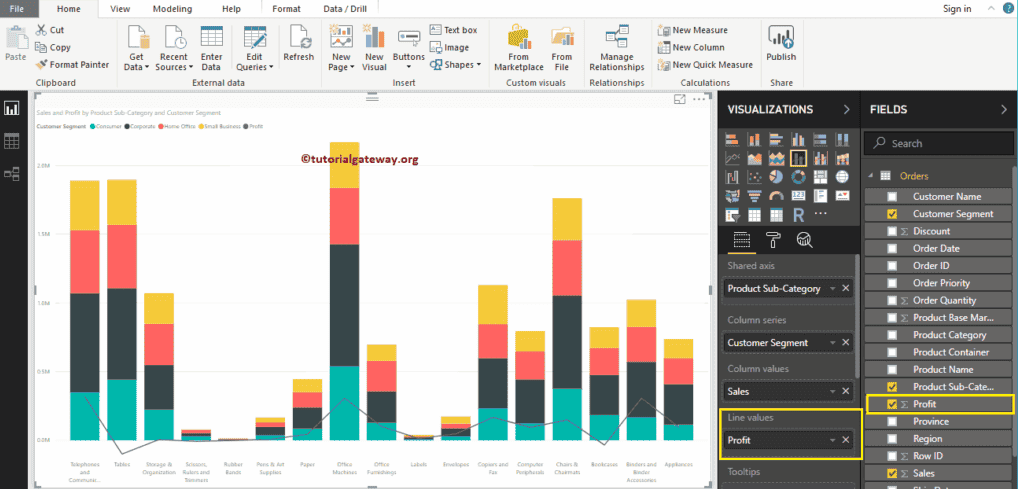
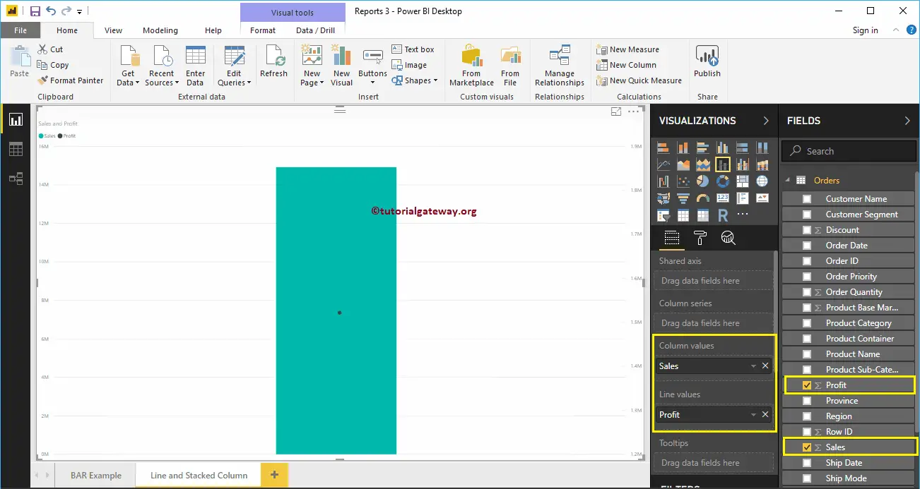
Let me drag the Sales Amount from the Fields section to Column Values field, and Profit field to the Line Values Section.
Next, let me add the Product Subcategory Name to the shared Axis section. You can do this by dragging Product Subcategory Name to the shared Axis section. Or simply checkmark the Product Subcategory Name column.
Let me sort the data by Product Subcategory Name. To do this, click on the … (3 dots) on the top right corner and select the Sort By Product Subcategory Name option, as we showed below.
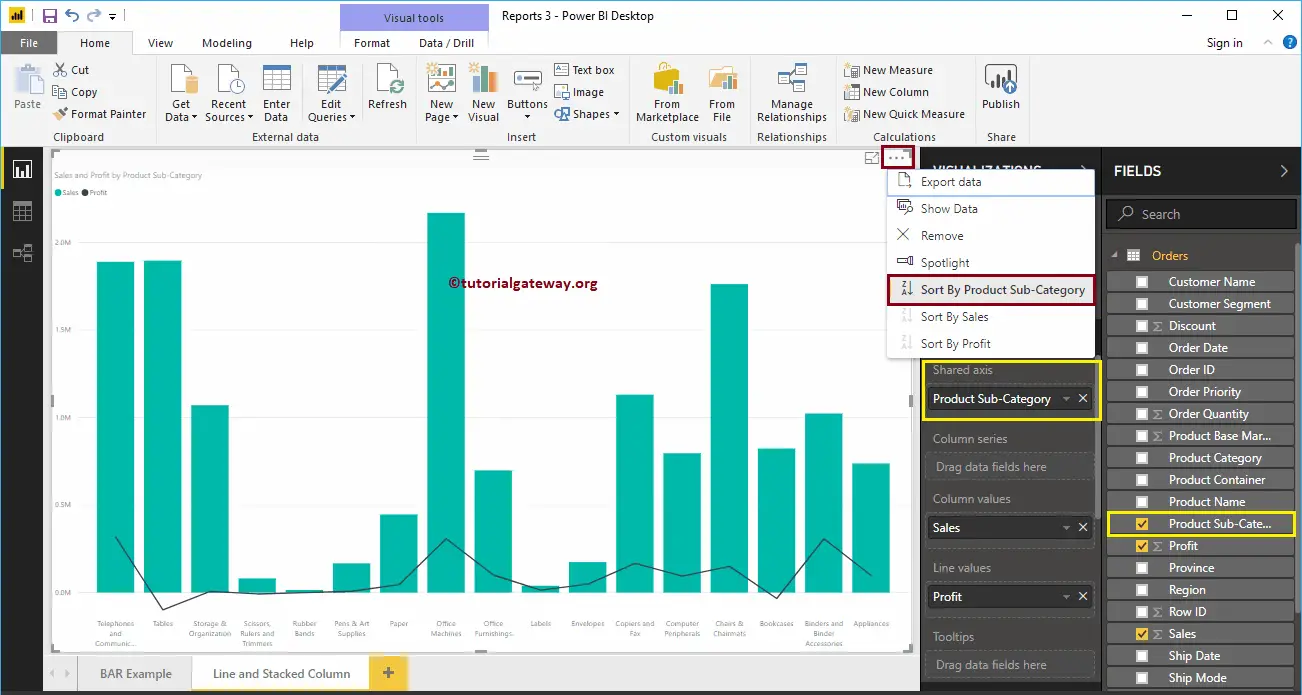
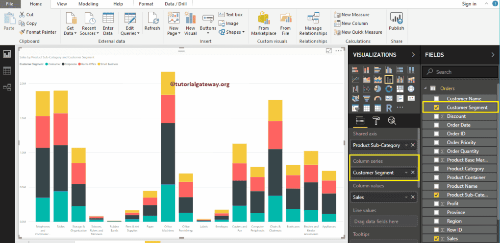
Next, add the Customer Segment to the Column Series section. That’s it; we got our Line and Stacked Column chart
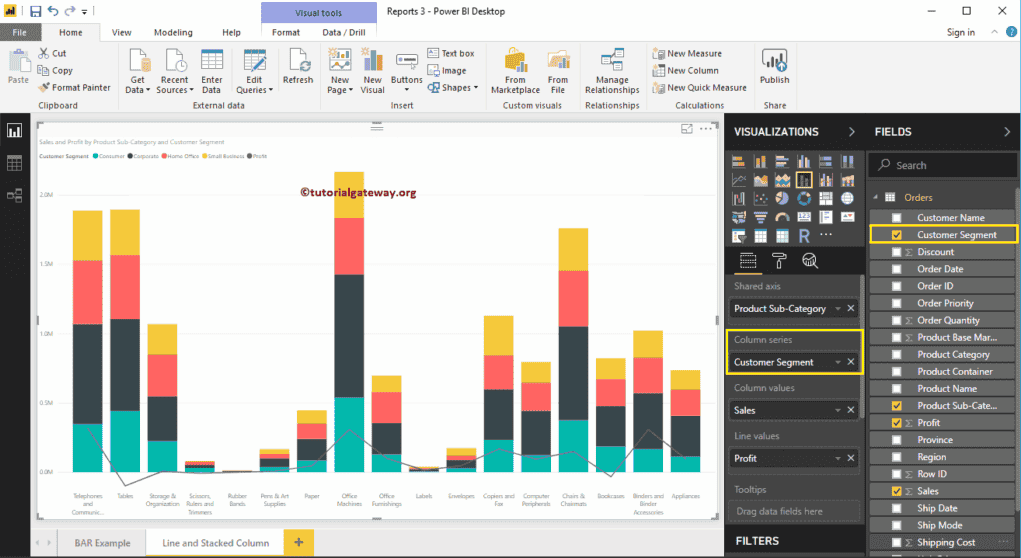
Hover over any portion of a vertical bar shows the Tool-tip of Product Subcategory, Customer Segment, and Sales Amount.
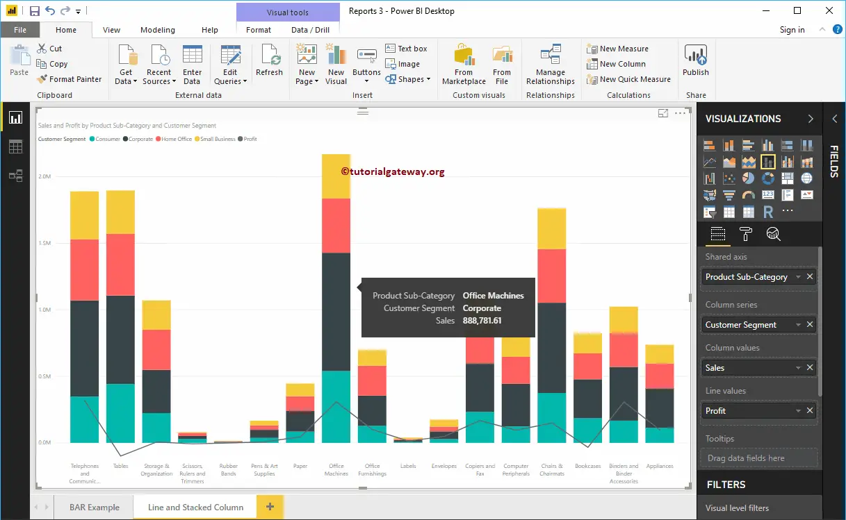
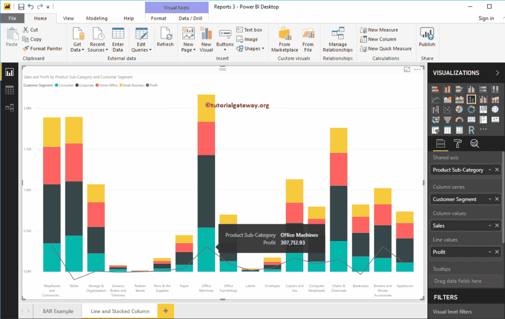
Hover over any portion of a Line shows the Tool-tip of Product Subcategory and Profit.
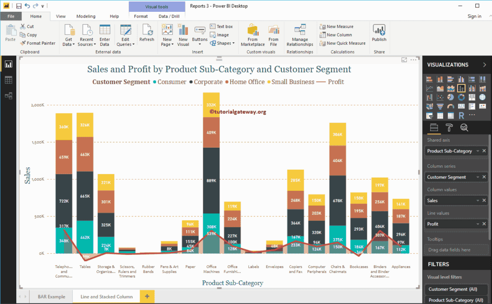
Let me do some quick formatting to this Line and Stacked Column Chart in Power BI.
NOTE: I suggest you refer to Format Line and Stacked Column Chart article to understand the steps involved in formatting the Lines, and Stacked Column Colors, Title, etc.
Format Power BI Line and Stacked Column Chart
How to FormatPower BI Line and Stacked Column Chart with an example?. Formatting Power BI Line and Stacked Column Chart includes changing the Line Strokes, Stacked Column colors, Title position, Axis Details, etc.
To demonstrate the Power BI Line and Stacked Column Chart formatting options, we are going to use the Line and Stacked Column Chart that we created earlier.
Please refer to Line and Stacked Column Chart in Power BI article to understand the steps involved in creating it.
How to Format Power BI Line and Stacked Column Chart
Please click on the Format button to see the list of formatting options that are available for this Line and Stacked Column Chart.

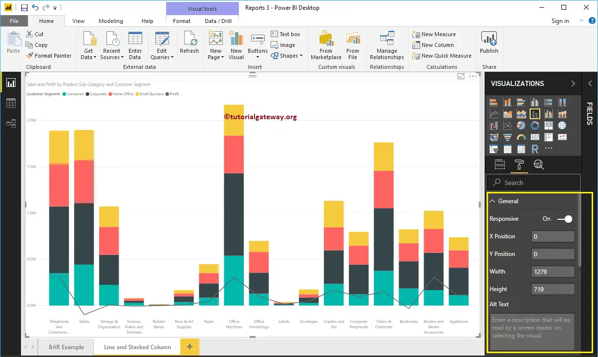
Power BI Line and Stacked Column Chart General Settings
Use this Power BI General Section to Change the X, Y position, Width, and height of a Line and Stacked Column Chart.
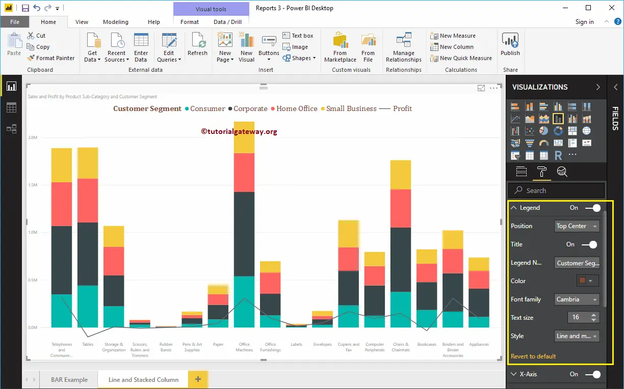
Format Legend of a Line and Stacked Column Chart in Power BI
First, we used the Position drop-down box to change the legend position to Top Center. Next, we changed the Color to Brick Red, Font family to Cambria, and text size to 16.
The X-Axis of a Line and Stacked Column Chart in Power BI
The following are the list of options that are available for you to format X-Axis. Here, we changed the Color to Brown, font family to Candara, and Text Size to 14.
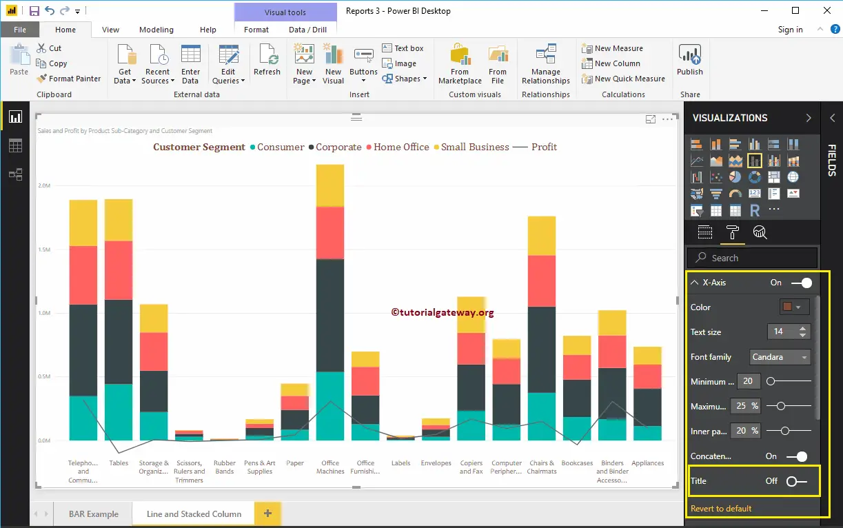
As you see from the above screenshot, by default, the X-Axis title set to Off for the Line and Stacked Column Chart. But you can enable it by toggling Title to On. Let me change the Title Color to Green, Font style to Georgia, and Font Size to 20.
Format Y-Axis of a Power BI Line and Stacked Column Chart
As you can see, we changed the Y-Axis labels Color to Brown, font style to Candara, Text Size to 14, and display units to thousands.

By default, Line and Stacked Column Chart Y-Axis title set to Off, but you can enable it by toggling Title to On. Let me change the Title Color to Green, Text Size to 24, and Font family Georgia.
By toggling the Gridlines option from On to Off, you can disable the Line and Stacked Column Chart Gridlines.
- Color: You can change the Gridlines color.
- Stroke Width: Use this to change the Gridlines width.
- Line Style: Choose the line style such as Solid, dotted, and dashed.

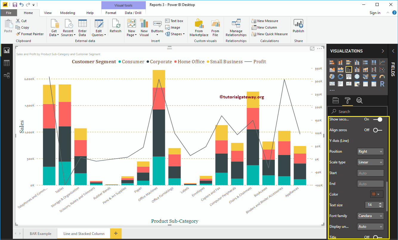
As you can see from the above screenshot, there is an option called show secondary axis under the Y-Axis. By enabling this, you can display the secondary Y-Axis as well.
Format Power BI Line and Stacked Column Chart Data Colors
By default, Line and Stacked Column Chart uses the default colors to fill the stacked columns and lines. Let me change them for the demonstration purpose.
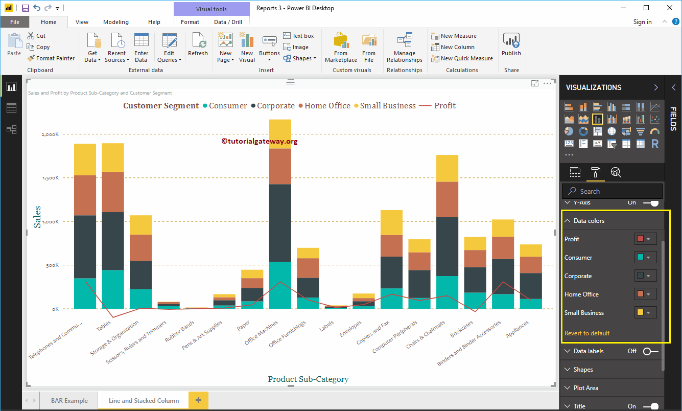
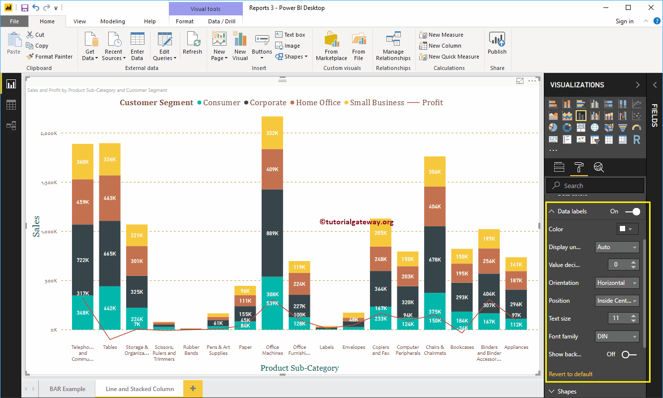
Format Data Labels of a Line and Stacked Column Chart
Data Labels display the Metric Values (Sales Amount of group, and Profit at each point). As you can see from the below screenshot, we enabled data labels and changed the color to white.
Format Line and Stacked Column Chart in Power BI Shapes
You can use this section to change the Line Strokes, or marking shapes.
As you can see from the below screenshot, we changed the Stroke Width (Line width) to 4, join type to bevel, and line style to solid.
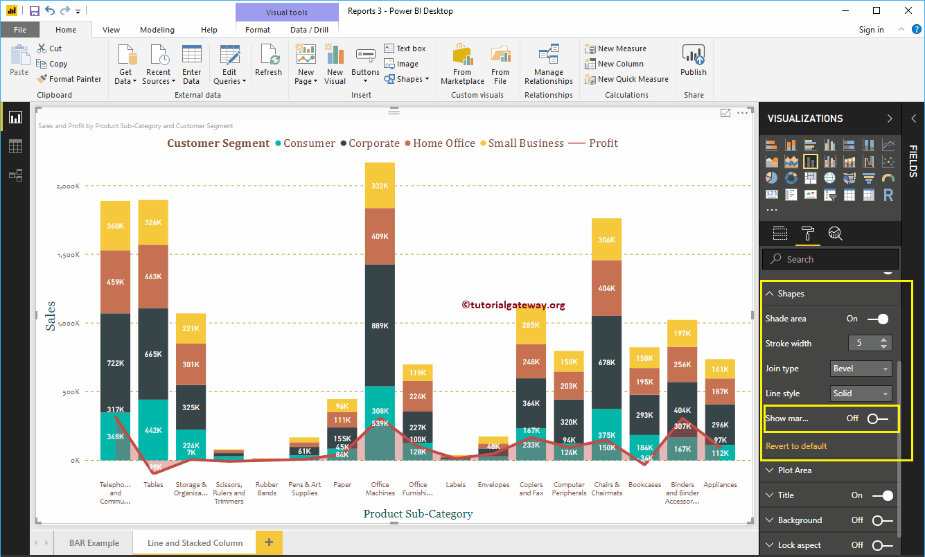
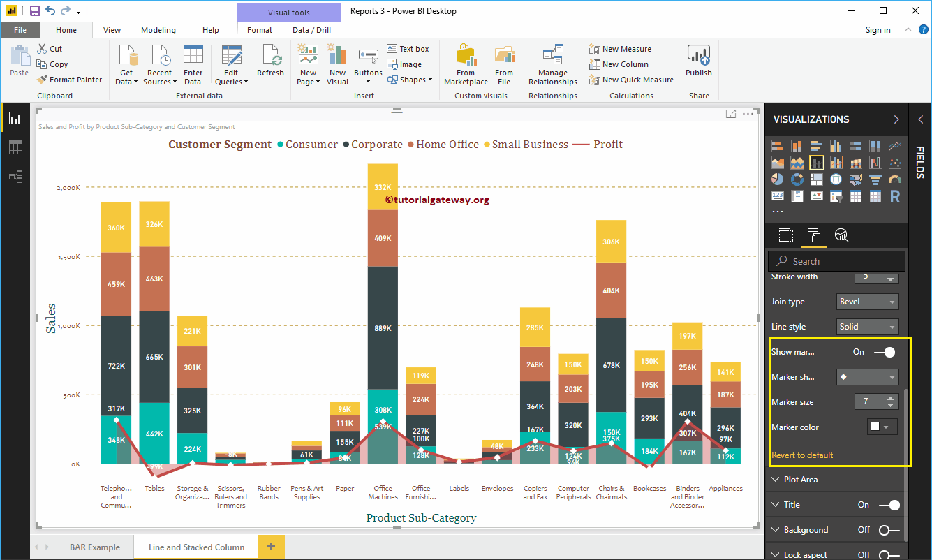
By enabling Show Markers property, you can display the markers at each point.
First, we changed the marker Shape (joining Point Shape ) as Diamond, Marker size as 7, and marker color as white.
Line and Stacked Column Chart in Power BI Plot Area
Using this Plot Area property, you can add custom Images as the Background of the Line and Stacked Column Chart. For the demonstration purpose, we added one image as the Plot Area Background.
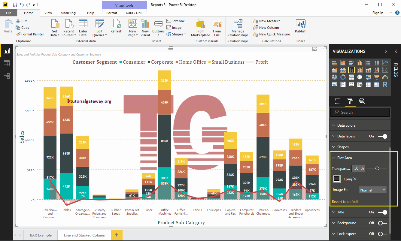
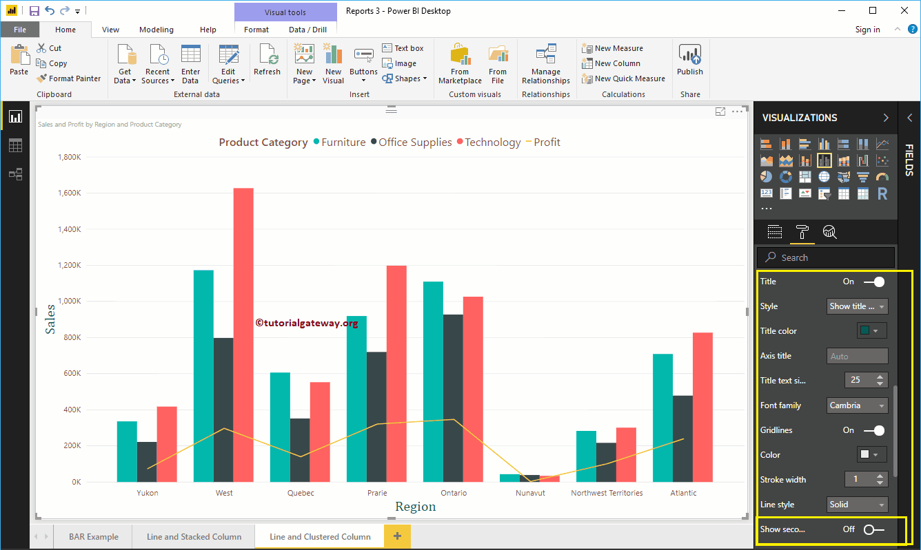
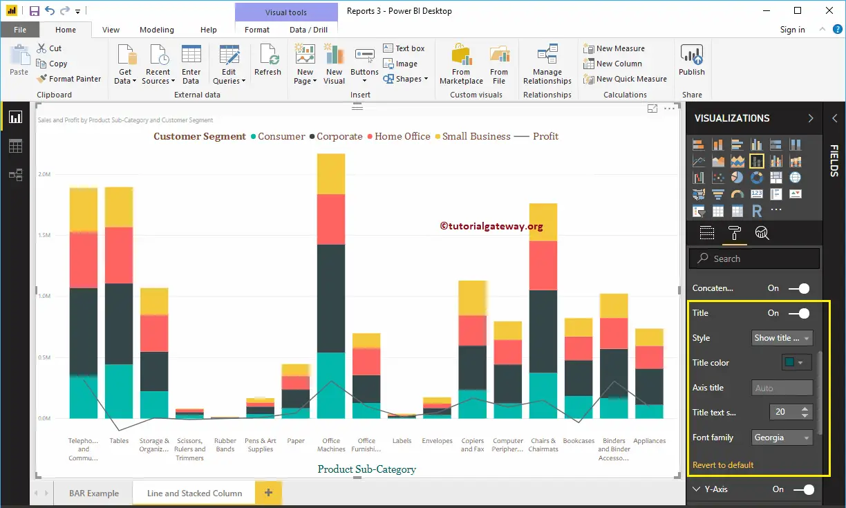
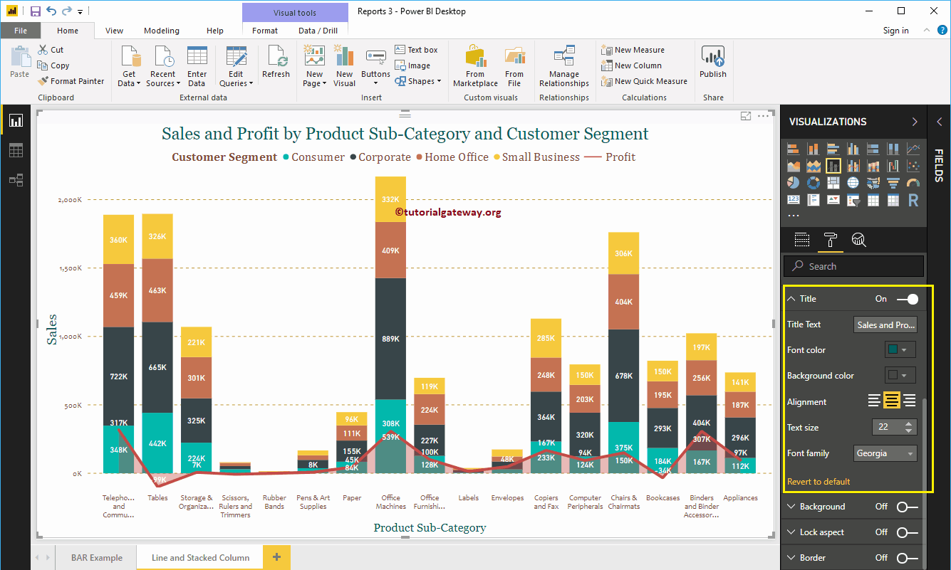
Format Power BI Line and Stacked Column Chart Title
As you see, we changed the Font Color to Green, Font Family to Georgia, Text Size to 22, and Title Alignment to center. If you want, you can add the background Color to the title as well.
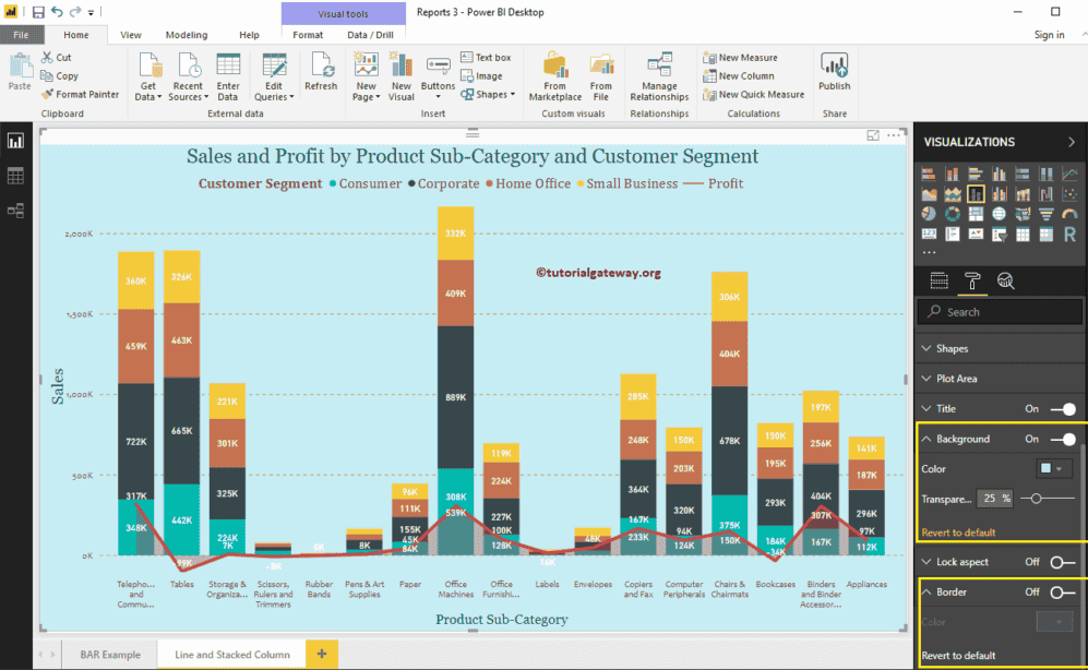
Format Line and Stacked Column Chart Background Color and Borders
You can add the Background color to a Line and Stacked Column Chart by toggling Background option to On. For the demonstration purpose, we added sky blue with 25% transparency.
Similarly, you can add Borders to a Line and Stacked Column Chart by toggling the Border option from Off to On.
Create a Matrix in Power BI
Power BI Matrix also called as Cross tab, is useful to display the relationships between two or more than two groups. Let me show you how to Create a Matrix in Power BI with example.
For this Power BI Matrix demonstration, we are going to use the SQL Data Source that we created in our previous article. So, Please refer to Connect Power BI to SQL Server article to understand the Power BI Data Source.
How to Create a Matrix in Power BI
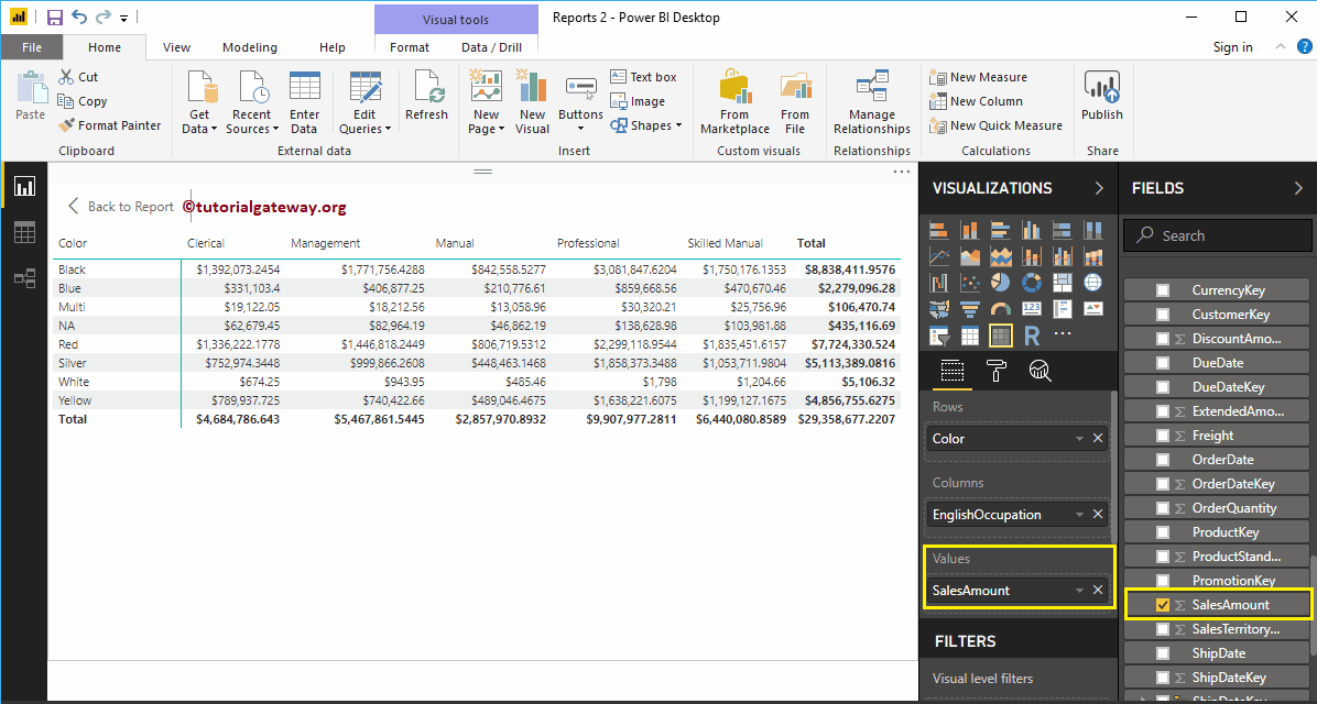
When you drag any dimension field to the Canvas, Power BI automatically creates a table. Let me drag and drop the English Product Name from the Fields section to Canvas. And you can see the table.
Next, let me drag one metric value (Sales Amount) to the Values section and click on the Matrix under the Visualization section.
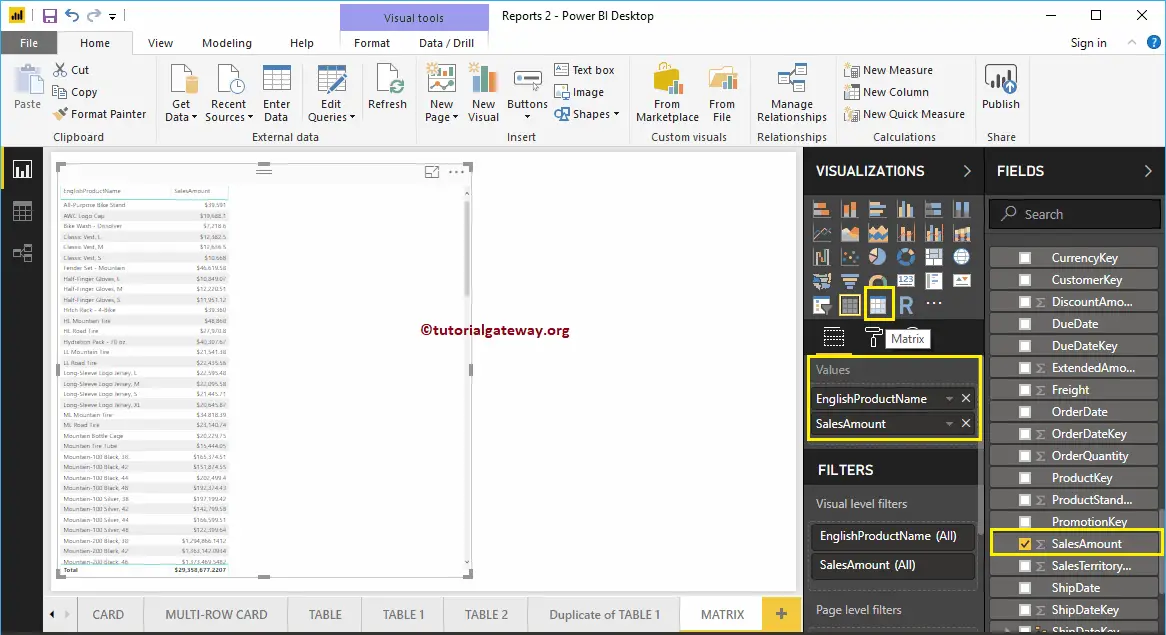
Clicking the Matrix will automatically convert a Table into a Matrix. From the screenshot below, you can see the Matrix representation of English Product names and Sales Amount.
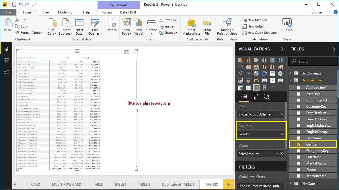
Let me add one more column group so that you can understand the Matrix. As you can see, we added Customer gender to the Column Groups.
Create a Matrix in Power BI Approach 2
If you want to convert the existing chart into Power BI Matrix, then you can follow this step. As you can see from the screenshot below, we created a column chart, which represents the Order Quantity by English Product Subcategory.
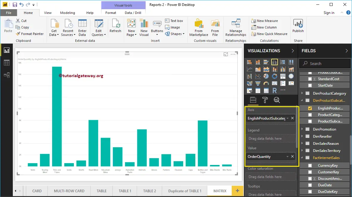
Click on the Matrix under the Visualization section automatically convert the Column Chart into a Matrix.
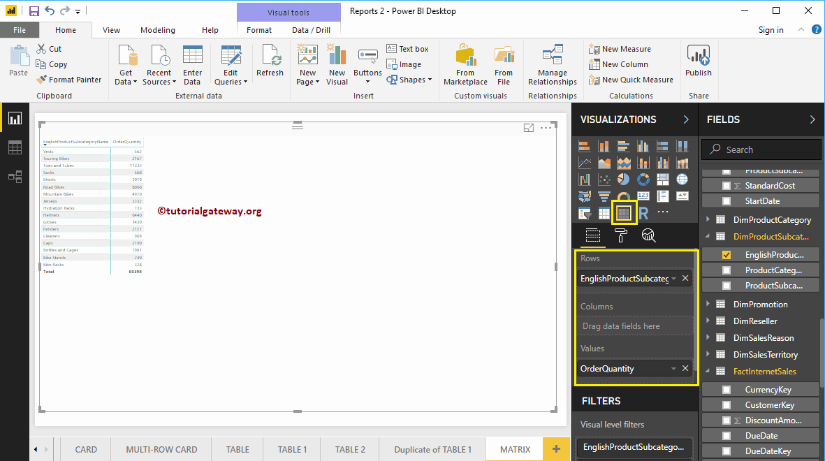
Let me add the Product Color to the Column Group
Create a Matrix in Power BI Approach 3
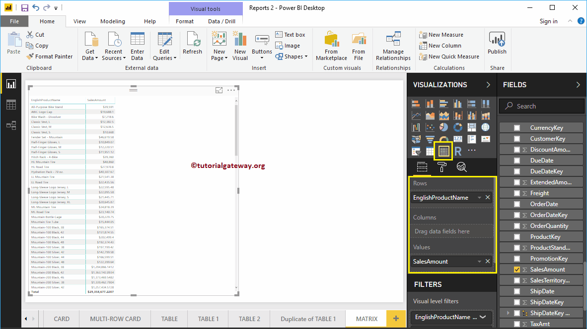
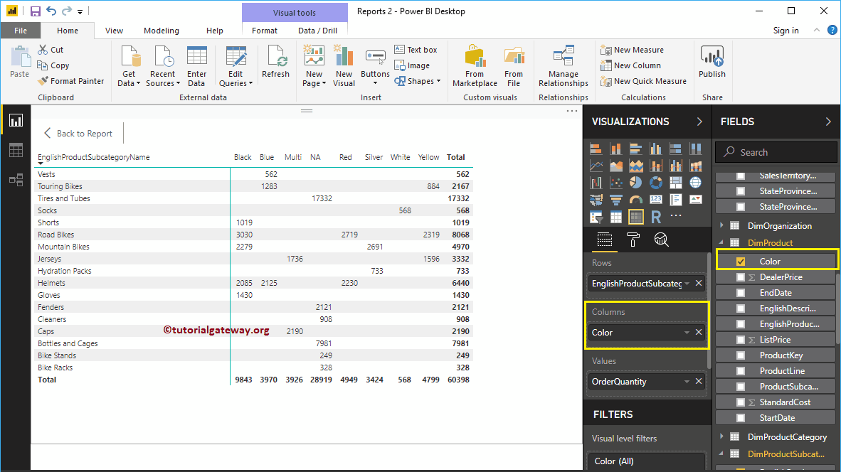
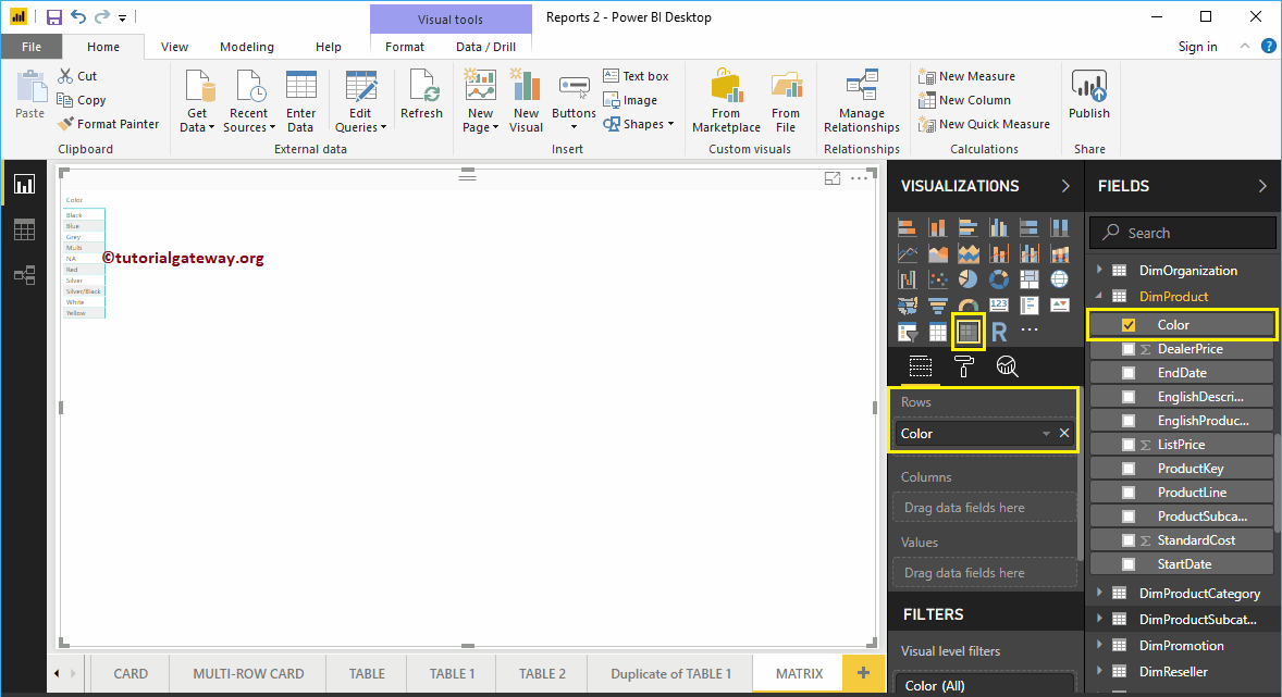
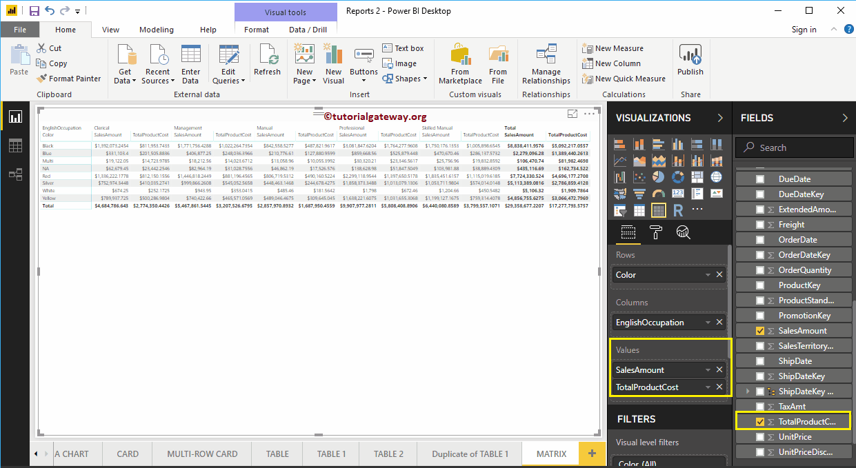
First, click on the Matrix present in the Visualization section. It automatically creates a Matrix with dummy data. Next, let me add the product Color as the Row Group.
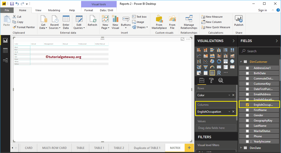
Next, drag and drop the English Occupation to the Column Groups. Now, you can see the Matrix.
Next, let me drag the Sales Amount to the Values section. It automatically enables the Subtotals and grand totals.
For this Power BI Matrix demonstration purpose, we are adding one more metric field, i.e., Total Product Cost to the Values section.
Let me do some quick formatting to this Power BI Matrix
NOTE: I suggest you refer to Format a Matrix article to understand the formatting options.
Format Power BI Matrix
How to Format Power BI Matrix report with an example?. The Power BI Formatting Matrix includes changing the Matrix Grid Colors, Row formatting, Column formatting, row and column colors, Matrix Title text, and background color, etc.
To demonstrate these Power BI matrix formatting options, we are going to use the Matrix that we created earlier. Please refer to Create a Matrix in Power BI article to understand the steps involved in creating a Power BI Matrix.
How to Format Power BI Matrix
Please click on the Format button to see the list of Matrix formatting options that are available in Power BI.

Format Power BI Matrix General Settings
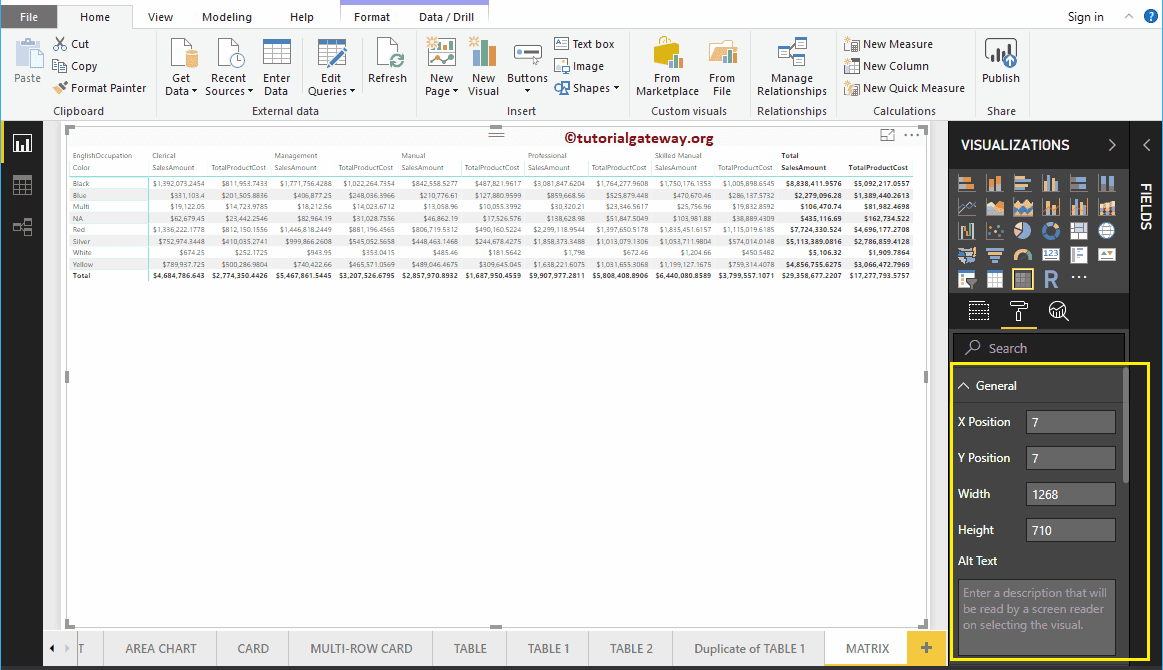
Use this General Section to Change the X, Y position, Width and height of a Matrix
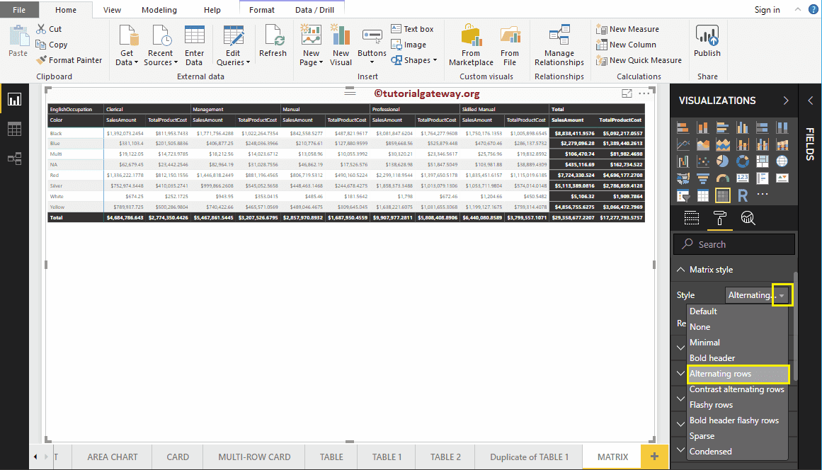
Format Power BI Matrix Style
From the below screenshot, you can see the list of styles that are available to style this Matrix. Please select any style as per your requirement.
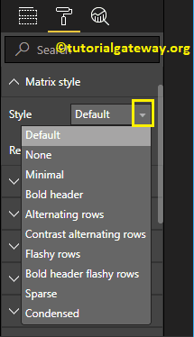
For now, we are selecting the Alternating Rows option from the drop-down list. It adds alternative row colors and adds Black color to Header, Subtotals, and Grand totals.
The following are the list of options that are available for you to format the Power BI Matrix Grid.
- Vert Grid: Toggling this property from Off to On add Vertical Grid to the Matrix. Nothing but enabling Vertical line to separate each column.
- Horiz Grid: Add Horizontal Grid. Nothing but enabling Horizontal line to separate each row.
- Horiz Grid Color: Changing the Color of a Matrix Horizontal Grid.
- Horiz Grid thickness: Matrix Horizontal Grid Line width
- Row Padding: Space between the rows.

As you can see from the below screenshot, w changed the grid color to gold, grid thickness to 2, and row padding to 10
- Outline Color: Color after the Header, and row group. We are using the default green as the Outline color.
- Outline Weight: Matrix Line width. We changed the line stroke to 4
- Text Size: Font size of table values. Let me change the text size to 9

As you can see from the below screenshot, we enabled the Vertical Grid and assigned some random colors.
- Vert Grid Color: Change the Color of a Matrix Vertical Grid.
- Vert Grid thickness: Matrix Vertical Grid Line width or stroke

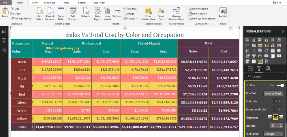
To adjust the space, we renamed the column names under the values section. As you can see, we changed the Sales Amount names as Sales and Total Product Cost as Cost

Format Column Headers of a Matrix in Power BI
This section is to alter the Header Colors. As you can see from the screenshot below, we changed the Font color to White, Background color to green. Next, Font Family to Cambria, Outline to Top + Bottom (Outline added to the top and bottom of a Header), Text Size to 15, and Header text alignment to center.

Format Row Headers of a Matrix in Power BI
This section is used to alter or format the Row Headers section. Here, we changed the Font color to White, Background color to Red, Outline to Top + Bottom (Outline added to the top and bottom of each row), Font Family to Cambria, Text Size to 15, and text alignment to center.

As you can see from the above screenshot, though, we changed the Background color of total rows (Row Headers), only Total background color has changed. It is because of the Banded Row Style property that we explain in the next step
Format Values of a Matrix in Power BI
You can use this section to change the Matrix values. As you can see from the screenshot below, we changed the Font colors and Back color of the even and odd rows.

Banded Row Style: By default, it set to On. It means the Row Header color will be the same as the remaining Row fields.
Let me set this Off. It changes the Row Header Background Color to the Purple. It is because, we applied this color in the above step, i.e., Row Headers section

Show On Rows: Enabling this option show the totals on Rows

As you can see, we removed the Outline and Changed the Font to Cambria, and Text size to 13

Format Subtotals of a Matrix in Power BI
Use this subtotal section to alter the text and background color of subtotals. By toggling Row subtotals, column subtotals to Off, you can remove the Totals completely.

Format Grand Total of a Matrix in Power BI
Use this Grand Total section to alter the text and background color of Total. As you can see from the below screenshot, we changed the Totals Font color to white, Background color to purple, Font Family to Cambria, and Text Size to 14.
Apply to labels: By toggling this option to On apply the Background Color to the Header of the Total. As you can see, Power Bi has changed the background color of the text of a header of Total
Format Power BI Matrix – Field Formatting
Use this section to format individual columns in a Matrix.
For example, you can use this section to assign a completely different color to one column. Here, we are selecting Sales.

For the Format Power BI Matrix demo purpose, we changed the background color to Pink for this column only.

Format Power BI Matrix – Conditional Formatting
Use this section to format Metric columns (Numeric) in a Matrix. For example, adding a background color to a complete column, or adding data bars, etc. We will write a separate article to explain these settings

Format Power BI Matrix Title
By toggling the Matrix option from Off to On, you can enable the Matrix title.
From the screenshot below, you can see we added the Title Text as Sales Vs. Total Product Cost by Product Color and Occupation. Next, we changed the Font Color to Green, Font Family to Georgia, Text Size to 25, and Title Alignment to center. If you want, you can add the background Color to the Matrix title as well.

Format Power BI Matrix Background Color, and Borders
You can add a Background color to a Matrix by toggling Background option to On. For the Format Matrix demonstration purpose, we added sky pale yellow color with 34% transparency.
Similarly, by toggling Border option from Off to On, you can add Borders to a Matrix.
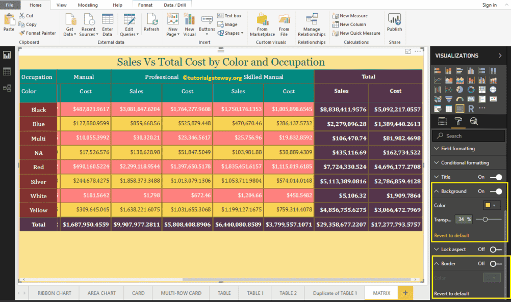
Create a Multi-Row Card in Power BI
Power BI Multi-Row Card is useful to display the data in a Group format (or a section-wise). Let me show you how to Create a Multi-Row Card in Power BI with an example.
For this Power BI Multi-Row Card demonstration, we are going to use the SQL Data Source that we created in our previous article. So, Please refer to Connect Power BI to SQL Server article to understand the Data Source in Power BI.
How to Create a Multi-Row Card in Power BI
Drag and Drop the Sales Amount from the Fields section to Canvas automatically create a Column Chart, as shown in the screenshot below.
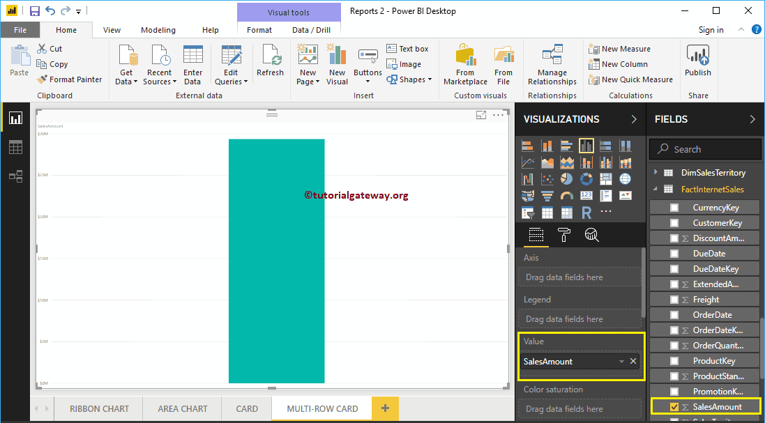
Next, let me add the Color field to the Axis field. It creates a column chart that shows the Sales Amount by the product Color.
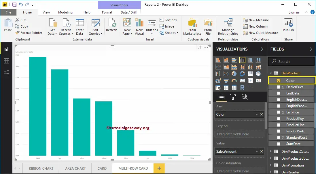
Click on the Multi-Row Card under the Visualization section. It automatically converts the Column Chart into a Multi-Row Card. From the screenshot below, you can see the Multi-Row Card that shows the Total Sales Amount grouped by Product Color.
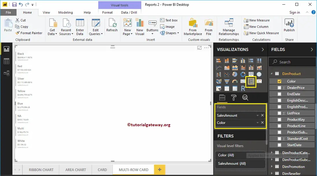
Create a Multi-Row Card in Power BI Approach 2
First, click on the Multi-Row Card under the Visualization section. It creates a Multi-Row Card with dummy data, as shown in the below screenshot.
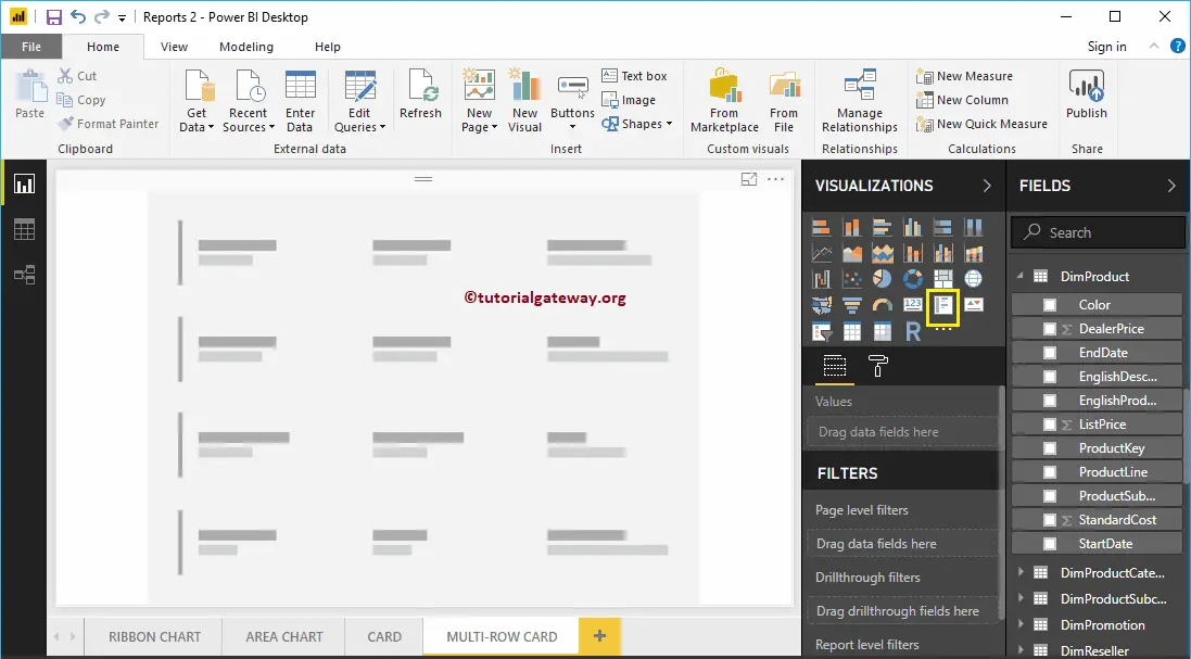
Let me drag the Product Color and Sales Amount to Fields section. As you can see, it shows the Multi-Row Card of Product Color and Sales Amount.
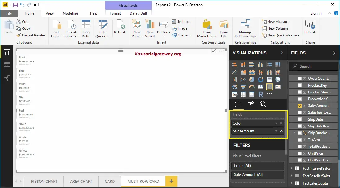
Next, Let me drag one more metric value, i.e., total product cost to the Fields section.
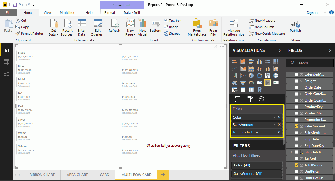
Let me drag the Tax Amount as well.
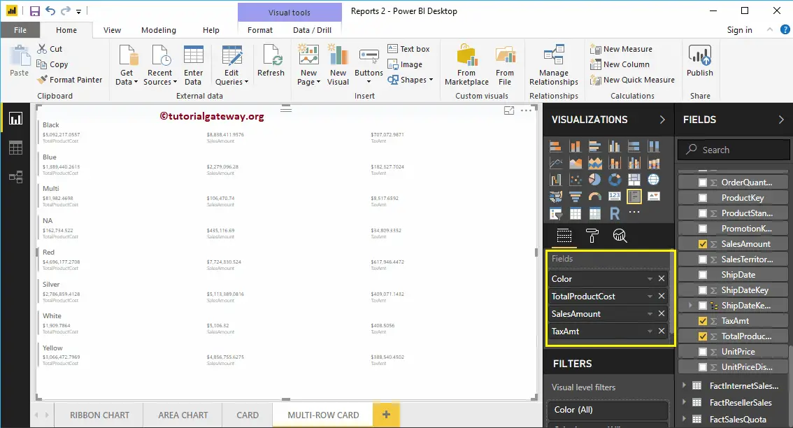
Let me do some quick formatting to this Multi-Row Card
NOTE: I suggest you refer to Format Multi-Row Card article to understand the formatting options.
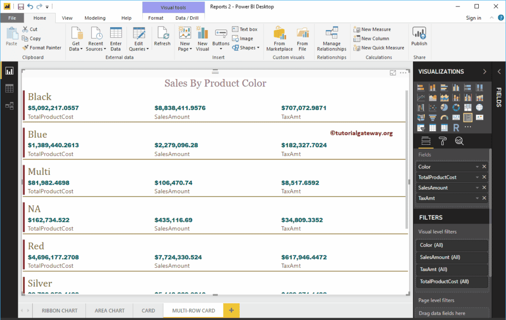
Format Power BI Multi-Row Card
How to Format Power BI Multi-Row Card with an example?. Formatting Power BI Multi-Row Card includes Data Labels, Category label Colors, enabling the Chart Title, formatting Cards, background colors, position etc.
To demonstrate these Power BI Multi-Row Card formatting options, we are going to use the Multi-Row Card that we created earlier. Please refer to Multi-Row Card in Power BI article to understand the steps involved in creating it.
How to Format Power BI Multi-Row Card
Please click on the Format button to see the list of formatting options that are available for this Multi-Row Card.
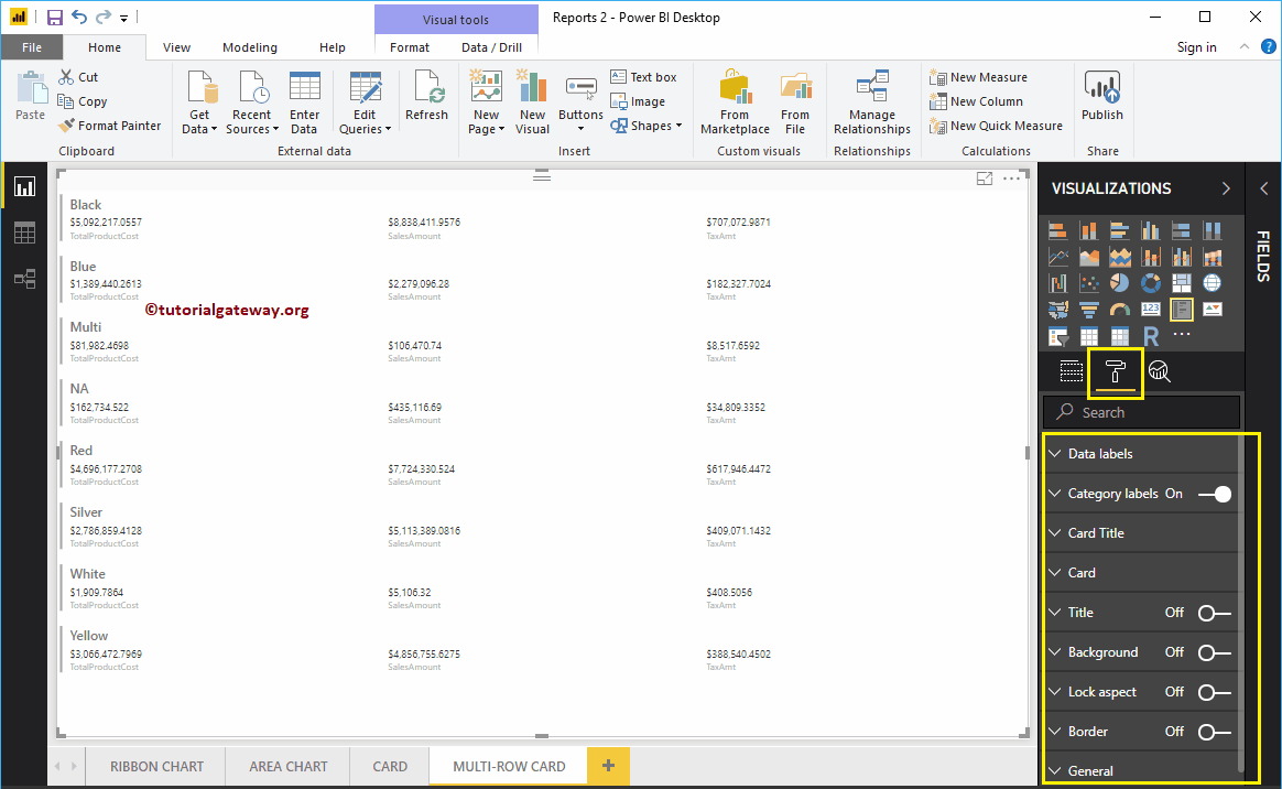
Format Data Labels of a Multi-Row Card in Power BI
Data Labels display the Metric Values (Sales Amount, or Order Quantity, or Total Product Cost). As you can see from the below Power BI screenshot, we changed the Data Label Color to Green, Text Size to 14, and Font Family to Arial Black.
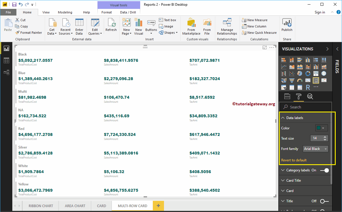
Format Category Labels of a Multi-Row Card
Category Labels mean Column Name of the Metric Values that we used in the Multi-Row Card. From the screenshot below, you can see, we changed the Category Labels Color to Brown and Text Size to 15.
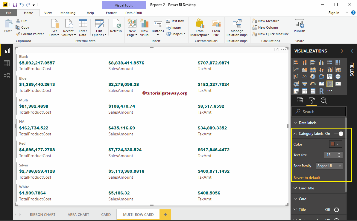
Format Card Title of a Power BI Multi-Row Card
The Card Title means the Multi-Row Card Group Names. From the screenshot below, you can see, we change the Color to Gold, Font Family to Cambria, and Text Size to 25.
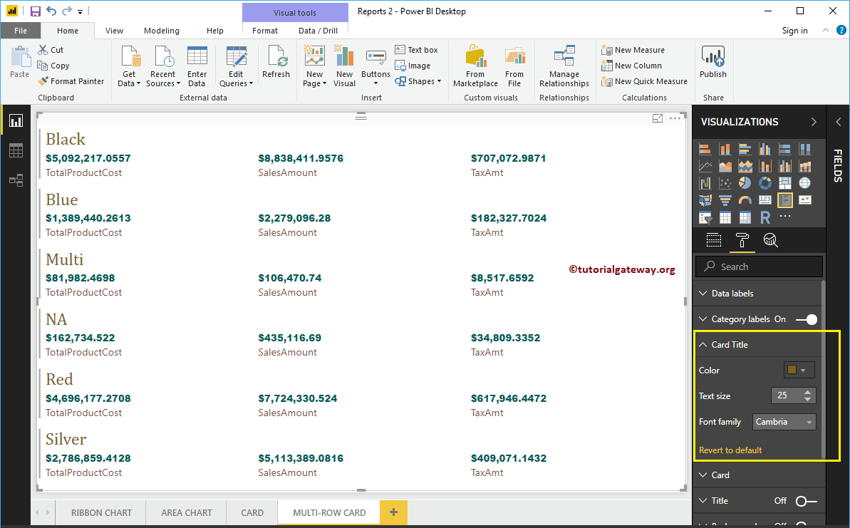
Format Card of a Multi-Row Card
Use this section to change the individual Card appearance. The following are the list of options that are available in this Card section.
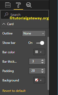
The outline property is useful to enable Line around the individual card. As you can see from the screenshot below, we enabled the Outline to Bottom Only.
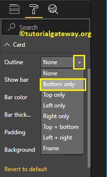
Next, we changed the color of a line and the weight of a line (Stroke width)
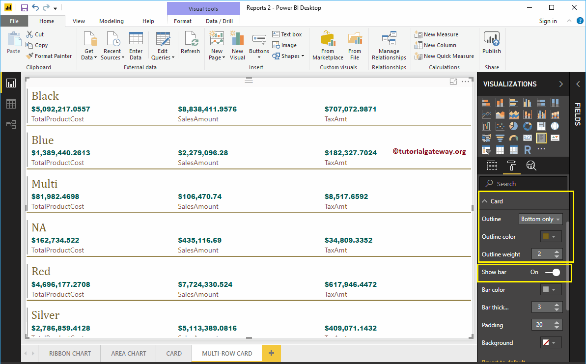
Show bar means the Bar on the left side. We changed the Color to Red, Bar Thickness to 6, and Padding (Space) to 18.
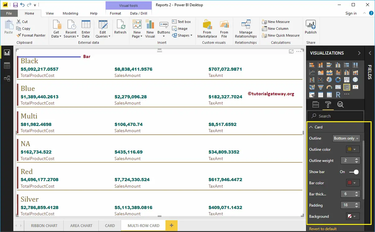
Format Power BI Multi-Row Card Title
By toggling the Title option from Off to On, you can enable the title of a Multi-Row Card.
From the screenshot below, you can see, we change the Title Text to Sales By Product Color. Next, we changed the Font Color to Pink, Title Alignment to center, Font Family to Georgia, and Text Size to 25.
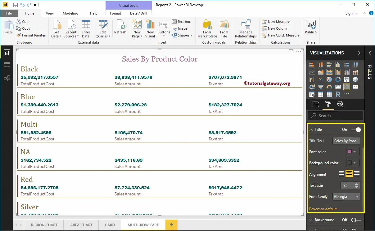
Format Power BI Multi-Row Card Background Color
You can add the Background color to a Multi-Row Card by toggling Background option to On. For the Multi-Row demonstration purpose, we added some random colors with 30% transparency.
Similarly, you can add the Borders to a Multi-Row Card by toggling the Border option from Off to On.
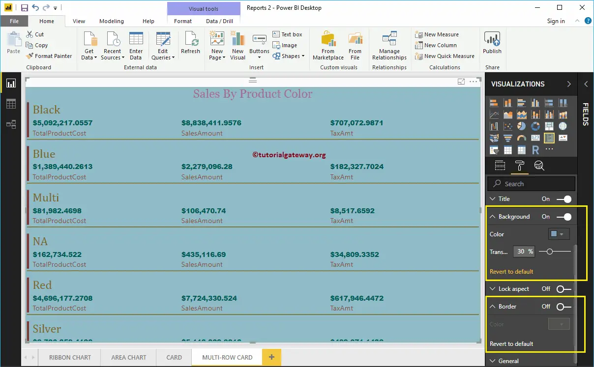
Format Multi-Row Card General Settings
Use the General Section to Change the X, Y position, Width, and height of a Multi-Row Card. For now, we are leaving them as it is.
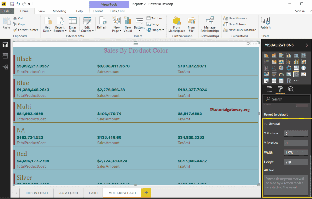
Pie Chart in Power BI
Power BI Pie Charts are very useful to visualize the High-level data. For example, Sales by Continent or region, Orders by Country, Customers by region, or Sales by Main product Group, etc. Let us see how to Create a Pie Chart in Power BI with example.
For this pie chart in power bi example, we are going to use the SQL Data Source that we created in our previous article.
Please refer to Connect Power BI to SQL Server article to understand the Power BI Data Source.
How to Create a Pie Chart in Power BI
When you click on the Pie Chart under the Visualization section, automatically create a Pie Chart, as shown in the below screenshot.
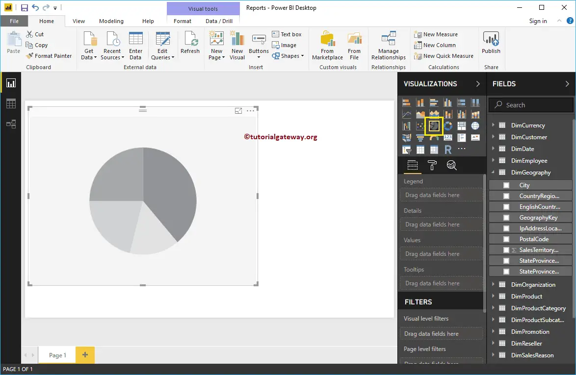
To add data to Power Bi Pie Chart, we have to add the required fields:
- Legend: Drag the column that you want to display as the legend.
- Details: Please specify the Column name on which you want to partition your Pie Chart. Values split based on this field.
- Values: Any Numeric value, such as sales amount, Total Sales, Customer count, etc.
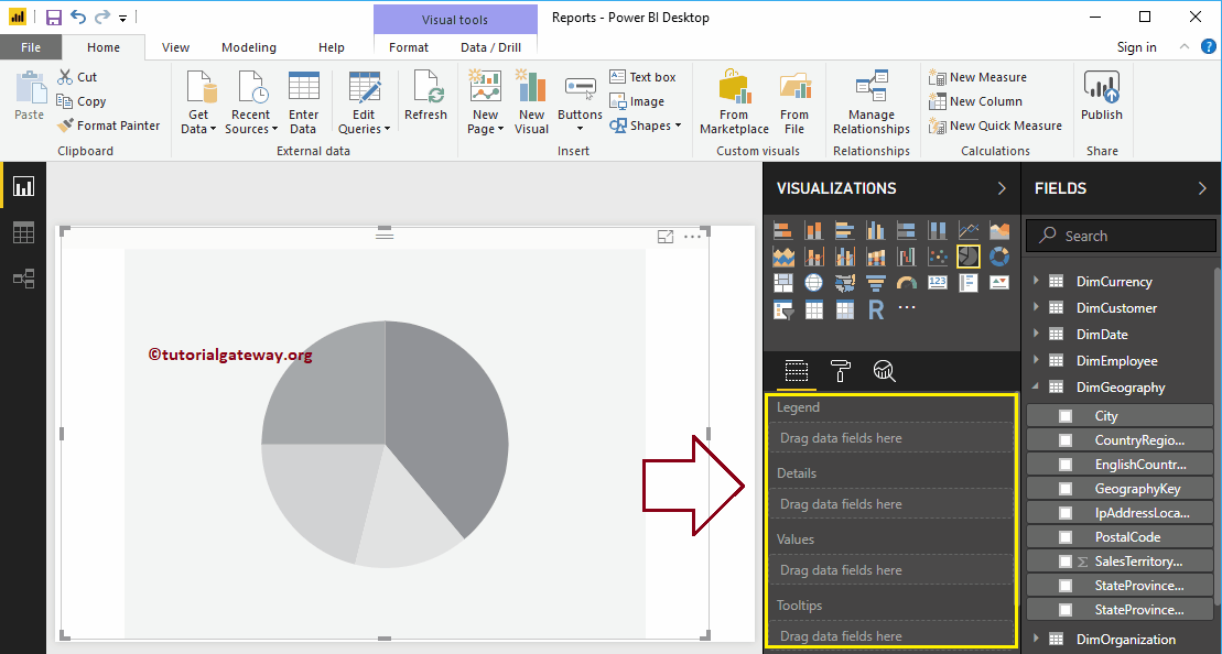
In this example, we create a Pie chart for Sales Amount by country Names. So, Drag the Sales Amount column to the Values field.
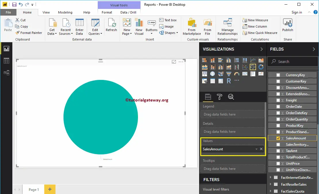
Next, checkmark the English Country Region Name, or Drag and drop it to Legend region automatically create a Pie Chart for you.
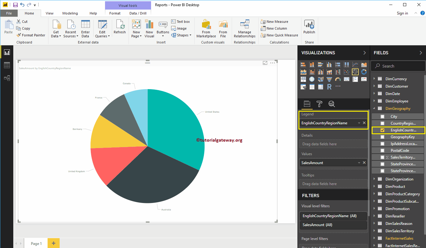
Hover over any slice show you the Tool-tip of Country Name and Its Sales Amount
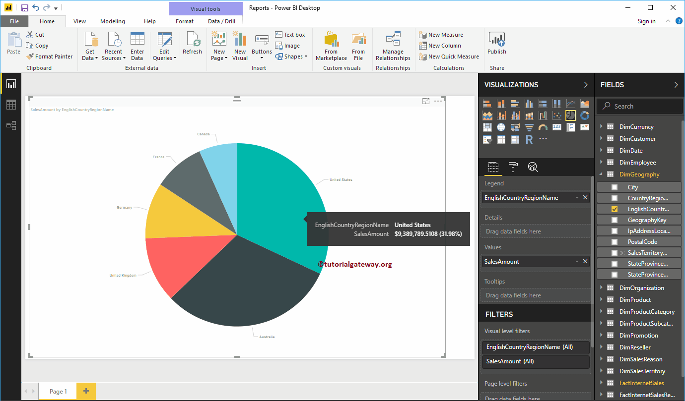
Second Approach to Create a Pie Chart in Power BI
Drag and Drop the Sales Amount from Fields section to Canvas automatically create a Bar Chart, as shown in the below screenshot.
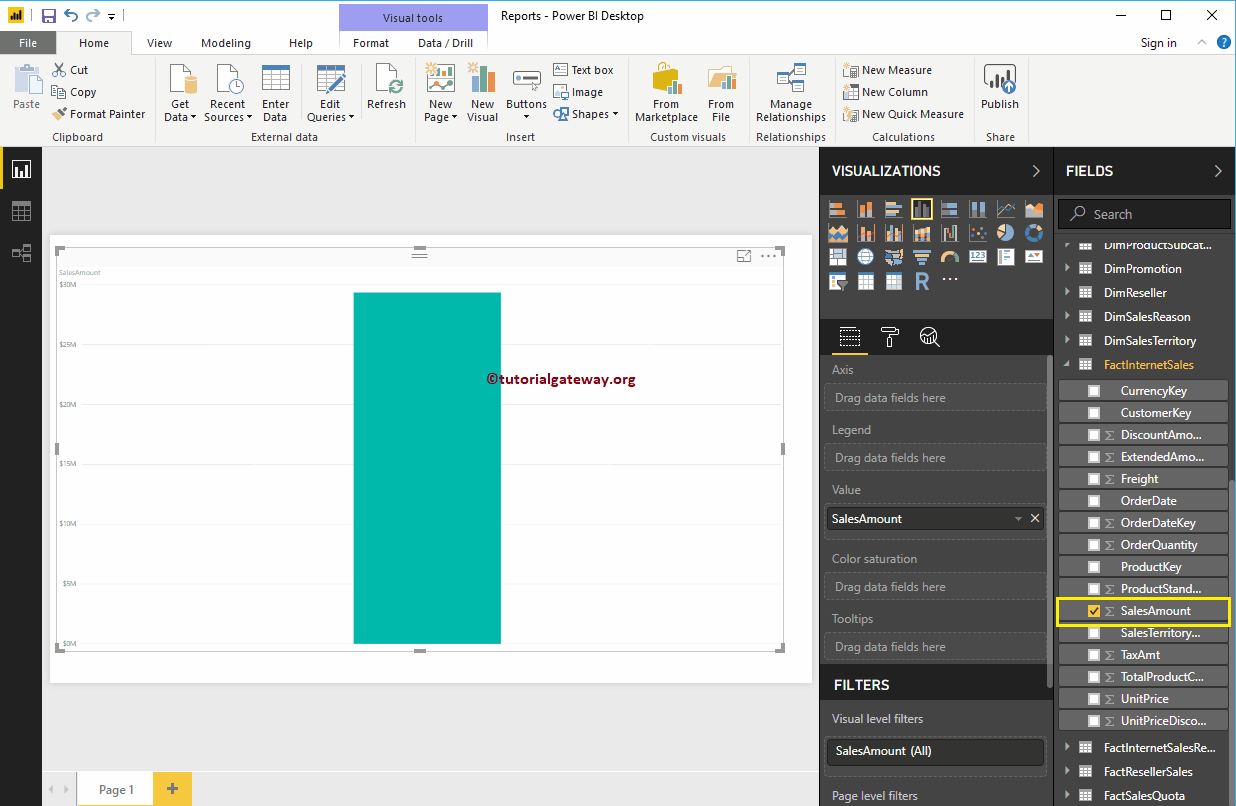
By clicking the Pie Chart in the Visualization, converts the Bar Chart to Pie Chart.
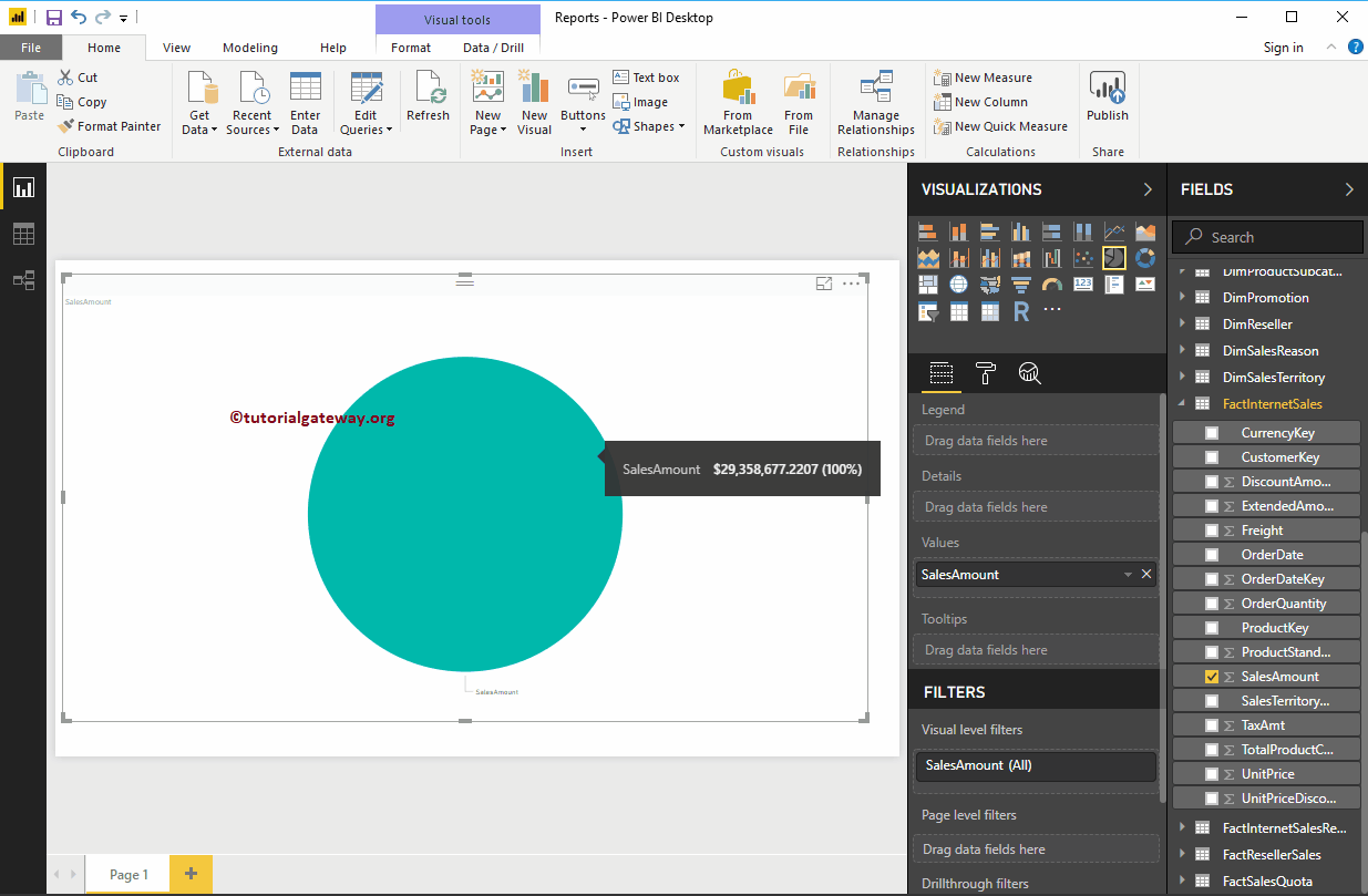
Add the Country Name to legend. Remember, we haven’t added anything to the Details section. So, it considers English Country Region Name (legend) as the Details.
If I add State Provide Name to the Details (explicitly), then Power BI Pie Chart displays the Sales by State province Name, and legend displays the Country Name.
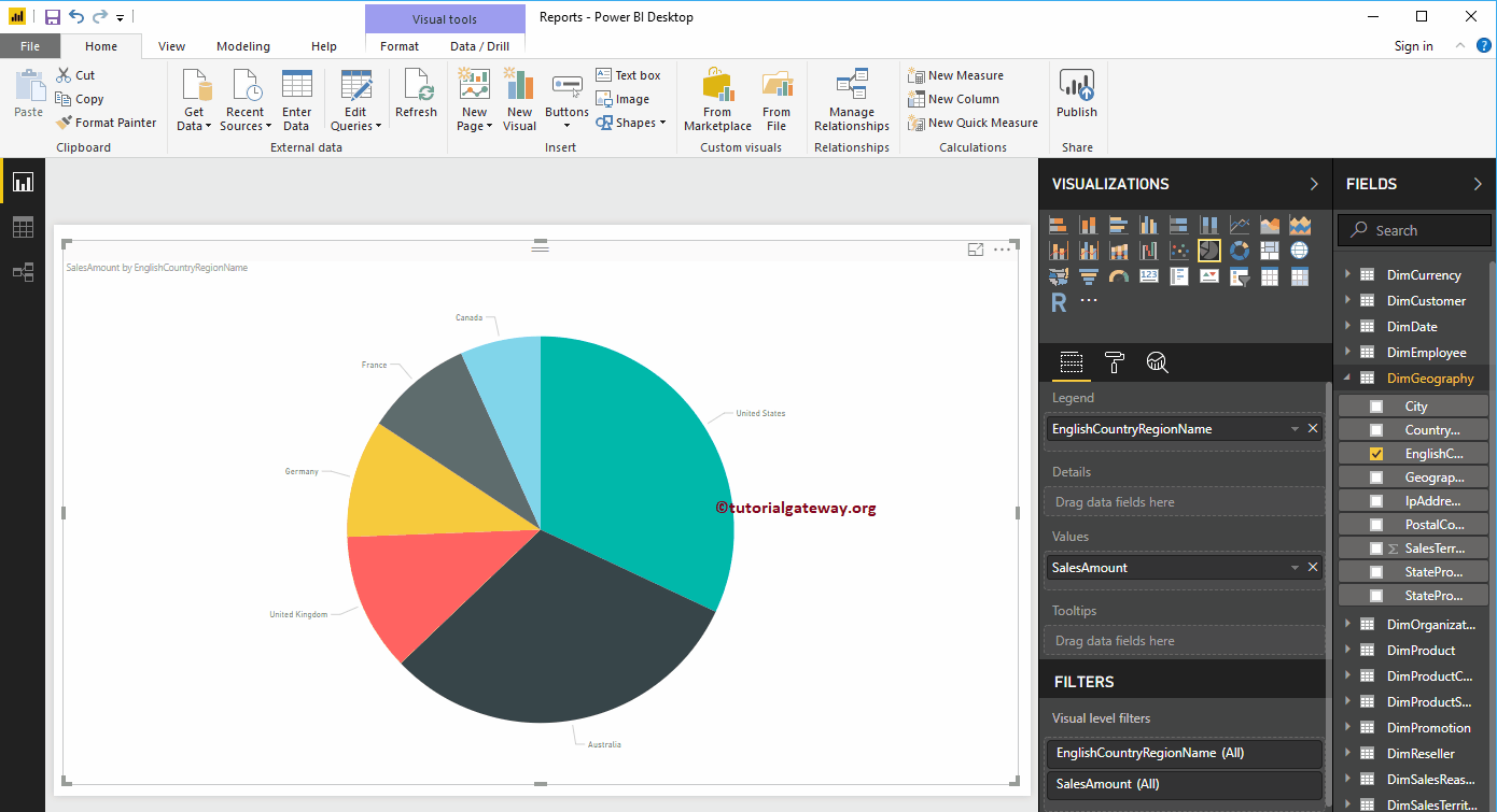
Let me do some quick formatting of this pie chart
NOTE: I suggest you to refer Format Pie Chart article to understand the steps involved in formatting legend, Data Color, Background Color, Title, and Slice colors.
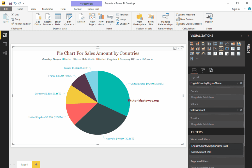
Format Power BI Pie Chart
How to Format Power BI Pie Chart with examples?. Formatting Power BI Pie Chart includes changing the Legend and Title position, Slice and background Colors etc.
To demonstrate these formatting options, we are going to use the Pie Chart that we created earlier. Please refer Pie Chart in Power BI article to understand the steps involved in creating Power BI Pie Chart.
How to Format Power BI Pie Chart
Please click on the Format button to see the list of available formatting options for this Pie Chart.
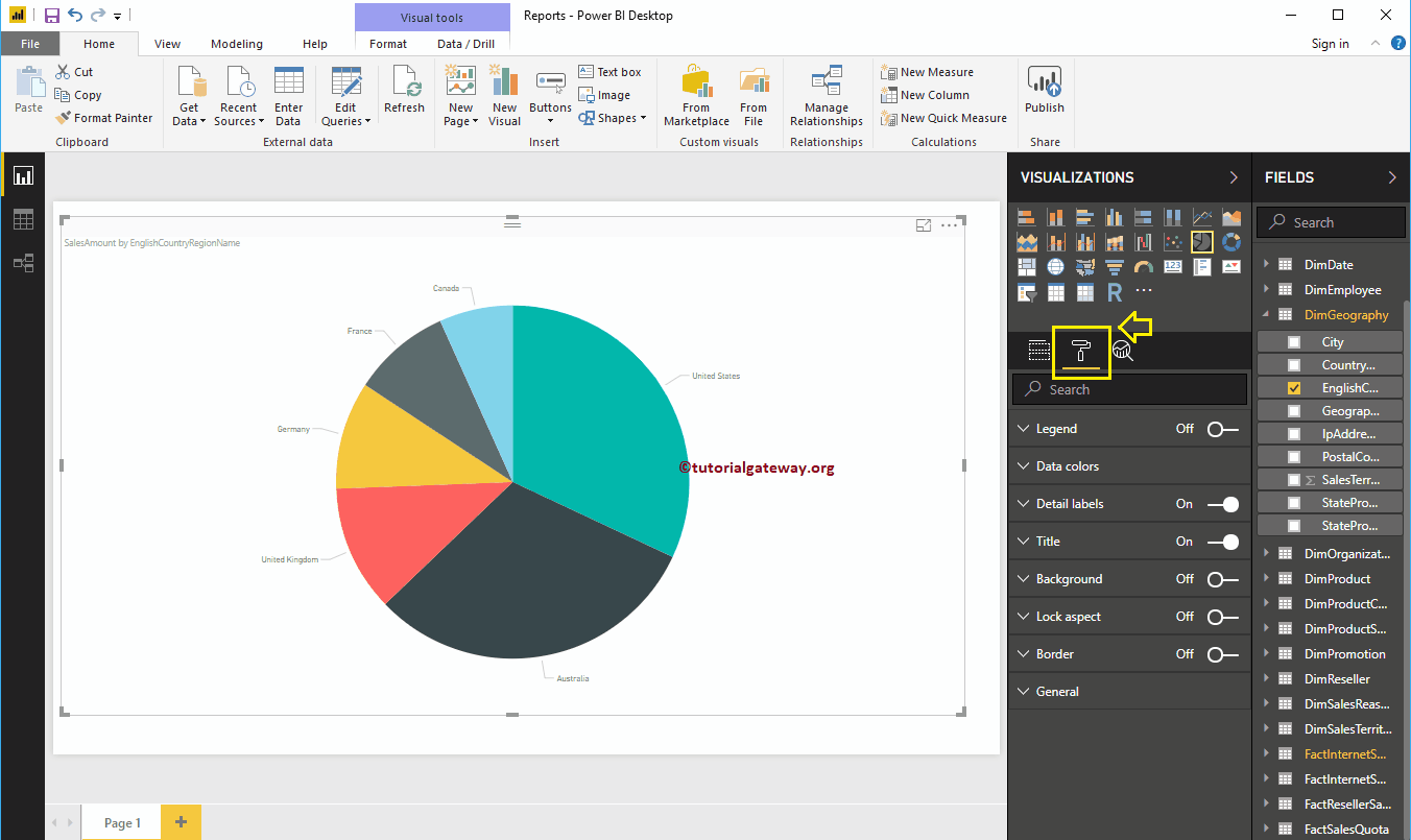
Format Legend of a Power Bi Pie Chart
To display the Legend, Please select the Legend region and change the option from Off to On. From the below screenshot, you can see the legend
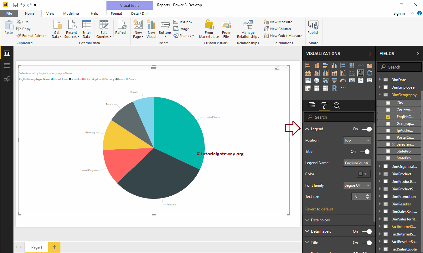
Legend Position: Use the drop-down box to change the Pie Chart legend position as per your requirements. For now, we are selecting the Top Center.
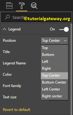
Title: Toggle on to display Legend title i.e EnglishCountryRegionName
Legend Name: You can change the Legend name. Here, we are changing its Country names
Color: Use the Color pallet to add color to legend
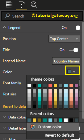
As you can see from the below screenshot, we changed the Font family to Comic Sans, and font size to 14
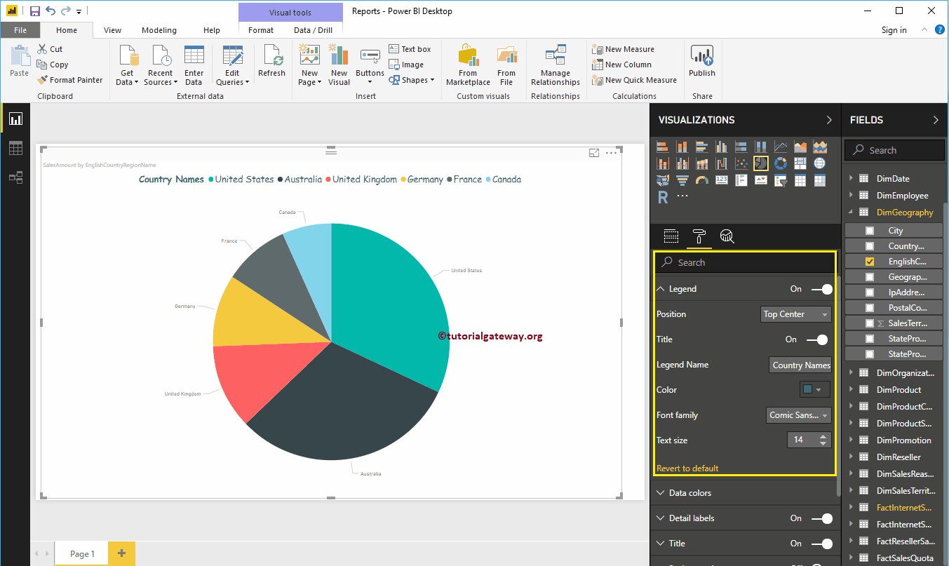
Format Data Colors of a Power BI Pie Chart
Data Colors means changing the Slice Colors. Use this section to change the default slice colors to the required ones.
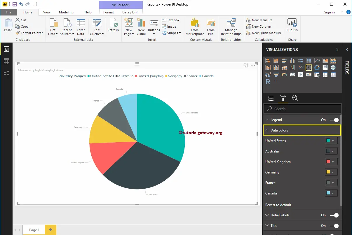
For the demonstration purpose, we changed the France Color to Violet.
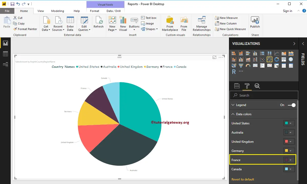
Format Detail labels of a Power BI Pie Chart
Detail labels also called data labels. Use this section to format the slice information
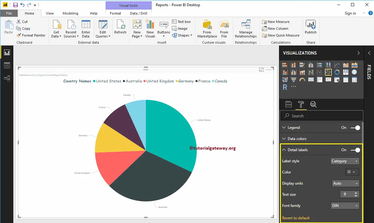
Label Style: By default, it displays the Category (Column Value) as the Label. Here we are changing it to All details labels. It means each slice shows the information about the Filed Name, Sales Amount, and the Percentage of Total.
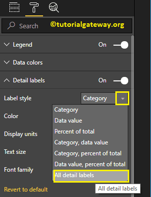
Let me change the Color of a Label to Green. You can also change the Display Units from Auto to Millions or Trillions.
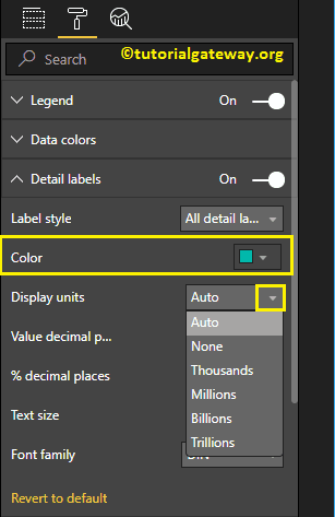
We changed the Decimal Values for Amount and Percentage of Total to 2, Font family to Comic Sans, and Text size to 12
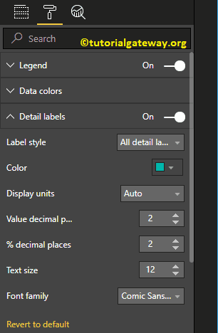
From the screenshot below, you can see all the changes that we made so far.
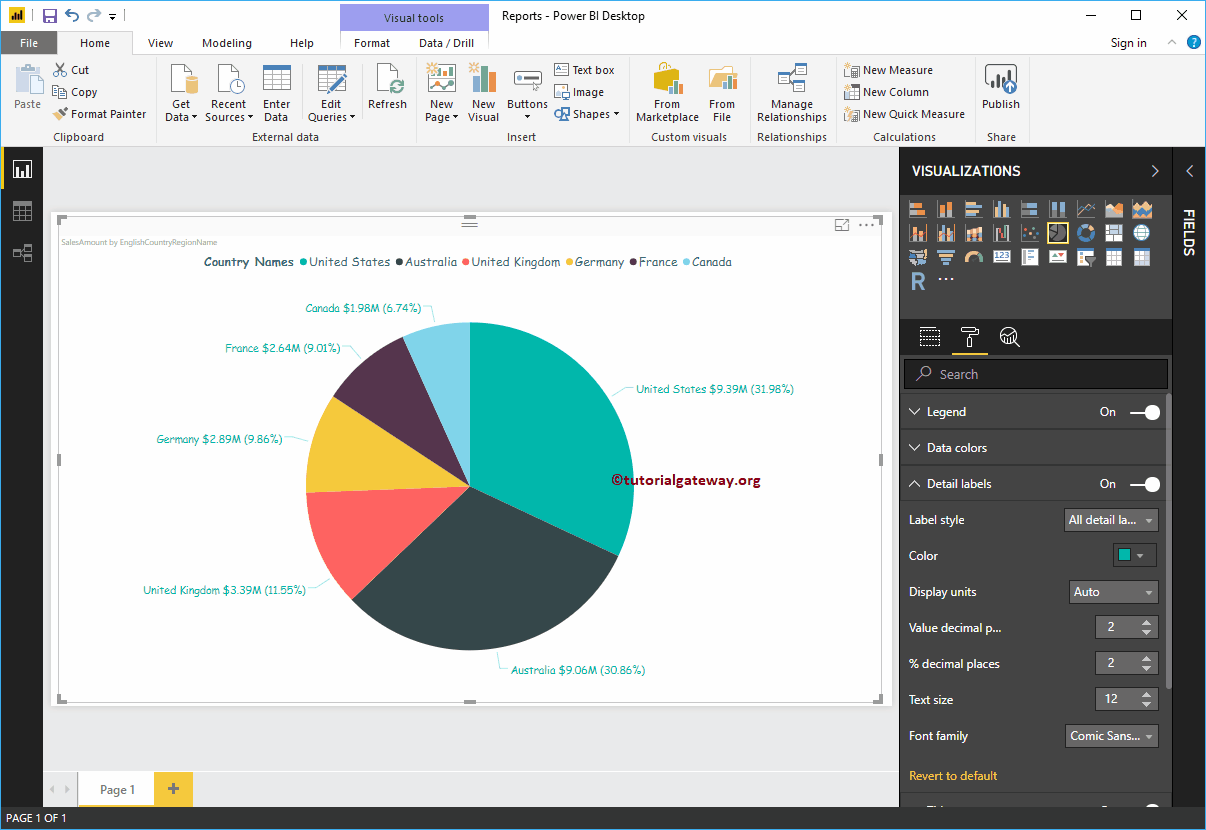
Format Title of a Power Bi Pie Chart
To display the Pie Chart Title, Please select the Title, and change the option from Off to On.
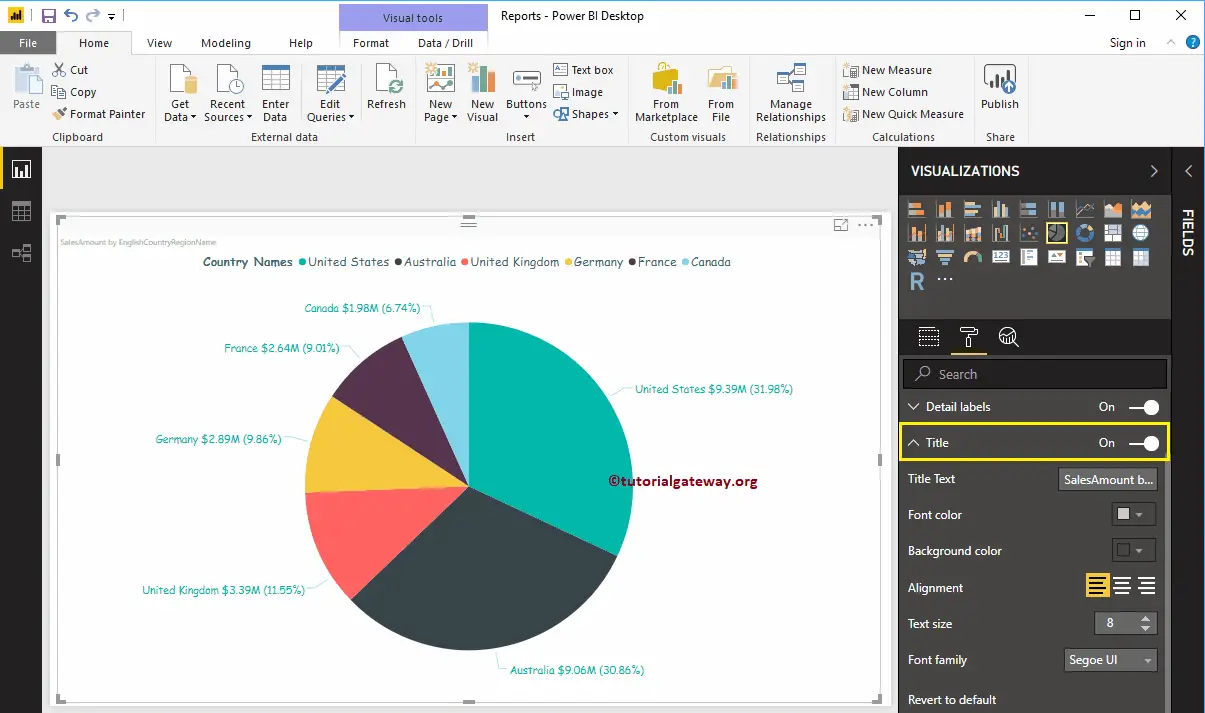
As you can see from the below screenshot, we change the Title Text, Color, Font style, Font Size, and Title Alignment to center
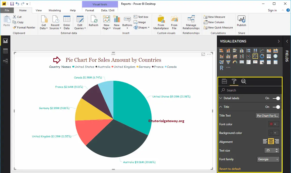
Add Background Color to Pie Chart in Power BI
By toggling the Background option to On, it allows you to add the Background color to Pie Chart. For the demonstration purpose, we are adding a background color. Here, you can change the Transparency percentage as well.
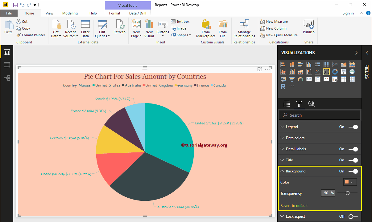
Add Border Colors to Pie Chart in Power BI
By toggling the Border option to On allows you to add Borders to Pie Chart. For the demonstration purpose, we are adding Green color as the Border color.
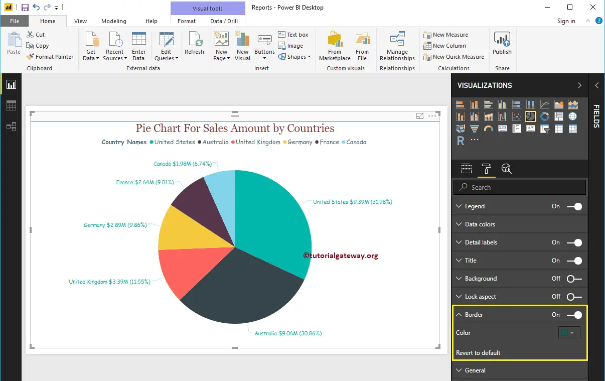
Use the General Section to Change the X, Y position, and Width and height of a Pie Chart
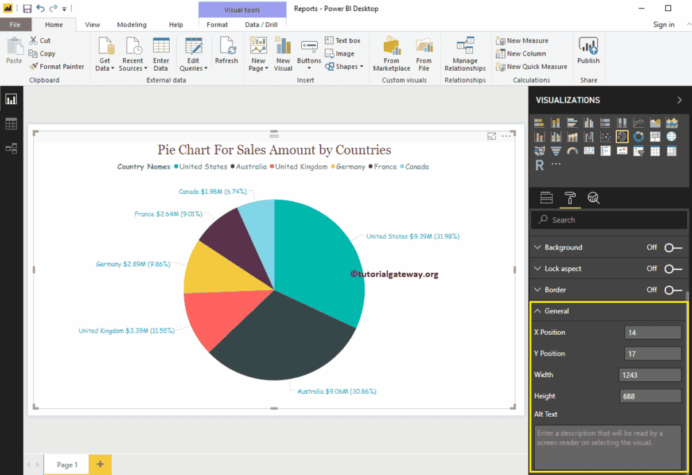
Create a Ribbon Chart in Power BI
Power BI Ribbon Chart is useful to quickly identify which categorical data has the highest rank (large values). Let me show you how to Create a Ribbon Chart in Power BI with example.
For this Power BI Ribbon Chart demonstration, we are going to use the SQL Data Source that we created in our previous article. So, Please refer to Connect Power BI to SQL Server article to understand the Power BI Data Source.
How to Create a Ribbon Chart in Power BI
To create a Ribbon Chart in Power BI, first Drag and Drop the Sales Amount from Fields section to the Canvas region. It automatically creates a Column Chart, as we showed in the below screenshot.
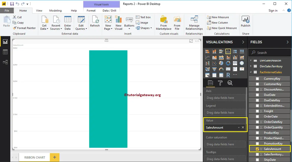
Next, let me add the English Country Region Name to the Axis section. You can do this by dragging Country Region Name to Axis section, or simply checkmark the Country column. It will automatically create a Column Chart for you.
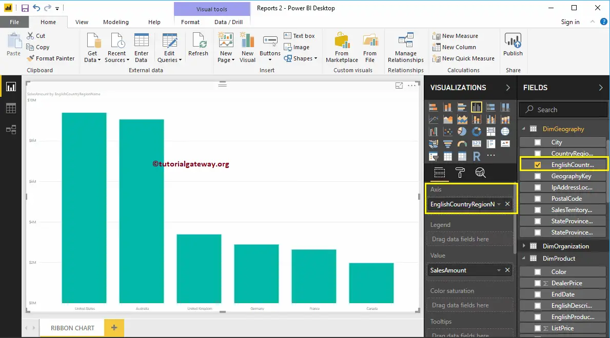
Next, add Product Color from DimProduct table to the Legend section.
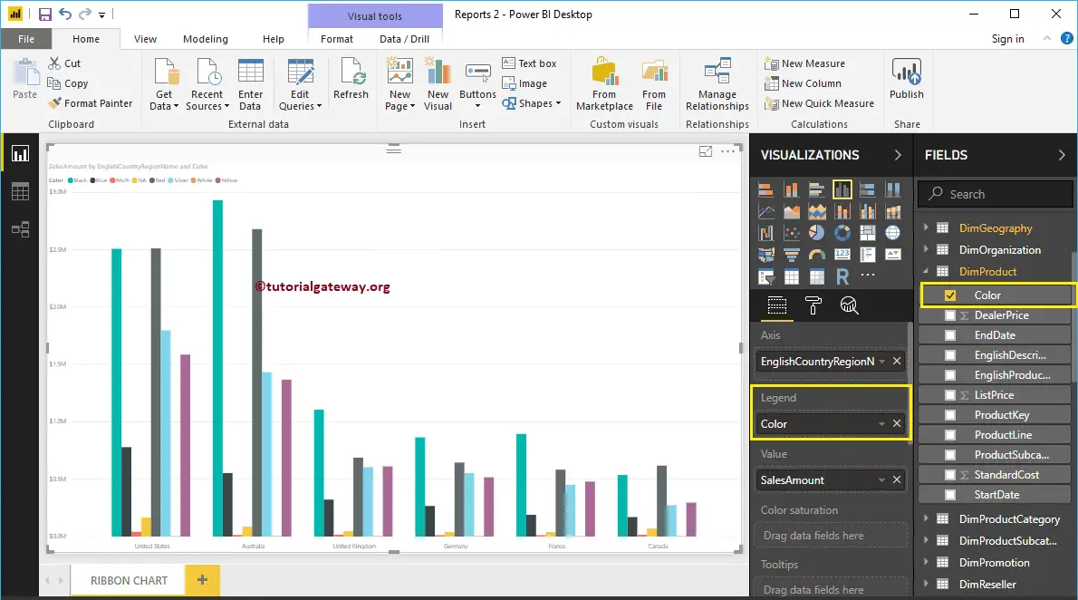
By clicking the Ribbon Chart under the Visualization section, it will convert the Clustered Column Chart into Ribbon Chart. From the screenshot below, you can see the Ribbon Chart that shows the Sales by Country and Color.
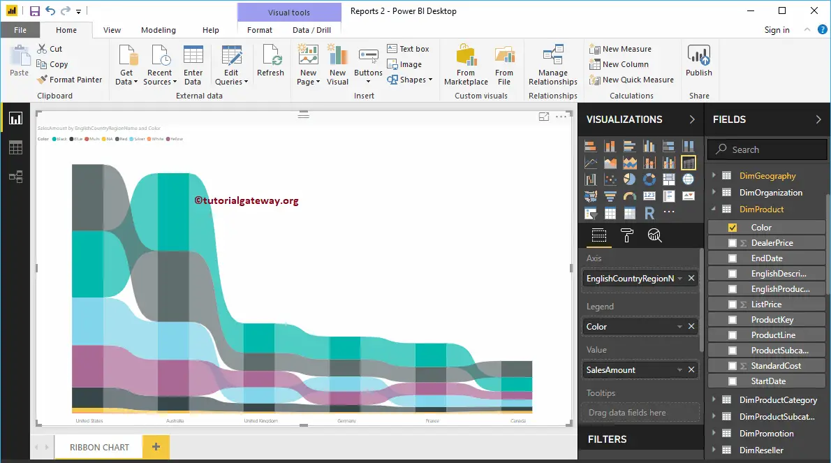
Create a Ribbon Chart in Power BI Approach 2
First, click on the Ribbon Chart under the Visualization section. It will create a Ribbon Chart with dummy data, as shown in the below screenshot.
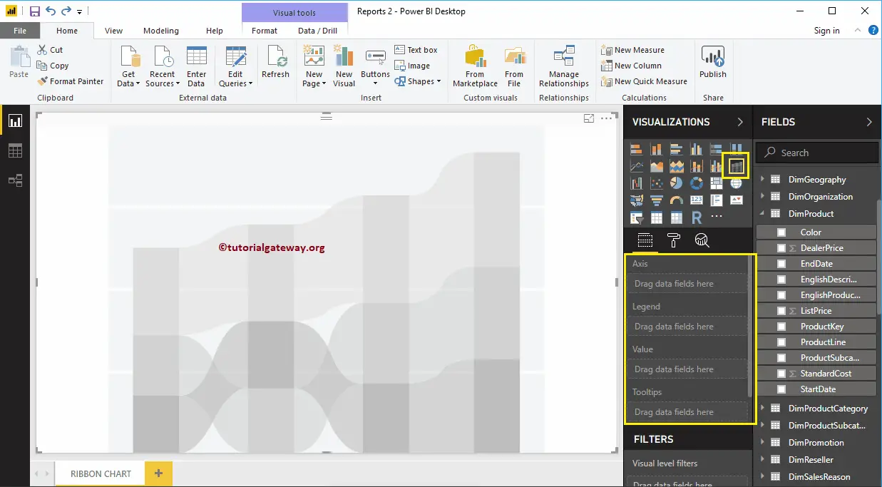
Let me drag the Sales Amount from Fields section to Values field and English Country Region Name from Dim Geography to Axis Field.
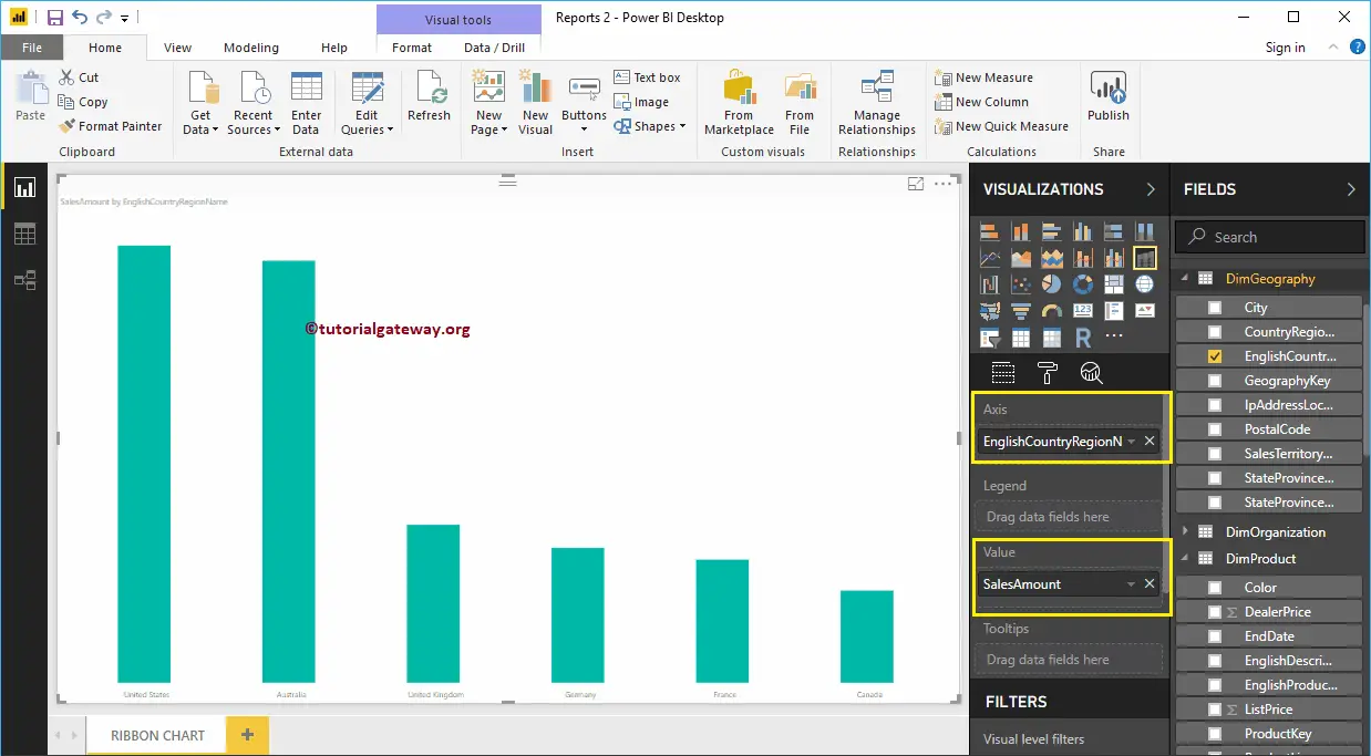
Next, add Product Color to the Legend section.
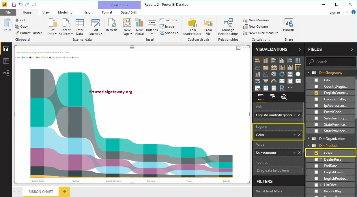
Let me sort the data by English Country Name (By default, it is sorted by Sales Amount). To do this, click on the … (3 dots) on the top right corner, and select the Sort By English Country Region Name option as we showed below.
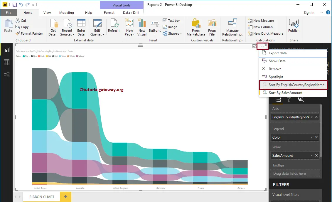
Now you can see the proper Power BI Ribbon Chart
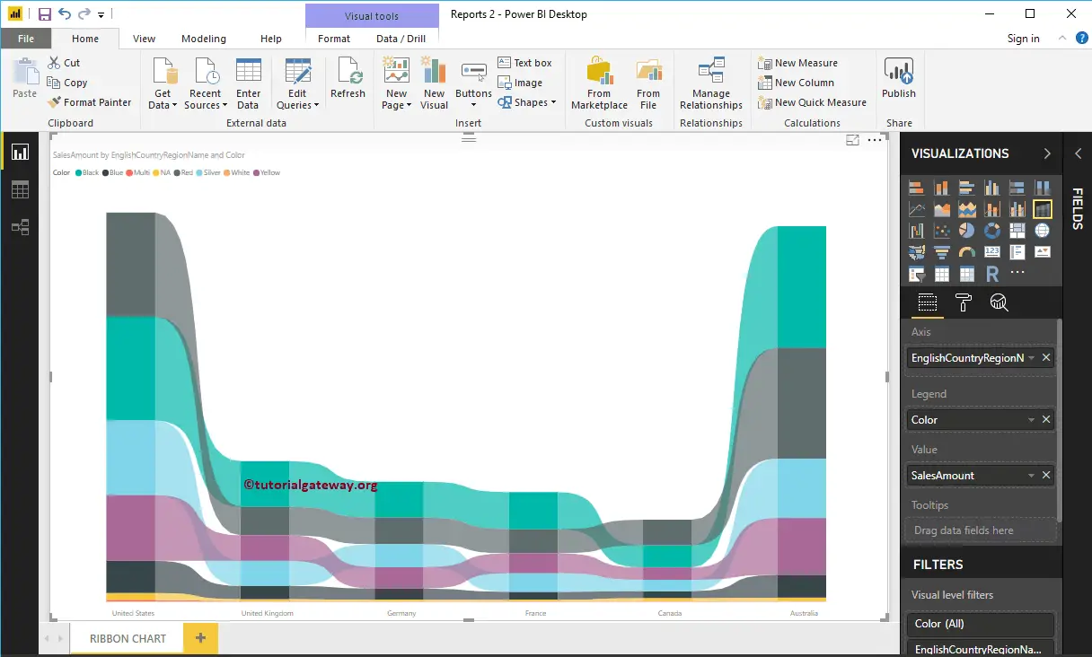
Hover over any bar shows the Tool-tip of Country Name, Product Color, and Sales Amount
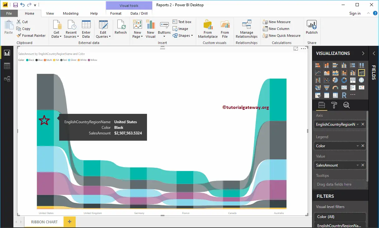
Hover over any position in-between the two bars will show you the Tool-tip of Previous Country Sales, Next Country Sales, Difference in percentage, and the Rank between those two countries in this case
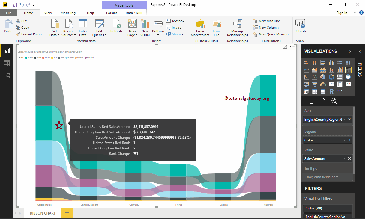
Let me do some quick formatting to this Power BI Ribbon Chart
NOTE: I suggest you refer to the Format Ribbon Chart article to understand the steps involved in formatting these Ribbons, background colors, data labels, etc.
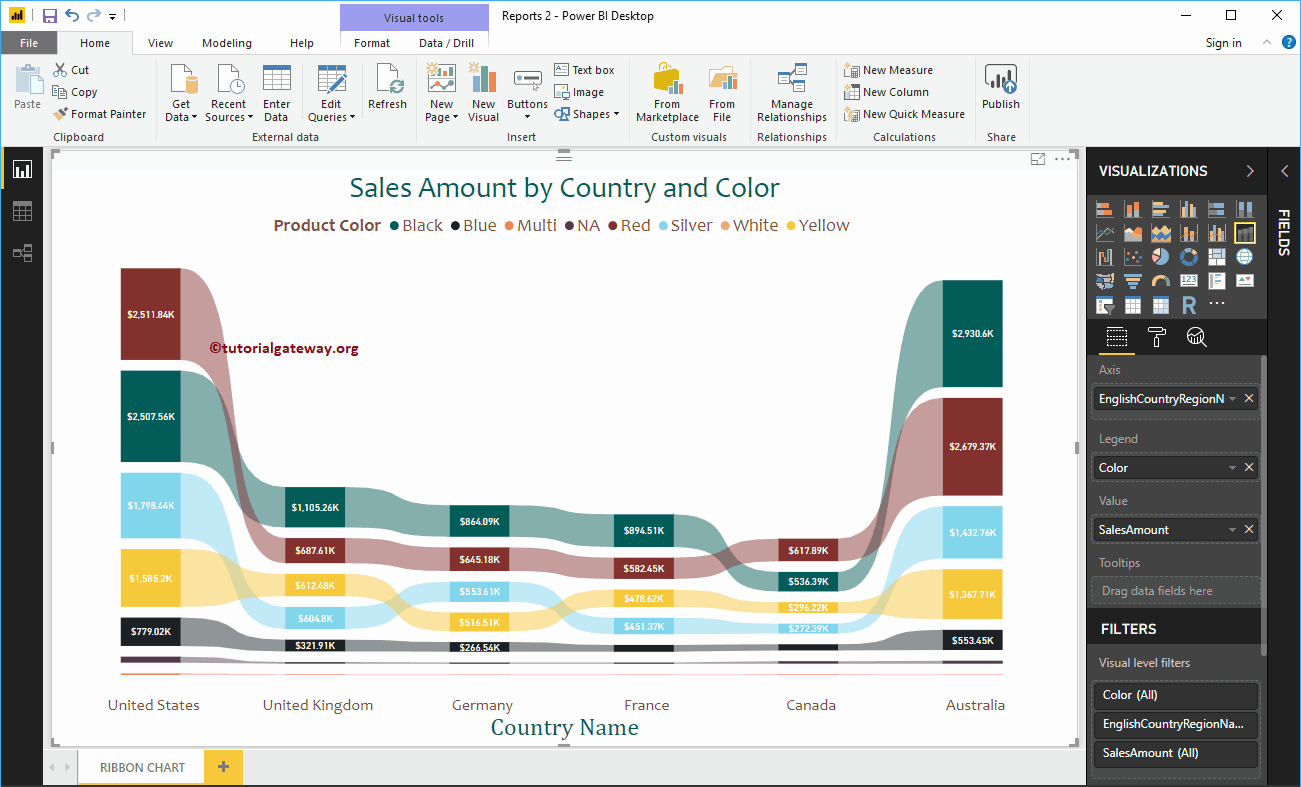
Format Power BI Ribbon Chart
How to Format Power BI Ribbon Chart with an example?. Formatting Power BI Ribbon Chart includes changing the Ribbon Colors, Ribbon Chart Title text, Title position, etc.
To demonstrate the Power BI Ribbon Chart formatting options, we are going to use the Ribbon Chart that we created earlier. Please refer Ribbon Chart in Power BI article to understand the steps involved in creating a Power BI Ribbon chart.
How to Format Power BI Ribbon Chart
Please click on the Format button to see the list of formatting options that are available for this ribbon Chart.
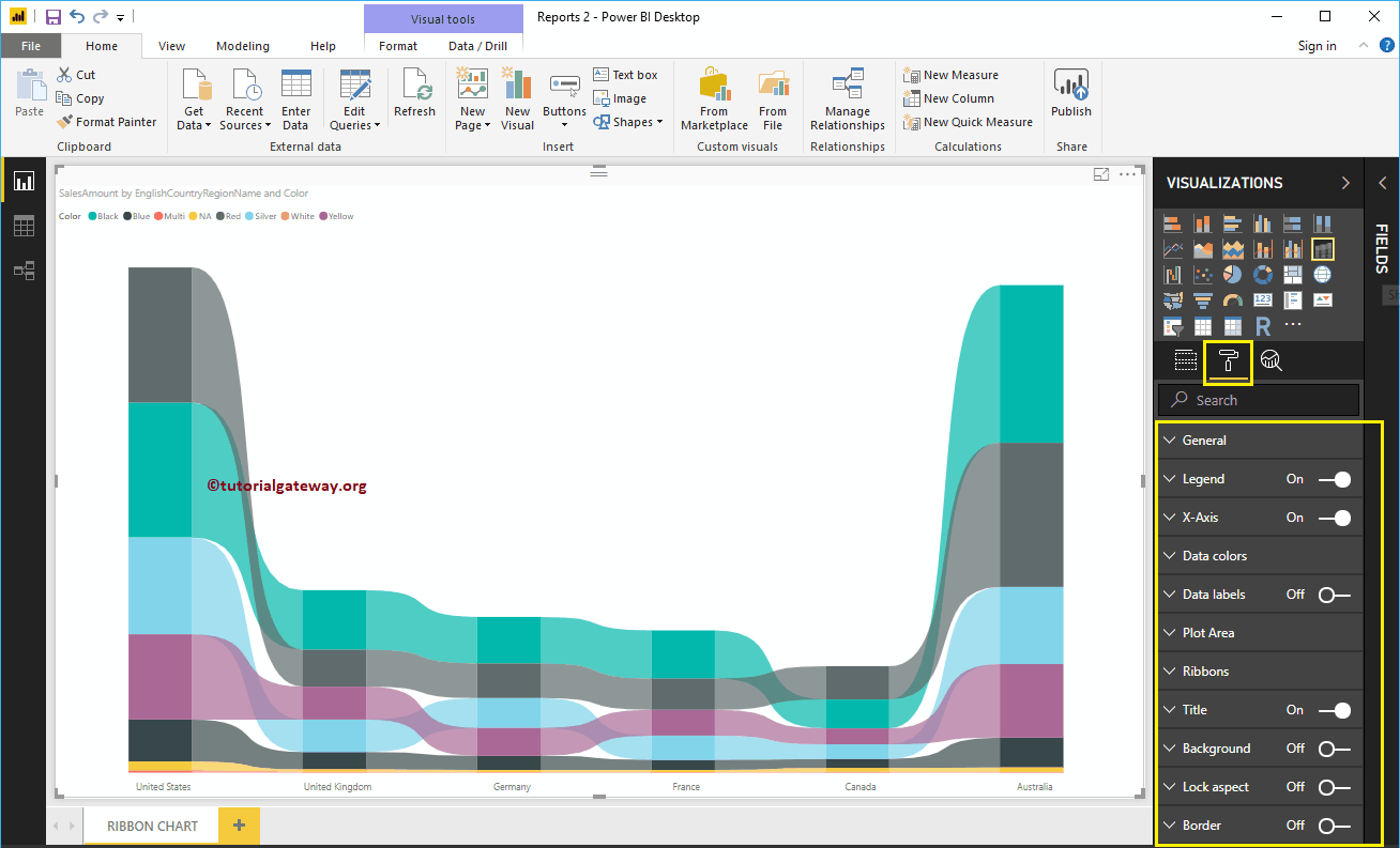
Format Ribbon Chart General Settings
Use this General Section to Change the X, Y position, Width, and height of a Ribbon Chart
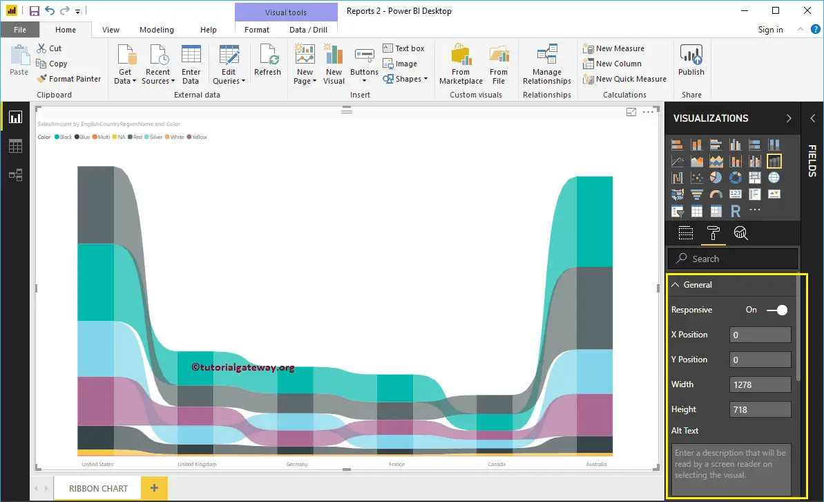
Format Power BI Ribbon Chart Legend
To display or enable the Legend, Please select the Legend region and toggle the option from Off to On.
As you can see from the screenshot below, we changed the Legend Title as Product Color, Legend Position as Top Center. We also changed the Color to Brown, Font family to Candara, and text size to 17.
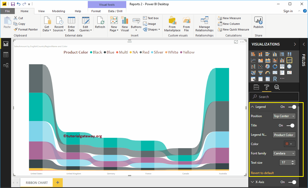
Format X-Axis of a Ribbon Chart in Power BI
The following are the list of options that are available for you to format the Ribbon Chart Horizontal axis or X-Axis. As you can see from the below screenshot, we change the Color to Brown, Font style to Candara, Text Size to 20.
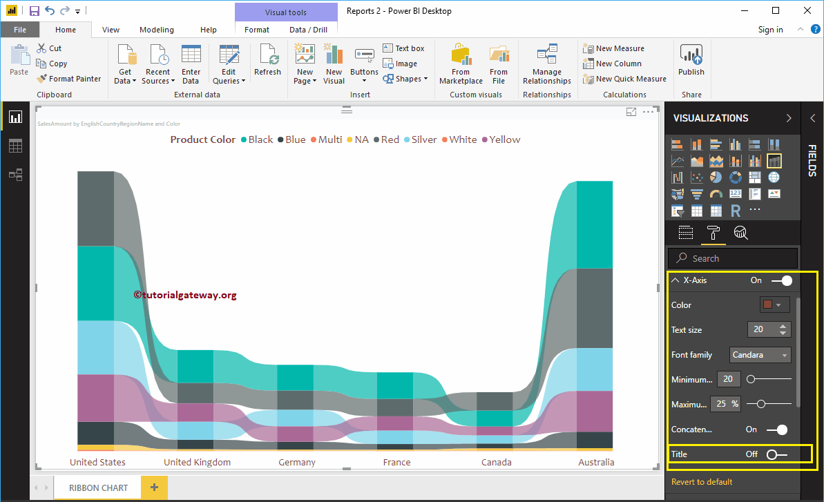
By default, Ribbon chart X-Axis title set to Off, but you can enable it by toggling Title to On. Let me change the Title Color to Green, Font style to Cambria, and Text Size to 30.
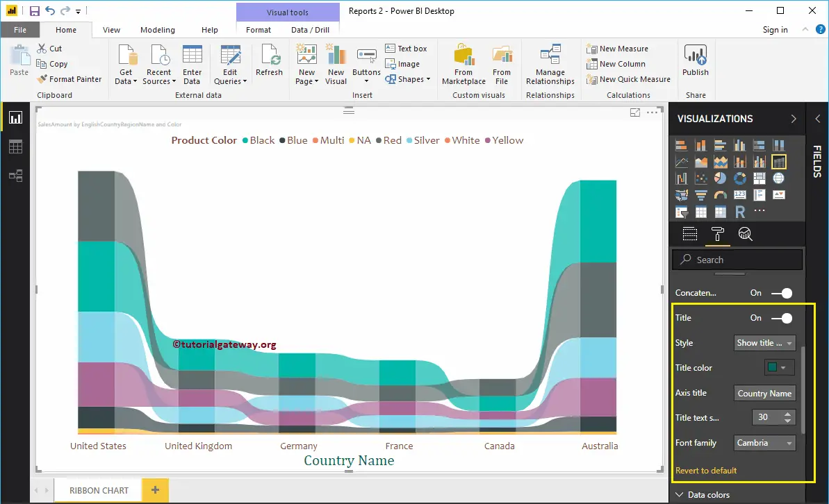
Format Ribbon Chart Data Colors
By default, the Ribbon chart will pick default colors for all the ribbons. But, you can change them as per your requirements.
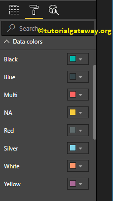
Let me change a few ribbon colors to show you the difference.
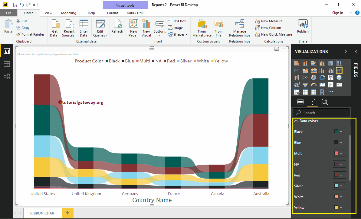
Format Data Labels of a Ribbon Chart in Power BI
Ribbon Chart Data Labels display the Metric Value (Sales Amount at each group) within a bar. As you can see from the screenshot below, we enabled data labels for this ribbon chart and changed the color to white.
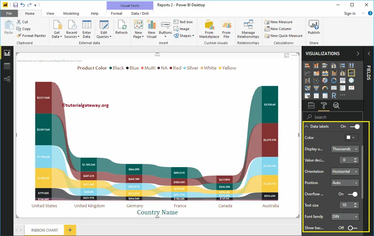
Format Ribbon Chart Plot Area
Using this Plot Area property, you can add custom Images as the Background of the Ribbon Chart. For the demonstration purpose, we added one image as the Plot Area Background.
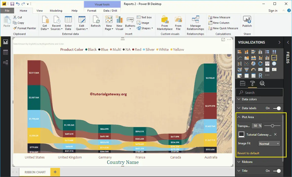
Format Power BI Ribbon Chart Ribbons
The following are the list of options that are available for you to format the Ribbons.
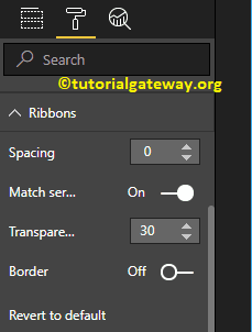
From the screenshot below, you can see, we changed the spacing property to 10 (space between each ribbon) and Transparency to 52% (ribbon space between bars or in-between countries).
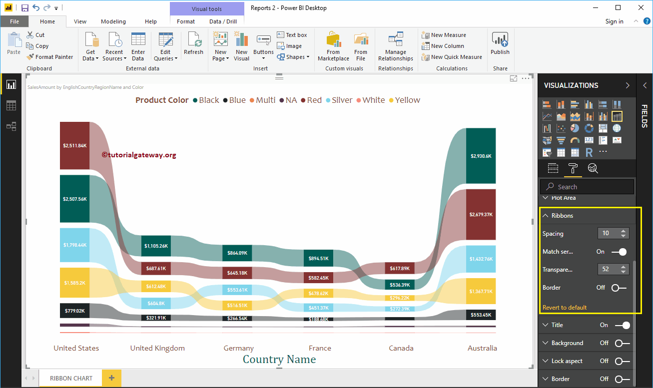
Power BI Ribbon Chart Title
Use this section to format the Ribbon Chart title as per your requirements.
As you can see from the screenshot below, we change the Title Text to Sale Amount by Country and Color. Next, we changed the Font Color to Green, Font Family to Candara, Font Size to 27, and Title Alignment to center. If you want, you can add the background color to the title as well.
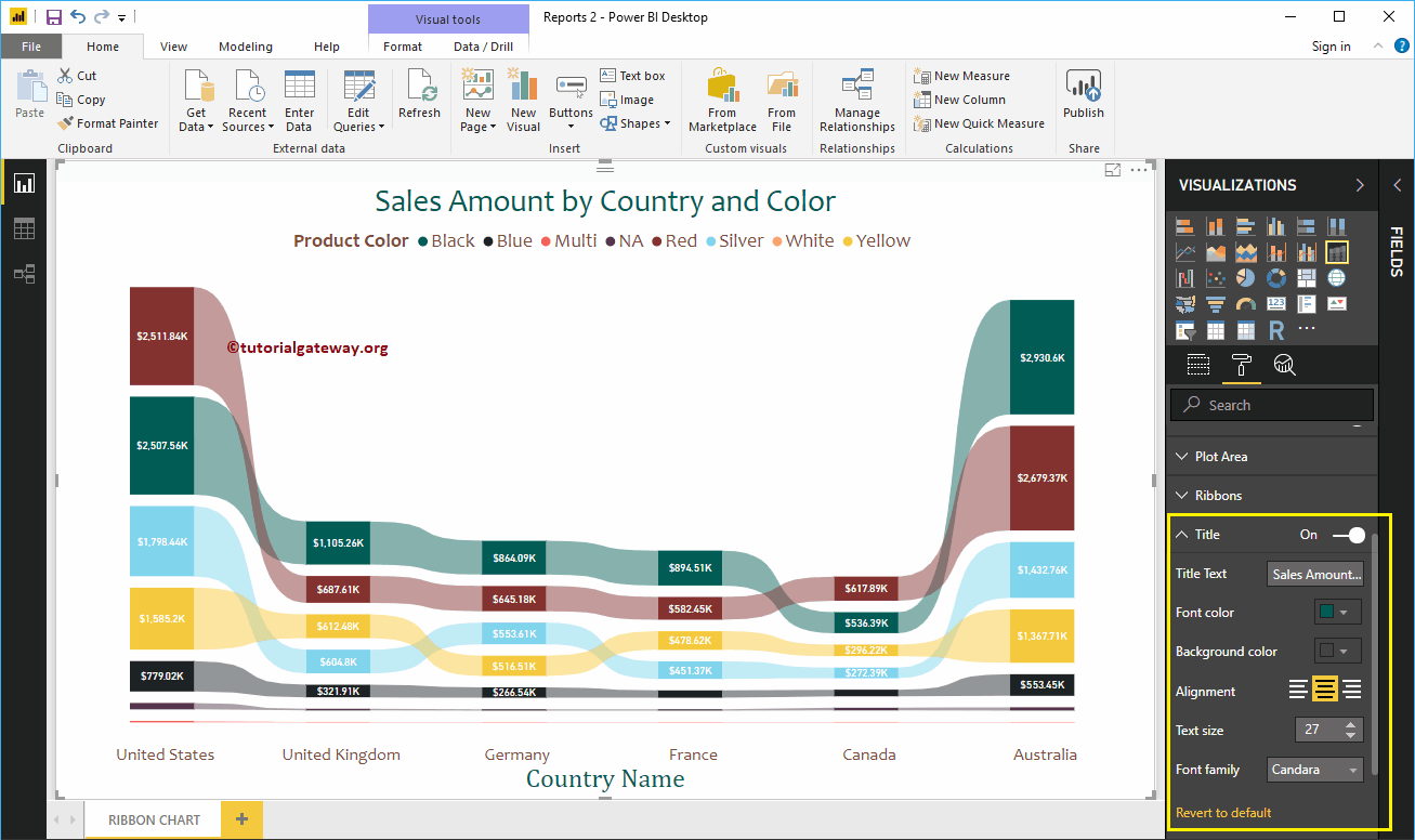
Format Ribbon Chart in Power BI Background Color and Border
You can add the Background color to a Ribbon Chart by toggling Background option to On. For the Ribbon Chart demonstration purpose, we added a light yellow color with 38% transparency.
Similarly, you can add Borders to a Ribbon Chart by toggling the Border option from Off to On.
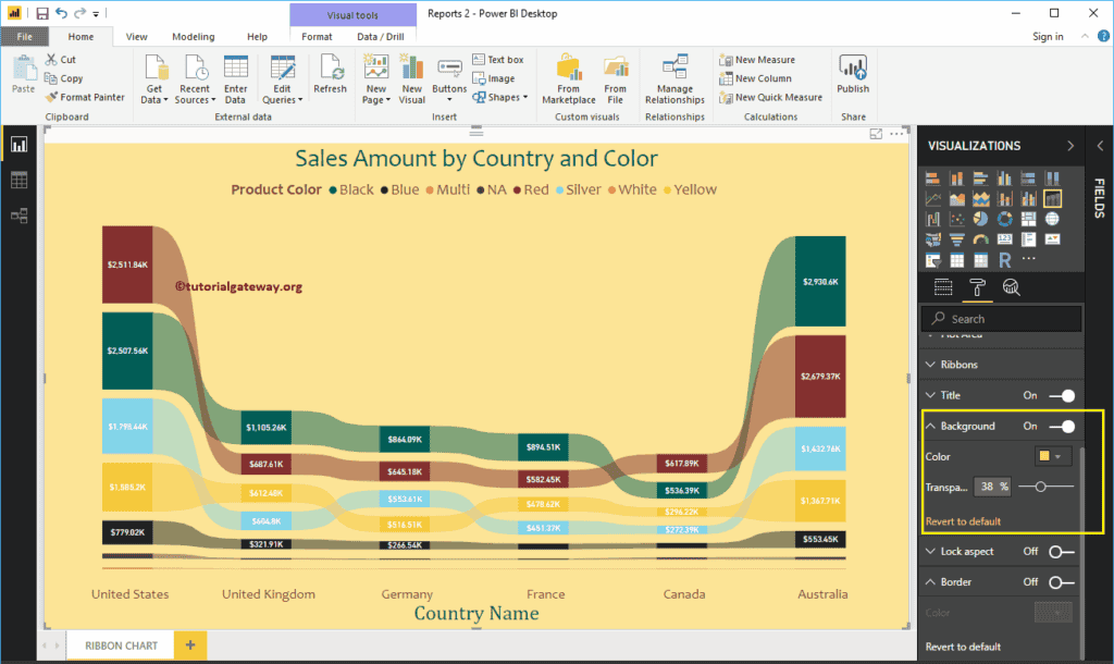
Stacked Area Chart in Power BI
How to Create a Stacked Area Chart in Power BI with example?. For this Power BI Stacked Area Chart demonstration, we are going to use the SQL Data Source that we created earlier.
Please refer to Connect Power BI to SQL Server article to understand the Power BI Data Source.
How to Create a Stacked Area Chart in Power BI
To create a Stacked Area Chart in Power BI, first Drag and Drop the Sales Amount from Fields section to Canvas region. It automatically creates a Column Chart, as we have shown below.
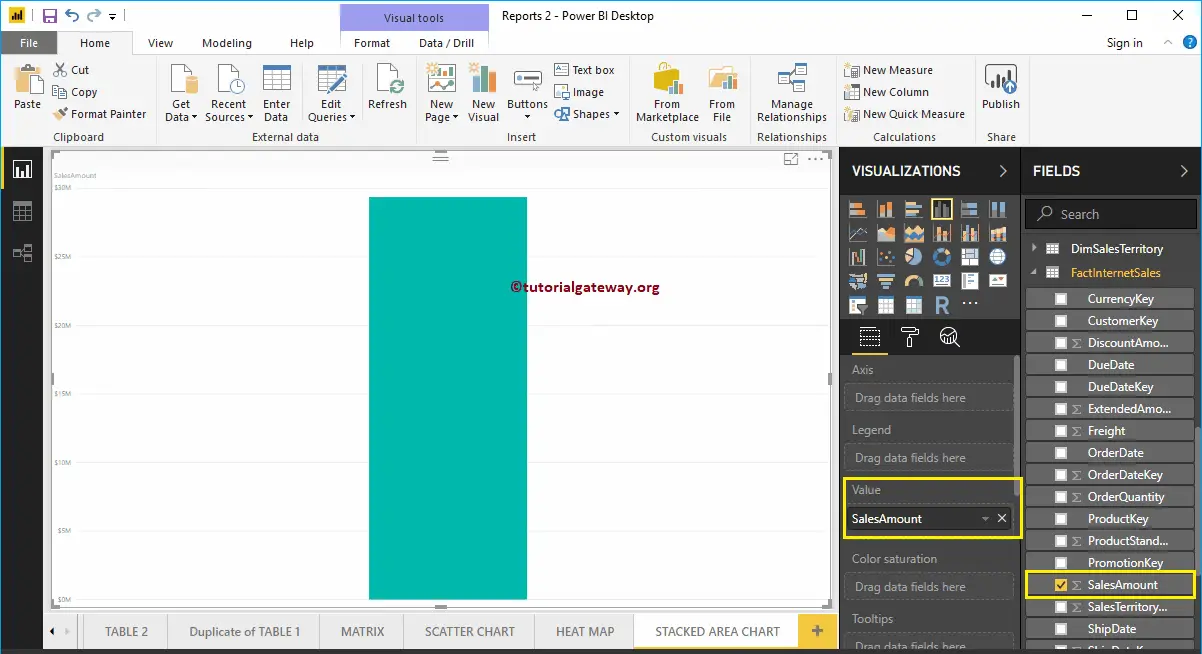
Next, let me add the State Province Name to the Axis section.
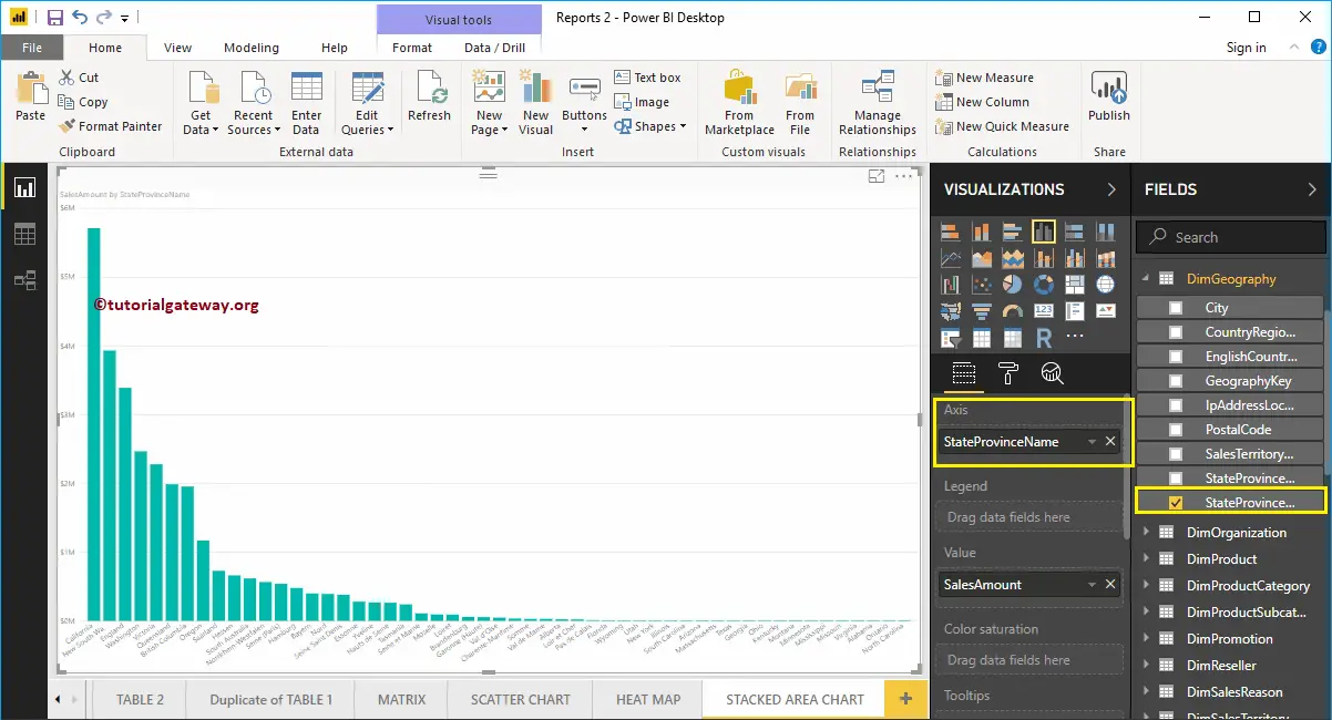
Click on the Stacked Area Chart under the Visualization section. It automatically converts the Column Chart into a Stacked Area Chart. From the screenshot below, you can see the Stacked Area Chart that shows the Sales Amount by State Province Name.
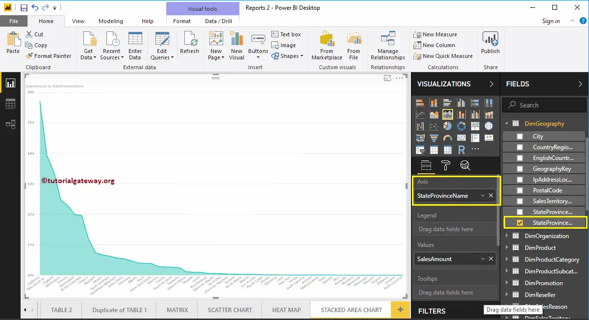
Let me add the Total Product Cost to Values as well. By this, you can compare the Sales Vs Product Cost by State province name.
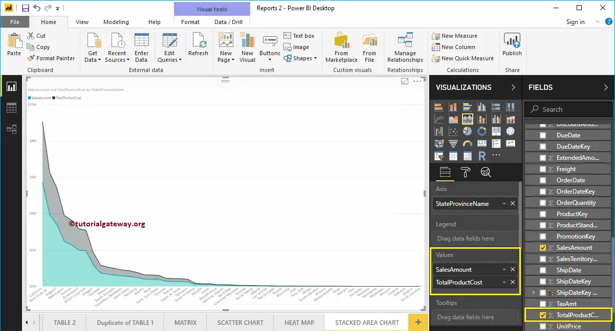
Create a Stacked Area Chart in Power BI – Approach 2
First, click on the Stacked Area Chart under the Visualization section. It automatically creates a Power BI Stacked Area Chart with dummy data, as shown in the below screenshot.
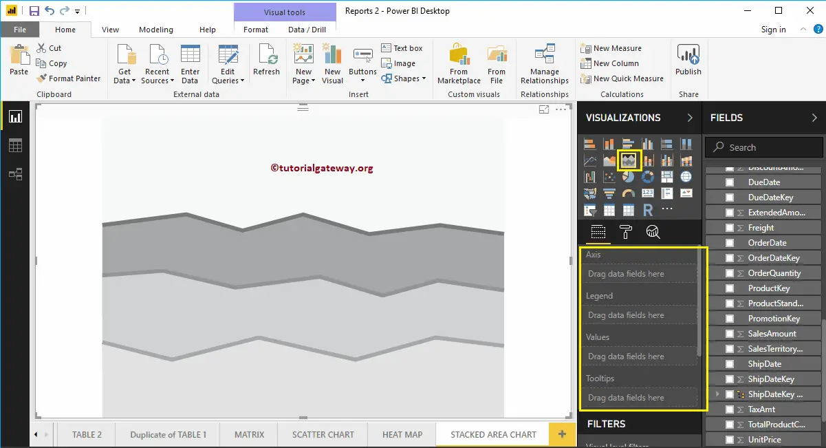
To add data to the Stacked Area Chart, we have to add the required fields:
- Axis: Please specify the Column Name that represents the Stacked Area.
- Legend: Column that divides the values further
- Values: Any Numeric value(s) such as sales amount, Order Quantity, Total Sales, etc.
Let me drag the Sales Amount and Total Product Cost from Fields section to Values field.
Next, let me add State Province Name to the Axis section. You can do this by dragging State Province to Axis section, or simply checkmark the State Province column.
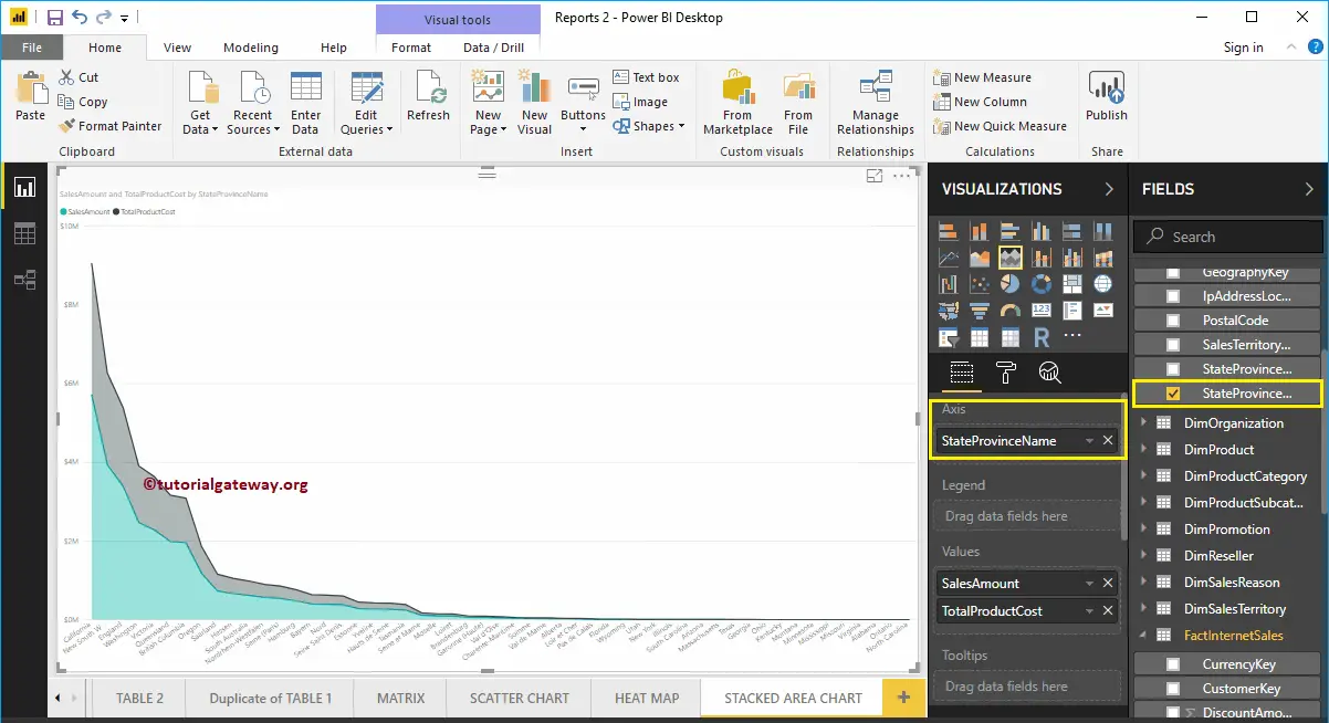
From the above screenshot, you can see that the Stacked area chart is sorted by Sales Amount in descending order. So, let me sort the data by the State Province Name. To do this, click on the … (3 dots) on the top right corner, and select the Sort By State Province Name option as we showed below.
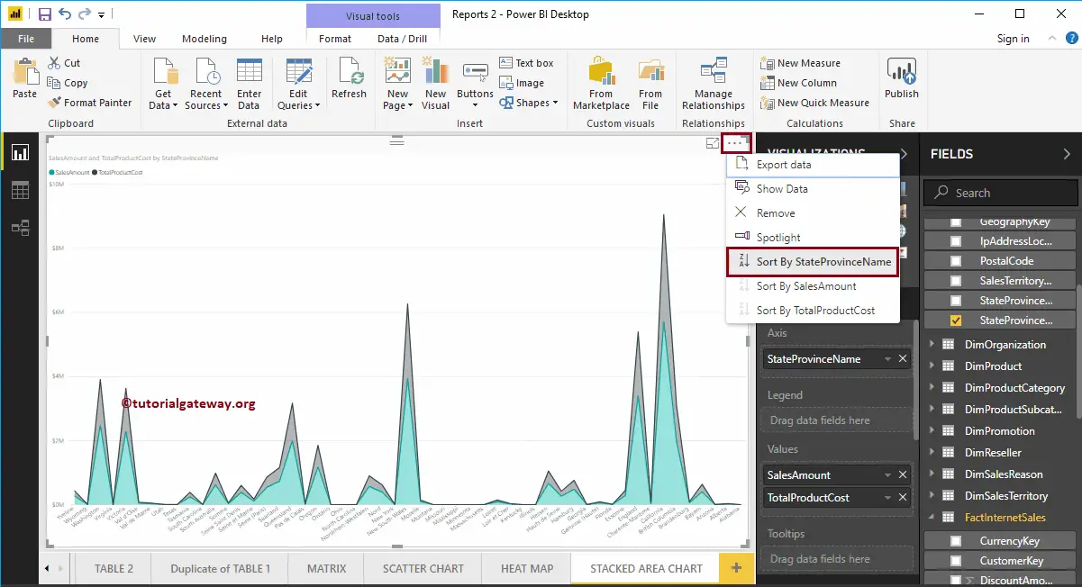
Let me do some quick formatting to this Power BI Stacked Area Chart.
NOTE: Formatting options for both Area Chart and Stacked Area Charts are the same. So, I suggest you refer to the Format Area Chart article to understand the steps involved in formatting this Stacked Area Chart.
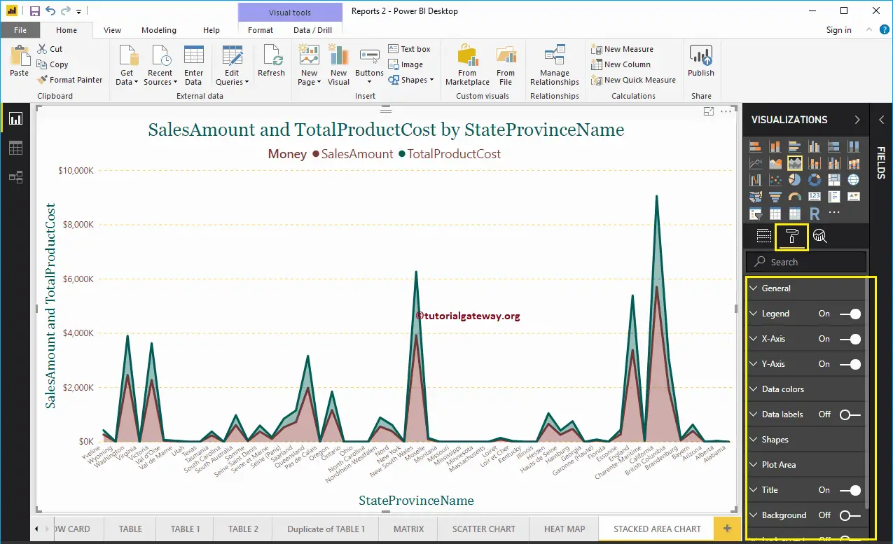
Let me add Product Color to the Legend section to show multiple dimensions.
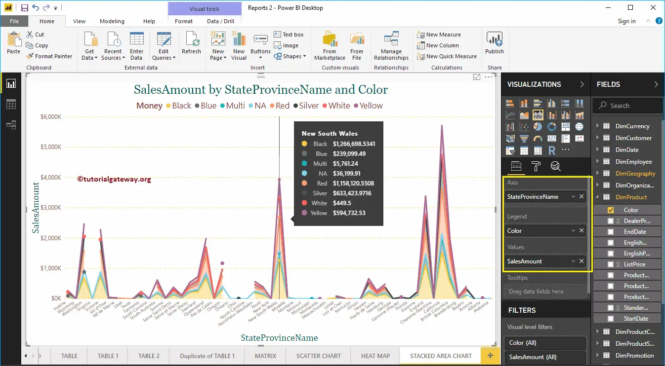
Format Power BI Area Chart
How to Format Power BI Area Chart with an example?. Formatting Power BI Area Chart includes changing the Area Colors, Chart Title text, Title position, X-Axis Details, Y-Axis details, Data labels, and Background Images, etc.
To demonstrate these Power BI Area Chart formatting options, we are going to use the Area Chart that we created earlier. Please refer Area Chart in Power BI article.
How to Format Power BI Area Chart
Please click on the Format button to see the list of formatting options that are available for this Area Chart.
Format Area Chart General Settings
Use this General Section to Change the X, Y position, Width, and height of an Area Chart
Format Legend of an Area Chart in Power BI
Please select the Power BI Legend region and toggle the option from Off to On to enable Legend.
As you can see from the screenshot below, we used the Position drop-down box to change the legend position to Top Center. And we also added the Legend Title as Money, Color to Brick Red, Font family to Candara, and text size to 15.
Format X-Axis of an Area Chart in Power BI
The following are the list of options that are available for you to format the Area Chart Horizontal axis or X-Axis. Here, we change the Color to Brown and Text Size to 12.
By default, the X-Axis title set to Off for the Area Chart, but you can enable it by toggling Title to On. Let me change the Title Color to Green, Font style to Cambria, and Font Size to 25.
Format Y-Axis of a Power BI Area Chart
As you can see, we changed the Y-Axis labels Color to Brown, Text Size to 15, and display units to thousands.
Let me change the Scale type to Log. From the below screenshot, you can see that it is displaying the Log scale.
By default, Area Chart Y-Axis title set to Off. But, you can enable it by toggling Title under the Y-Axis section to On. Let me change the Title Color to Green, Text Size to 25, and Font family Cambria.
By toggling the Area Chart Gridlines option from On to Off, you can disable the Gridlines.
- Color: You can change the Gridlines color.
- Stroke Width: Use this to change the Gridlines width.
- Line Style: Choose the line style such as Solid, dotted, and dashed.
Format Power BI Area Chart Data Colors
By default, the area chart fills the space between axis and line with default colors. Let me change the Sales Amount Line color to Green and Total Product Cost color to Red.
Format Data Labels of an Area Chart
Data Labels display the Values (Sales Amount and Total Product Cost at each point). As you can see from the below screenshot, we enabled data labels and changed the color to black.
Format Area Chart in Power BI Shapes
Use this section to change the Line Strokes, or marking shapes.
As you can see from the below screenshot, we changed the Stroke Width (Line width) to 4, marker Shape (joining Point Shape ) as Diamond, Marker size as 7, and marker color as cherry red.
Format Area Chart Plot Area
Using this Plot Area property, you can add custom Images as the Background of the Area Chart. For the demonstration purpose, we added one image as the Plot Area Background.
Format Power BI Area Chart Title
By toggling the Title option from On to Off, you can disable the Area Chart title.
From the below screenshot, you can see, we change the Title Text to Sale Amount and Total Product Cost by State Name. We also changed the Font Color to Green, Font Family to Georgia, Text Size to 25, and Title Alignment to center. If you want, you can add the background Color to the title as well.
Format Power BI Area Chart Background Color, and Borders
You can add the Background color to an Area Chart by toggling Background option to On. For the demonstration purpose, we added yellow color with 28% transparency.
Similarly, you can add Borders to an Area Chart by toggling the Border option from Off to On.
Scatter Chart in Power BI
Power BI Scatter Chart or Scatter plot is very useful to visualize the relationship between two sets of data. Let me show you how to Create a Scatter Chart in Power BI with example.
For this Power BI Scatter Chart demonstration, we are going to use the SQL Data Source that we created in our previous article. So, Please refer to Connect Power BI to SQL Server article to understand the Power BI Data Source.
How to Create a Scatter Chart in Power BI
To create a Scatter Chart in Power BI, first, Drag and Drop the Sales Amount from Fields section to Canvas region. It automatically creates a Column Chart, as we shown below.
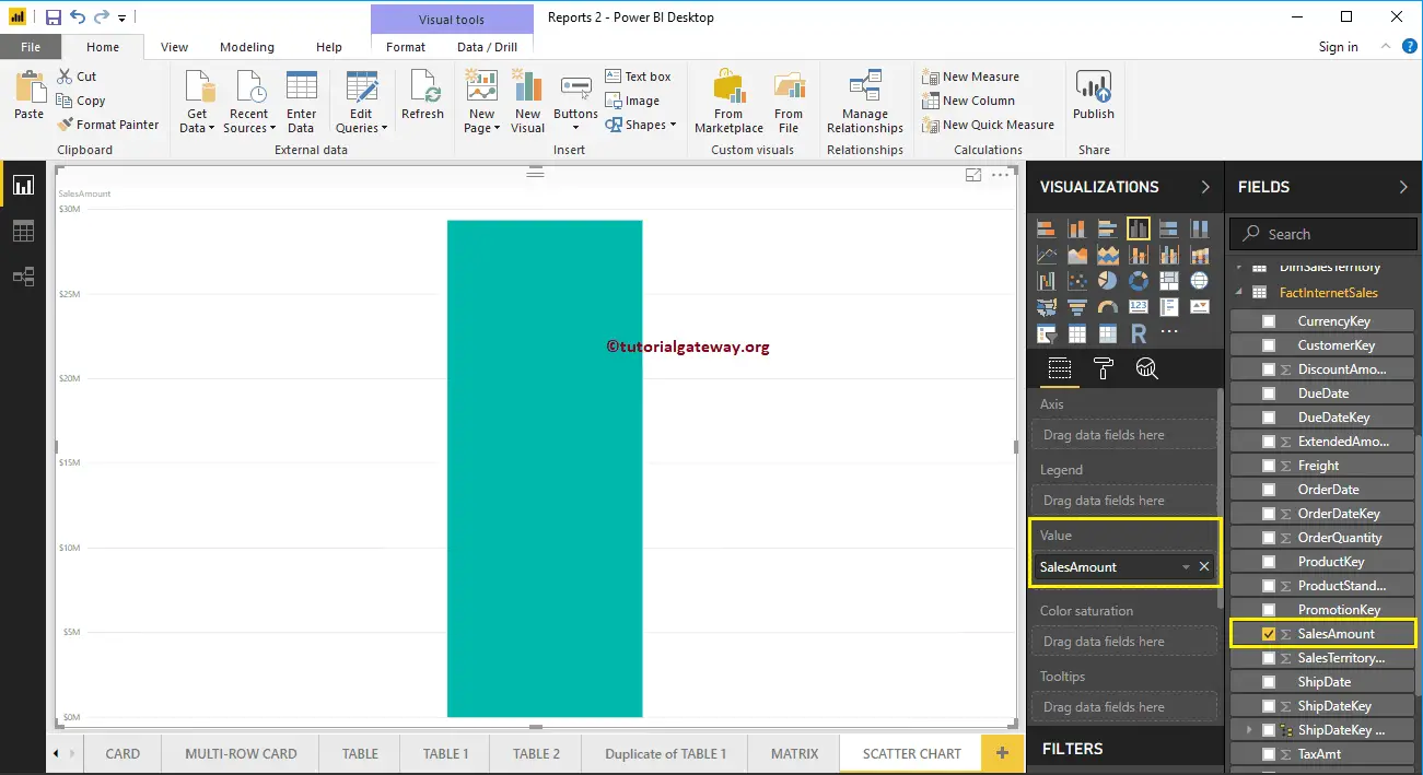
Click on the Scatter Chart under the Visualization section. It automatically converts a Column Chart into a Scatter Chart.
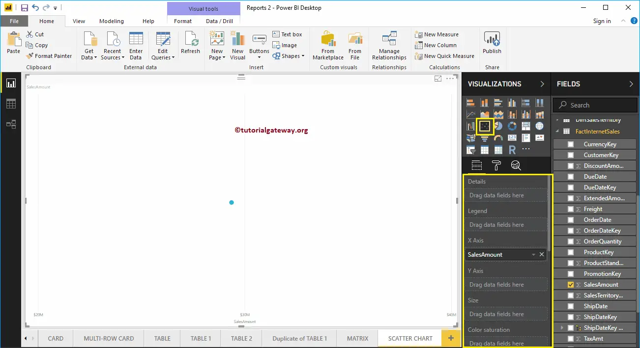
Let me add the Postal Code to the Details section.
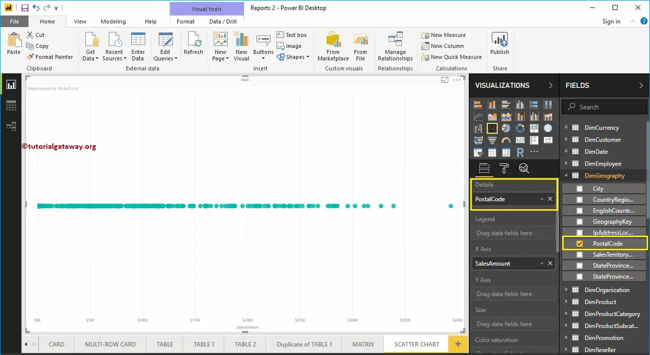
Next, we added the Order Quantity as the Y-Axis. Now you can see the proper Scatter Chart.
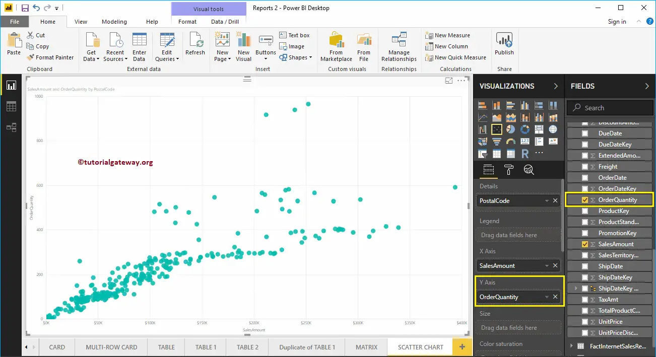
Let me do some quick formatting to this Power BI Scatter Chart
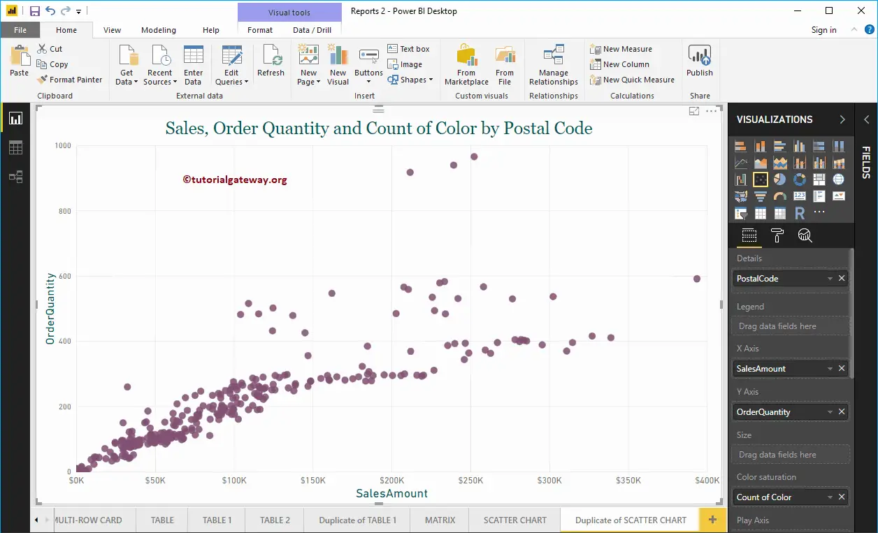
Create a Scatter Chart in Power BI Approach 2
First, click on the Scatter Chart under the Visualization section. It automatically creates a Scatter Chart with dummy data, as shown in the below screenshot.
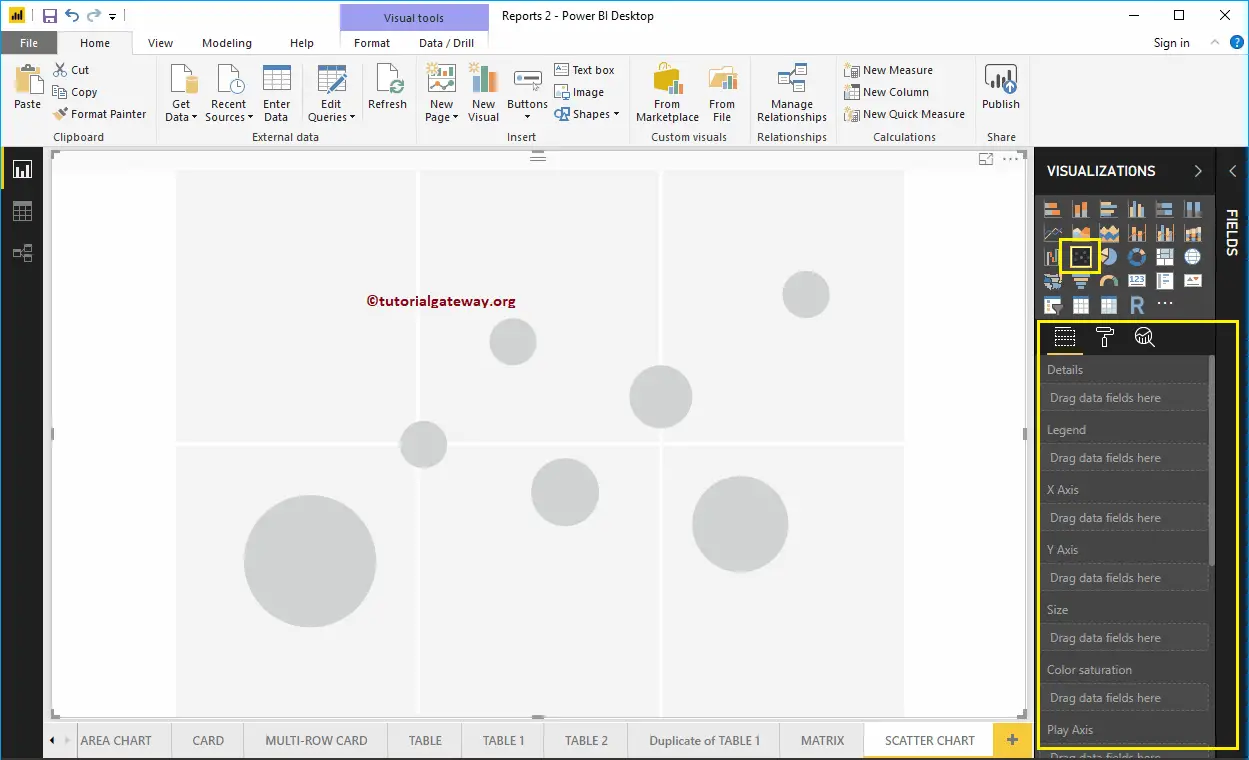
To add data to the Power BI Scatter Chart, we have to add the required fields:
- Details: Please specify the Column that represents the Bubbles.
- Legend: Specify the Column that sub-divide the Details data.
- X-Axis: Please specify the Column that represents the Horizontal Axis.
- Y-Axis: Column that represents the Vertical Axis.
- Size: Specify the Column that represents the Bubbles size.
- Color Saturation: Any Numeric value that decides the color of the bubbles.
Let me drag the Sales Amount from the Fields section to the X-Axis section, and Order Quantity to Y-Axis Section.
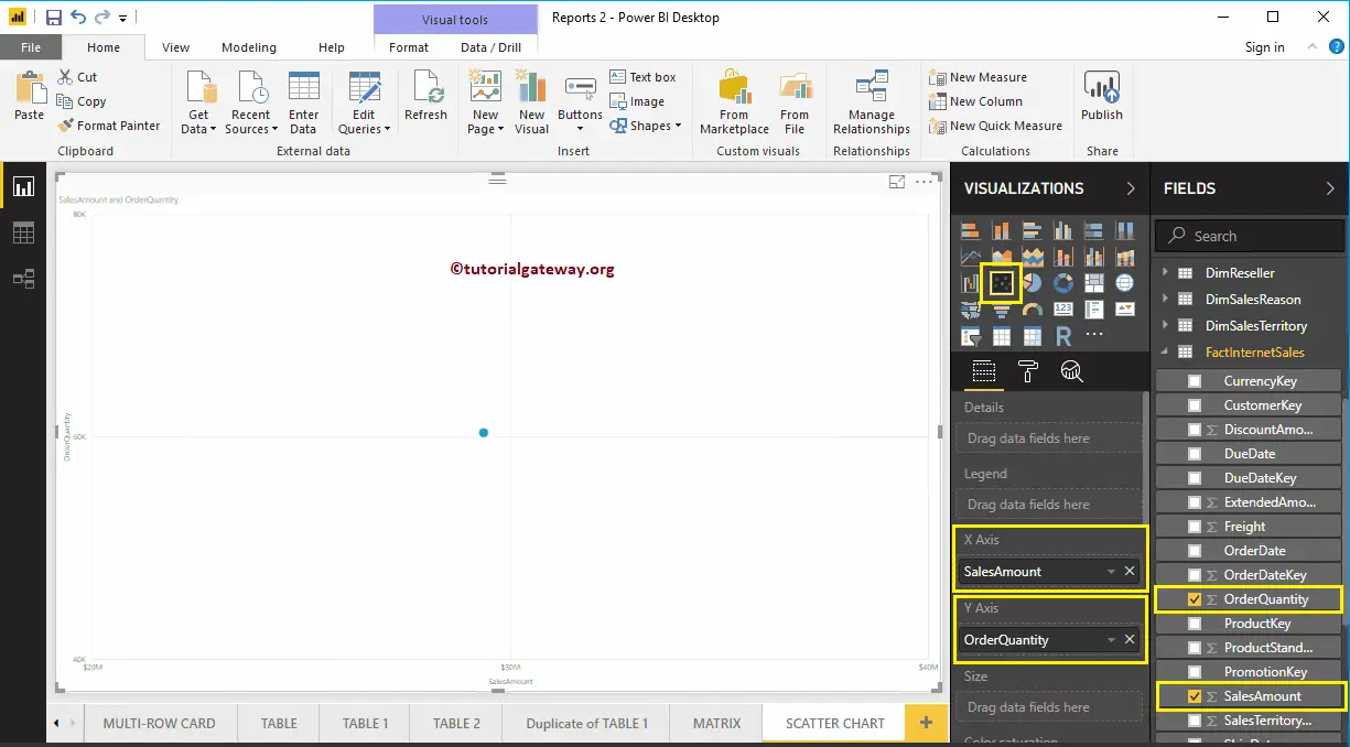
Next, let me add the English Country Region Name to Details section. You can do this by dragging Country to Details section, or simply checkmark the English Country Region Name column.
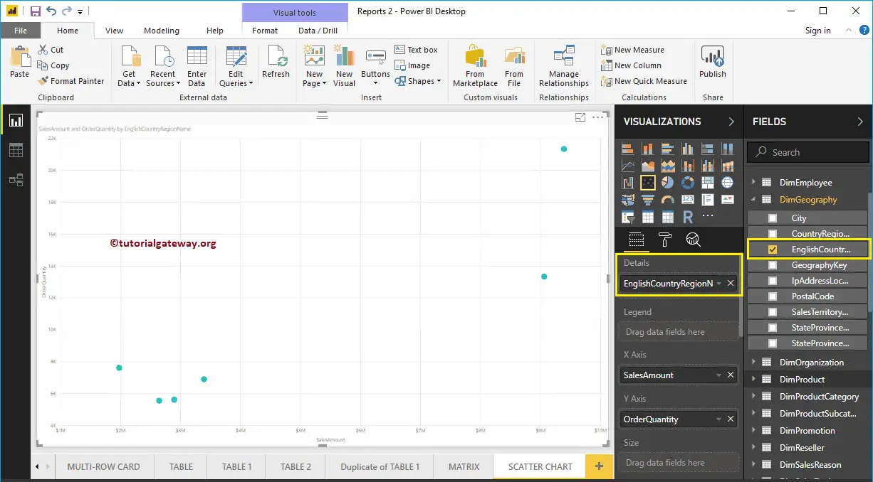
Let me add Customer English Occupation to the Legend section. Hover over any circle shows the information about the Country, Occupation, Sales Amount, and Total Product Cost.
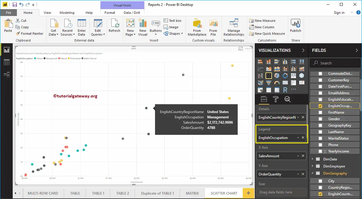
To demonstrate the Size section of a Power BI scatter chart, we removed the English Occupation from the Legend section. We added the Order Quantity to the Size section.
As you can see from the below screenshot, the size of the circle has changed as per the Order Quantity (number of orders)
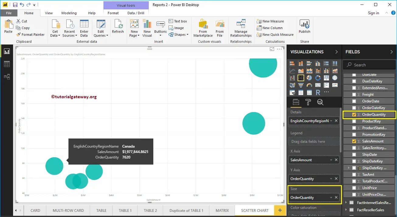
To demonstrate the Color Saturation section, we added the Sales Amount to the Color Saturation section. As you can see from the below screenshot, the color of each circle has changed as per the Sales Amount
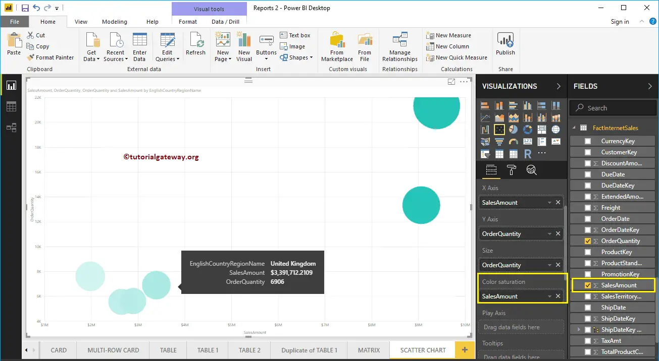
Let me do some quick formatting to this Power BI Scatter plot
NOTE: I suggest you refer to Format Scatter Chart article to understand the formatting options.
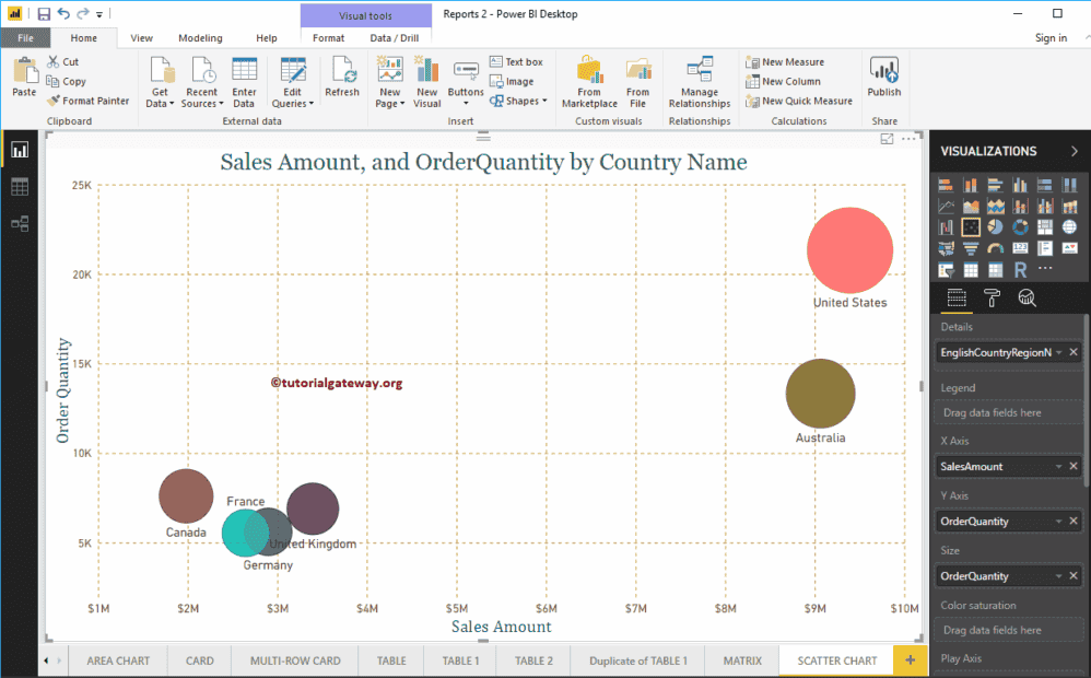
Format Power BI Scatter Chart
How to Format Power BI Scatter Chart with an example?. Formatting the Scatter chart includes changing the scatters (Circle Shapes), Colors, Scatter Chart Title text, Title position, X and Y-Axis Details, Data colors, and background Images, etc.
To demonstrate these Scatter chart formatting options, we are going to use the Scatter Chart that we created earlier. Please refer Scatter Chart in Power BI article to understand the steps involved in creating a Power BI Scatter Chart.
How to Format Power BI Scatter Chart
Please click on the Format button to see the list of formatting options that are available for this Scatter Chart.
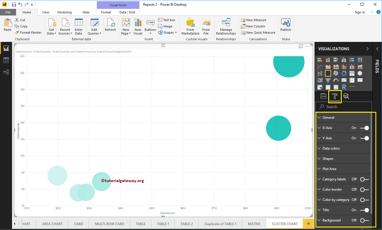
Format Power BI Scatter Chart General Settings
Use this General Section to Change the data volume, Chart Responsiveness, X, Y position, Width, and height of a Scatter Chart.
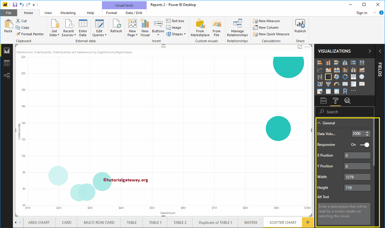
Format X-Axis of a Scatter Chart in Power BI
The following are the list of options that are available for you to format the Horizontal axis or X-Axis. Here, you can mention the Start and End Value.
As you can see from the screenshot below, we change the Color to Brown, Text Size to 19, and font family to DIN.
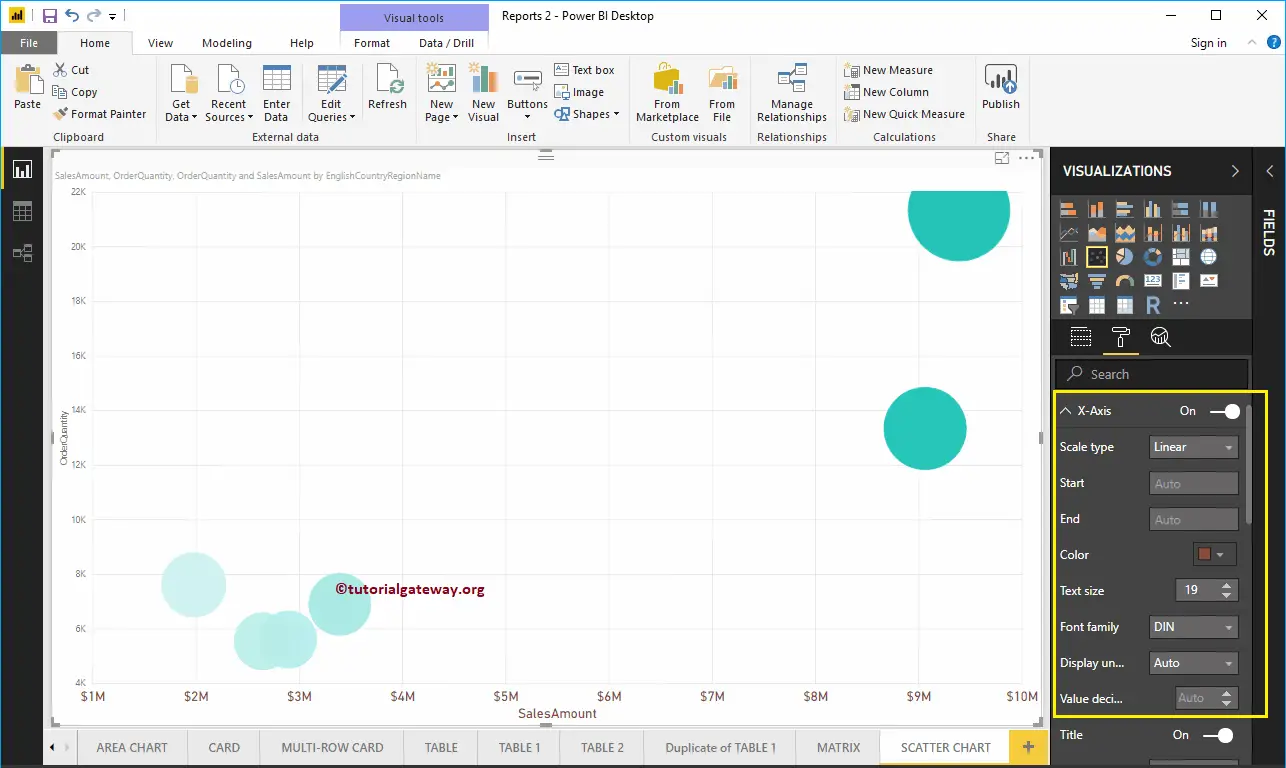
Let me change the Axis Title from SalesAmount to Sales Amount, Title Color to Green, Font style to Cambria, and Font Size to 25.
By toggling the Scatter Chart Gridlines option from On to Off, you can disable the Gridlines.
- Color: You can change the Gridlines color.
- Stroke Width: Use this to change the Gridlines width.
- Line Style: Choose the line style such as Solid, dotted, and dashed.
Here, we changed the color to gold, and line style to dashed.
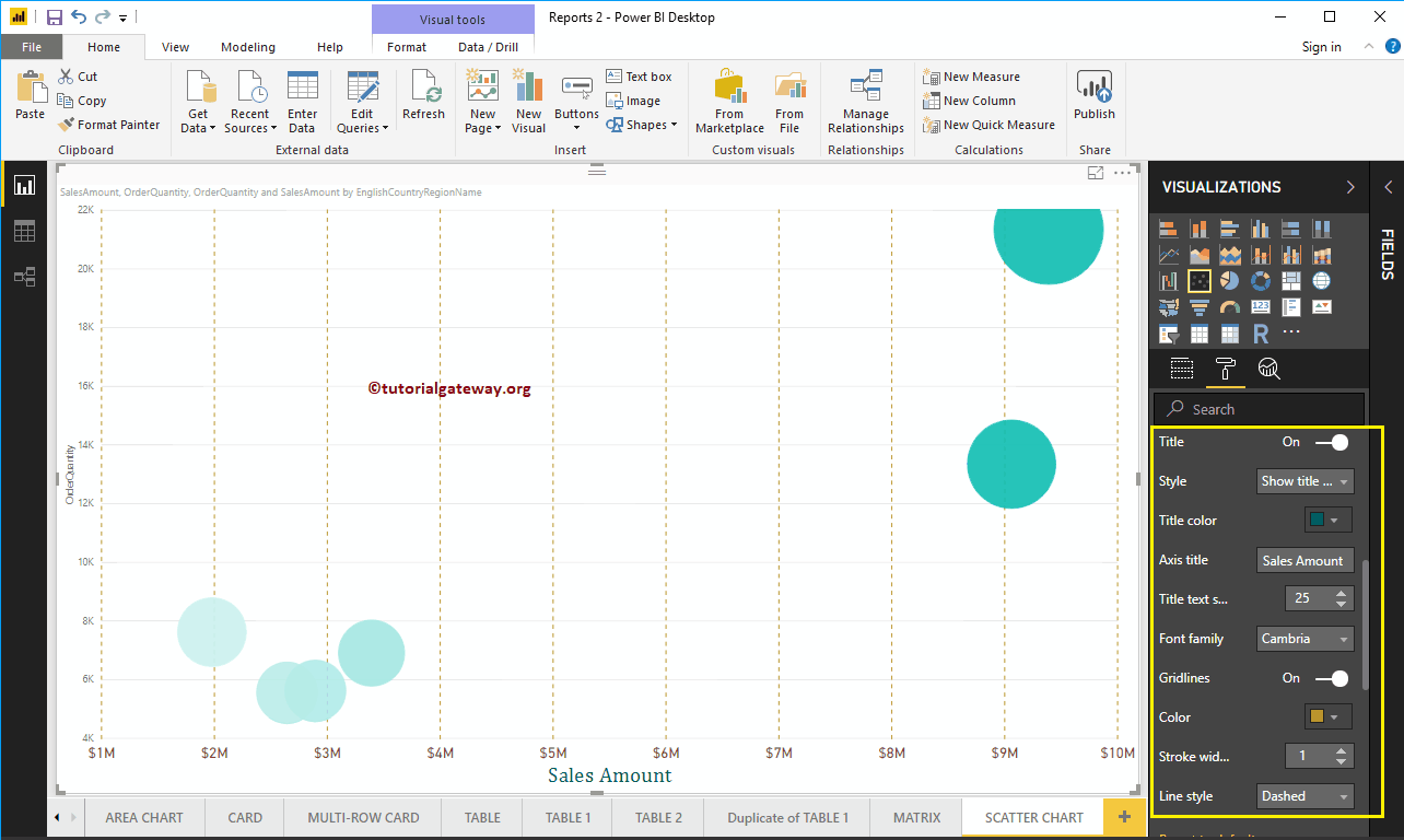
Format Y-Axis of a Power BI Scatter Chart
As you can see, we changed the Y-Axis starting value to 2000 and End value to 25000, labels Color to Brown, and Text Size to 18.
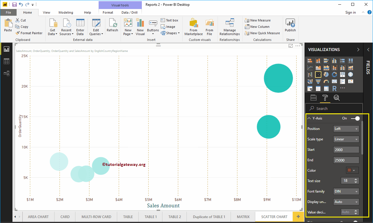
Let me change the Y-Axis title from OrderQuantity to Order Quantity, Title Color to Green, Text Size to 24, and Font family to Cambria. Here, Here, we also changed the gridlines color to gold, and line style to dashed.
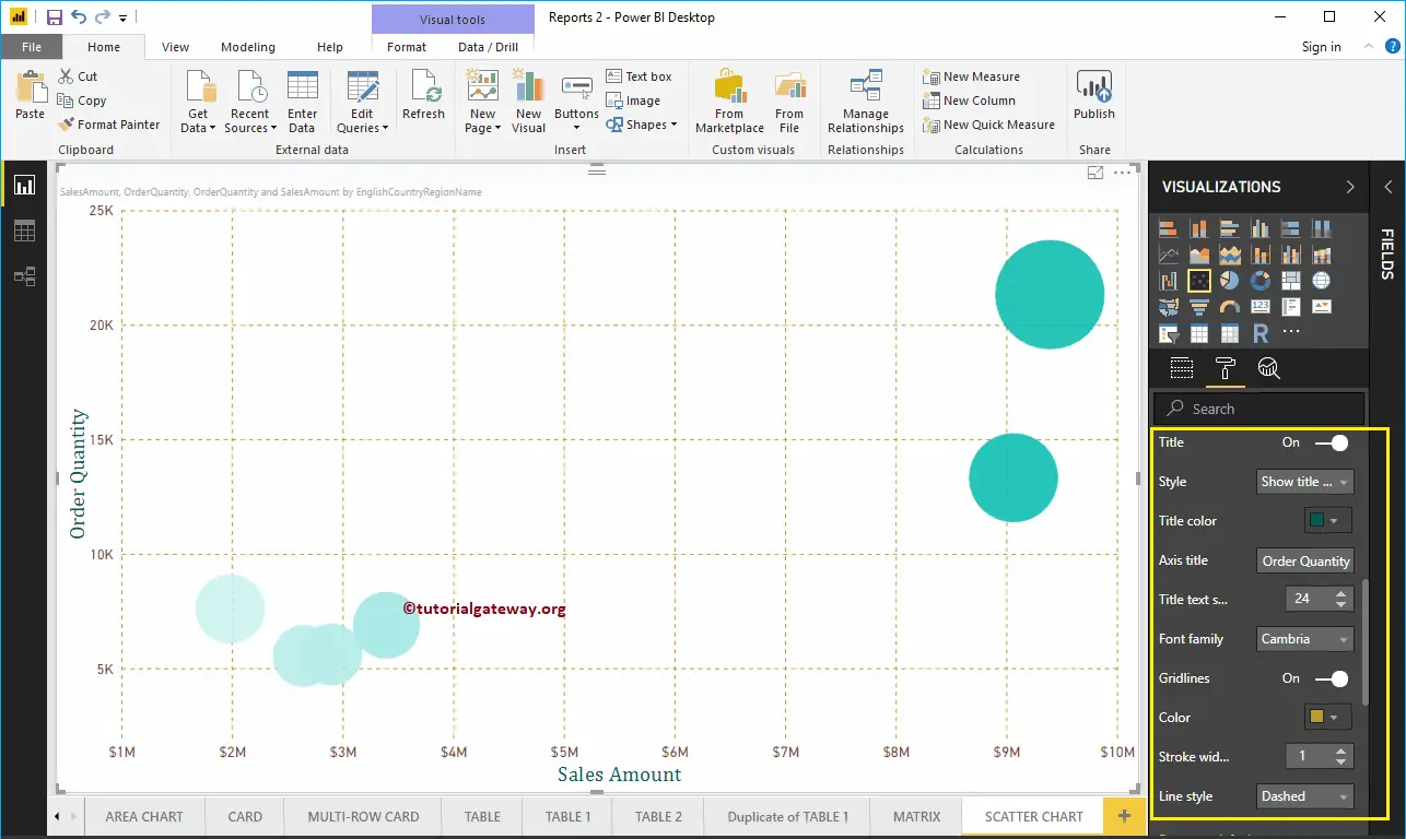
Format Power BI Scatter Chart Data Colors
While we are creating this scatter chart, we added the Sales Amount as the Color Saturation, and that’s why we see the Diverging option under the Data Colors. Please change the Minimum, Center, and Maximum colors as per your requirements.
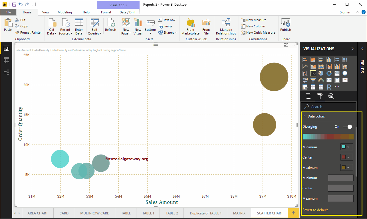
Format Scatter Plot in Power BI Shapes
Use this section to change the Scatter Chart default Circles.
As you can see from the screenshot below, we changed the Marker Shape to Diamond for demo purposes.
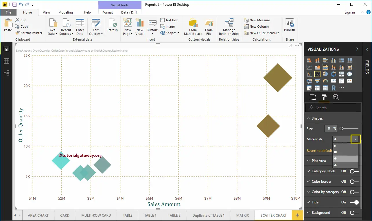
Format Scatter Chart in Power BI Plot Area
Using this Plot Area property, you can add custom Images as the Background of the Scatter Chart. For the demonstration purpose, we added one image as the Plot Area Background.
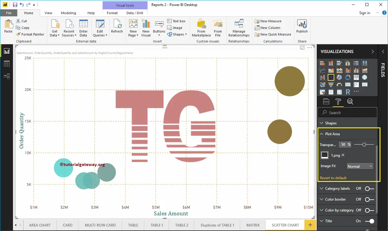
Format Power BI Scatter Chart Category Labels
Category labels mean names that represent each circle. By toggling the Category labels option from Off to On, you can enable these labels.
From the screenshot below, you can see, we change the Color to Purple, Text Size to 15, Font Family to DIN. If you want, you can add the background color as well.
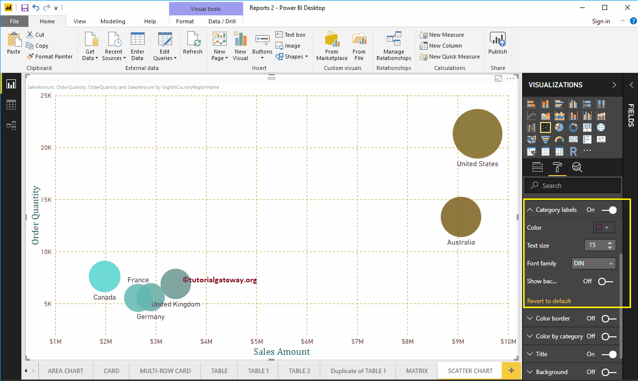
Format Power BI Scatter Chart Border Color
By toggling the Color Border option from Off to On, you can enable borders to the Circle (or whatever shape you selected).
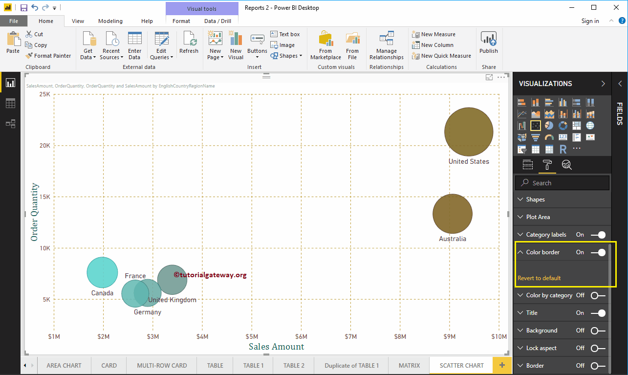
Format Power BI Scatter Chart Title
By toggling the Title option from On to Off, you can disable the Scatter Chart title.
From the below screenshot, you can see we change the Title Text to Sale Amount and Order Quantity by Country Name. Next, Font Color to Green, Text Size to 25, Font Family to Georgia, and Title Alignment to center. If you want, you can add the background color to the title as well.
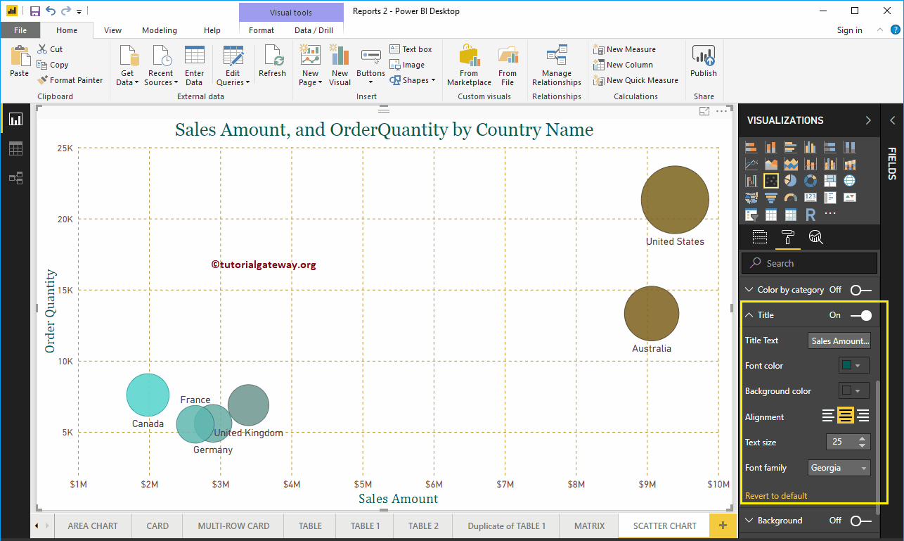
Format Power BI Scatter Chart Background Color, and Borders
You can add a Background color to a Scatter Chart by toggling Background option to On. For the demonstration purpose, we added yellow color with 40% transparency.
Similarly, you can add Borders to a Scatter Chart by toggling the Border option from Off to On.
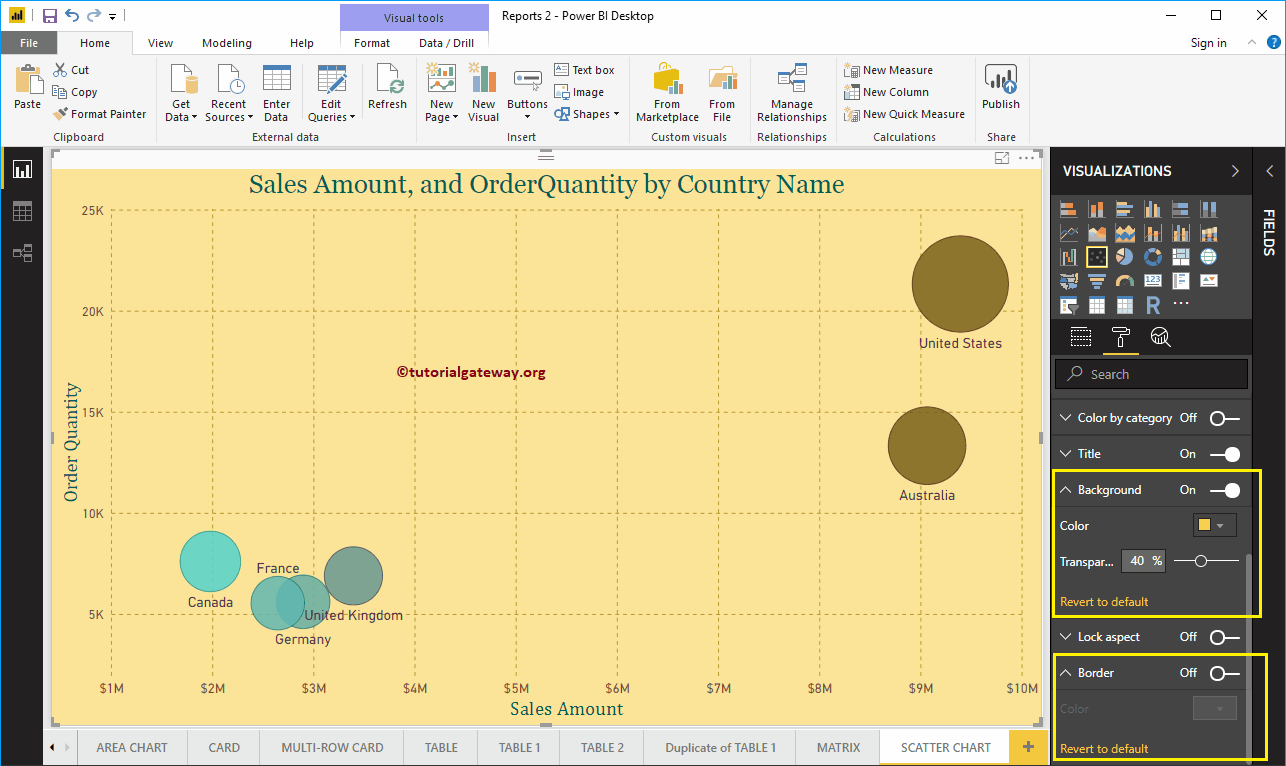
Format Power BI Scatter Chart Data Colors – Part 2
If you designed the scatter chart without placing any measured value in the Color Saturation Section, then the Data Colors section shows you the following options. By default, it selects some random colors, but you can change them as per your requirements.
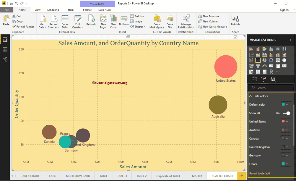
Power BI Stacked Bar Chart
Power BI Stacked Bar Chart Bar Chart is useful to compare multiple dimensions against a single measure. Let me show you how to Create a Stacked Bar Chart in Power BI with example.
For this Power BI Stacked Bar Chart demonstration, we are going to use the SQL Data Source that we created in our previous article. So, Please refer to Connect Power BI to SQL Server article to understand the Power BI Data Source.
How to Create a Power BI Stacked Bar Chart
To create a Stacked Bar Chart in Power BI, first Drag and Drop the Sales Amount from Fields section to Canvas region. It automatically creates a Column Chart, as shown in the below screenshot.
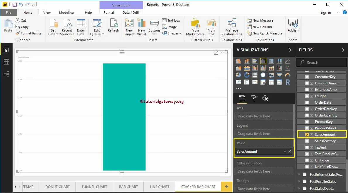
By clicking the Stacked Bar Chart under the Visualization section, it automatically converts the Column Chart into Stacked Bar Chart
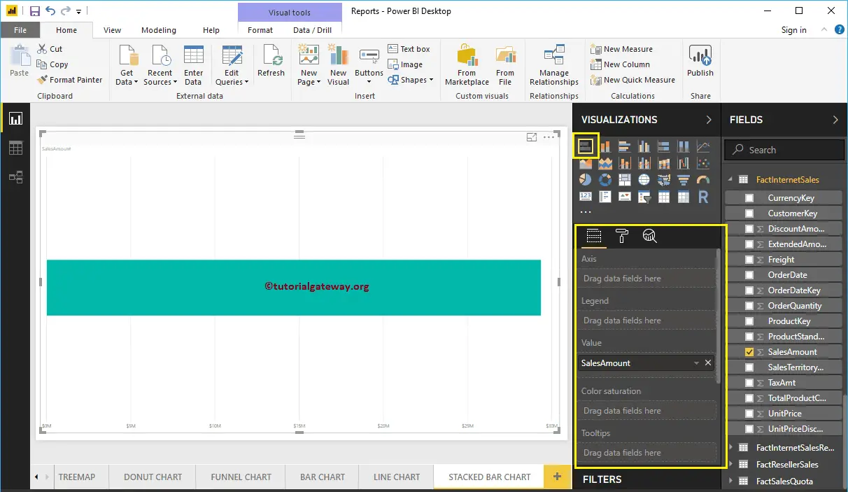
Next, let me add Color to Axis section to create a Bar chart that shows Sales Amount by Color.
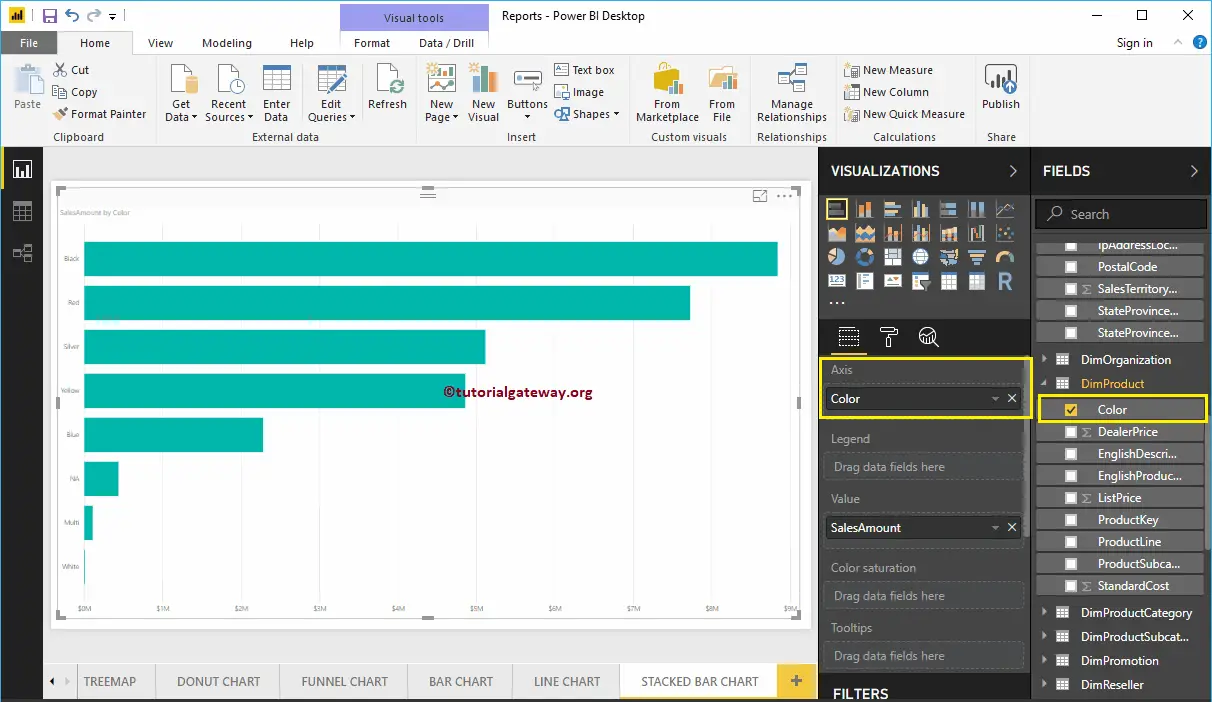
Next, we are adding the English Country Region Name to the Legend section to convert it into the Stacked Bar Chart.
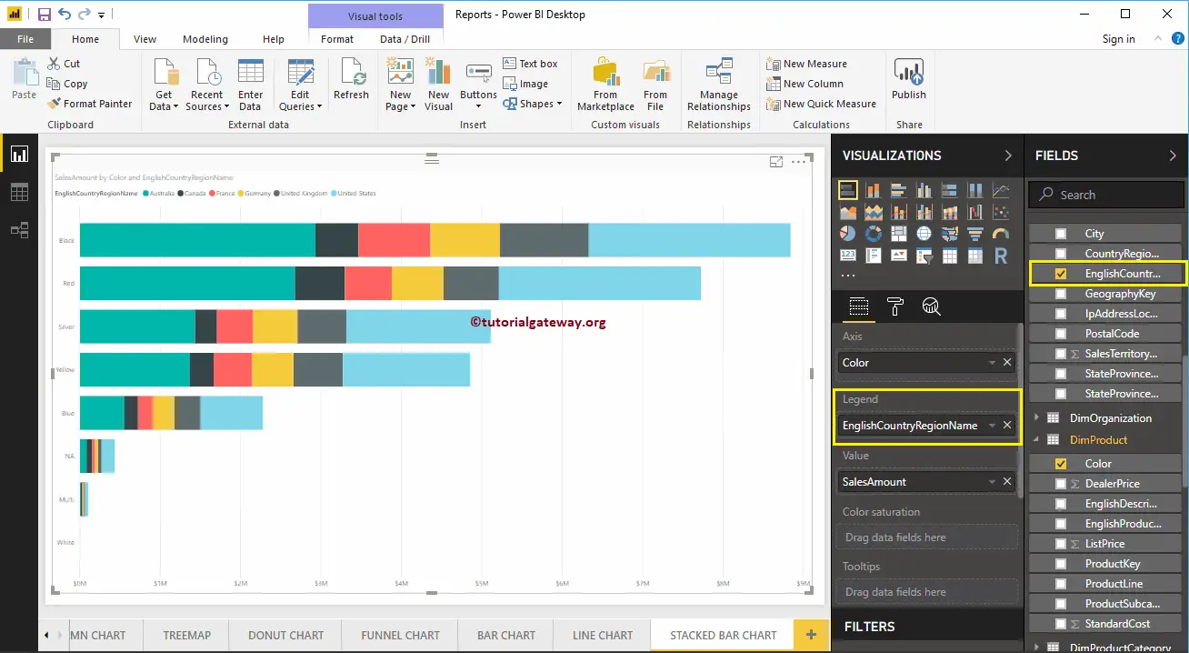
This time, we added State Province Name to Axis, and Country to Legend. From the screenshot below, you can see Country Name is acting as the Bar Color. It is because you can’t group the Country Names inside a State ( State Name Inherited from Country). Please remember this while you are working with a stacked bar chart.
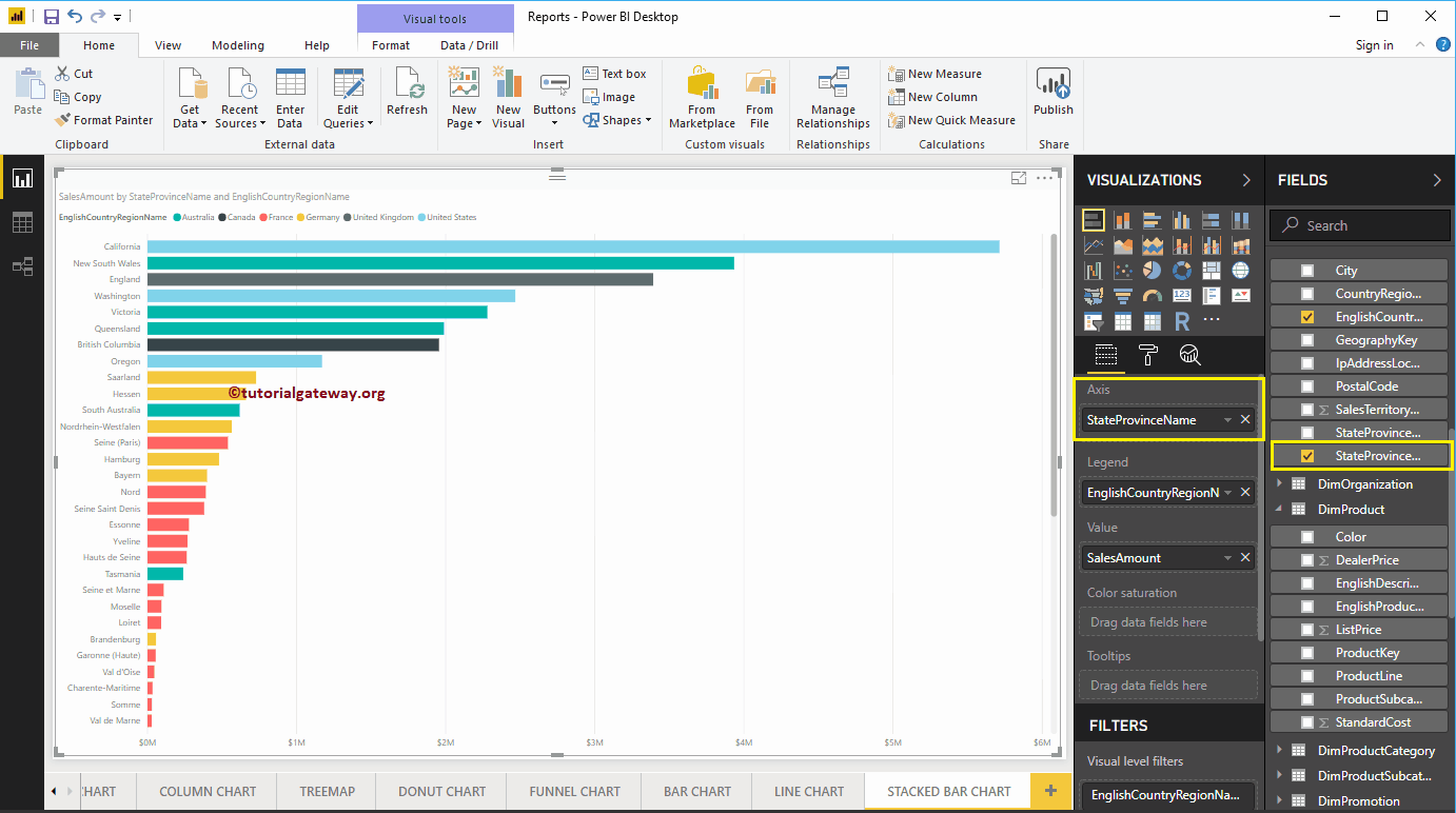
Hover over any stacked bar shows the Tool-tip of State Name, Country, and its Sales Amount
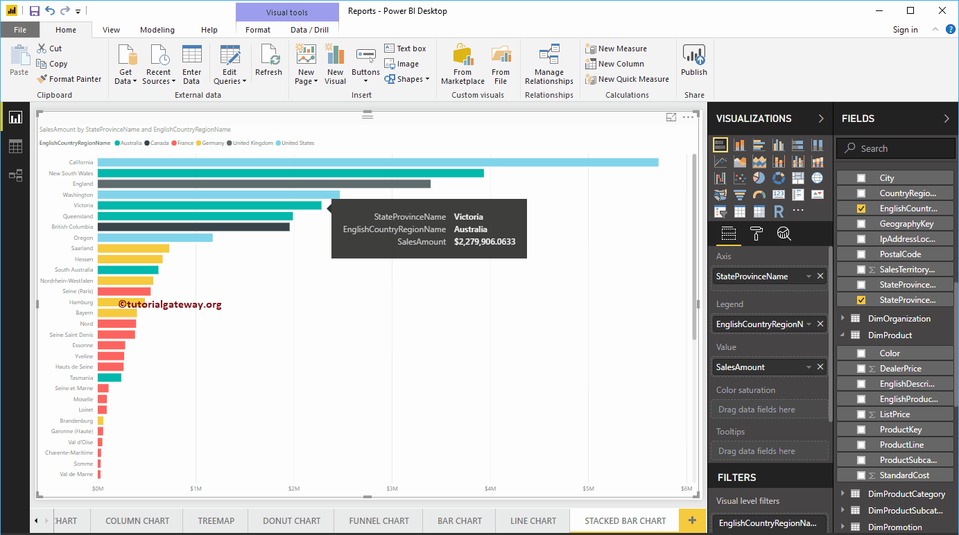
Create a Power BI Stacked Bar Chart Approach 2
First, click on the Stacked Bar Chart under the Visualization section. It automatically creates a Stacked Bar Chart with dummy data, as shown in the below screenshot.
In order to add data to the Power BI Stacked Bar Chart, we have to add the required fields:
- Axis: Please specify the Column that represents the Horizontal Bars.
- Legend: Specify the Column to divide the Horizontal Bars.
- Values: Any Numeric value such as sales amount, Total Sales etc.
Let me drag the Sales Amount from the Fields section to the Values field, and Color field to the Axis Section.
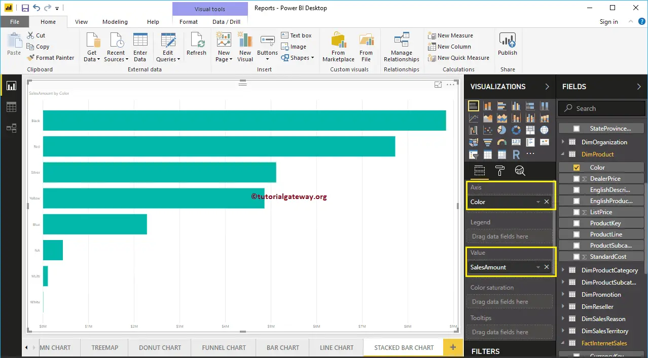
Next, add the English Country Region Name from the DimGeography table to the Legend section. You can do this by dragging Country to Legend section, or simply checkmark the English Country Region Name column
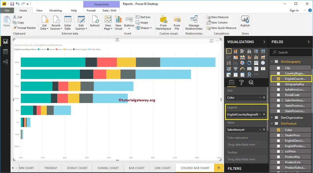
Now you can see a Stacked Bar Chart that represents Sales by Color, which is further divided by Country Name. Hover over any portion on a bar shows the Tool-tip of Color, Country, and its Sales Amount.
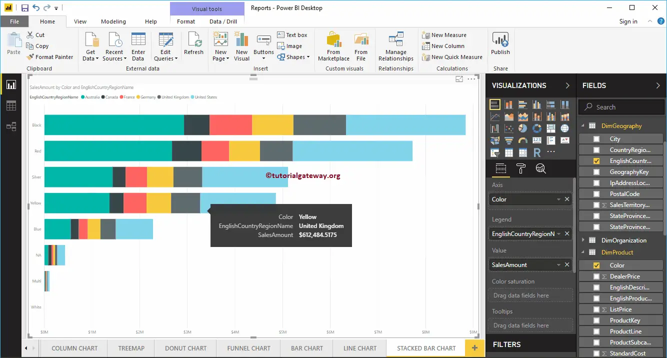
Let me do some quick formatting to this Power BI Stacked Bar Chart
NOTE: I suggest you refer to Format Stacked Bar Chart article to understand the steps involved in formatting the Stacked Bar Colors, Chart Title, Data Color, background Color, Axis Colors, Axis fonts style and colors, etc.
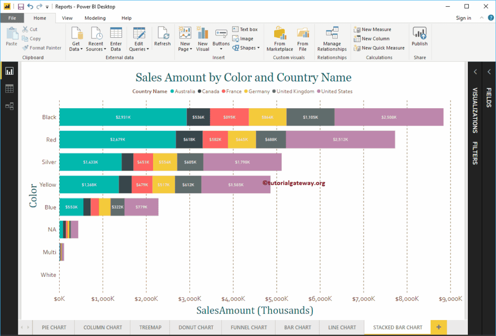
Format Stacked Bar Chart in Power BI
How to Format Stacked Bar Chart in Power BI with an example?. Formatting Power BI Stacked Bar Chart includes changing the Stacked Bar Colors, Title text, position, Data labels, Axis Fonts, and Background Colors, etc.
To demonstrate the Power BI Stacked Bar Chart formatting options, we are going to use the Stacked Bar Chart that we created earlier. Please refer to the Power BI Stacked Bar Chart article.
How to Format Stacked Bar Chart in Power BI
Please click on the Format button to see the list of formatting options that are available for this Stacked Bar Chart.

Format Stacked Bar Chart General Section
Use this General Section to Change the X Position, Y Position, Width, and height of a Stacked Bar Chart
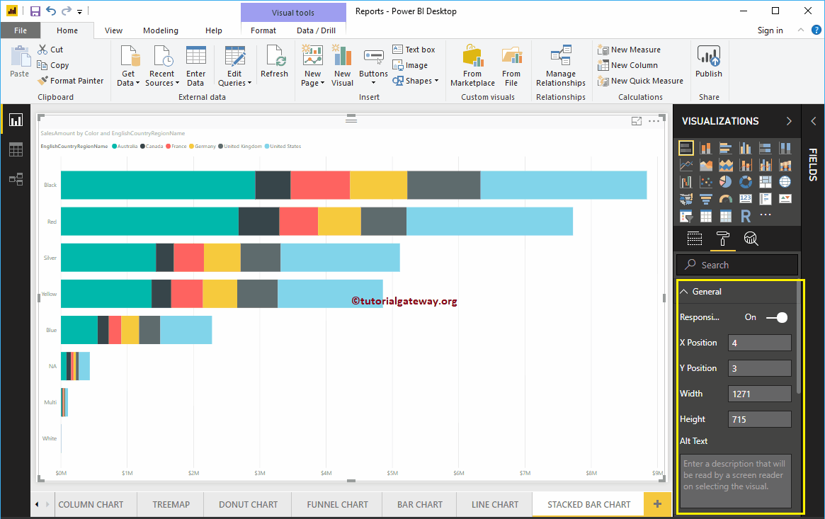
Format Legend of a Stacked Bar Chart in Power BI
To display or enable the Legend, Please select the Power BI Legend region and toggle the option from Off to On. You can use the Position drop down box to change the legend position.
As you can see from the screenshot below, we added the Legend Title as Country Name, Legend Position as Top Center. Next, we also changed the Color to Brown, Font family to Corbel, and text size to 12.
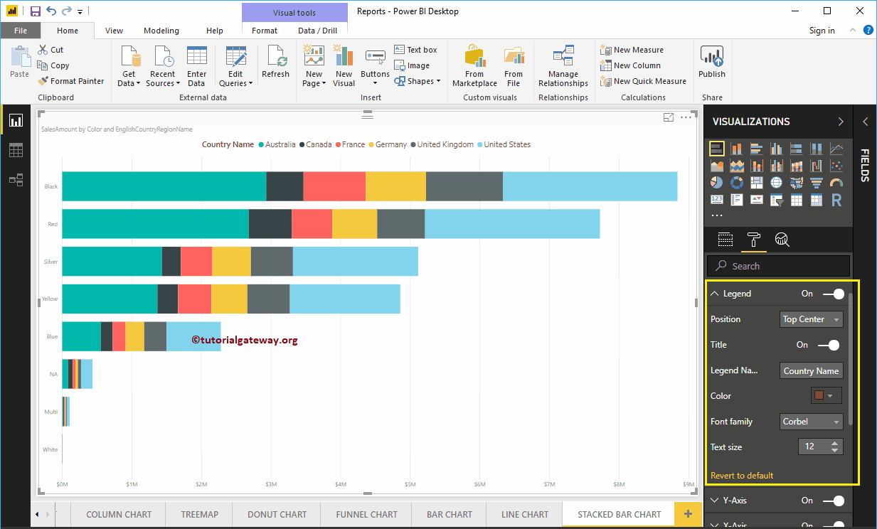
The Y-Axis of a Power BI Stacked Bar Chart
As you can see from the screenshot below, we change the Y-Axis labels Color to Brown, Text Size to 18, Font style to Corbel. You can use Minimum category width, Maximum Size, and Inner Padding options to change the bar widths
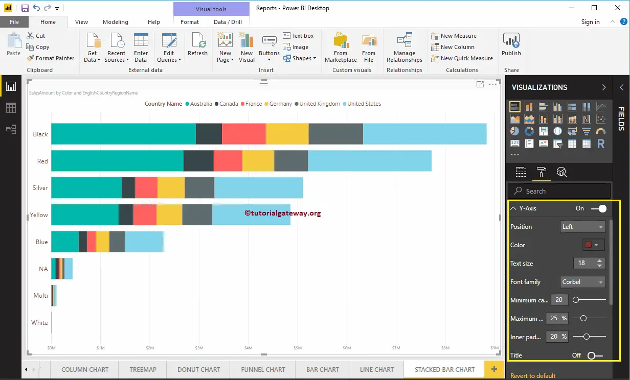
By default, the Y-Axis title set to Off, but you can enable it by toggling Title under the Y-Axis section to On. Let me change the Title Color to Green, Title Text Size to 30, and Font style to Cambria.
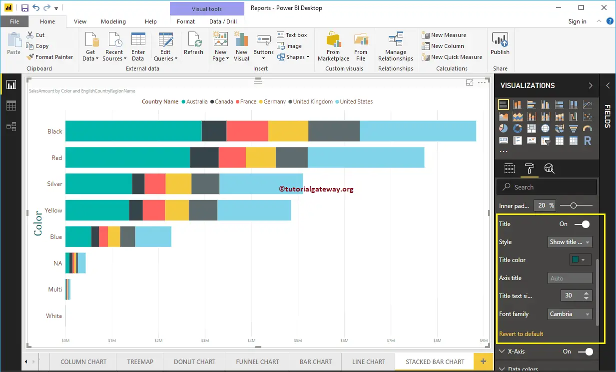
Format X-Axis of a Stacked Bar Chart in Power BI
As you can see from the below screenshot, we change the Color to Brown, Font style to Corbel, Text Size to 20, Display Units to Thousands (default is Auto).
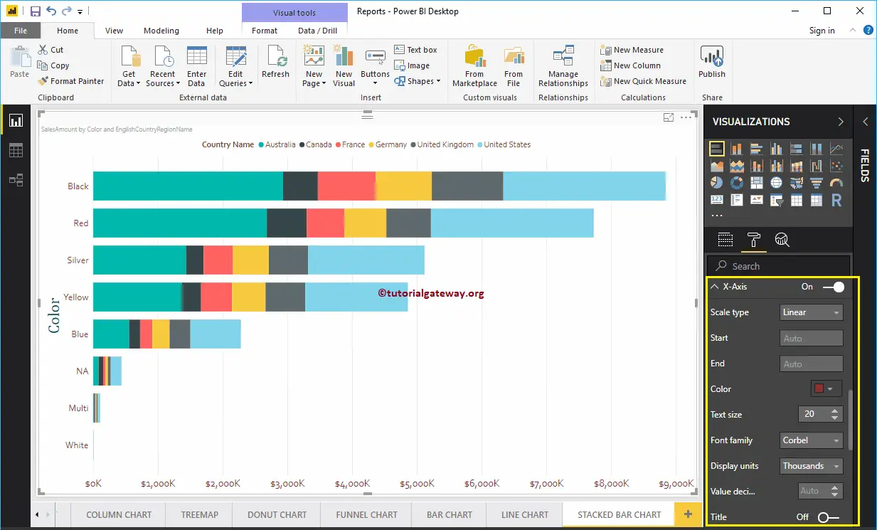
By default, the X-Axis title set to Off, but you can enable it by toggling Title to On. Let me change the Title Color to Green, Font style to Cambria, and Font Size to 30.
By toggling the Gridlines option from On to Off, you can disable the Stacked Bar chart Gridlines.
- Color: You can change the Gridlines color.
- Stroke Width: Use this to change the Gridlines width.
- Line Style: Choose the line style such as Solid, dotted, and dashed.
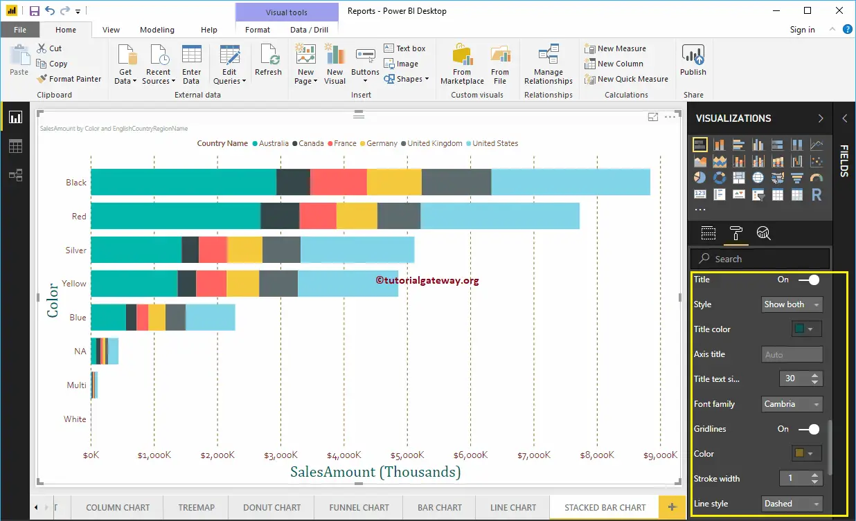
Format Power BI Stacked Bar Chart Data Colors
By default, Power BI allocates some default colors to each bar. Let me change the Color of the United States to Pink.

Enable Data Labels for Power BI Stacked Bar Chart
The Stacked Bar chart Data Labels display the information about each individual group of a horizontal bar. In this case, it displays the Sales Amount of each country. To enable data labels, please toggle Data labels option to On.
Let me change the Color to White, Font family to DIN, and Text Size to 10
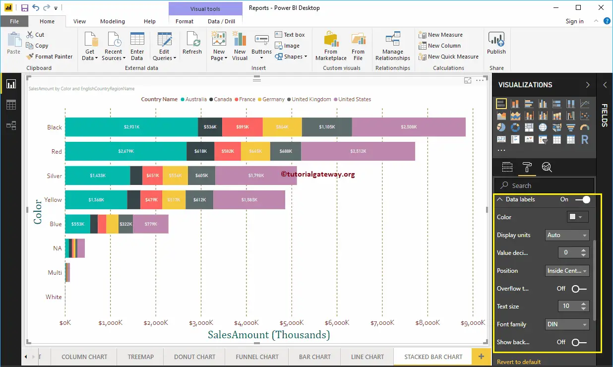
Format Stacked Bar Chart in Power BI Plot Area
You can add Images as the Background of a Stacked Bar Chart using this Plot Area section. For the demonstration purpose, we added one image as the Plot Area Background.
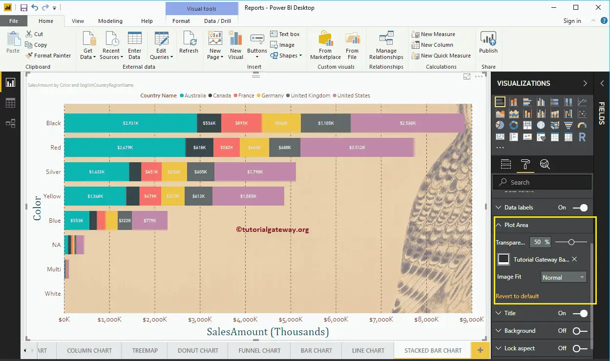
Format Stacked Bar Chart in Power BI Title
By toggling the Title option from On to Off, you can disable the Bar Chart title.
As you can see from the screenshot below, we change the Title Text to Sale Amount by Color and Country Name. And we also changed the Font Color to Green, Font Family to Georgia, Font Size to 25, and Title Alignment to center. If you want, you can add the background color to the title as well.
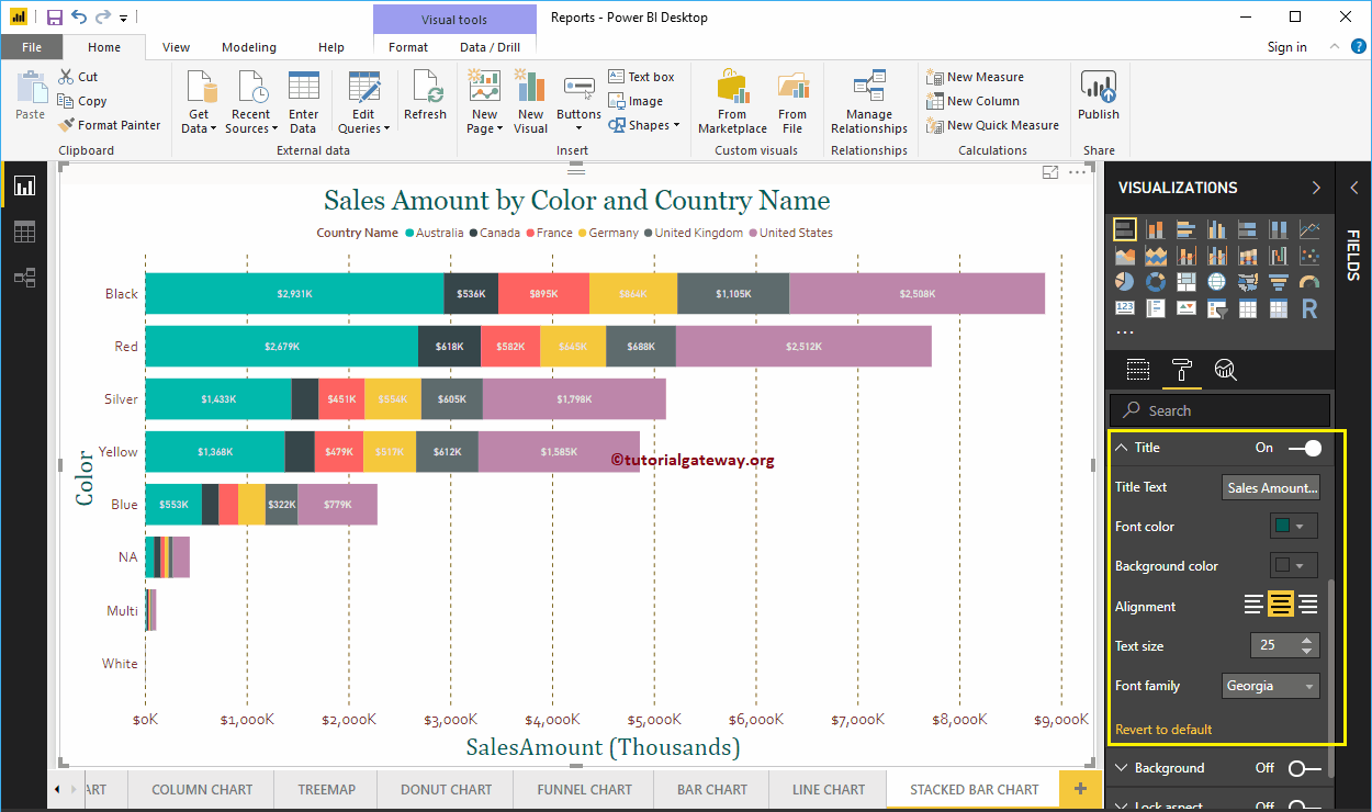
Format Background Color of a Stacked Bar Chart in Power BI
You can add the Background color to a Bar Chart by toggling Background option to On. For the demonstration purpose, we added the background color.

Format Border of a Stacked Bar Chart
You can add Borders to a Line Chart by toggling the Border option from Off to On.
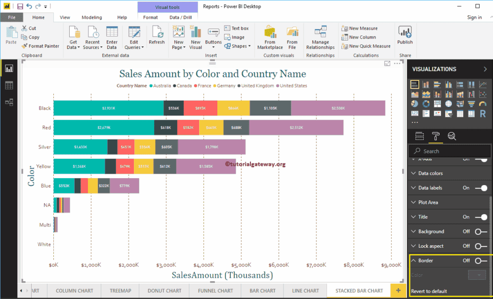
Stacked Column Chart in Power BI
Power BI Stacked Column Chart is useful to visualize multiple dimensions against a single measure. Let me show you how to Create a Stacked Column Chart in Power BI with example.
For this Power BI Stacked Column Chart demonstration, we are going to use the SQL Data Source that we created in our previous article. So, Please refer Connect Power BI to SQL Server article to understand the Data Source in Power BI.
How to Create a Stacked Column Chart in Power BI
To create a Stacked Column Chart in Power BI, first Drag and Drop the Sales Amount from Fields section to Canvas region. It automatically creates a Column Chart.
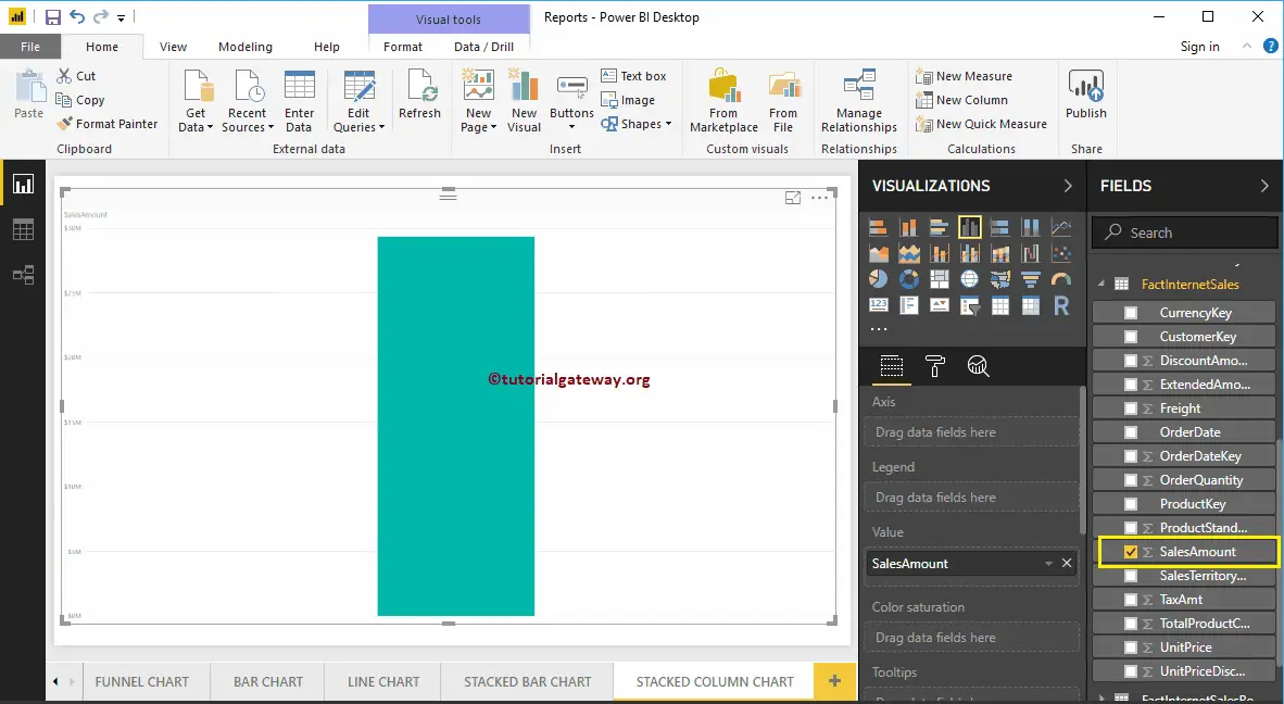
By clicking the Stacked column Chart under the Visualization section, it automatically converts the Column Chart into Stacked Column Chart
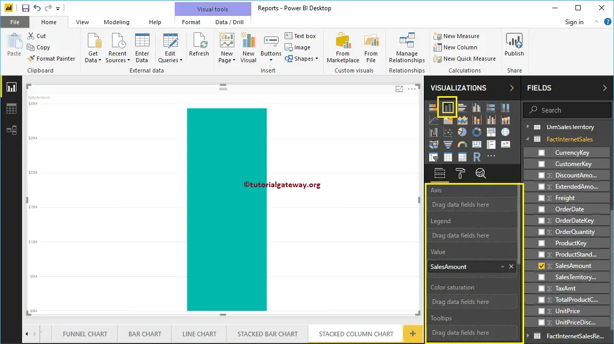
Next, let me add Color to Axis section to create a Column chart that shows Sales Amount by Color.
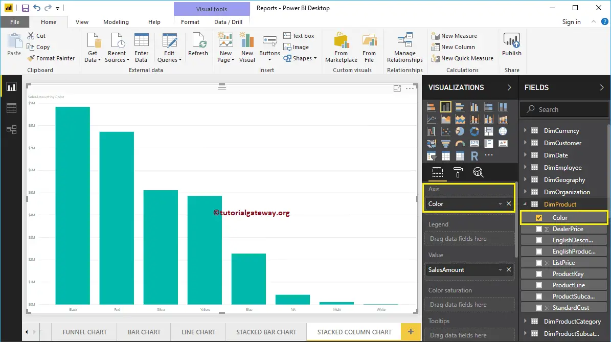
Next, we are adding Sales Territory Region Name to Legend section to convert it into the Stacked Column Chart.
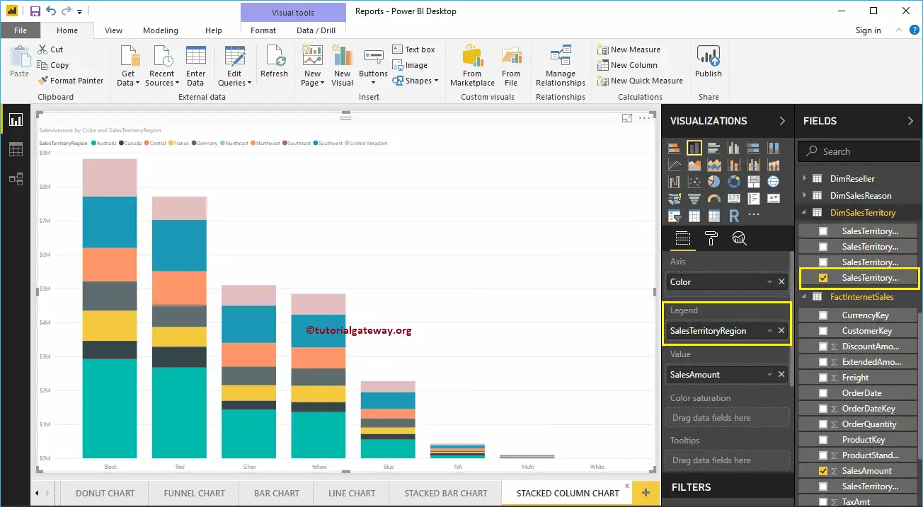
Hover over any section of a vertical bar shows the Tool-tip of Territory, Color, and its Sales Amount
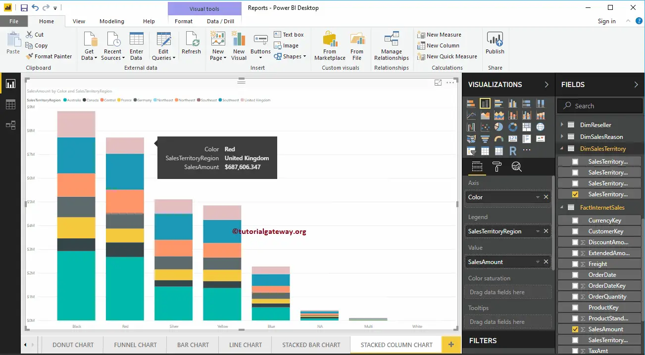
This time, we replaced the Color with State Province Name in Axis Section. From the screenshot below, you can see, Territory Region Name is acting as the Bar Color. It is because You can’t group the Territory inside a State ( State Name Inherited from Territory).
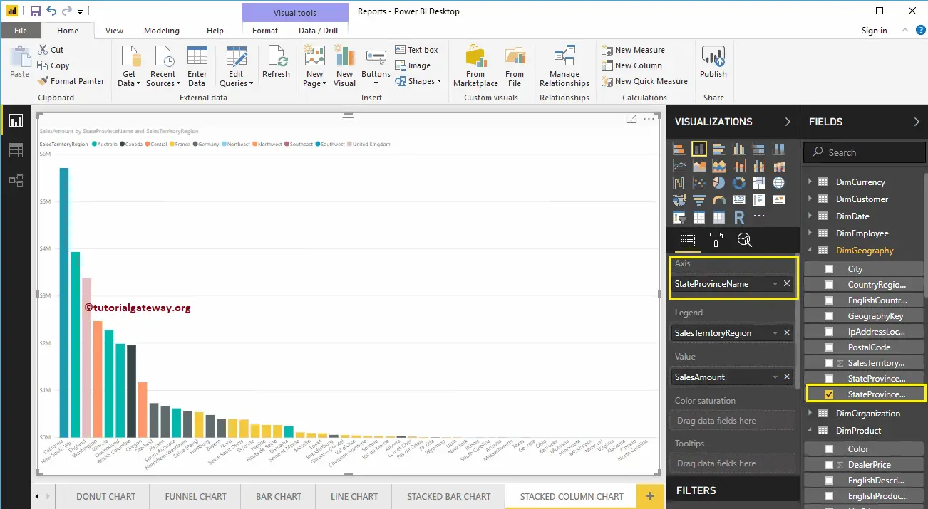
Hover over any vertical bar shows the Tool-tip of State Name, Territory, and its Sales Amount
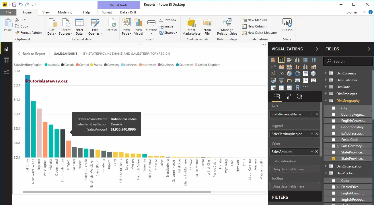
Create a Stacked Column Chart in Power BI Approach 2
First, click on the Stacked Column Chart under the Visualization section. It creates a Stacked Column Chart with dummy data.
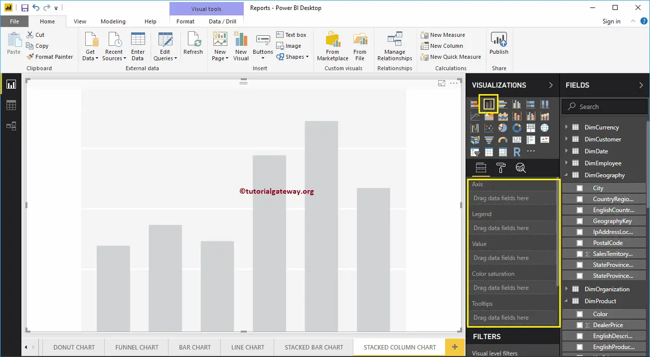
To add data to the Power BI Stacked Column Chart, we have to add the required fields:
- Axis: Please specify the Column that represents the Vertical Bars.
- Legend: Specify the Column to divide the Vertical Bars.
- Values: Any Numeric value such as sales amount, Total Sales etc.
Let me drag the Sales Amount from the Fields section to the Values field, and Color field to the Axis Section.
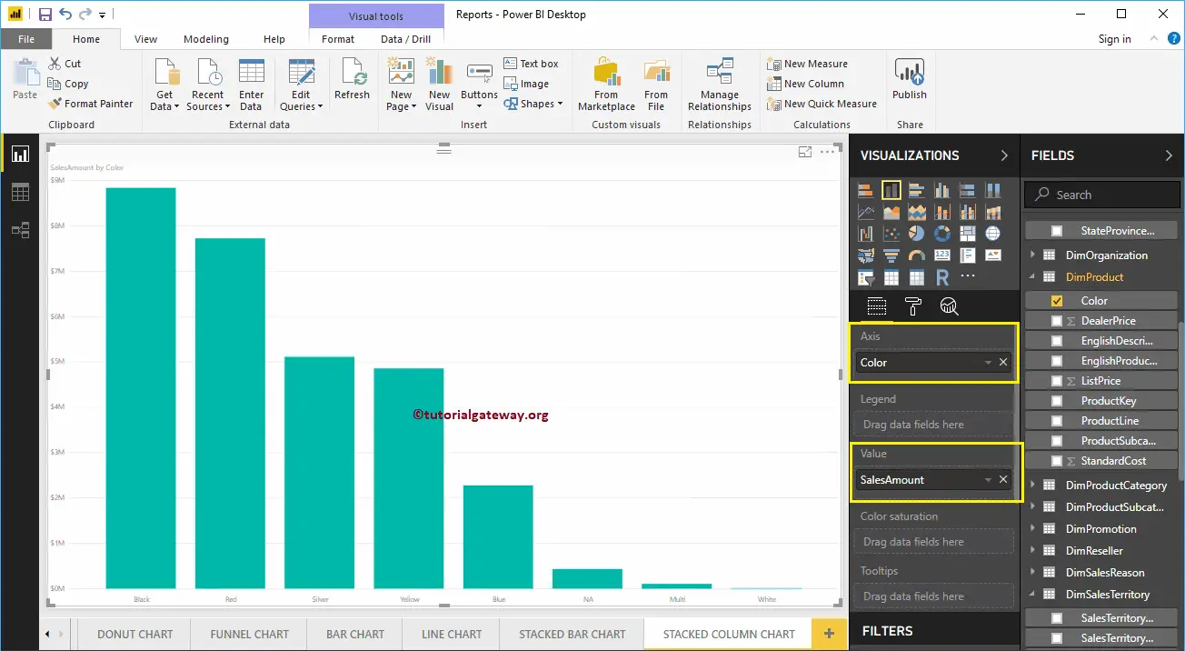
Next, add the Sales Territory Region Name from DimSalesTerritory table to the Legend section. You can do this by dragging Territory to Legend section, or simply checkmark the Sales Territory Region Name column
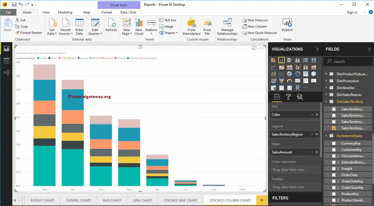
Let me do some quick formatting to this Stacked Column Chart
NOTE: I suggest you refer to the Format Stacked Column Chart article to understand the steps involved in formatting the Stacked Column Colors, Title, etc.
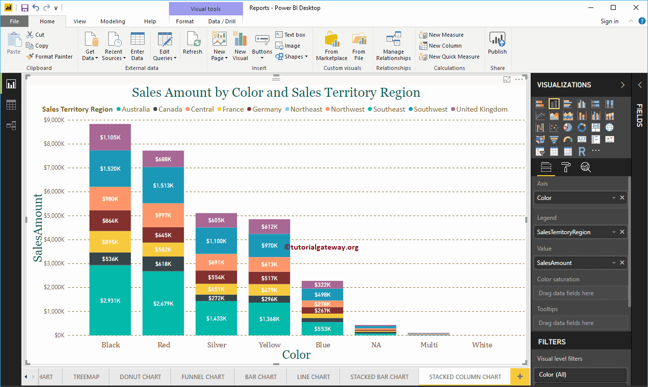
Format Power BI Stacked Column Chart
How to Format Power BI Stacked Column Chart with an example?. Formatting Power BI Stacked Column Chart includes changing the Stacked Column Chart Colors, Title text, Title position, Enabling Data labels, Axis Fonts, and Background Colors, etc.
To demonstrate these Stacked Column Chart formatting options, we are going to use the Stacked Column Chart that we created earlier. Please refer to the Stacked Column Chart in Power BI article to understand the steps involved in creating a Power BI Stacked Column chart.
How to Format Power BI Stacked Column Chart
Please click on the Format button to see the list of formatting options that are available for this Stacked Column Chart.
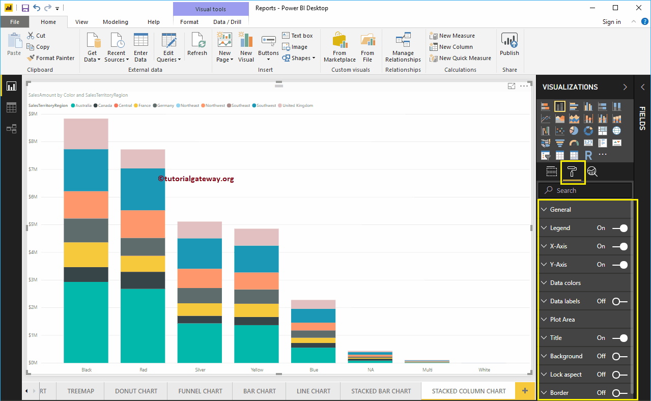
Format Stacked Column Chart General Section
Use this General Section to Change the X Position, Y Position, Width, and height of a Stacked Column Chart.
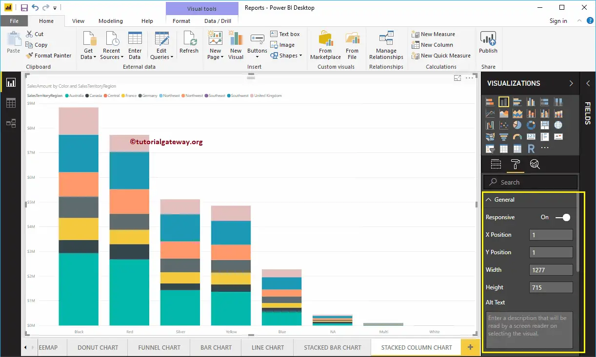
Format Legend of a Stacked Column Chart in Power BI
To display or enable the Legend, Please select the Legend region and toggle the option from Off to On.
As you can see from the screenshot below, we added the Legend Title as Sales Territory Region, Legend Position as Top Center. And we also changed the Color to Golden Yellow, Font family to Calibri, and text size to 15.
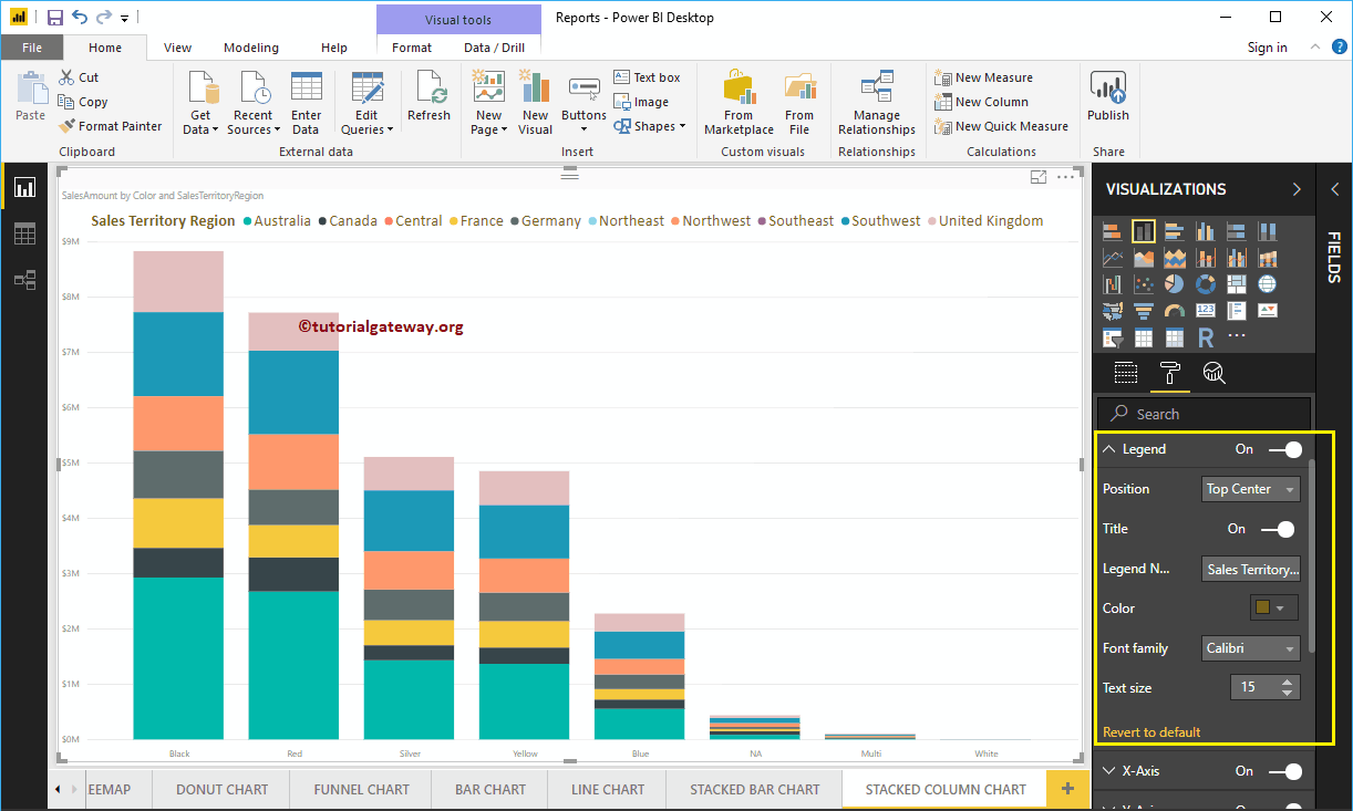
Format X-Axis of a Power BI Stacked Column Chart
As you can see from the below screenshot, we change the Color to Brown, Font style to Cambria, and Text Size to 20. Minimum category, Maximum Size, and Inner Padding options are to change the vertical bar widths
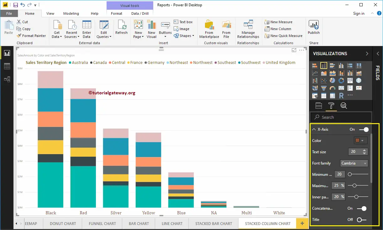
By default, the X-Axis title set to Off for stacked column chart. But you can enable it by toggling Title to On. Let me change the Title Color to Green, Font style to Georgia, and Title Text Size to 30
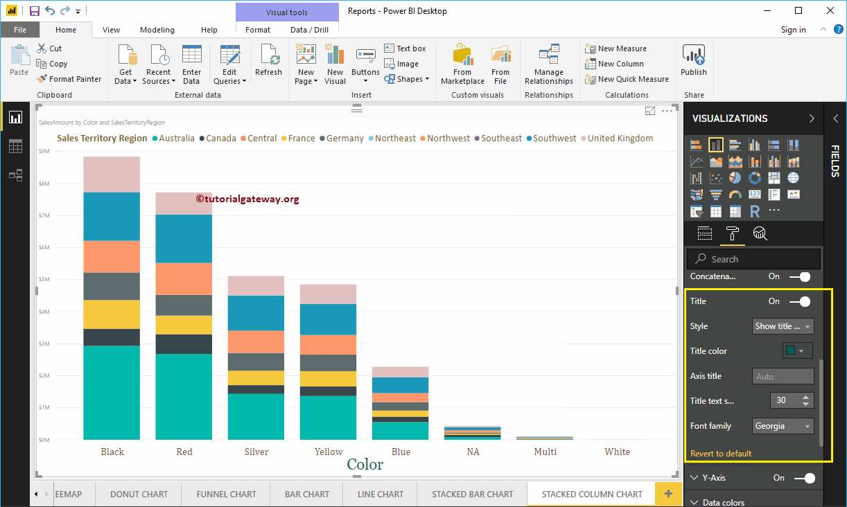
Format Power BI Stacked Column Chart Y-Axis
As you can see from the screenshot below, we change the Y-Axis labels Color to Brown, Text Size to 15, and Display Units to Thousands.
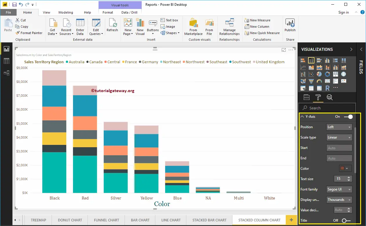
By default, the Y-Axis title set to Off for a stacked column chart. But you can enable it by toggling Title under the Y-Axis section to On. Let me change the Title Color to Green, Font style to Georgia, and Title Text Size to 30.
By toggling the Stacked Column Chart Gridlines option from On to Off, you can disable the Gridlines for this stacked column chart.
- Color: You can change the Gridlines color.
- Stroke Width: Use this to change the Gridlines width.
- Line Style: Choose the line style such as Solid, dotted, etc.
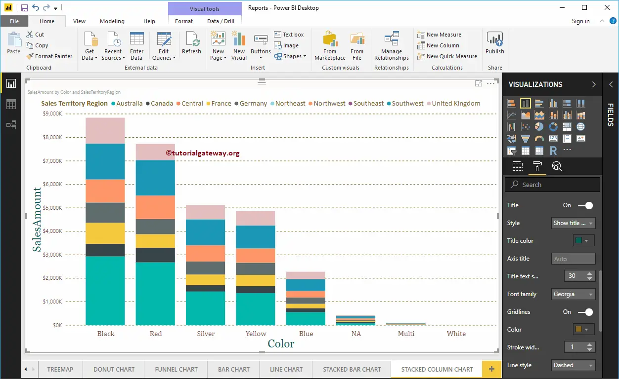
Format Power BI Stacked Column Chart Data Colors
By default, Power BI allocates some default colors to each group in a vertical bar. Please change the colors as per your requirement.
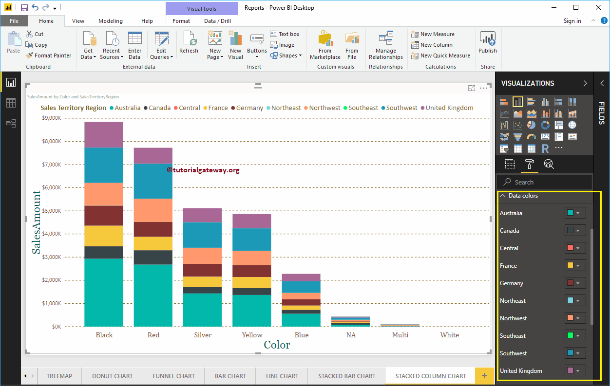
How to enable Data Labels for Power BI Stacked Column Chart
Data Labels display information about each individual group of a Vertical bar. In this case, it displays the Sales Amount of each Sales Territory Region. To enable data labels, please toggle Data labels option to On.
Let me change the Color to White, Font family to DIN, and Text Size to 12
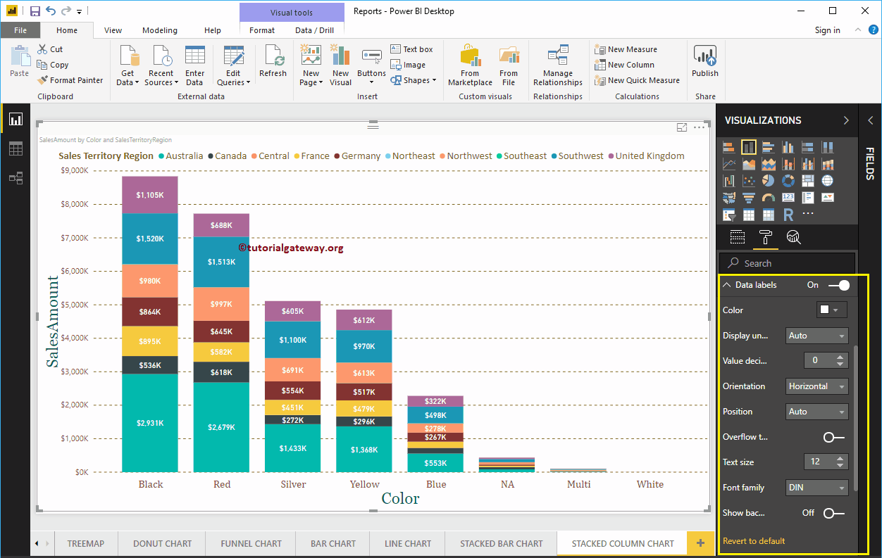
Format Power BI Stacked Column Chart Plot Area
You can add Images as the Background of a Stacked Column Chart using this Plot Area section. For the demonstration purpose, we added one image as the Stacked Column Chart Plot Area Background.
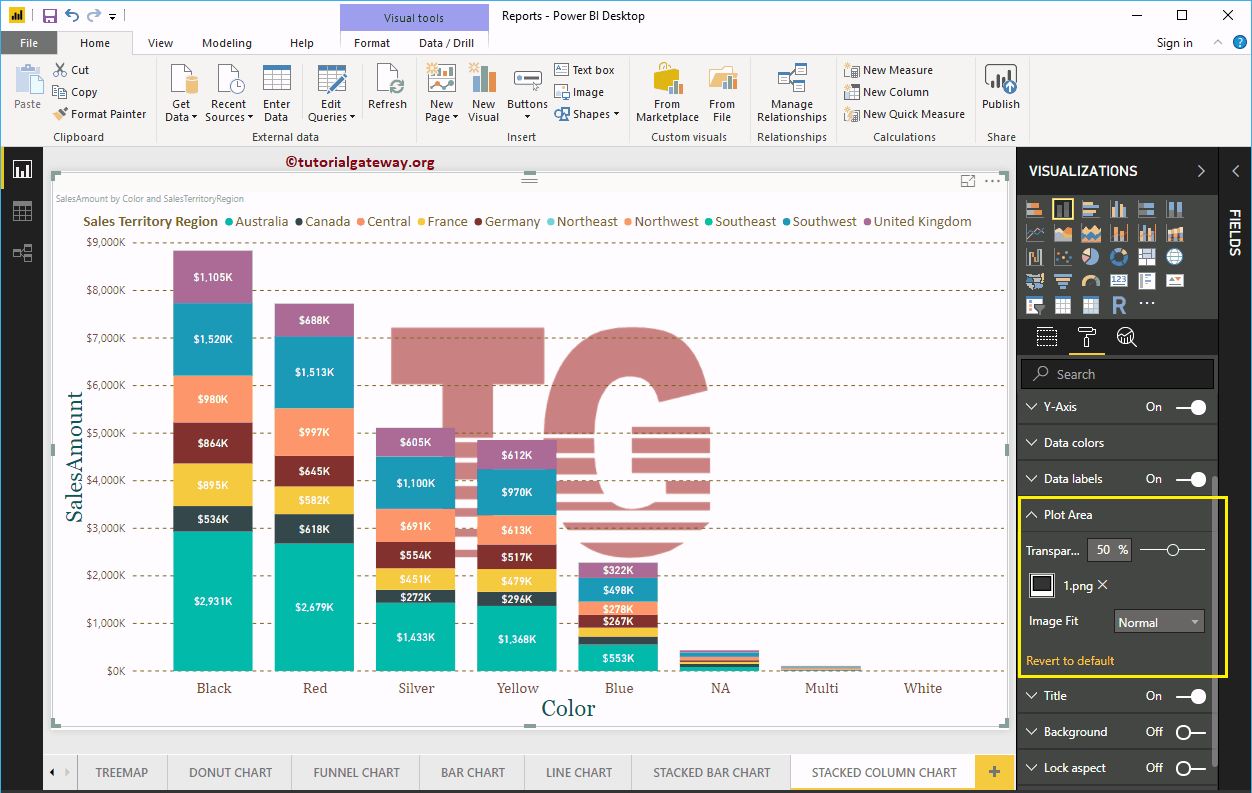
Format Power BI Stacked Column Chart Title
By toggling the Title option from On to Off, you can disable the Stacked Column Chart title.
As you can see from the screenshot below, we change the Title Text to Sale Amount by Color and Sales Territory Region. We also changed the Font Color to Green, Font Family to Georgia, Font Size to 25, and Title Alignment to center. If you want, you can add the background color to the title as well.
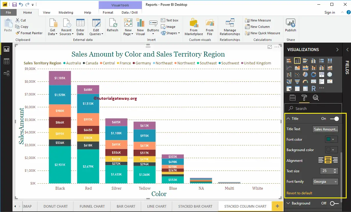
Format Background Color of a Stacked Column Chart in Power BI
By toggling Background option to On, you can add the Background color to a Stacked Column Chart. For the demonstration purpose, we added the background color.
Similarly, you can add Borders to a Stacked Column Chart by toggling the Border option from Off to On.
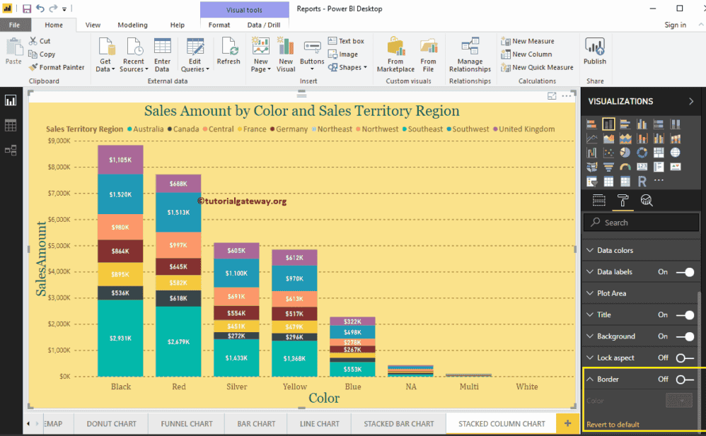
Create a Table in Power BI
Let me show you how to create a Table in Power BI with example. For this Power BI table report demonstration, we are going to use the SQL Data Source that we created in our previous article.
Please refer to Connect Power BI to SQL Server article to understand the Power BI Data Source.
How to Create a Table in Power BI
If you drag and drop any dimension field, then Power BI automatically creates a table for you.
Let me drag and drop the English Product Name from the Fields section to Canvas, as you can see from the screenshot below, desktop automatically creating a table for you.
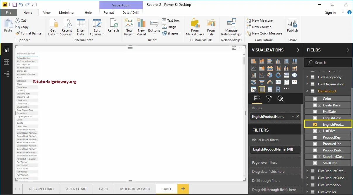
Creating a Table Approach 2
If you want to convert the existing chart to the table, then you can follow this step. As you can see from the screenshot below, we created a column chart, which represents the Sales Amount by Product Name.
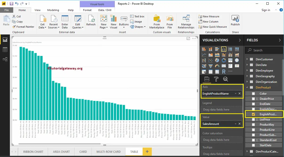
Click on the Table under the Visualization section. It automatically converts the Column Chart into a Table. From the below screenshot, you can see the Tabular representation of Product names and their Sales Amount.
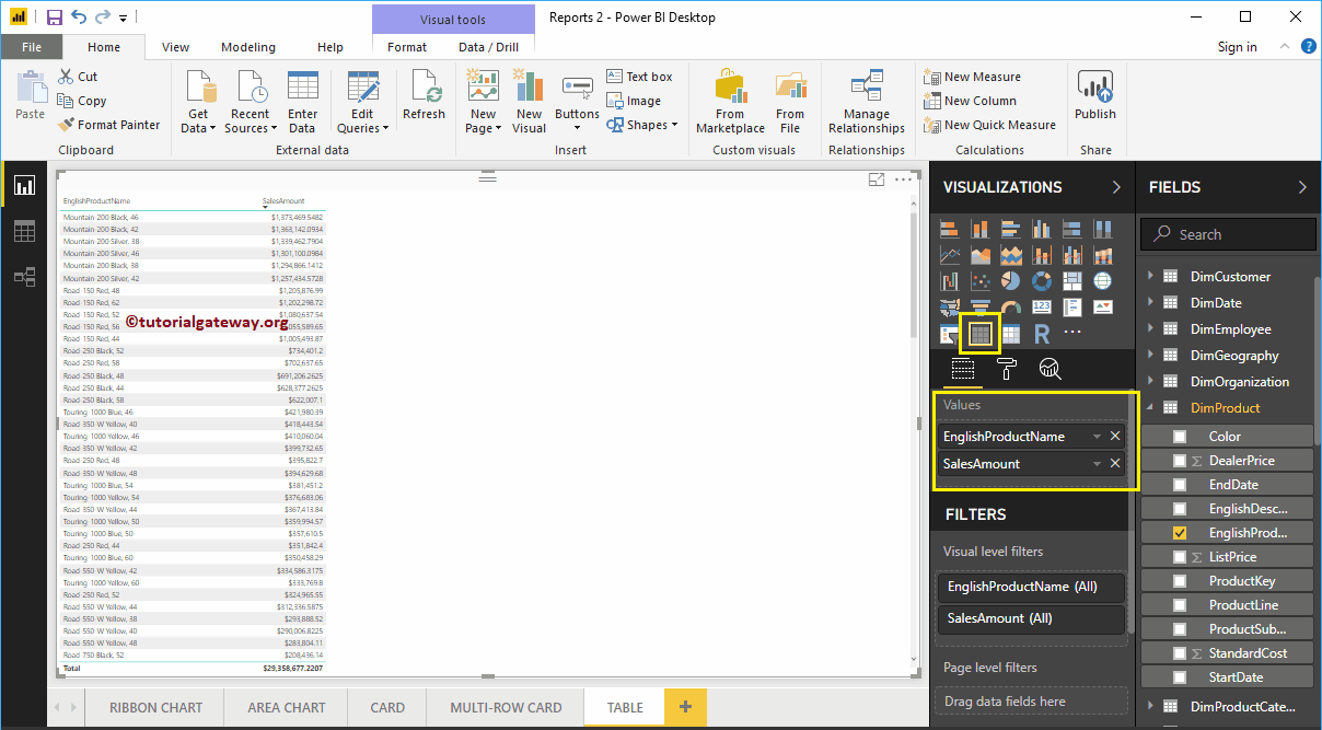
Create a Table in Power BI Approach 3
First, click on the Table present in the Visualization section. It automatically creates a Table with dummy data, as shown in the below screenshot.
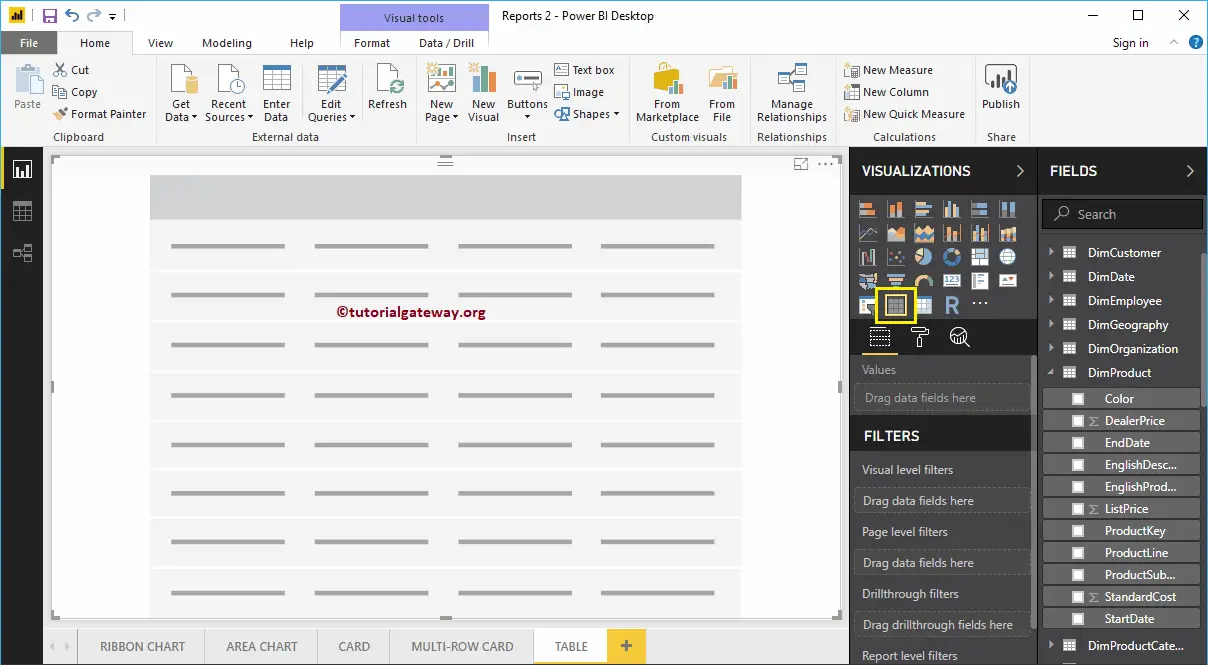
Next, let me drag the English product Subcategory Names and Sales Amount to the Values section. Now, you can see the table.
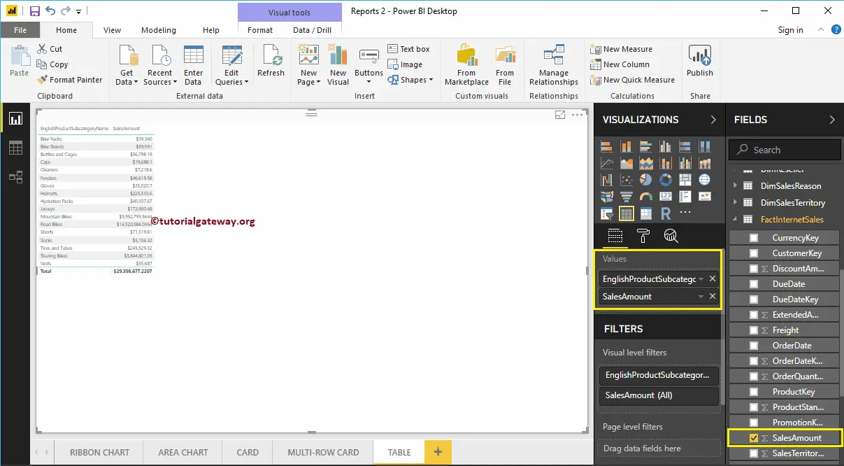
Let me add few more metric values such as Total Product Cost, Order Quantity, and Tax amount
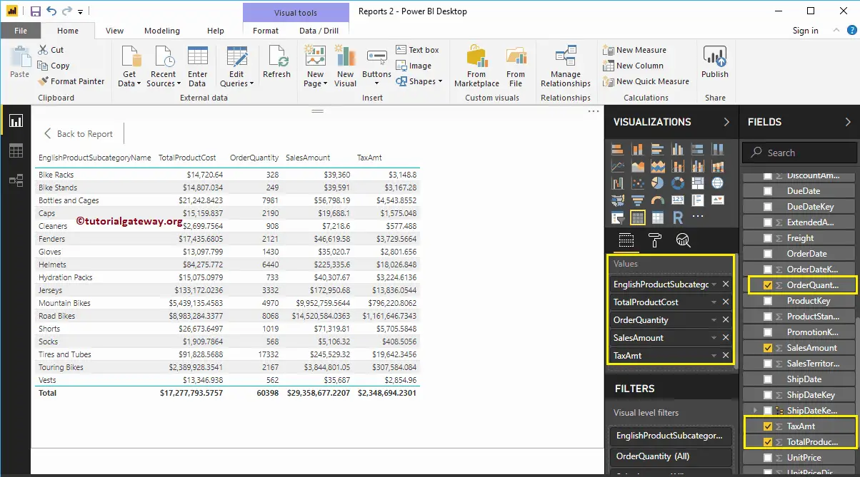
Let me do some quick formatting to this Table
NOTE: I suggest you refer to Format a Table article to understand the formatting options.
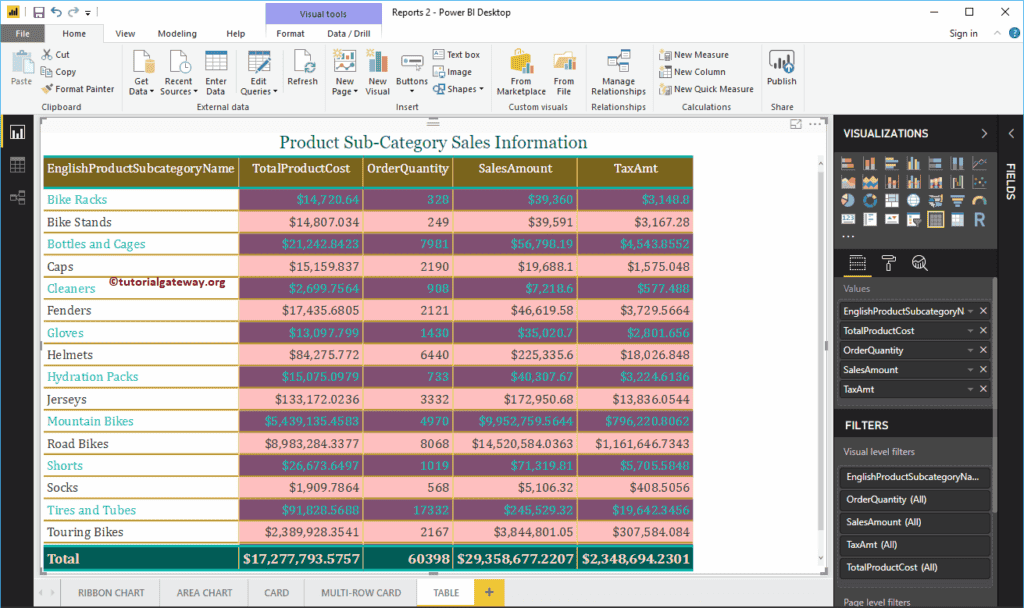
Format Power BI Table
How to Format Power BI Table report with an example?. The Power BI Format Table includes changing the table Grid Colors, Row Colors, Column formatting, row formatting, Table Title text, and background color, etc.
To demonstrate these Power BI table formatting options, we are going to use the Table that we created earlier. Please refer to Create a Table in Power BI article to understand the steps involved in creating a Power BI table.
How to Format Power BI Table
Please click on the Format button to see the list of table formatting options that are available.
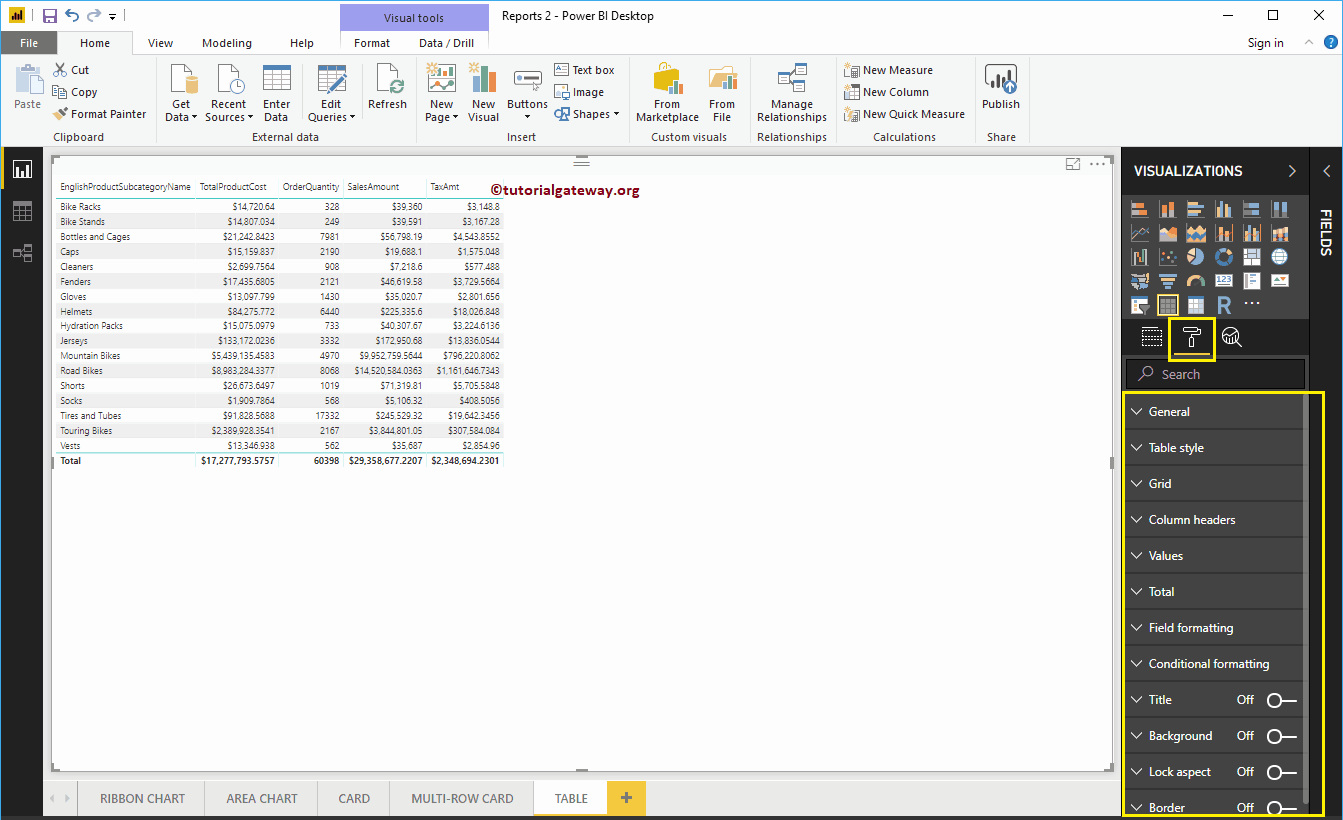
Format Power BI Table General Settings
Use this General Section to Change the X, Y position, Width and height of a table
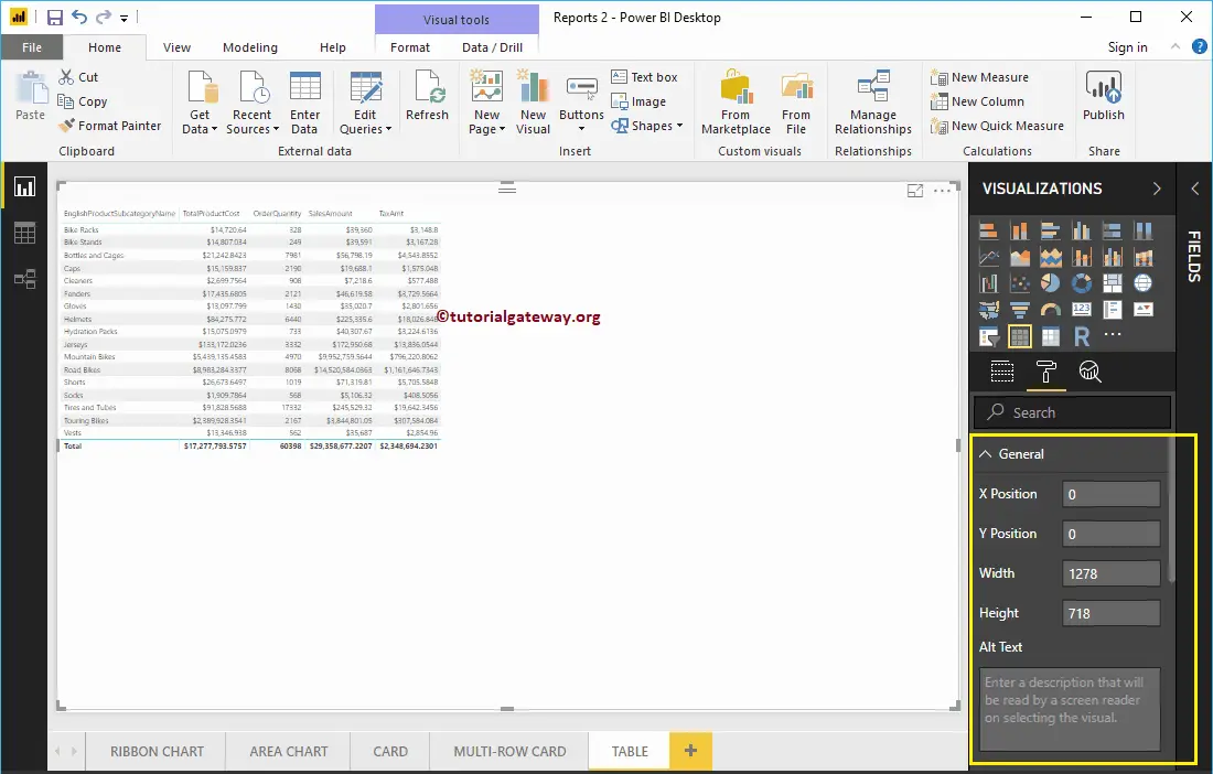
Format Power BI Table Style
From the below screenshot, you can see the list of styles that are available to style this table. Please select the style as per your requirement.
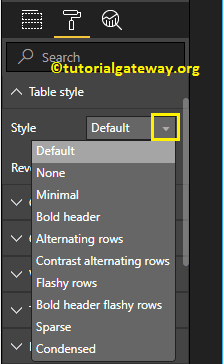
For now, we are selecting the Alternating Rows option from the drop-down list. Remember, this is the default option for any table, and it adds alternative row colors.
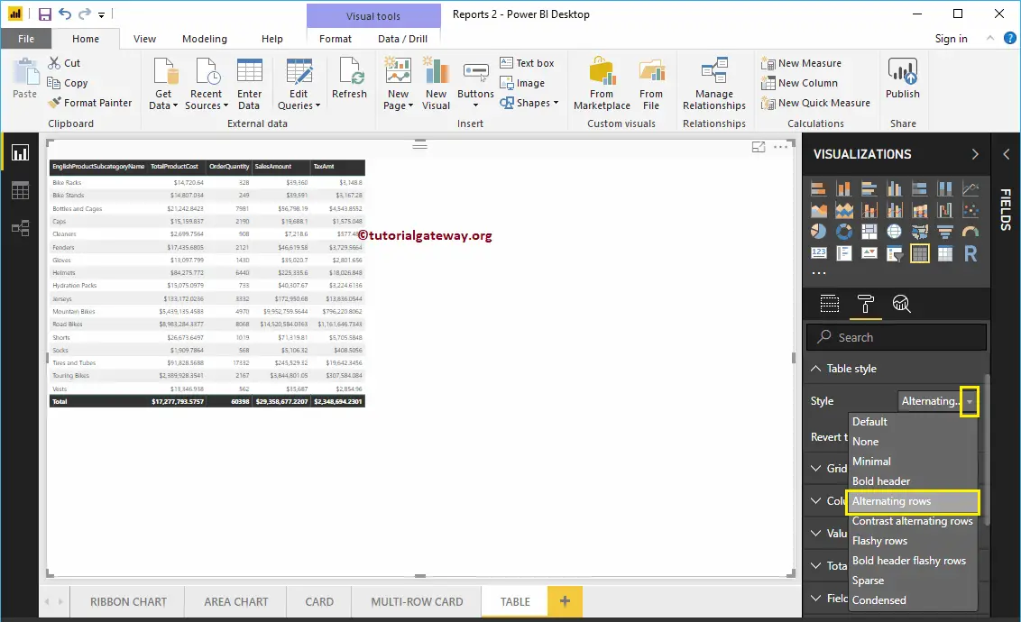
Format Grid of a Table in Power BI
The following are the list of options that are available for you to format the Grid.
- Vert Grid : Toggling this option from Off to On adds Vertical Grid. Nothing but enabling Vertical line to separate each column.
- Horiz Grid : It adds Horizontal Grid. Nothing but enabling Horizontal line to separate each row.
- Horiz Grid Color: Changing the Color of a Horizontal Grid.
- Horiz Grid thickness: Horizontal Grid Line width
- Row Padding: Space between the rows. Let me change it to 3 to increase the space
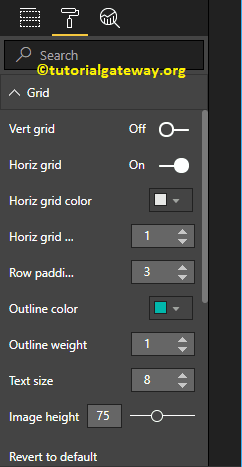
As you can see from the below screenshot, we enabled the Vertical Grid, and assigned some random colors.
- Vert Grid Color: Change the Color of a Vertical Grid.
- Vert Grid thickness: Vertical Grid Line width or stroke
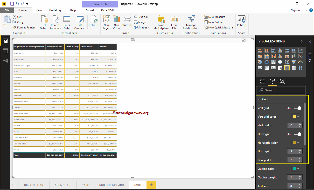
- Outline Color: Color Before the first row start, and after the last row. We are using the default green as the Outline color.
- Outline Weight: Line width. We changed the line stroke to 4
- Text Size: Font size of table values. Let me change the text size to 14
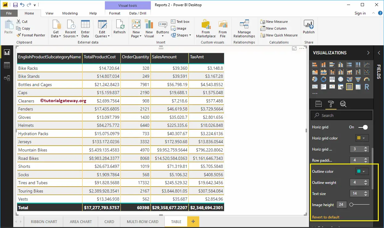
Format Column Headers of a Table in Power BI
This section is to alter the Header Colors. As you can see from the screenshot below, we changed the Font color to White, Background color to olive green. Next, Outline to Top + Bottom (Outline added to the top and bottom of a Header), Font Family to Cambria, Text Size to 26, and Header text alignment to center.
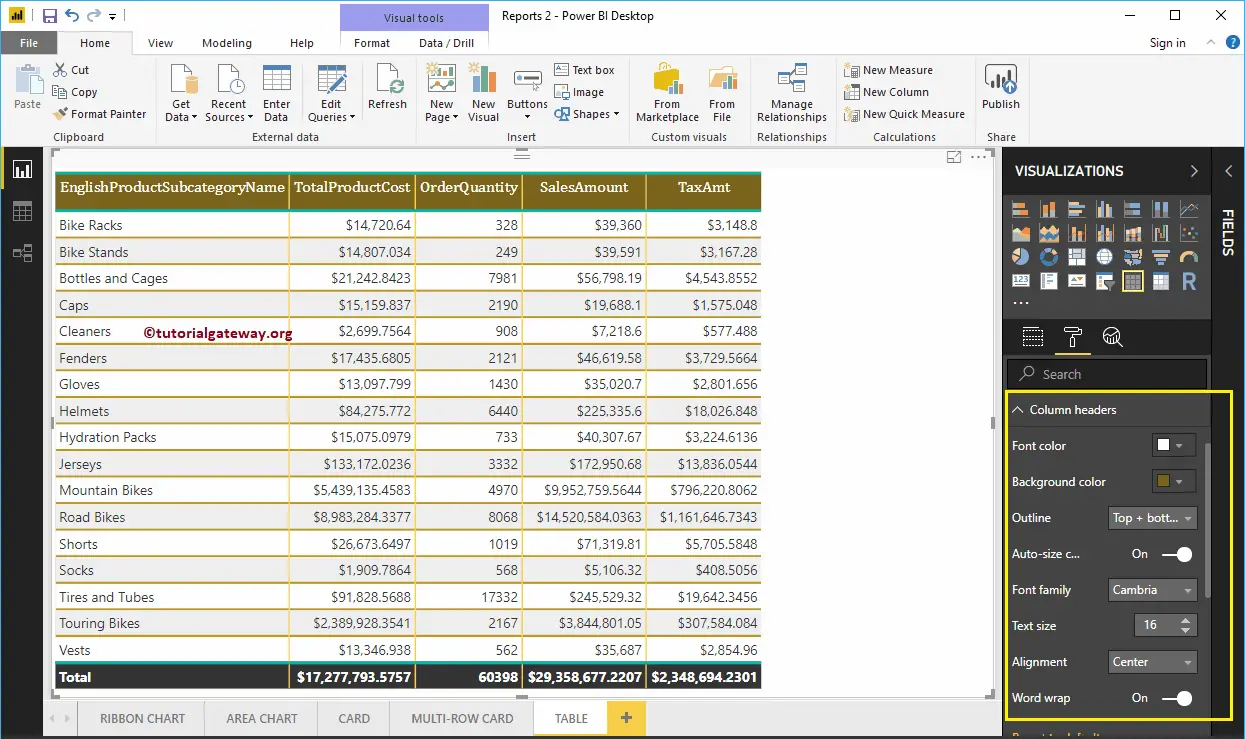
Format Values of a Table in Power BI
You can use this section to change the table values. As you can see from the screenshot below, we changed the Font colors and Back color of the even and odd rows. Here, we also changed the Font-family to Cambria, and Text size to 16
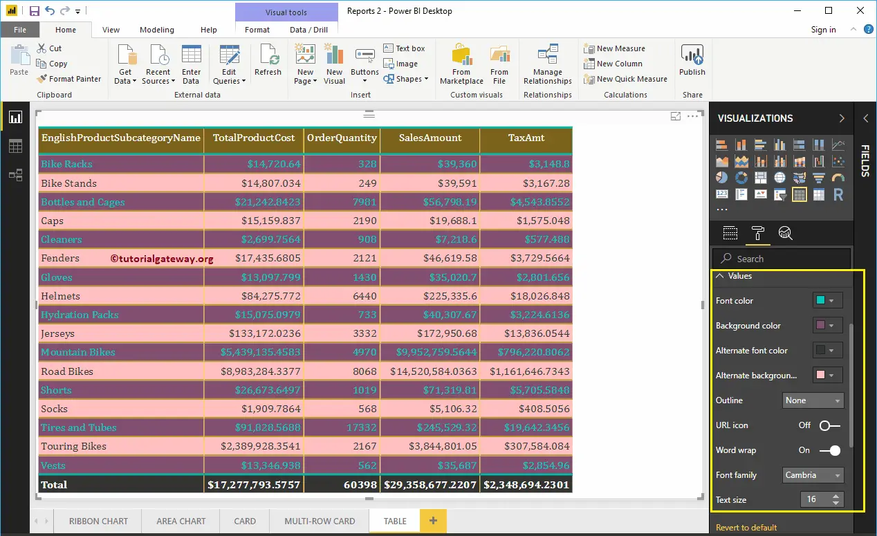
Format Total of a Table in Power BI
Use this Total section to alter the text and background color of Total. As you can see from the screenshot below, we changed the Totals Font color. Next, Background color to green, Outline to Top + Bottom (Outline added to the top and bottom of Total), Font Family to Cambria, and Text Size to 17.
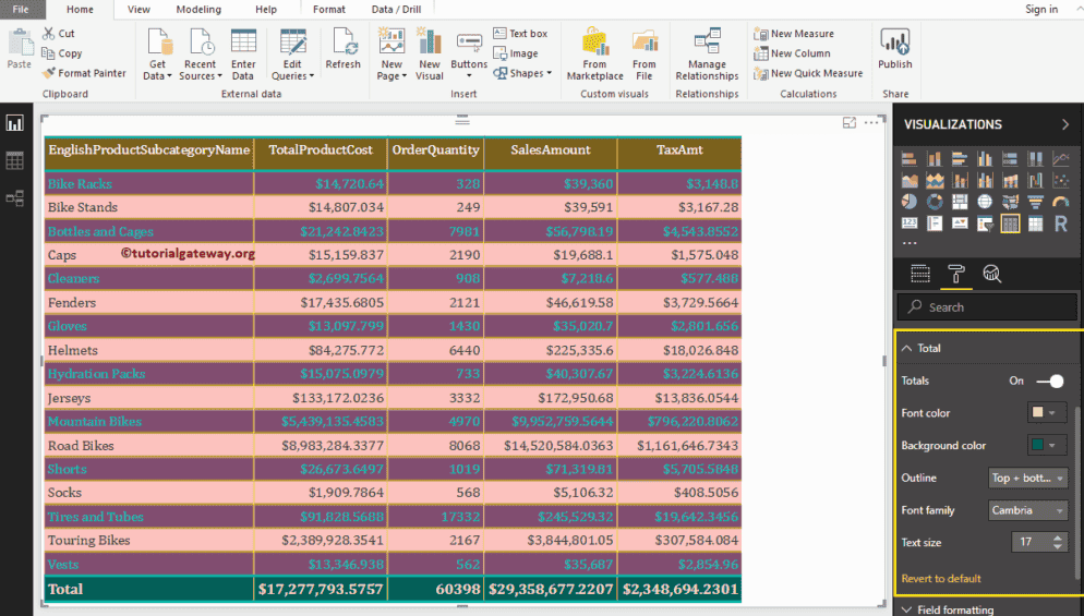
Format Power BI Table – Field Formatting
Use this section to format individual columns in a table. For example, you can use this section to assign a completely different color to one column. Here, we are selecting the English Product Sub-Category Name.
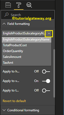
For the demo purpose, we changed the background color to white for this column only.
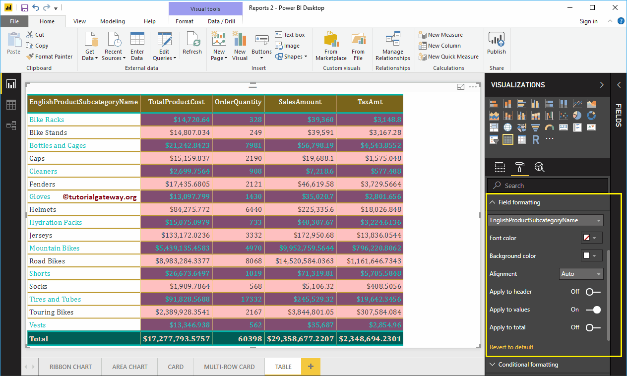
Format Power BI Table Conditional Formatting
Use this section to format Metric columns (Numeric) in a table. For now, we are selecting the Total Product Cost.
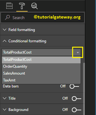
Selecting any numeric column opens the following window.
- Minimum: Color at Minimum Total Sales Amount
- Maximum: Color at Maximum Total Sales Amount
- Diverging: You can checkmark this option to assign diverging colors to this column.
We write a separate article to explain these settings
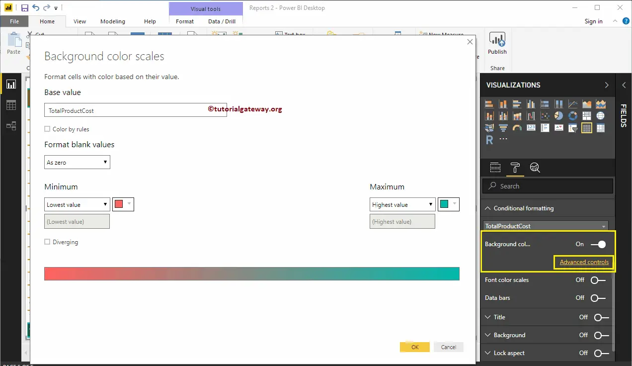
Format Power BI Table Title
By toggling the Title option from Off to On, you can enable the Table title.
From the below screenshot you can see, we added the Title Text as Product Sub-Category Sales Information. Next, Font Color to Green, Font Family to Georgia, Text Size to 21, and Title Alignment to center. If you want, you can add the background Color to the Table title as well.
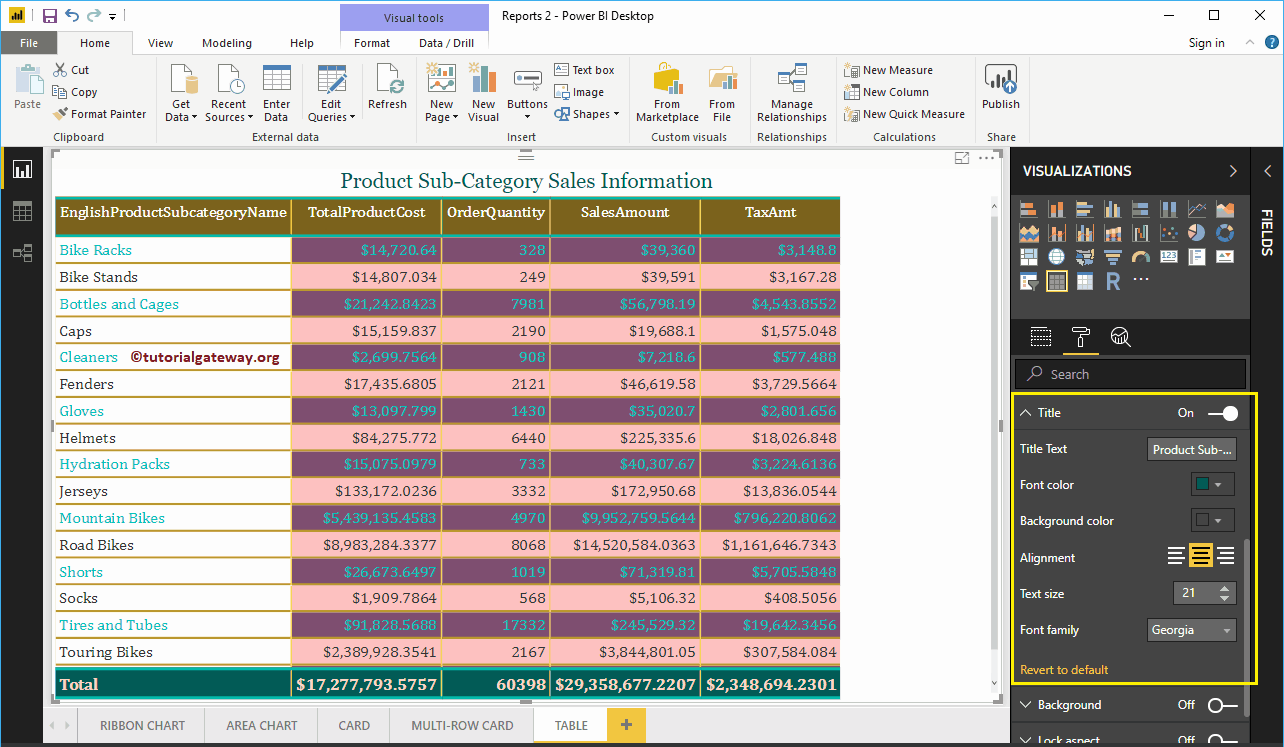
Format Power BI Table Background Color, and Borders
You can add a Background color to a table by toggling Background option to On. For the demonstration purpose, we added sky blue with 49% transparency.
Similarly, you can add Borders to a table by toggling the Border option from Off to On.
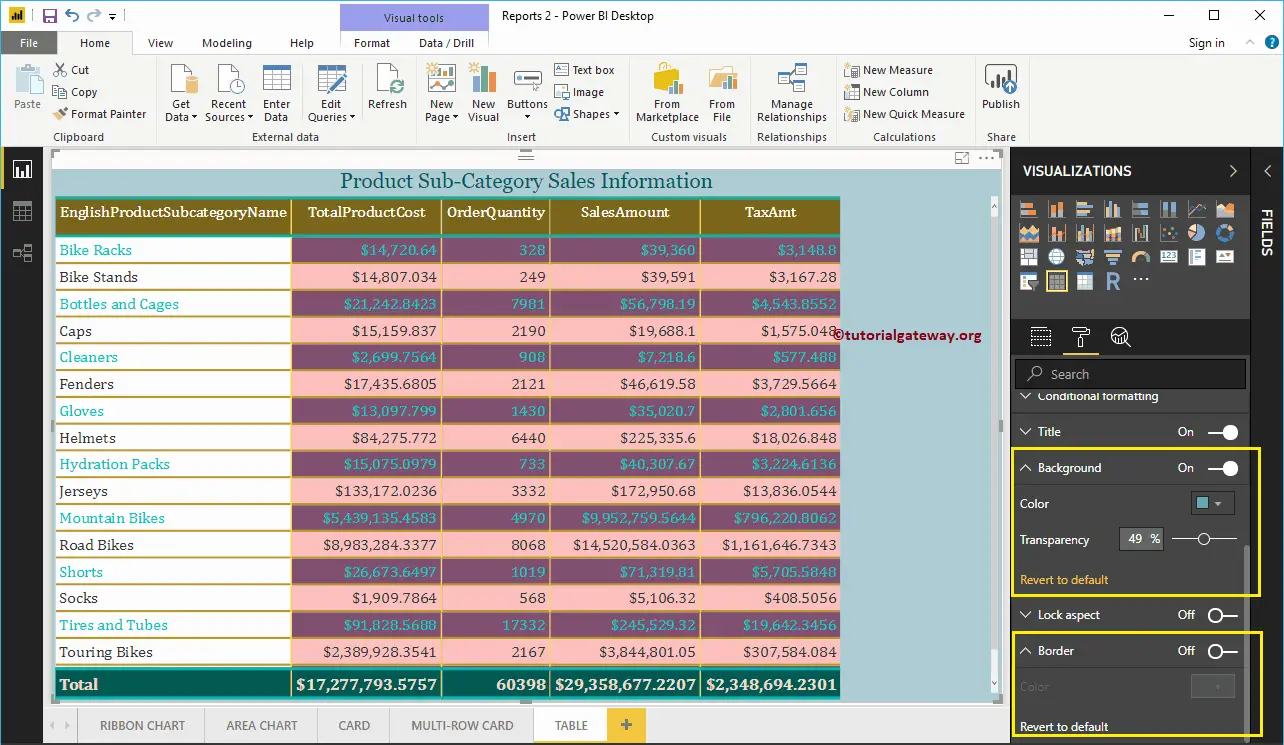
Create Power BI Treemap
Power BI Treemap is used to display the data in Rectangle Boxes. You can define the rectangle box using any Dimension column, and its size by Measure value.
The Tree maps in Power BI are very useful to display the largest data in a small region. For this Create a Treemap in Power BI demonstration, we are going to use the SQL Data Source that we created in our previous article.
Please refer to Connect Power BI to SQL Server article to understand the Power BI Data Source.
How to Create a Power BI Treemap
To create a Power BI tree map, first, Drag and Drop the Sales Amount from Fields section to Canvas. It automatically creates a Column Chart.
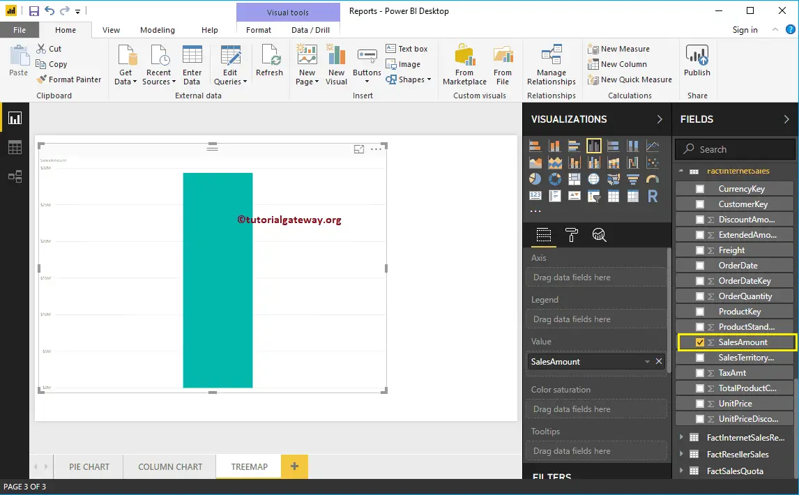
By clicking the Treemap under the Visualization section automatically convert the Column Chart into Treemap
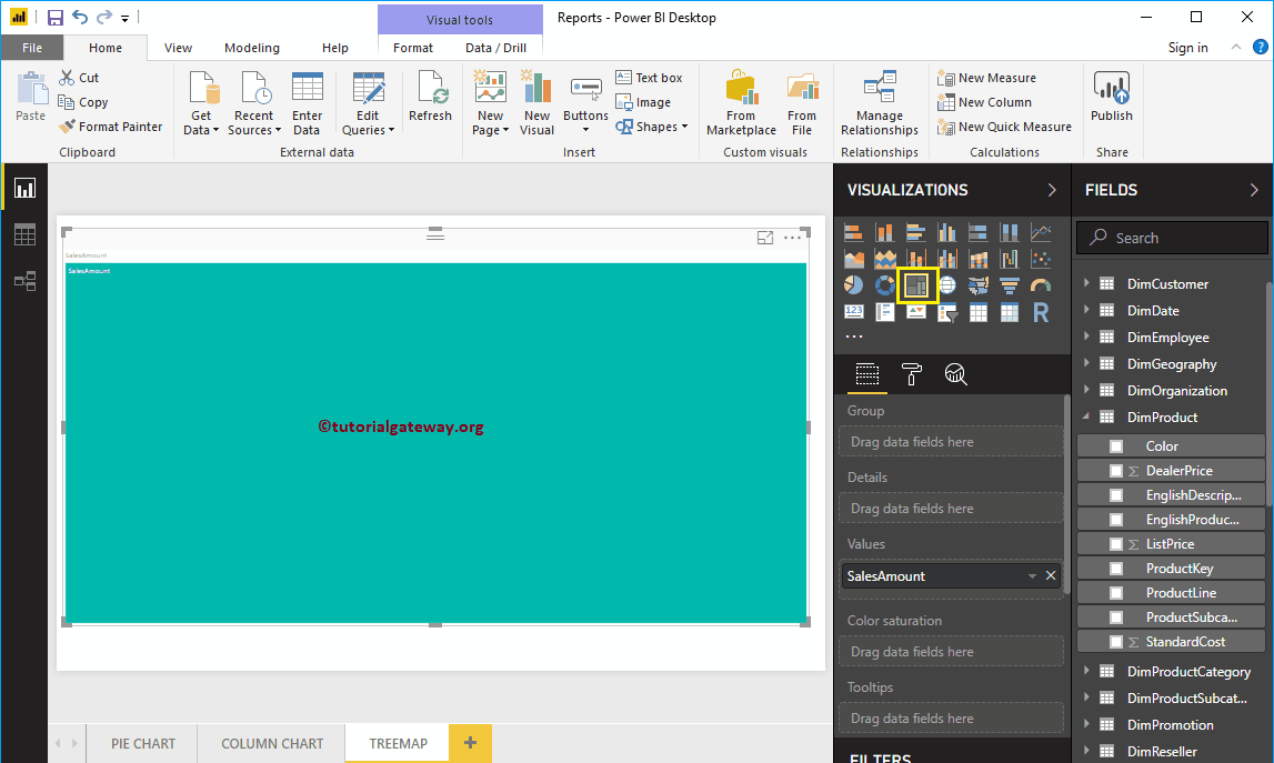
Next, let me add the English Product Name from DimProduct Table to the Group section. It divides the rectangle boxes based on the Sales amount by each product.
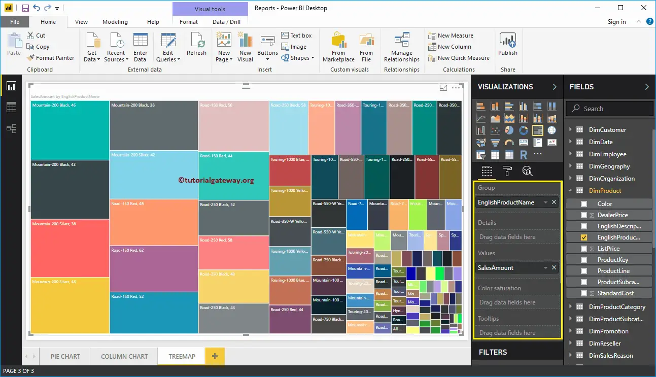
Create a Power BI Treemap Approach 2
When you click on the Treemap present in the Visualization section, it creates a Treemap with dummy data.
To add data to Power BI TreeMap, we have to add the required fields:
- Group: Please specify the Column that divides the Rectangle Boxes.
- Values: Any Numeric value, such as sales amount, Total Sales, Customer count, etc.
Let me drag and drop the Sales from Fields section to Values field.
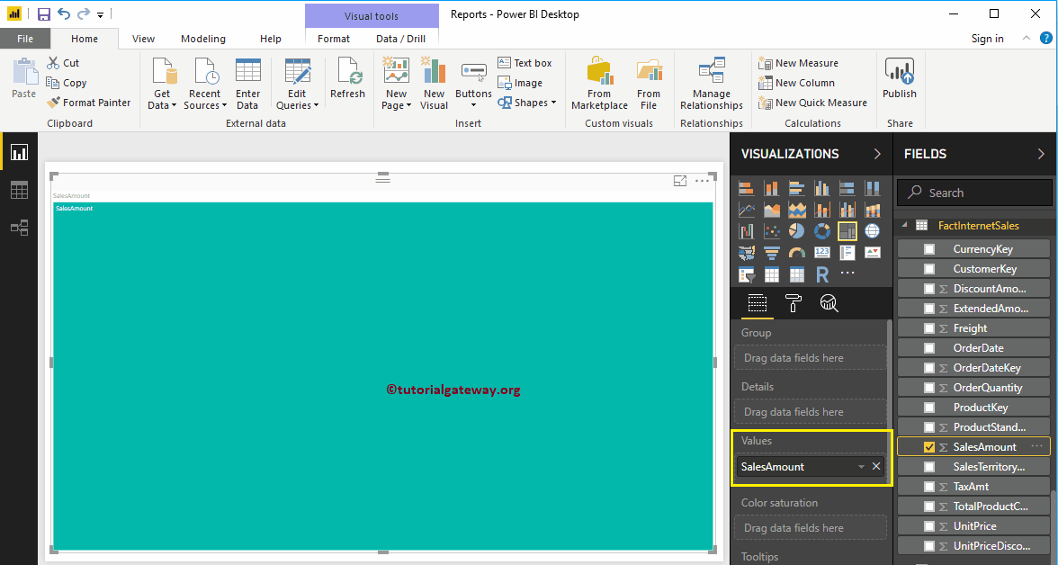
Next, add Department Name from the DimEmployee table to the group section. You can do this by dragging Department Name to Group section, or checkmark the Department Name column
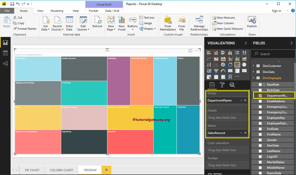
Now you can see the TreeMap of Sales Amount that is divided by Employees Department Name. Hover over any box shows the Tool-tip of Department Name and its Sales Amount
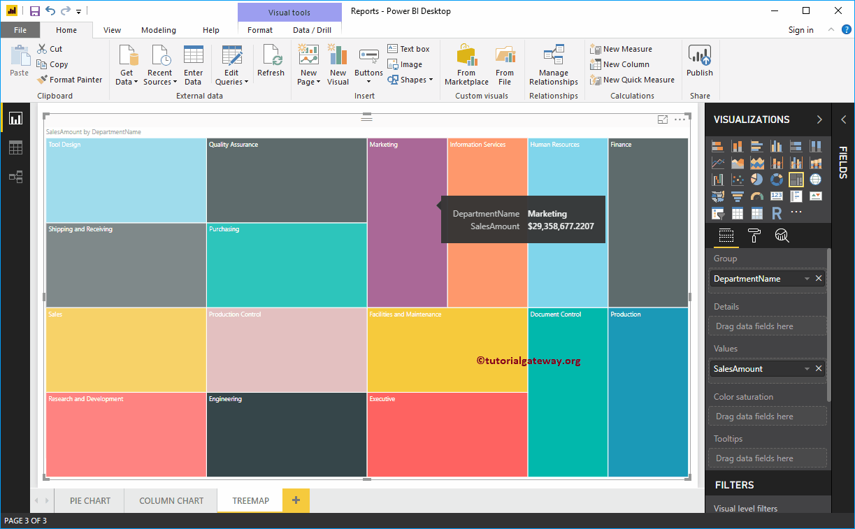
Let me do some quick formatting to the Power BI Tree map
NOTE: I suggest you to refer Format TreeMap article to understand the steps involved in formatting the Power BI TreeMap Box Colors, Title font, Title alignment, Data labels, and colors.
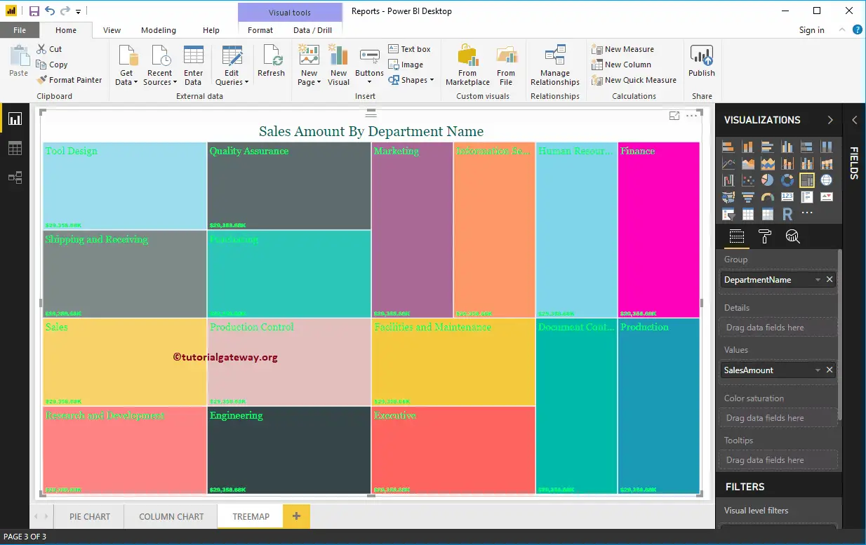
Format Tree Map in Power BI
How to Format Tree Map in Power BI with example?. It includes changing the Box Color, TreeMap Title position, background Colors, and Data labels, etc.
To demonstrate these formatting options, we are going to use the Treemap that we created earlier. Please refer Power BI Treemap article to understand the steps involved in creating Power BI Tree Map.
How to Format Tree Map in Power BI
Please click on the Format button to see the list of available formatting options for the tree map.
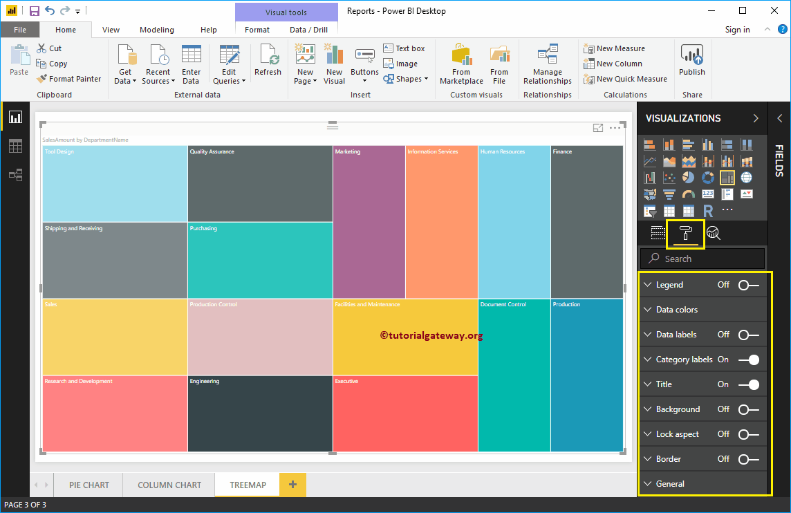
Format Legend of a Tree Map in Power BI
To display the Legend, Please select the Legend region and change the option from Off to On. From the below screenshot, you can see the legend
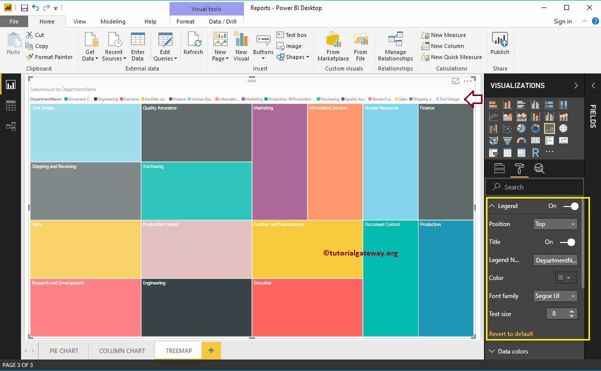
Format Power BI Tree Map Data Colors
By default, Power BI IntelliSense assign random colors to each rectangle box. But using this Data Colors section, you have an option to changes these colors as per your requirement.
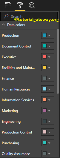
For the demonstration purpose, we changed the rectangle Box of a Finance to Pink.
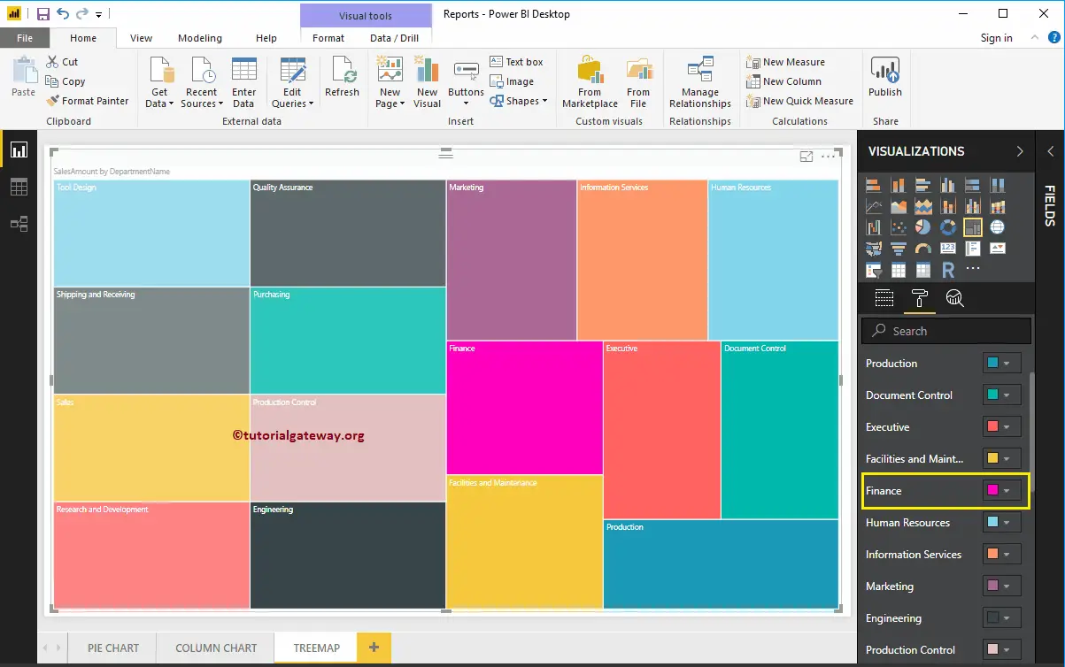
Enable Data Labels on Tree Map in Power BI
Data Labels used to display information about the rectangle box. In this case, it displays the Sales Amount of each rectangle box. To enable data labels, please toggle Data labels option to On.
From the screenshot below, you can see we changed the Color, Display Units from Auto to Thousands and Font family to Arial Black.
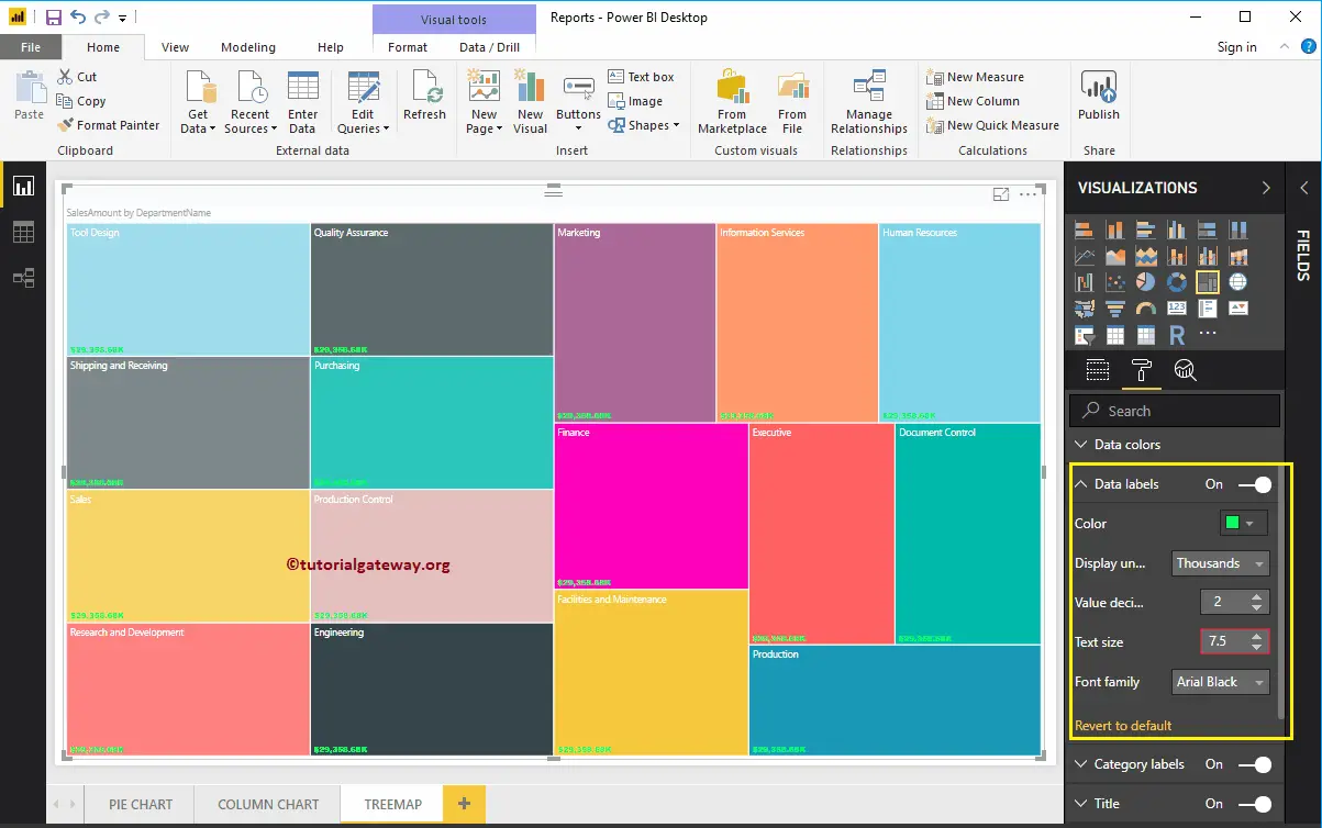
Format Category Labels of a Power BI Tree Map
Category Labels are noting but a Dimension value (Group Value) that represents a rectangle box. From the screenshot below, you can see that we changed the color of a category Label, Text Size to 14, and Font family to Georgia.
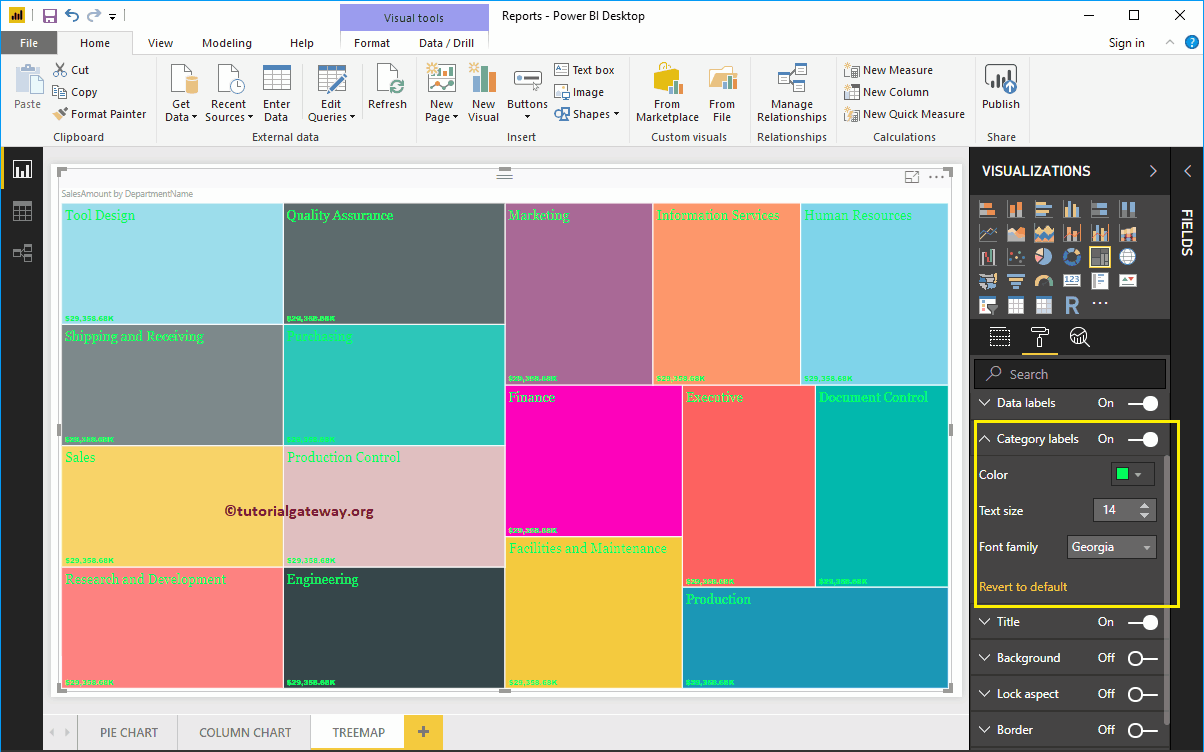
Format Title of a Tree Map in Power BI
Please select the Title, and toggle the option from Off to On to display the Treemap title. The following are the list of options that are available to format the Treemap title.
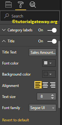
As you can see from the screenshot below, we change the Title Text to Sales Amount by Department Name. Next, Font style to Georgia, Font Size to 20, and Title Alignment to center.
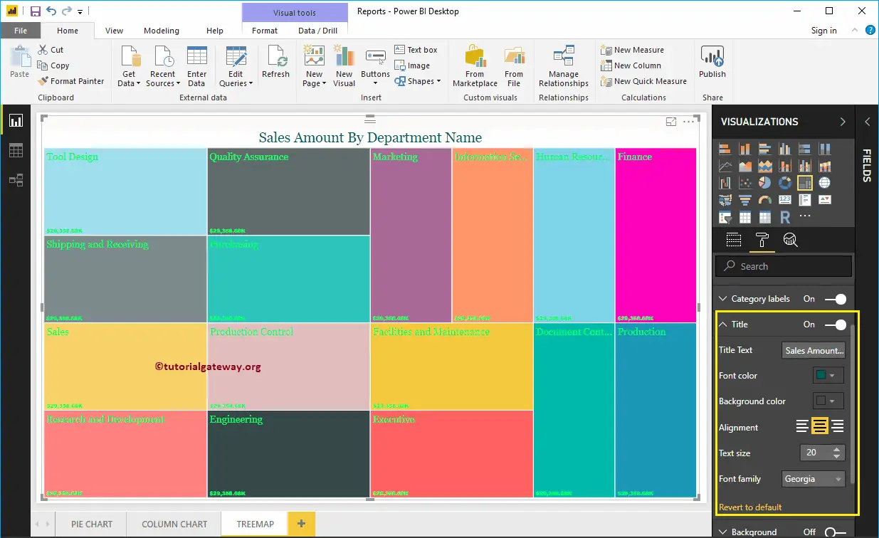
Add Background Color to Tree Map in Power BI
You can add the Background color to Treemap by toggling Background option to On. For the demonstration purpose, we are adding Yellow as the background color. Here, you can change the Transparency percentage as well.
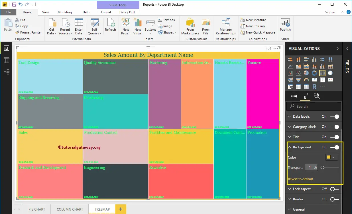
The screenshot below shows you the Treemap after formatting.

Waterfall Chart in Power BI
Power BI Waterfall Chart is very useful to visualize the Sales or Profit over some time. Let me show you how to create a Waterfall Chart in Power BI with example.
For this Power BI Waterfall Chart demonstration, we are going to use the Excel Data Source that we created in our previous article. So, Please refer to Connect Power BI to Excel Multiple Excel Sheets article to understand the Power BI Data Source.
How to Create a Waterfall Chart in Power BI
To create a Waterfall Chart in Power BI, first, Drag and Drop the Profit from Fields section to the Canvas region. It automatically creates a Column Chart, as we showed in below.
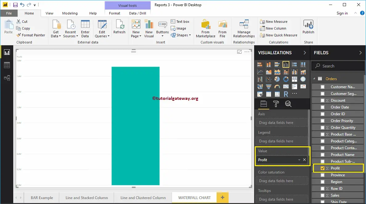
Let me add the Product Sub-Category to the Axis section.
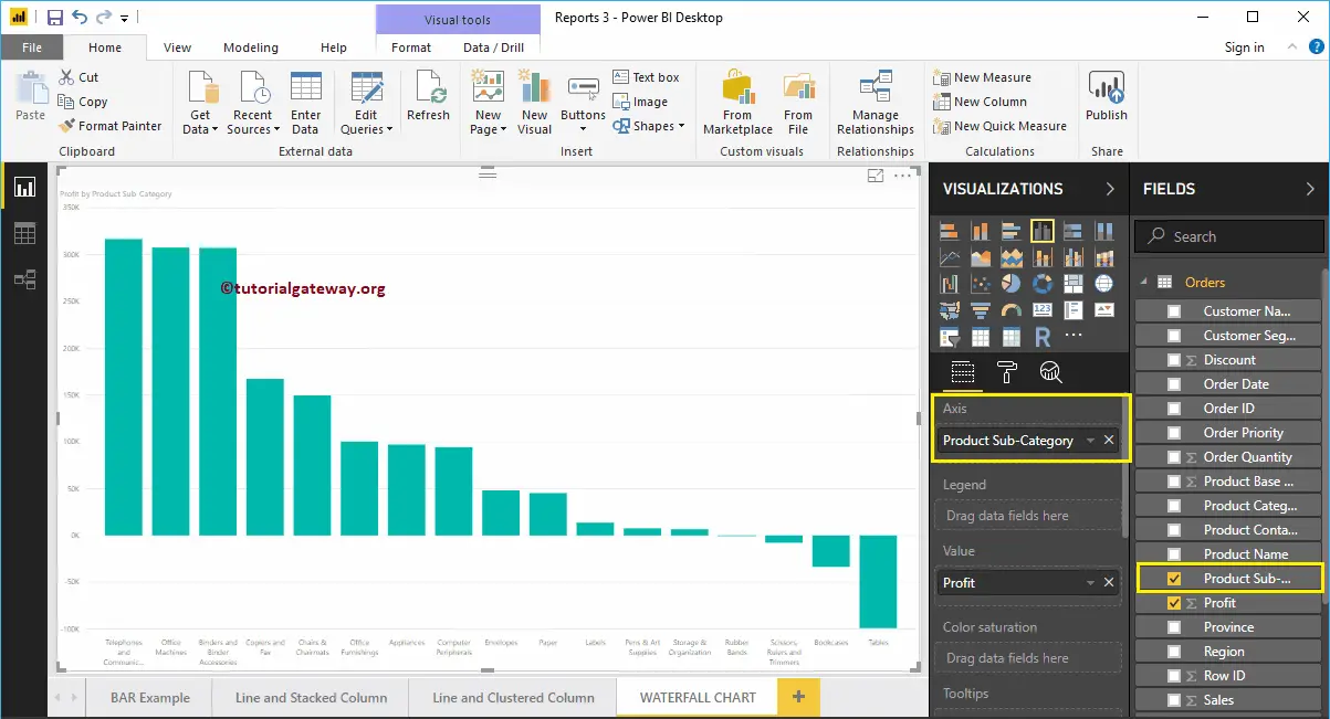
Click on the Waterfall Chart under the Visualization section. It automatically converts a Column Chart into a Waterfall Chart.
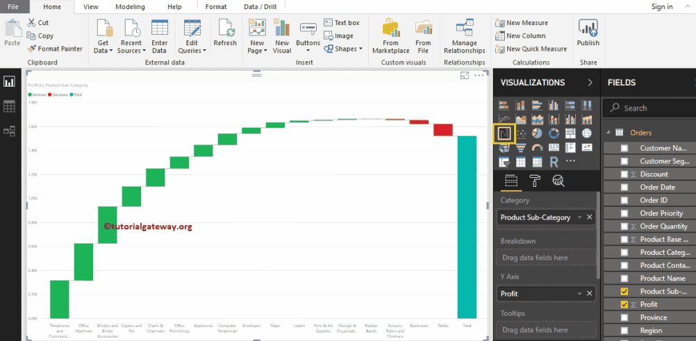
Next, we added the Data Labels so that you can see the increased or decreased profit amount. Under the sentiment colors, you can change these bar colors as well.
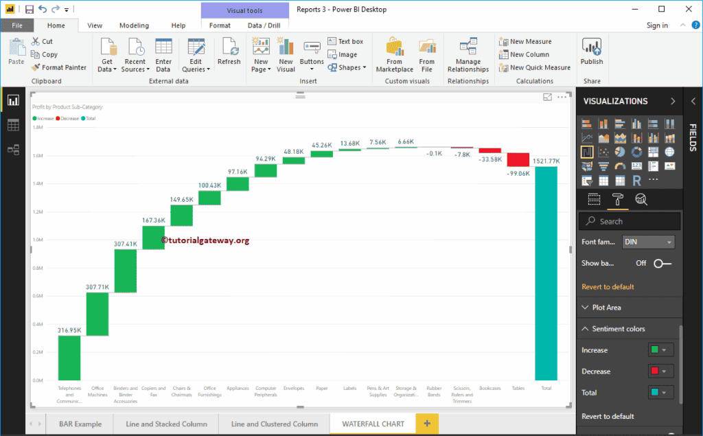
Create a Waterfall Chart in Power BI Approach 2
First, click on the Waterfall Chart under the Visualization section. It automatically creates a Waterfall Chart with dummy data, as shown in the screenshot below.
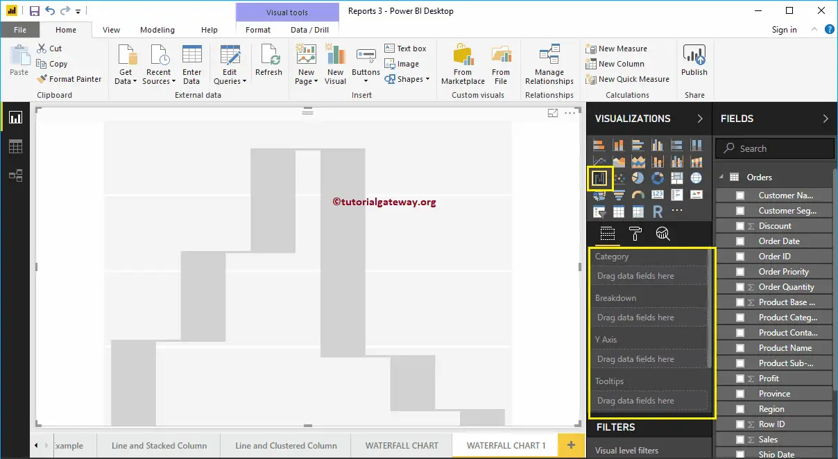
To add data to the Power BI Waterfall Chart, we have to add the required fields:
- Category: Please specify the Column that divides the chart (Horizontal axis column).
- Breakdown: Specify the Column that sub-divide the Details data.
- Y Axis: Please specify the Metric Column that represents the Vertical Axis.
Let me drag the Profit from the Fields section to the Y-Axis section.
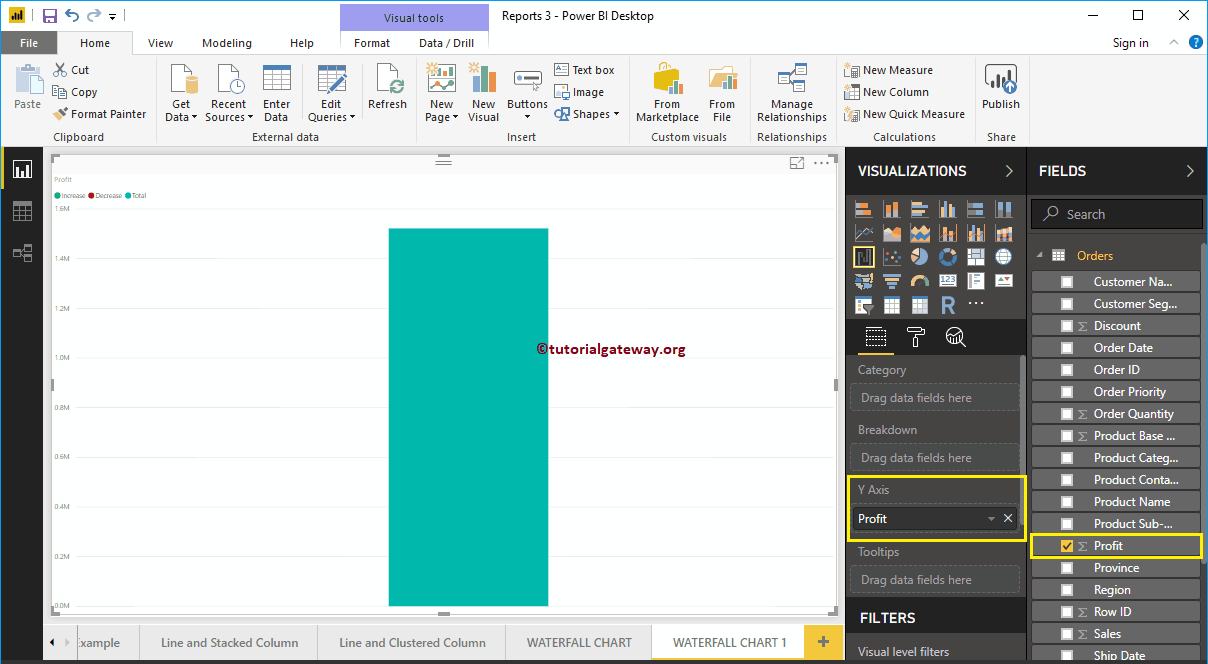
Next, let me add the Product Container to the Category section. You can do this by dragging the Product Container to Category section, or simply checkmark the Product Container column.
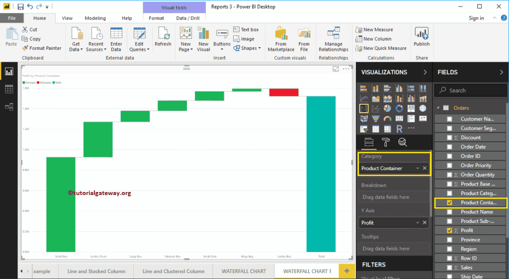
Next, we added the Data Labels so that you can see the increased profit.
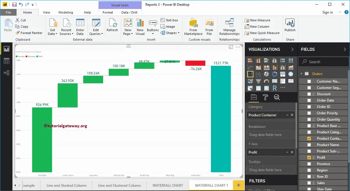
From the above screenshot, you can see that the Waterfall chart is sorted by Profit in descending order. So, let me sort the chart by Profit in ascending order. To do this, click on the … (3 dots) on the top right corner, and select the Left corner of the Sort By Profit option, as we shown below.
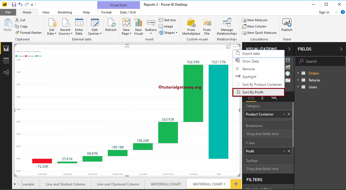
This time we sorted the data by Product Container in descending order.
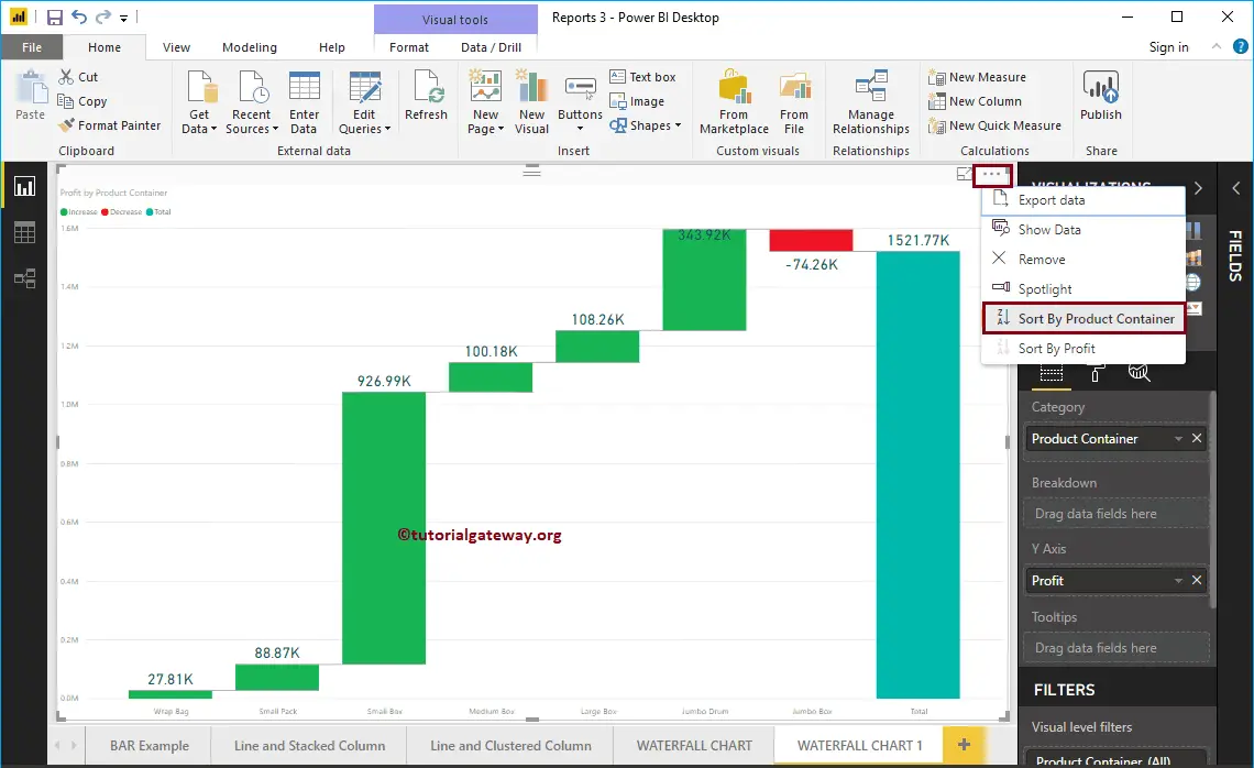
This time we sorted the data by Product Container in ascending order.
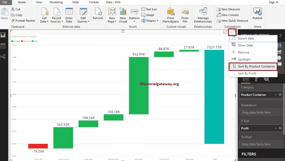
Power BI Waterfall Chart Breakdown
Let me add Customer Segment to the Breakdown section. And as you can see from the screenshot below, the waterfall chart has further divided based on the Customer Segment.
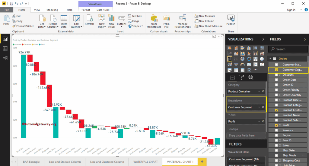
Let me do some quick formatting to this Waterfall Chart
NOTE: I suggest you refer to Format Waterfall Chart article to understand the formatting options.
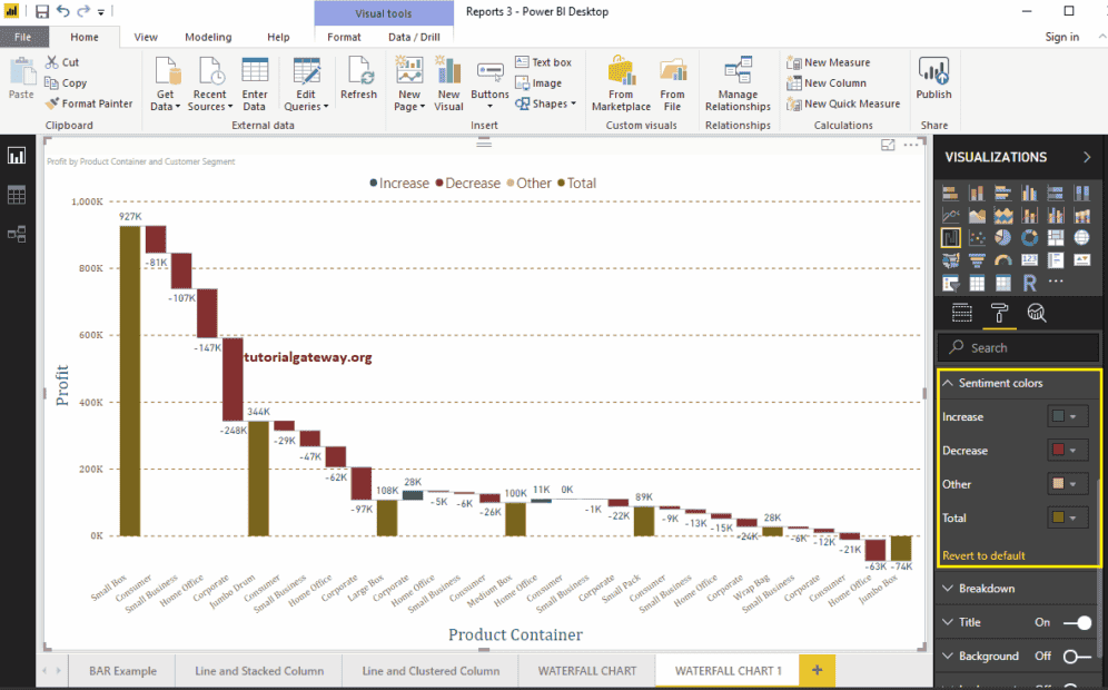
Format Power BI Waterfall Chart
How to Format Power BI Waterfall Chart with example?. Formatting Waterfall Chart includes changing the Bar colors, Waterfall Chart Title text, Title position, Y-Axis, and X-Axis Details, Data labels, and Background Images, etc.
To demonstrate these Waterfall Chart formatting options, we are going to use the Waterfall Chart that we created earlier. Please refer Waterfall Chart in Power BI article to understand the steps involved in creating a Power BI Waterfall Chart.
How to Format Power BI Waterfall Chart in Power BI
Please click on the Format button to see the list of formatting options that are available for this Waterfall Chart. As you can see from the below screenshot, Hovering over any bar show you the Profit difference between the Product Containers

Format Power BI Waterfall Chart General Settings
Use this General Section to Change the Chart Responsiveness, X, Y position, Width and height of a Waterfall Chart
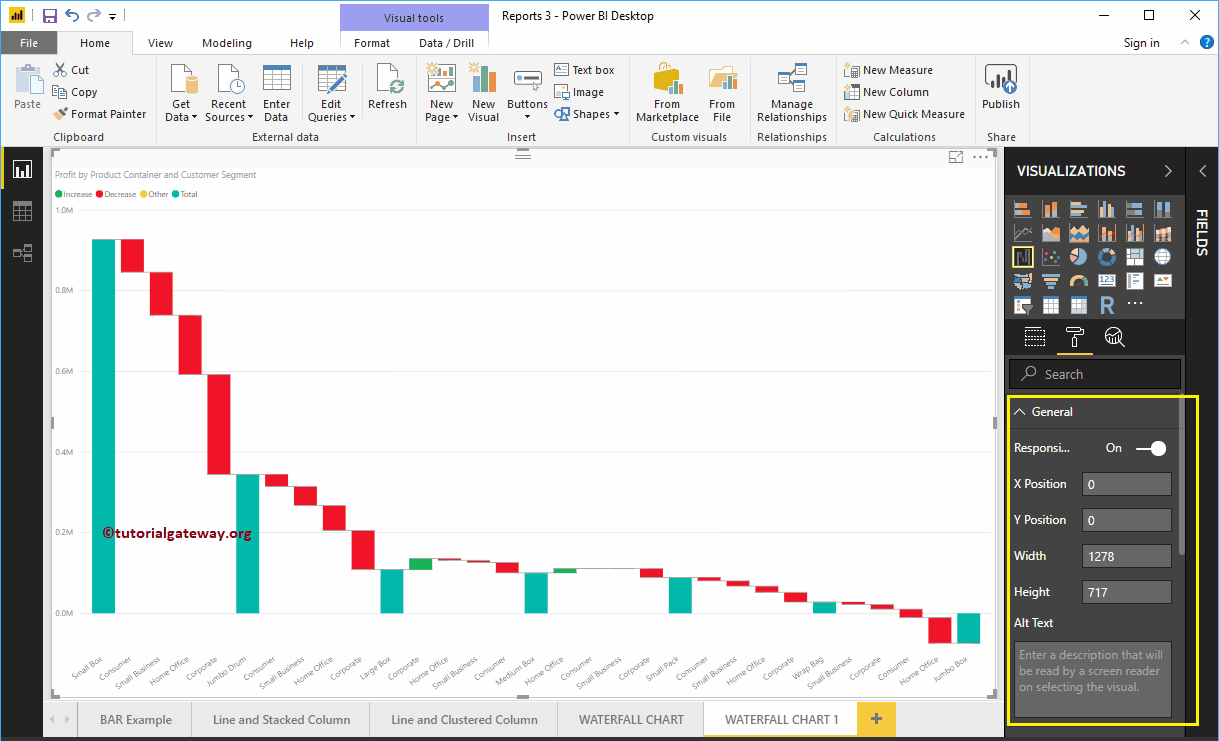
Format Legend of a Waterfall Chart in Power BI
Please select the Legend region and toggle the option from Off to On to enable Legend.
As you can see from the screenshot below, we used the Position drop-down box to change the legend position to Top Center. Next, we changed the legend Color to Brown and text size to 15.
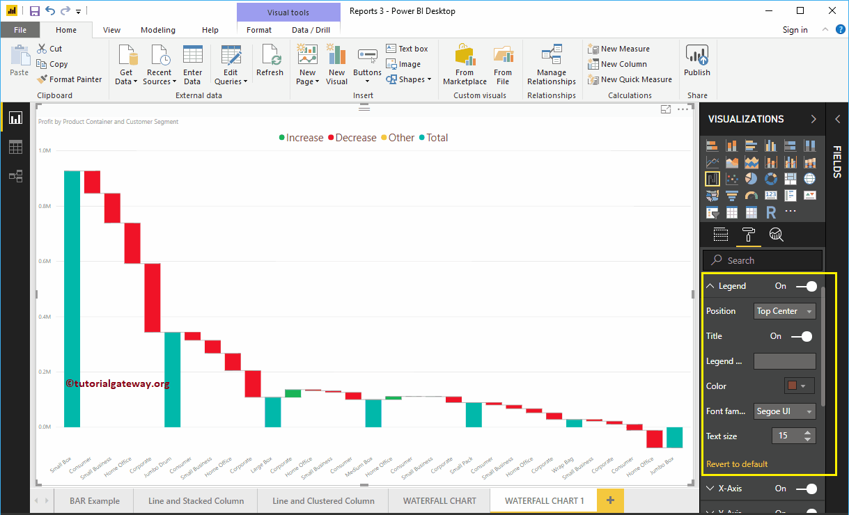
Format X-Axis of a Waterfall Chart in Power BI
The following are the list of options that are available for you to format the Horizontal axis or X-Axis. As you can see from the screenshot below, we change the Color to Brown, Text Size to 14, and font family to Cambria.
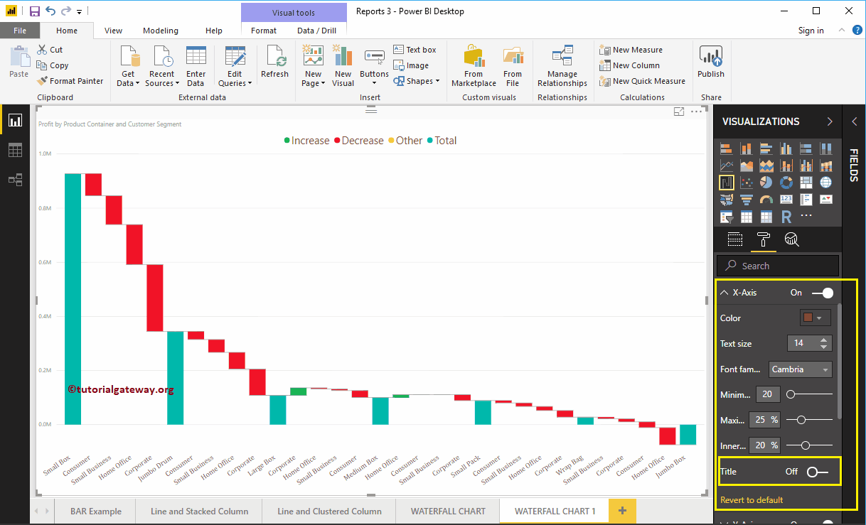
By default, the X-Axis title set to Off. Let me change the option from Off to On. Next, change the Title Color to Green, Font style to Cambria, and Font Size to 25.

Format Y-Axis of a Power BI Waterfall Chart
The following are the list of options available to format vertical Axis. Here, you can change the default start and end values of the YAxis
As you can see, we changed the Y-Axis Font color to Brown, Font Family to Cambria, Display units to Thousands, and Text Size to 15.
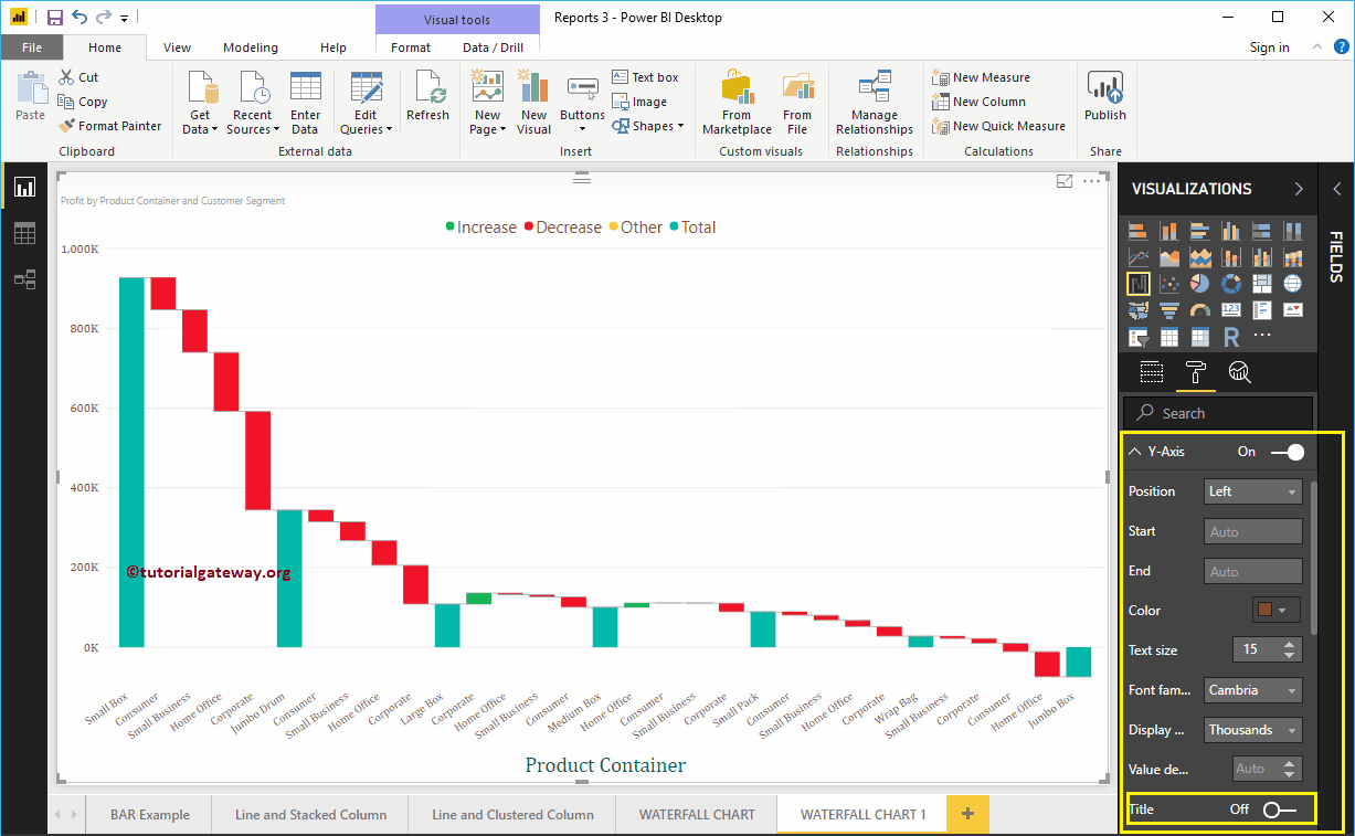
By default, the X-Axis title set to Off. Let me change the option from Off to On. Next, we changed the Y-Axis Title Color to Green, Text Size to 25, and Font family to Cambria.
By toggling the Gridlines option from On to Off, you can disable the Gridlines.
- Color: You can change the Gridlines color.
- Stroke Width: Use this to change the Gridlines width.
- Line Style: Choose the line style such as Solid, dotted, and dashed.
Here, we changed the color to gold, and line style to dashed.
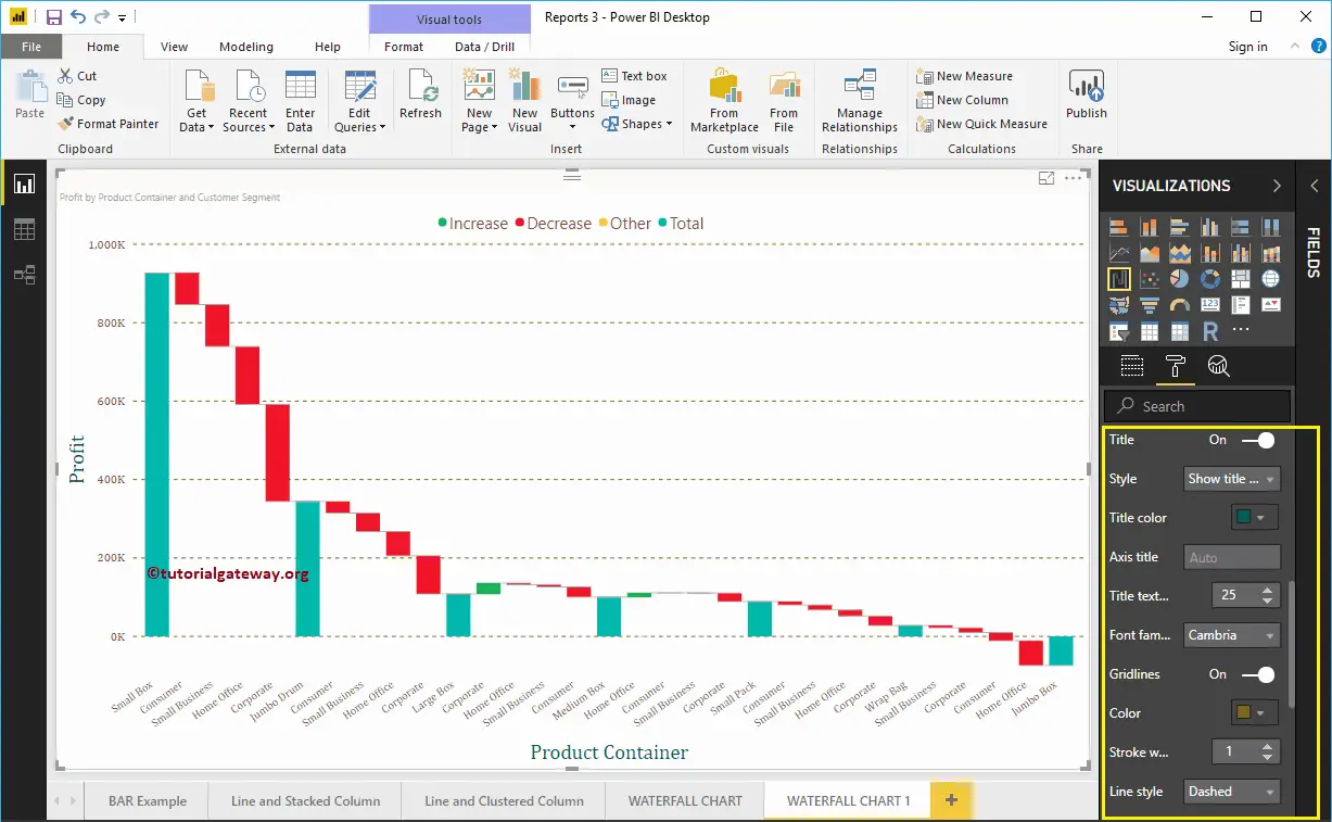
Format Data Labels of a Waterfall Chart in Power BI
Data Labels display the Values (Sales or Profit at each point of time). As you can see from the screenshot below, we enabled data labels and changed the color to green.
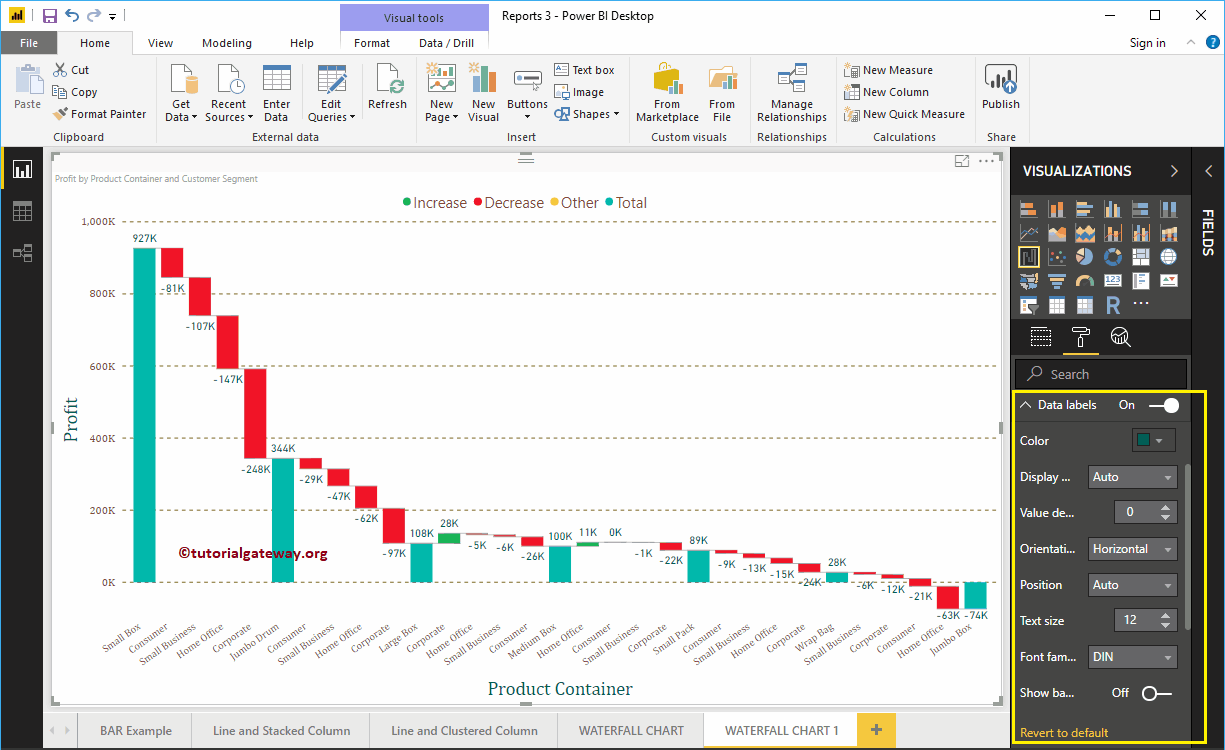
Format Waterfall Chart in Power BI Plot Area
Using this Plot Area property, you can add custom Images as the Background of the waterfall Chart. For the demonstration purpose, we added one image as the Plot Area Background.
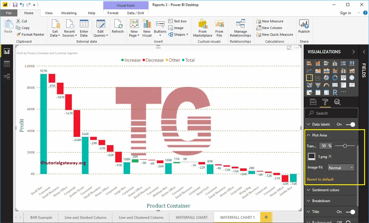
Format Power BI Waterfall Chart Data Colors
Please change these colors as per your requirements.
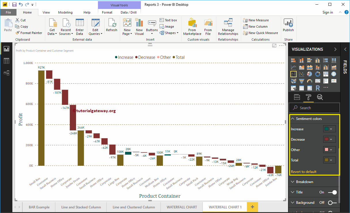
Format Power BI Waterfall Chart Breakdown
This option restricts the number of breakdowns waterfall charts allowed. While we are creating this waterfall chart, we added the Customer Segment as the Breakdown property.
Our data has 4 records under the Customer Segment, and that’s why breakdown is showing those 4 records.
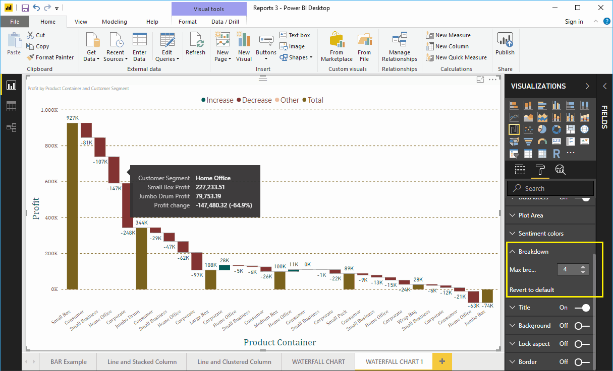
Let me change the value to 2. It means the waterfall allows a maximum of two breakdowns in between each product container.
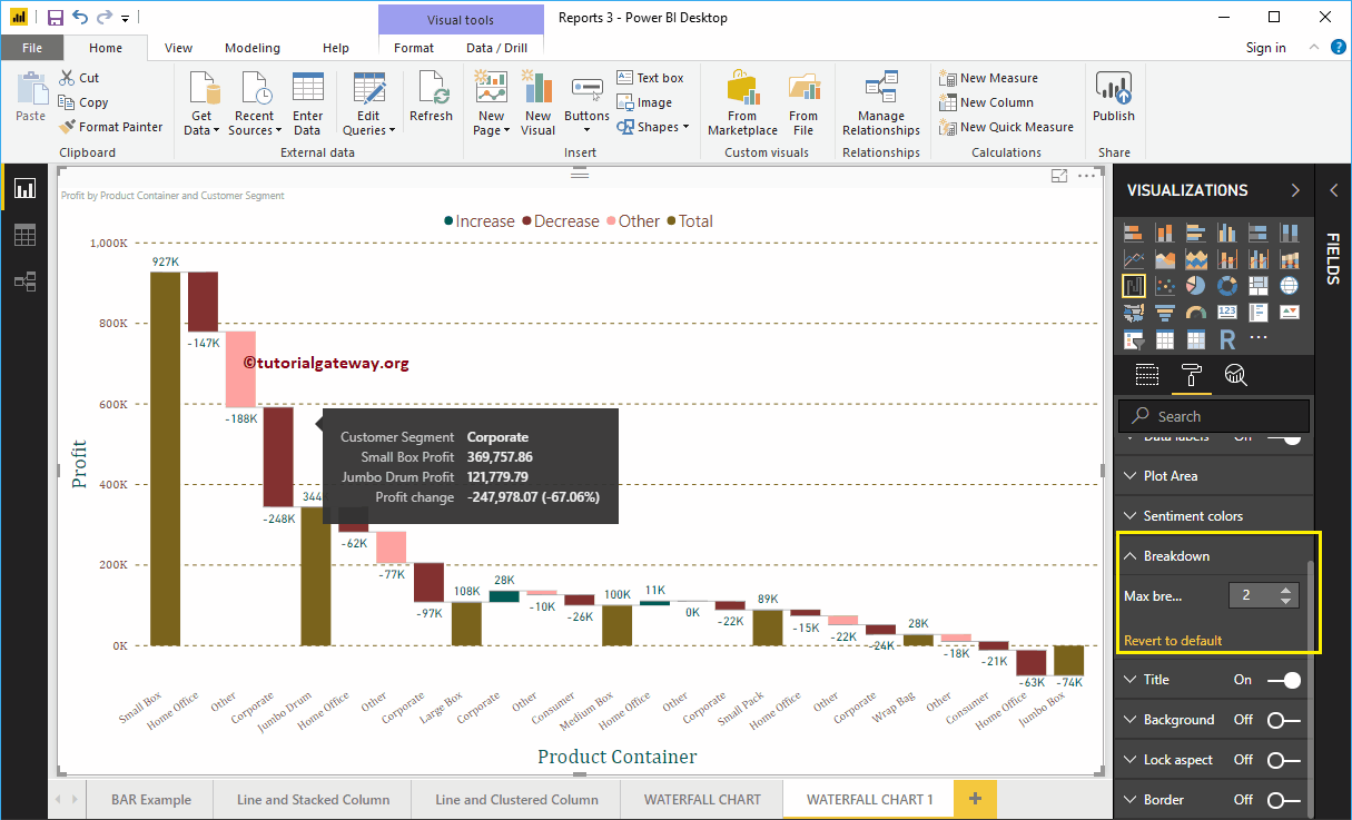
Format Power BI Waterfall Chart Title
By toggling the Title option from On to Off, you can disable the Waterfall Chart title.
From the screenshot below, you can see we change the Font Color to Green, Title Alignment to center, Text Size to 25, and Font Family to Georgia. If you want, you can add the background color to the title as well.
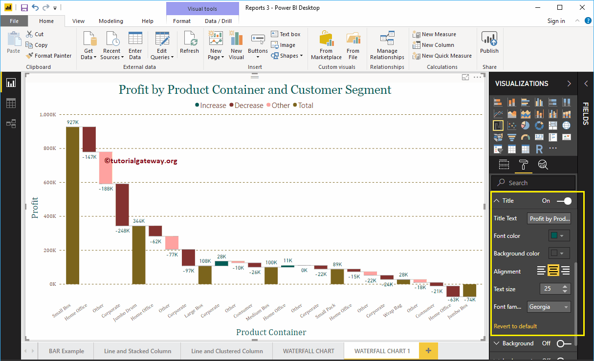
Format Power BI Waterfall Chart Background Color, and Borders
You can add the Background color to a Waterfall Chart by toggling Background option to On. For the demonstration purpose, we added a random yellow color with 30% transparency.
Similarly, you can add Borders to a Waterfall Chart by toggling the Border option from Off to On.
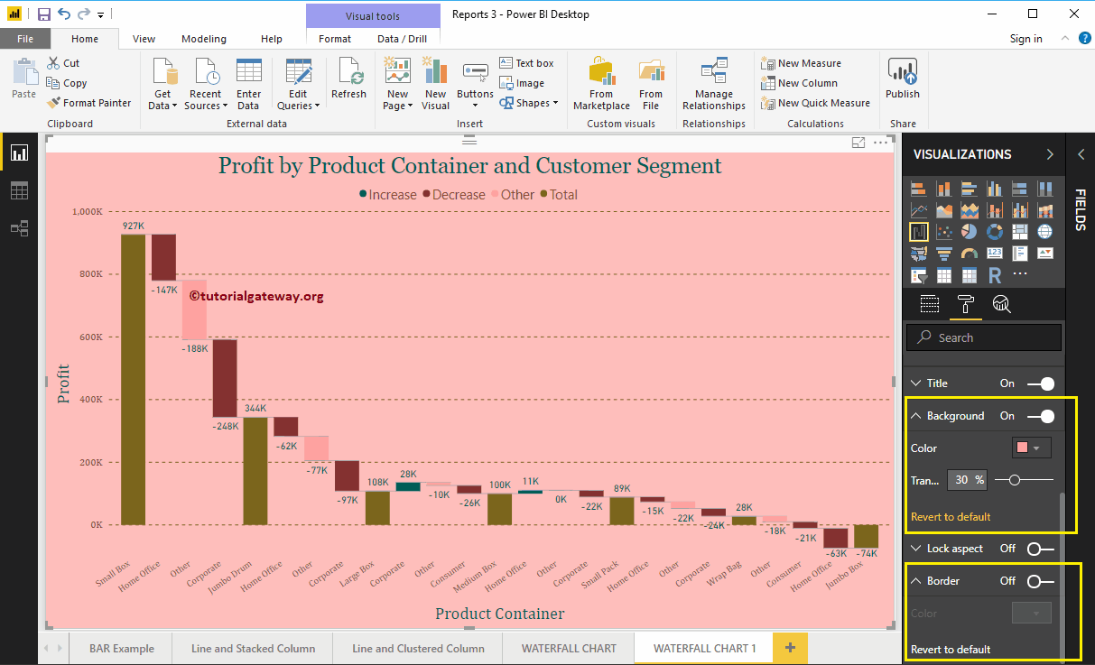
Power BI 100% Stacked Bar Chart
The Power BI 100% Stacked Bar Chart displays the metric information in percentages. Let me show you how to create a 100% Stacked Bar Chart in Power BI with example.
For this Power BI 100% Stacked Bar Chart demonstration, we are going to use the SQL Data Source that we created in our previous article. So, Please refer to Connect Power BI to SQL Server article to understand the Power BI Data Source.
How to Create 100% Stacked Bar Chart in Power BI
To create a Power BI 100% Stacked Bar Chart, first Drag and Drop the Sales Amount from Fields section to Canvas region. It automatically creates a Column Chart, as we shown below.
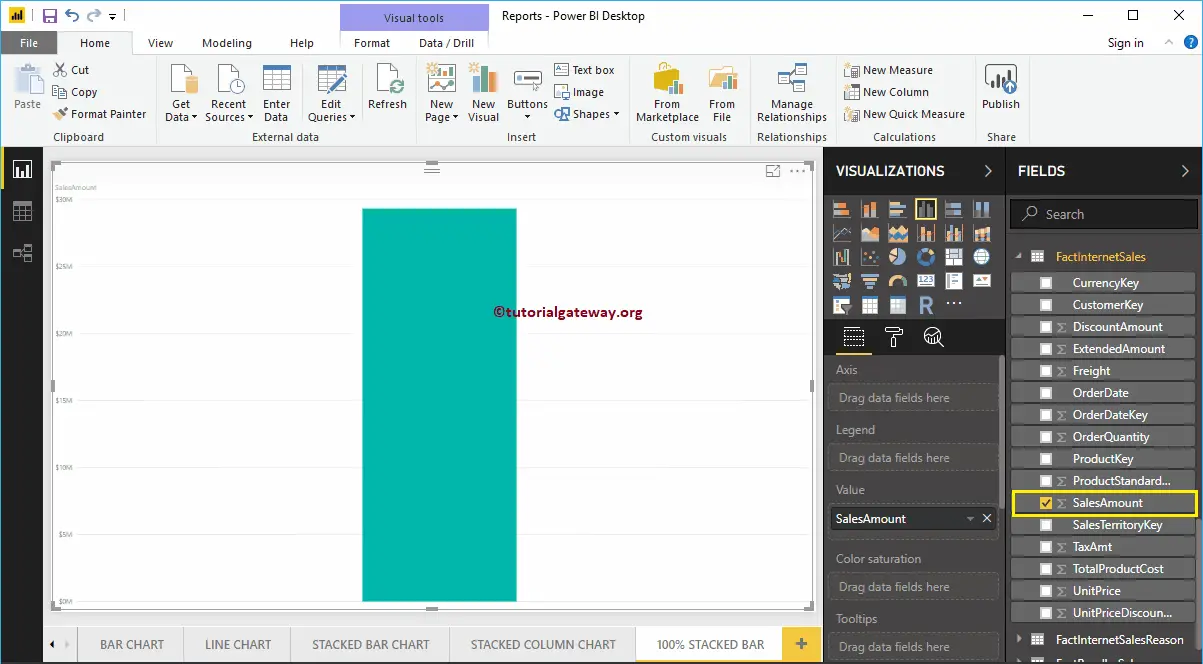
By clicking the 100% Stacked Bar Chart under the Visualization section automatically convert the Column Chart into 100% Stacked Bar Chart
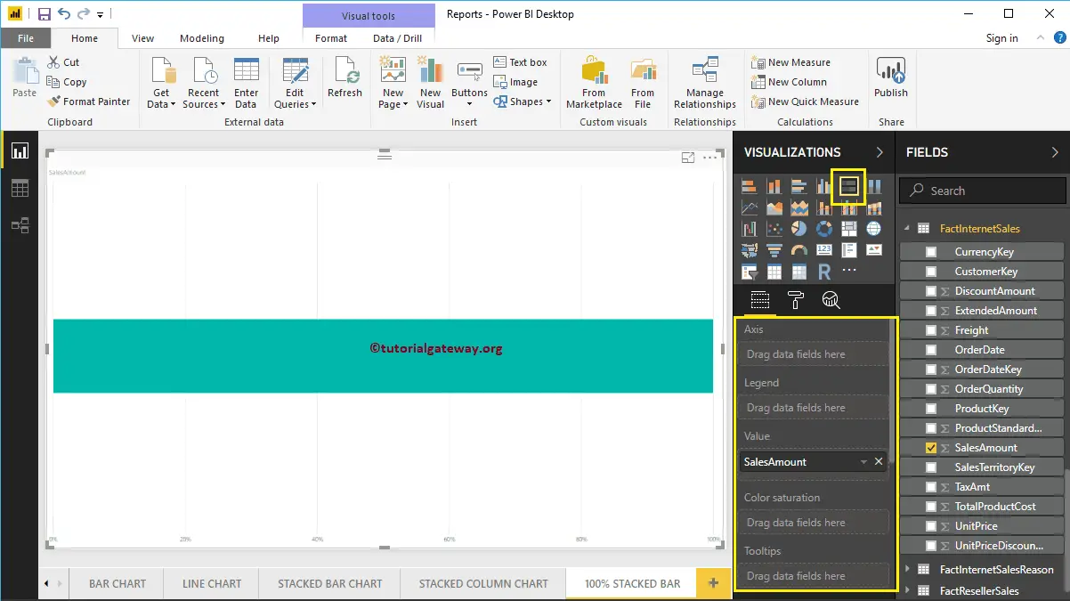
Next, let me add the English Country Region Name to Axis section to create a 100% Bar chart. This Chart shows the Sales Amount (in percentage) by English Country Region Name.
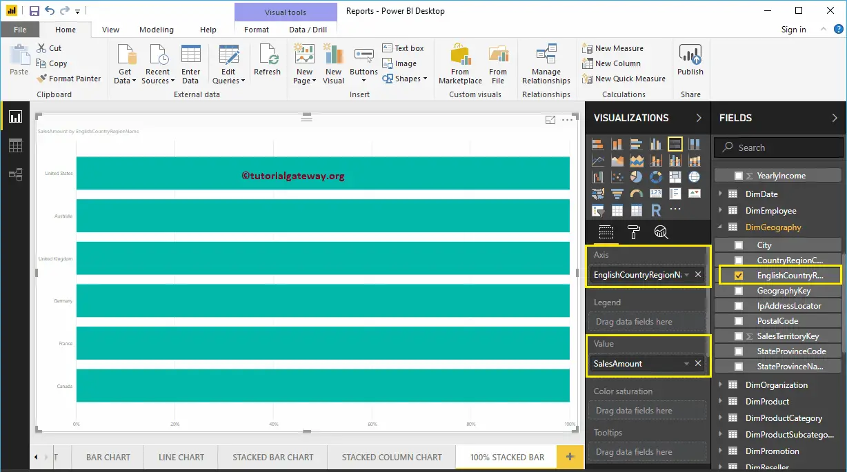
Next, we are adding Occupation to Legend section to convert it into the 100% Stacked Bar Chart.

Hover over any portion of a bar show you the Tool-tip of Country Name, Customer Occupation, and Sales Amount.
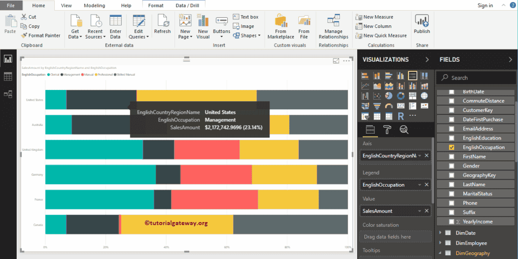
Create 100% Stacked Bar Chart in Power BI Approach 2
First, click on the 100% Stacked Bar Chart under the Visualization section. It automatically creates a 100% Stacked Bar Chart with dummy data, as shown in the below screenshot.
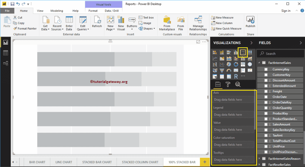
To add data to the100% Stacked Bar Chart, we have to add required fields:
- Axis: Please specify the Column that represents the Horizontal Bars.
- Legend: Specify the Column to divide the Horizontal Bars.
- Values: Any Metric value such as sales amount, Total Sales etc.
Let me drag the Sales Amount from the Fields section to the Values field and English Country Region Name field to the Axis Section.

Next, add the English Occupation from the DimCustomer table to the Legend section. You can do this by dragging Occupation to Legend section, or simply checkmark the English Occupation column.
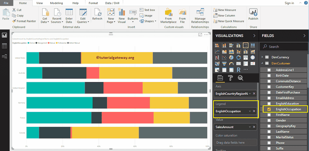
Data Labels display information about each group of a horizontal bar (country). In this case, it displays the Sales Amount (in percentage) of each occupation. Let me Enable the Data Labels so that you can see the Percentage of each group.
To enable data labels, please go to the Format tab and toggle Data labels option to On. Let me change the Color to White, Font family to DIN, and Text Size to 18
Now you can see a 100% Stacked Bar Chart with Percentage values
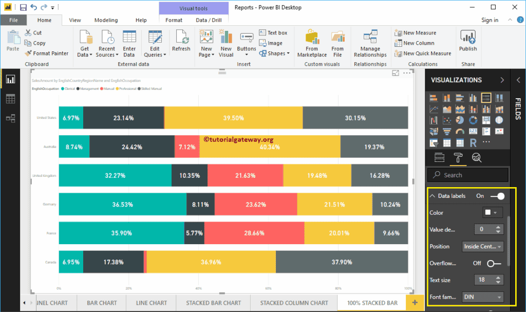
Let me do some quick formatting to this Power BI 100% Stacked Bar Chart
NOTE: Formatting options for both Stacked Bar Chart and 100% Stacked bar Chart are the same. So, I suggest you refer to the Format Stacked Bar Chart article to understand the steps involved in formatting the 100% Stacked Bar Colors.

This time, we added State Province Name to Axis and Country to Legend for a 100% stacked bar chart. From the screenshot below, you can see Country Name is acting as the Bar Color. It is because You can’t group the Country Names inside a State ( State Name Inherited from Country).
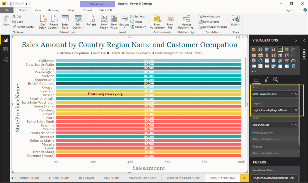
Create 100% Stacked Column Chart in Power BI
The Power BI 100% Stacked Column Chart displays the metric information in percentages. Let me show you how to Create a 100% Stacked Column Chart in Power BI with example.
For this Power BI 100% Stacked Column Chart demo, we are going to use the SQL Data Source that we created in our previous article. So, Please refer to Connect Power BI to SQL Server article to understand the Power BI Data Source.
How to Create 100% Stacked Column Chart in Power BI
To create a Power BI 100% Stacked Column Chart, first Drag and Drop the Sales Amount from the Fields section to the Canvas region. It automatically creates a Column Chart.
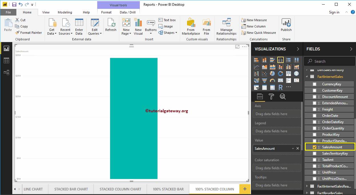
Next, let me add Sales Territory Region Name to the Axis section. This Column Chart shows the Sales Amount by Sales Territory Region Name.
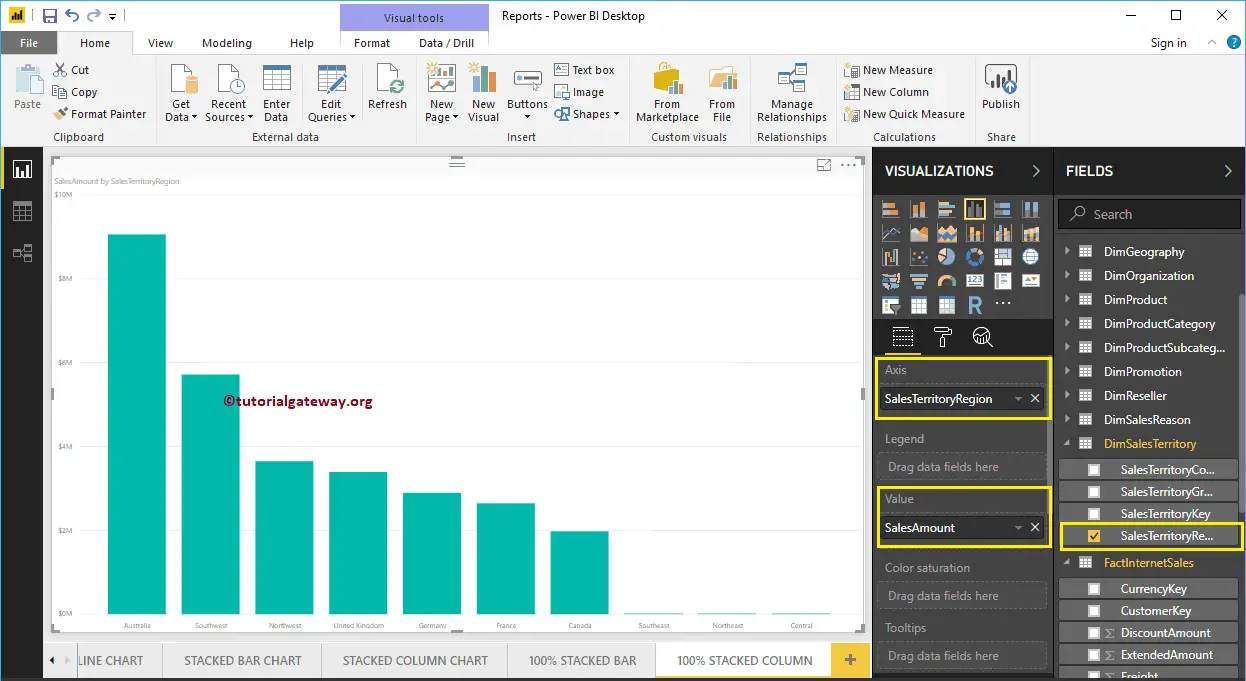
Click on the 100% Stacked Column Chart under the Visualization section. It automatically converts the Column Chart into a 100% Stacked Column Chart.
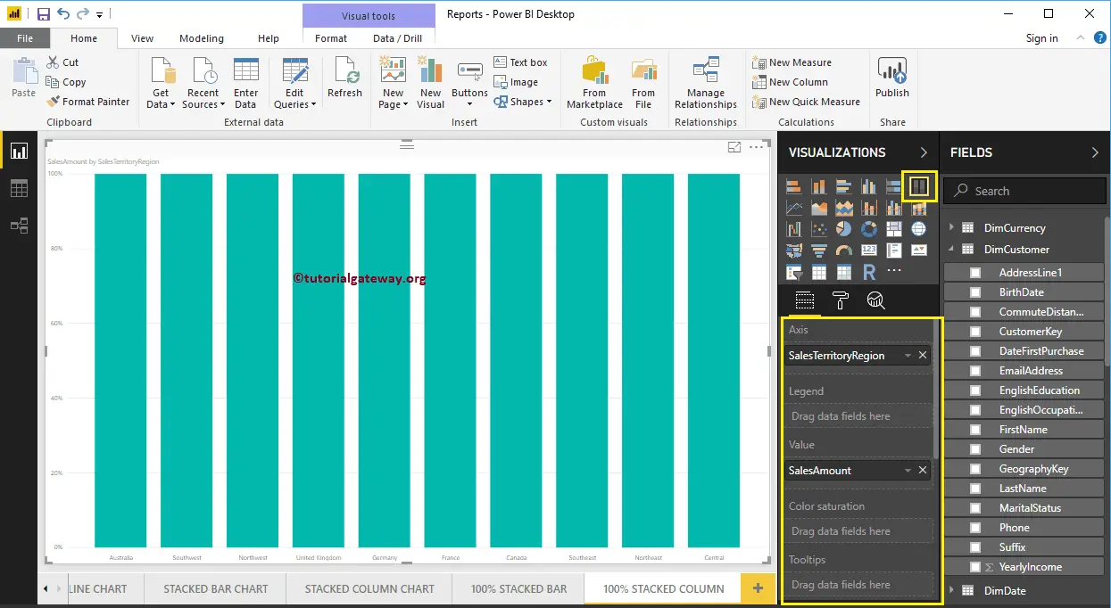
Next, we are adding Customer Occupation to the Legend section to convert it into the 100% Stacked Column Chart.
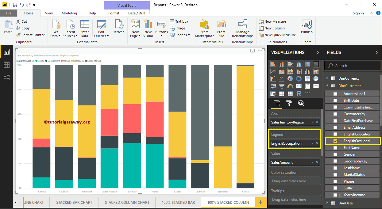
Hover over any portion of a bar shows the Tool-tip of Sales Territory Region Name, Customer Occupation, and Sales Amount (in percentage)
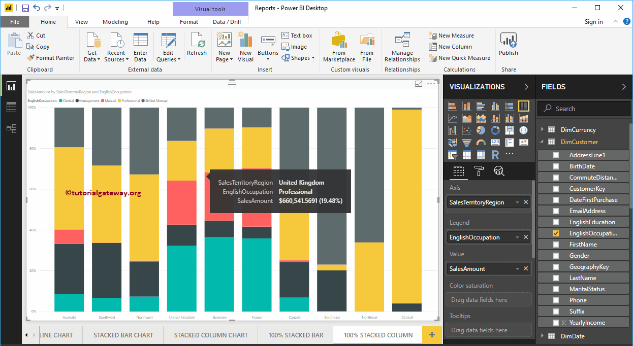
Create 100% Stacked Column Chart in Power BI Approach 2
First, click on the 100% Stacked Column Chart under the Visualization section. It automatically creates a 100% Stacked Column Chart with dummy data, as shown in the below screenshot.
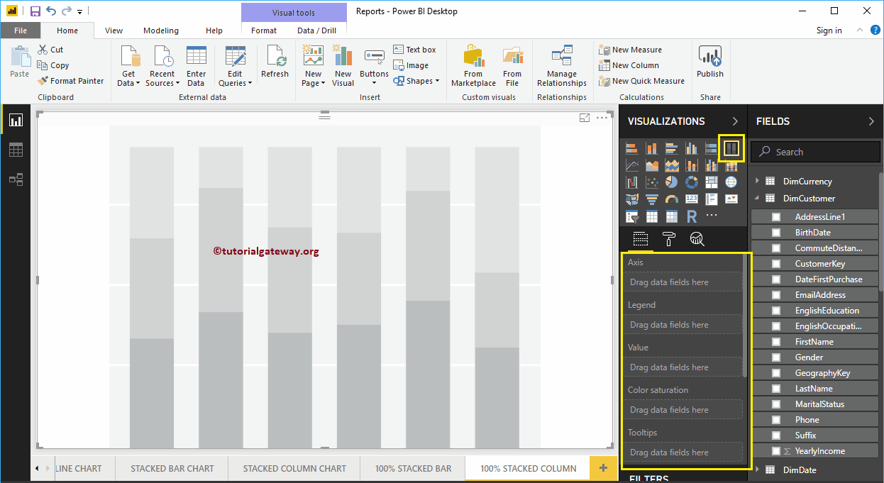
To add data to the Power BI 100% Stacked Column Chart, we have to add the required fields:
- Axis: Please specify the Column that represents the Vertical Bars.
- Legend: Specify the Column to divide the Vertical Bars.
- Values: Any Metric value such as sales amount, Total Sales etc.
Let me drag the Sales Amount from the Fields section to the Values field and the Sales Territory Region Name field to the Axis Section.

Next, add the English Occupation from the DimCustomer table to the Legend section. You can do this by dragging Occupation to Legend section, or simply checkmark the English Occupation column.
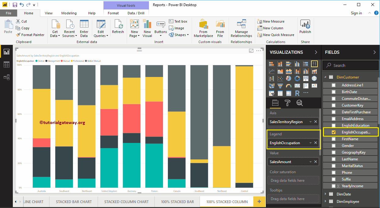
In Power BI Charts, Data Labels display information about every individual group of a vertical bar (Sales Territory Region). In this case, it displays the Sales Amount (in percentage) of each occupation. Let me Enable the Data Labels so that you can see the Percentage of each group.
To enable data labels, please go to the Format tab and toggle Data labels option to On. Let me change the Color to White, Font family to DIN, and Text Size to 20
Now you can see a 100% Stacked Column Chart with Percentage values
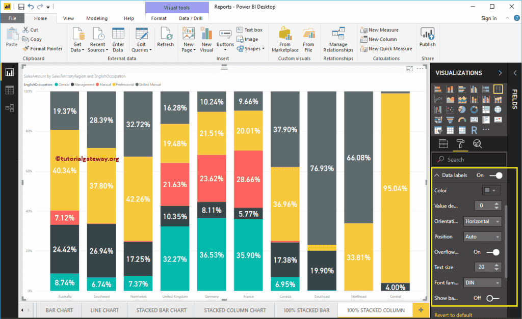
Let me do some quick formatting to this Power BI 100% Stacked Column Chart
NOTE: Formatting options for both Stacked Column Chart and 100% Stacked Column Chart are the same. So, I suggest you refer to the Format Stacked Column Chart article to understand the steps involved in formatting the 100% Stacked Column Chart properties.
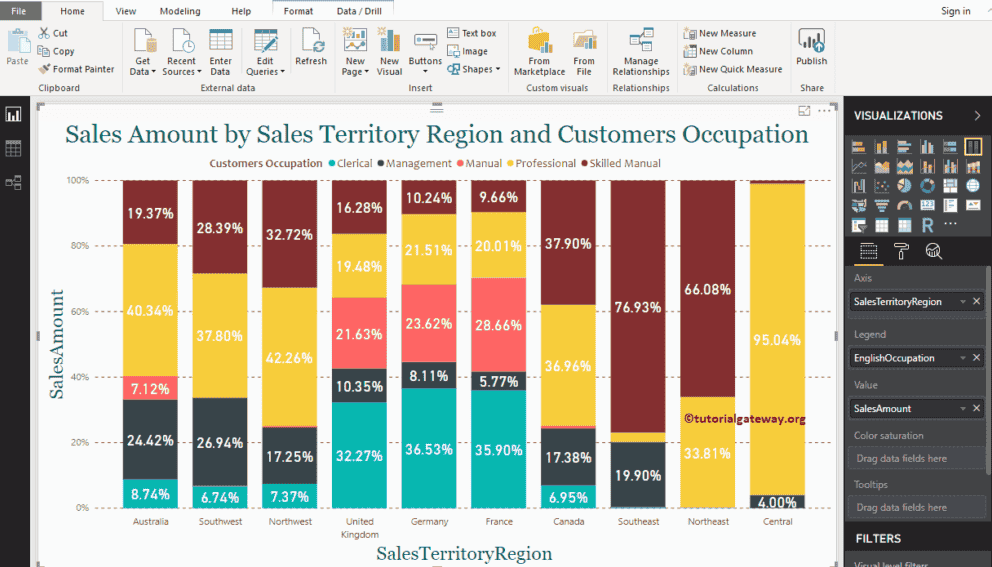
This time, we added State Province Name to Axis and Sales Territory Region to Legend for a 100% stacked column chart. From the screenshot below, you can see, Sales Territory Region is acting as the Bar Color. It is because you can’t group the Sales Territory Region inside a State ( State Name Inherited from Territory).
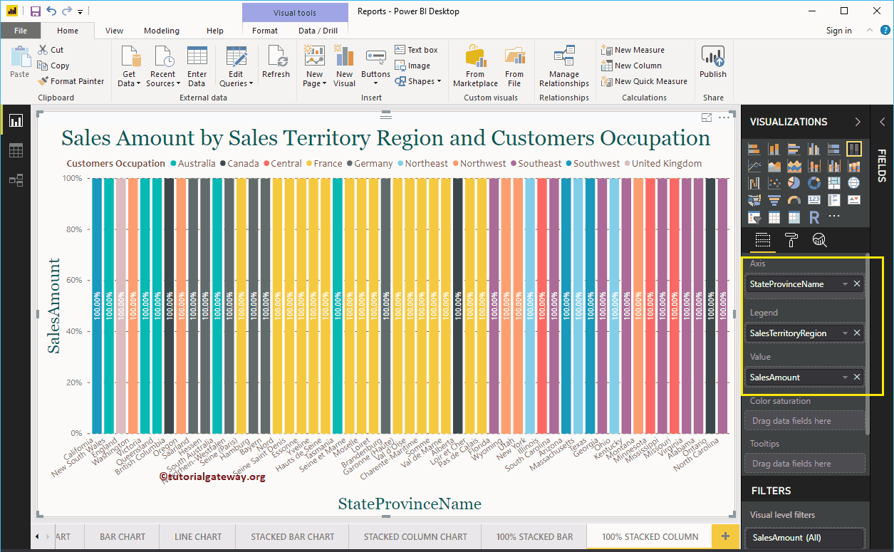
Power BI R Script
Power BI R Script allows using R visuals or R charts inside your Power BI dashboard. Using R script inside the Power BI is very helpful for the data scientists to place their work in one place.
In this section, we show you how to create a chart using Power BI R Script with example. For this Power BI R Script demonstration, we are going to use the Faithful CSV file created by R studio.
I suggest you refer R Programming to understand the code that we used in this Power BI article.

Create a Power BI R Script Visual
In Power BI, you can use this R Script Visual to create R Charts inside a Power Bi dashboard.

First, click on the R Script Visual under the Visualization section. It automatically creates an R Chart with an R script editor, as shown in the below screenshot.
You have to use this R script editor window to write R script.
Before you start writing R code, you have to create a data set. It can be done by dragging the required fields to the Values section. For this demo, let me drag eruptions and waiting columns to the Values section.

As you can see from the above screenshot, Power BI has automatically generated a data set for you. Now, you have to use this data set to create your R visual.
Here, we used ggplot2 to create 2D scatter plot. I suggest you refer, Create a Scatter Plot article to understand this code.
library(ggplot2)
ggplot(dataset, aes(x = eruptions, y = waiting))  +
     geom_point() +
     geom_density_2d()
Once you finished writing your script, click the Run button
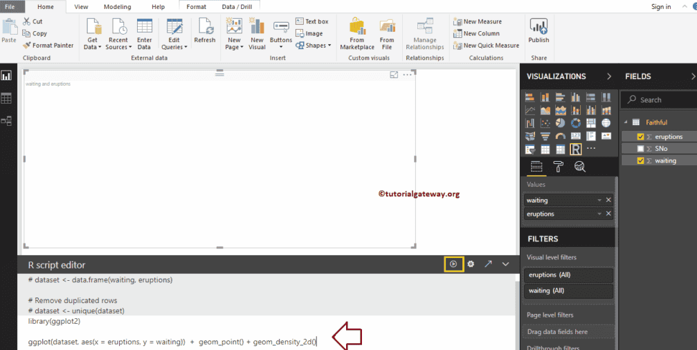
From the screenshot below, you can see the R Chart.
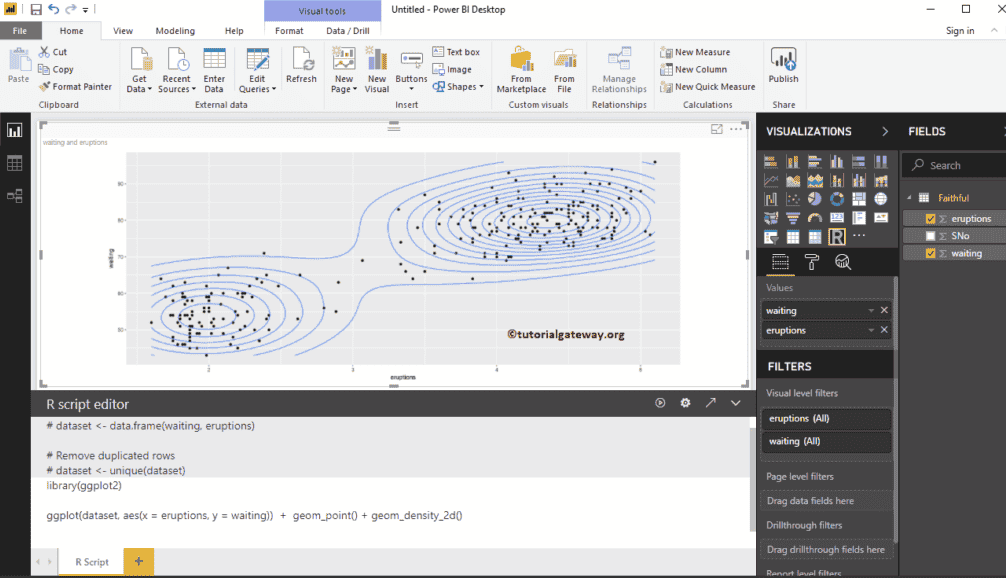
Like any other chart in Power BI, you can apply filters on the R chart as well. To demonstrate the Power BI R script filters, let me create a table first.
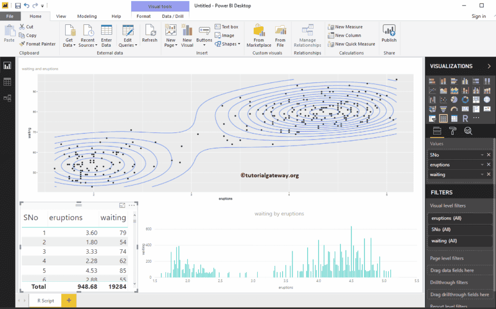
We created a column chart, as well.

I think there is too much data in the table to apply filters. So, let me create a cluster.
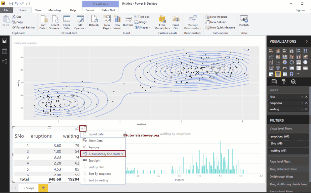
We are leaving the default settings
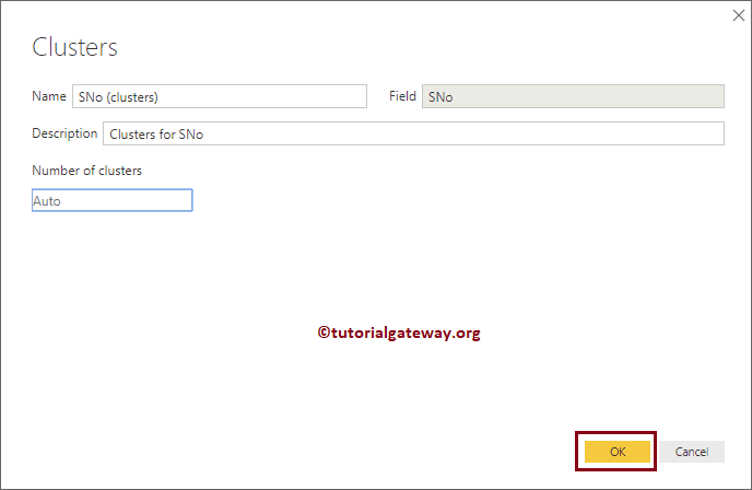
As you can see, it has created two clusters. Next, we replaced the Sno with the Cluster column in a Table
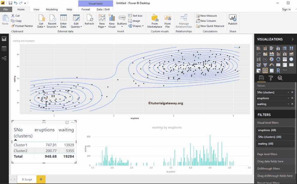
Let me select the Cluster 1. From the screenshot below, you can see that the R visual is filtering.
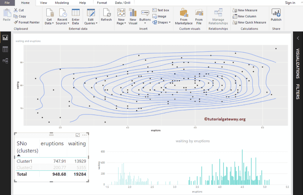
Try with the other cluster too
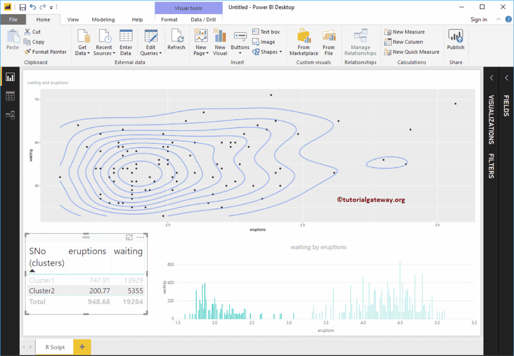
Create a Power BI R Script Visual 2
In Power BI, you can also create an R visual with default datasets available in R. To demonstrate the same, we are using the Diamonds data set.
library(ggplot2)
ggplot(diamonds, aes(x = carat, y = price, color = cut))  +
       geom_point() +
       geom_smooth(method = "auto", se = FALSE) +
       scale_color_manual(values = c("orchid", "chocolate4",
                                 "goldenrod2", "tomato2", "midnightblue"))
From the screenshot below, you can see the R Script in the report.
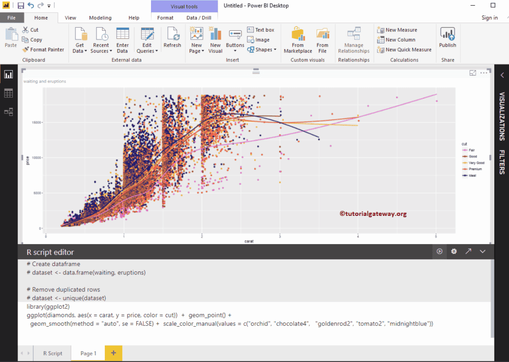
Create a Map in Power BI
Power BI Maps help you to visualize the geological data. Let us see the step by step approach to Create a Map in Power BI with a practical example.
For the Power BI Map demo, we use the World Population Excel data file that we downloaded from the Data bank.
Please visit Connect to Excel to learn the steps included in working with Excel.
How to Create a Map in Power BI
Dropping any geographic data to the Canvas area automatically create a Map. For instance, let me drag and drop the Country Names available in the world Population table to the Canvas.
From the following screenshot, you can notice that the power bi has created a map for you.
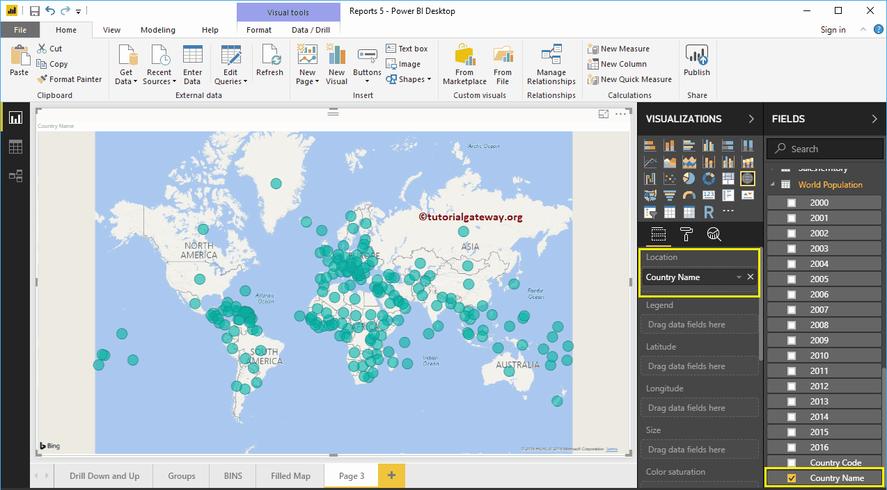
Next, Drag and Release the Population of the year 2016 from Power BI Fields region to the Legend section.
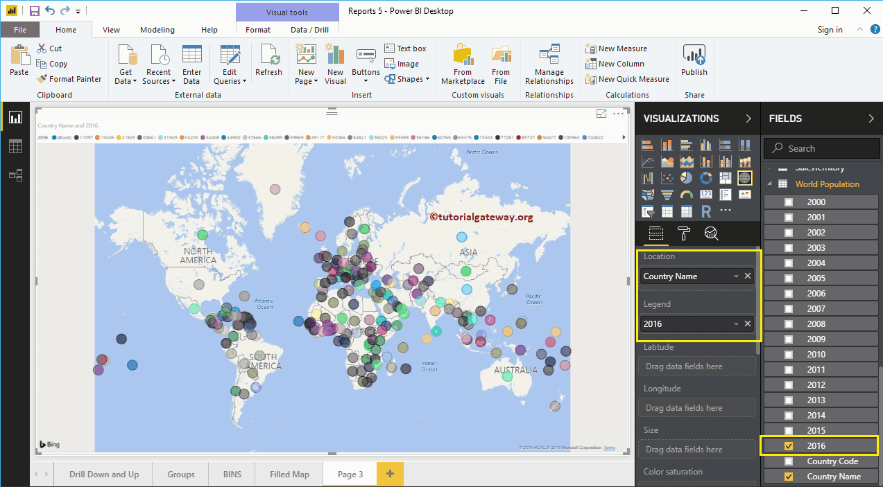
Hover over any bubble to see the country it represents, and the country population.
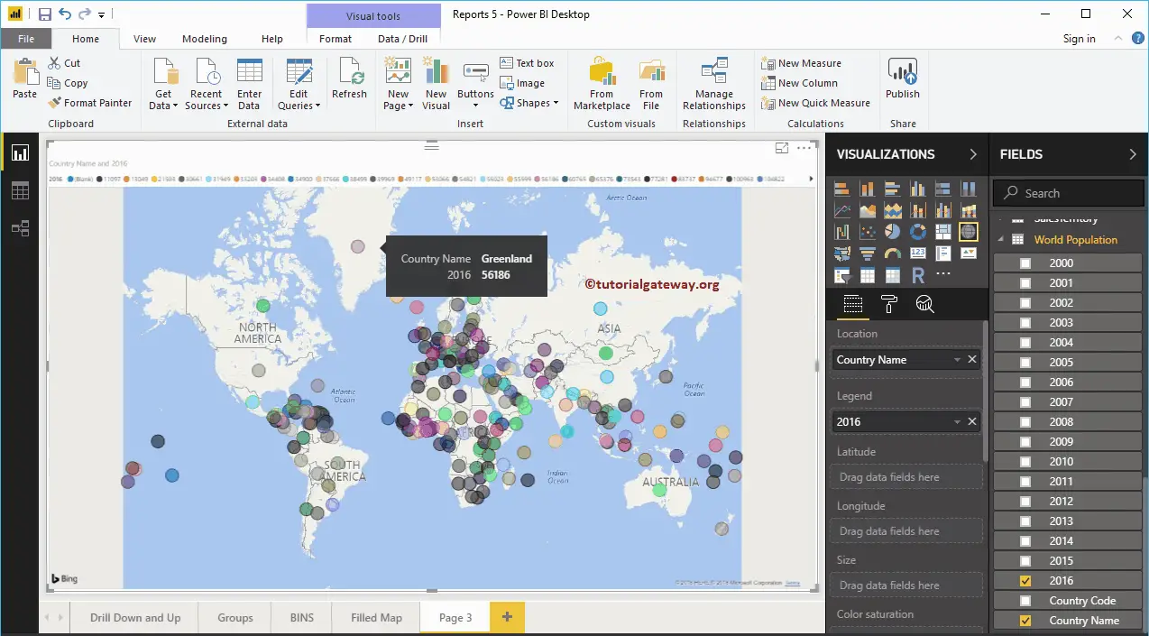
The Second approach to Create a Map in Power BI
First, under the Visualization section, click on the Map. It automatically creates a Map with model data, as we have shown in the below screenshot.
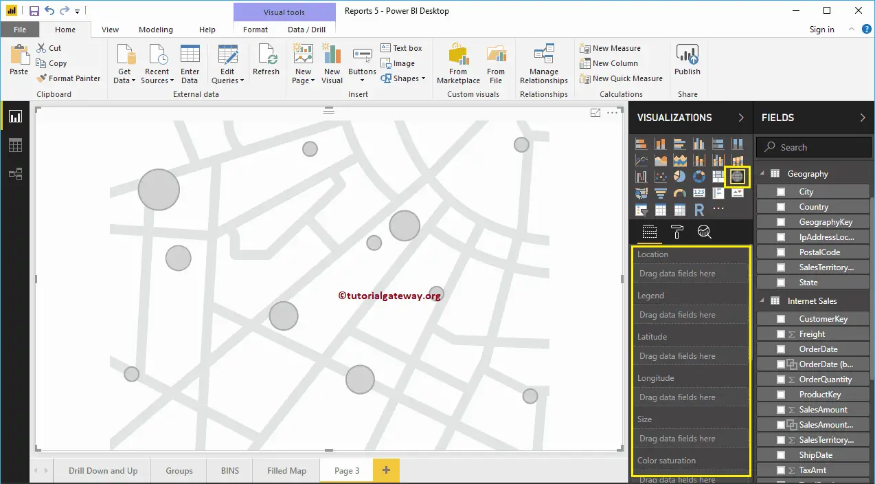
To add data to a Map in Power BI, we should add the required fields:
- Location: Please provide the Geological Column name that draws the Bubbles.
- Legend: Column name that sub-divides the data in the Location section. Something similar to Country, Region, Territory, or Continent
- Latitude and Longitude: If the data contains the latitude and longitude information, you can use them to retrieve the exact location.
- Size: Define the Column that describes the Bubble size.
- Color Saturation: Any Numeric data that decides the Power BI map bubbles color.
Let me drag the State from Fields area to the Location Section. You can achieve this by dragging the State column to the Location section or checkmark the State column.
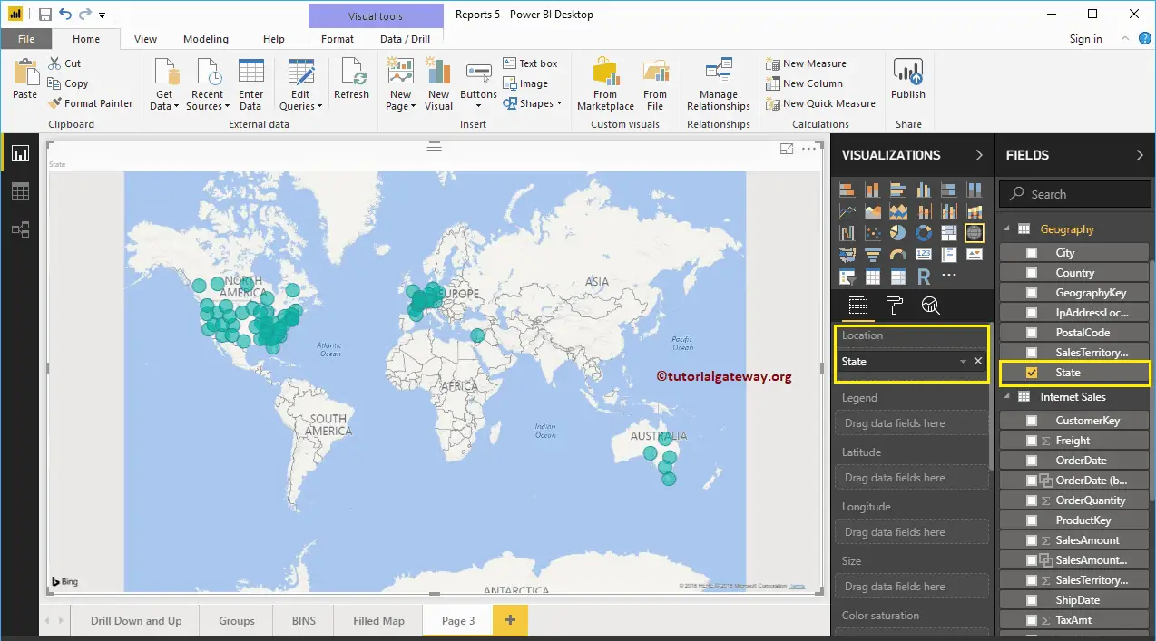
Next, add the Sales Amount to the Size section. Now, you recognize the size difference in the bubbles
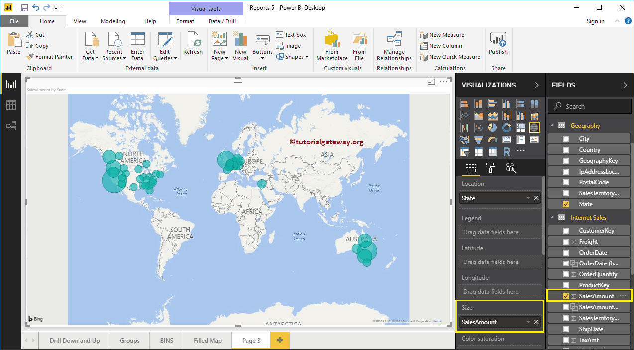
Next, let me add Country Name to the Tooltip section. After this, if you hover-over any bubble, show you the information about the Country, State, and its Sales Amount.
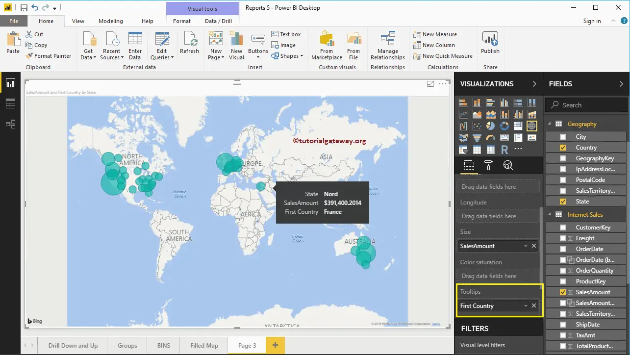
Let me add Country Name to the Legend section. As you can see, the color of bubbles is changed based on the country they represent.
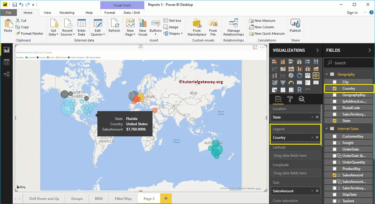
To demonstrate the Color Saturation section of a Power BI map, we added the Order Quantity to the Color Saturation section. From the below Map screenshot, the color of each circle has changed as per the Order Quantity. Remember, you can’t use the Legend and Color Saturation at the same time.
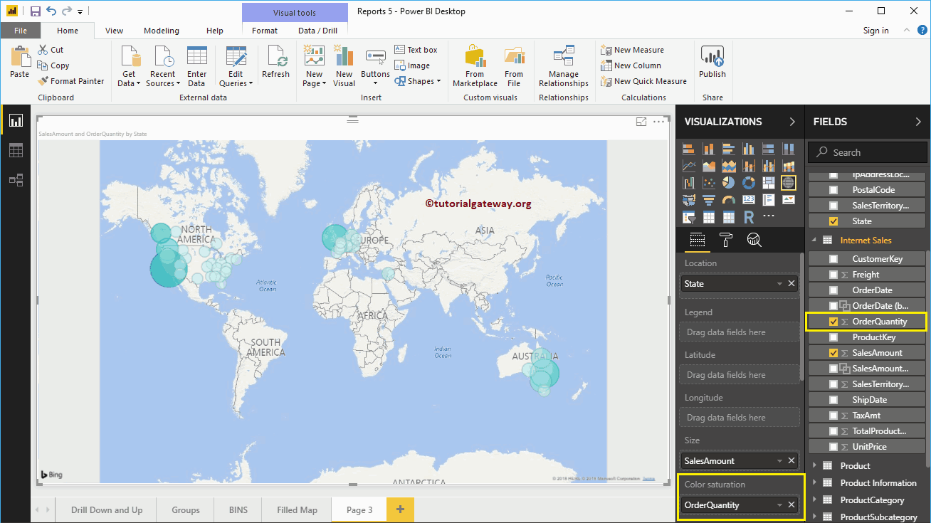
Let me do some quick formatting to this Power BI Map
NOTE: I suggest you refer Format Maps article to understand the formatting options.
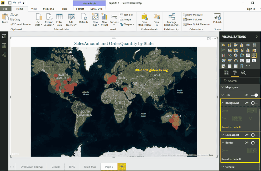
Format Power BI Map
How to Format Power BI Map with an example?. Formatting Power BI Map includes changing the Bubble Size, Color, Map Title text, Title position, background color, etc.
To demonstrate these Map formatting options, we are going to use the Map that we created earlier. Please refer to Create a Map in Power BI article to understand the steps involved in creating a Power BI map.
How to Format Power BI Map
Please click on the Format button to see the list of formatting options that are available for this map.
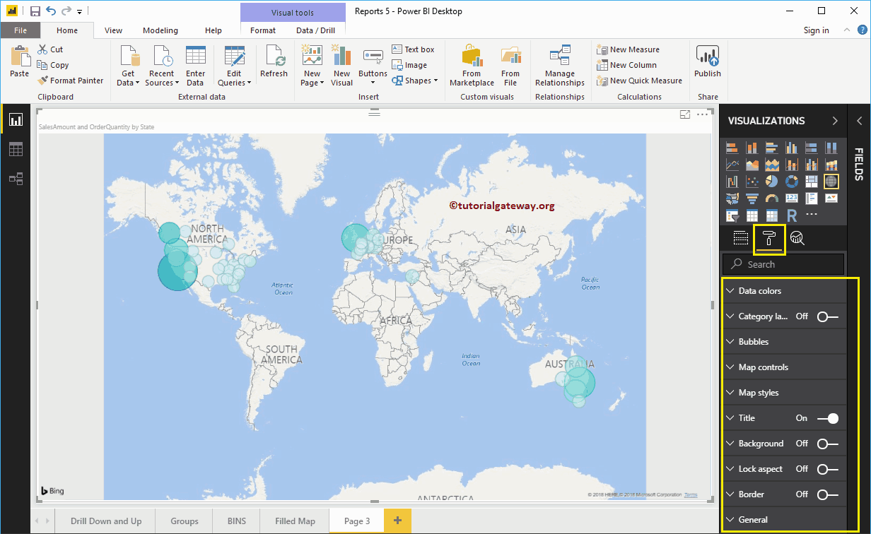
Format Power BI Map Data Colors
While we are creating this map, we added the Order Quantity as the Color Saturation, and that’s why we see the Diverging option under the Data Colors. Please change the Minimum, Center, and Maximum colors as per your requirements.
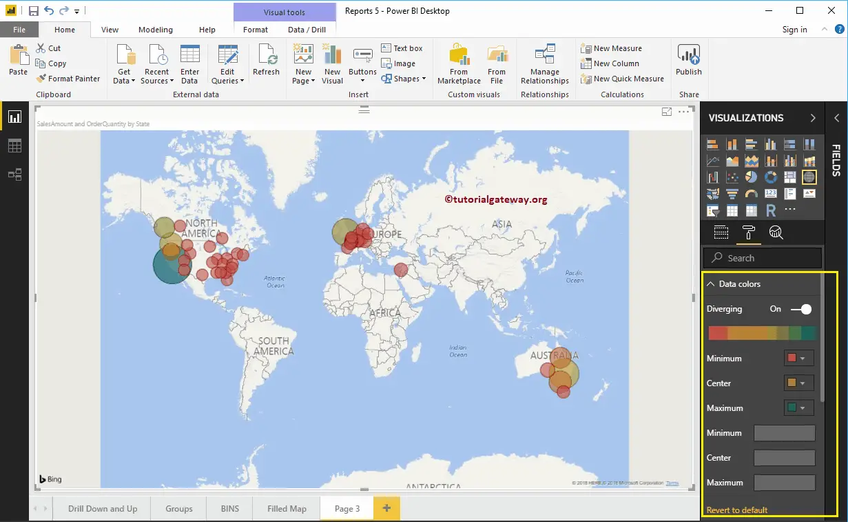
If you removed the Order Quantity from the Color Saturation, the Data Colors section shows you the colors of each bubble, as we showed below.
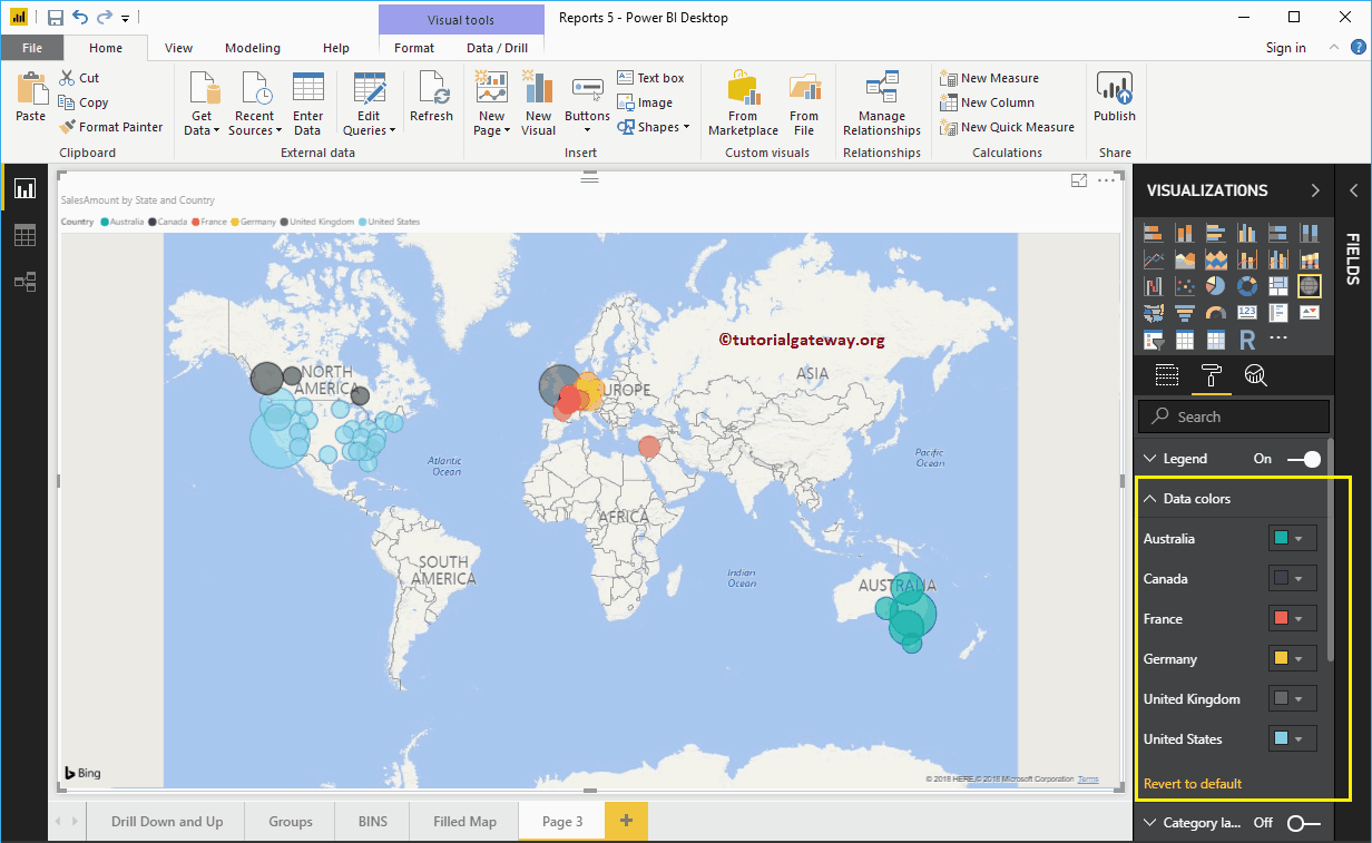
Let me add the Order Quantity to Color Saturation again
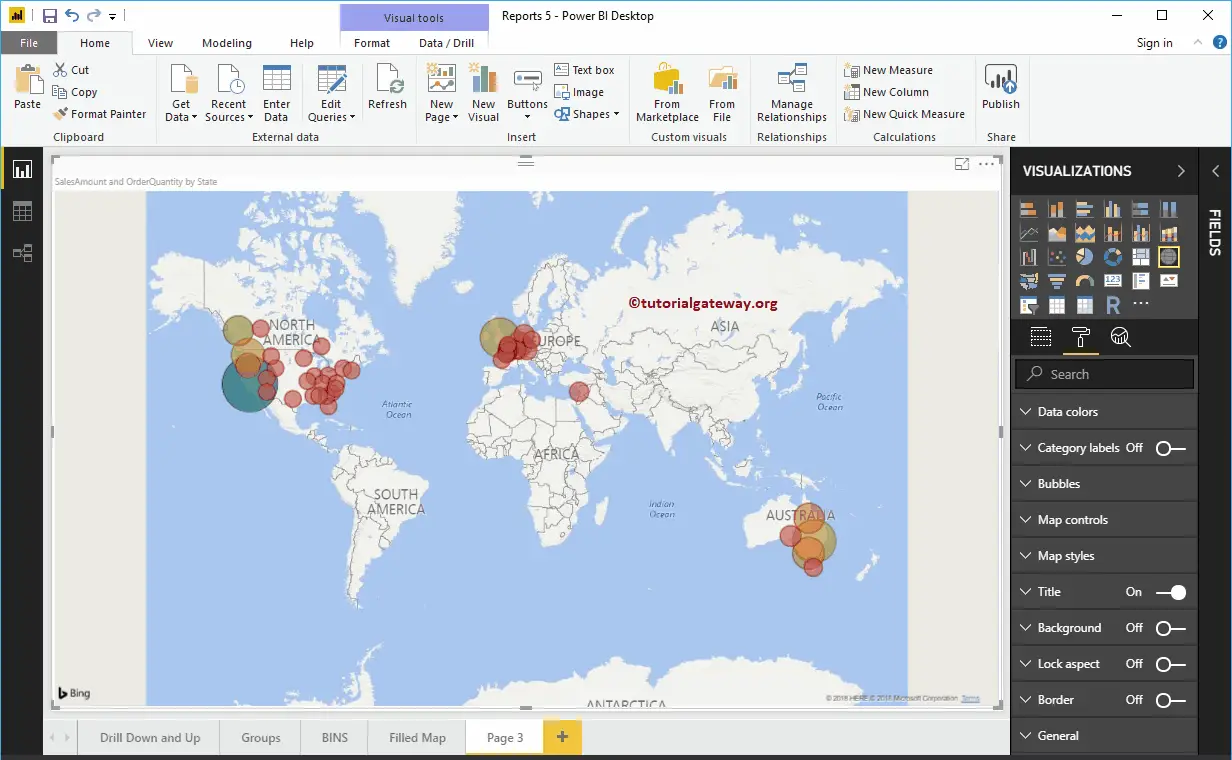
Format Power BI Map Category Labels
Map Category labels mean names that represent each bubble or circle. By toggling the Category labels option from Off to On, you can enable these labels.
From the screenshot below, you can see, we change the Color to Black and Text Size to 14. If you want, you can add the background color as well.
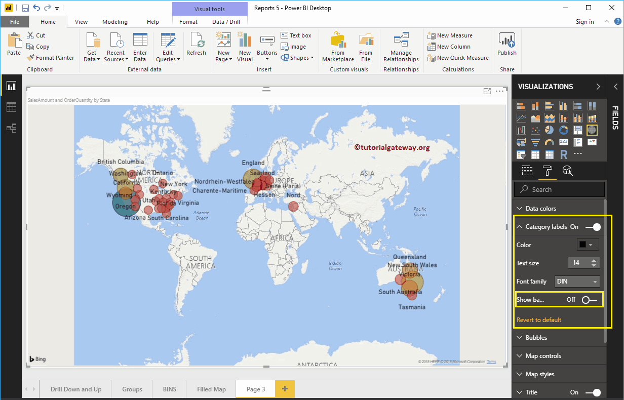
Format Bubble Size of a Power BI Map
Use this section to change the size of all the Circles. As you can see from the screenshot below, we changed the size to 25%.
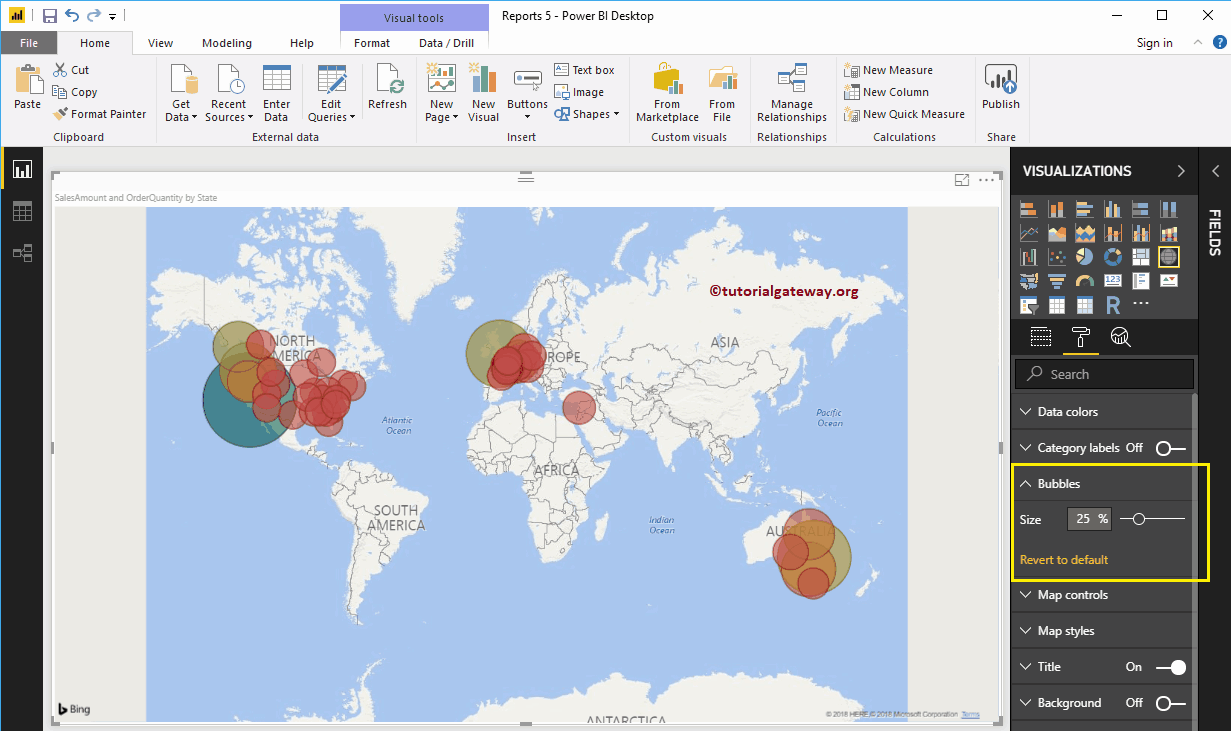
Map Control in Power BI Map
By default, the auto zoom option enabled for this map. However, you can disable by toggling the Auto zoom option from on to off.
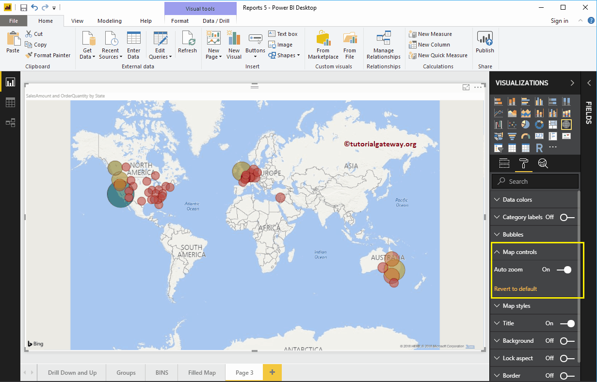
Format Theme of a Map
Use this section to change the look or theme of a map. Let me select the Aerial Theme.
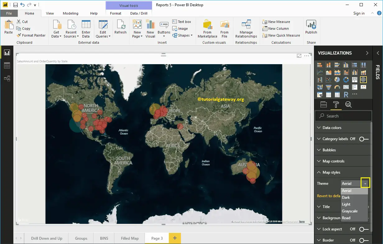
Format Title of a Map in Power BI
By toggling the Title option from On to Off, you can disable the Map title.
From the screenshot below, you can see, we change the Font Color to Green, Text Size to 20, Font Family to Georgia, and Title Alignment to center. If you want, you can add the background color to the title as well.
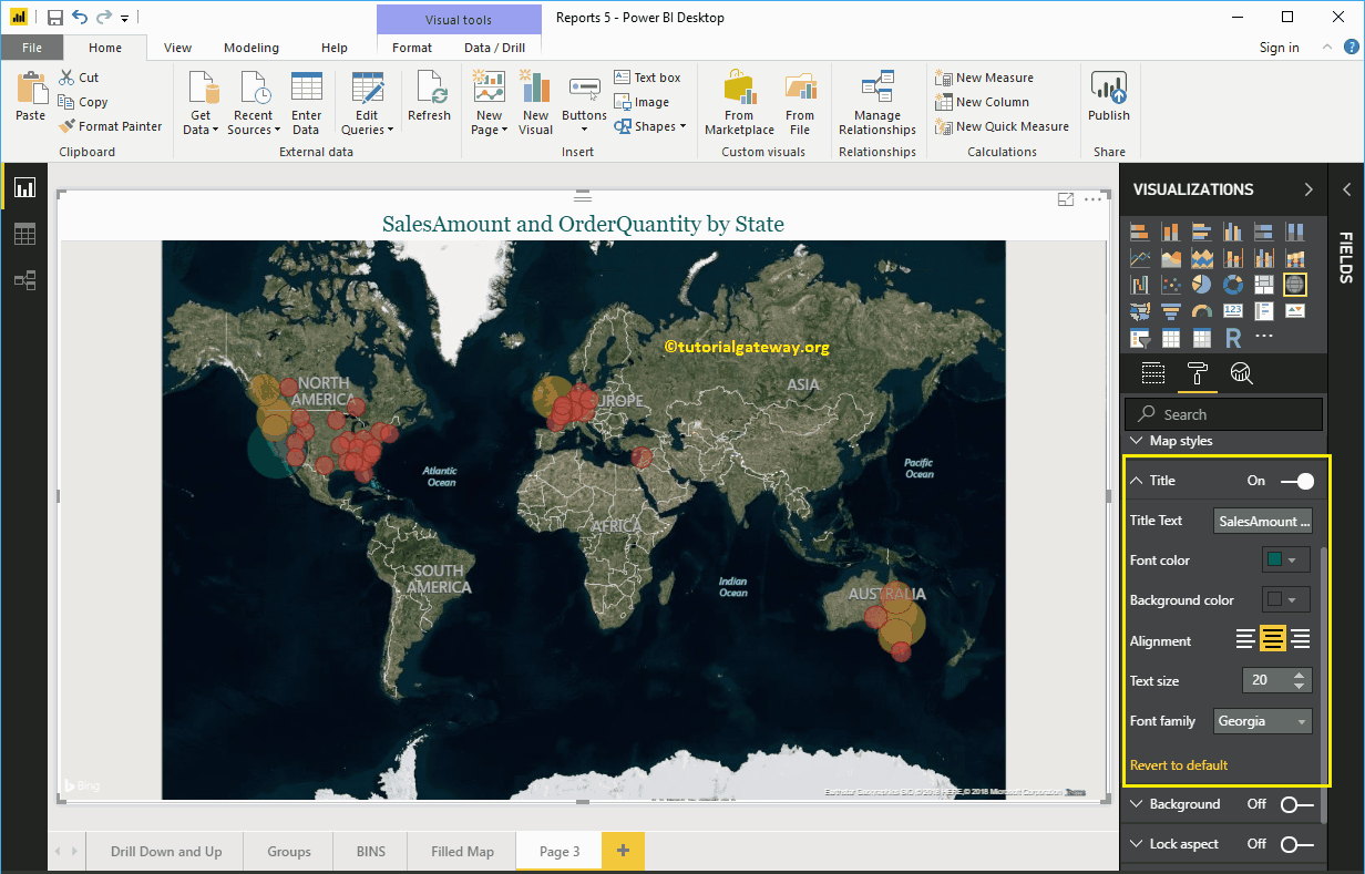
Format Background Color and Borders of a Map
You can add the Background color to a Map by toggling Background option to On.
Similarly, you can add Borders to a Map by toggling the Border option from Off to On.

Filled Map in Power BI
Power BI Filled Maps fill the Map with colors based on the geological data that you provide. Let me show you how to Create a Filled Map in Power BI with example.
For this Power BI Filled Map demonstration, we are going to use the World Population data that we downloaded from the Data bank (in Excel format).
Please refer Connect to the Excel article to understand the Power BI steps involved in working with Excel.

How to Create a Filled Map in Power BI
Dragging any geographical data to the Canvas region will automatically create a Map for you. First, let me drag the Country Names from the world Population table to the Canvas.
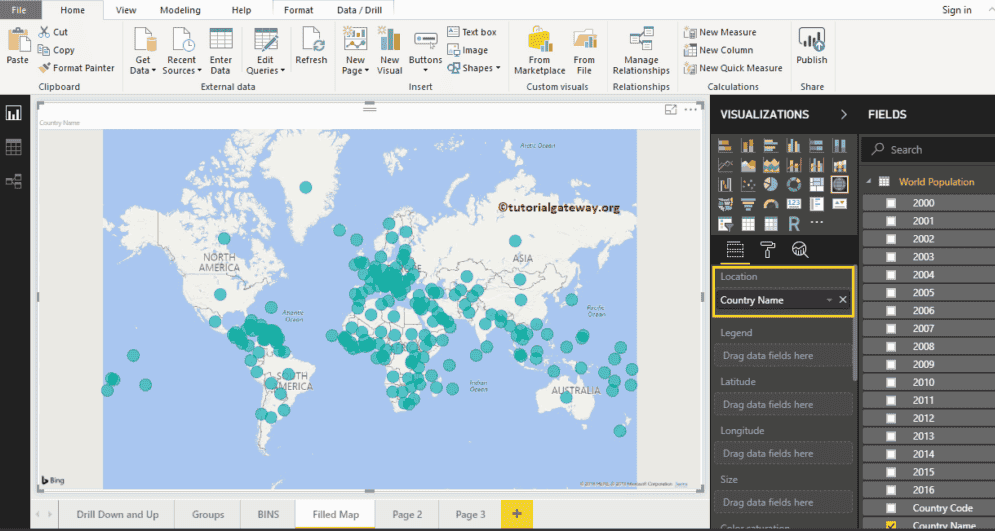
Click on the Filled Map under the Visualization section. It converts a Map into a Filled Map.
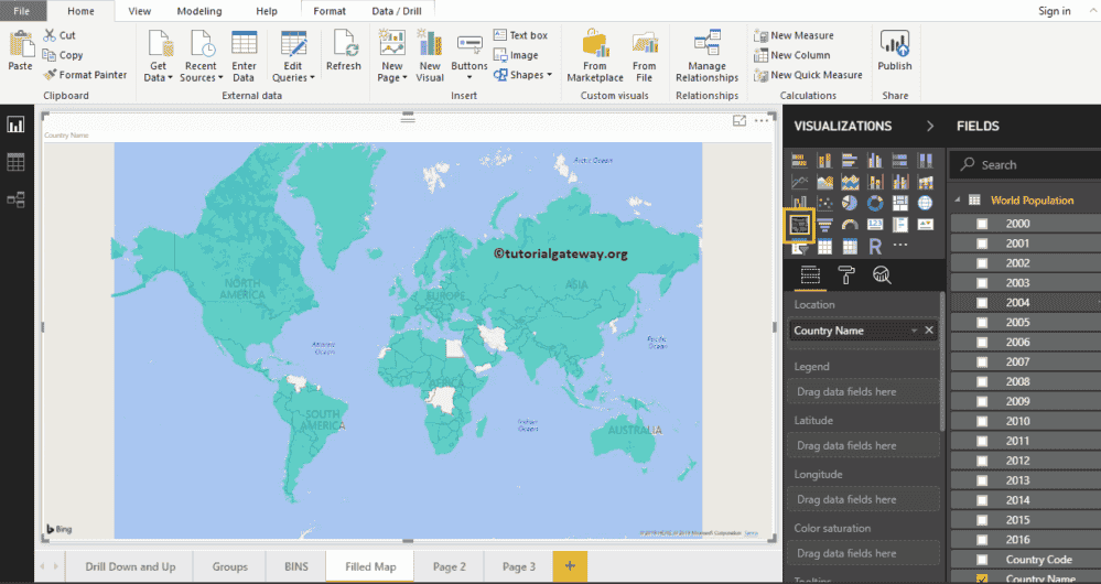
Next, Drag and Drop the 2016 Population from Fields section to Legend region.
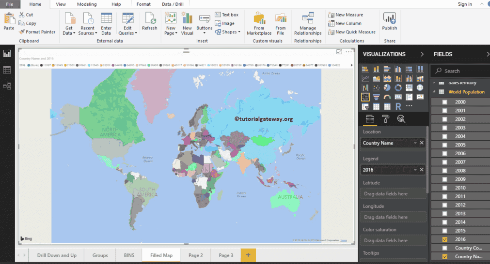
From the above screenshot, you can see the filled map that represents in the country-wise population in the year 2016
Create a Filled Map in Power BI Approach 2
First, click on the filled Map under the Visualization section. It automatically creates a filled Map with dummy data, as shown in the screenshot below.
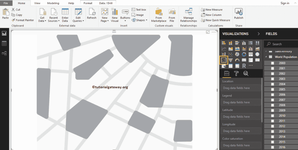
To add data to a Power BI filled Map, we have to add the required fields:
- Location: Please specify the Geological Column that represents the Bubbles.
- Legend: Specify the Column that sub-divide the Location data. Something like Territory, Country, Region, or Continent
- Latitude and Longitude: If your data has latitude and longitude information, then you can use them to get the exact location.
- Size: Specify the Column that represents the Bubbles size.
- Color Saturation: Any Numeric value that decides the color of the bubble.
Let me drag the country name from the Fields section to the Location Section. You can do this by dragging the country name to the Location section, or simply checkmark the country name column.
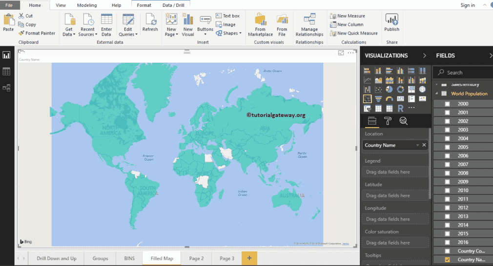
Next, let me add the 2016 population to the legend section. Now you see the filled map
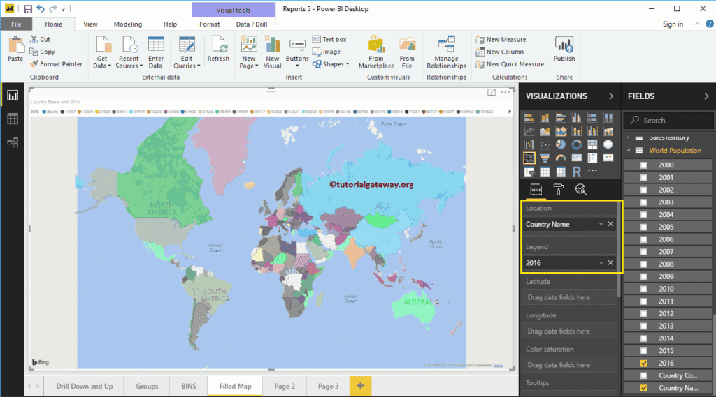
Let me do some quick formatting to this Power BI filled Map
NOTE: I suggest you to refer Format Filled Maps article to understand the formatting options.

Hover-over any region to see the country name, and the country population.
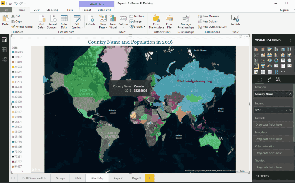
Format Power BI Filled Map
How to Format Power BI Filled Map with an example?. Formatting Power BI Filled Map includes changing the Map Color, filled Map Title text, Title position, background color, etc.
How to Format Power BI Filled Map
To demonstrate these filled Map formatting options, we are going to use the filled Map that we created earlier. Please refer to Create a Filled Map in Power BI article to understand the process of creating a filled map in Power BI.
Please click on the Format button to see the list of available formatting options for this filled map.
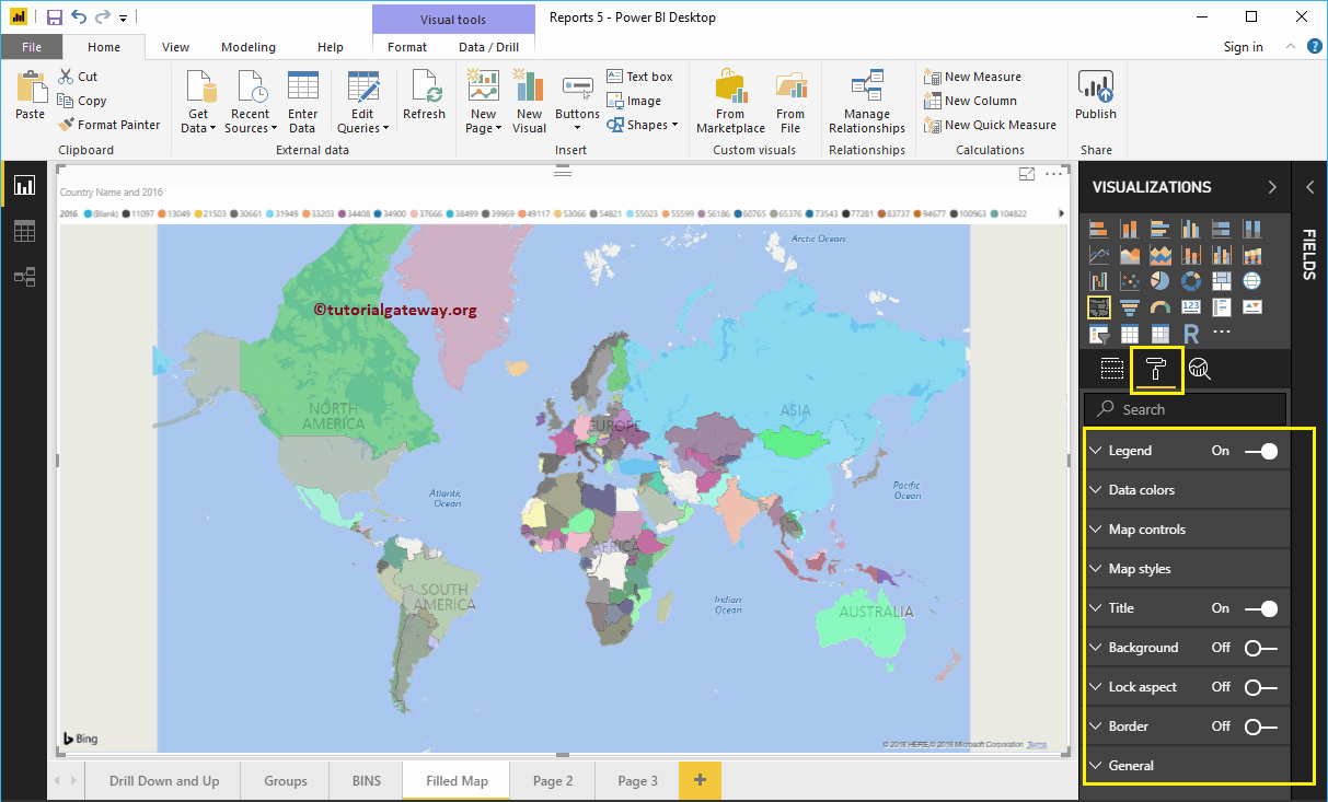
Format Legend of a filled Map in Power BI
As you can see from the screenshot below, we used the Position drop-down box to change the legend position to Left. Next, we changed the legend text size to 11.
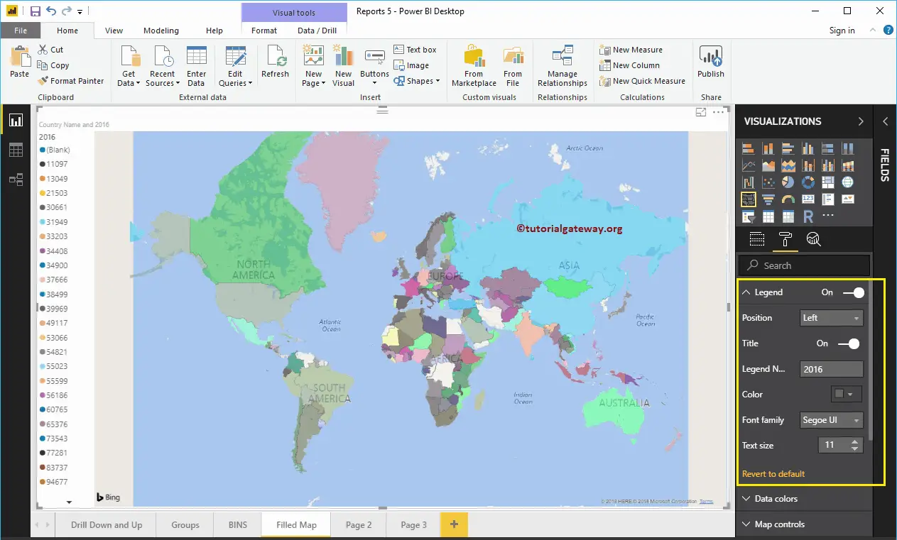
Format Filled Map Data Colors
Use this Data Colors section to change the color of each and every individual area (here, it is country).
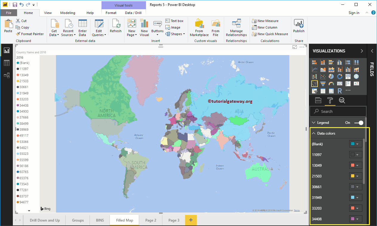
Map Control in Power BI Filled Map
By default, auto zoom option enabled in this filled map. However, you can disable by toggling Auto zoom option from on to off.
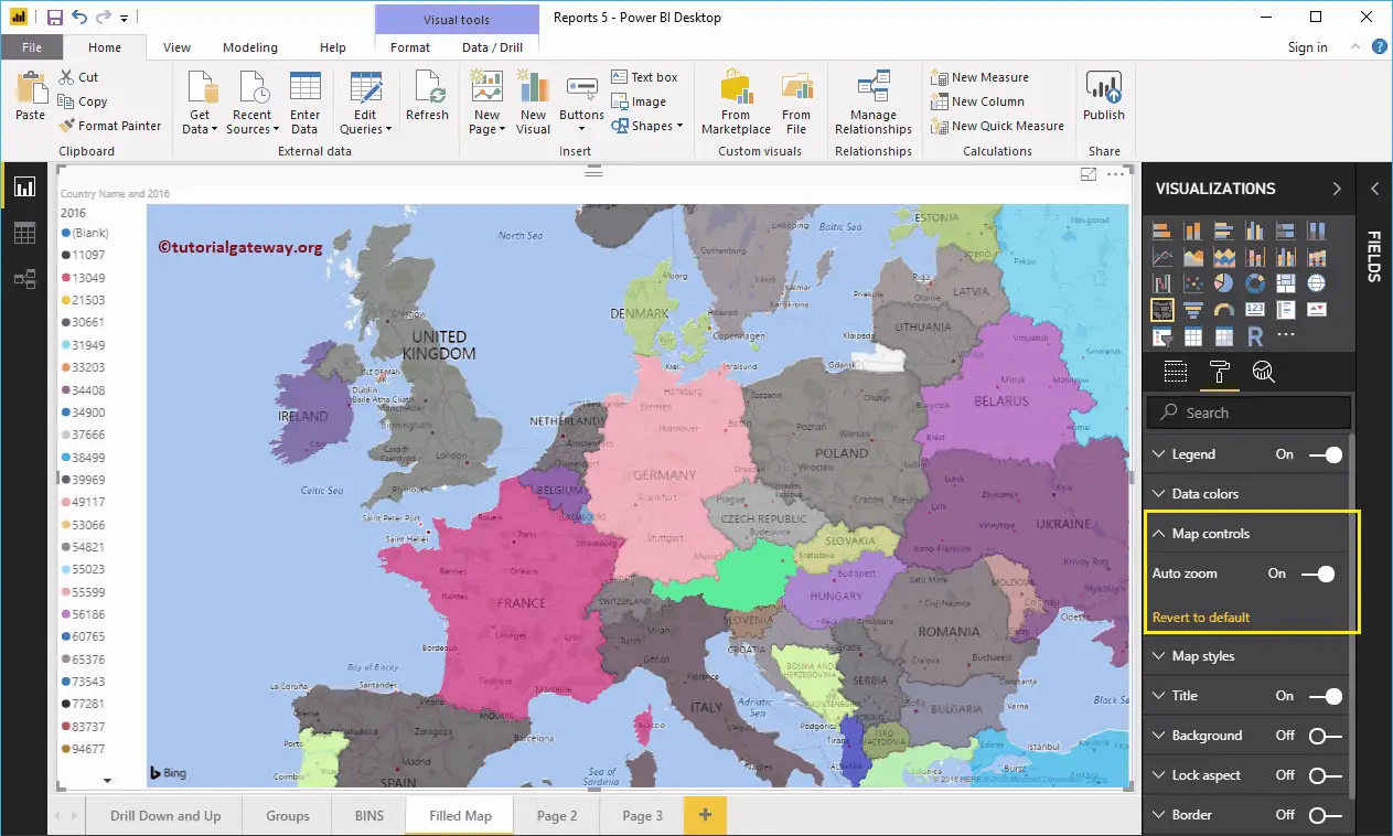
Format Map Style of a Filed Map
Use this section to change the look or theme of a map.
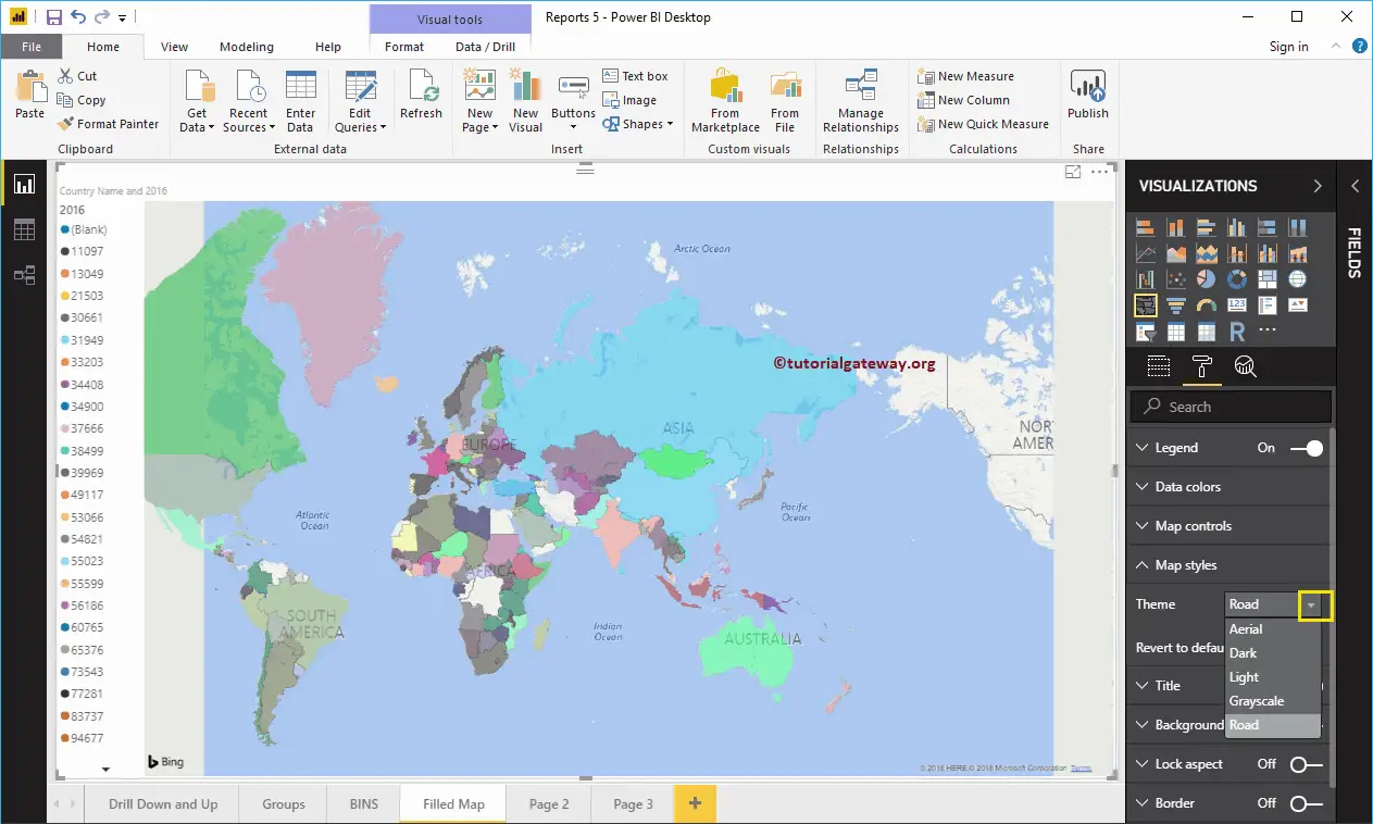
Let me select the Aerial Theme.
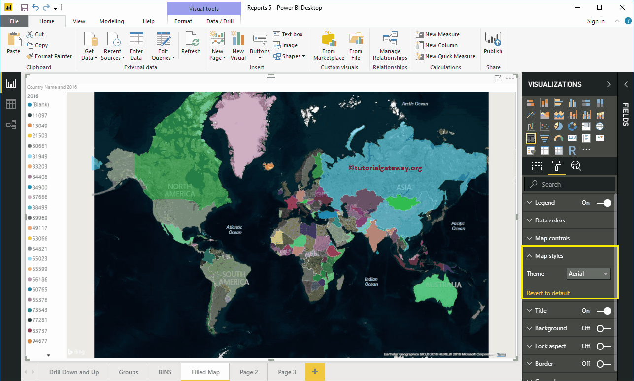
Format Title of a Filled Map
By toggling the Title option from On to Off, you can disable the filled Map title.
From the screenshot below, you can see, we change the Font Color to Green, Text Size to 20, Title Alignment to center, and Font Family to Georgia. If you want, you can add the background color to the title as well.
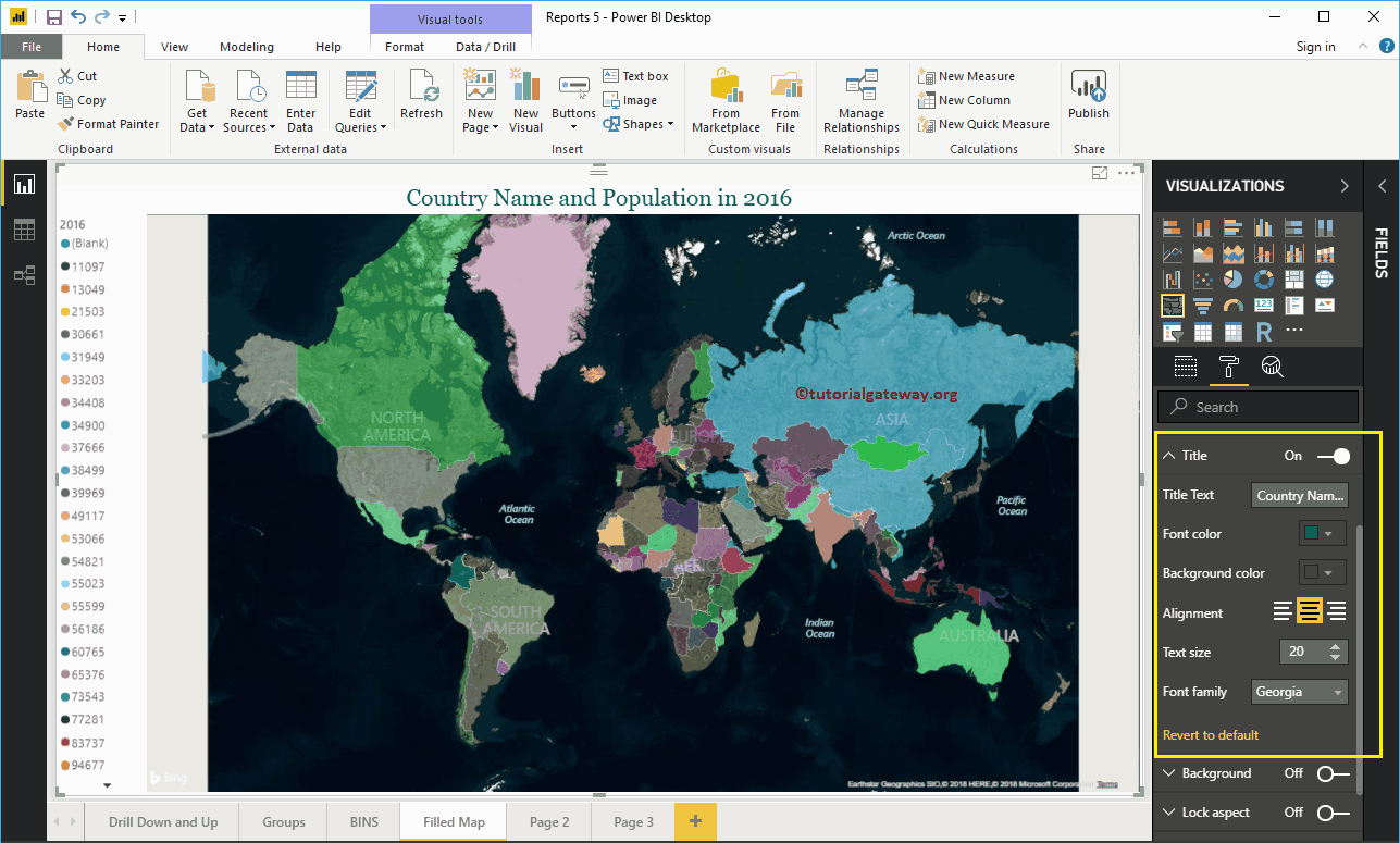
Format Background Color of a Filled Map in Power BI
You can add the Background color to a filled Map by toggling Background option to On. For the demonstration purpose, we added yellow color with 17% transparency.
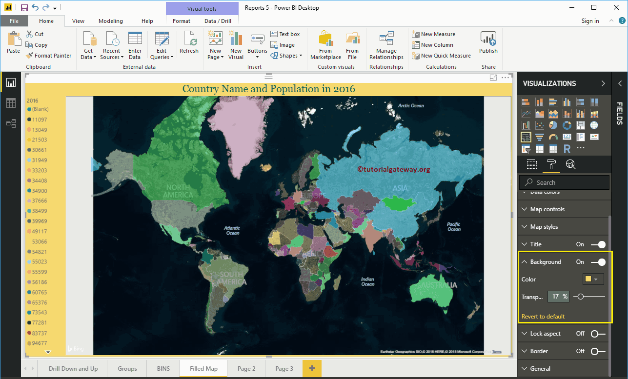
Format Borders and General settings of a filled Map
You can add Borders to a filled Map by toggling the Border option from Off to On. Similarly, use this General Section to Change the filled map X, Y position, Width, and height