Power BI Donut Chart is similar to Pie Chart, which is useful to visualize the higher-level data. In this article, we show you how to Create a Donut Chart in Power BI with example.
For this Donut Chart in Power BI demonstration, we are going to use the SQL Data Source that we created in our previous article.
Please refer to Connect Power BI to SQL Server article to understand the Power BI Data Source.
How to Create a Donut Chart in Power BI
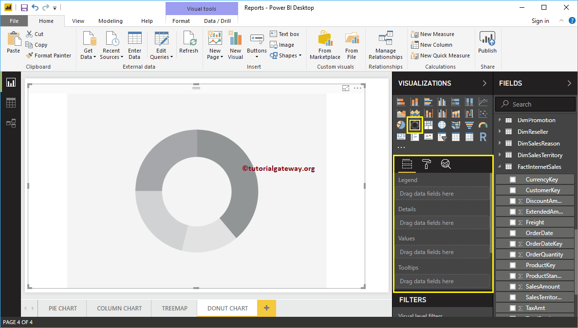
When you click on the Donut Chart under the Visualization section, it automatically creates a Donut Chart with dummy data.
To add data to the Power BI Donut Chart, we have to add the required fields:
- Legend: Drag and drop the column that you want to display as the legend.
- Details: Drag and drop the Column on which you want to partition your Donut Chart.
- Values: Any Numeric value such as orders, sales amount, Total Sales, Customer count, etc.
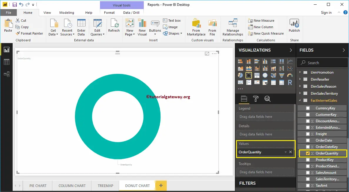
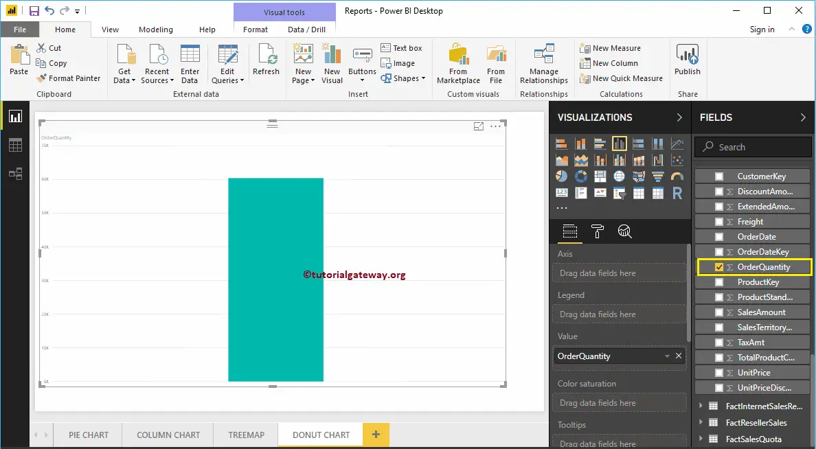
Let me drag and drop the Order Quantity from Fields section to Values field.
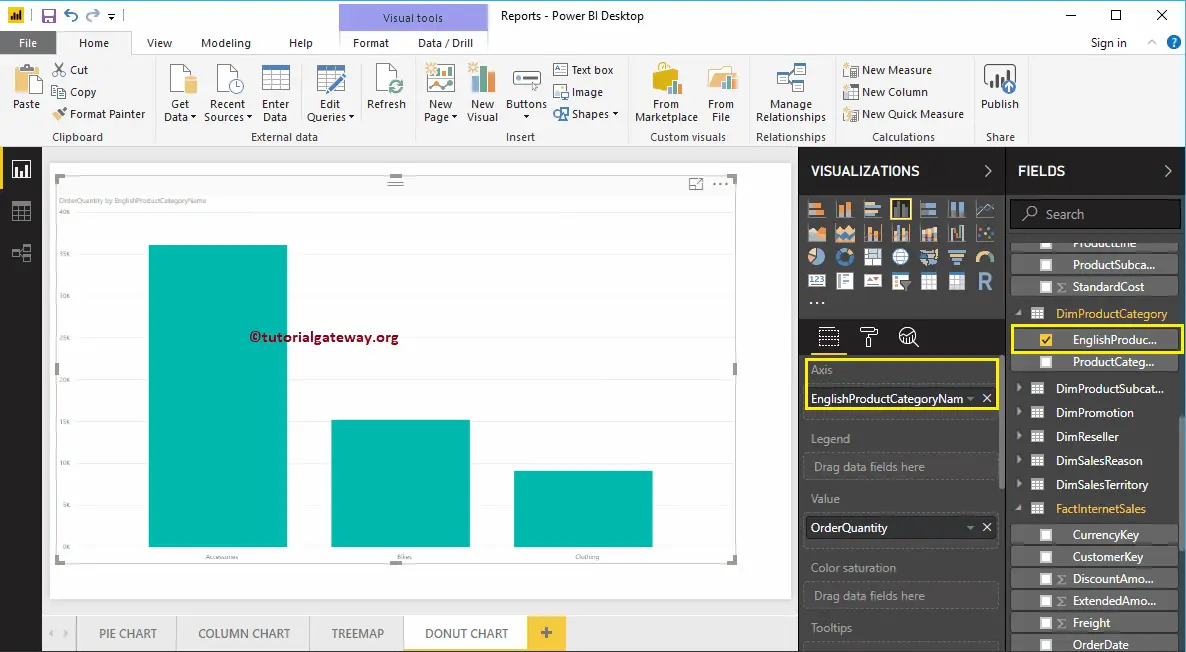
Next, let me add the English Product Category Name from DimProductCategory Table to the Axis section. You can do this by dragging Category to Axis, or checkmark the category column.
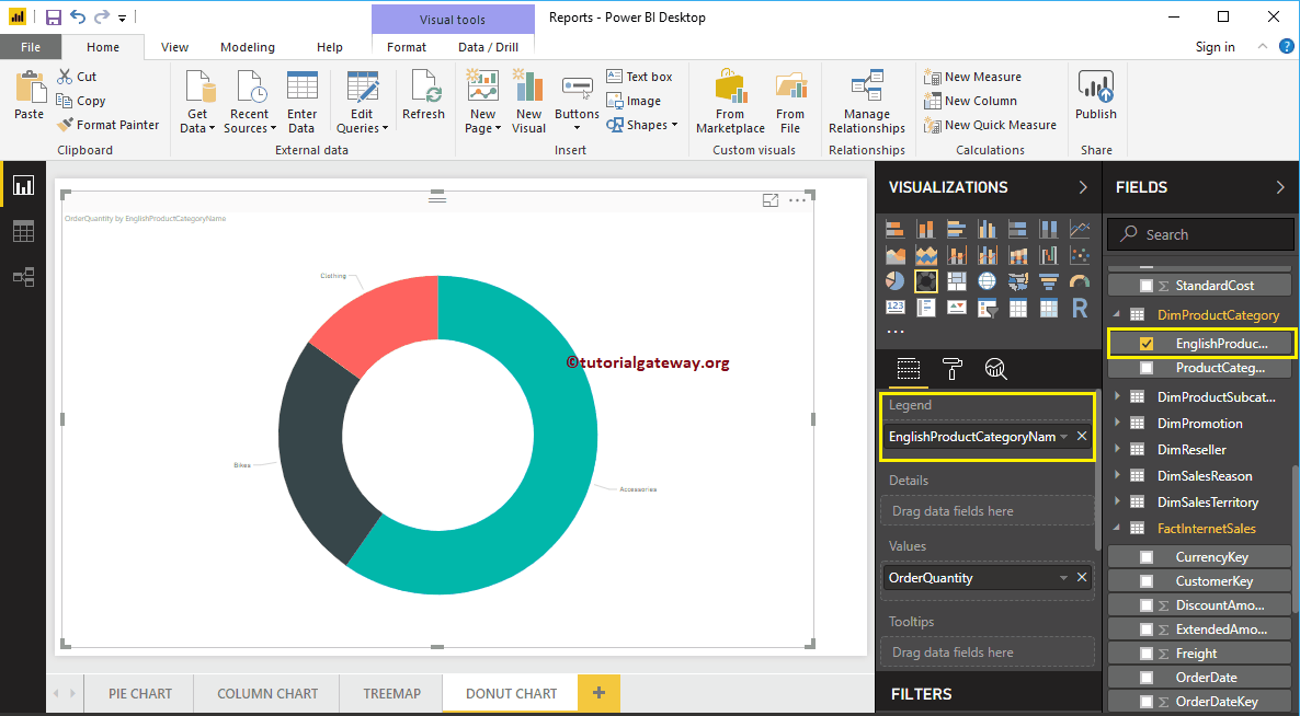
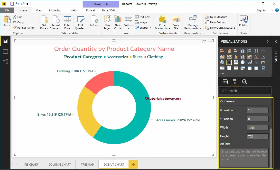
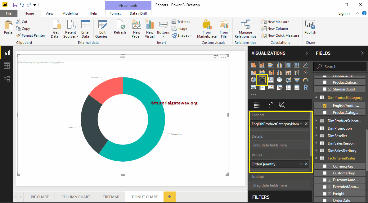
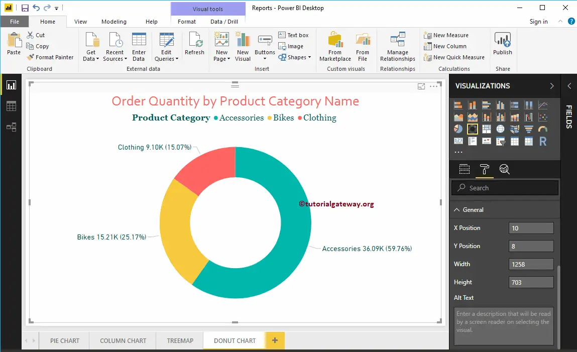
From the above screenshot, you can see the Donut Chart of Order Quantity that is Sliced by Product Category.
Create a Donut Chart in Power BI – Approach 2
First, Drag and Drop the Order Quantity from Fields section to Canvas. It automatically creates a Power BI Column Chart.
Next, let me add the English Product Category Name from DimProductCategory Table to the Axis section. For this, drag and drop Category to Axis, or checkmark the category column.
By clicking the Donut Chart under the Visualization section automatically convert the Column Chart into Donut Chart
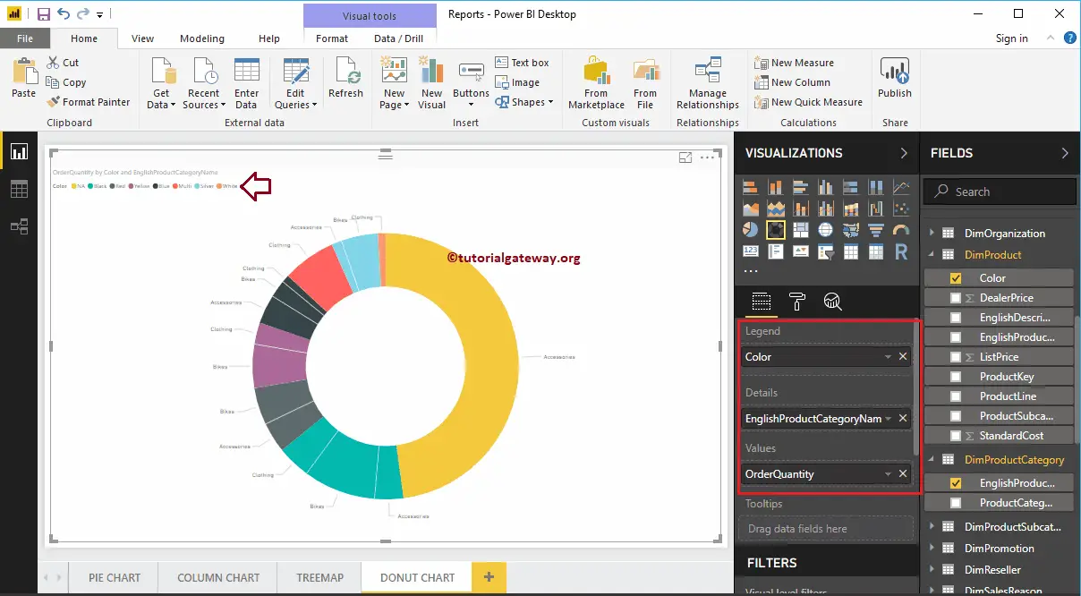
By adding another field to Details section further divide the Power BI Donut Chart.
Let me do some quick formatting to the Donut Chart
NOTE: I suggest you to refer to the Format Donut Chart article to understand the steps involved in formatting the Title font, Title alignment, Data labels, Legend titles, Slice color, and background colors.
How to Format Donut Chart in Power BI with example?. Formatting Donut Chart includes enabling Legend, positioning Legend, Title position, Slice colors, and background colors, etc.
To demonstrate these formatting options, we are going to use the Donut Chart that we created earlier. Please refer to the Power BI Donut Chart article to understand the steps involved in creating a Power BI Donut Chart.
How to Format Donut Chart in Power BI
Please click on the Format button to see the list of available formatting options for this Donut Chart.
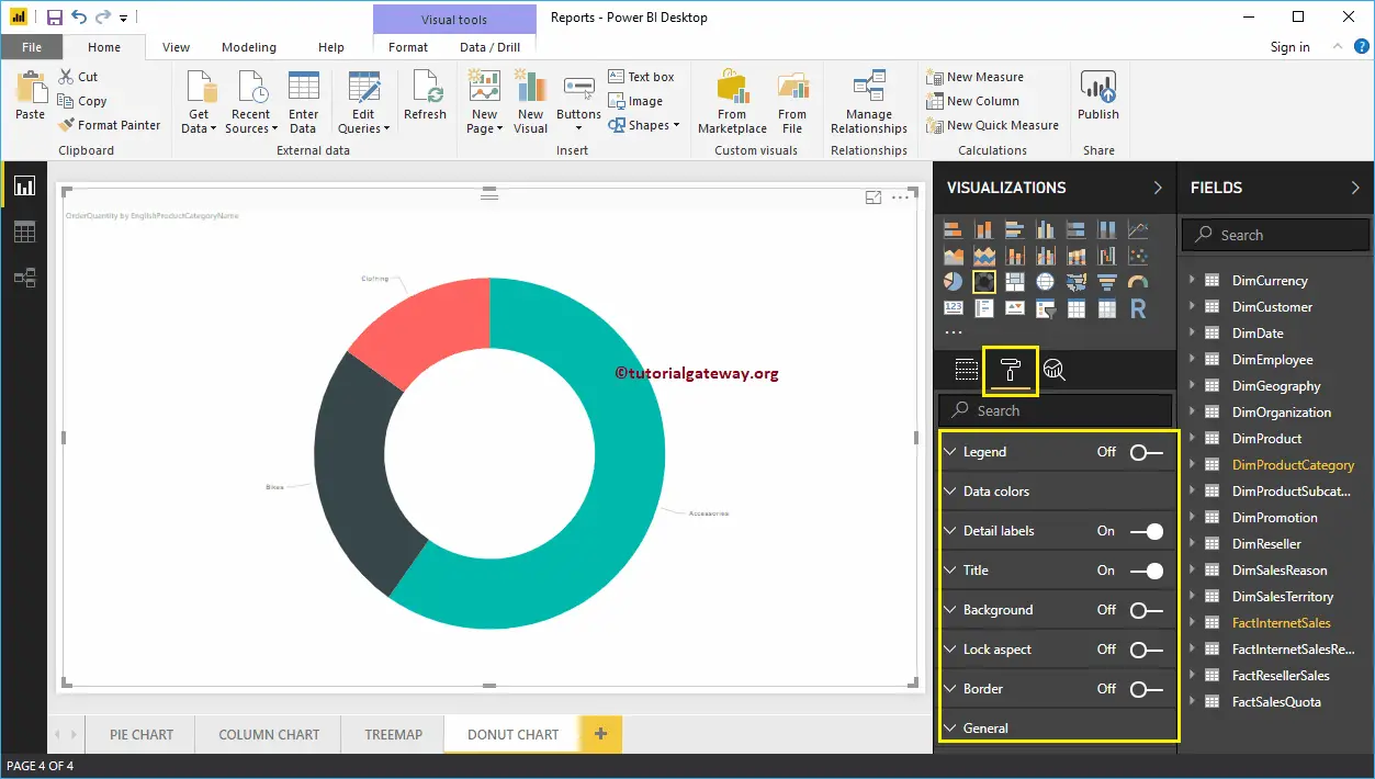
Format Legend of a Donut Chart in Power BI
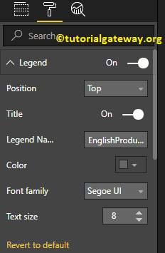
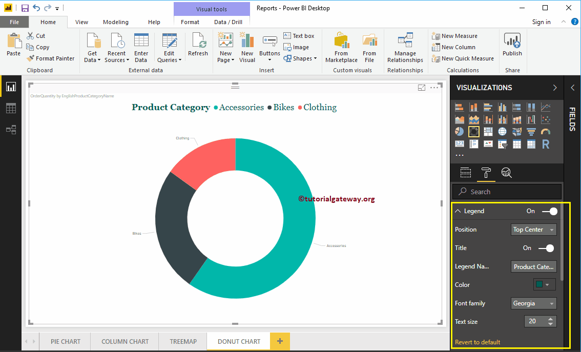
To display or enable the Legend, Please select the Legend region and toggle the option from Off to On. From the below screenshot, you can see the list of properties available for the legend
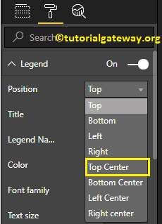
Position: Use the drop-down box to change the Donut Chart legend position as per your requirements. For now, we are selecting the Top Center.
As you can see from the below screenshot, we changed the Legend Title to product category, Color to Green, Font family to Georgia, and text size to 20.
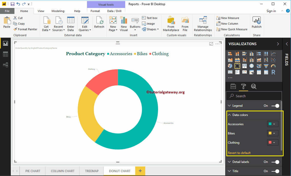
Format Data Colors of a Donut Chart in Power BI
Data Colors are useful to change the Slice Colors. Use this section to change the default slice colors to the required ones.
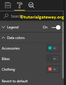
For the demonstration purpose, we changed the Bikes color to yellow.
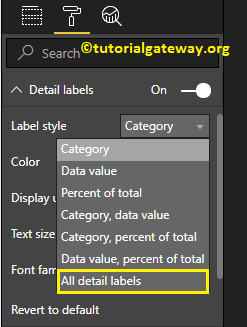
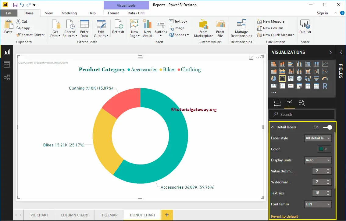
Format Detail labels of a Power BI Donut Chart
Detail labels display the information about each slice. By default, it displays the Category Name as the label. Let me change the Label style to All details. It means each slice shows the information about the Category Name, Order Quantity, and the Percentage of Total.
As you can see from the below screenshot, we also changed the Color of a Label to Green, and font size to 18. You can also change the Display Units from Auto to Millions or Trillions.
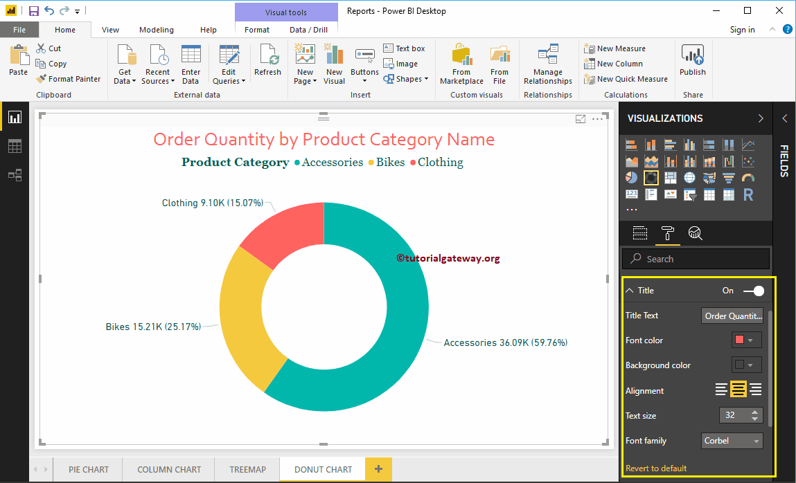
Format Donut Chart in Power BI Title
To display the Pie Chart Title, Please select the Title, and change the option from Off to On. The following are the list of options that are available to format the Donut Chart title.
As you can see from the screenshot below, we change the Title Text to Order Quantity by Product Category Name. Next, Font Color to brick red, Font style to Corbel, Font Size to 32, and Title Alignment to center.
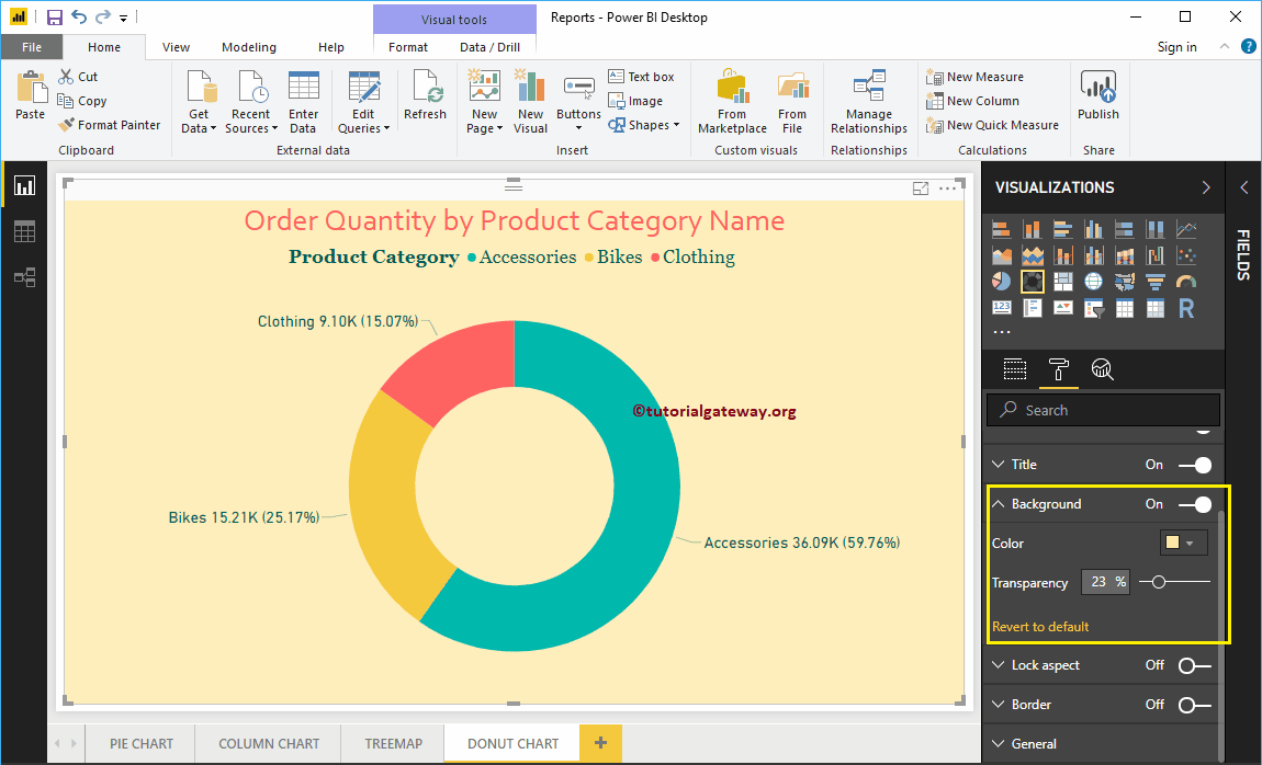
Add Background Color to Donut Chart in Power BI
You can add a Background color to Donut Chart by toggling the Background option from Off to On. For the demonstration purpose, we are adding a background color. Here, you can change the Transparency percentage as well.
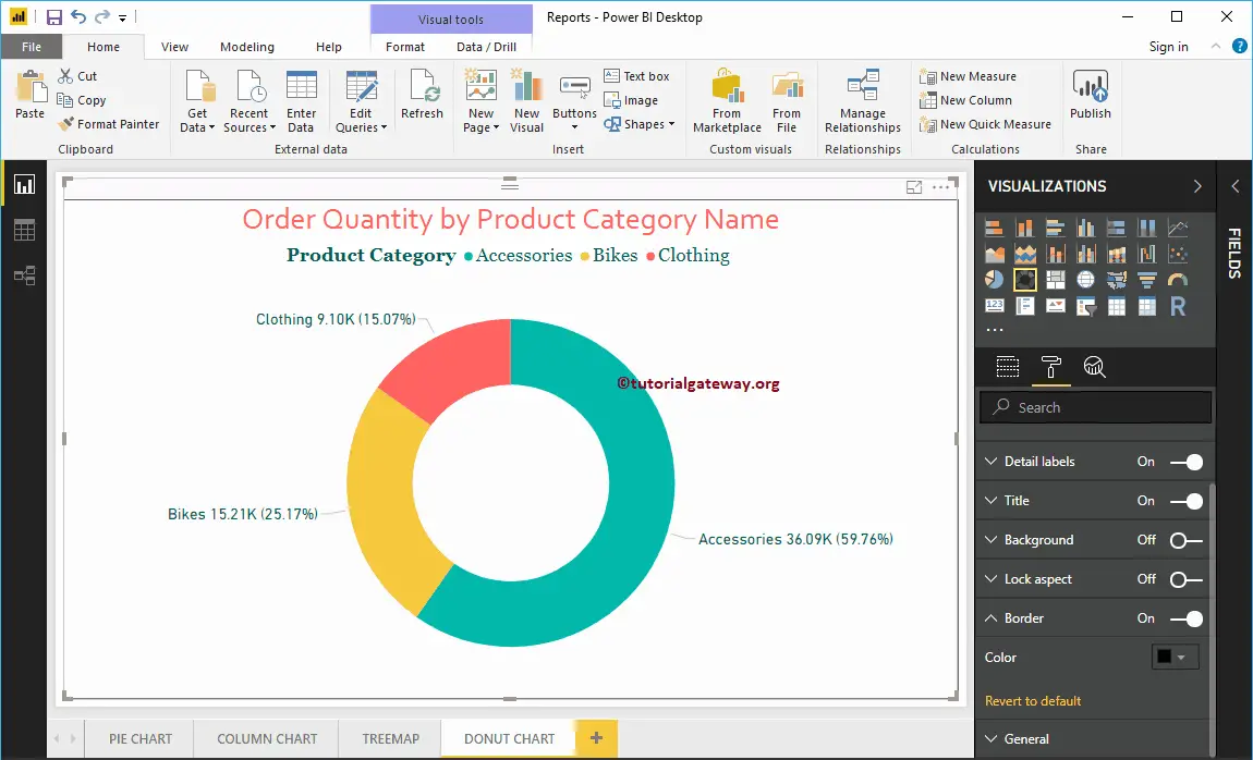
Add Border Colors to Donut Chart in Power BI
Toggling Border option from Off to On allows you to add Borders to Donut Chart. For the demonstration purpose, we are enabling it and adding Black color as the Border color.
You can use this General Section to Change the X, Y position, Width and height of a Donut Chart