Power BI Column Chart is very useful to compare the categorical data visually. For example, If we want to compare Sales by Product Group, or Color, then we can use this Power BI column chart.
For this Power BI Column Chart demonstration, we are going to use the SQL Data Source that we created in our previous article.
Please refer to Connect Power BI to SQL Server article to understand the Power BI Data Source.
How to Create a Column Chart in Power BI
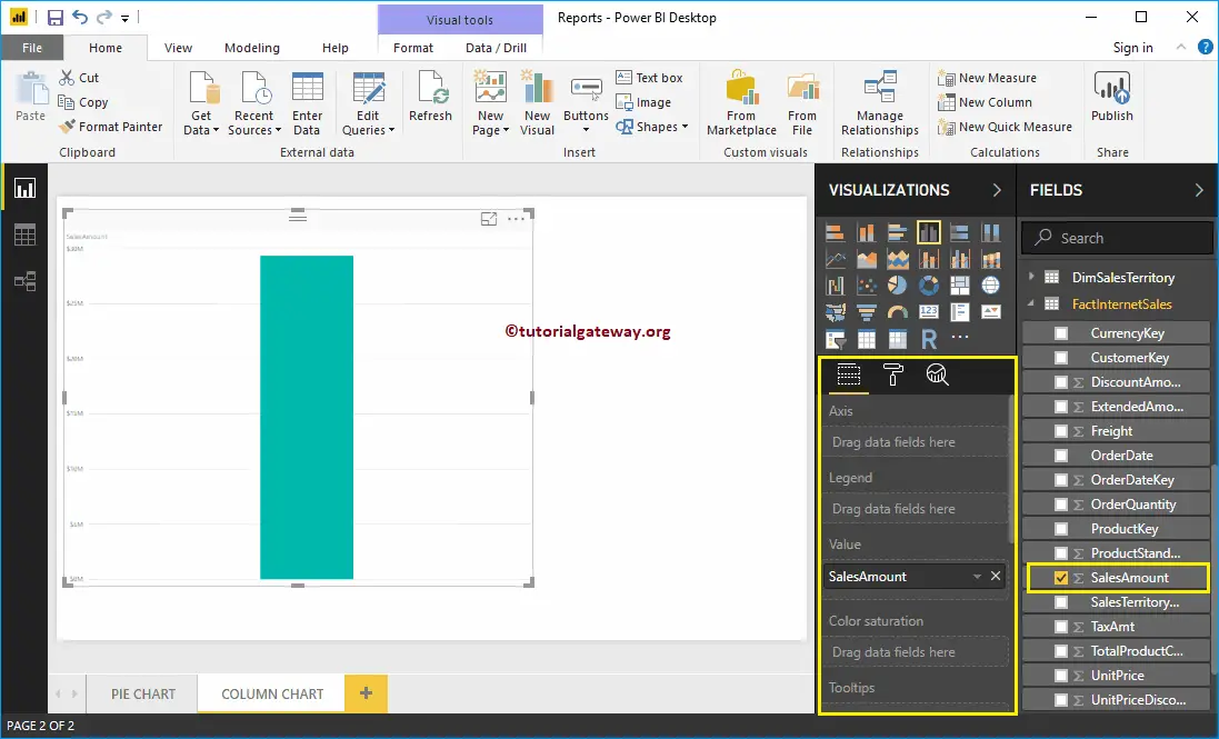
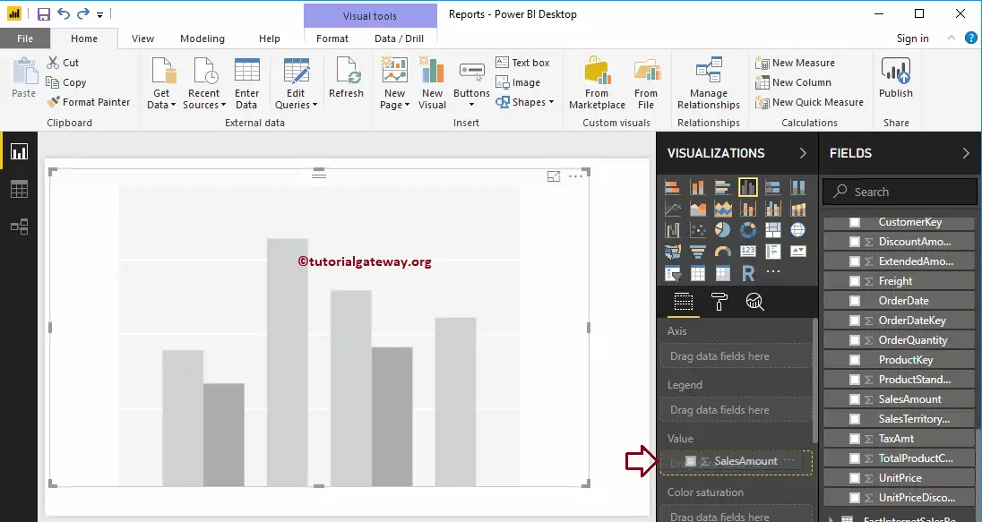
Drag and Drop the Sales Amount from Fields section to Canvas automatically create a Column Chart, as have shown in the below screenshot.
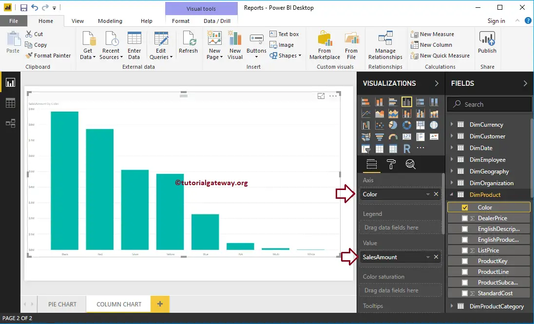
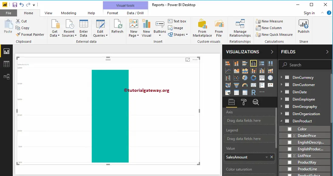
Next, let me add Color field to Axis to create a column chart that shows Sales Amount by the product Color.
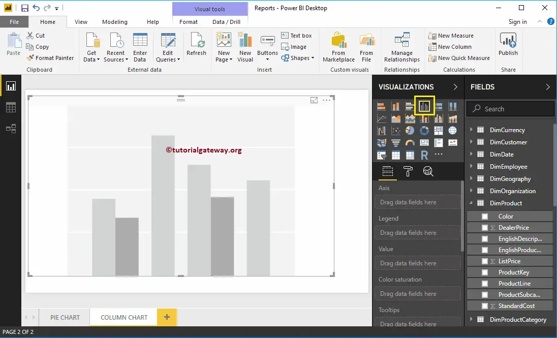
Create a Column Chart in Power BI – Approach 2
When you click on the Column Chart under the Visualization section, it automatically creates a Column Chart, as shown in the below screenshot.
To add data to the Power BI Column Chart, we have to add the required fields:
- Axis: Please specify the Column that divides the Bars.
- Values: Any Numeric value, such as sales amount, Total Sales, Customer count, etc.
Let me drag the Sales Amount from the Fields section to the Values field.
And you can see, it has created a column chart for you
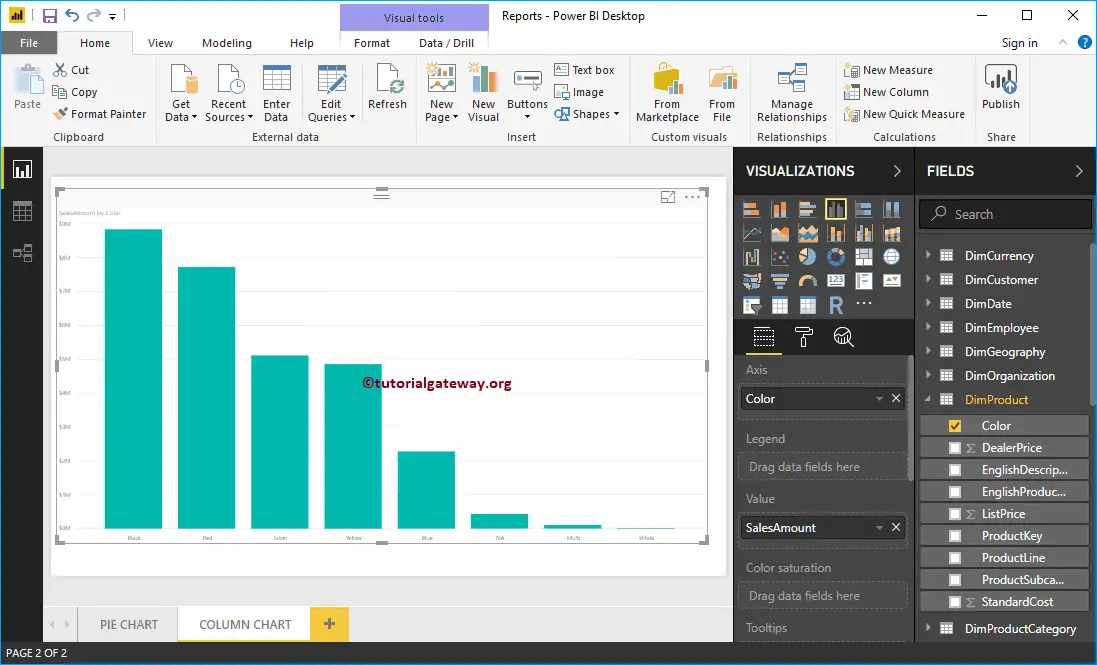
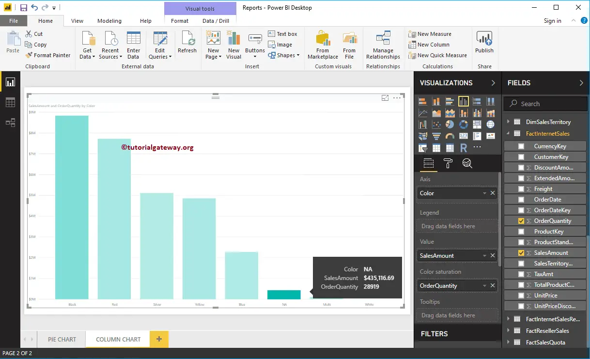
Next, add Product Color to the Axis field. You can do this by dragging Color to Axis section, or Checkmark the Color column
Power BI Column chart has one more property called Color Saturation. Let me add Order Quantity to saturate the Color from Light to dark. From the below screenshot you can see, all Product Colors apart from NA are light
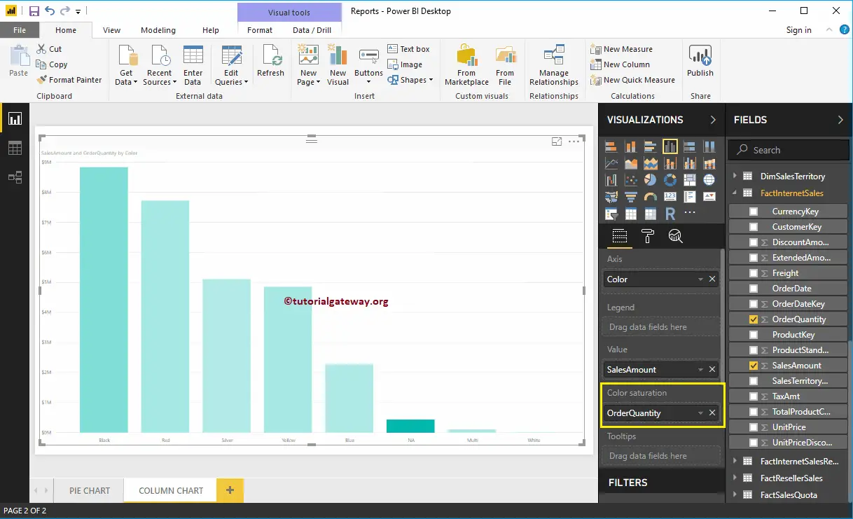
It’s because the Order Quantity is high for NA color products, but the sale amount is very less. Whereas the Sales Amount of Black color products is High, but the number of orders is very less.
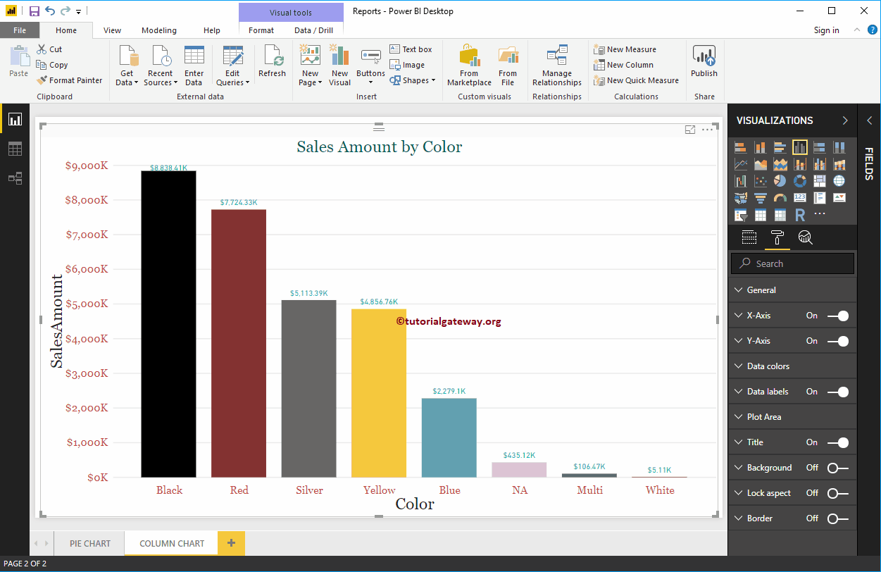
Let me do some quick formatting to this Column Chart
NOTE: I suggest you refer to the Format Column Chart article to understand the steps involved in formatting Bar Colors, Data Color, Background Color, Title, Axis fonts, and colors.
How to Format Power BI Column Chart with example?. Formatting Power BI Column Chart includes changing the Bar Color, Title position, background Colors, and adding Data labels, etc.
To demonstrate these Column chart formatting options, we are going to use the Column Chart that we created earlier. Please refer Column Chart in Power BI article to understand the steps involved in creating a Power BI column chart.
How to Format Power BI Column Chart
Please click on the Format button to see the list of available formatting options for this Column Chart.
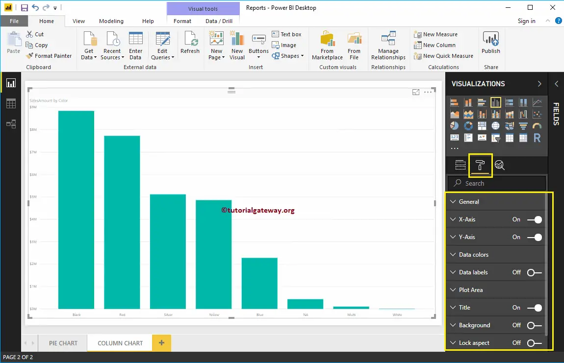
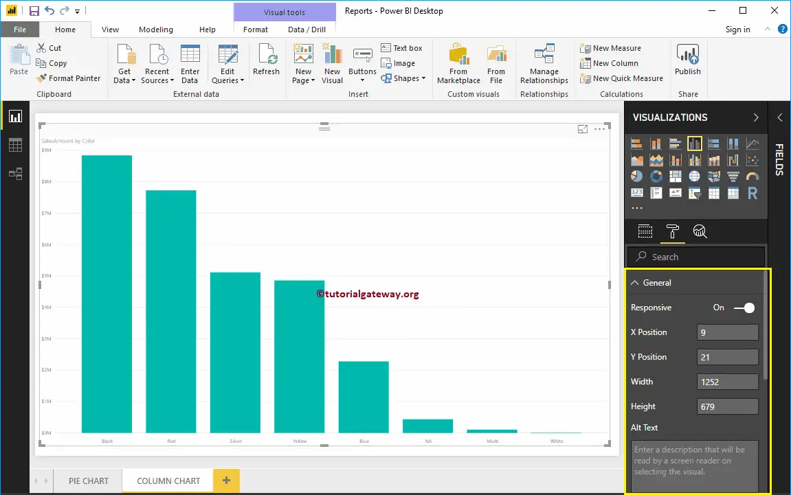
Use the General Section to Change the X, Y position, Width and height of a Column Chart
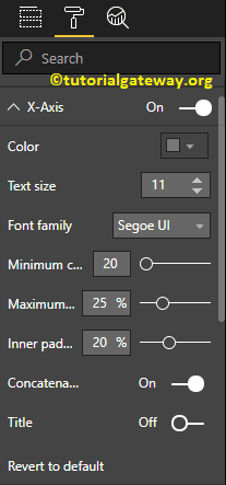
Format X-Axis of a Power BI Column Chart
Toggle the X-Axis option from Off to On to format the X-Axis labels. Following are the list of options that are available for you to format the Horizontal axis
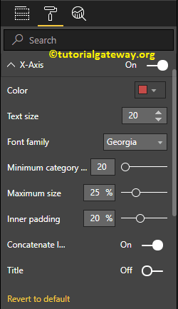
As you can see from the below screenshot, we change the Color to Brick red, Font style to Georgia, and Text Size to 20. Minimum category, Maximum Size, and Inner Padding options are to changed the bar widths
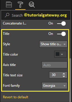
By default, the X-Axis title set to Off. But you can enable it by toggling Title to On. Let me change the Title Color to Dark Grey, Font style to Georgia, and Title Text Size to 30
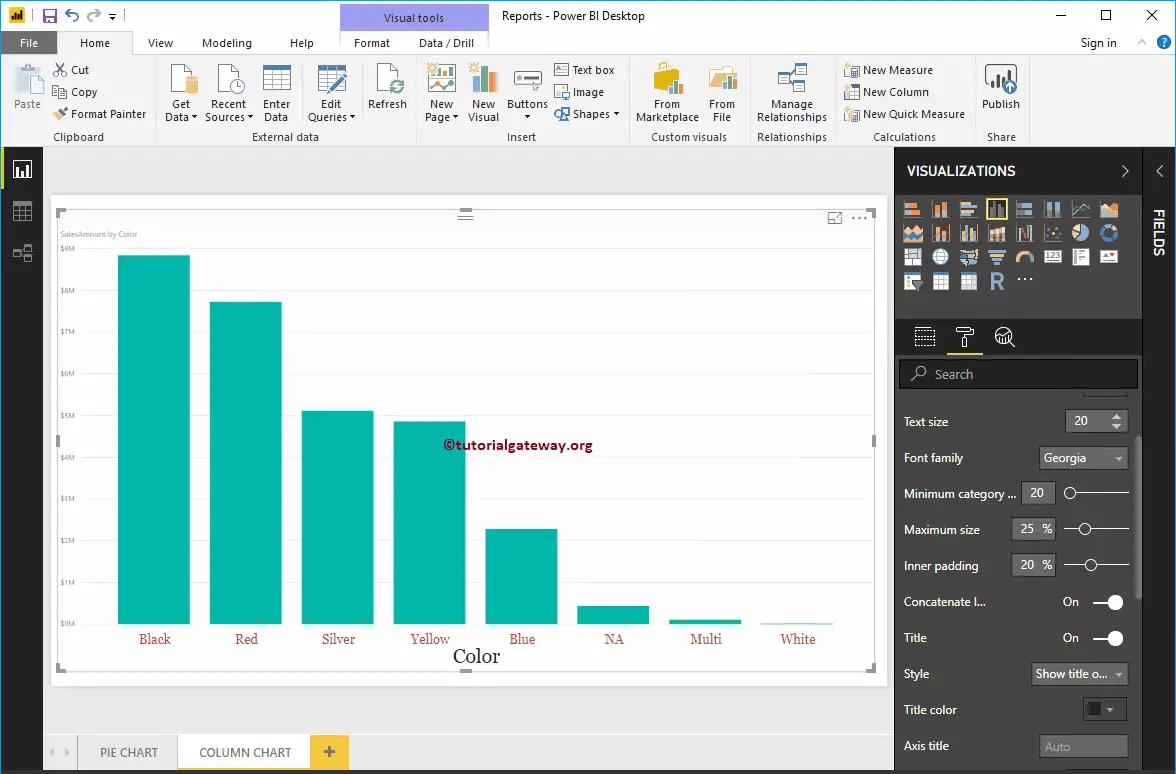
From the below screenshot, you can see the changes that we made to X-Axis.
Format Power BI Column Chart Y-Axis
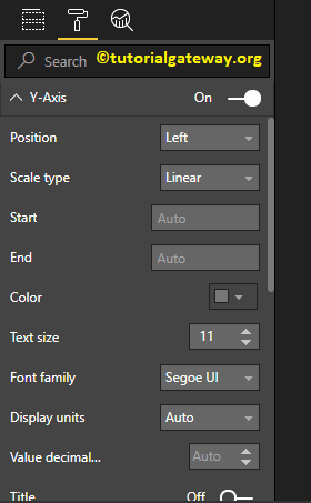
By toggling the Y-Axis option from Off to On, you can format the Y-Axis labels. The following are the list of options that are available for you to format the Vertical axis or Y-Axis.
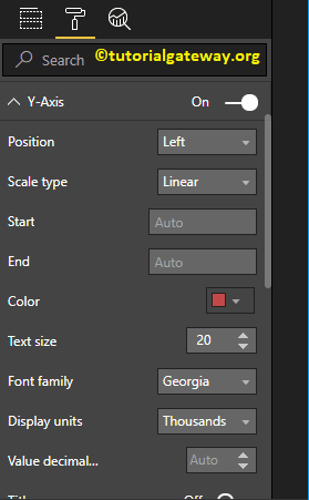
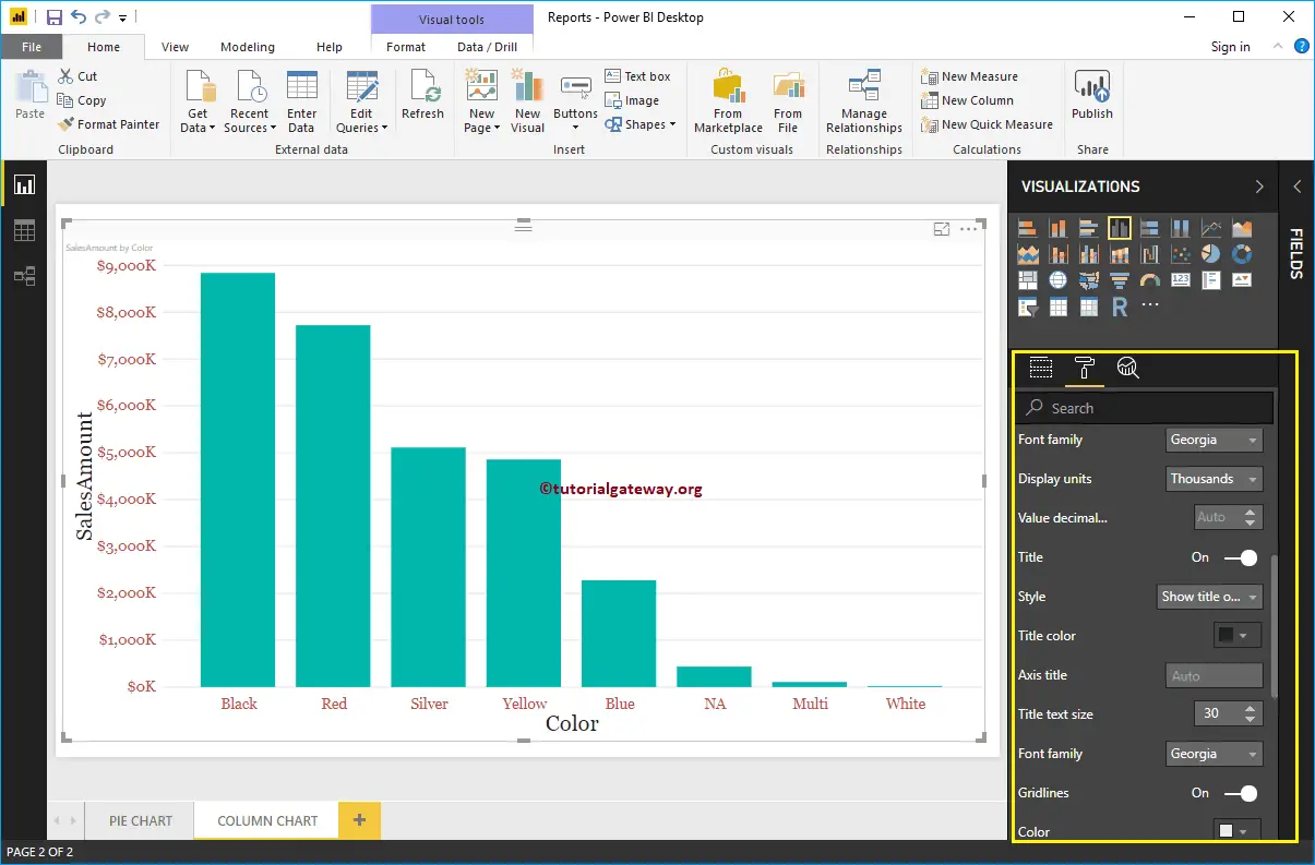
From the screenshot below, you can see that we change the Y-Axis labels Color to Brick red, Text Size to 20, Font style to Georgia, and Display Units to Thousands.
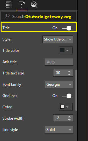
By default, the Y-Axis title set to Off. But you can enable it by toggling Title under the Y-Axis section to On. Let me change the Title Color to Dark Grey, Font style to Georgia, and Title Text Size to 30.
By toggling the Gridlines option from On to Off, you can disable the Gridlines.
- Color: You can change the Gridlines color.
- Stroke Width: Use this to change the Gridlines width. Here, we changed the width from default 1 to 2 strokes.
- Line Style: Choose the line style such as Solid, dotted, etc.
From the below screenshot, you can see all the changes that we made so far to the Y-Axis.
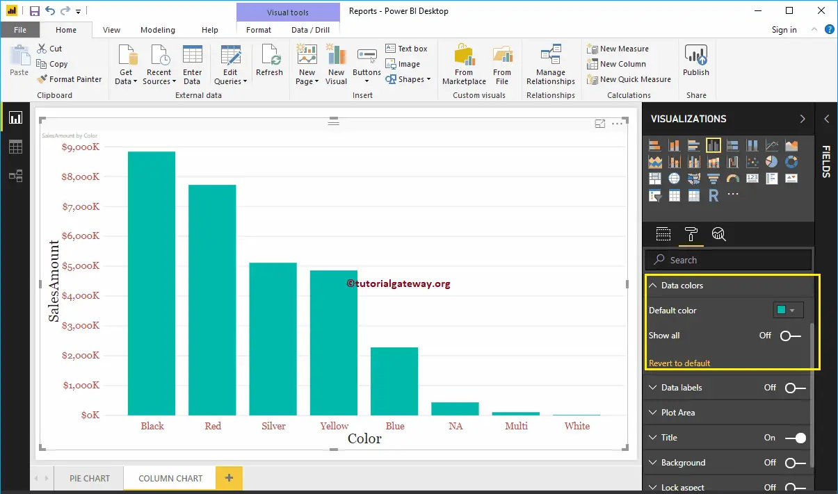
Format Power BI Column Chart Data Colors
By default, all the Bars in Column chart display in a single default color. This Data Colors section used to change the Bar Colors.
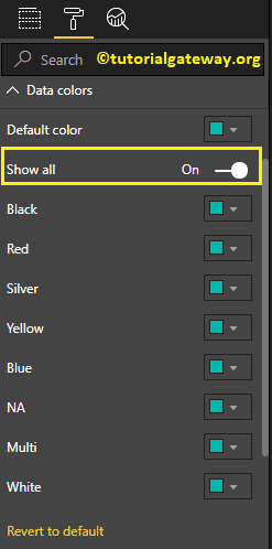
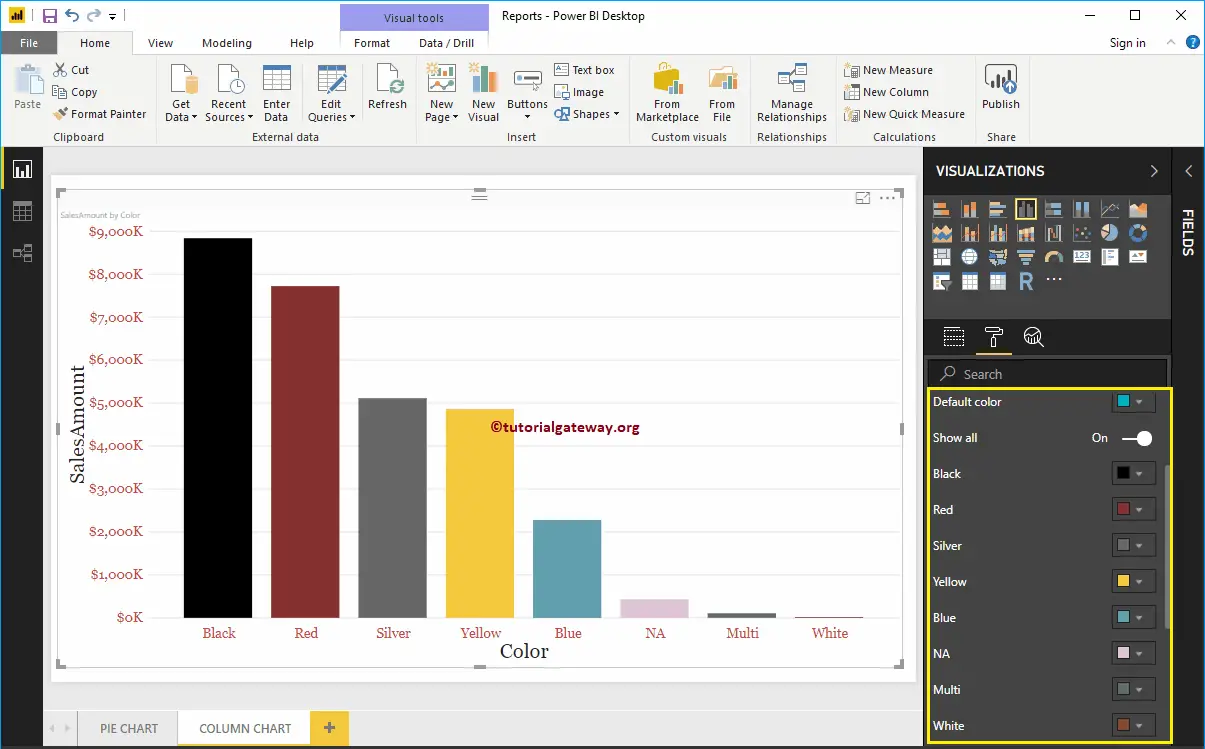
First, toggle Show all options from Off to On. It allows you to pick the individual color for each bar.
For the demonstration purpose, we changed the Colors of all the existing bars.
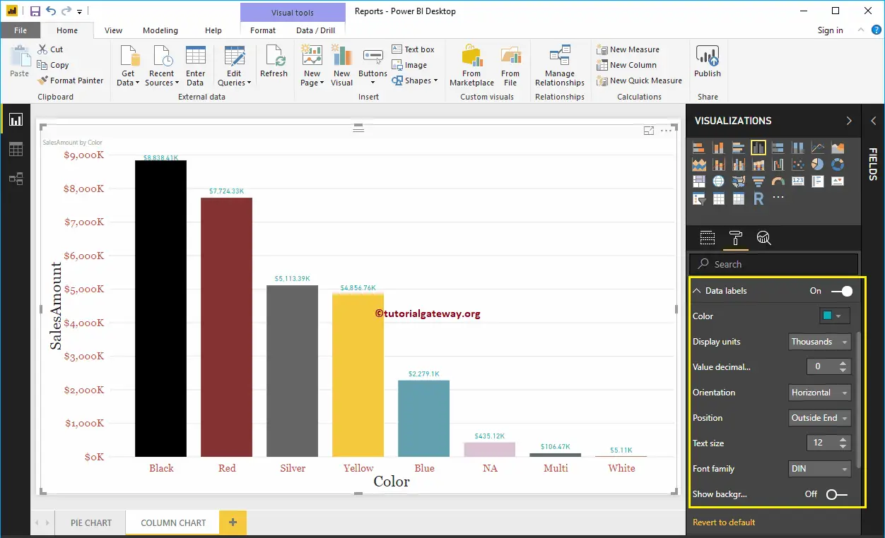
Enable Data Labels for Power BI Column Chart
Data Labels display information about the bar. In this case, it displays the Sales Amount of each bar. To enable data labels, please toggle Data labels option to On.
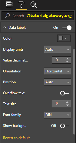
Let me change the Color to Green, Display Units from Auto to Thousands, Position to Outside End (Top of the Bar), Text Size to 12, and Font family to DIN. You can also add a Background color to the Data labels as well by enabling Show Background
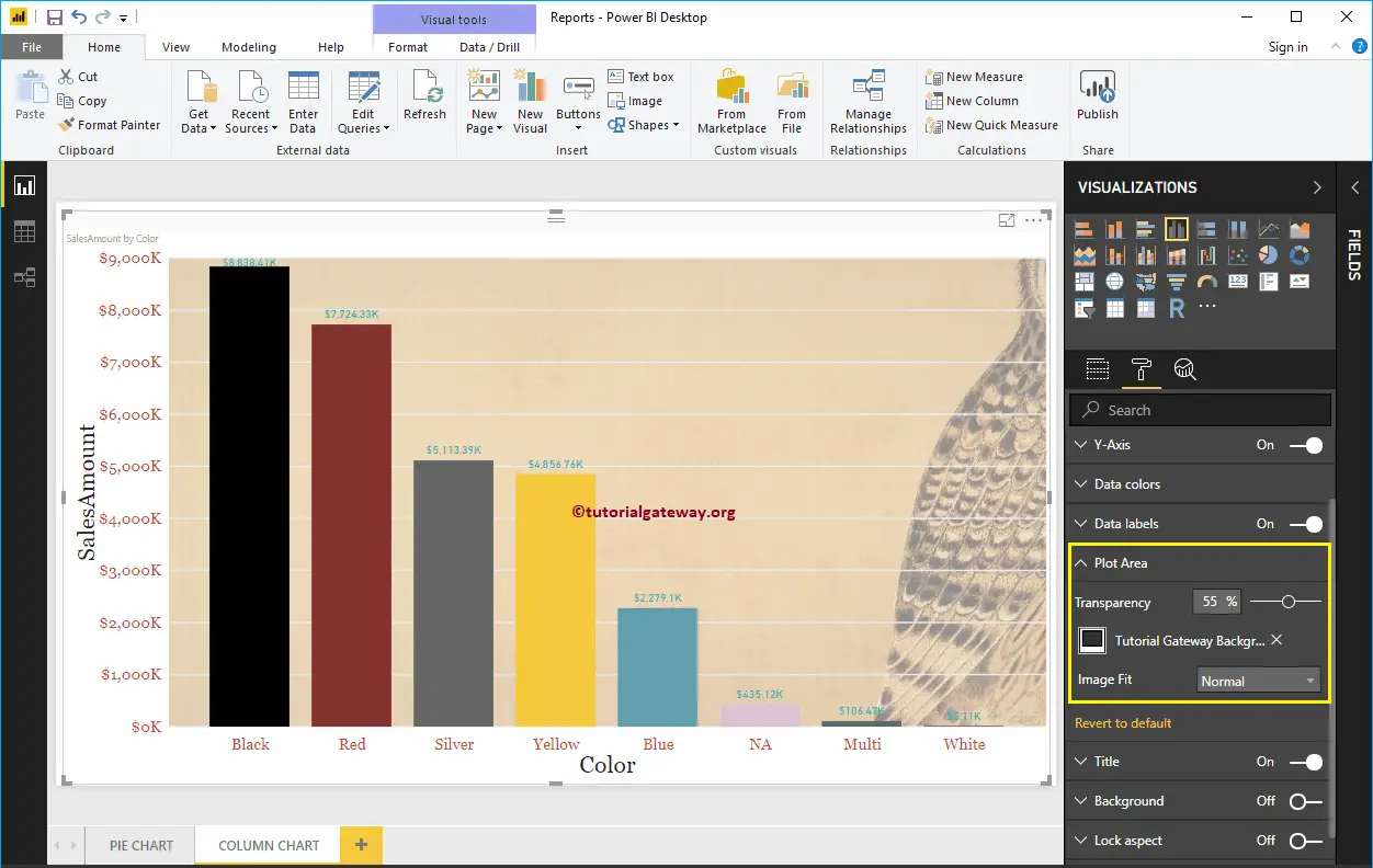
Format Power BI Column Chart Plot Area
You can add Images as the Background by using the Plot Area section. For the demonstration purpose, we added one image as the Plot Area Background.
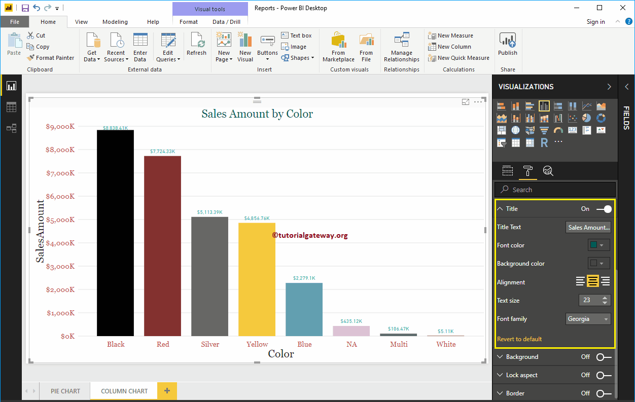
Format Power BI Column Chart Title
Please select the Title, and change the option from Off to On to display the Column Chart title. As you can see from the below screenshot, we change the Title Text to Sale Amount by Color. Next, Font Color to Green, Font style to Georgia, Font Size to 23, and Title Alignment to center. If you want, you can add the background color to the title as well.
Add Background Color to Column Chart in Power BI
You can add Background color to the Column Chart by toggling Background option to On. For the demonstration purpose, we are adding a background color. Here, you can change the Transparency percentage as well.
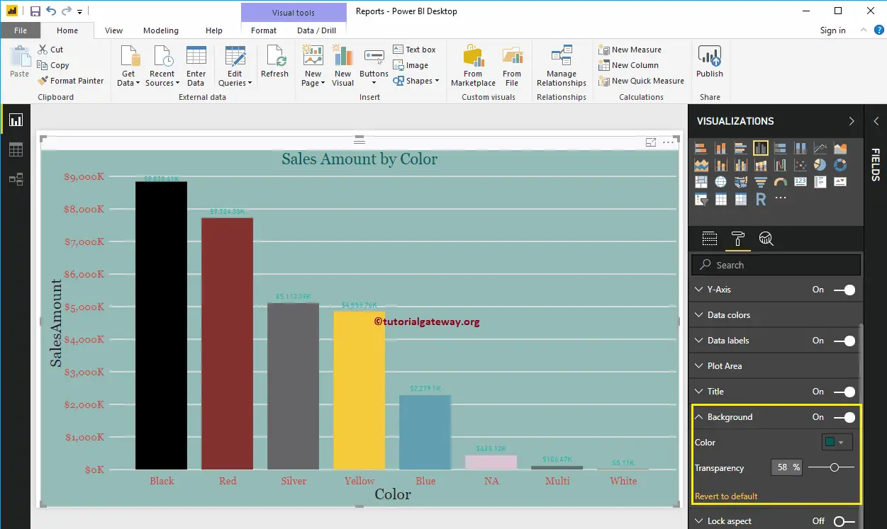
It doesn’t look very good. Let me remove the background color by clicking the Revert to the default option
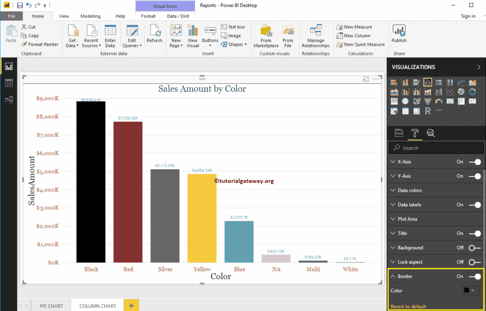
Enable Border to Column Chart in Power BI
You can add Borders to Column Chart by toggling the Border option from Off to On. For the demonstration purpose, we enabled Borders and added Dark Grey color as the Border color.
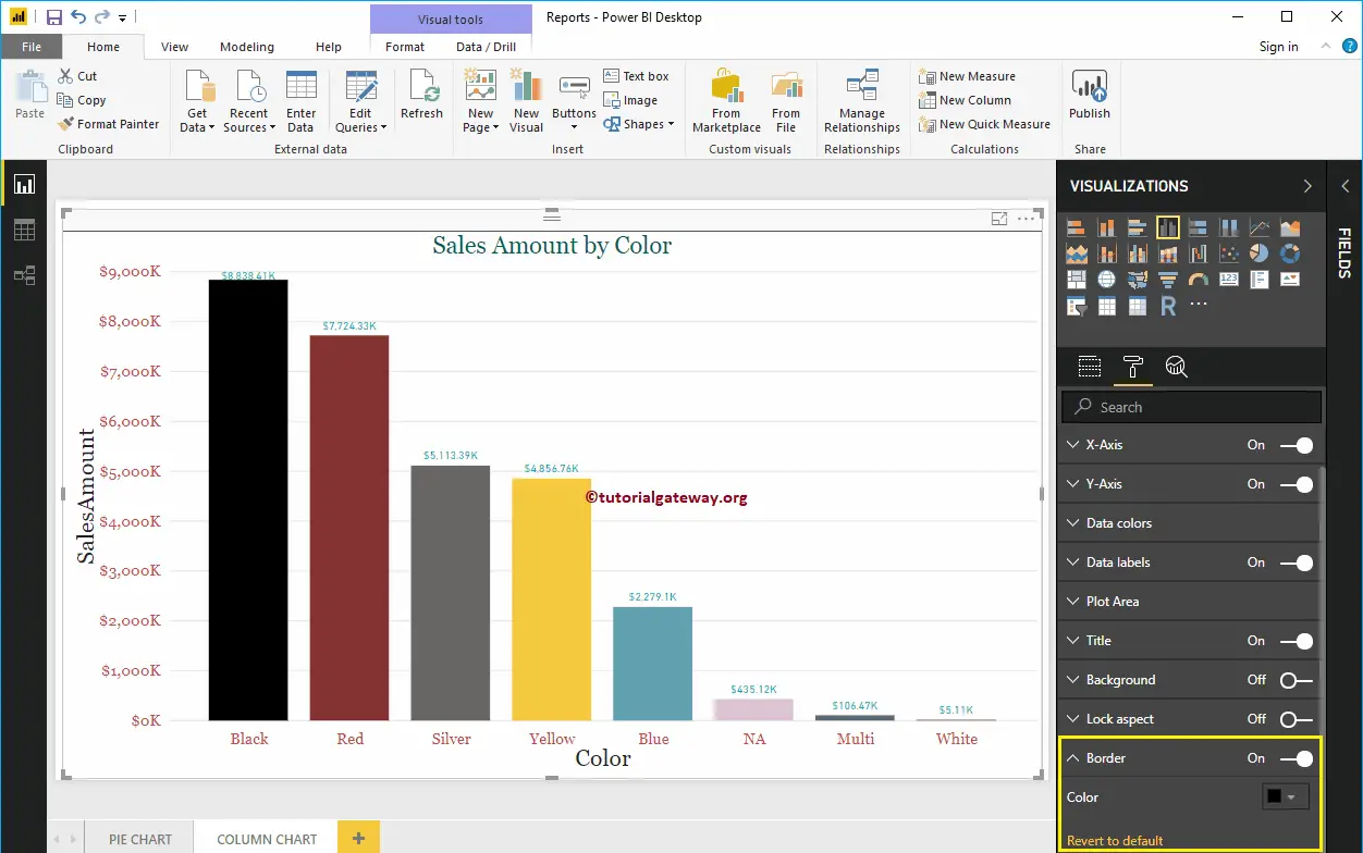
The below screenshot shows the Column Chart after formatting