Users Online

· Guests Online: 14

· Members Online: 0

· Total Members: 188
· Newest Member: meenachowdary055

Forum Threads

Newest Threads
No Threads created
Hottest Threads
No Threads created

Latest Articles

Power BI Tutorial - Power BI Charts Tutorial


Create a Map in Power BI

Power BI Maps help you to visualize the geological data. Let us see the step by step approach to Create a Map in Power BI with a practical example.


For the Power BI Map demo, we use the World Population Excel data file that we downloaded from the Data bank.

Please visit Connect to Excel to learn the steps included in working with Excel.

How to Create a Map in Power BI

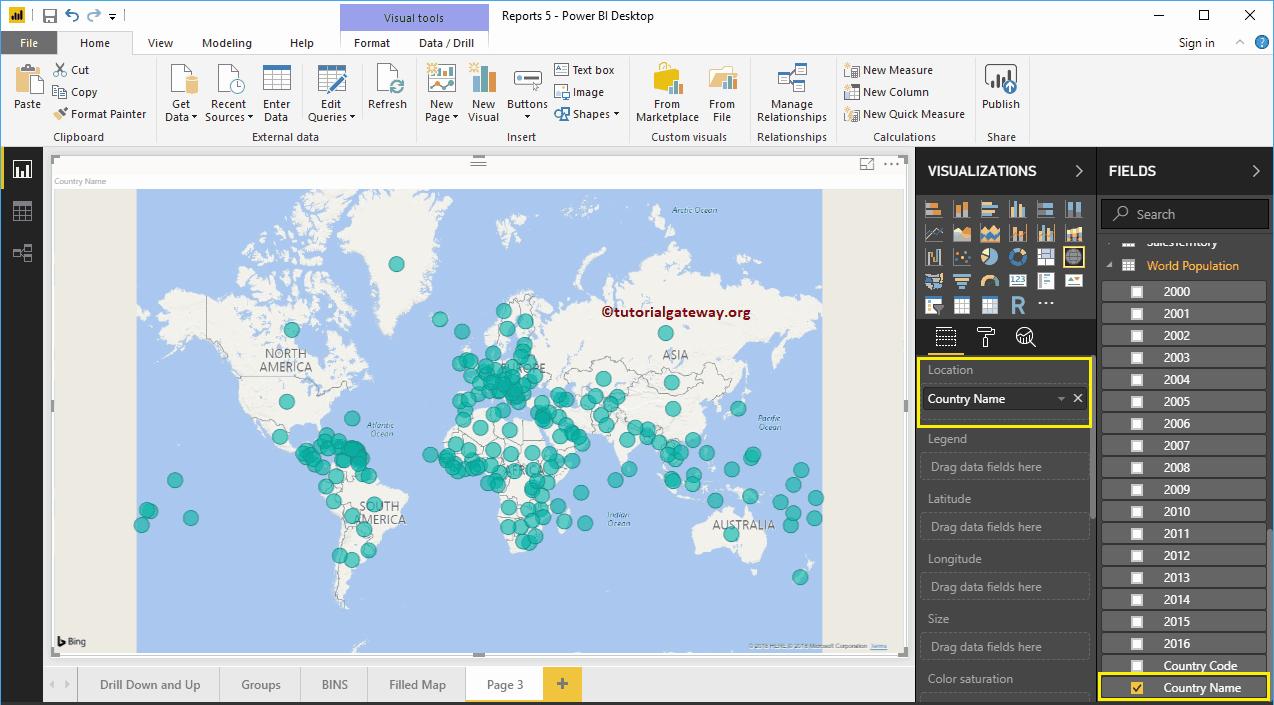
Dropping any geographic data to the Canvas area automatically create a Map. For instance, let me drag and drop the Country Names available in the world Population table to the Canvas.

From the following screenshot, you can notice that the power bi has created a map for you.

  Create a Map in Power BI 1

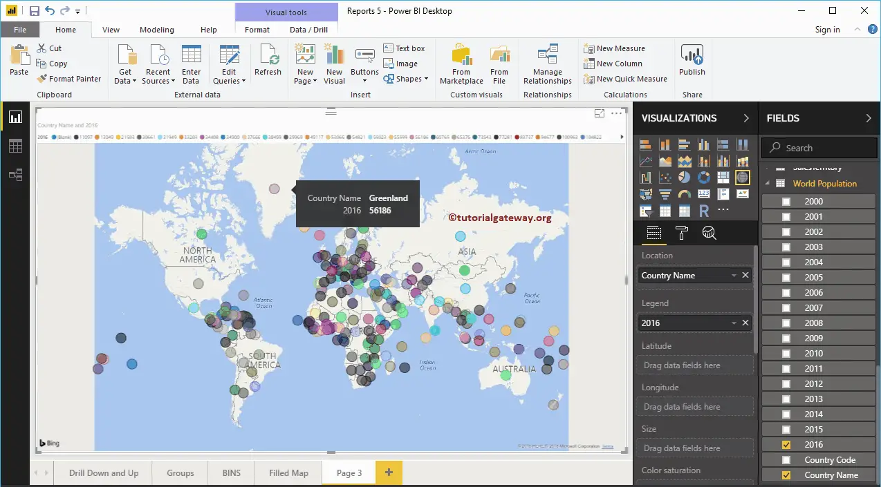
Next, Drag and Release the Population of the year 2016 from Power BI Fields region to the Legend section.

Create a Map in Power BI 2

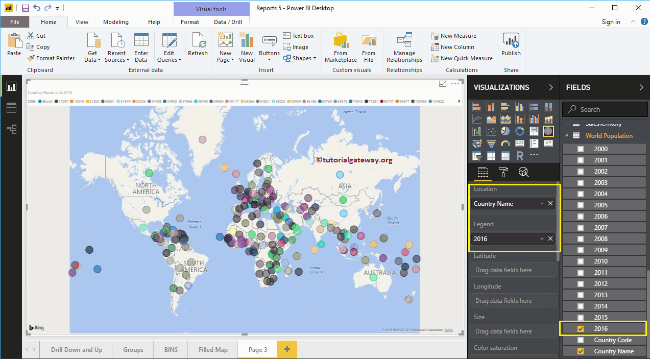
Hover over any bubble to see the country it represents, and the country population.

Create a Map in Power BI 3

The Second approach to Create a Map in Power BI

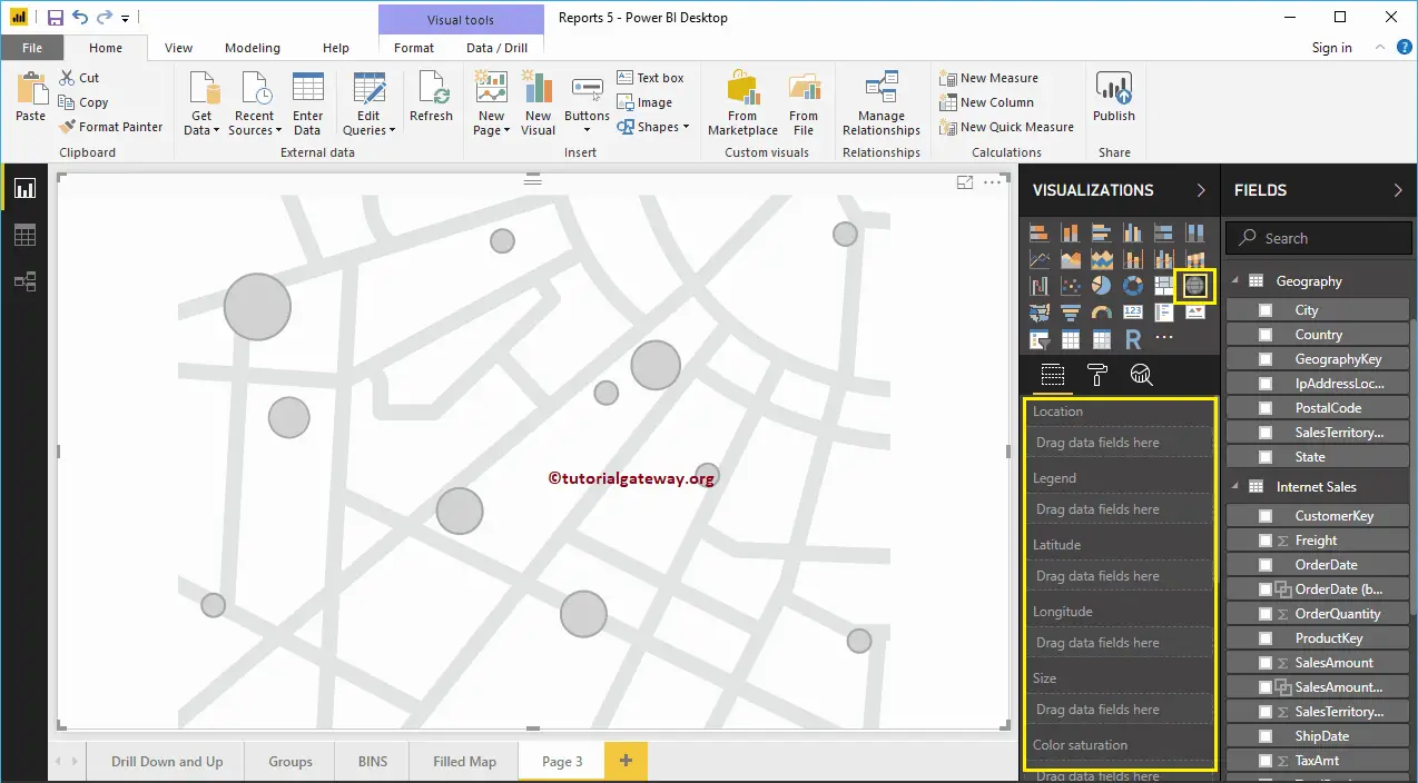
First, under the Visualization section, click on the Map. It automatically creates a Map with model data, as we have shown in the below screenshot.

Create a Map in Power BI 4

To add data to a Map in Power BI, we should add the required fields:

  • Location: Please provide the Geological Column name that draws the Bubbles.
  • Legend: Column name that sub-divides the data in the Location section. Something similar to Country, Region, Territory, or Continent
  • Latitude and Longitude: If the data contains the latitude and longitude information, you can use them to retrieve the exact location.
  • Size: Define the Column that describes the Bubble size.
  • Color Saturation: Any Numeric data that decides the Power BI map bubbles color.

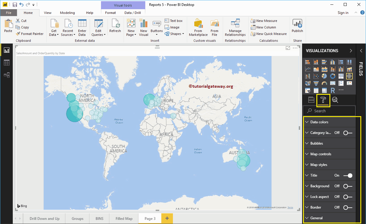
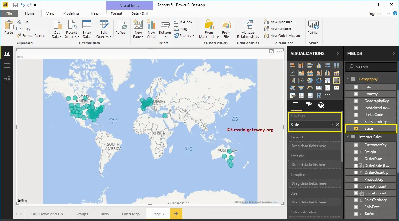
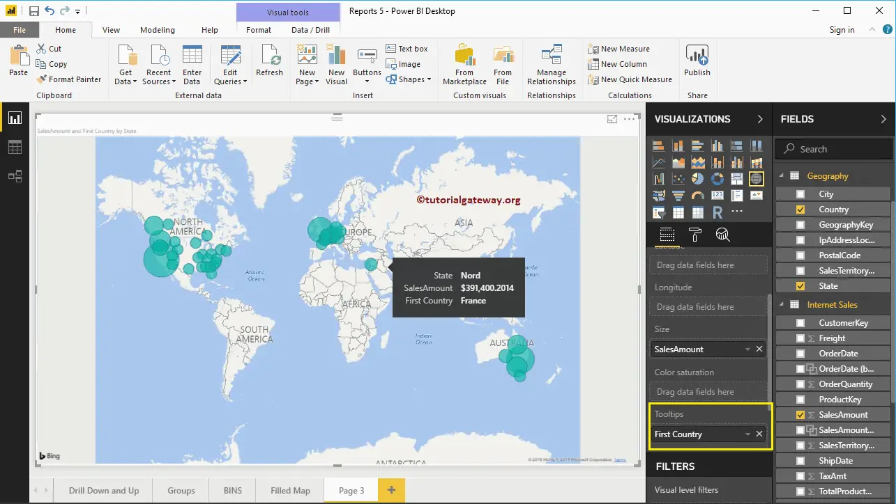
Let me drag the State from Fields area to the Location Section. You can achieve this by dragging the State column to the Location section or checkmark the State column.

Create a Map in Power BI 5

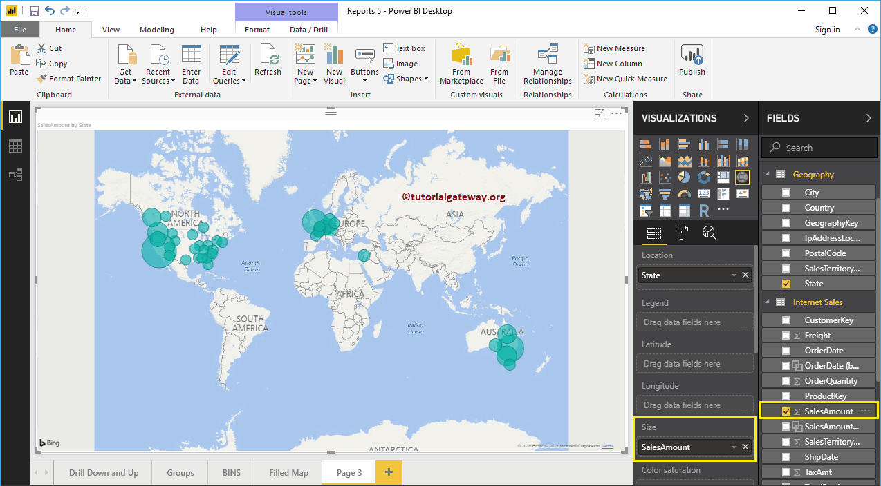
Next, add the Sales Amount to the Size section. Now, you recognize the size difference in the bubbles

Create a Map in Power BI 6

Next, let me add Country Name to the Tooltip section. After this, if you hover-over any bubble, show you the information about the Country, State, and its Sales Amount.

Create a Map in Power BI 7

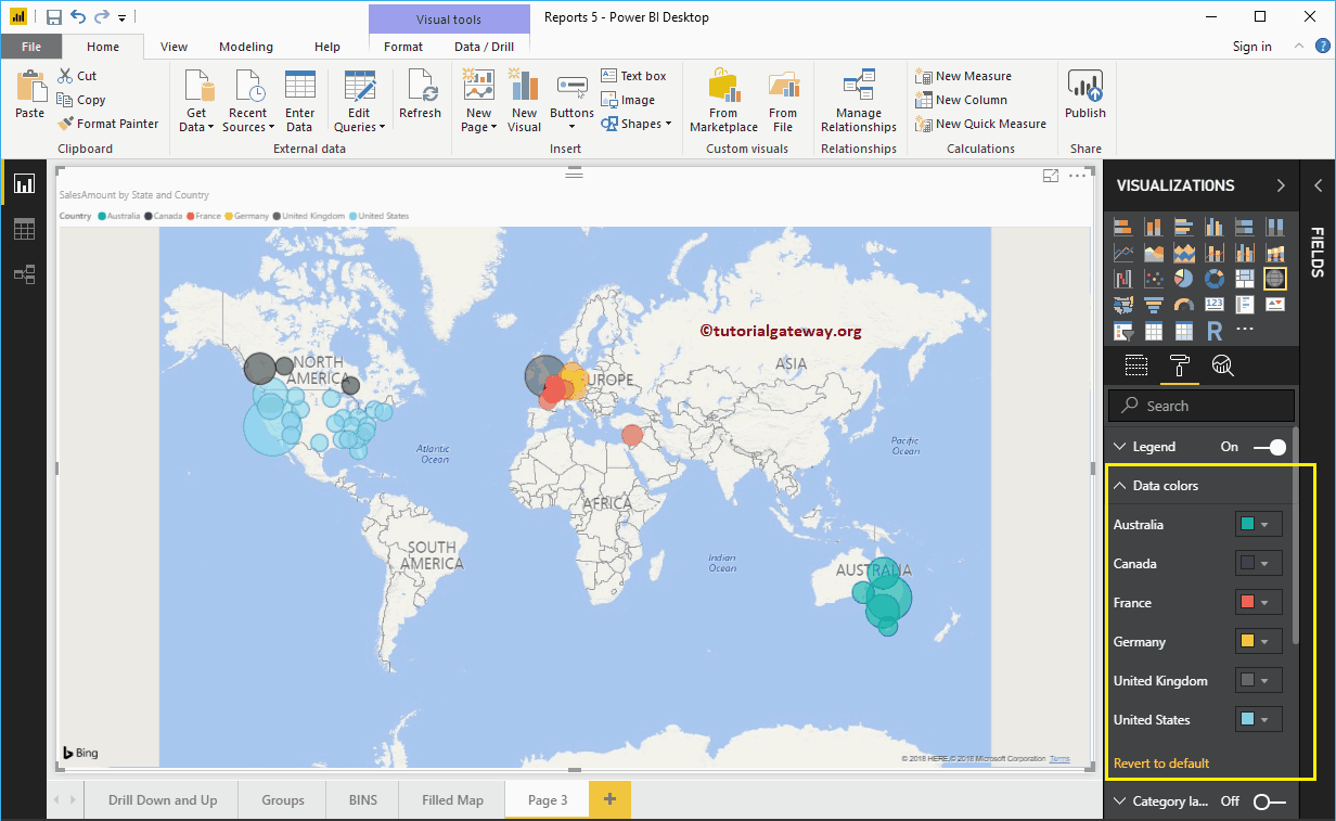
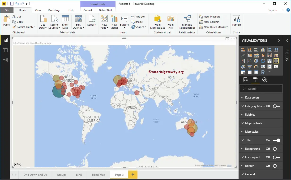
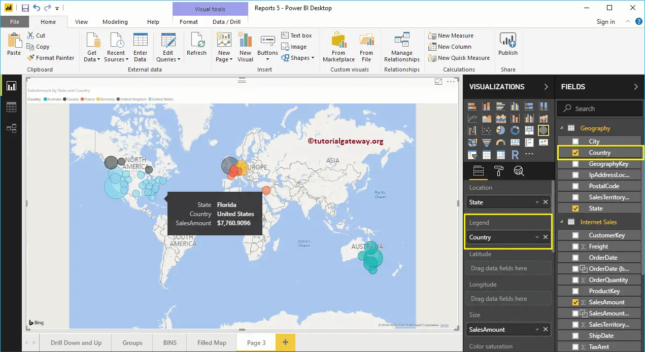
Let me add Country Name to the Legend section. As you can see, the color of bubbles is changed based on the country they represent.

Create a Map in Power BI 8

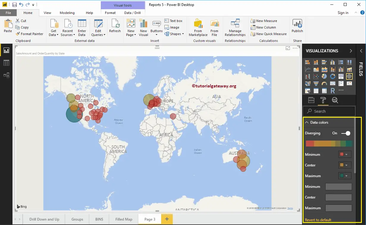
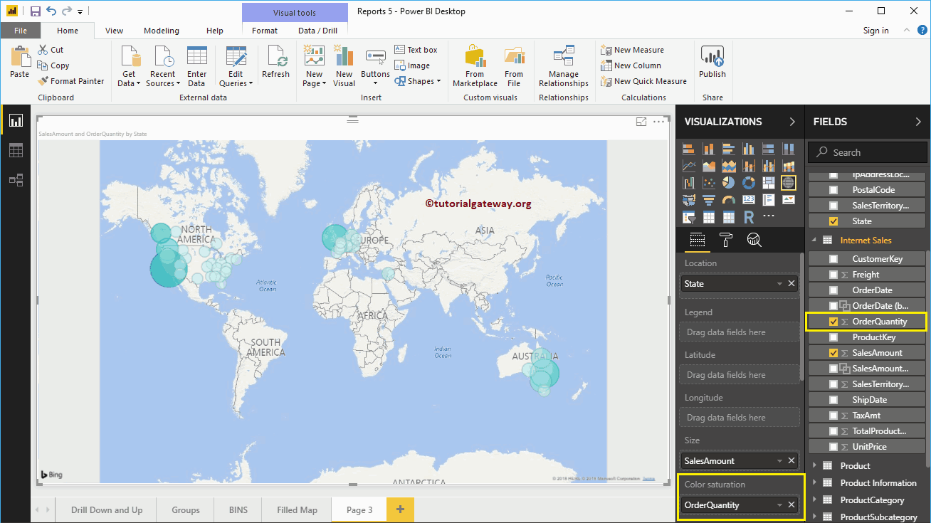
To demonstrate the Color Saturation section of a Power BI map, we added the Order Quantity to the Color Saturation section. From the below Map screenshot, the color of each circle has changed as per the Order Quantity. Remember, you can’t use the Legend and Color Saturation at the same time.

Create a Map in Power BI 9

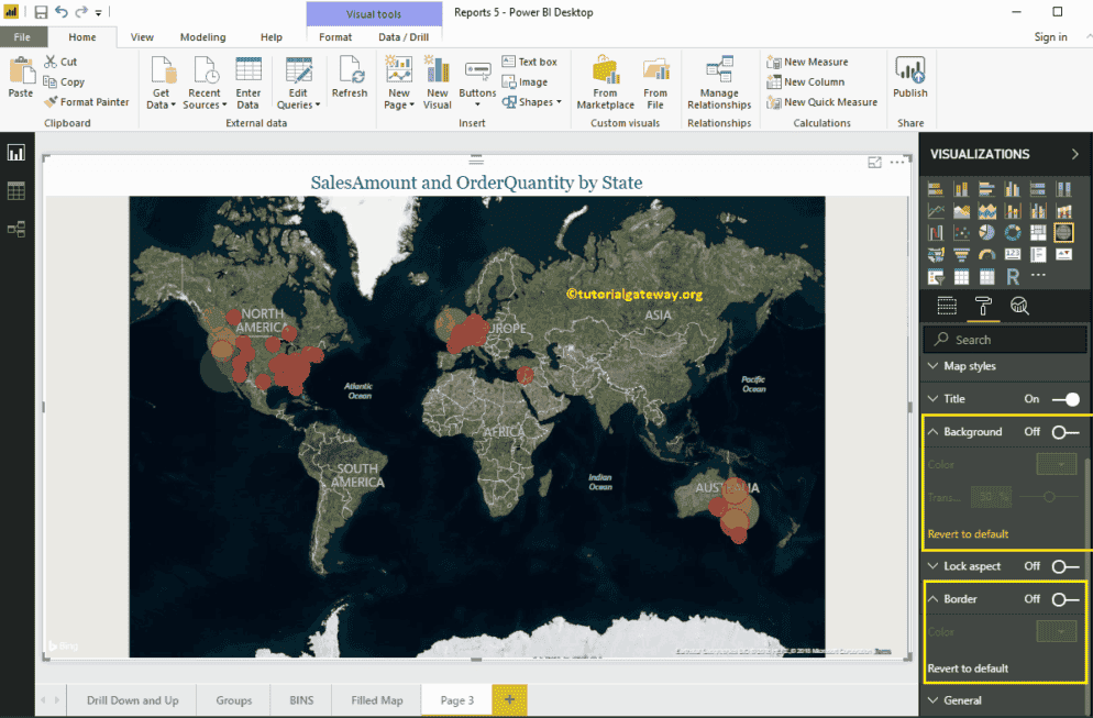
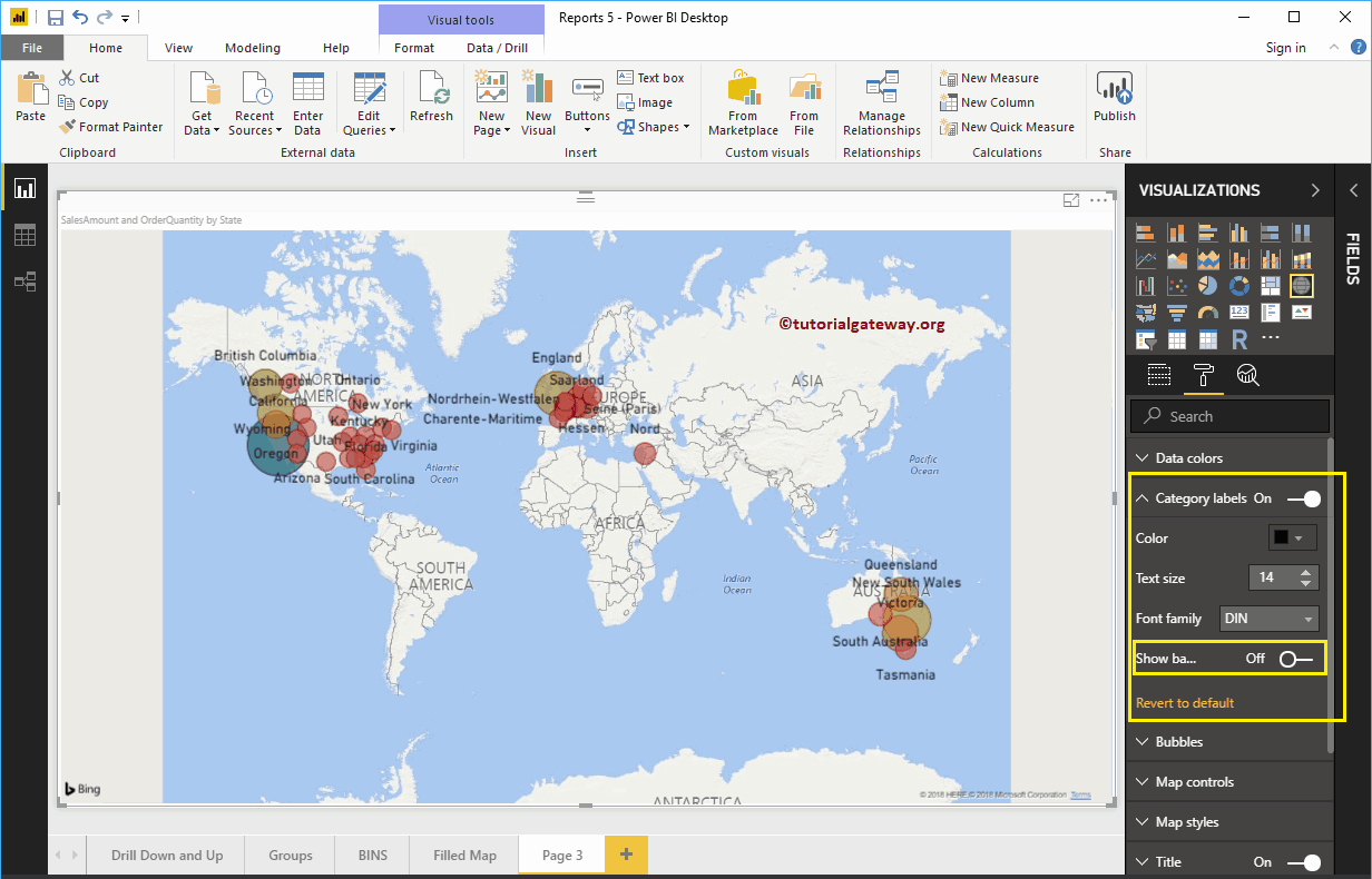
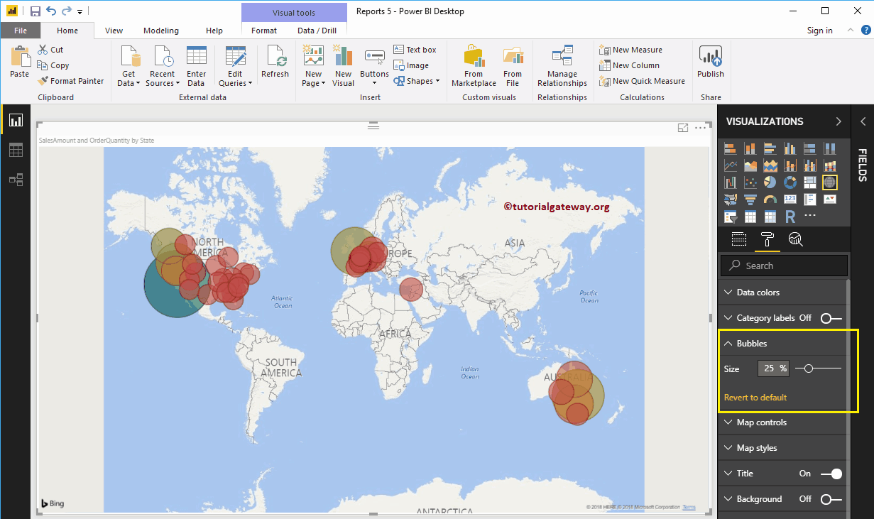
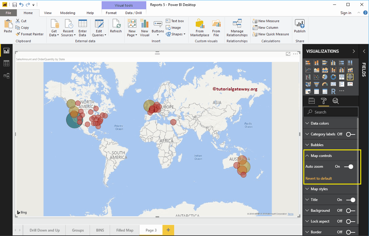
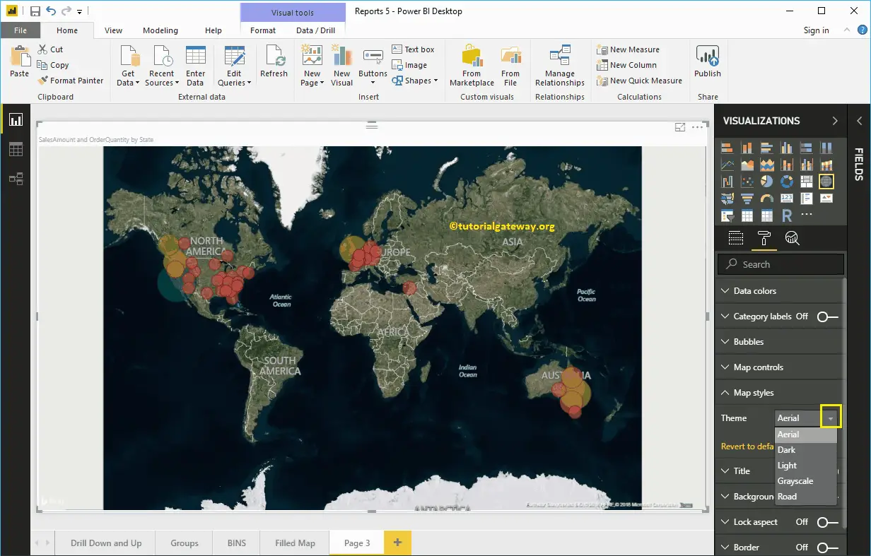
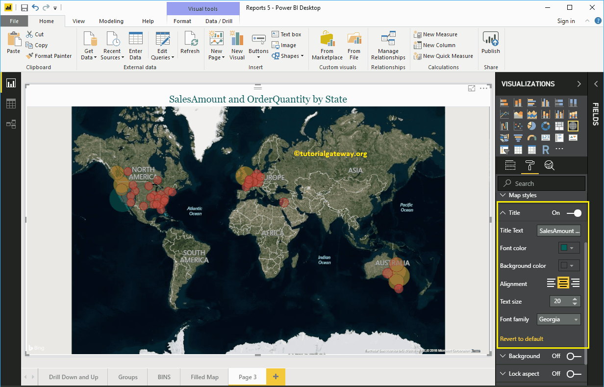
Let me do some quick formatting to this Power BI Map 


NOTE: I suggest you refer Format Maps article to understand the formatting options.

Create a Map in Power BI 10


Format Power BI Map

How to Format Power BI Map with an example?. Formatting Power BI Map includes changing the Bubble Size, Color, Map Title text, Title position, background color, etc.


To demonstrate these Map formatting options, we are going to use the Map that we created earlier. Please refer to Create a Map in Power BI article to understand the steps involved in creating a Power BI map.

How to Format Power BI Map

Please click on the Format button to see the list of formatting options that are available for this map.

Format Power BI Map 1

Format Power BI Map Data Colors

While we are creating this map, we added the Order Quantity as the Color Saturation, and that’s why we see the Diverging option under the Data Colors. Please change the Minimum, Center, and Maximum colors as per your requirements.

Format Power BI Map 2

If you removed the Order Quantity from the Color Saturation, the Data Colors section shows you the colors of each bubble, as we showed below.

  Format Power BI Map 3

Let me add the Order Quantity to Color Saturation again

Format Power BI Map 4

Format Power BI Map Category Labels

Map Category labels mean names that represent each bubble or circle. By toggling the Category labels option from Off to On, you can enable these labels.

From the screenshot below, you can see, we change the Color to Black and Text Size to 14. If you want, you can add the background color as well.

Format Power BI Map 5

Format Bubble Size of a Power BI Map

Use this section to change the size of all the Circles. As you can see from the screenshot below, we changed the size to 25%.

Format Power BI Map 6

Map Control in Power BI Map

By default, the auto zoom option enabled for this map. However, you can disable by toggling the Auto zoom option from on to off.

Format Power BI Map 7

Format Theme of a Map

Use this section to change the look or theme of a map. Let me select the Aerial Theme.

Format Power BI Map 8

Format Title of a Map in Power BI

By toggling the Title option from On to Off, you can disable the Map title.

From the screenshot below, you can see, we change the Font Color to Green, Text Size to 20, Font Family to Georgia, and Title Alignment to center. If you want, you can add the background color to the title as well.

Format Power BI Map 9

Format Background Color and Borders of a Map

You can add the Background color to a Map by toggling Background option to On.

Similarly, you can add Borders to a Map by toggling the Border option from Off to On. 


Format Power BI Map 10

Ratings

Rating is available to Members only.

Please login or register to vote.

No Ratings have been Posted.
Render time: 0.79 seconds
9,317,879 unique visits