Power BI Stacked Column Chart is useful to visualize multiple dimensions against a single measure. Let me show you how to Create a Stacked Column Chart in Power BI with example.
For this Power BI Stacked Column Chart demonstration, we are going to use the SQL Data Source that we created in our previous article. So, Please refer Connect Power BI to SQL Server article to understand the Data Source in Power BI.
How to Create a Stacked Column Chart in Power BI
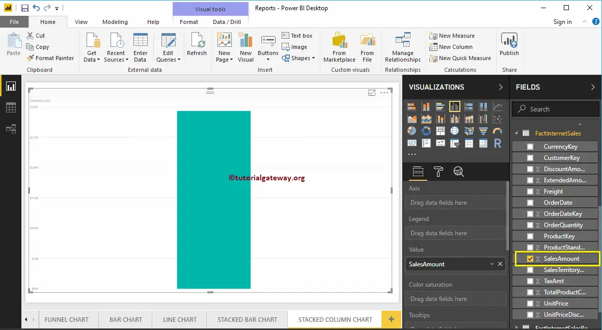
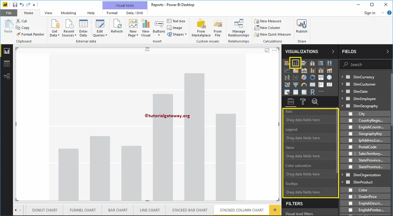
To create a Stacked Column Chart in Power BI, first Drag and Drop the Sales Amount from Fields section to Canvas region. It automatically creates a Column Chart.
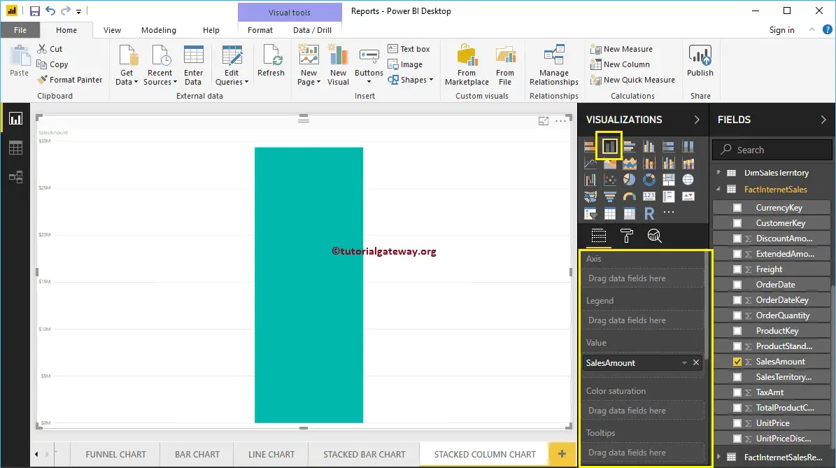
By clicking the Stacked column Chart under the Visualization section, it automatically converts the Column Chart into Stacked Column Chart
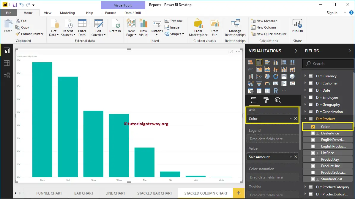
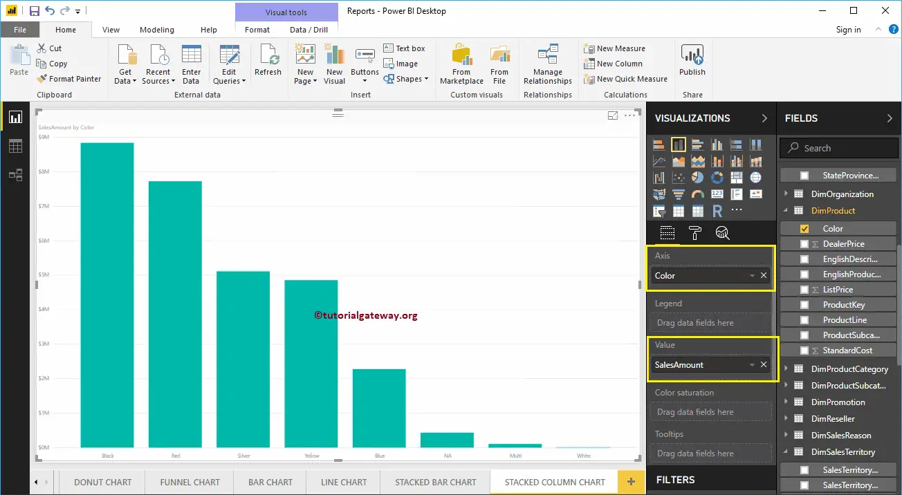
Next, let me add Color to Axis section to create a Column chart that shows Sales Amount by Color.
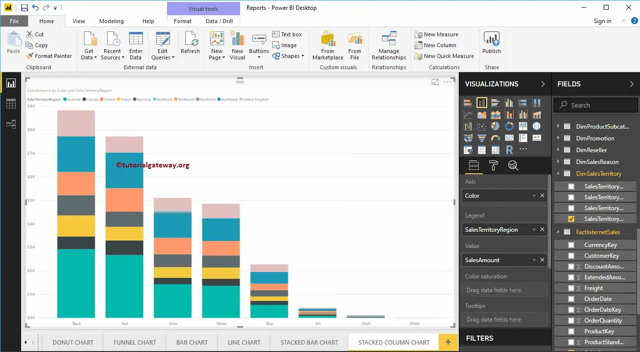
Next, we are adding Sales Territory Region Name to Legend section to convert it into the Stacked Column Chart.
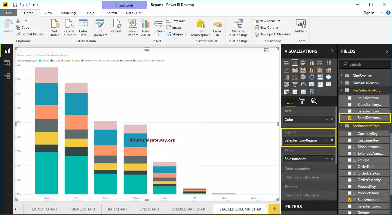
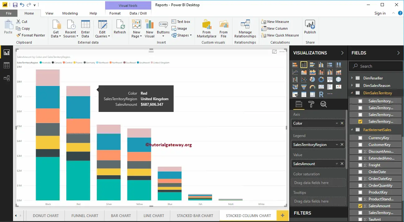
Hover over any section of a vertical bar shows the Tool-tip of Territory, Color, and its Sales Amount
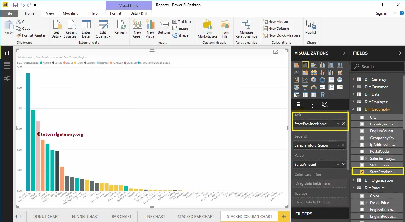
This time, we replaced the Color with State Province Name in Axis Section. From the screenshot below, you can see, Territory Region Name is acting as the Bar Color. It is because You can’t group the Territory inside a State ( State Name Inherited from Territory).
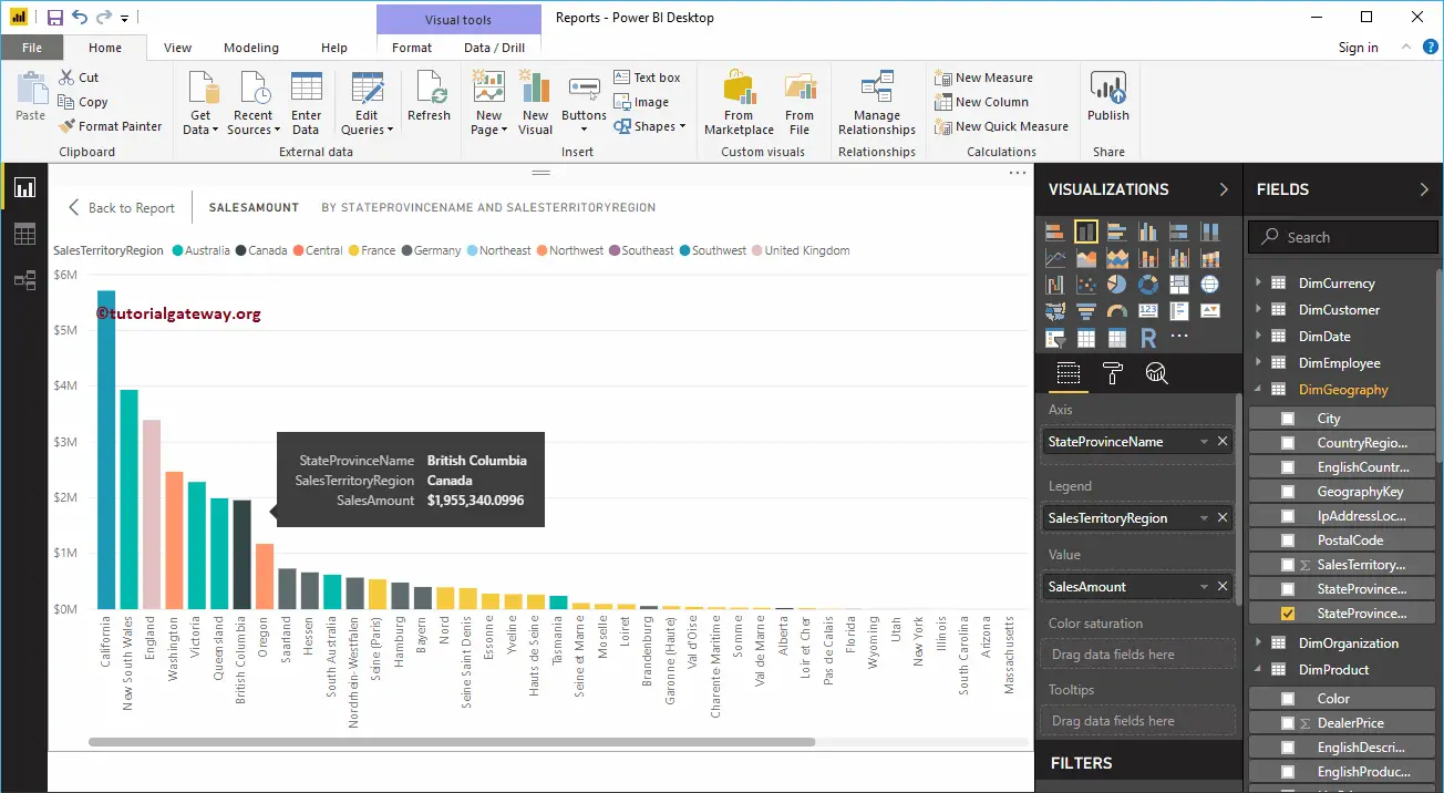
Hover over any vertical bar shows the Tool-tip of State Name, Territory, and its Sales Amount
Create a Stacked Column Chart in Power BI Approach 2
First, click on the Stacked Column Chart under the Visualization section. It creates a Stacked Column Chart with dummy data.
To add data to the Power BI Stacked Column Chart, we have to add the required fields:
- Axis: Please specify the Column that represents the Vertical Bars.
- Legend: Specify the Column to divide the Vertical Bars.
- Values: Any Numeric value such as sales amount, Total Sales etc.
Let me drag the Sales Amount from the Fields section to the Values field, and Color field to the Axis Section.
Next, add the Sales Territory Region Name from DimSalesTerritory table to the Legend section. You can do this by dragging Territory to Legend section, or simply checkmark the Sales Territory Region Name column
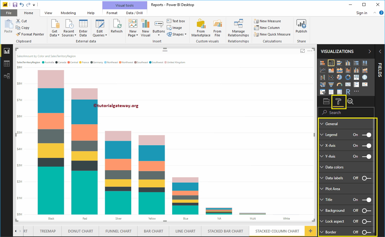
Let me do some quick formatting to this Stacked Column Chart
NOTE: I suggest you refer to the Format Stacked Column Chart article to understand the steps involved in formatting the Stacked Column Colors, Title, etc.
How to Format Power BI Stacked Column Chart with an example?. Formatting Power BI Stacked Column Chart includes changing the Stacked Column Chart Colors, Title text, Title position, Enabling Data labels, Axis Fonts, and Background Colors, etc.
To demonstrate these Stacked Column Chart formatting options, we are going to use the Stacked Column Chart that we created earlier. Please refer to the Stacked Column Chart in Power BI article to understand the steps involved in creating a Power BI Stacked Column chart.
How to Format Power BI Stacked Column Chart
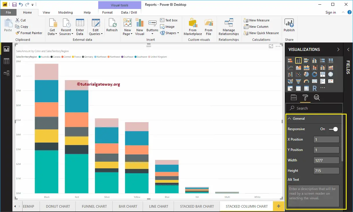
Please click on the Format button to see the list of formatting options that are available for this Stacked Column Chart.
Format Stacked Column Chart General Section
Use this General Section to Change the X Position, Y Position, Width, and height of a Stacked Column Chart.
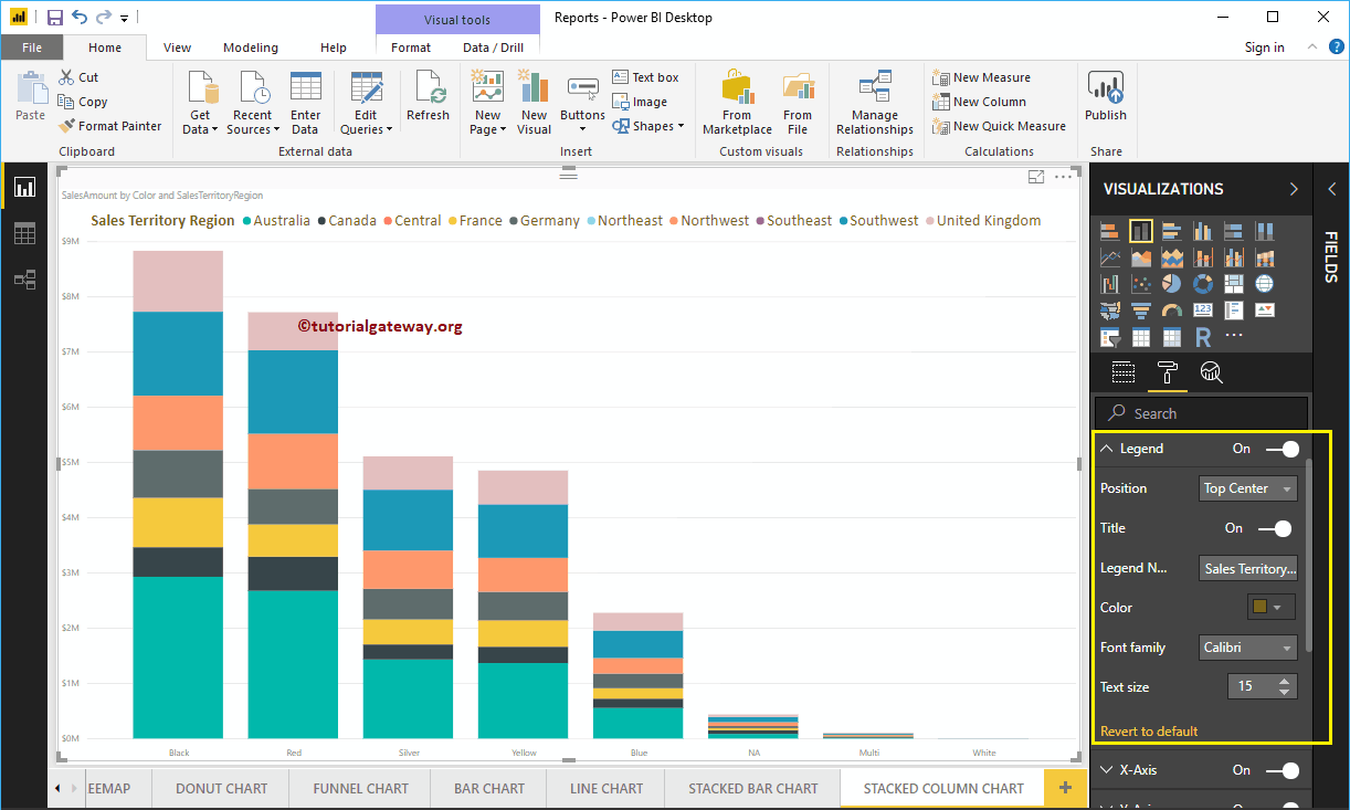
Format Legend of a Stacked Column Chart in Power BI
To display or enable the Legend, Please select the Legend region and toggle the option from Off to On.
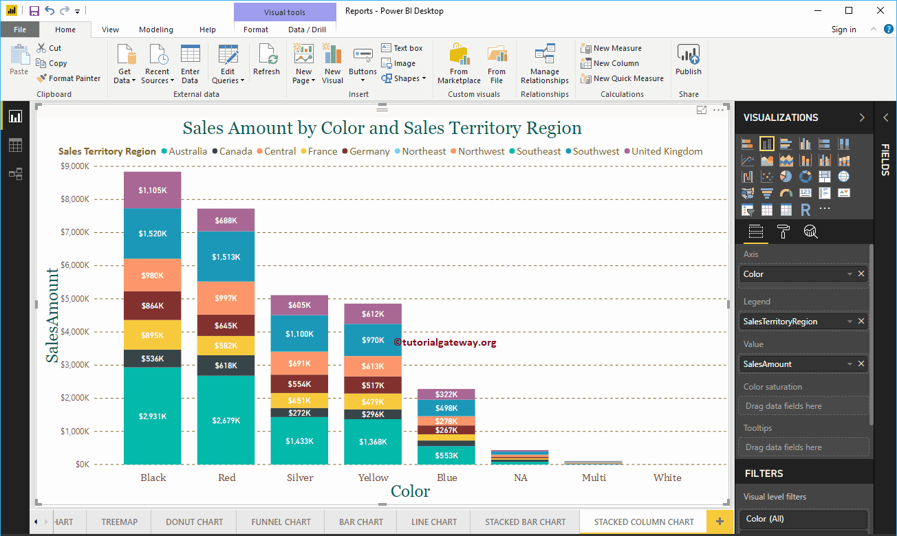
As you can see from the screenshot below, we added the Legend Title as Sales Territory Region, Legend Position as Top Center. And we also changed the Color to Golden Yellow, Font family to Calibri, and text size to 15.
Format X-Axis of a Power BI Stacked Column Chart
As you can see from the below screenshot, we change the Color to Brown, Font style to Cambria, and Text Size to 20. Minimum category, Maximum Size, and Inner Padding options are to change the vertical bar widths
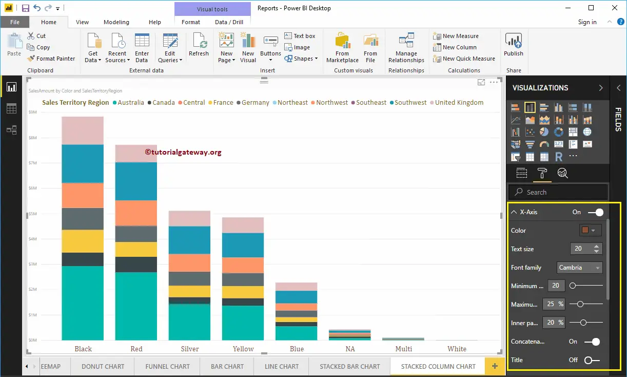
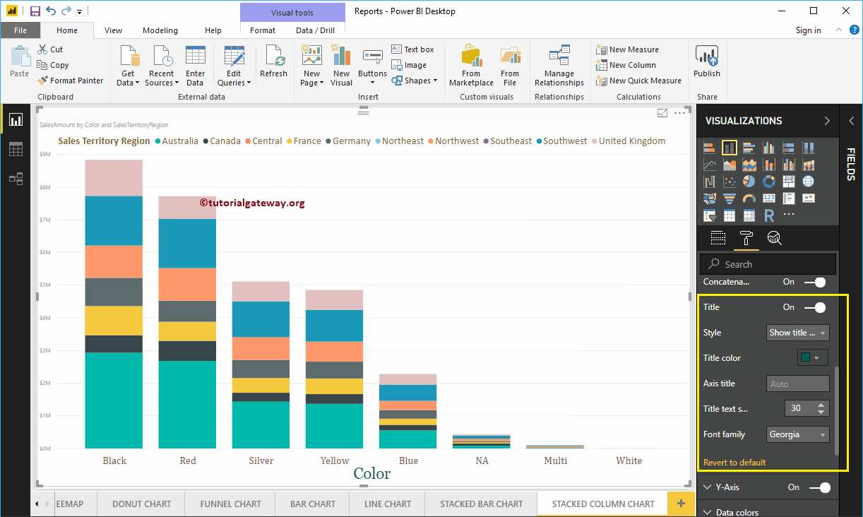
By default, the X-Axis title set to Off for stacked column chart. But you can enable it by toggling Title to On. Let me change the Title Color to Green, Font style to Georgia, and Title Text Size to 30
Format Power BI Stacked Column Chart Y-Axis
As you can see from the screenshot below, we change the Y-Axis labels Color to Brown, Text Size to 15, and Display Units to Thousands.
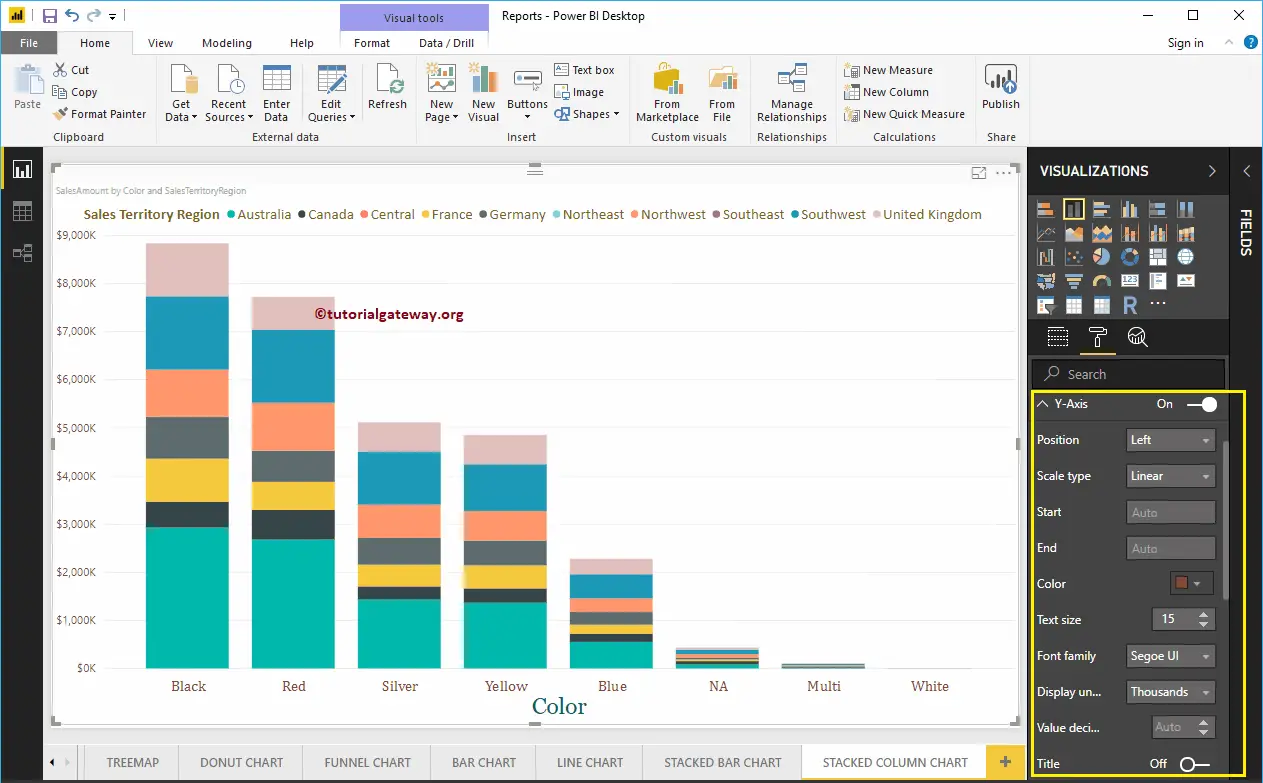
By default, the Y-Axis title set to Off for a stacked column chart. But you can enable it by toggling Title under the Y-Axis section to On. Let me change the Title Color to Green, Font style to Georgia, and Title Text Size to 30.
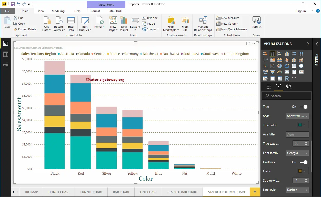
By toggling the Stacked Column Chart Gridlines option from On to Off, you can disable the Gridlines for this stacked column chart.
- Color: You can change the Gridlines color.
- Stroke Width: Use this to change the Gridlines width.
- Line Style: Choose the line style such as Solid, dotted, etc.
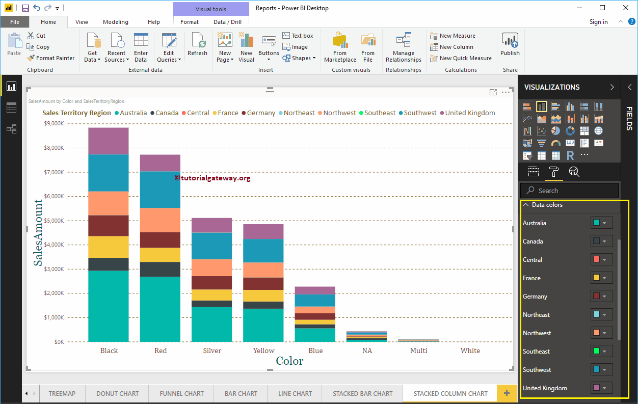
Format Power BI Stacked Column Chart Data Colors
By default, Power BI allocates some default colors to each group in a vertical bar. Please change the colors as per your requirement.
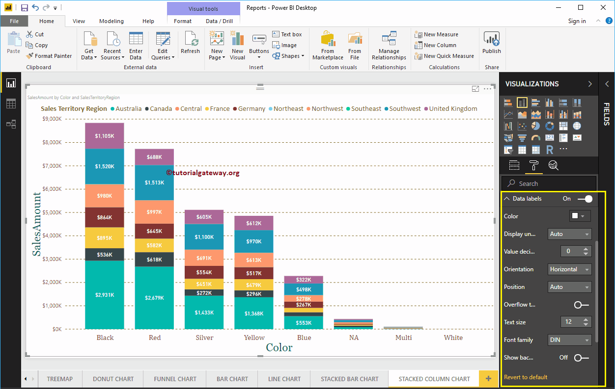
How to enable Data Labels for Power BI Stacked Column Chart
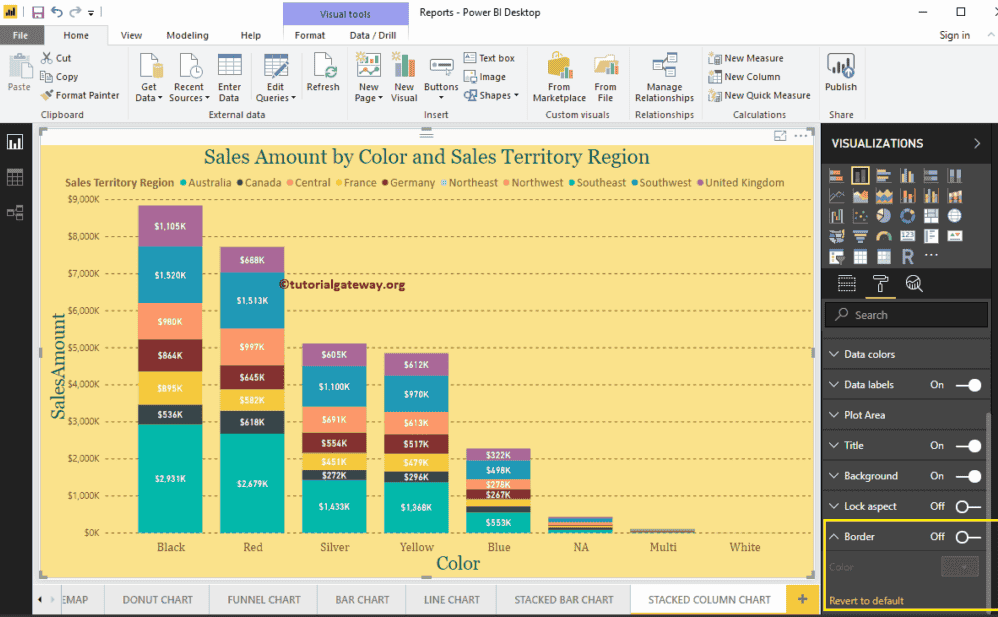
Data Labels display information about each individual group of a Vertical bar. In this case, it displays the Sales Amount of each Sales Territory Region. To enable data labels, please toggle Data labels option to On.
Let me change the Color to White, Font family to DIN, and Text Size to 12
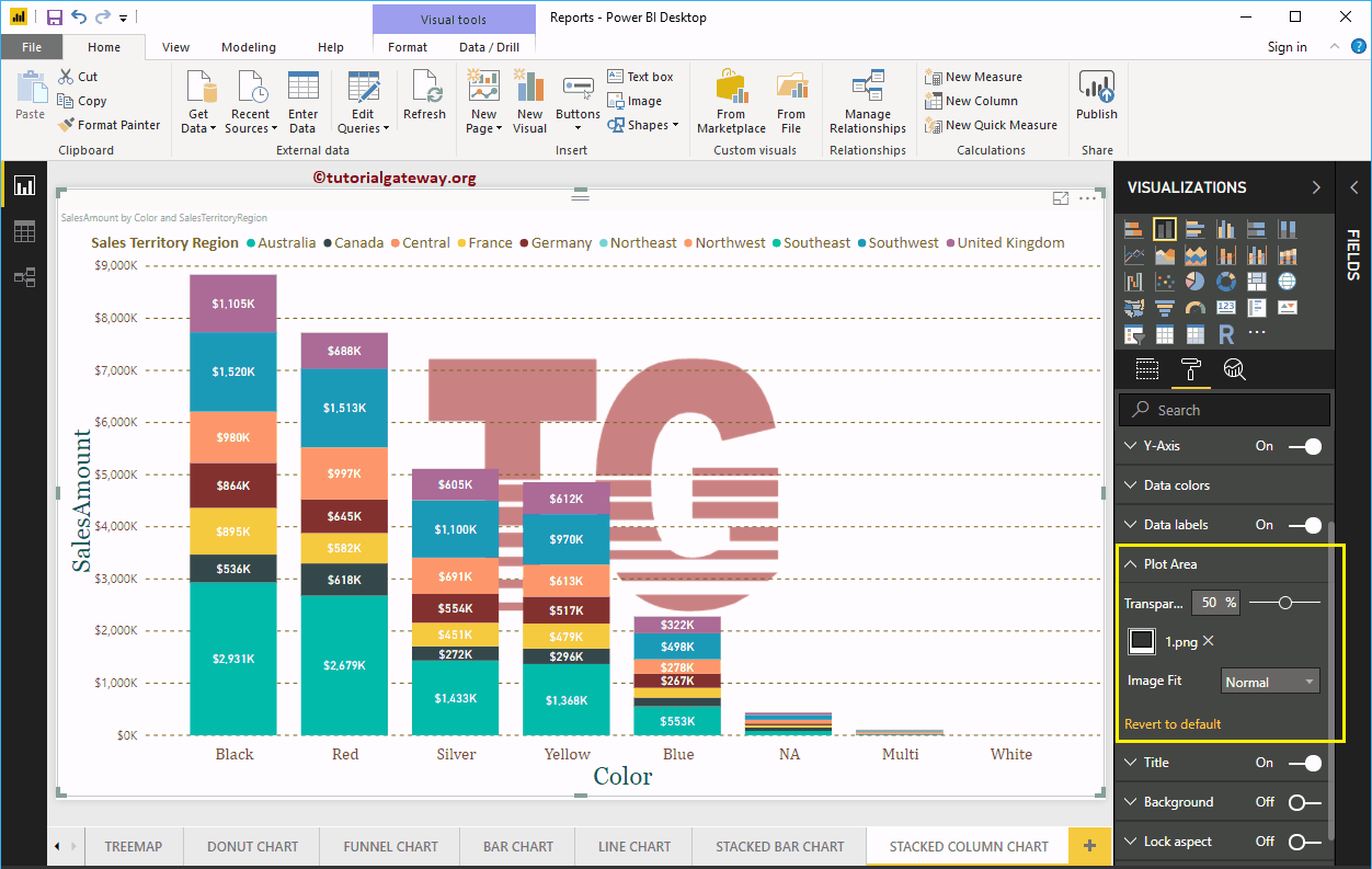
Format Power BI Stacked Column Chart Plot Area
You can add Images as the Background of a Stacked Column Chart using this Plot Area section. For the demonstration purpose, we added one image as the Stacked Column Chart Plot Area Background.
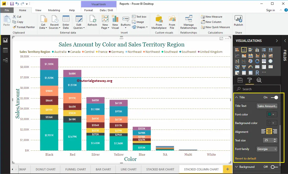
Format Power BI Stacked Column Chart Title
By toggling the Title option from On to Off, you can disable the Stacked Column Chart title.
As you can see from the screenshot below, we change the Title Text to Sale Amount by Color and Sales Territory Region. We also changed the Font Color to Green, Font Family to Georgia, Font Size to 25, and Title Alignment to center. If you want, you can add the background color to the title as well.
Format Background Color of a Stacked Column Chart in Power BI
By toggling Background option to On, you can add the Background color to a Stacked Column Chart. For the demonstration purpose, we added the background color.
Similarly, you can add Borders to a Stacked Column Chart by toggling the Border option from Off to On.