Power BI Scatter Chart or Scatter plot is very useful to visualize the relationship between two sets of data. Let me show you how to Create a Scatter Chart in Power BI with example.
For this Power BI Scatter Chart demonstration, we are going to use the SQL Data Source that we created in our previous article. So, Please refer to Connect Power BI to SQL Server article to understand the Power BI Data Source.
How to Create a Scatter Chart in Power BI
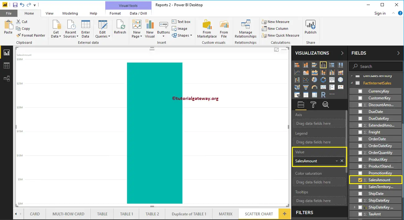
To create a Scatter Chart in Power BI, first, Drag and Drop the Sales Amount from Fields section to Canvas region. It automatically creates a Column Chart, as we shown below.
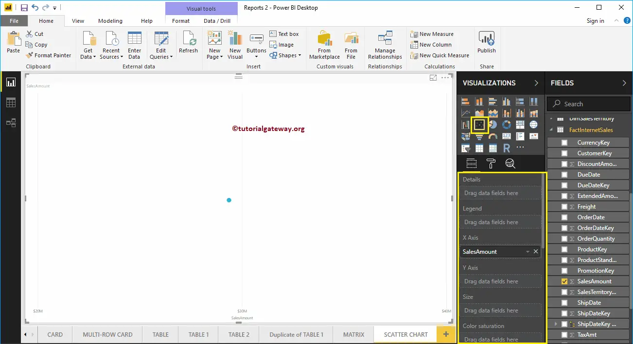
Click on the Scatter Chart under the Visualization section. It automatically converts a Column Chart into a Scatter Chart.
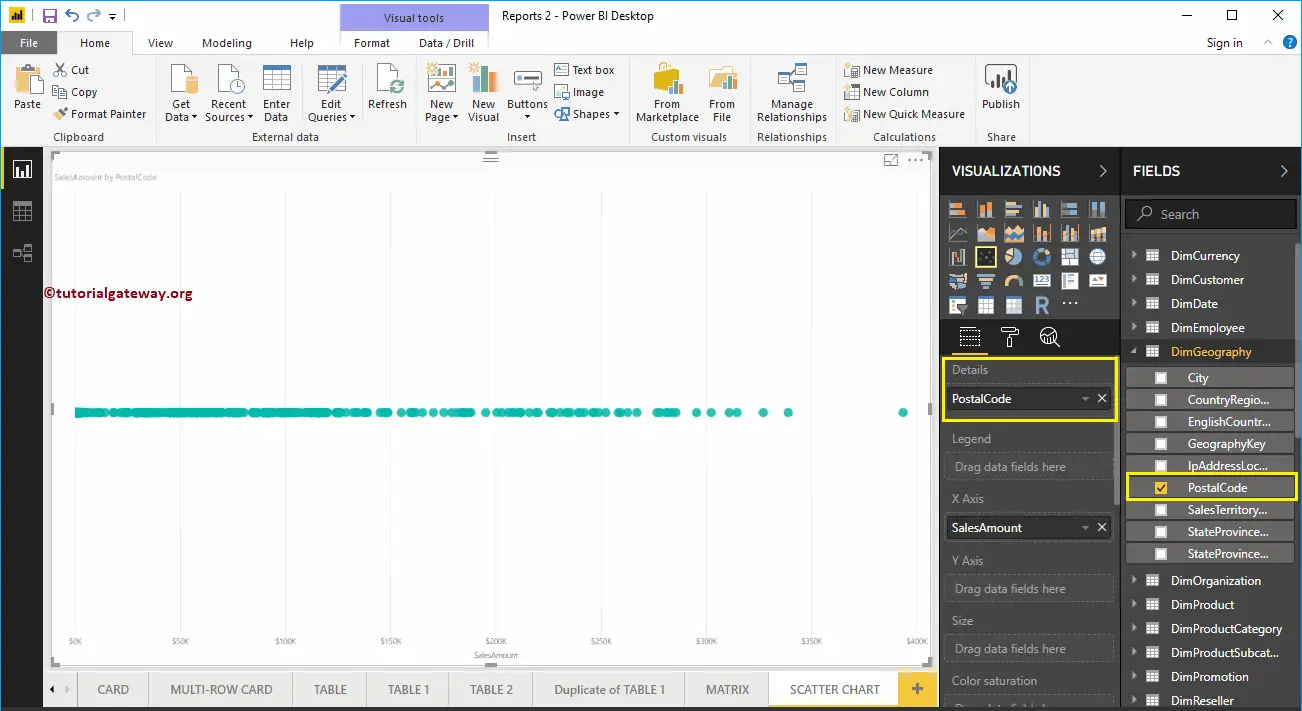
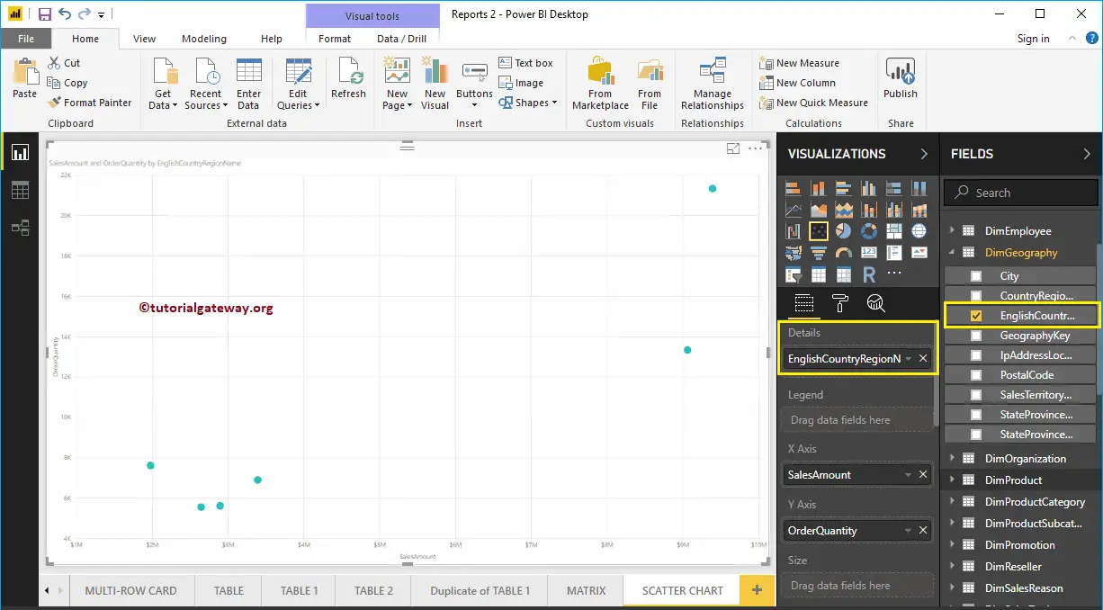
Let me add the Postal Code to the Details section.
Next, we added the Order Quantity as the Y-Axis. Now you can see the proper Scatter Chart.
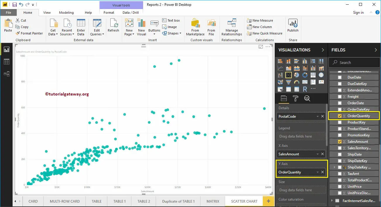
Let me do some quick formatting to this Power BI Scatter Chart
Create a Scatter Chart in Power BI Approach 2
First, click on the Scatter Chart under the Visualization section. It automatically creates a Scatter Chart with dummy data, as shown in the below screenshot.
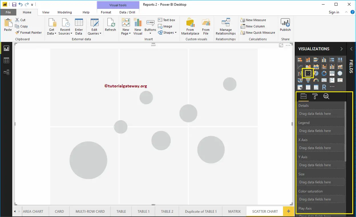
To add data to the Power BI Scatter Chart, we have to add the required fields:
- Details: Please specify the Column that represents the Bubbles.
- Legend: Specify the Column that sub-divide the Details data.
- X-Axis: Please specify the Column that represents the Horizontal Axis.
- Y-Axis: Column that represents the Vertical Axis.
- Size: Specify the Column that represents the Bubbles size.
- Color Saturation: Any Numeric value that decides the color of the bubbles.
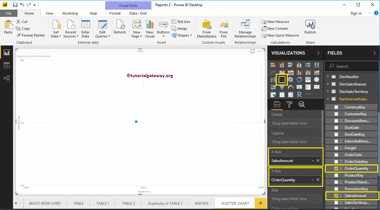
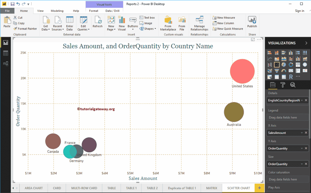
Let me drag the Sales Amount from the Fields section to the X-Axis section, and Order Quantity to Y-Axis Section.
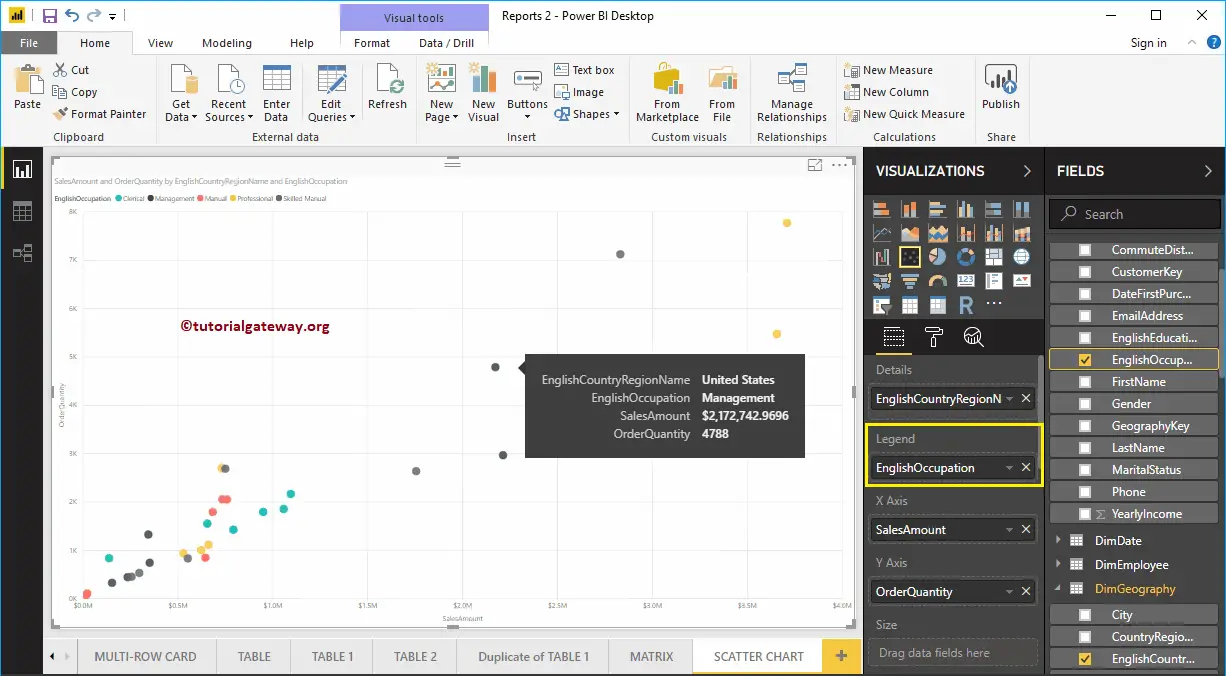
Next, let me add the English Country Region Name to Details section. You can do this by dragging Country to Details section, or simply checkmark the English Country Region Name column.
Let me add Customer English Occupation to the Legend section. Hover over any circle shows the information about the Country, Occupation, Sales Amount, and Total Product Cost.
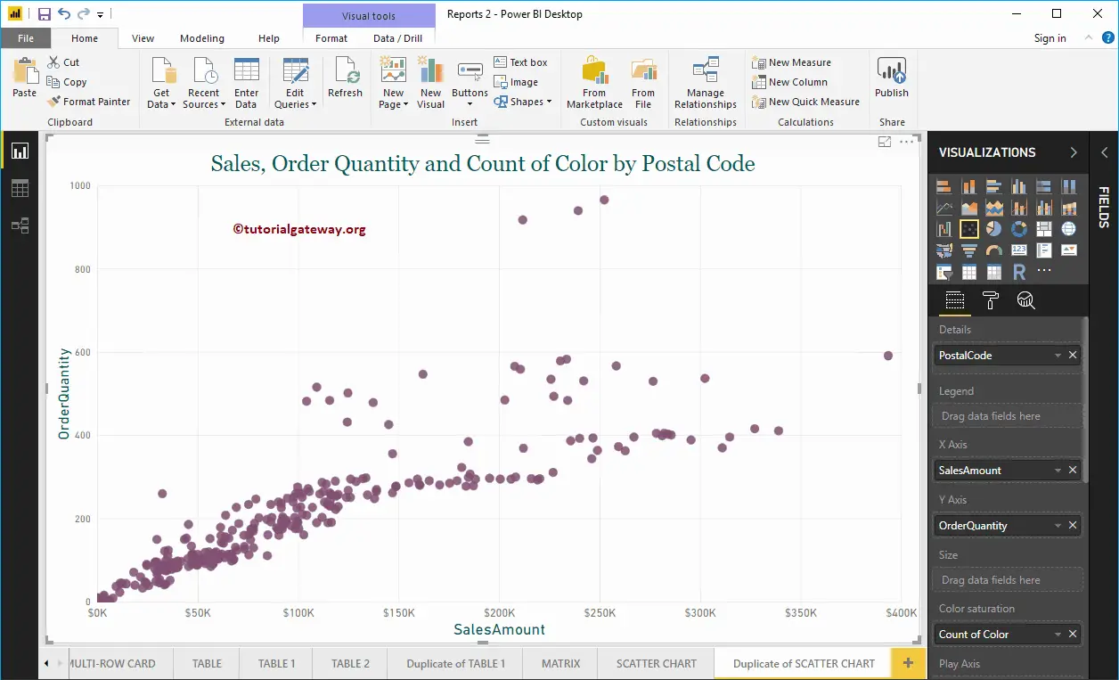
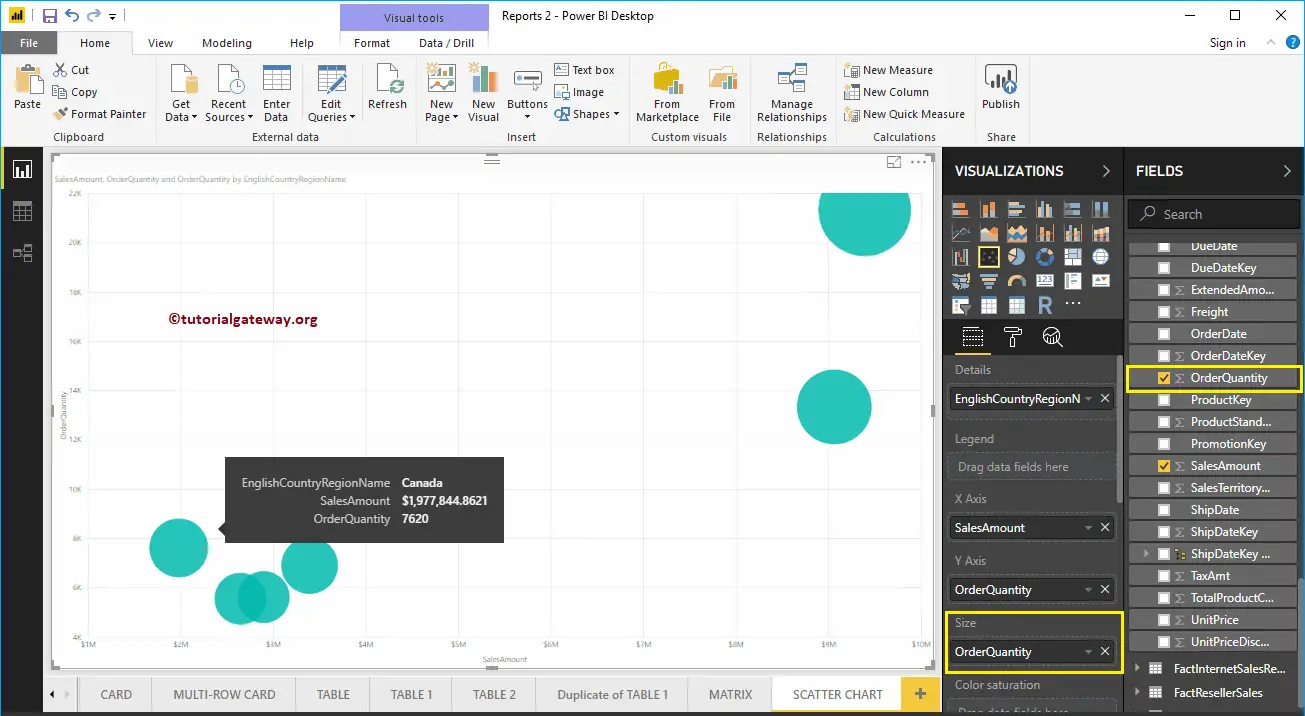
To demonstrate the Size section of a Power BI scatter chart, we removed the English Occupation from the Legend section. We added the Order Quantity to the Size section.
As you can see from the below screenshot, the size of the circle has changed as per the Order Quantity (number of orders)
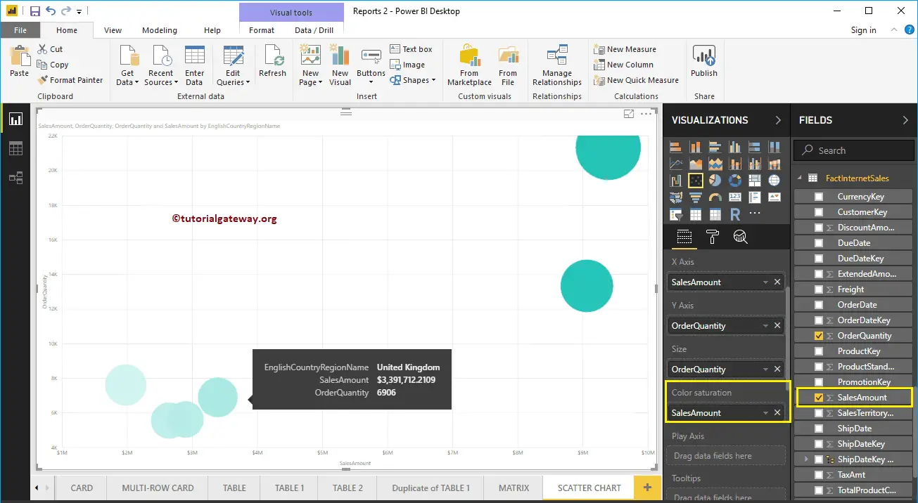
To demonstrate the Color Saturation section, we added the Sales Amount to the Color Saturation section. As you can see from the below screenshot, the color of each circle has changed as per the Sales Amount
Let me do some quick formatting to this Power BI Scatter plot
NOTE: I suggest you refer to Format Scatter Chart article to understand the formatting options.
How to Format Power BI Scatter Chart with an example?. Formatting the Scatter chart includes changing the scatters (Circle Shapes), Colors, Scatter Chart Title text, Title position, X and Y-Axis Details, Data colors, and background Images, etc.
To demonstrate these Scatter chart formatting options, we are going to use the Scatter Chart that we created earlier. Please refer Scatter Chart in Power BI article to understand the steps involved in creating a Power BI Scatter Chart.
How to Format Power BI Scatter Chart
Please click on the Format button to see the list of formatting options that are available for this Scatter Chart.
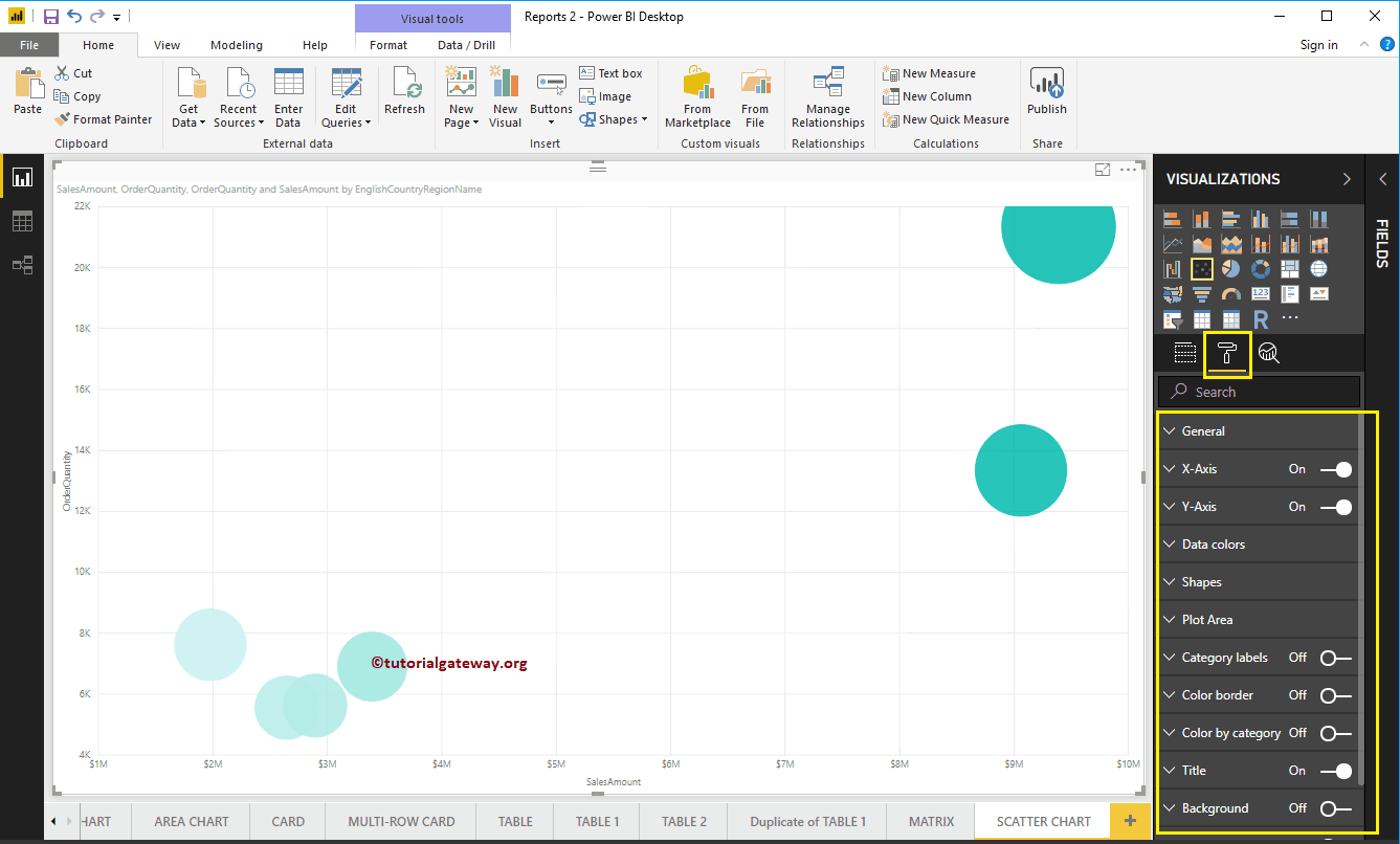
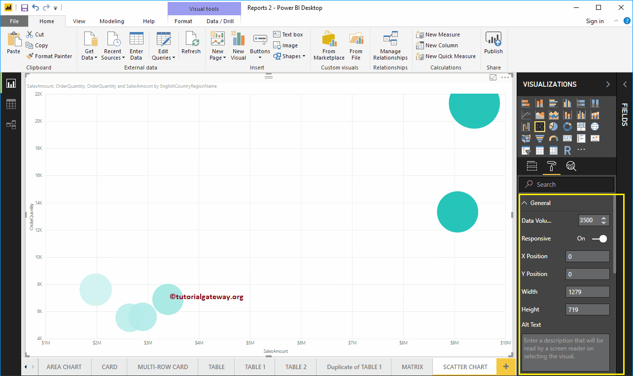
Format Power BI Scatter Chart General Settings
Use this General Section to Change the data volume, Chart Responsiveness, X, Y position, Width, and height of a Scatter Chart.
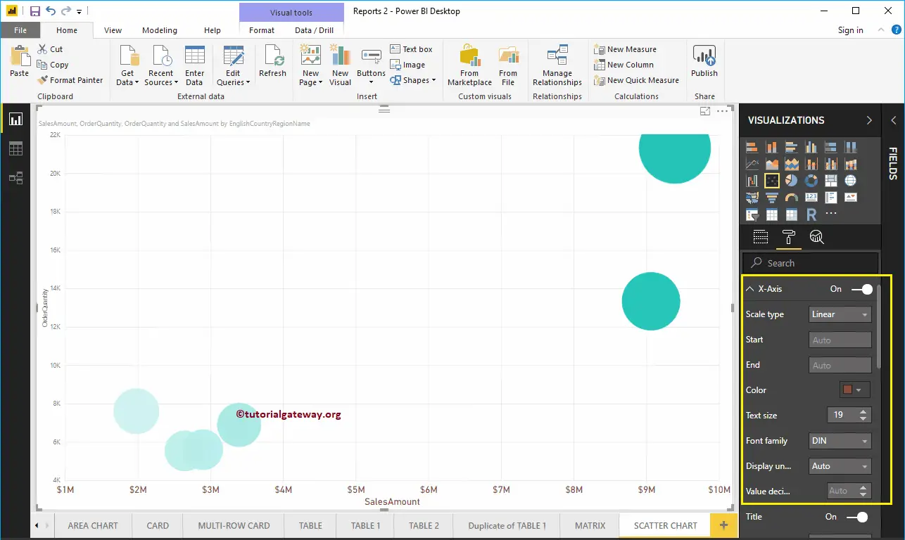
Format X-Axis of a Scatter Chart in Power BI
The following are the list of options that are available for you to format the Horizontal axis or X-Axis. Here, you can mention the Start and End Value.
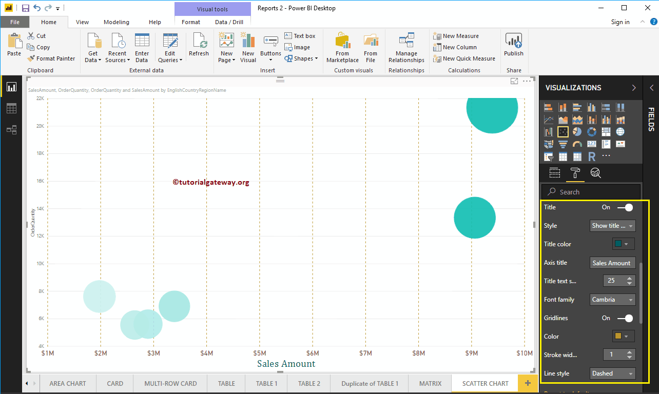
As you can see from the screenshot below, we change the Color to Brown, Text Size to 19, and font family to DIN.
Let me change the Axis Title from SalesAmount to Sales Amount, Title Color to Green, Font style to Cambria, and Font Size to 25.
By toggling the Scatter Chart Gridlines option from On to Off, you can disable the Gridlines.
- Color: You can change the Gridlines color.
- Stroke Width: Use this to change the Gridlines width.
- Line Style: Choose the line style such as Solid, dotted, and dashed.
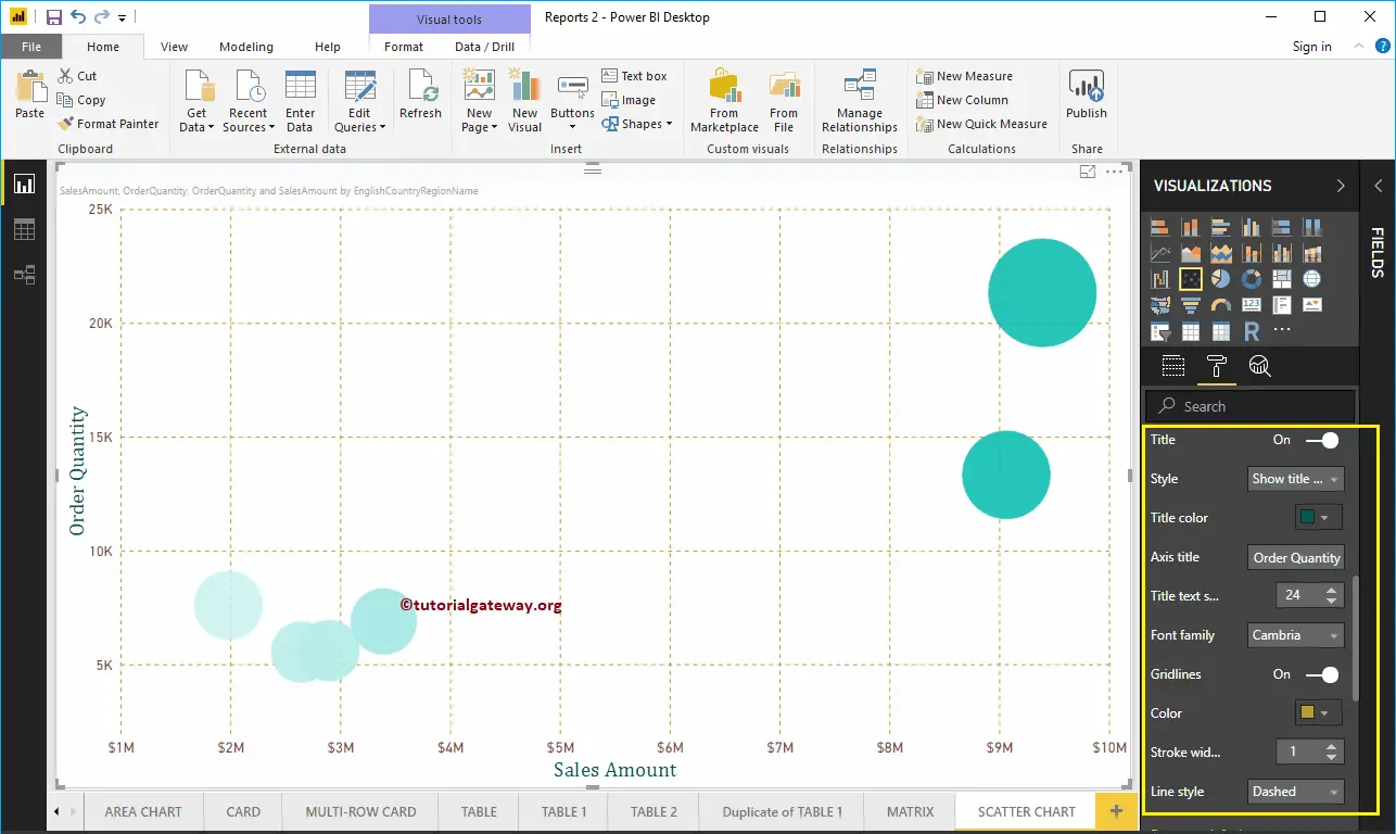
Here, we changed the color to gold, and line style to dashed.
Format Y-Axis of a Power BI Scatter Chart
As you can see, we changed the Y-Axis starting value to 2000 and End value to 25000, labels Color to Brown, and Text Size to 18.
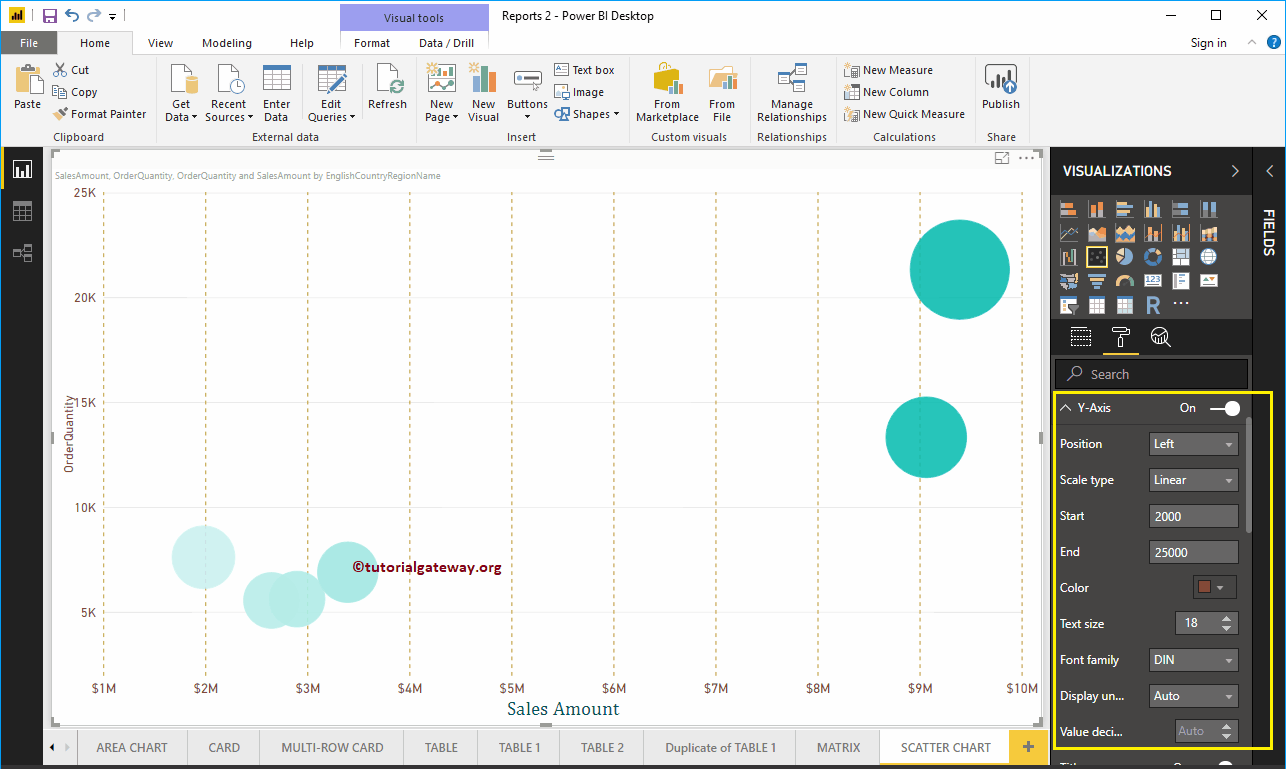
Let me change the Y-Axis title from OrderQuantity to Order Quantity, Title Color to Green, Text Size to 24, and Font family to Cambria. Here, Here, we also changed the gridlines color to gold, and line style to dashed.
Format Power BI Scatter Chart Data Colors
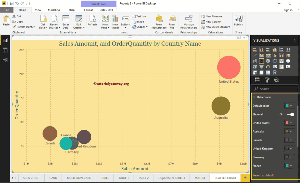
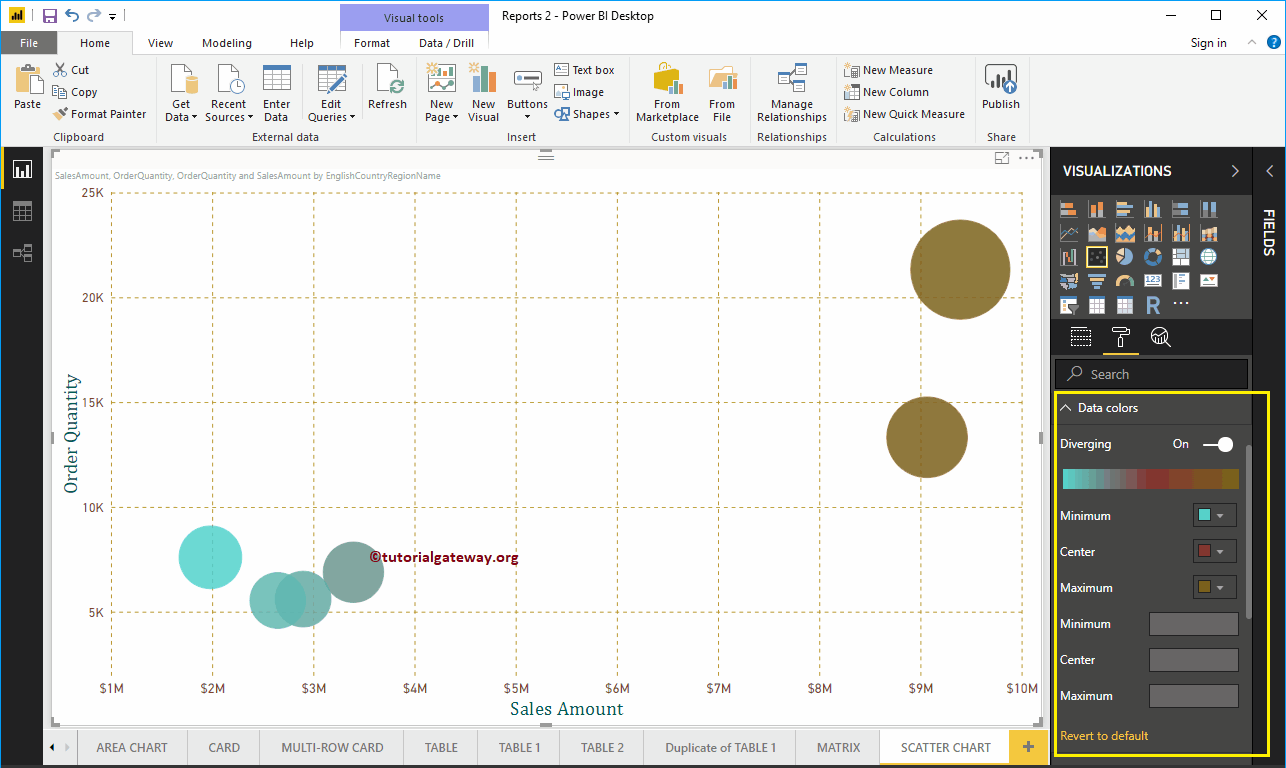
While we are creating this scatter chart, we added the Sales Amount as the Color Saturation, and that’s why we see the Diverging option under the Data Colors. Please change the Minimum, Center, and Maximum colors as per your requirements.
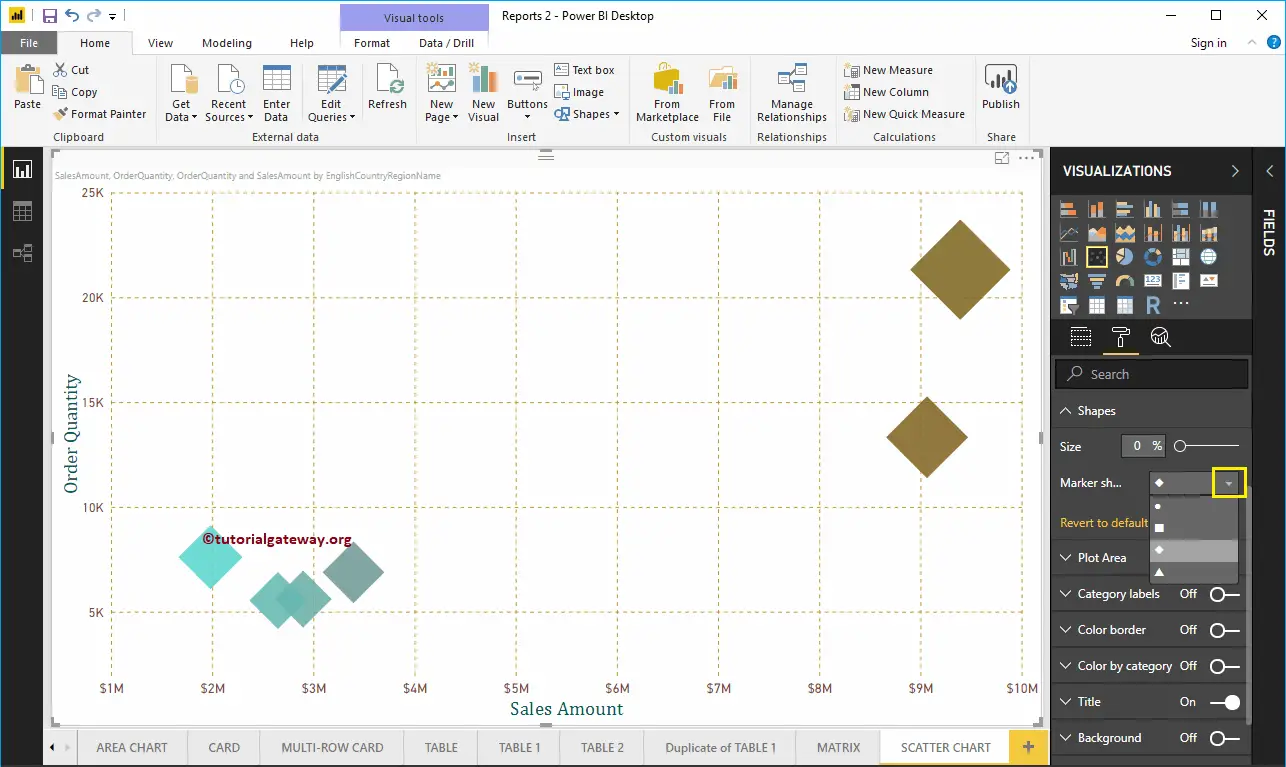
Format Scatter Plot in Power BI Shapes
Use this section to change the Scatter Chart default Circles.
As you can see from the screenshot below, we changed the Marker Shape to Diamond for demo purposes.
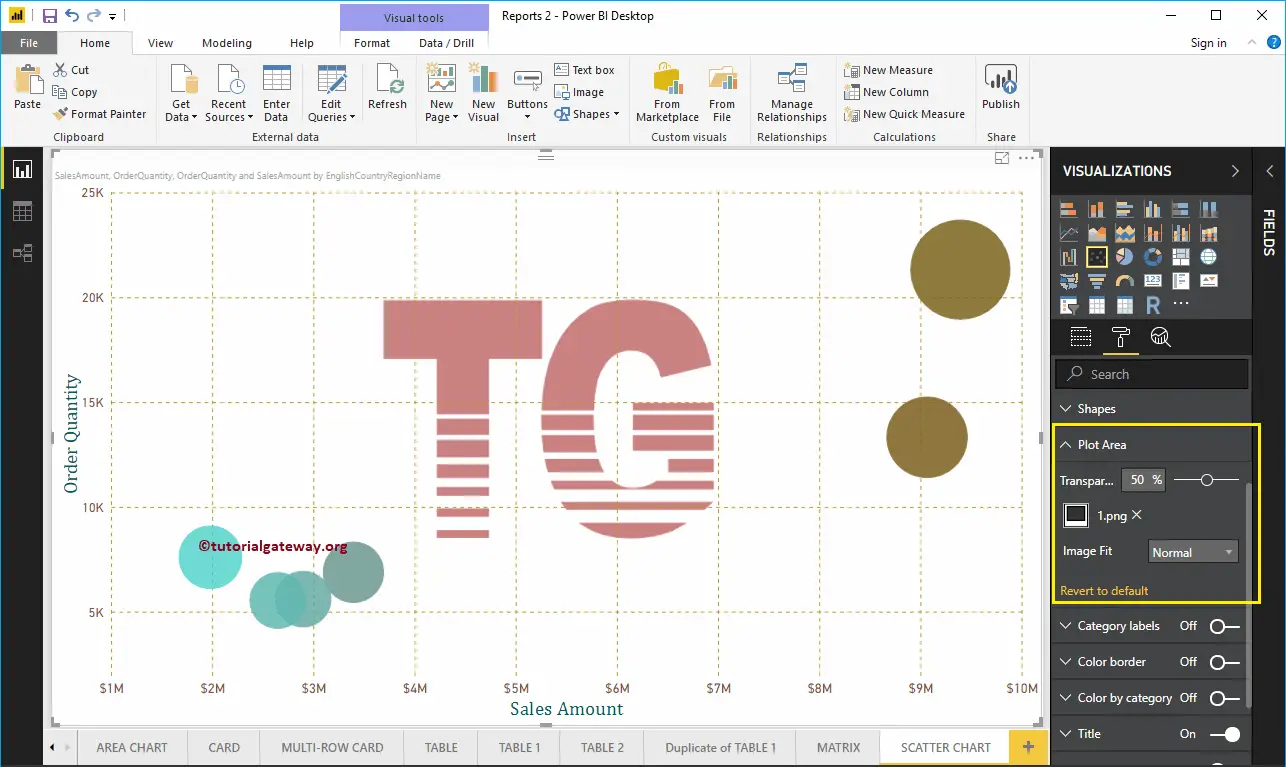
Format Scatter Chart in Power BI Plot Area
Using this Plot Area property, you can add custom Images as the Background of the Scatter Chart. For the demonstration purpose, we added one image as the Plot Area Background.
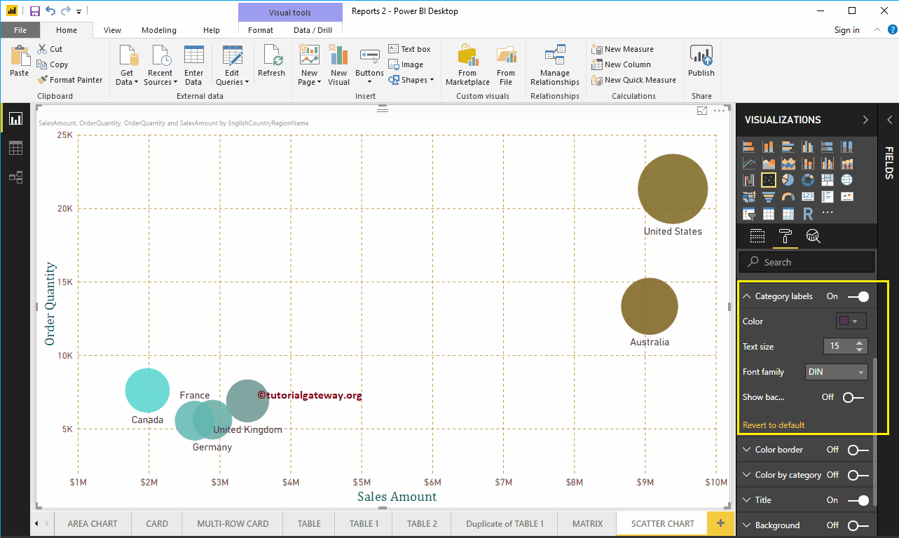
Format Power BI Scatter Chart Category Labels
Category labels mean names that represent each circle. By toggling the Category labels option from Off to On, you can enable these labels.
From the screenshot below, you can see, we change the Color to Purple, Text Size to 15, Font Family to DIN. If you want, you can add the background color as well.
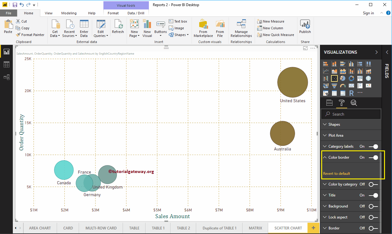
Format Power BI Scatter Chart Border Color
By toggling the Color Border option from Off to On, you can enable borders to the Circle (or whatever shape you selected).
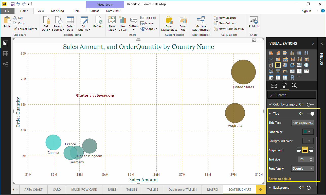
Format Power BI Scatter Chart Title
By toggling the Title option from On to Off, you can disable the Scatter Chart title.
From the below screenshot, you can see we change the Title Text to Sale Amount and Order Quantity by Country Name. Next, Font Color to Green, Text Size to 25, Font Family to Georgia, and Title Alignment to center. If you want, you can add the background color to the title as well.
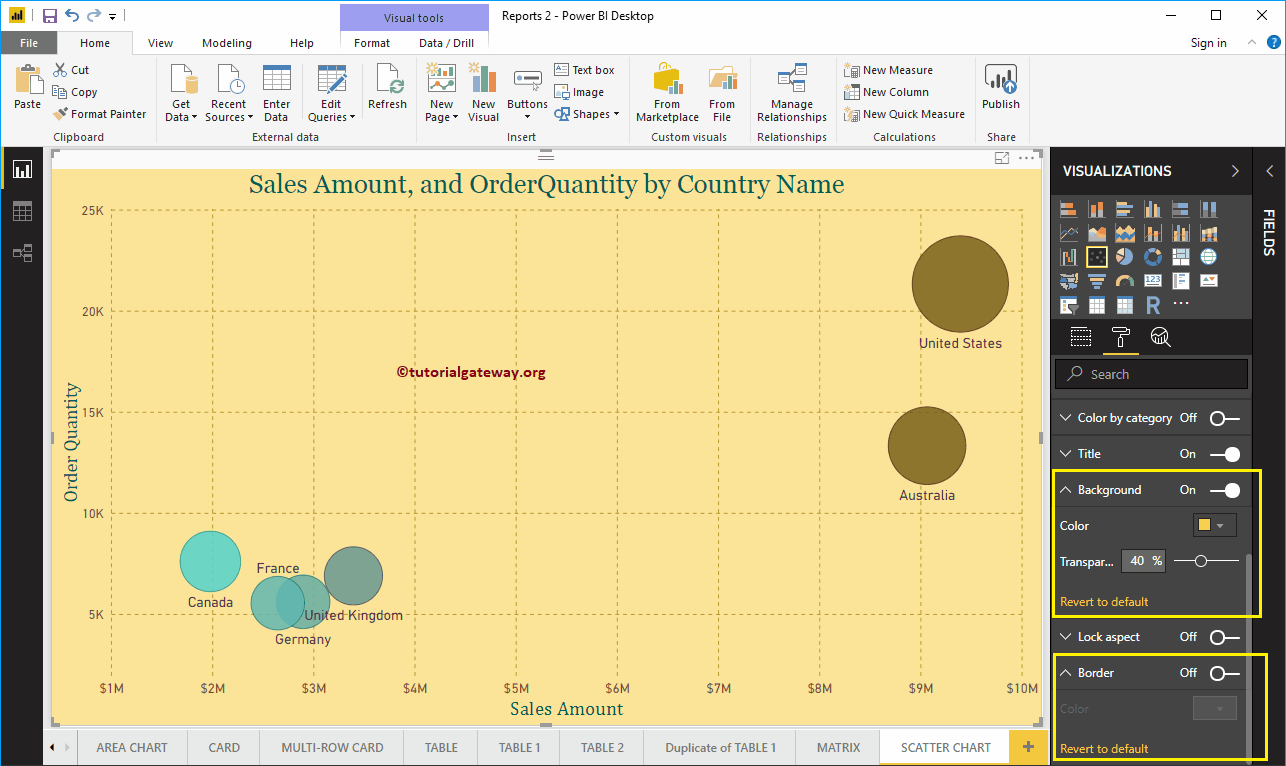
Format Power BI Scatter Chart Background Color, and Borders
You can add a Background color to a Scatter Chart by toggling Background option to On. For the demonstration purpose, we added yellow color with 40% transparency.
Similarly, you can add Borders to a Scatter Chart by toggling the Border option from Off to On.
Format Power BI Scatter Chart Data Colors – Part 2
If you designed the scatter chart without placing any measured value in the Color Saturation Section, then the Data Colors section shows you the following options. By default, it selects some random colors, but you can change them as per your requirements.