Power BI Ribbon Chart is useful to quickly identify which categorical data has the highest rank (large values). Let me show you how to Create a Ribbon Chart in Power BI with example.
For this Power BI Ribbon Chart demonstration, we are going to use the SQL Data Source that we created in our previous article. So, Please refer to Connect Power BI to SQL Server article to understand the Power BI Data Source.
How to Create a Ribbon Chart in Power BI
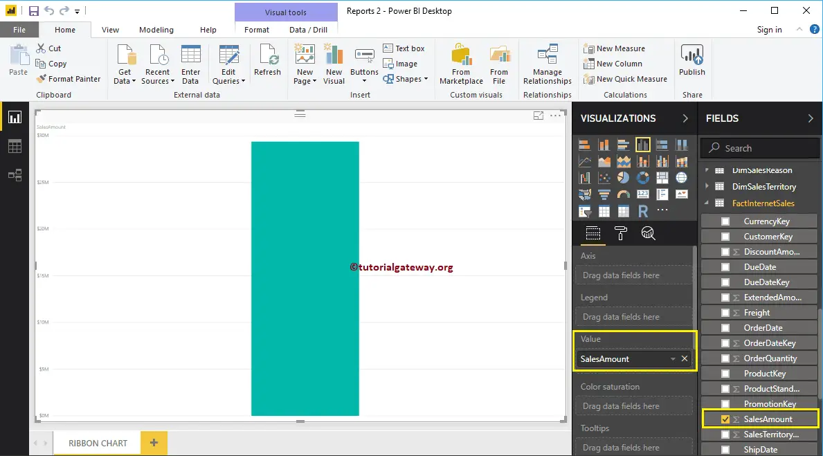
To create a Ribbon Chart in Power BI, first Drag and Drop the Sales Amount from Fields section to the Canvas region. It automatically creates a Column Chart, as we showed in the below screenshot.
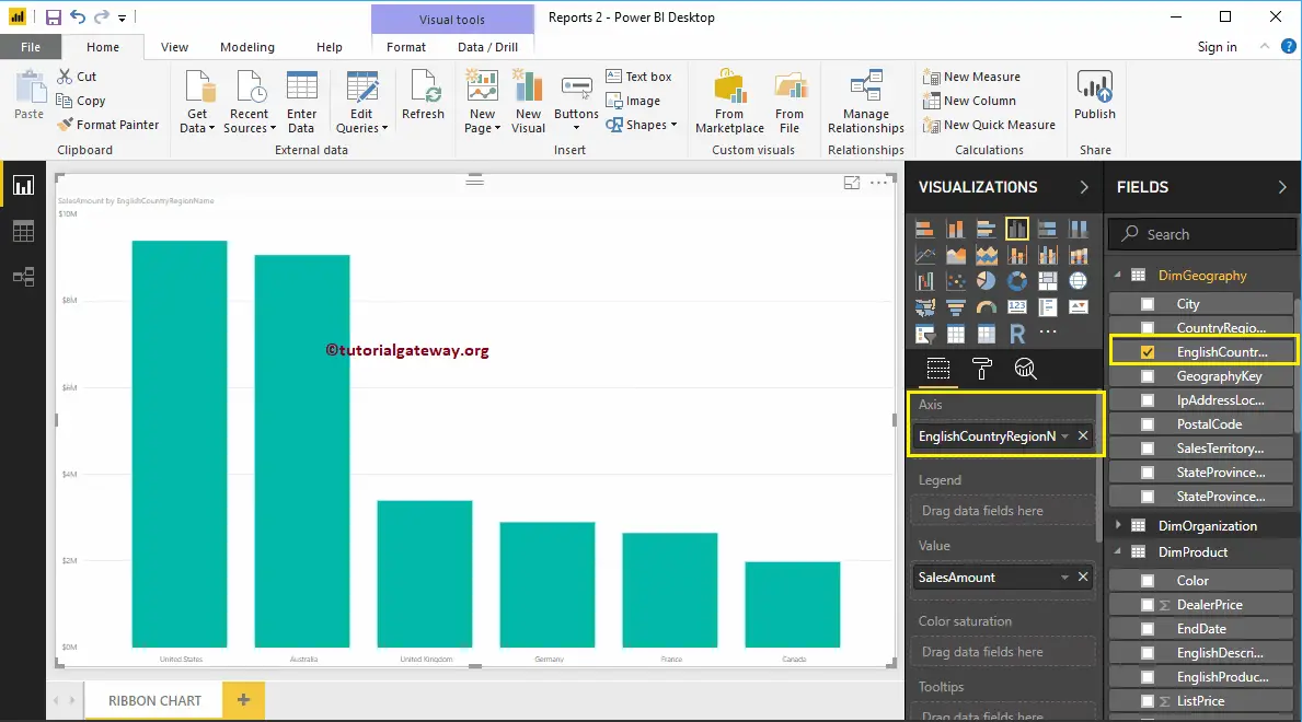
Next, let me add the English Country Region Name to the Axis section. You can do this by dragging Country Region Name to Axis section, or simply checkmark the Country column. It will automatically create a Column Chart for you.
Next, add Product Color from DimProduct table to the Legend section.
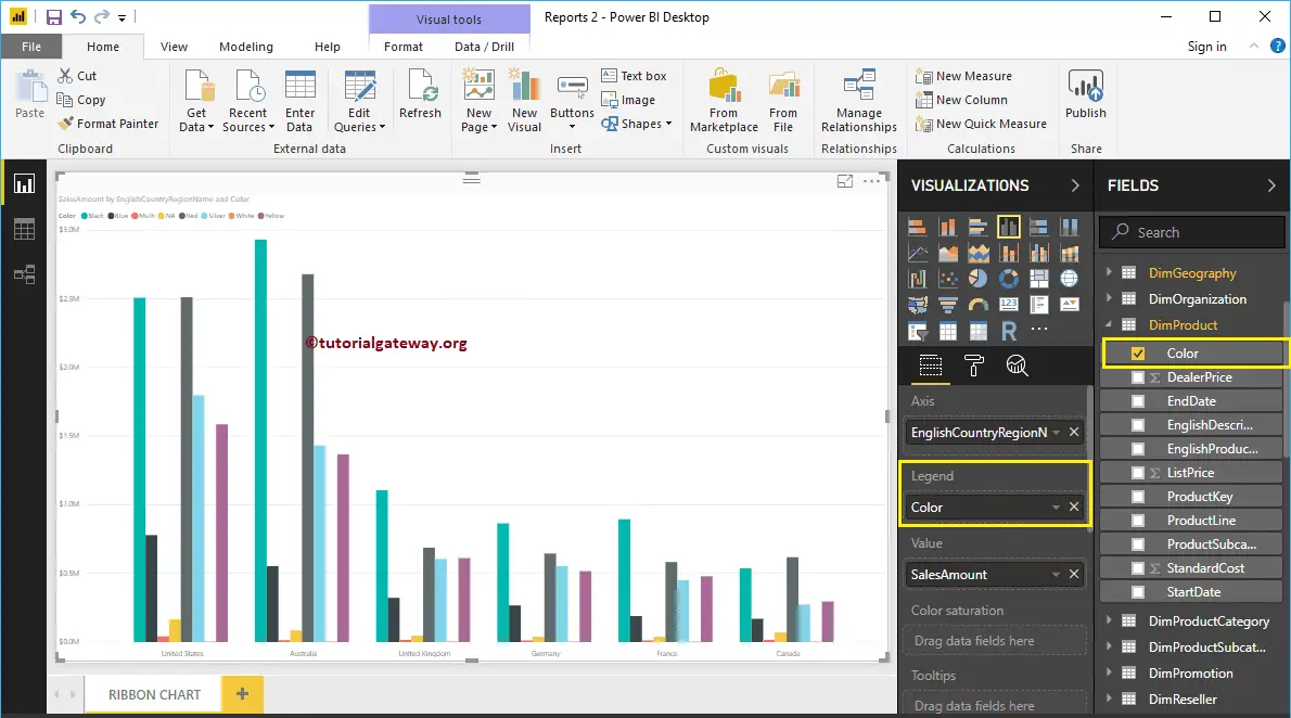
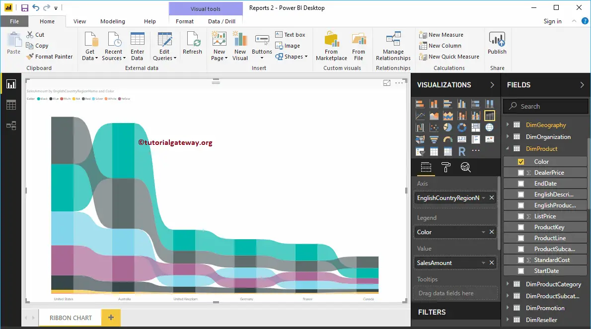
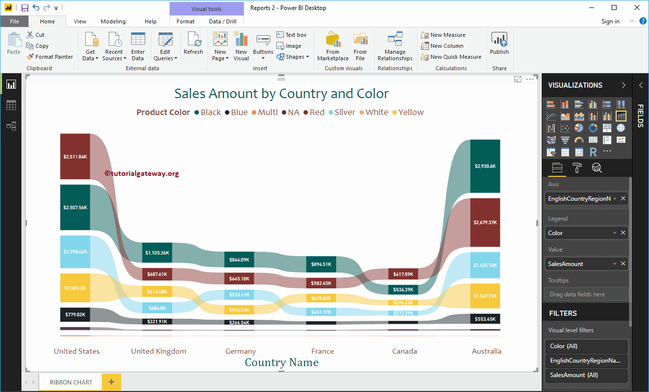
By clicking the Ribbon Chart under the Visualization section, it will convert the Clustered Column Chart into Ribbon Chart. From the screenshot below, you can see the Ribbon Chart that shows the Sales by Country and Color.
Create a Ribbon Chart in Power BI Approach 2
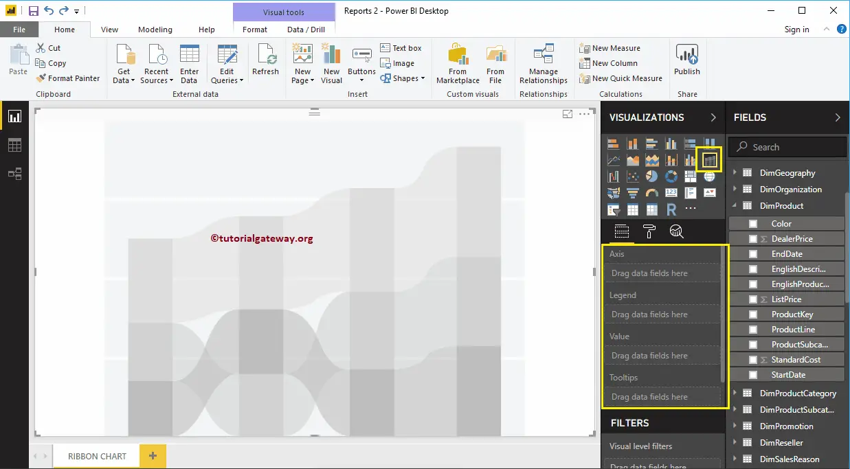
First, click on the Ribbon Chart under the Visualization section. It will create a Ribbon Chart with dummy data, as shown in the below screenshot.
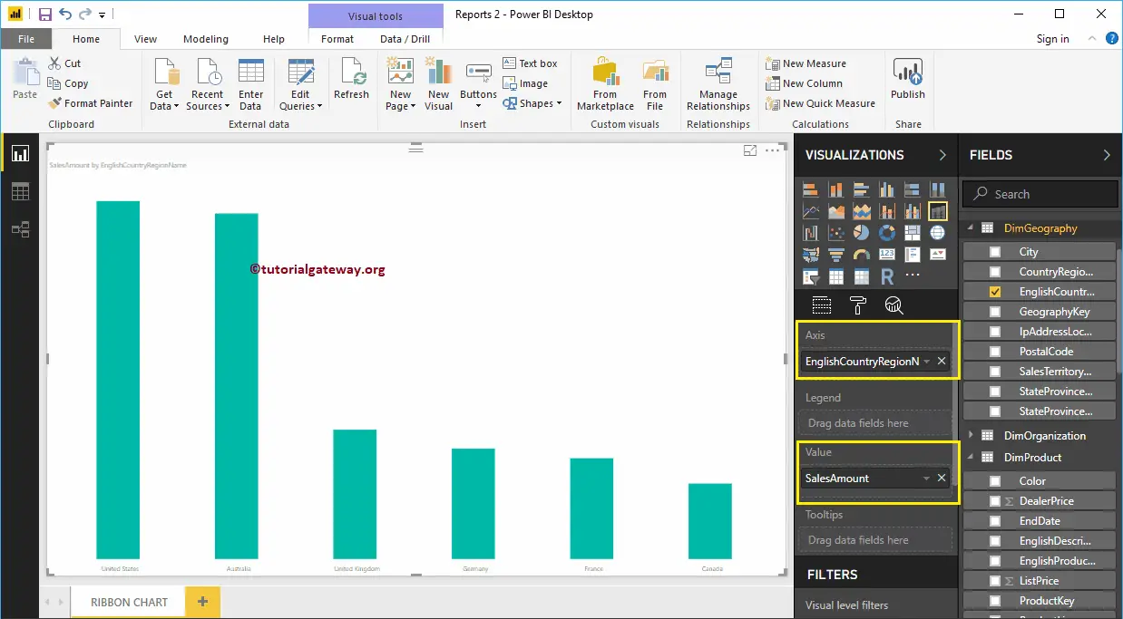
Let me drag the Sales Amount from Fields section to Values field and English Country Region Name from Dim Geography to Axis Field.
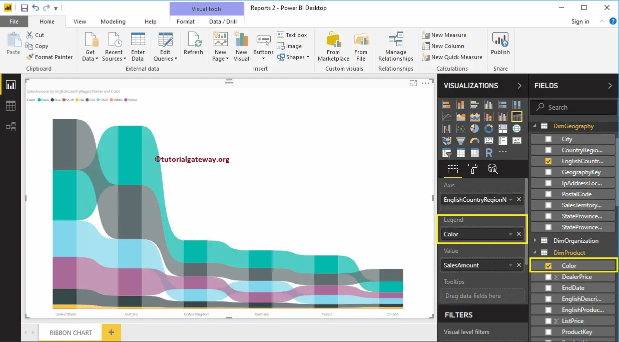
Next, add Product Color to the Legend section.
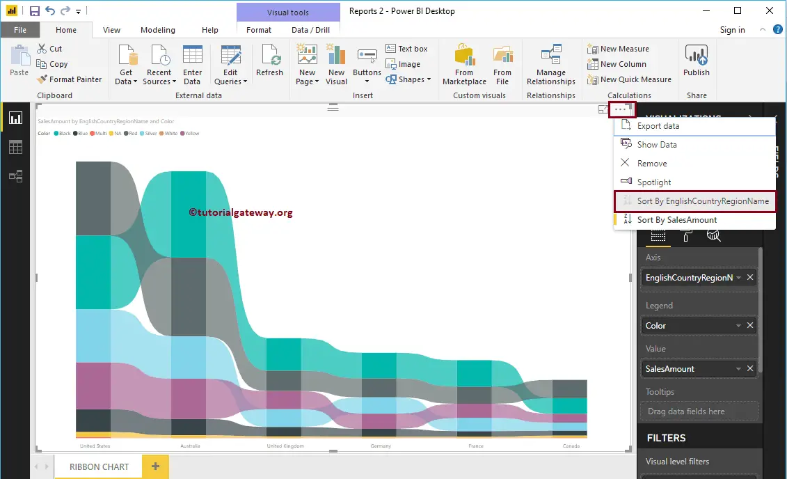
Let me sort the data by English Country Name (By default, it is sorted by Sales Amount). To do this, click on the … (3 dots) on the top right corner, and select the Sort By English Country Region Name option as we showed below.
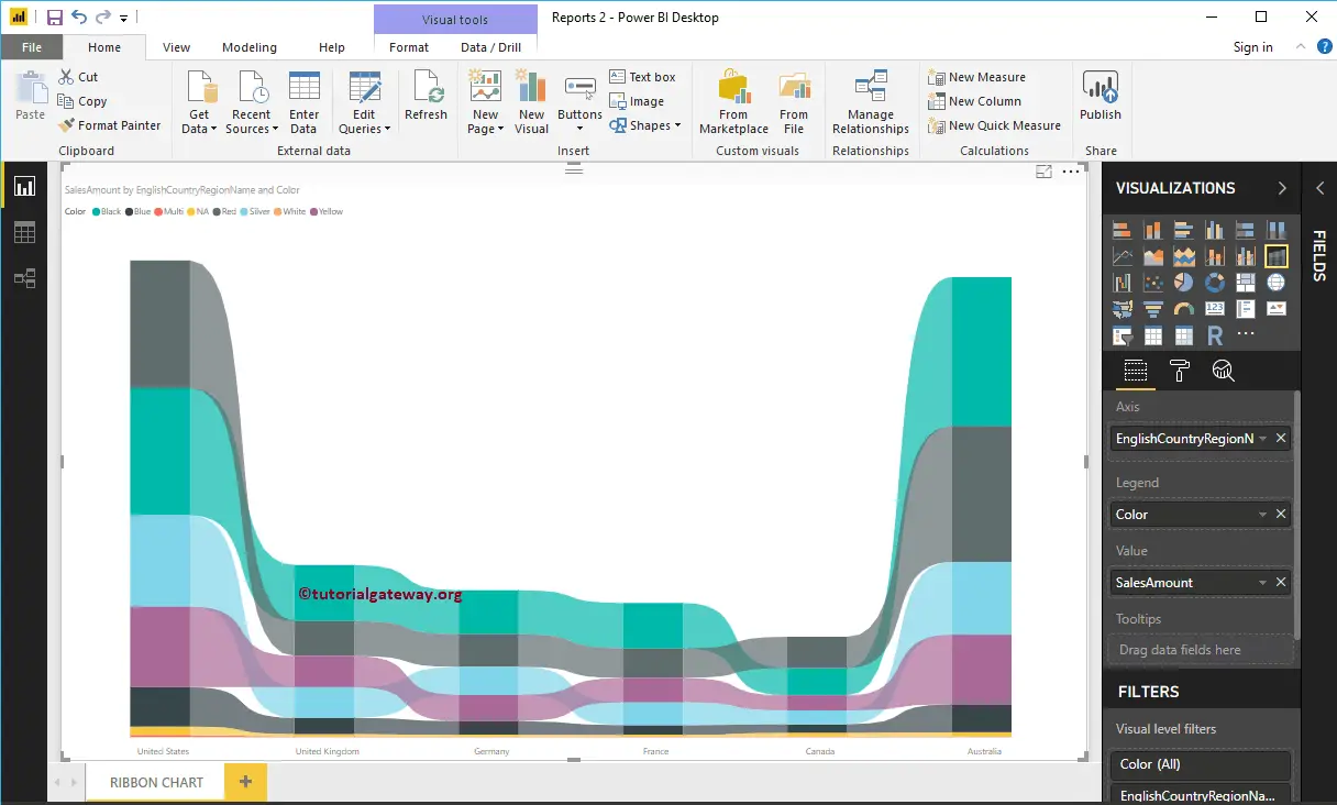
Now you can see the proper Power BI Ribbon Chart
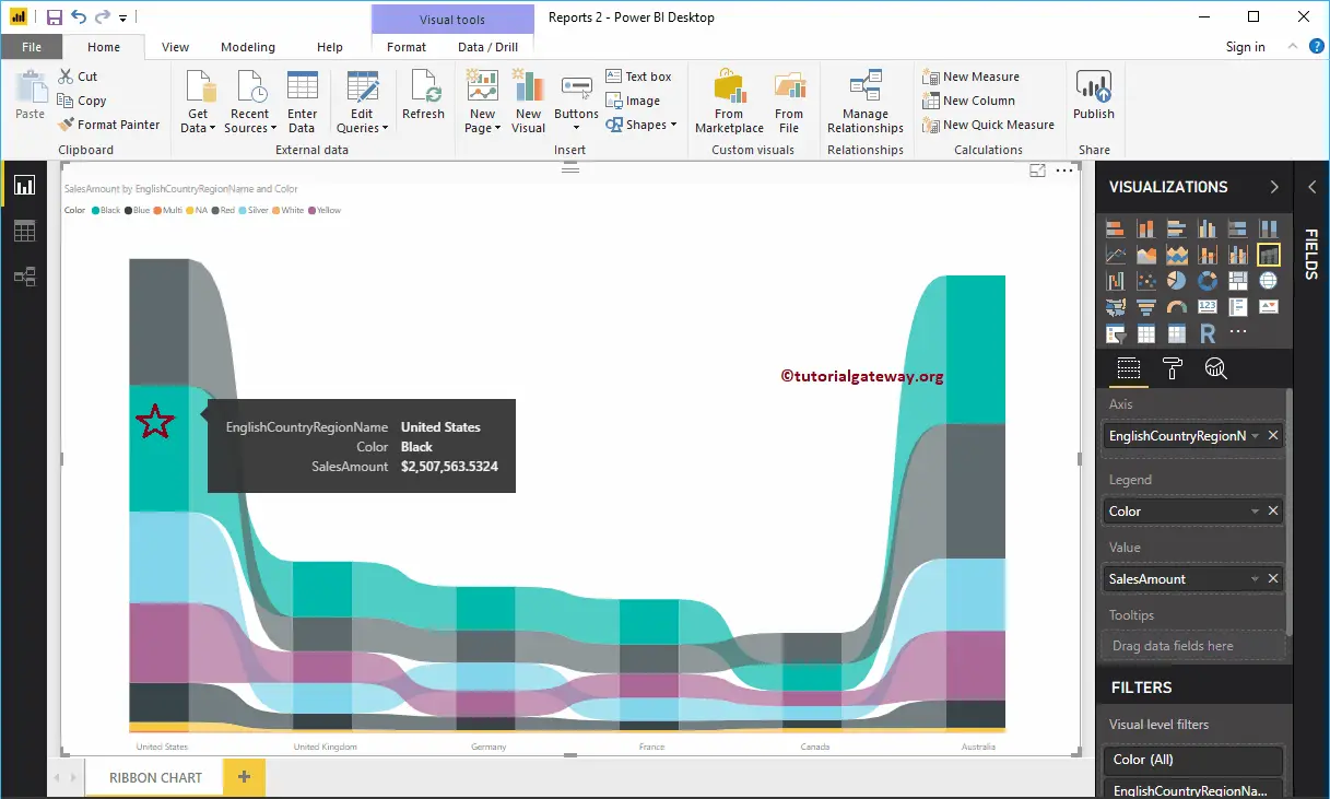
Hover over any bar shows the Tool-tip of Country Name, Product Color, and Sales Amount
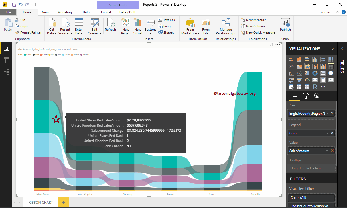
Hover over any position in-between the two bars will show you the Tool-tip of Previous Country Sales, Next Country Sales, Difference in percentage, and the Rank between those two countries in this case
Let me do some quick formatting to this Power BI Ribbon Chart
NOTE: I suggest you refer to the Format Ribbon Chart article to understand the steps involved in formatting these Ribbons, background colors, data labels, etc.
How to Format Power BI Ribbon Chart with an example?. Formatting Power BI Ribbon Chart includes changing the Ribbon Colors, Ribbon Chart Title text, Title position, etc.
To demonstrate the Power BI Ribbon Chart formatting options, we are going to use the Ribbon Chart that we created earlier. Please refer Ribbon Chart in Power BI article to understand the steps involved in creating a Power BI Ribbon chart.
How to Format Power BI Ribbon Chart
Please click on the Format button to see the list of formatting options that are available for this ribbon Chart.
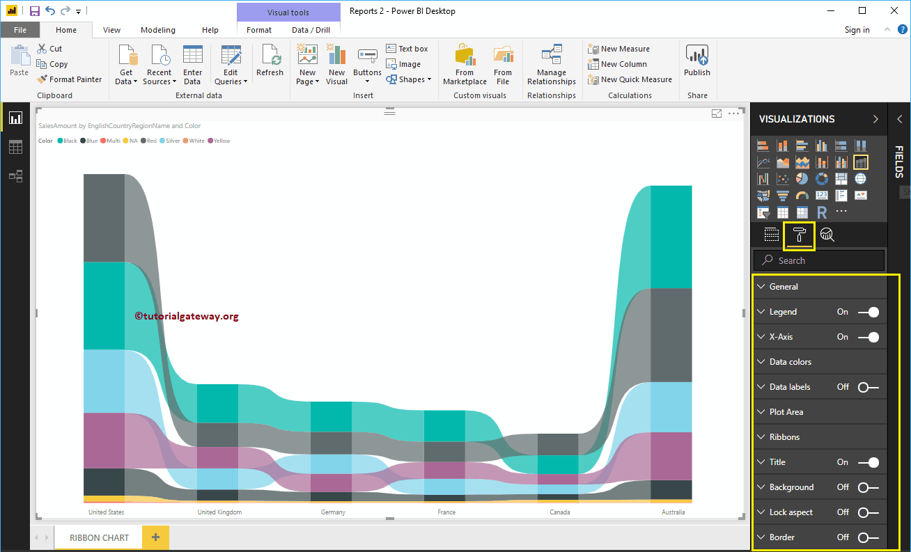
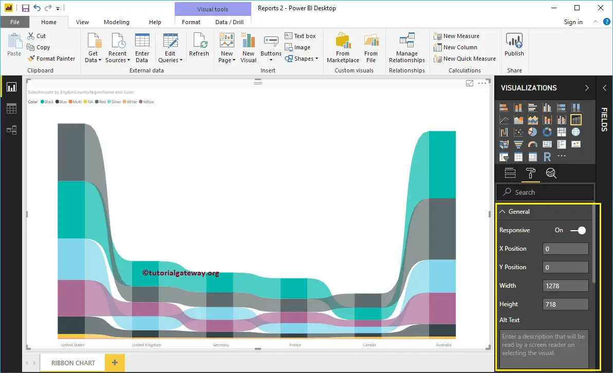
Format Ribbon Chart General Settings
Use this General Section to Change the X, Y position, Width, and height of a Ribbon Chart
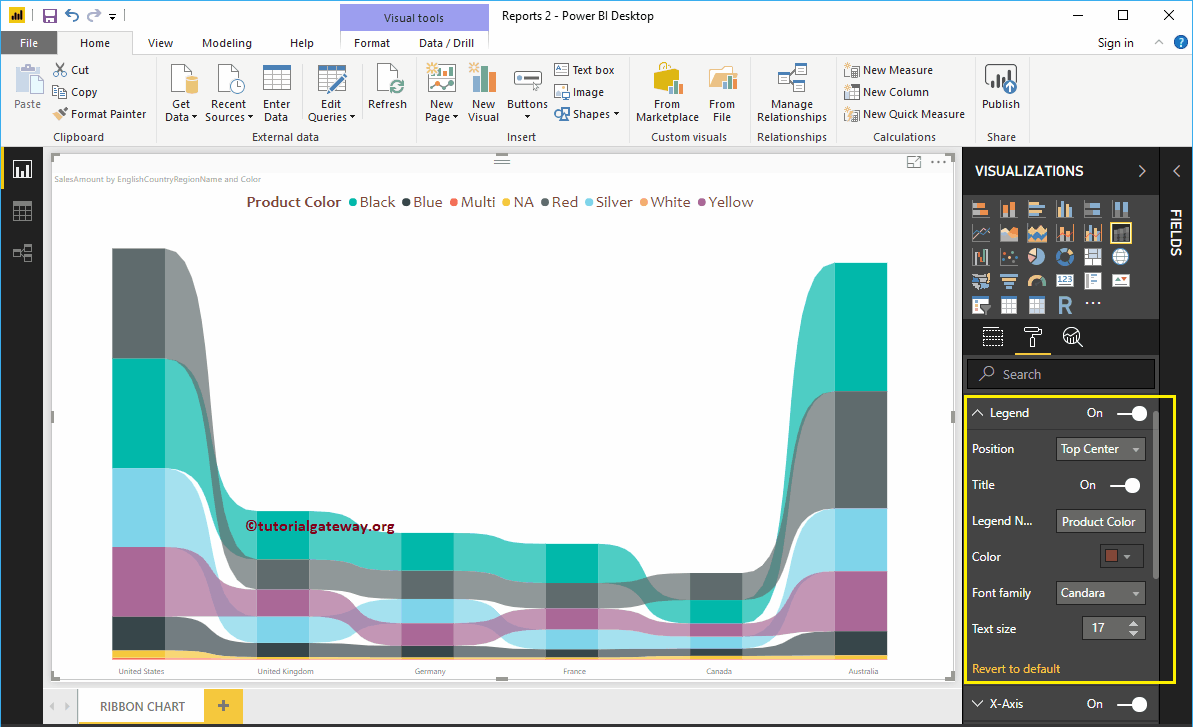
Format Power BI Ribbon Chart Legend
To display or enable the Legend, Please select the Legend region and toggle the option from Off to On.
As you can see from the screenshot below, we changed the Legend Title as Product Color, Legend Position as Top Center. We also changed the Color to Brown, Font family to Candara, and text size to 17.
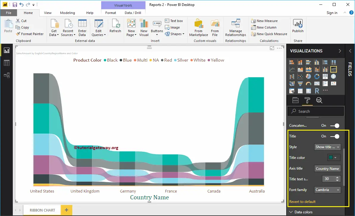
Format X-Axis of a Ribbon Chart in Power BI
The following are the list of options that are available for you to format the Ribbon Chart Horizontal axis or X-Axis. As you can see from the below screenshot, we change the Color to Brown, Font style to Candara, Text Size to 20.
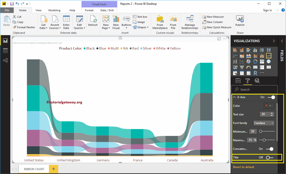
By default, Ribbon chart X-Axis title set to Off, but you can enable it by toggling Title to On. Let me change the Title Color to Green, Font style to Cambria, and Text Size to 30.
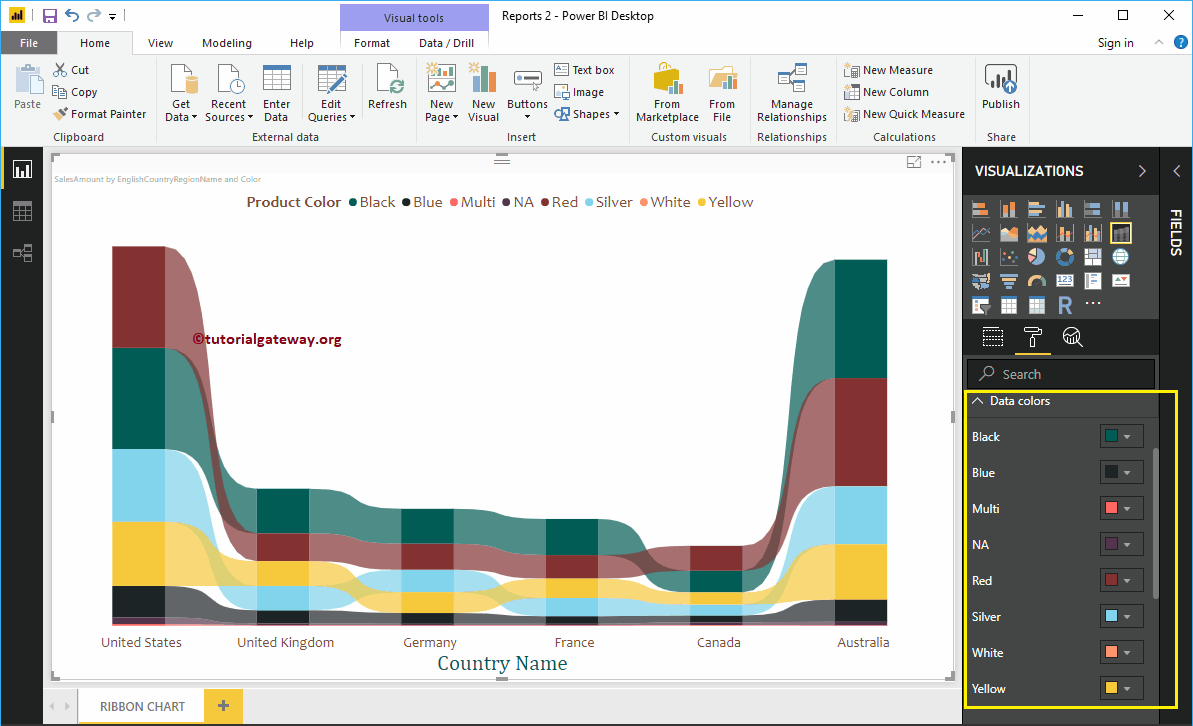
Format Ribbon Chart Data Colors
By default, the Ribbon chart will pick default colors for all the ribbons. But, you can change them as per your requirements.
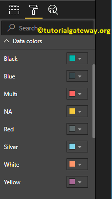
Let me change a few ribbon colors to show you the difference.
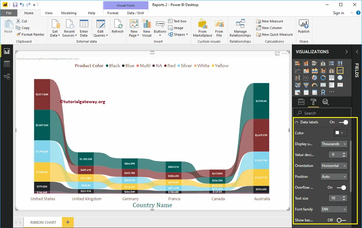
Format Data Labels of a Ribbon Chart in Power BI
Ribbon Chart Data Labels display the Metric Value (Sales Amount at each group) within a bar. As you can see from the screenshot below, we enabled data labels for this ribbon chart and changed the color to white.
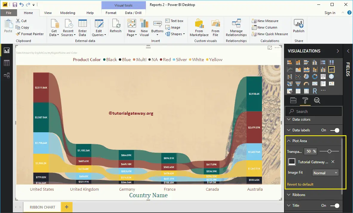
Format Ribbon Chart Plot Area
Using this Plot Area property, you can add custom Images as the Background of the Ribbon Chart. For the demonstration purpose, we added one image as the Plot Area Background.
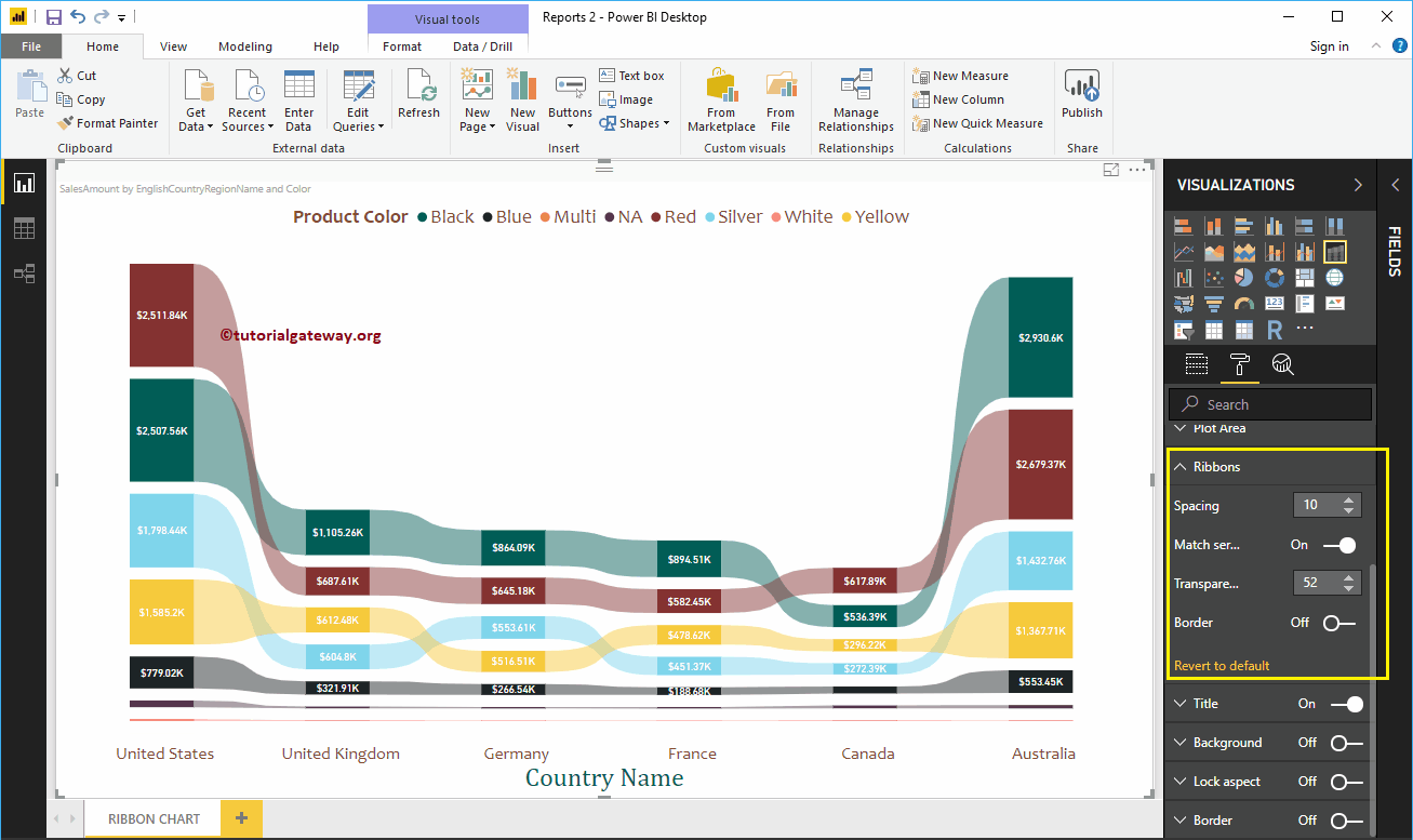
Format Power BI Ribbon Chart Ribbons
The following are the list of options that are available for you to format the Ribbons.
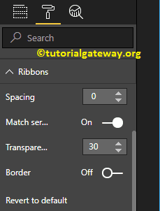
From the screenshot below, you can see, we changed the spacing property to 10 (space between each ribbon) and Transparency to 52% (ribbon space between bars or in-between countries).
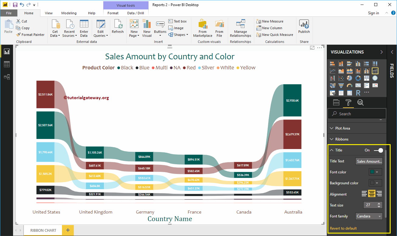
Power BI Ribbon Chart Title
Use this section to format the Ribbon Chart title as per your requirements.
As you can see from the screenshot below, we change the Title Text to Sale Amount by Country and Color. Next, we changed the Font Color to Green, Font Family to Candara, Font Size to 27, and Title Alignment to center. If you want, you can add the background color to the title as well.
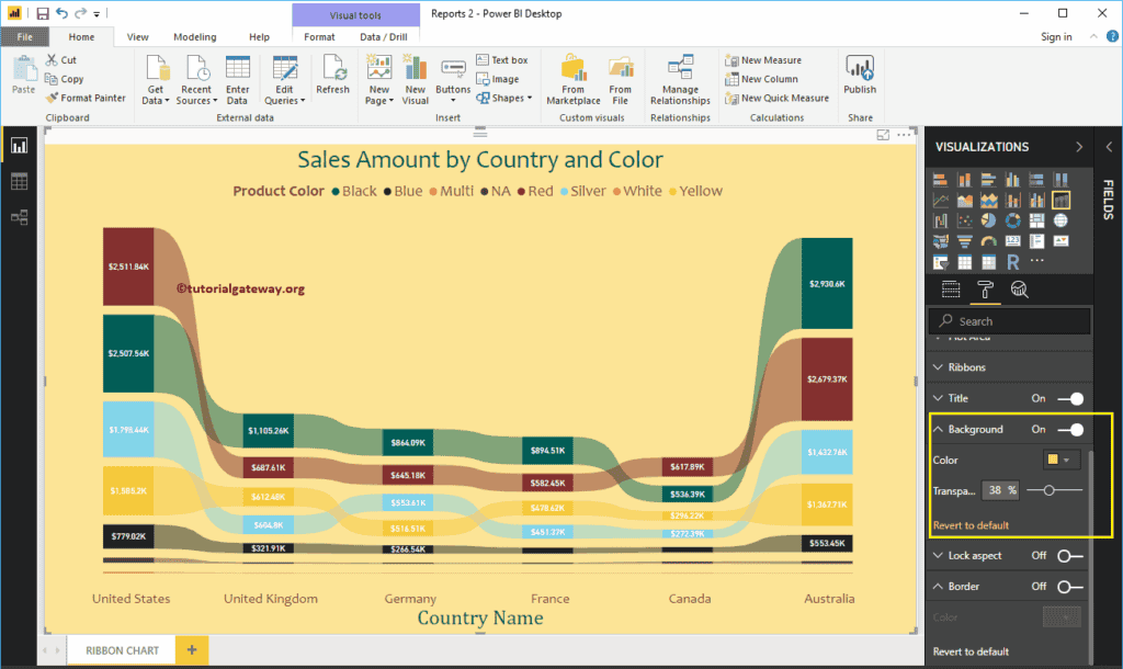
Format Ribbon Chart in Power BI Background Color and Border
You can add the Background color to a Ribbon Chart by toggling Background option to On. For the Ribbon Chart demonstration purpose, we added a light yellow color with 38% transparency.
Similarly, you can add Borders to a Ribbon Chart by toggling the Border option from Off to On.