Users Online

· Guests Online: 17

· Members Online: 0

· Total Members: 188
· Newest Member: meenachowdary055

Forum Threads

Newest Threads
No Threads created
Hottest Threads
No Threads created

Latest Articles

Power BI Tutorial - Power BI Charts Tutorial

Line and Stacked Column Chart in Power BI

Power BI Line and Stacked Column Chart help you visualize multiple dimensions and measures. Let me show you how to Create a Line and Stacked Column Chart in Power BI with example.


For this Power BI Line and Stacked Column Chart demonstration, we are going to use the Excel Data Source that we created in our previous article.

Please refer to Connect Power BI to Excel Multiple Excel Sheets article to understand the Power BI Data Source.  


How to Create a Line and Stacked Column Chart in Power BI

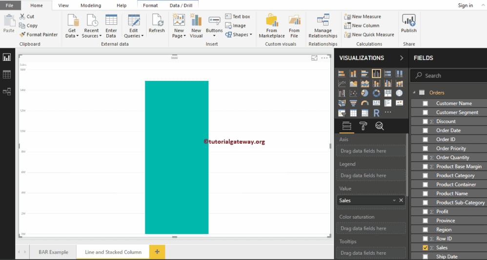
To create a Line and Stacked Column Chart in Power BI, first Drag and Drop the Sales from Fields section to Canvas region. It automatically creates a Column Chart, as we shown below.

Line and Stacked Column Chart in Power BI 1

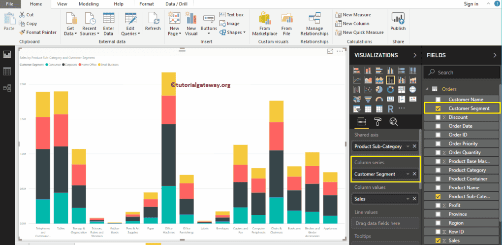
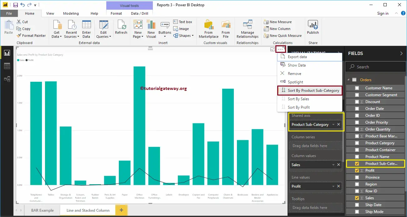
Next, let me add the Product Subcategory Name to Axis section.


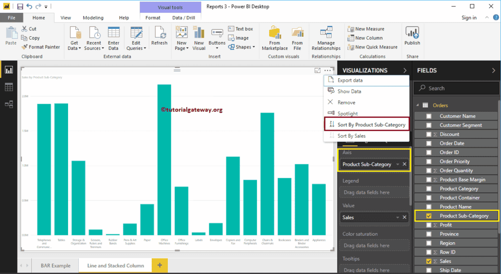
Let me sort the data by English Product Sub-category Name (By default, it sorted by Sales Amount). To do this, click on the  (3 dots) on the top right corner and select the Sort By Product Sub-category Name option, as we showed below.

Line and Stacked Column Chart in Power BI 2

Click on the Line and Stacked Column Chart under the Visualization section. It converts the Column Chart into a Line and Stacked Column Chart. From the screenshot below, currently, you don’t see the change, because you have to add a few more fields.

Line and Stacked Column Chart in Power BI 3

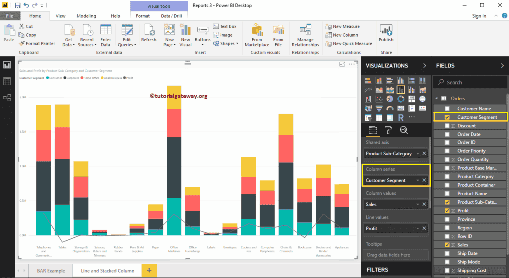
Next, we are adding a Customer Segment to the Column Series section to convert it into the Stacked Column Chart.

Line and Stacked Column Chart in Power BI 4

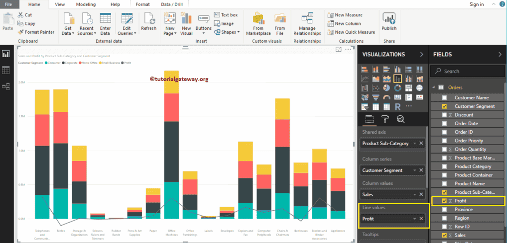
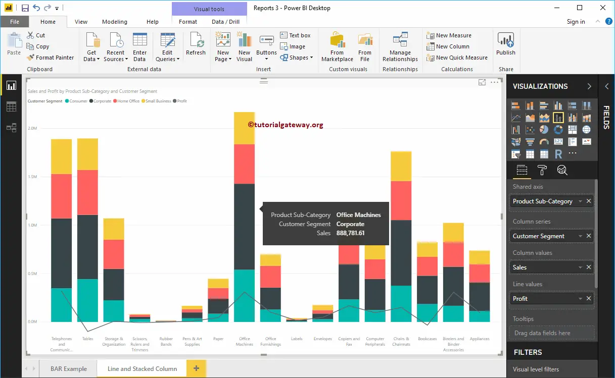
Next, we are adding Profit to Line Values section to convert it into the Line and Stacked Column Chart.

Line and Stacked Column Chart in Power BI 5

Create a Line and Stacked Column Chart in Power BI Approach 2

First, click on the Line and Stacked Column Chart under the Visualization section. It will create a Line and Stacked Column Chart with dummy data, as shown in the below screenshot.

Line and Stacked Column Chart in Power BI 6

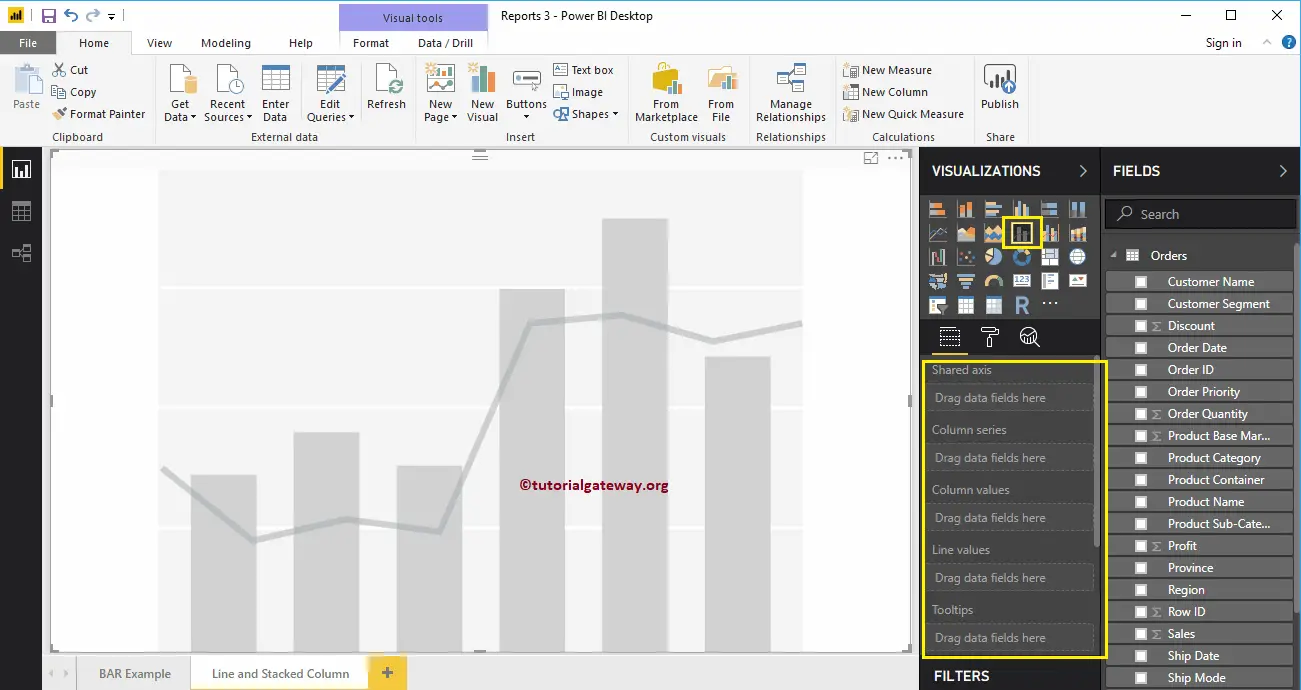
To add data to Line and Stacked Column Chart in Power BI, we have to add required fields:

  • Shared Axis: Please specify the Column that represents the Vertical Axis.
  • Column Series: Specify the Column to divide the Vertical Bars.
  • Column Values: Any Numeric value such as sales amount, Total Sales, etc., that represent the Vertical bars.
  • Line Values: Any Numeric value that represents the Line.

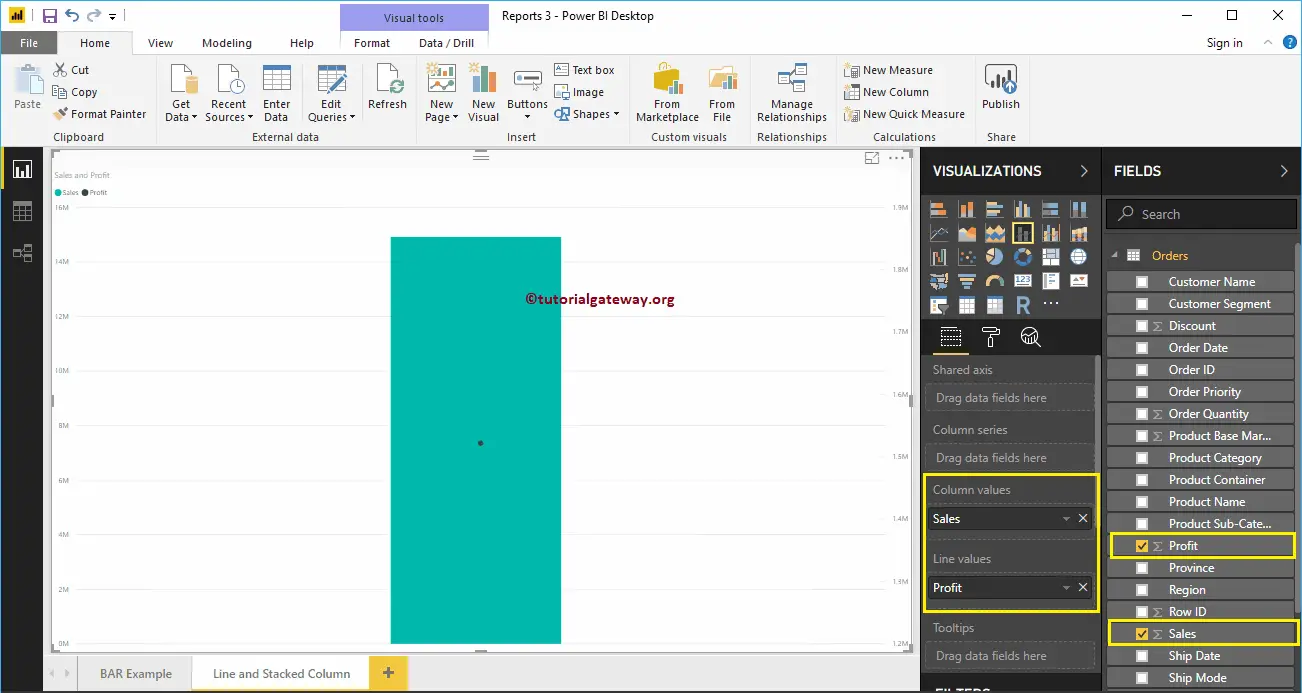
Let me drag the Sales Amount from the Fields section to Column Values field, and Profit field to the Line Values Section.

Line and Stacked Column Chart in Power BI 7

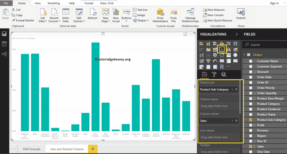
Next, let me add the Product Subcategory Name to the shared Axis section. You can do this by dragging Product Subcategory Name to the shared Axis section. Or simply checkmark the Product Subcategory Name column.

Let me sort the data by Product Subcategory Name. To do this, click on the  (3 dots) on the top right corner and select the Sort By Product Subcategory Name option, as we showed below.

Line and Stacked Column Chart in Power BI 8

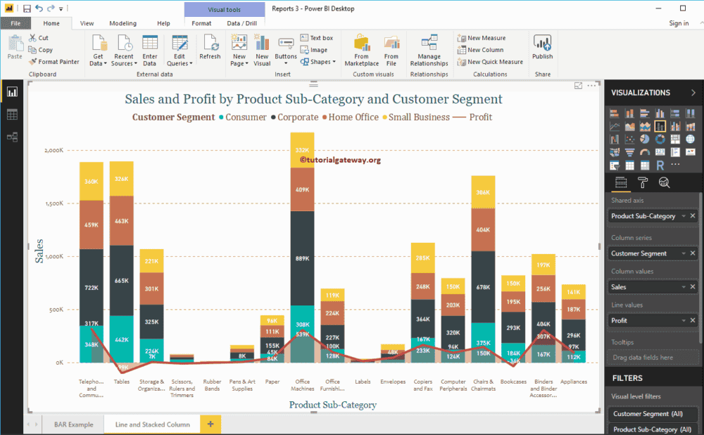
Next, add the Customer Segment to the Column Series section. That’s it; we got our Line and Stacked Column chart 


Line and Stacked Column Chart in Power BI 9

Hover over any portion of a vertical bar shows the Tool-tip of Product Subcategory, Customer Segment, and Sales Amount.

Line and Stacked Column Chart in Power BI 10

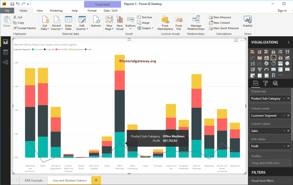
Hover over any portion of a Line shows the Tool-tip of Product Subcategory and Profit.

Line and Stacked Column Chart in Power BI 11

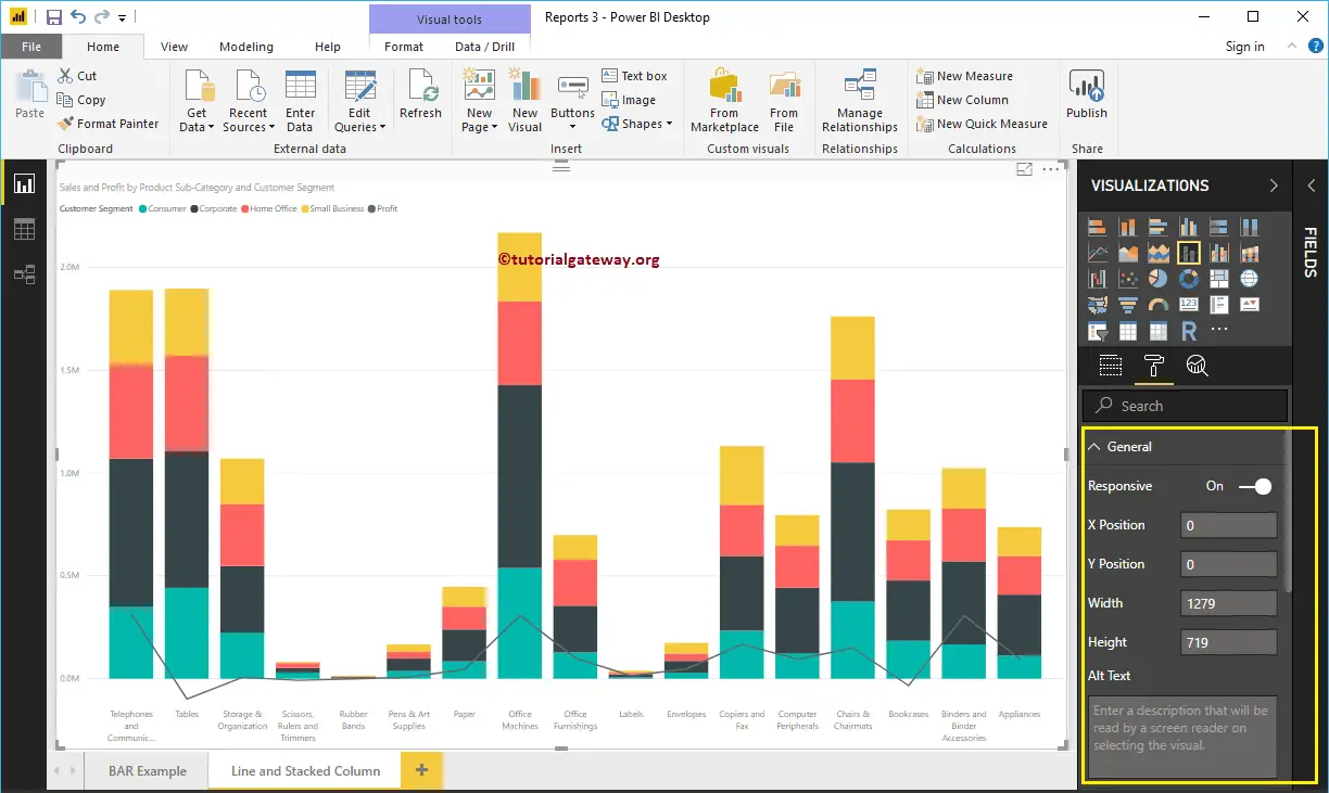
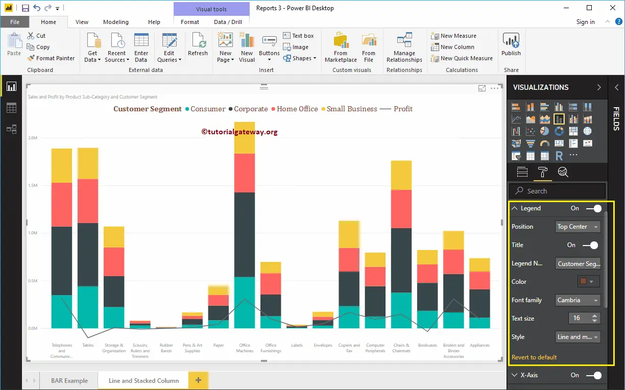
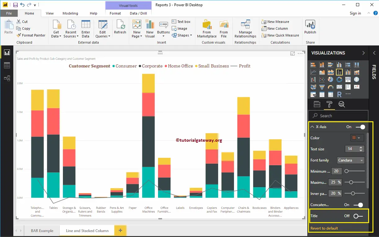
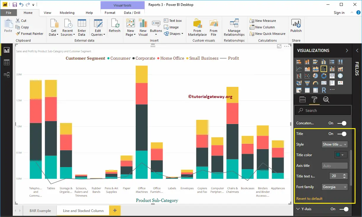
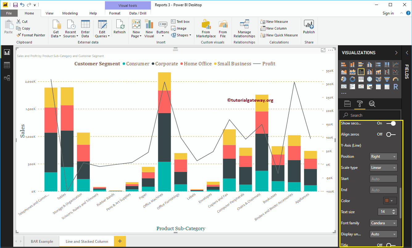
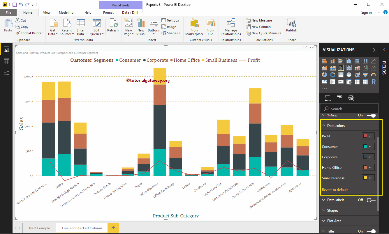
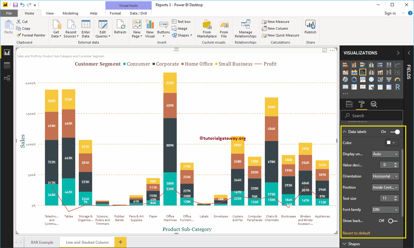
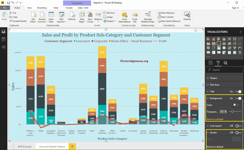
Let me do some quick formatting to this Line and Stacked Column Chart in Power BI.

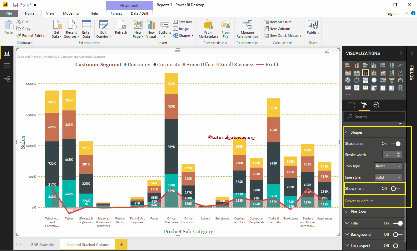
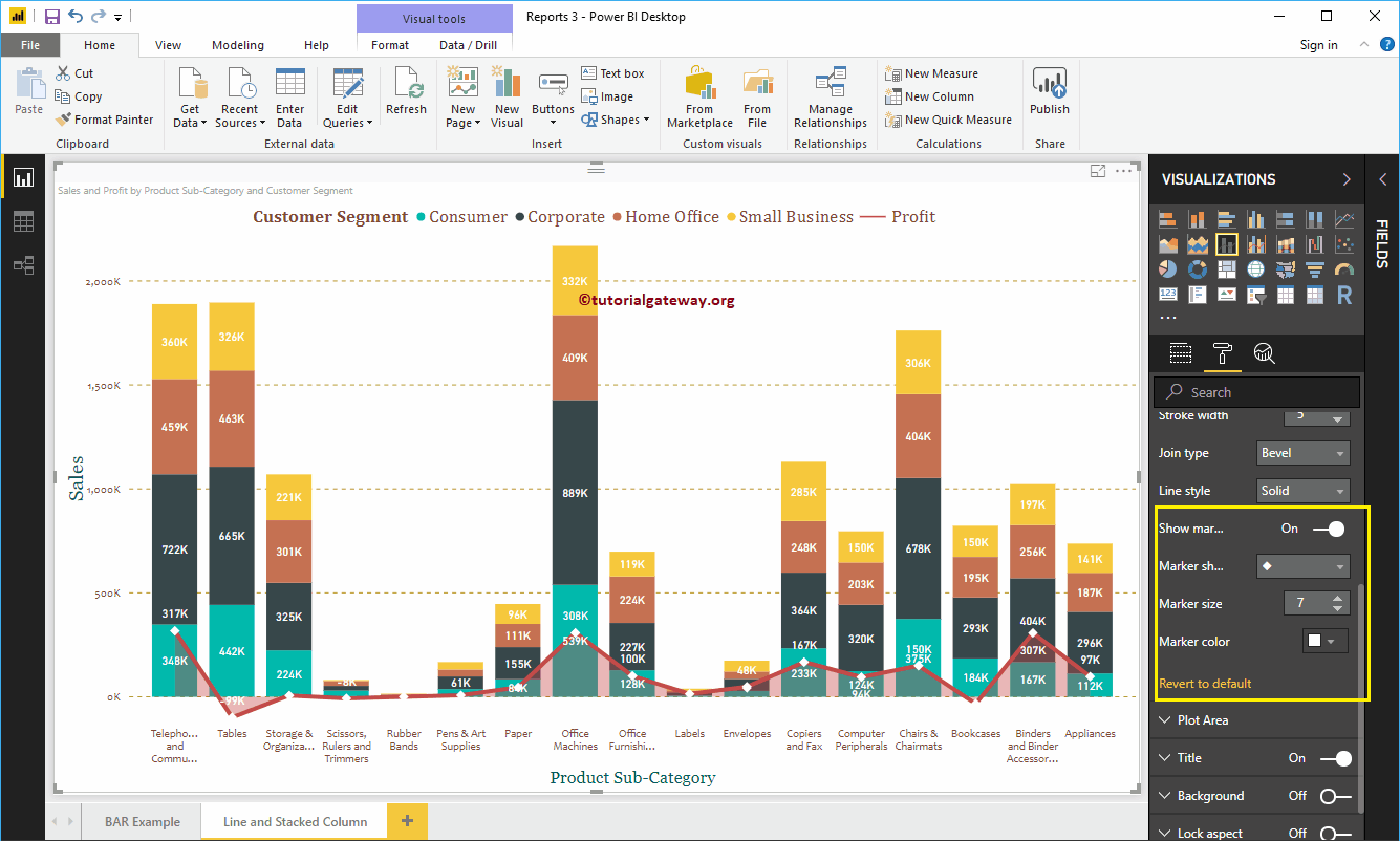
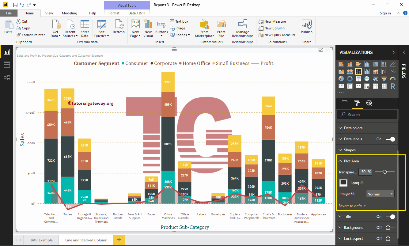
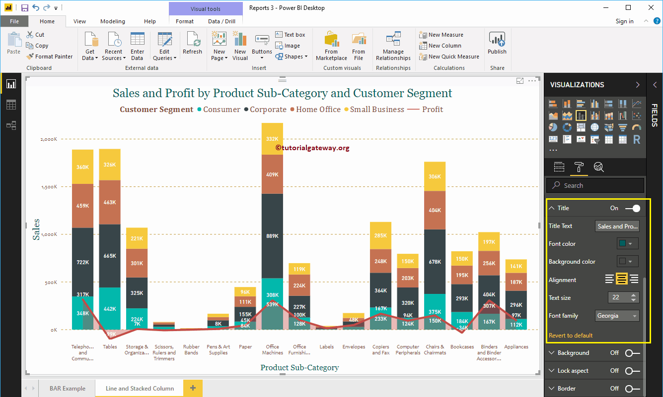
NOTE: I suggest you refer to Format Line and Stacked Column Chart article to understand the steps involved in formatting the Lines, and Stacked Column Colors, Title, etc.

Line and Stacked Column Chart in Power BI 12

Format Power BI Line and Stacked Column Chart

How to FormatPower BI Line and Stacked Column Chart with an example?. Formatting Power BI Line and Stacked Column Chart includes changing the Line Strokes, Stacked Column colors, Title position, Axis Details, etc.


To demonstrate the Power BI Line and Stacked Column Chart formatting options, we are going to use the Line and Stacked Column Chart that we created earlier.

Please refer to Line and Stacked Column Chart in Power BI article to understand the steps involved in creating it.

How to Format Power BI Line and Stacked Column Chart

Please click on the Format button to see the list of formatting options that are available for this Line and Stacked Column Chart.

Format Power BI Line and Stacked Column Chart 1

Power BI Line and Stacked Column Chart General Settings

Use this Power BI General Section to Change the X, Y position, Width, and height of a Line and Stacked Column Chart.

  Format Power BI Line and Stacked Column Chart 2

Format Legend of a Line and Stacked Column Chart in Power BI

First, we used the Position drop-down box to change the legend position to Top Center. Next, we changed the Color to Brick Red, Font family to Cambria, and text size to 16.

Format Power BI Line and Stacked Column Chart 3

The X-Axis of a Line and Stacked Column Chart in Power BI

The following are the list of options that are available for you to format X-Axis. Here, we changed the Color to Brown, font family to Candara, and Text Size to 14.

Format Power BI Line and Stacked Column Chart 4

As you see from the above screenshot, by default, the X-Axis title set to Off for the Line and Stacked Column Chart. But you can enable it by toggling Title to On. Let me change the Title Color to Green, Font style to Georgia, and Font Size to 20.

Format Power BI Line and Stacked Column Chart 5

Format Y-Axis of a Power BI Line and Stacked Column Chart

As you can see, we changed the Y-Axis labels Color to Brown, font style to Candara, Text Size to 14, and display units to thousands.

Format Power BI Line and Stacked Column Chart 6

By default, Line and Stacked Column Chart Y-Axis title set to Off, but you can enable it by toggling Title to On. Let me change the Title Color to Green, Text Size to 24, and Font family Georgia.

By toggling the Gridlines option from On to Off, you can disable the Line and Stacked Column Chart Gridlines.

  • Color: You can change the Gridlines color.
  • Stroke Width: Use this to change the Gridlines width.
  • Line Style: Choose the line style such as Solid, dotted, and dashed.
Format Power BI Line and Stacked Column Chart 7

As you can see from the above screenshot, there is an option called show secondary axis under the Y-Axis. By enabling this, you can display the secondary Y-Axis as well.

Format Power BI Line and Stacked Column Chart 8

Format Power BI Line and Stacked Column Chart Data Colors

By default, Line and Stacked Column Chart uses the default colors to fill the stacked columns and lines. Let me change them for the demonstration purpose.

Format Power BI Line and Stacked Column Chart 9

Format Data Labels of a Line and Stacked Column Chart

Data Labels display the Metric Values (Sales Amount of group, and Profit at each point). As you can see from the below screenshot, we enabled data labels and changed the color to white.

Format Power BI Line and Stacked Column Chart 10

Format Line and Stacked Column Chart in Power BI Shapes

You can use this section to change the Line Strokes, or marking shapes. 


As you can see from the below screenshot, we changed the Stroke Width (Line width) to 4, join type to bevel, and line style to solid.

Format Power BI Line and Stacked Column Chart 11

By enabling Show Markers property, you can display the markers at each point.

First, we changed the marker Shape (joining Point Shape ) as Diamond, Marker size as 7, and marker color as white.

Format Power BI Line and Stacked Column Chart 12

Line and Stacked Column Chart in Power BI Plot Area

Using this Plot Area property, you can add custom Images as the Background of the Line and Stacked Column Chart. For the demonstration purpose, we added one image as the Plot Area Background.

Format Power BI Line and Stacked Column Chart 13

Format Power BI Line and Stacked Column Chart Title

As you see, we changed the Font Color to Green, Font Family to Georgia, Text Size to 22, and Title Alignment to center. If you want, you can add the background Color to the title as well.

Format Power BI Line and Stacked Column Chart 14

Format Line and Stacked Column Chart Background Color and Borders

You can add the Background color to a Line and Stacked Column Chart by toggling Background option to On. For the demonstration purpose, we added sky blue with 25% transparency.  


Similarly, you can add Borders to a Line and Stacked Column Chart by toggling the Border option from Off to On.

Format Power BI Line and Stacked Column Chart 15

Ratings

Rating is available to Members only.

Please login or register to vote.

No Ratings have been Posted.
Render time: 0.74 seconds
9,317,794 unique visits