Power BI Line and Clustered Column Chart is useful to visualize multiple dimensions and measures. Let me show you how to Create a Line and Clustered Column Chart in Power BI with example.
For this Power BI Line and Clustered Column Chart demonstration, we are going to use the Excel Data Source that we created in our previous article.
Please refer to Connect Power BI to Excel Multiple Excel Sheets article to understand the Power BI Data Source.
How to Create a Line and Clustered Column Chart in Power BI
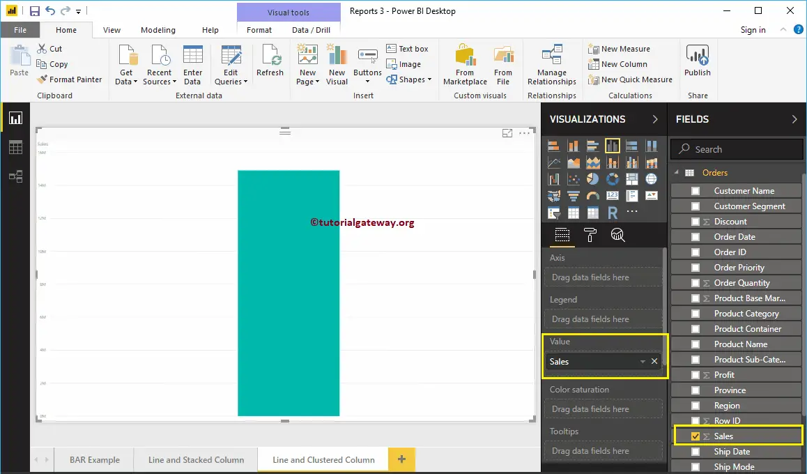
To create a Line and Clustered Column Chart, first Drag and Drop the Sales from Fields section to Canvas region. It automatically creates a Column Chart, as we have shown below.
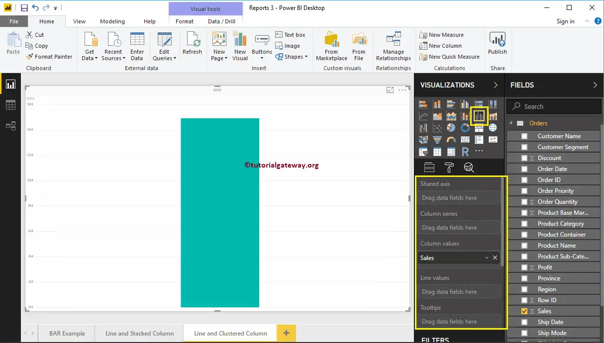
Click on the Line and Clustered Column Chart under theVisualizationsection. It automatically converts a Column Chart into a Line and Clustered Column Chart. Currently, you don’t see the change, because you have to add a few more fields.
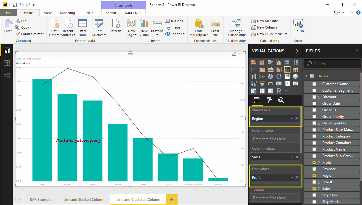
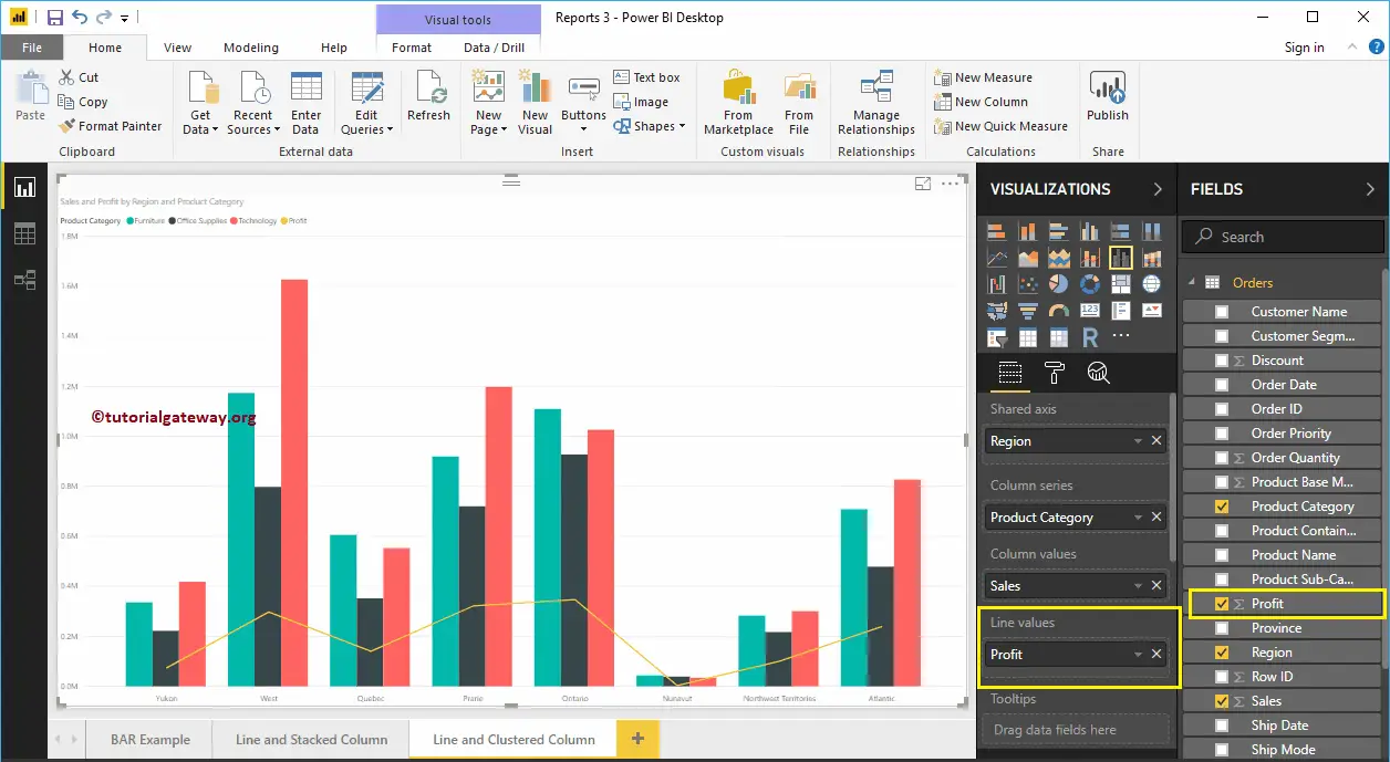
Let me add Region to Shared Axis section, and Profit to Line Values section to convert it into the Line and Clustered Column Chart.
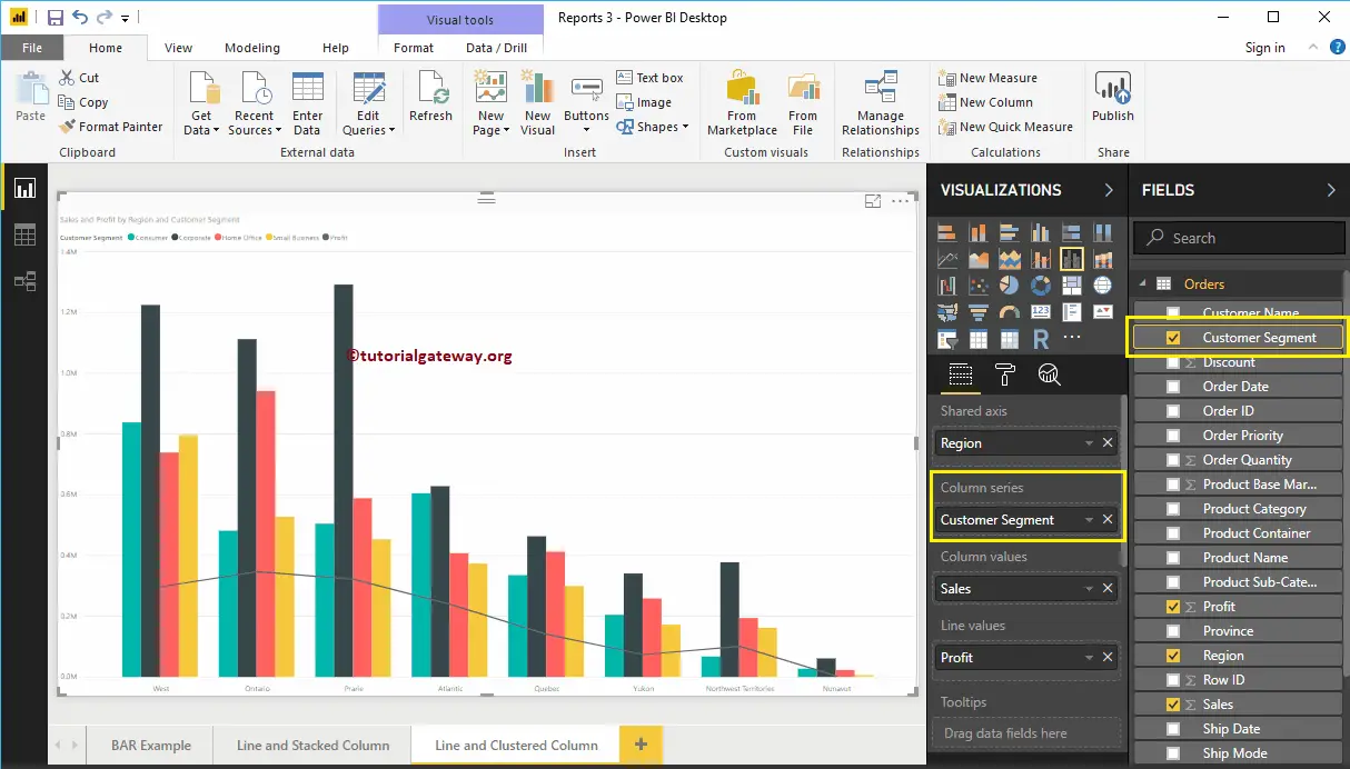
Next, we are adding Customer Segment to the Column Series section to convert it into the Clustered Column Chart.
Create a Line and Clustered Column Chart in Power BI Approach 2
First, click on the Line and Clustered Column Chart under the Visualization section. It will create a Line and Clustered Column Chart with dummy data, as shown in the screenshot below.
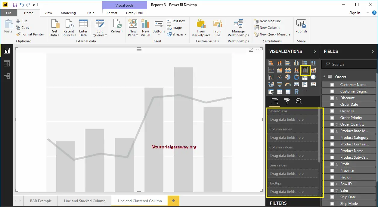
To add data to the Power BI Line and Clustered Column Chart, we have to add the required fields:
- Shared Axis: Please specify the Column that represents the Vertical Axis.
- Column Series: Specify the Column that represents the Clustered column Bars.
- Column Values: Any Numeric value such as sales, profit, etc., that represent the Vertical bars.
- Line Values: Any Numeric value that represents the Line.
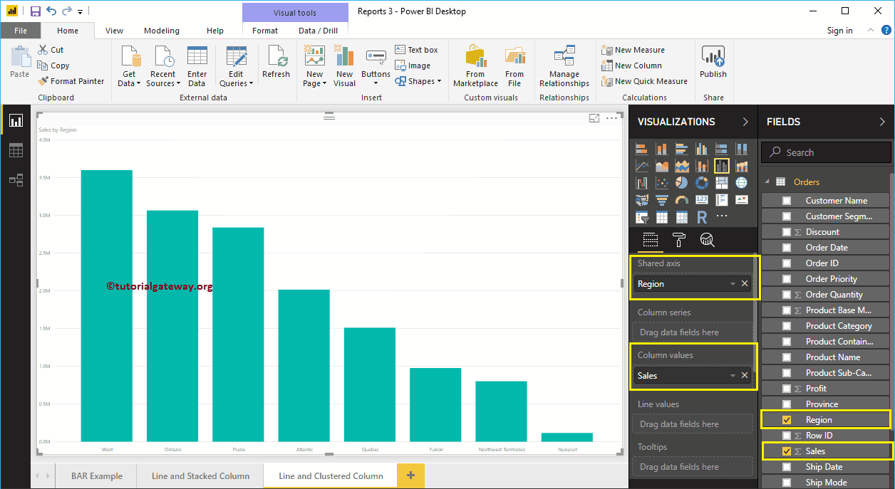
Let me drag the Sales from Fields section to Column Values field and Region to Shared Axis Section.
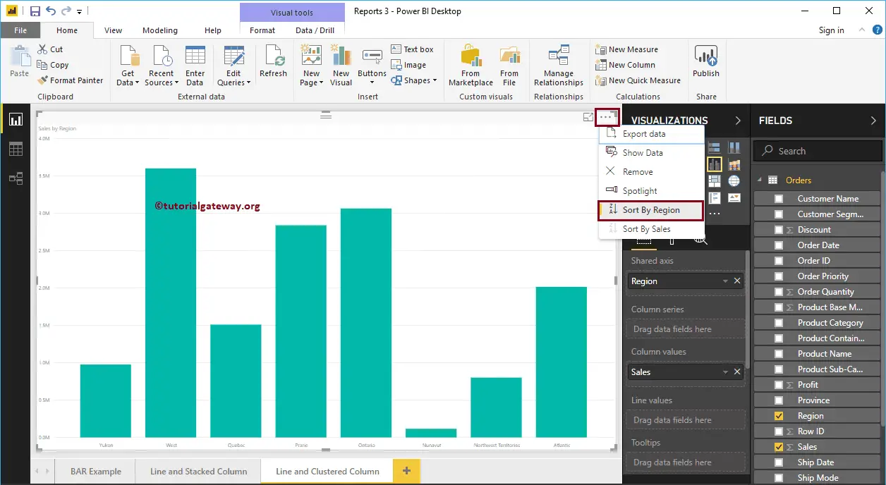
Let me sort the data by Region. To do this, click on the … (3 dots) on the top right corner, and select the Sort By Region option as we showed below.
Next, add the Product Category to the Column Series section
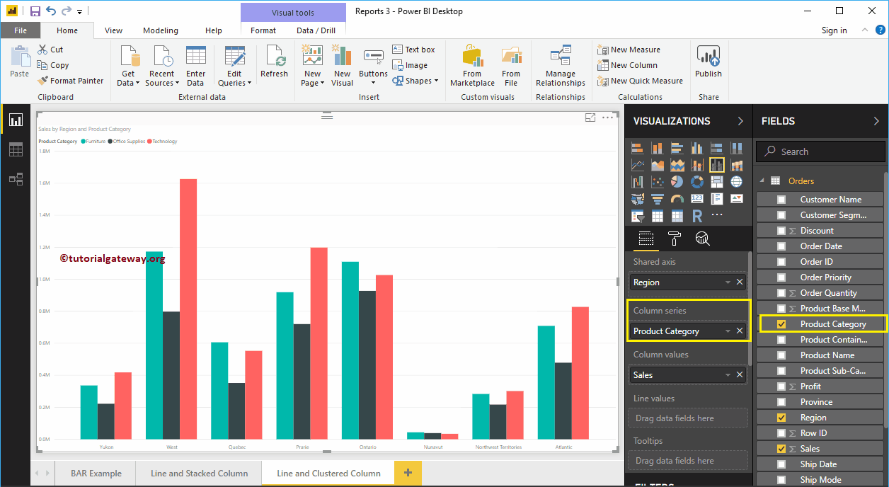
Drag and Drop the Profit field into the Line Values section. That’s it; we got our Line and Clustered Column Chart.
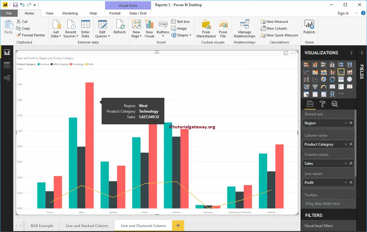
Hover over any vertical bar shows you the Tool-tip of Region, Product Category, and Sales Amount.
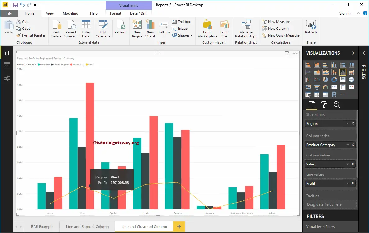
Hover over any portion of a Line will show the Tool-tip of Region, and Profit.
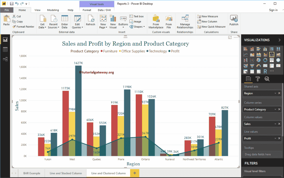
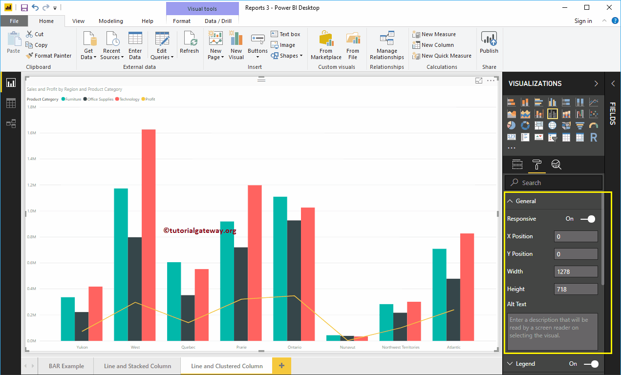
Let me do some quick formatting to this Line and Clustered Column Chart
NOTE: I suggest you refer to Format Line and Clustered Column Chart article to understand the steps involved in formatting the Clustered columns, Lines, Title, etc.
How to Format Power BI Line and Clustered Column Chart with an example?. Formatting Power BI Line and Clustered Column Chart includes changing the Clustered Column colors, Line Strokes, Title position, Axis Details, etc.
To demonstrate the Line and Clustered Column Chart formatting options, we are going to use the Line and Clustered Column Chart that we created earlier. Please refer to Line and Clustered Column Chart in Power BI article in Power BI to understand the steps involved in creating it.
How to Format Power BI Line and Clustered Column Chart
Please click on the Format button to see the list of available formatting options in Line and Clustered Column Chart.
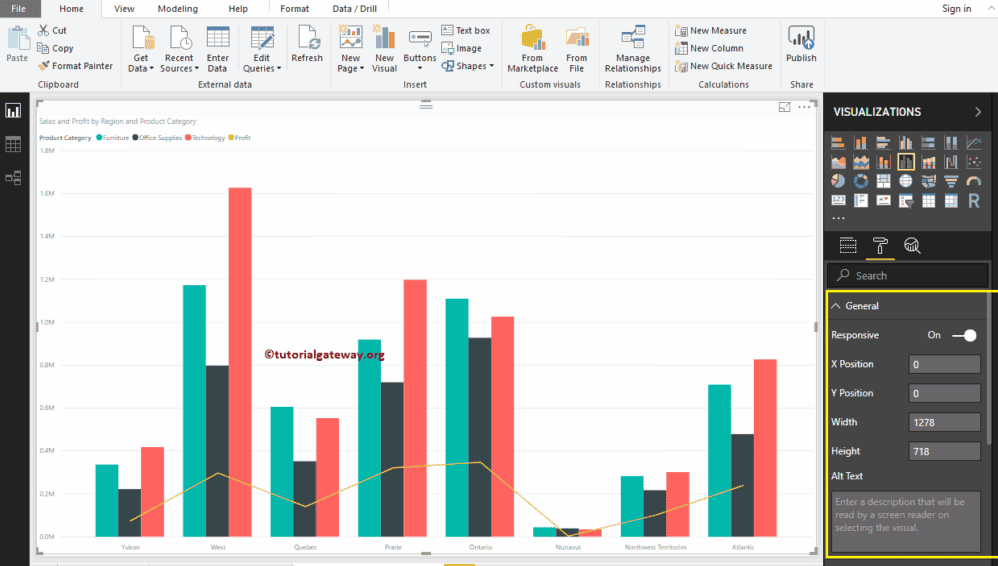
Format Line and Clustered Column Chart General Settings
Use this General Section to Change the X, Y position, Width and height of a Line and Clustered Column Chart
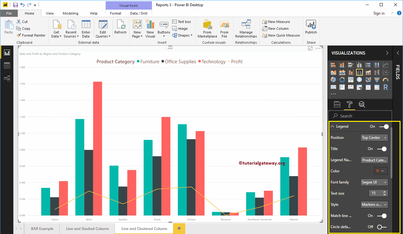
Format Legend of a Line and Clustered Column Chart in Power BI
First, we used the Position drop-down to change the legend position to Top Center. Next, we changed the Color to Brown and text size to 15.
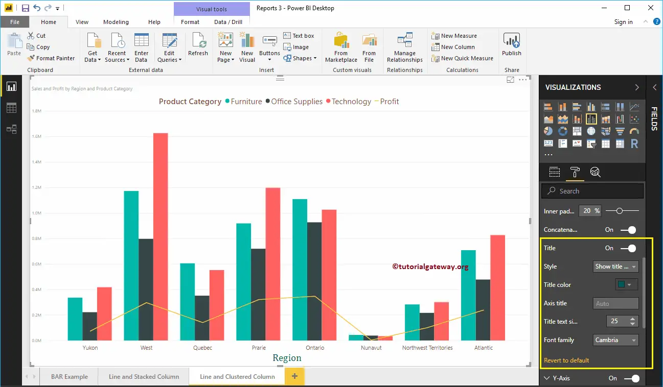
Format X-Axis of a Line and Clustered Column Chart in Power BI
The following are the list of options that are available for you to format X-Axis. Here, we changed the Color to Brown, and Text Size to 14.

As you see from the above screenshot, by default, the X-Axis title set to Off for the Line and Clustered Column Chart. But you can enable it by toggling Title to On. Let me change the Title Color to Green, Font style to Cambria, and Font Size to 25.
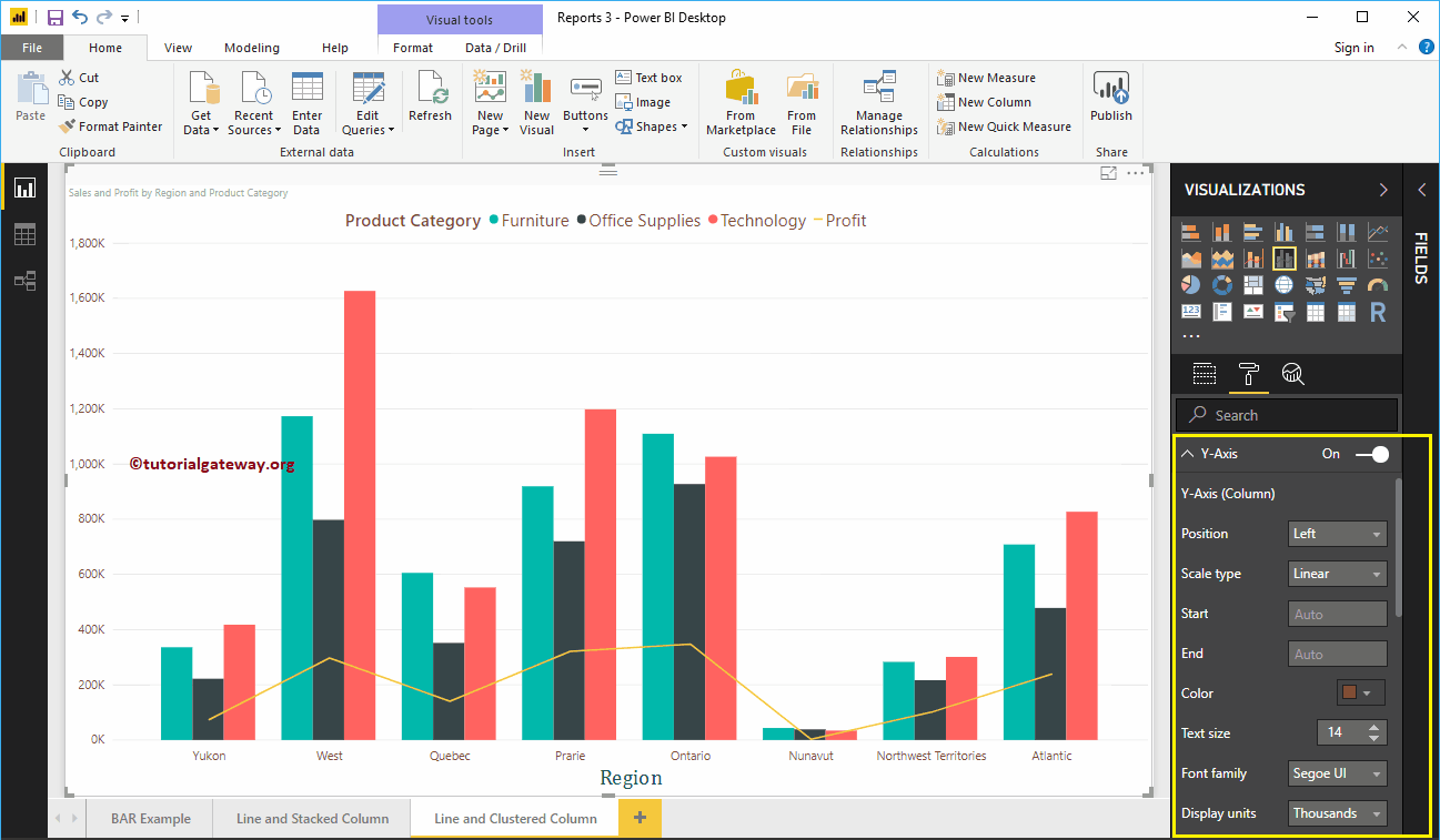
Format Y-Axis of a Line and Clustered Column Chart
As you can see, we changed the Y-Axis labels Color to Brown, Text Size to 14, and display units to thousands.
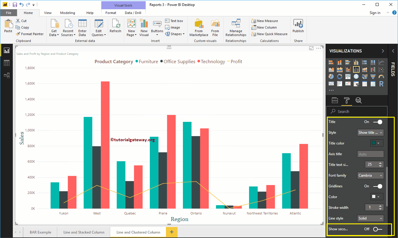
By default, Line and Clustered Column Chart Y-Axis title set to Off, but you can toggling Title to On. Let me change the Title Color to Green, Text Size to 25, and Font family Cambria.
By toggling the Line and Clustered Chart Gridlines option from On to Off, you can disable the Gridlines.
- Color: You can change the Gridlines color.
- Stroke Width: Use this to change the Gridlines width.
- Line Style: Choose the line style such as Solid, dotted, and dashed.
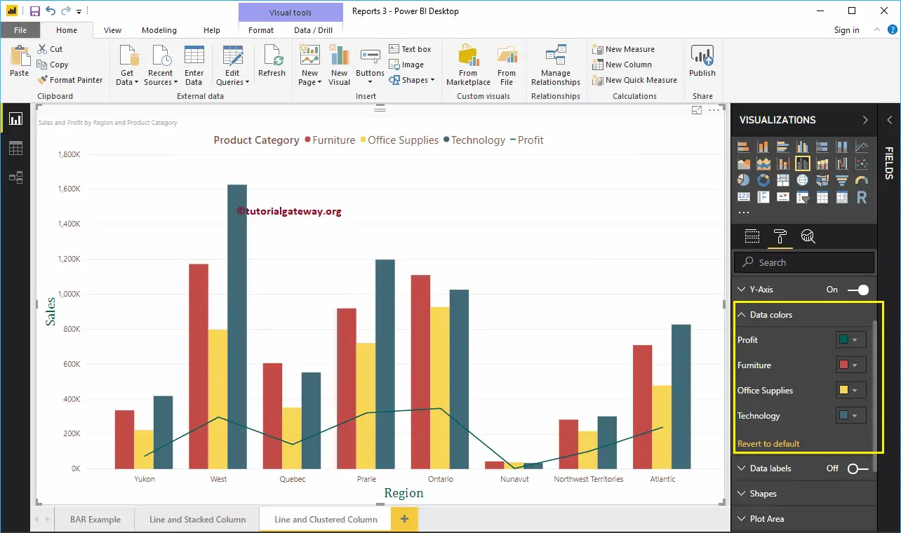
Format Power BI Line and Clustered Column Chart Data Colors
By default, Line and Clustered Column Chart will use the default colors to fill the Clustered columns and lines. Let me change them for the demonstration purpose.
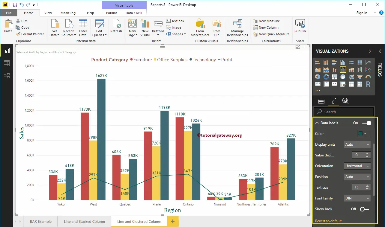
Format Power BI Line and Clustered Column Chart Data Labels
Data Labels display the Metric Values (Sales and Profit at each point). As you can see from the below screenshot, we enabled data labels and changes the color to Green, and Text size to 15.
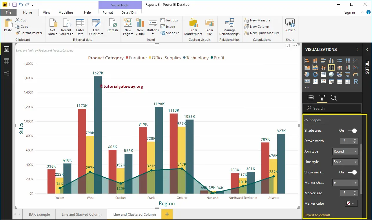
Format Line and Clustered Column Chart in Power BI Shapes
You can use this section to change the Line Strokes, or marking shapes. By enabling the Shade Area property, you can share the area between the x-axis and the line. Next, we changed the Stroke Width (Line width) to 4, join type to round, and line style to solid.
By enabling Show Markers property, you can display the markers at each point. Here, we changed the Marker size as 6.
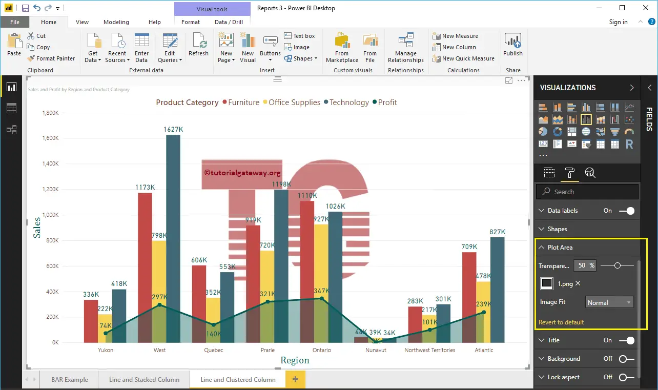
Format Line and Clustered Column Chart Plot Area
Using this Plot Area property, you can add custom Images as the Background of the Line and Clustered Column Chart. For the demonstration purpose, we added one image as the Plot Area Background.
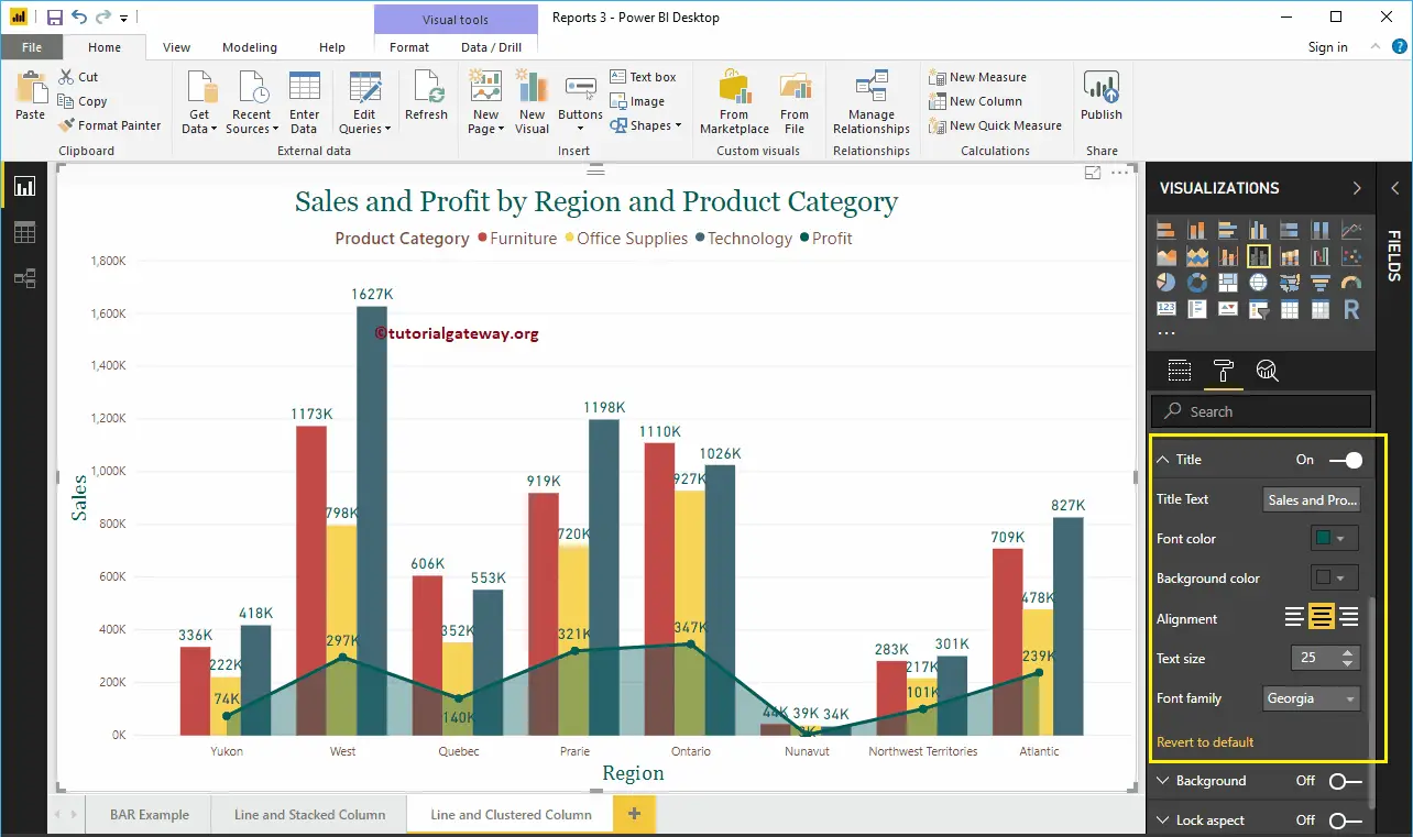
Format Line and Clustered Column Chart Title
As you see, we changed the Font Color to Green, Font Family to Georgia, Text Size to 25, and Title Alignment to center. If you want, you can add the background Color to the title as well.
Format Power BI Line and Clustered Column Chart Background Color, and Borders
You can add the Background color to a Line and Clustered Column Chart by toggling Background option to On. For the demonstration purpose, we added pale yellow with 25% transparency.
Similarly, you can add Borders to a Line and Clustered Column Chart by toggling the Border option from Off to On.