Power BI Area Chart is the same as Line Chart, where the Area between the X-Axis and lines filled with a color. Let me show you how to Create an Area Chart in Power BI with an example.
For this Power BI Area chart demonstration, we are going to use the SQL Data Source that we created in our previous article.
Please refer to Connect Power BI to SQL Server article to understand the Data Source in Power BI. And also refer Line Chart article.
How to Create Area Chart in Power BI
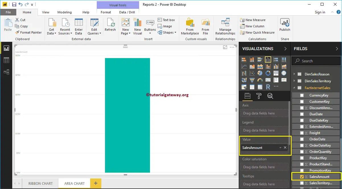
To create an Area Chart in Power BI, first Drag and Drop the Sales Amount from Fields section to Canvas region. It automatically creates a Column Chart, as we have shown in the below screenshot.
Next, let me add English Product Subcategory Name to the Axis section.
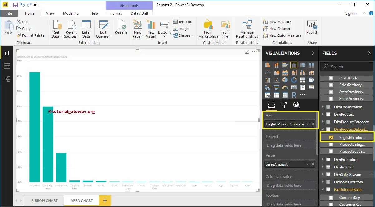
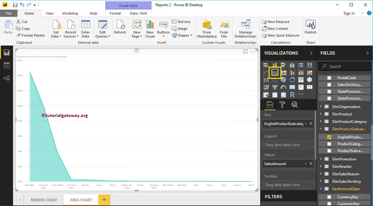
Please click on the Area Chart under the Visualization section. It will convert the Column Chart into an Area Chart. From the screenshot below, you can see the Area Chart that shows the Sales by Product Subcategory.
Create an Area Chart in Power BI Approach 2
First, click on the Area Chart under the Visualization section. It will create an Area Chart with dummy data, as shown in the below screenshot.
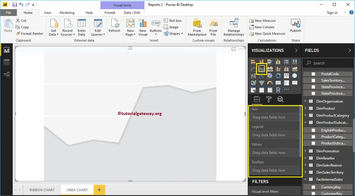
In order to add data to the Power BI Area Chart, we have to add the required fields:
- Axis: Please specify the Column Name that represents the Area.
- Values: Any Numeric value such as sales amount, Total Sales etc.
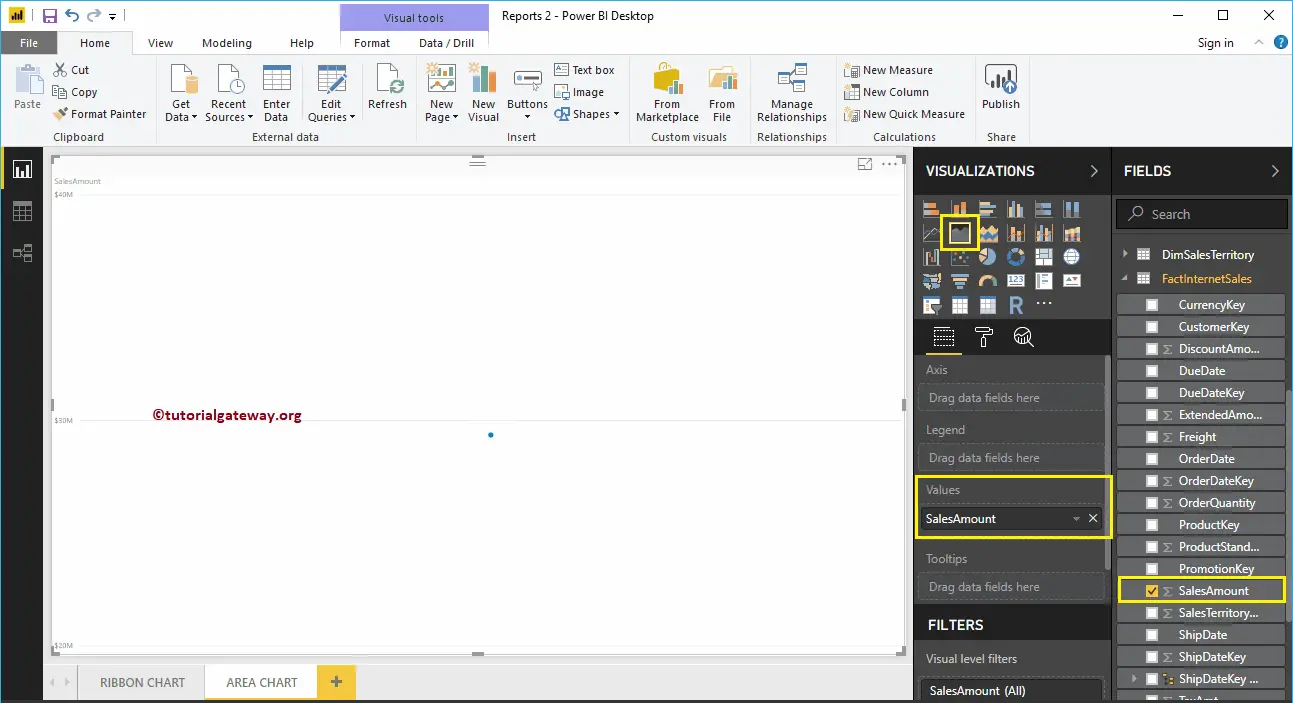
Let me drag the Sales Amount from the Fields section to the Values field.
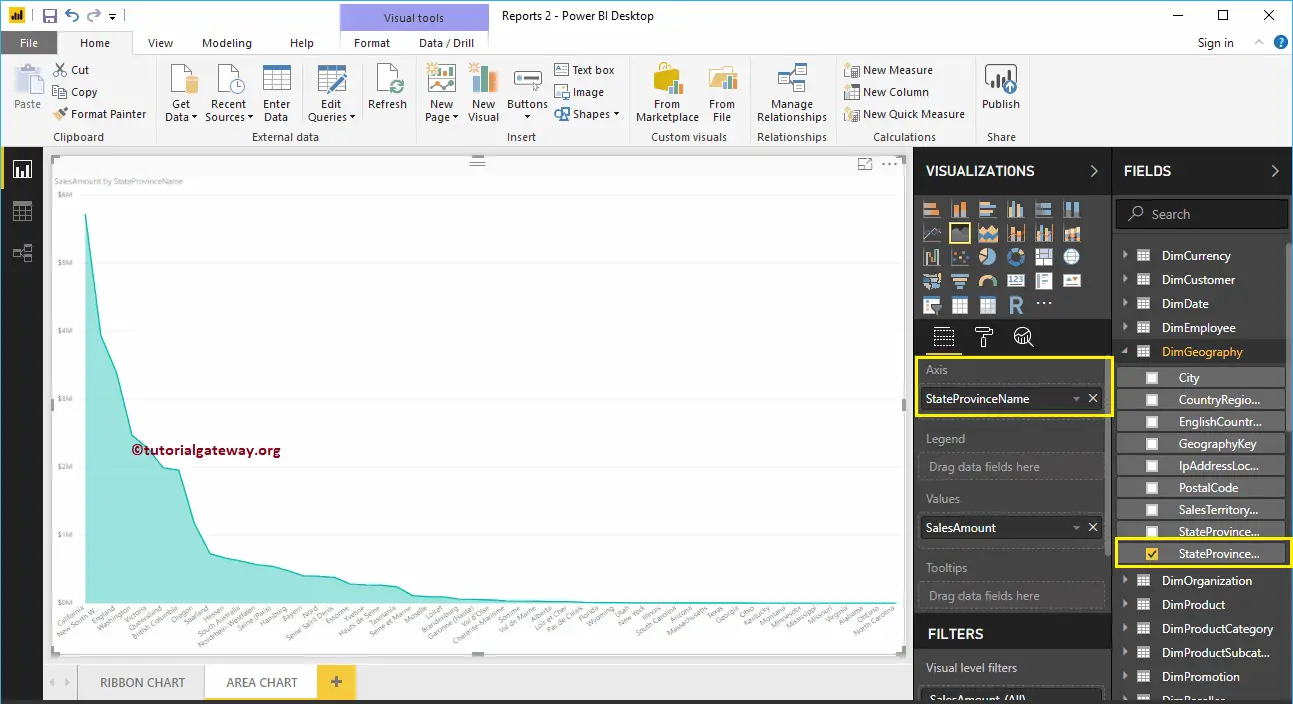
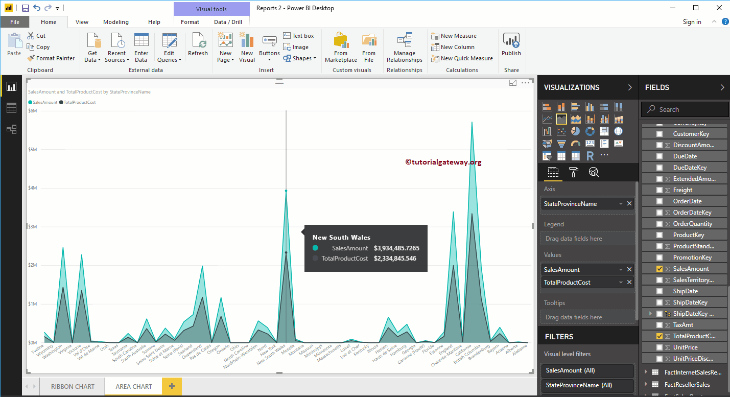
Next, let me add State Province Name to the Axis section. You can do this by dragging State Province to Axis section, or simply checkmark the State Province column.
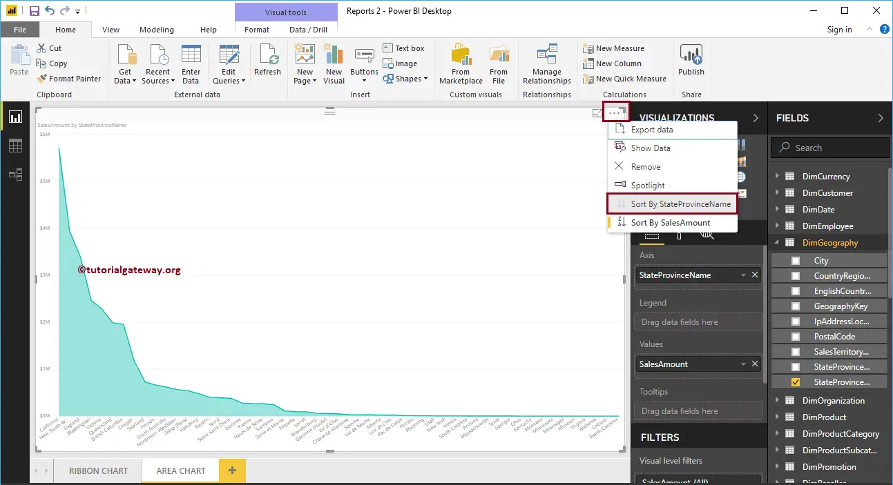
Let me sort the data by State Province Name (By default, it sorted by Sales Amount). To do this, click on the … (3 dots) on the top right corner, and select the Sort By StateProvinceName option as we showed below.
Now you can see a more meaningful area chart
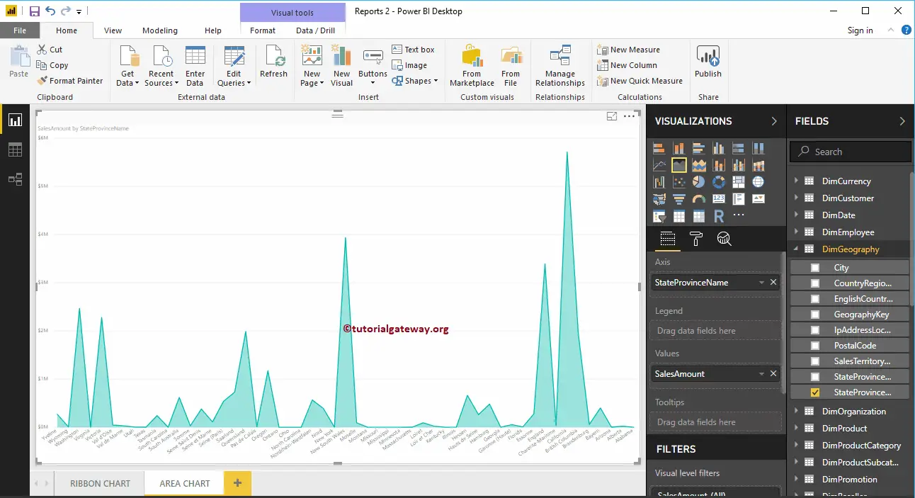
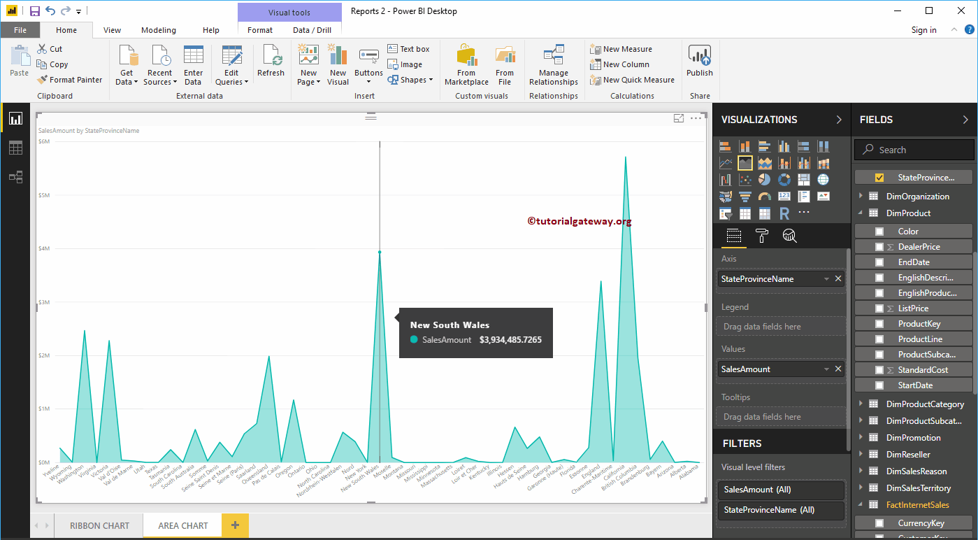
Hover over any position shows the Tool-tip of Sales Amount, and State Province Name
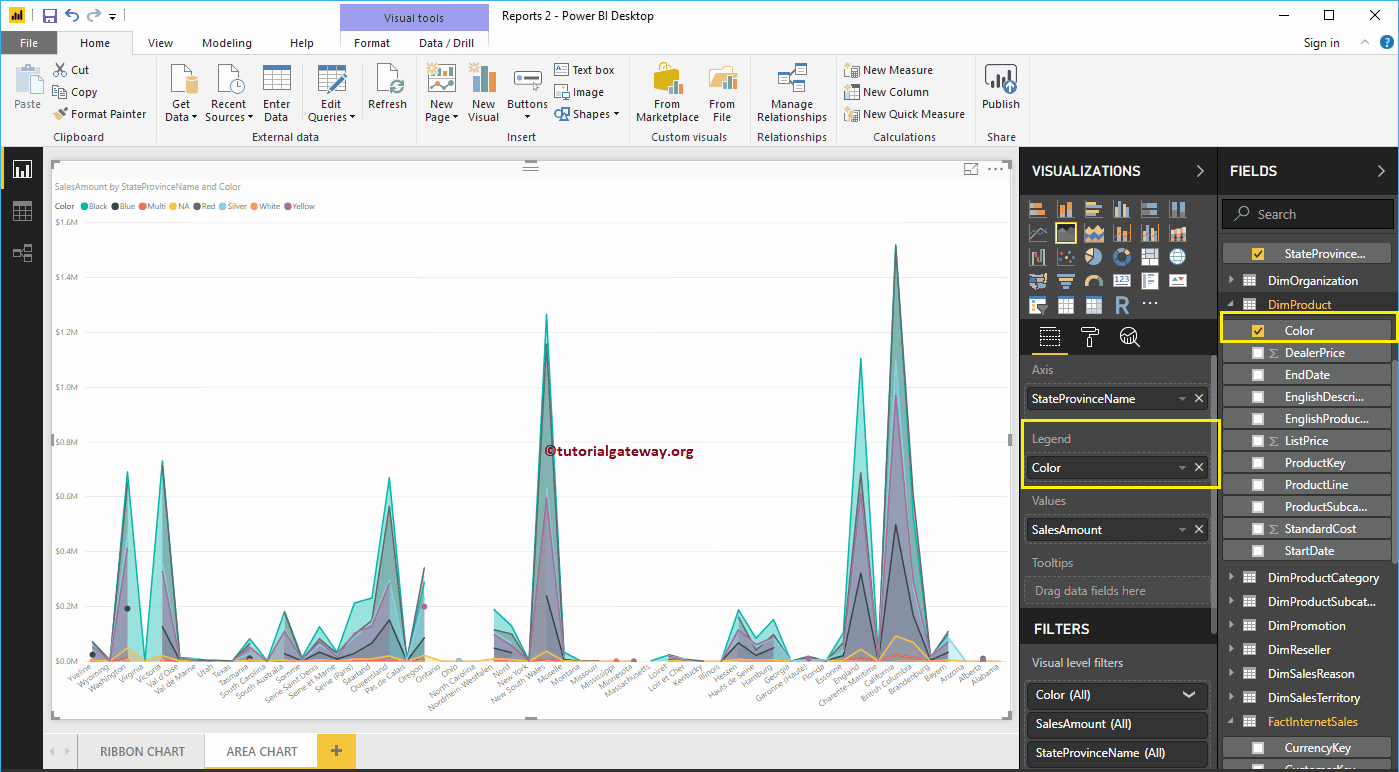
By adding Product Color to the Legend section, it will convert the Power BI Area chart into the Stacked Area chart.
Let me remove the Color field from the Legend section and add one more field, i.e., Total Product Cost to Values section. It compares the Area of Sales Amount against the Total Product Cost.
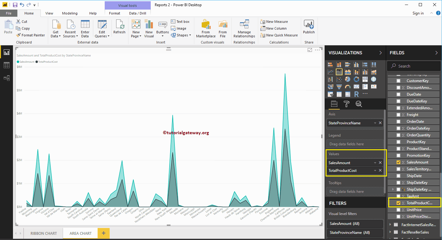
Hover over any position shows the Tool-tip of Sales Amount and Total Product Cost
Let me do some quick formatting to this Power BI Area Chart
NOTE: I suggest you refer to the Format Area Chart article to understand the steps involved in formatting the Area chart title, plot area, line color, etc.
How to Format Power BI Area Chart with an example?. Formatting Power BI Area Chart includes changing the Area Colors, Chart Title text, Title position, X-Axis Details, Y-Axis details, Data labels, and Background Images, etc.
To demonstrate these Power BI Area Chart formatting options, we are going to use the Area Chart that we created earlier. Please refer Area Chart in Power BI article.
How to Format Power BI Area Chart
Please click on the Format button to see the list of formatting options that are available for this Area Chart.
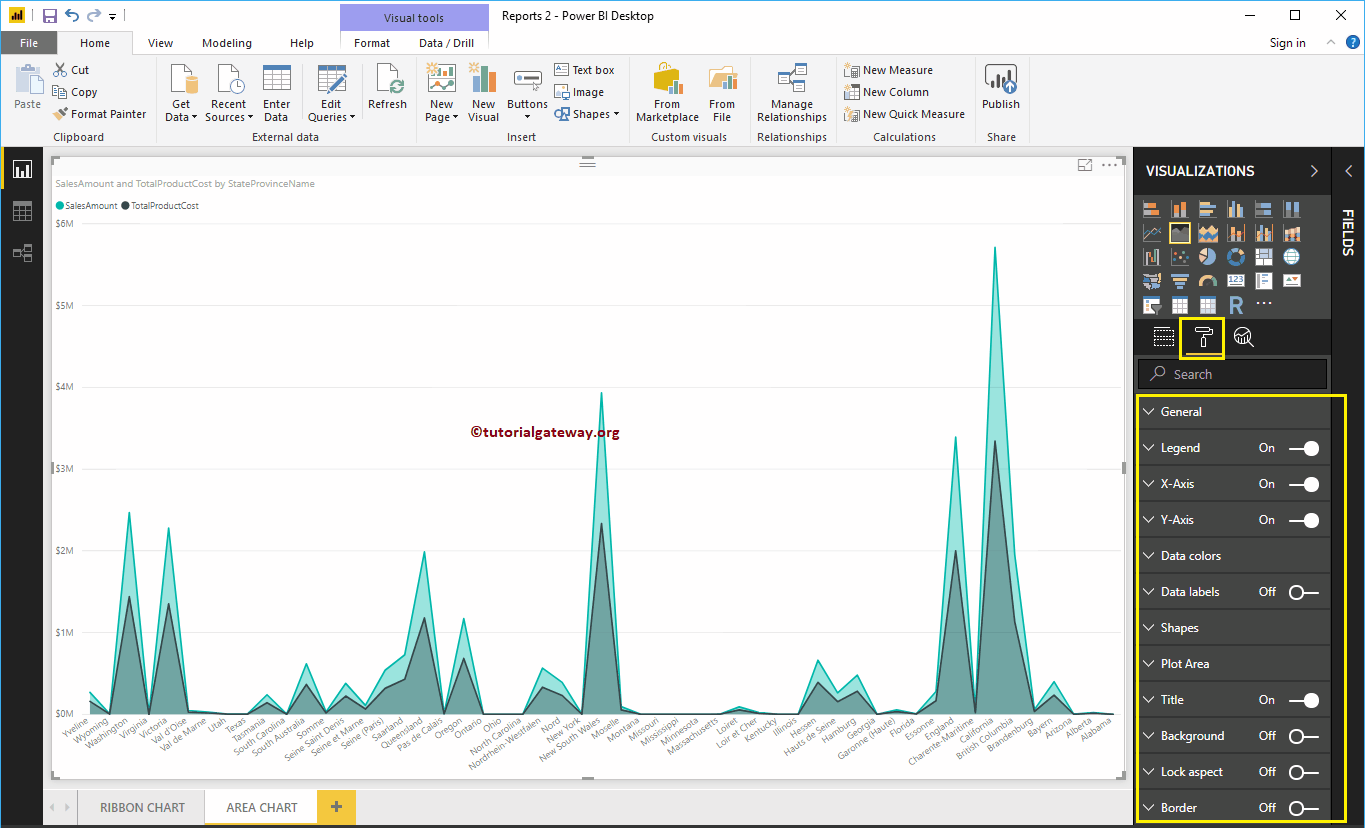
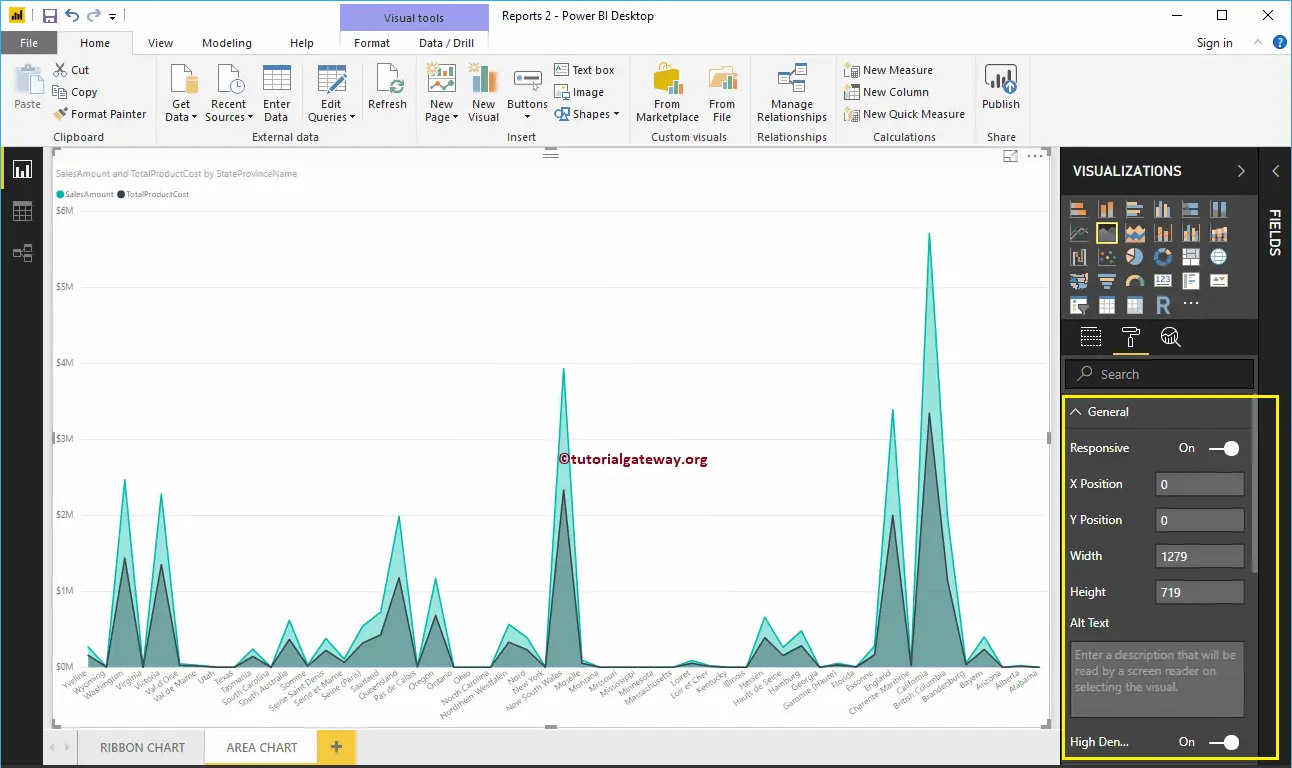
Format Area Chart General Settings
Use this General Section to Change the X, Y position, Width, and height of an Area Chart
Format Legend of an Area Chart in Power BI
Please select the Power BI Legend region and toggle the option from Off to On to enable Legend.
As you can see from the screenshot below, we used the Position drop-down box to change the legend position to Top Center. And we also added the Legend Title as Money, Color to Brick Red, Font family to Candara, and text size to 15.

Format X-Axis of an Area Chart in Power BI
The following are the list of options that are available for you to format the Area Chart Horizontal axis or X-Axis. Here, we change the Color to Brown and Text Size to 12.
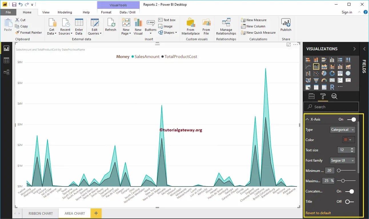
By default, the X-Axis title set to Off for the Area Chart, but you can enable it by toggling Title to On. Let me change the Title Color to Green, Font style to Cambria, and Font Size to 25.
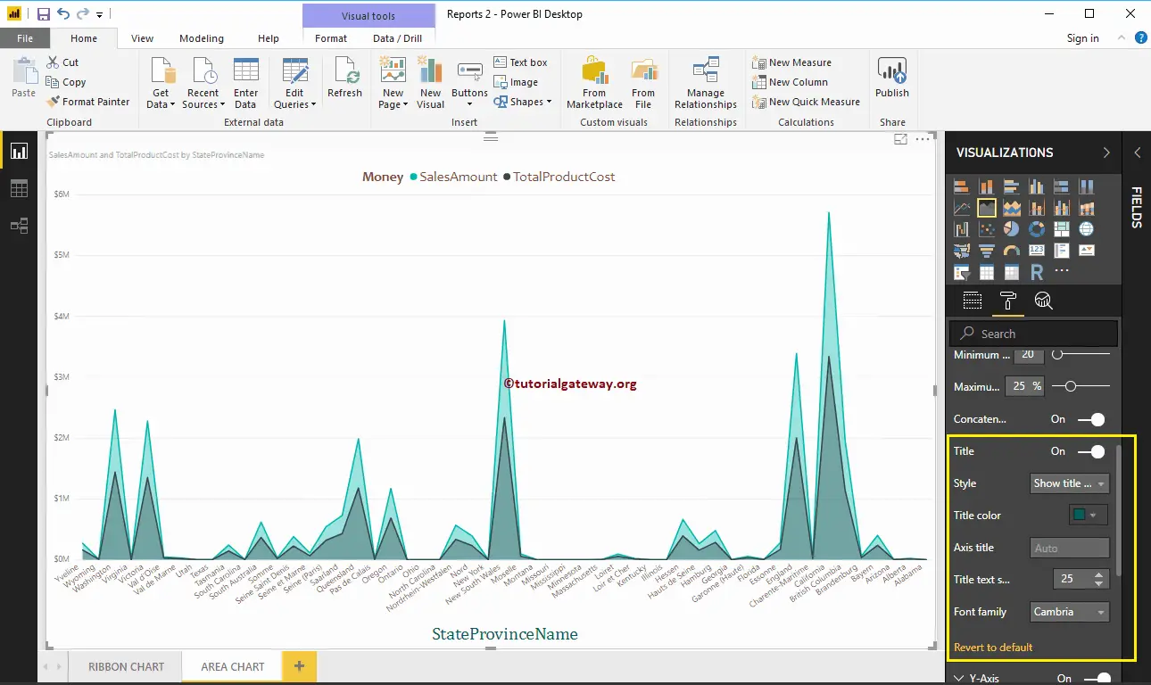
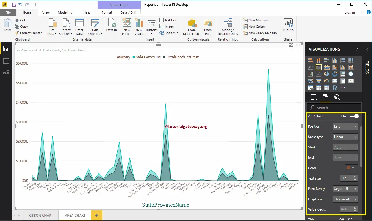
Format Y-Axis of a Power BI Area Chart
As you can see, we changed the Y-Axis labels Color to Brown, Text Size to 15, and display units to thousands.
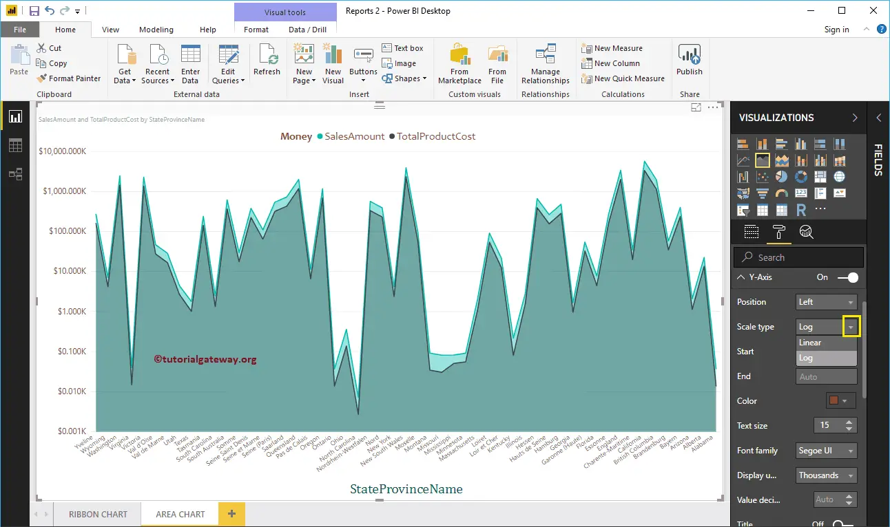
Let me change the Scale type to Log. From the below screenshot, you can see that it is displaying the Log scale.
By default, Area Chart Y-Axis title set to Off. But, you can enable it by toggling Title under the Y-Axis section to On. Let me change the Title Color to Green, Text Size to 25, and Font family Cambria.
By toggling the Area Chart Gridlines option from On to Off, you can disable the Gridlines.
- Color: You can change the Gridlines color.
- Stroke Width: Use this to change the Gridlines width.
- Line Style: Choose the line style such as Solid, dotted, and dashed.

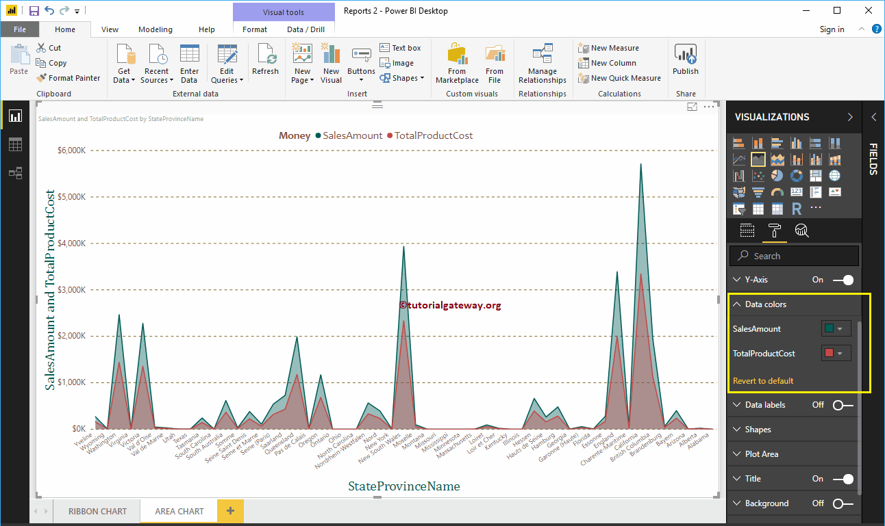
Format Power BI Area Chart Data Colors
By default, the area chart fills the space between axis and line with default colors. Let me change the Sales Amount Line color to Green and Total Product Cost color to Red.
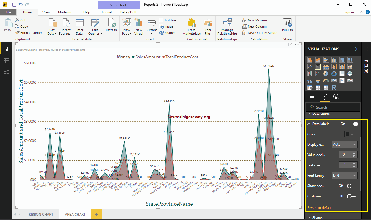
Format Data Labels of an Area Chart
Data Labels display the Values (Sales Amount and Total Product Cost at each point). As you can see from the below screenshot, we enabled data labels and changed the color to black.
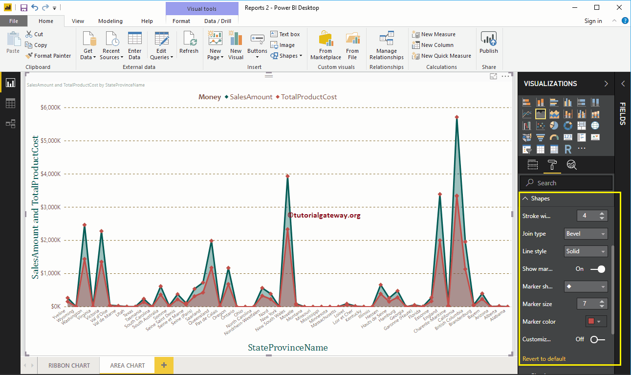
Format Area Chart in Power BI Shapes
Use this section to change the Line Strokes, or marking shapes.
As you can see from the below screenshot, we changed the Stroke Width (Line width) to 4, marker Shape (joining Point Shape ) as Diamond, Marker size as 7, and marker color as cherry red.
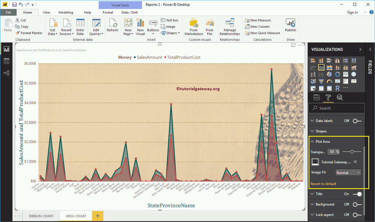
Format Area Chart Plot Area
Using this Plot Area property, you can add custom Images as the Background of the Area Chart. For the demonstration purpose, we added one image as the Plot Area Background.
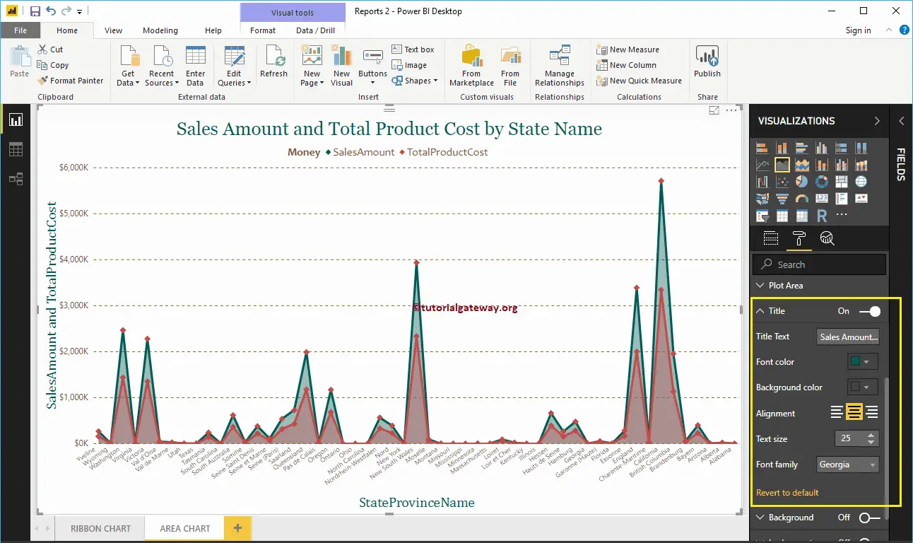
Format Power BI Area Chart Title
By toggling the Title option from On to Off, you can disable the Area Chart title.
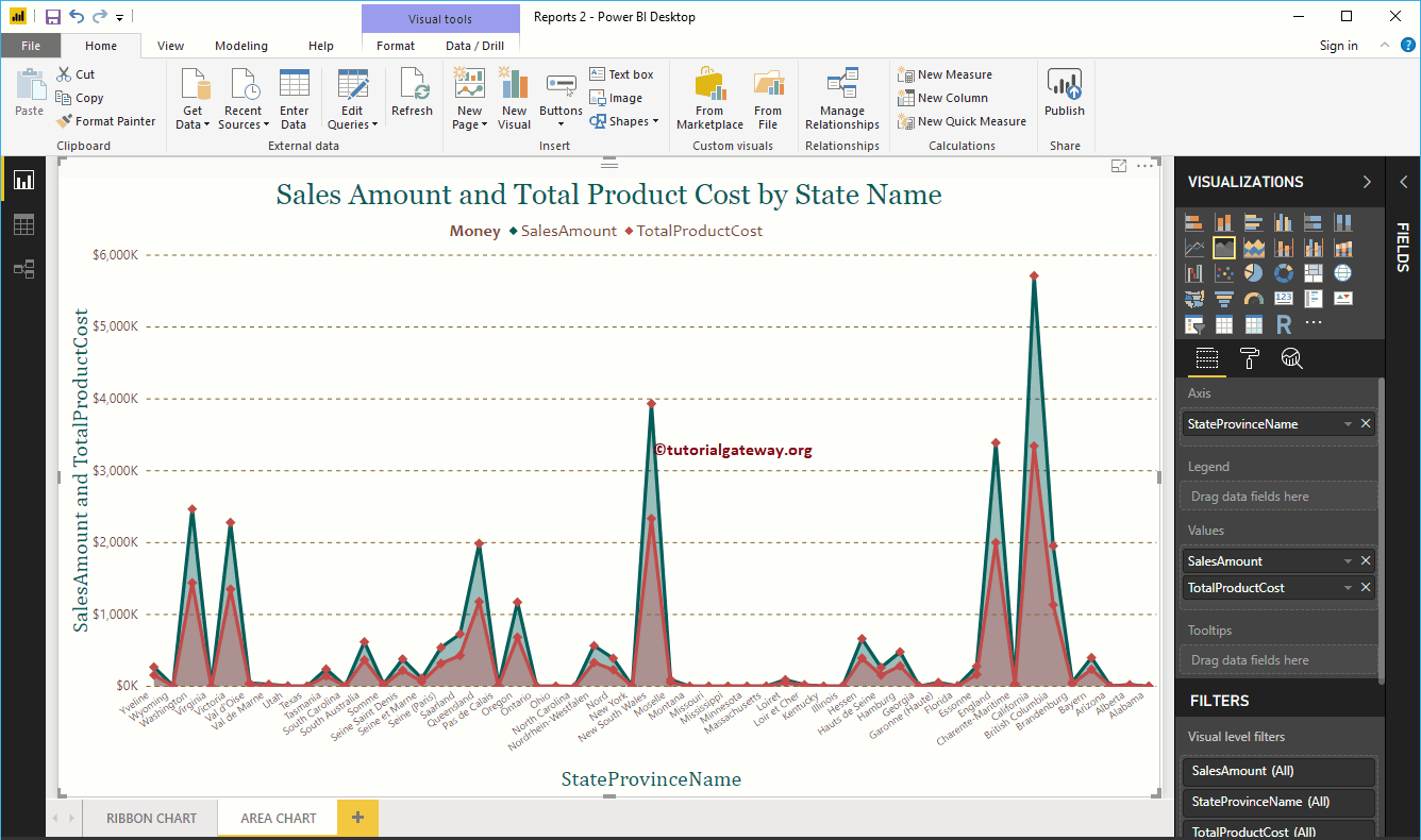
From the below screenshot, you can see, we change the Title Text to Sale Amount and Total Product Cost by State Name. We also changed the Font Color to Green, Font Family to Georgia, Text Size to 25, and Title Alignment to center. If you want, you can add the background Color to the title as well.
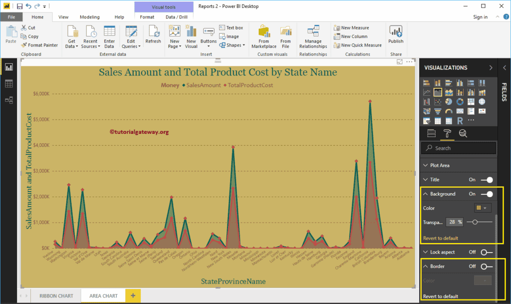
Format Power BI Area Chart Background Color, and Borders
You can add the Background color to an Area Chart by toggling Background option to On. For the demonstration purpose, we added yellow color with 28% transparency.
Similarly, you can add Borders to an Area Chart by toggling the Border option from Off to On.